Animating Data: A Different Way to Look at Marcellus Shale Drilling
by Josh Knauer, CEO of Rhiza
 At Rhiza, we love to experiment with new ways of visualizing data that help tell better data stories. In most of our work environments, using data is kind of difficult and visualizing is usually left to data experts. We’d love to see a future where sharing data visualizations (maps, charts, explanations, etc) is as easy as recording and sharing a video on YouTube. Not everything produced will be stellar in quality, but at least we’ll all be a lot further down the road towards breaking down the traditional data silos and moving data aggregation and visualization solely out of the hands of database admins and graphic designers. We’ll still need those folks, their jobs will just get a lot more fun!
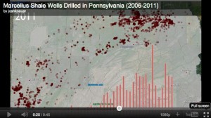
To this end, when I saw a data animation created by John Detwiler that showed the spread of drilled Marcellus shale gas wells in Bradford County, I wanted to create my own data animation telling the same story, but for the entire state of Pennsylvania… Read more»