Bird’s eye view of a sand mine in Wisconsin. Photo by Ted Auch 2013.

West Central Wisconsin’s Landscape and What Silica Sand Mining Has Done to It

By Ted Auch, Great Lakes Program Coordinator, and Elliott Kurtz, GIS Intern

The Great Lakes may see a major increase in the number of sand mines developed in the name of fracking. What impacts has the area already seen, and does future development mean for the region’s ecosystem and land use?

Introduction

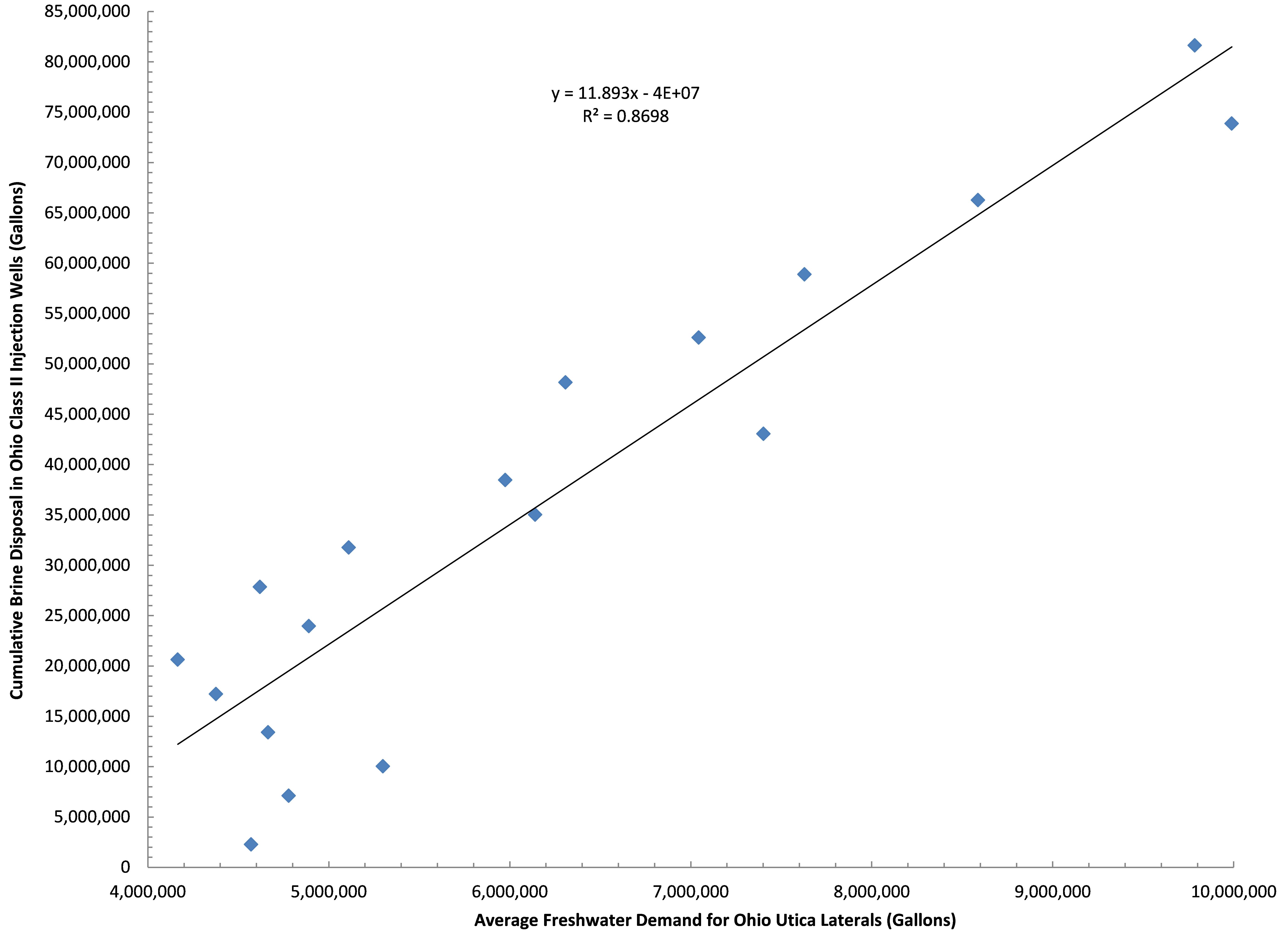
Sand is a necessary component of today’s oil and gas extraction industry for use in propping open the cracks that fracking creates. Silica sand is a highly sought after proppant for this purpose and often found in Wisconsin and Michigan. At the present time here in Ohio our Utica laterals are averaging 4,300-5,000 tons of silica sand or “proppant” with demand increasing by 85+ tons per lateral per quarter.

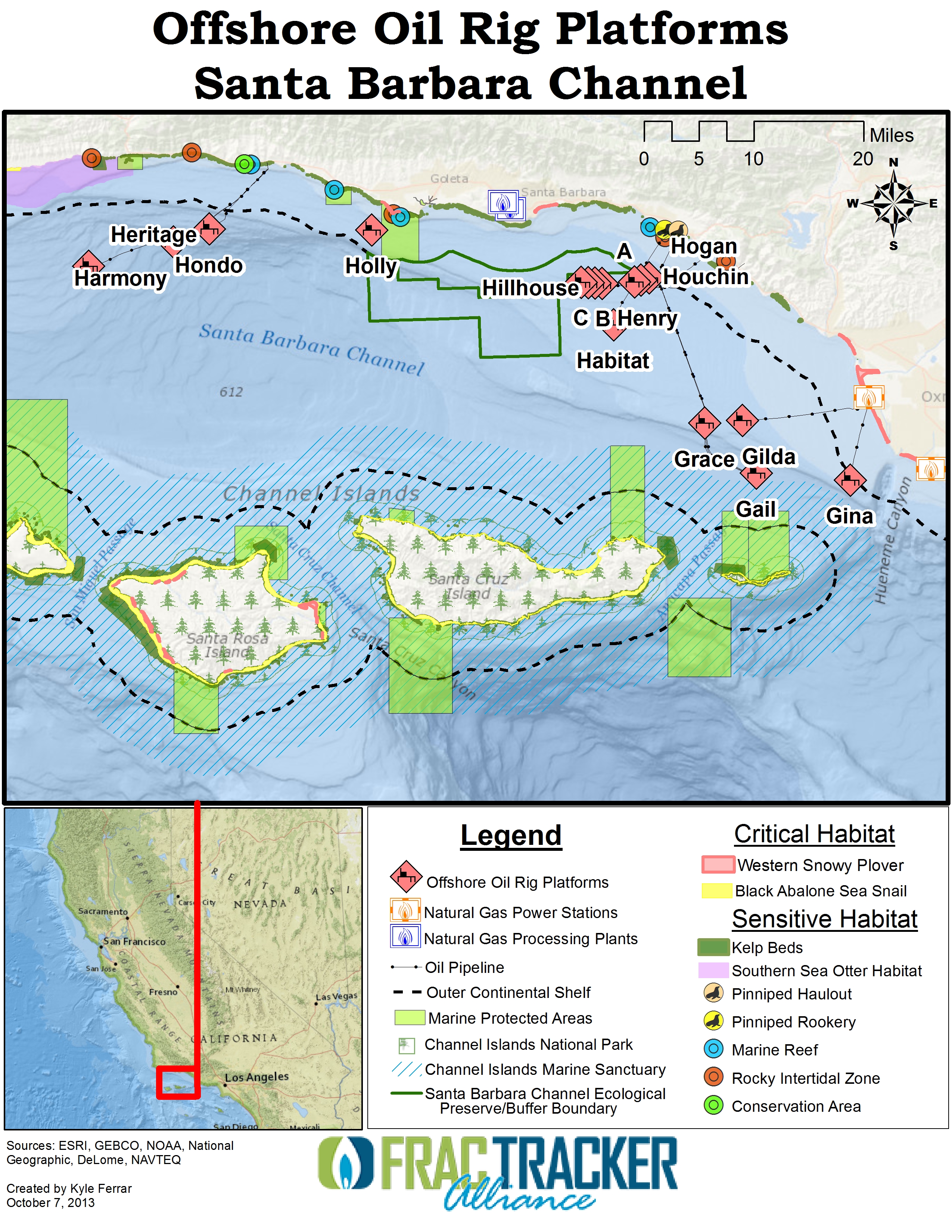
Wisconsin’s 125+ silica sand mines and processing facilities are spread out across 15,739 square miles of the state’s West Central region, adjacent to the Minnesota border in the Northern Mississippi Valley. These mines have dramatically altered the landscape while generating proppant for the shale gas industry; approximately 2.5 million tons of sand are extracted per mine. The length of the average shale gas lateral well grows by > 50 feet per quarter, so we expect silica sand usage will grow from 5,500 tons to > 8,000 tons per lateral. To meet this increase in demand, additional mines are being proposed near the Great Lakes.

Migration of the sand industry from the Southwest to the Great Lakes in search of this silica sand has had a large impact on regional ecosystem productivity and watershed resilience[1]. The land in the Great Lakes region is more productive, from a soil and biomass perspective; much of the Southwest sandstone geology is dominated by scrublands that have accrue plant biomass at much slower rates, while the Great Lakes host productive forests and agricultural land. Great Lakes ecosystems produce 1.92 times more soil organic matter and 1.46 times more perennial biomass than Southwestern ecosystems.

Effects on the Great Lakes

Quantifying what the landscape looks like now will serve as a baseline for understanding how the silica sand industry will have altered the overall landscape, much like Appalachia is doing today in the aftermath of strip-mining and Mountaintop Removal Mining[2]. West Central Wisconsin (WCW) has a chance to learn from the admittedly short-cited and myopic mistakes of their brethren across the coalfields of Appalachia.

Herein we aim to present numbers speaking to the diversity and distribution of WCW’s “working landscape” across eight types of land-cover. We will then present numbers speaking to how the silica mining industry has altered the region to date and what these numbers mean for reclamation. The folks at UC Berkeley’s Department of Environmental Science, Policy , and Management describe “Working Landscapes” as follows:

a broad term that expresses the goal of fostering landscapes where production of market goods and ecosystem services is mutually reinforcing. It means working with people as partners to create landscapes and ecosystems that benefit humanity and the planet… A goal is finding management and policy synergies—practices and policies that enhance production of multiple ecosystem services as well as goods for the market…Collaborative management processes can help discover synergies and create better decisions and policy. Incentives can help private landowners support management that benefits society.

Methods

We used the 1993 WISCLAND satellite imagery to determine how WCW’s landscape is partitioned and then we applied these data to an updated inventory of silica sand mine boundaries to determine what existed within their boundaries prior to mining. The point locations of Wisconsin’s current inventory of silica sand mines was determined using the “Geocode Address” function in ArcMap 10.2 using the Composite_US Address Locator. Addresses were drawn from mine inventory information originally maintained by the West Central WI Regional Planning Commission (WCWRPC) and now managed by the WI Department of Natural Resources’ Mines, pits and quarries division. Meanwhile current mine extent boundary polygons were determined using one of three satellite data-sets:

  1. 2013 imagery from the USDA National Agriculture Imagery Program (NAIP),
  2. 2014 ArcMap 10.2 World Imagery, and
  3. 2014 Google Satellite.

What We Found

Land Cover Types Replaced by Silica Sand Mining

Sand-LandEffects

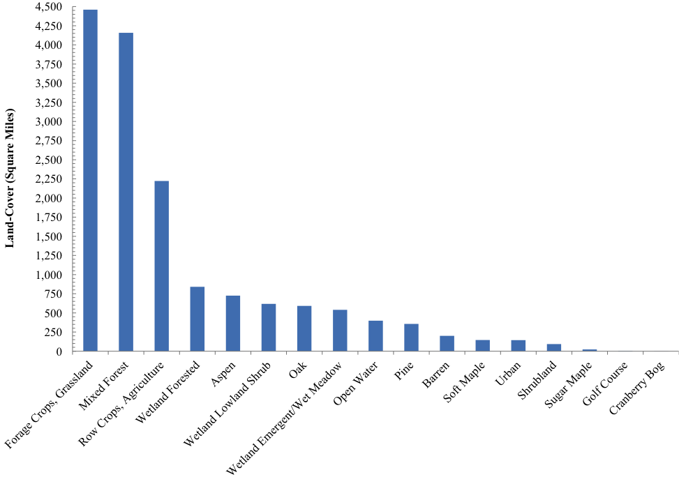
Fig 1. Square mileage of various land cover types replaced by silica sand mining in WCW

Thirty-nine percent of the WCW landscape is currently allocated to forests, 43% to agriculture broadly speaking, and 13% is occupied by various types of wetlands. Open waters occupy 2.6% of the landscape with tertiary uses including barren lands (1.3%), golf courses (0.03%), high and low-density urban areas (0.9%), and miscellaneous shrublands (0.6%) (See Figure 1).

Effects by Land Cover Type

Figure 2. Forest Cover in WCW

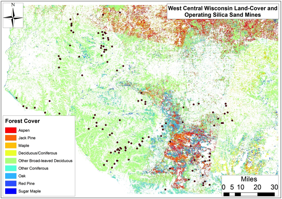
Fig 2. Forest Cover in WCW

Figure 3. Agricultural Cover

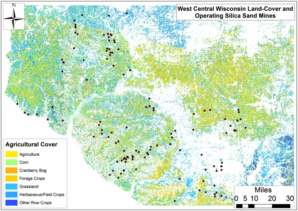
Fig 3. Agricultural Cover

Figure 4. Open Water & Wetland Cover

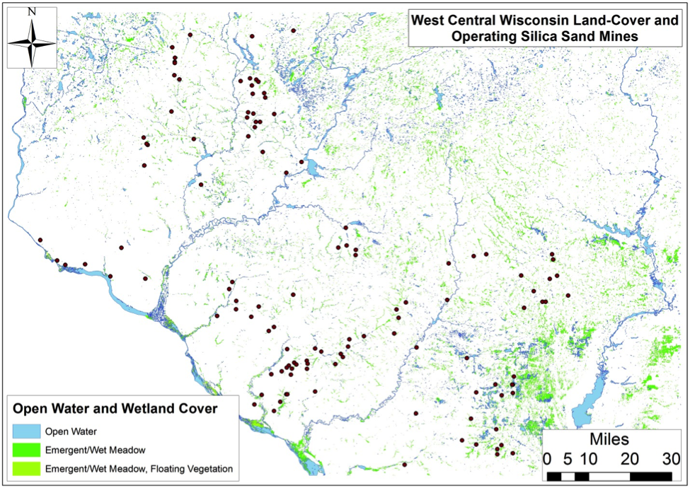
Fig 4. Open Water & Wetland Cover

Figure 5. Forested Wetland Cover

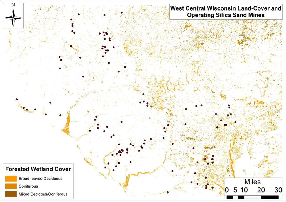
Fig 5. Forested Wetland Cover

Figure 6. Lowland Shrub Wetland Cover

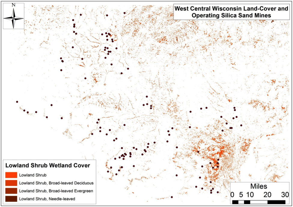
Fig 6. Lowland Shrub Wetlands

Figure 7. Miscellaneous Cover

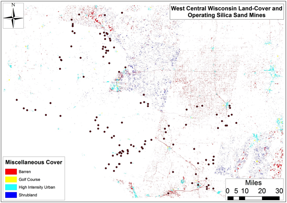
Fig 7. Miscellaneous Cover

Figure 2. The wood in these forests has a current stumpage value of $253-936 million and by way of photosynthesis accumulates 63 to 131 million tons of CO2 and has accumulated 4.8-9.8 billion tons of CO2 if we assumed that on average forests in this region are 65-85 years old. Putting a finer point on WCW forest cover and associated quantifiables is difficult because most of these tracts (2.7 million acres) fall within a catchall category called “Mixed Forest”. Pine (2.3% of the region), Aspen (4.7%), and Oak (3.8%) most of the remaining 1.2 million forested acres with much less sugar (Acer saccharum) and soft (Acer rubrum) maple acreage than we expected scattered in a horseshoe fashion across the Northeastern portion of the study area.

Figure 3. Seven different agricultural land-uses occupy 4.3 million WCW acres with forage crops and grasslands constituting 29% of the region followed by 1.4 million acres of row crops and miscellaneous agricultural activities. Additionally, 2% of WI’s 19,700 cranberry bog acres are within the study area generating $4.02 million worth of cranberries per year. The larger agricultural categories generate $3.2 billion worth of commodities.

Figure 4. Nearly 16% of WCW is characterized by open waters or various types of wetlands with a total area of 2,396 square miles clustered primarily in two Northeast and one Southeast segment. Open waters occupy 398 square miles with forested wetlands – possibly vernal pool-type systems – amounting to 5.4% of the region or 841 square miles. Lowland shrub and emergent/wet meadows occupy 540 and 618 square miles, respectively.

Figure 5. Of the nine types of wetlands present in this region the forested broad-leaved deciduous and emergent/wet meadow variety constitute the largest fraction of the region at 1,107 square miles (7.1% of region). Some percentage of the former would likely be defined by Wisconsin DNR as vernal pools, which do the following according to their Ephemeral Pond program. The WI DNR doesn’t include silica sand mining in its list of 14 threats to vernal pools or potential conservation actions, however.

These ponds are depressions with impeded drainage (usually in forest landscapes), that hold water for a period of time following snowmelt and spring rains but typically dry out by mid-summer…They flourish with productivity during their brief existence and provide critical breeding habitat for certain invertebrates, as well as for many amphibians such as wood frogs and salamanders. They also provide feeding, resting and breeding habitat for songbirds and a source of food for many mammals. Ephemeral ponds contribute in many ways to the biodiversity of a woodlot, forest stand and the larger landscape…they all broadly fit into a community context by the following attributes: their placement in woodlands, isolation, small size, hydrology, length of time they hold water, and composition of the biological community (lacking fish as permanent predators).

Figure 6. Broad-leaved evergreen lowland shrub wetlands constitute ≈2.1% of the region or 319 square miles with most occurring around the Legacy Boggs silica mines and several cranberry operations turned silica mines in Jackson County. Meanwhile broad-leaved deciduous and needle-leaved lowland shrub wetlands are largely outside the current extent of silica sand mining in the region occupying 1.9% of the region with 293 square miles spread out within the northeastern 1/5th of the study area.

Figure 7. Finally, miscellaneous land-covers include 200 square miles of barren land, 145 square miles of low/high intensity urban areas including the cities of Eau Claire (Pop. 67,545) and Stevens Point (Pop. 26,670) as well as towns like Marshfield, Wisconsin Rapids, Merrill, and Rib Mountain-Weston. WCW also hosts 3,204 acres (0.03% of region) worth of golf courses which amounts to roughly 21 courses assuming the average course is 157 acres. Shrublands broadly defined occur throughout 0.6% of the region scattered throughout the southeast corner and north-central sixth of the region, with the both amalgamations poised to experience significant replacement or alteration as they are adjacent to two large silica mine groupings.

Producing Mine Land-Use/Land-Cover Change

To date we have established the current extent of land-use/land-cover change associated with 25 producing silica mines occupying 12 square miles of WCW. These mines have displaced 3 square miles of forests and 7 square miles of agricultural land-cover. These forested tracts accumulated 31,446-64,610 tons of CO2 per year or 2.4-4.9 million tons over the average lifespan of a typical Wisconsin forest. These values equate to the emissions of 144,401-295,956 Wisconsinites or 2.5-5.1% of the state’s population. The annual wood that was once generated on these parcels would have had a market value of $126,097-197,084 per year. Meanwhile the above agricultural lands would be generating roughly $1.5-3.3 million in commodities if they had not been displaced.

However, putting aside measurable market valuations it turns out the most concerning result of this analysis is that these mines have displaces 871 acres of wetlands which equals 11% of all mined lands. This alteration includes 158 acres of formerly forested wetlands, 352 acres of lowland shrub wetlands, and 361 acres of emergent/wet meadows. As we mentioned previously, the chance that these wetlands will be reconstituted to support their original plant and animal assemblages is doubtful.

We know that the St. Peter Sandstone formation is the primary target of the silica sand industry with respect to providing proppant for the shale gas industry. We also know that this formation extend across seven states and approximately 8,884 square miles, with all 91 square miles overlain by wetlands in Wisconsin. To this end carbon-rich grasslands soils or Mollisols, which we discussed earlier, sit atop 36% of the St. Peter Sandstone and given that these soils are alread endangered from past agricultural practices as well as current O&G exploration this is just another example of how soils stand to be dramatically altered by the full extent of the North American Hydrocarbon Industrial Complex. The following IFs would undoubtedly have a dramatic effect on the ability of the ecosystems overlying the St. Peter Sandstone to capture and store CO2 to the extent that they are today not to mention dramatically alter the landscape’s ability to capture, store, and purify precipitation inputs.

  • IF silica sand mining continues at the rate it is on currently
  • IF reclamation continues to result in “very poor stand of grass with some woody plants of very poor quality and little value on the whole for wildlife. Some areas may be reclaimed as crop land, however it is our opinion that substantial inputs such as commercial fertilizer as well as irrigation will be required in most if not all cases in order to produce an average crop.”
  • IF the highly productive temperate forests described above are not reassembled on similar acreage to their extent prior to mining and reclamation is largely to the very poor stands of grass mentione above
    • For example: Great Lakes forests like the ones sitting atop the St. Peter Sandstone capture 20.9 tons of CO2 per acre per year Vs their likely grass/scrublands replacement which capture 10.6-12.8 tons of CO2 per acre per year… You do the math!
  • “None two sites are capable of supporting the growing of food. They grow trees and some cover grass, but that is all. General scientific research says that the reclaimed soils lose up to 75% of their agricultural productivity.”

Quote from a concerned citizen:

I often wonder what it was like before the boom, before fortunes were built on castles of sand and resultant moonscapes stretched as far as the eye could see. In the past few years alone, the nickname the “Silica Sand Capital of the World” has become a curse rather than a blessing for the citizens of LaSalle County, Illinois. Here, the frac sand industry continues to proliferate and threaten thewellbeing of our people and rural ecosystem.

Additional Testimonials

References & Resources

  1. The US Forest Service defined Watershed Resilience as “Over time, all watersheds experience a variety of disturbance events such as fires and floods [and mining]. Resilient watersheds have the ability to recover promptly from such events and even be renewed by them. Much as treating forests can make them more resilient to wildfire, watershed restoration projects can improve watershed resilience to both natural and human disturbances.”
  2. Great example: Virginia Tech’s Powell River Project
Bird’s eye view of a sand mine in Wisconsin. Photo by Ted Auch 2013.

Quick Sand: Frack Sand Mining in Wisconsin

Each silica sand mine displaces 871 acres of wetlands and more than 12 square miles of forests and agriculture land in Wisconsin to provide the shale gas industry with fracking proppant.

By Juliana Henao, Communications Intern

Silica sand is used by the oil and gas industry as a way to prop open the fractures made during fracking – and is also referred to as a proppant. The industry’s demand for silica sand is steadily increasing (i.e., 4-5K tons per shale lateral, +86 tons per lateral per quarter), directly affecting the Great Lakes, their ecosystems, and land use. Silica sand is often found in Wisconsin and Michigan, which have felt the effects of increased sand mining demands through altered landscapes, impacted ecosystem productivity, and altering watershed resilience; these impacts will only continue to increase as the demand for silica sand increases.

To better understand frack sand mining’s current and potential effects, FracTracker’s Ted Auch and intern Elliott Kurtz, with generous support from the Save The Hills Alliance, explored mining and land use changes data in West Central Wisconsin (WCW). In their research paper, Auch and Kurtz show the current and future environmental impacts of increased sand mining in WCW in order to supply the oil and gas industry with sand. Not only does this research illustrate what is at risk in the WCW landscape, it also showcases what sand mining has already done to the region.

Key Frack Sand Mining Findings

Land alterations due to silica sand mining in WI

Sixteen percent, or 2,396 square miles, of the West Central Wisconsin (WCW) is made up of wetlands or open waters. These and the other existing WCW landscapes are unquestionably profitable. The forests buffer climate change impacts – to date accumulating between 4.8-9.8 billion tons of CO2 assuming they are 65-85 years old – and have a current stumpage value of $253-936 million.

The 25 producing silica mines in this region occupy 12 square miles of WCW and have already displaced:

  • 3 mi2 of forests
  • 7 mi2 of agricultural land-cover
  • 1.36 mi2 of wetlands (equal to 11% of all mined lands)
    Formerly, these wetlands were one of three types:

    • 18% (158 acres) forested wetlands
    • 41% (353 acres) lowland shrub wetlands, and
    • 41% (361 acres) emergent/wet meadows
Breakdown of the current landscape types near these expanding mines, based on an analysis of satellite imagery

Breakdown of the current landscape types near these expanding mines, based on an analysis of satellite imagery

Why Wisconsin?

There are more than 125 silica sand mines throughout WCW, a stretch of ~16,000 square miles. Previously, the mining industry focused their efforts in Oklahoma and Texas’s Riley, Hickory/Brady, and Old Creek formations, where the land is not as agriculturally or ecologically productive as WCW. Now, more and more mines are being proposed and built in the WCW region. We wanted to determine what this change would mean for such an ecosystem diverse area of Wisconsin – many of which are considered “globally imperiled” or “globally rare” including oak savanna, dry prairies, southern dry-mesic forests, pine barrens, moist cliffs and oak openings.

The St. Peter Sandstone – along with the early Devonian and much smaller Sylvania Sandstone in Southeastern Michigan – is the primary target of the silica sand industry. Carbon-rich grassland soils cover 36% of the St. Peter, where they aid the ecosystem by capturing and sorting 20.9 tons of CO2 per year, as well as purifying precipitation inputs. This ecosystem, amongst many others around sand mining activities, will be dramatically altered if silica sand mining continues at its increasing rate. We will see CO2 capturing levels drop from 20.9 tons to 10.6 tons per acre per year if the highly productive temperate forests are not reassembled and reclaimed to their original acreage, as well as a significant loss (75%) in agricultural productivity on sites that are not reclaimed properly.

Out-of-state mining companies are settling into Wisconsin and displacing the land at a very high rate. As the president of Iowa’s Allamakee County Protectors Ric Zarwell told us by email “Frac sand mining companies do not come from the area where I live.  So efforts to destroy landscapes for frac sand are going to involve Neighbors Opposing Invaders.”

A high demand in silica sand from the shale gas industry will continue to drive this influx of mining companies into WI, providing a potentially collapsed ecosystem in the future. Factors at play include additional – and often much larger – mines under consideration, the average shale gas lateral grows by > 50 feet per quarter, and silica sand usage will grow from 5,500 tons to > 8,000 tons per lateral (i.e., 85 tons per quarter per lateral). Auch and Kurtz’s research paper describes in detail where how much silica sand might be needed in the future, as well as a detailed set of maps depicting land cover and usage in WI.

Largest Coastal Spill in 25 years [in California]

By Kyle Ferrar, Western Program Coordinator

The Santa Barbara Pipeline Spill

On May 19, 2015, just 20 miles north of Santa Barbara, a heavily corroded section of pipeline ruptured spilling upwards of 101,000 gallons. The pipeline was operated by Plains All American LLC, based out of Houston Texas, and was used to move crude oil from offshore rigs to inland refineries. The spill occurred on a section of pipe running parallel to the coastline at a distance of only a tenth of a mile to the ocean. As a result, the ruptured oil traveled through a drainage culvert and onto the beach where 21,000 gallons spilled into the ocean. The oil spread into a slick that covered 4 miles of coastline, and has since spread to southern California beaches more than 100 miles to the south. Santa Barbara county officials immediately closed two beaches, Refugio and El Capitan, and southern California beaches were also closed June 3rd through June 5th. Commercial fishing has been prohibited near the spill, and nearly 300 dead marine mammals and birds have been found, as well as dead cephalopods (octopi).1

Mapping the Impacts


Santa Barbara 2015 Oil Spill at Refugio Beach. To view the legend and map full screen, click here.

The map above shows details of the oil spill, including the location on the coastline, the extent that the spill traveled south, and the Exxon offshore platforms forced to suspend operations due to their inability to transport crude to onshore refineries.

The dynamic map also shows the wildlife habitats that are impacted by this oil spill, putting these species at risk. This area of Central California coastline is incredibly unique. The Santa Barbara Channel Islands are formed and molded as colder northern swells meet warmer southern swells, generating many temperature gradients and microhabitats able to support an incredible amount of biodiversity. Many species are endemic to only this region of the California coastline, and therefore are very sensitive to the impacts of pollution. In addition to the many bird species, including the endangered Western Snow Plover and Golden Eagle, this area of coastline is home to a number of whale and porpoise species, and, as seen in the map, the Leatherback Sea Turtle and the Black Abolone Sea Snail, both threatened.

Santa Barbara Channel_10.7.13

Figure 1. Offshore Drilling Near Santa Barbara from 2013

For California’s harbor seal populations, this kill event reinforces existing environmental pressures that have been shrinking the seal and sea lion (pinniped) communities, increasing the threat of shark attacks on humans. For the potential impact that this could have on California’s sensitive sea otter population, see FracTracker’s recent story on the West Coast Sea Otter.

In 2013, The FracTracker Alliance collaborated with the Environmental Defense Center on the report Dirty Water: Fracking Offshore California. The report showed that much of the offshore oil is extracted by hydraulic fracturing (Fig 1.), and outlined the environmental impacts that would result from a spill of this magnitude.

Clean Up Efforts

Workers are currently cleaning the spill by hand using buckets and shovels. These old fashioned techniques may be painstaking, but they are the least invasive and they are necessary to ensure that there is not additional damage to the sensitive ecosystems. Even scraping the coastline with wire brushes and putty knives cannot remove the stain of oil that has been absorbed by porous rocks. The oil will only wear away with time as it is diluted back into the ocean. Costs of the clean-up response alone have already reached $92 million, which is being paid by Texas-based Plains All American Pipeline. There have not been any reports yet on the financial impacts to the recreational and fishing industries.2

Prevention Opportunities

By comparison, the Santa Barbara oil spill in 1969 was estimated at 200 million gallons. After over 45 years, nearly a half decade, one would think that advancements in pipeline engineering and technology would prevent these types of accidents. Plains All American, the pipeline operator states that their pressure monitors can detect leaks the size of pinholes. Why, then, did the ruptured pipe continue to spill crude for three hours after the public was notified of the incident?

This section of pipeline (falsely reported by the media to be abandoned) was built in 1987. At capacity the pipeline could transport 50,400 gallons of oil per hour, but during the time of the spill the pipeline was running under capacity. Pipeline inspections had occurred in 2012 and in April of 2014, just weeks prior. The Pipeline and Hazardous Material Safety Administration said testing conducted in May had identified extensive corrosion of the pipeline that required maintenance. It is possible that this incident is an isolated case of mismanagement, but the data tell a different story as this is not an isolated event.

Plains released a statement that a spill of this magnitude was “highly unlikely,” although this section of the pipeline has experienced multiple other spills, the largest of which being 1,200 gallons. Just a year prior, May 2014, the same company, Plains, was responsible for a 19,000 gallon spill of crude in Atwater Village in Los Angeles County. According to a joint hearing of two legislative committees, the operators, Plains did not meet state guidelines for reporting the spill. According to the county, the operator should have been able to shut down the pipeline much faster.3 It is not clear how long the pipeline was actually leaking.

NASA Spill Visualizations

As a result of the spill and to assist with the clean-up and recovery, NASA’s Jet Propulsion Laboratory (JPL) in Pasadena, CA has developed new technology to track the oil slick and locate contamination of beaches along the coastline. The JPL deployed a De Havilland Twin Otter aircraft carrying a unique airborne instrument developed to study the spill and test the ability of imaging spectroscopy to map tar on area beaches. What this means is that from aircraft special cameras can take pictures of the beach. Based on the nature of the light waves reflecting off the beach in the pictures, tar balls and oil contamination can be identified. Clean-up crews can then be dispatched to these areas. On their website, NASA states “The work is advancing our nation’s ability to respond to future oil spills.”4 A picture generated using this technology, and showing oil contamination in water and on the beach, is shown below.

SBOilSpill_NASA

References

  1.  Maza, C. 2015. California oil spill: Regulators, lawmakers scrutinize company response. Christian Science Monitor. Accessed 7/1/15.
  2. Chang, A. 2015. Workers clean up oil spill on California beaches by hand. The Washington Times. Accessed 7/5/15.
  3. Panzar, J. 2015. Official says pipeline firm violated state guidelines for reporting Santa Barbara spill. Los Angeles Times. Accessed 7/6/15.
  4. NASA. 2015. NASA Maps Beach Tar from California Oil Pipeline Spill. NASA Jet Propulsion Laboratory California Institute of Technology. Accessed 7/7/17.
Proposed Atlantic Coast Pipeline route

An urgent need? Atlantic Coast Pipeline Discussion and Map

By Karen Edelstein, Eastern Program Coordinator

This article was originally posted on 10 July 2015, and then updated on 22 January 2016 and 16 February 2016.

Proposed Pipeline to Funnel Marcellus Gas South

In early fall 2014, Dominion Energy proposed a $5 billion pipeline project, designed provide “clean-burning gas supplies to growing markets in Virginia and North Carolina.” Originally named the “Southeast Reliability Project,” the proposed pipeline would have a 42-inch diameter in West Virginia and Virginia. It would narrow to 36 inches in North Carolina, and narrow again to 20 inches in the portion that would extend to the coast at Hampton Roads. Moving 1.5 billion cubic feet per day of gas, with a maximum allowable operating pressure of 1440 psig (pounds per square inch gage), the pipeline would be designed for larger customers (such as manufacturers and power generators) or local gas distributors supplying homes and businesses to tap into the pipeline along the route, making the pipeline a prime mover for development along its path.

The project was renamed the Atlantic Coast Pipeline (ACP) when a coalition of four major US energy companies—Dominion (45% ownership), Duke Energy (40%), Piedmont Natural Gas (15%), and AGL Resources (5%)— proposed a joint venture in building and co-owning the pipeline. Since then, over 100 energy companies, economic developers, labor unions, manufacturers, and civic groups have joined the new Energy Sure Coalition, supporting the ACP. The coalition asserts that the pipeline is essential because the demand for fuel for power generation is predicted more than triple over the next 20 years. Their website touts the pipeline as a “Path to Cleaner Energy,” and suggests that the project will generate significant tax revenue for Virginia, North Carolina, and West Virginia.

Map of Proposed Atlantic Coast Pipeline


View map fullscreen – including legend and measurement tools.

Development Background

Lew Ebert, president of the North Carolina Chamber of Commerce, optimistically commented:

Having the ability to bring low-cost, affordable, predictable energy to a part of the state that’s desperately in need of it is a big deal. The opportunity to bring a new kind of energy to a part of the state that has really struggled over decades is a real economic plus.

Unlike older pipelines, which were designed to move oil and gas from the Gulf Coast refineries northward to meet energy demands there, the Atlantic Coast Pipeline would tap the Marcellus Shale Formation in Ohio, West Virginia and Pennsylvania and send it south to fuel power generation stations and residential customers. Dominion characterizes the need for natural gas in these parts of the country as “urgent,” and that there is no better supplier than these “four homegrown companies” that have been economic forces in the state for many years.

In addition to the 550 miles of proposed pipeline for this project, three compressor stations are also planned. One would be at the beginning of the pipeline in West Virginia, a second midway in County Virginia, and the third near the Virginia-North Carolina state line.  The compressor stations are located along the proposed pipeline, adjacent to the Transcontinental Pipeline, which stretches more than 1,800 miles from Pennsylvania and the New York City Area to locations along the Gulf of Mexico, as far south as Brownsville, TX.

In mid-May 2015, in order to avoid requesting Congressional approval to locate the pipeline over National Park Service lands, Dominion proposed rerouting two sections of the pipeline, combining the impact zones on both the Blue Ridge Parkway and the Appalachian Trail into a single location along the border of Nelson and Augusta Counties, VA. National Forest Service land does not require as strict of approvals as would construction on National Park Service lands. Dominion noted that over 80% of the pipeline route has already been surveyed.

Opposition to the Pipeline on Many Fronts

The path of the proposed pipeline crosses topography that is well known for its karst geology feature—underground caverns that are continuous with groundwater supplies. Environmentalists have been vocal in their concern that were part of the pipeline to rupture, groundwater contamination, along with impacts to wildlife could be extensive. In Nelson County, VA, alone, 70% of the property owners in the path of the proposed pipeline have refused Dominion access for survey, asserting that Dominion has been unresponsive to their concerns about environmental and cultural impacts of the project.

On the grassroots front, 38 conservation and environmental groups in Virginia and West Virginia have combined efforts to oppose the ACP. The group, called the Allegany-Blue Ridge Alliance (ABRA), cites among its primary concerns the ecologically-sensitive habitats the proposed pipeline would cross, including over 49.5 miles of the George Washington and Monongahela State Forests in Virginia and West Virginia. The “alternative” version of the pipeline route would traverse 62.7 miles of the same State Forests. Scenic routes, including the Blue Ridge Parkway and the Appalachian Scenic Trail would also be impacted. In addition, it would pose negative impacts on many rural communities but not offset these impacts with any longer-term economic benefits. ABRA is urging for a programmatic environmental impact statement (PEIS) to assess the full impact of the pipeline, and also evaluate “all reasonable, less damaging” alternatives. Importantly, ABRA is urging for a review that explores the cumulative impacts off all pipeline infrastructure projects in the area, especially in light of the increasing availability of clean energy alternatives.

Environmental and political opposition to the pipeline has been strong, especially in western Virginia. Friends of Nelson, based in Nelson County, VA, has taken issue with the impacts posed by the 150-foot-wide easement necessary for the pipeline, as well as the shortage of Department of Environmental Quality staff that would be necessary to oversee a project of this magnitude.

Do gas reserves justify this project?

Dominion, an informational flyer, put forward an interesting argument about why gas pipelines are a more environmentally desirable alternative to green energy:

If all of the natural gas that would flow through the Atlantic Coast Pipeline is used to generate electricity, the 1.5 billion cubic feet per day (bcf/d) would yield approximately 190,500 megawatt-hours per day (mwh/d) of electricity. The pipeline, once operational, would affect approximately 4,600 acres of land. To generate that much electricity with wind turbines, utilities would need approximately 46,500 wind turbines on approximately 476,000 acres of land. To generate that much electricity with solar farms, utilities would need approximately 1.7 million acres of land dedicated to solar power generation.

Nonetheless, researchers, as well as environmental groups, have questioned whether the logic is sound, given production in both the Marcellus and Utica Formations is dropping off in recent assessments.

Both Nature, in their article Natural Gas: The Fracking Fallacy, and Post Carbon Institute, in their paper Drilling Deeper, took a critical look at several of the current production scenarios for the Marcellus Shale offered by EIA and University of Texas Bureau of Economic Geology (UT/BEG). All estimates show a decline in production over current levels. The University of Texas report, authored by petroleum geologists, is considerably less optimistic than what has been suggested by the Energy Information Administration (EIA), and imply that the oil and gas bubble is likely to soon burst.

Natural Gas Production Projections for Marcellus Shale

Natural Gas Production Projections for Marcellus Shale

David Hughes, author of the Drilling Deeper report, summarized some of his findings on Marcellus productivity:

  • Field decline averages 32% per year without drilling, requiring about 1,000 wells per year in Pennsylvania and West Virginia to offset.
  • Core counties occupy a relatively small proportion of the total play area and are the current focus of drilling.
  • Average well productivity in most counties is increasing as operators apply better technology and focus drilling on sweet spots.
  • Production in the “most likely” drilling rate case is likely to peak by 2018 at 25% above the levels in mid-2014 and will cumulatively produce the quantity that the Energy Information Administration (EIA) projected through 2040. However, production levels will be higher in early years and lower in later years than the EIA projected, which is critical information for ongoing infrastructure development plans.
  • The EIA overestimates Marcellus production by between 6% and 18%, for its Natural Gas Weekly and Drilling Productivity reports, respectively.
  • Five out of more than 70 counties account for two-thirds of production. Eighty-five percent of production is from Pennsylvania, 15% from West Virginia and very small amounts from Ohio and New York. (The EIA has published maps of the depth, thickness and distribution of the Marcellus shale, which are helpful in understanding the variability of the play.)
  • The increase in well productivity over time reported in Drilling Deeper has now peaked in several of the top counties and is declining. This means that better technology is no longer increasing average well productivity in these counties, a result of either drilling in poorer locations and/or well interference resulting in one well cannibalizing another well’s recoverable gas. This declining well productivity is significant, yet expected, as top counties become saturated with wells and will degrade the economics which have allowed operators to sell into Appalachian gas hubs at a significant discount to Henry hub gas prices.
  • The backlog of wells awaiting completion (aka “fracklog”) was reduced from nearly a thousand wells in early 2012 to very few in mid-2013, but has increased to more than 500 in late 2014. This means there is a cushion of wells waiting on completion which can maintain or increase overall play production as they are connected, even if the rig count drops further.
  • Current drilling rates are sufficient to keep Marcellus production growing on track for its projected 2018 peak (“most likely” case in Drilling Deeper).

Post Carbon Institute estimates that Marcellus predictions overstate actual production by 45-142%. Regardless of the model we consider, production starts to drop off within a year or two after the proposed Atlantic Coast Pipeline would go into operation. This downward trend leads to some serious questions about whether moving ahead with the assumption of three-fold demand for gas along the Carolina coast should prompt some larger planning questions, and whether the availability of recoverable Marcellus gas over the next twenty years, as well as the environmental impacts of the Atlantic Coast Pipeline, justify its construction.

Next steps

The Federal Energy Regulatory Commission, FERC, will make a final approval on the pipeline route later in the summer of 2015, with a final decision on the pipeline construction itself expected by fall 2016.

UPDATE #1: On January 19, 2016, the Richmond Times-Dispatch reported that the United States Forest Service had rejected the pipeline, due to the impact its route would have on habitats of sensitive animal species living in the two National Forests it is proposed to traverse.

UPDATE #2: On February 12, 2016, Dominion Pipeline Company released a new map showing an alternative route to the one recently rejected by the United States Forest Service a month earlier. Stridently condemned by the Dominion Pipeline Monitoring Coalition as an “irresponsible undertaking”, the new route would not only cross terrain the Dominion had previously rejected as too hazardous for pipeline construction, it would–in avoiding a path through Cheat and Shenandoah Mountains–impact terrain known for its ecologically sensitive karst topography, and pose grave risks to water quality and soil erosion.

Northeast Ohio Class II injection wells taken via FracTracker's mobile app, May 2015

OH Class II Injection Wells – Waste Disposal and Industry Water Demand

By Ted Auch, PhD – Great Lakes Program Coordinator

Waste Trends in Ohio

Map of Class II Injection Volumes and Utica Shale Freshwater Demand in Ohio

Map of Class II Injection Volumes and Utica Shale Freshwater Demand in Ohio. Explore dynamic map

It has been nearly 2 years since last we looked at the injection well landscape in Ohio. Are existing disposals wells receiving just as much waste as before? Have new injection wells been added to the list of those permitted to receive oil and gas waste? Let’s take a look.

Waste disposal is an issue that causes quite a bit of consternation even amongst those that are pro-fracking. The disposal of fracking waste into injection wells has exposed many “hidden geologic faults” across the US as a result of induced seismicity, and it has been linked recently with increases in earthquake activity in states like Arkansas, Kansas, Texas, and Ohio. Here in OH there is growing evidence – from Ashtabula to Washington counties – that injection well volumes and quarterly rates of change are related to upticks in seismic activity.

Origins of Fracking Waste

Furthermore, as part of this analysis we wanted to understand the ratio of Ohio’s Class II waste that has come from within Ohio and the proportion of waste originating from neighboring states such as West Virginia and Pennsylvania. Out of 960 Utica laterals and 245+ Class II wells, the results speak to the fact that a preponderance of the waste is coming from outside Ohio with out-of-state shale development accounting for ≈90% of the state’s hydraulic fracturing brine stream to-date. However, more recently the tables have turned with in-state waste increasing by 4,202 barrels per quarter per well (BPQPW). Out-of-state waste is only increasing by 1,112 BPQPW. Such a change stands in sharp contrast to our August 2013 analysis that spoke to 471 and 723 BPQPW rates of change for In- and Out-Of-State, respectively.

Brine Production

Ohio Class II Injection Well trends In- and Out-Of-State, Cumulatively, and on Per Well basis (n = 248).

Figure 1. Ohio Class II Injection Well trends In- and Out-Of-State, Cumulatively, and on Per Well basis (n = 248).

For every gallon of freshwater used in the fracking process here in Ohio the industry is generating .03 gallons of brine (On average, Ohio’s 758 Utica wells use 6.88 million gallons of freshwater and produce 225,883 gallons of brine per well).

Back in August of 2013 the rate at which brine volumes were increasing was approaching 150,000 BPQPW (Learn more, Fig 5), however, that number has nearly doubled to +279,586 BPQPW (Note: 1 barrel of brine equals 32-42 gallons). Furthermore, Ohio’s Class II Injection wells are averaging 37,301 BPQPW (1.6 MGs) per quarter over the last year vs. 12,926 barrels BPQPW – all of this between the initiation of frack waste injection in 2010 and our last analysis up to and including Q2-2013. Finally, between Q3-2010 and Q1-2015 the exponential increase in injection activity has resulted in a total of 81.7 million barrels (2.6-3.4 billion gallons) of waste disposed of here in Ohio. From a dollars and cents perspective this waste has generated $2.5 million in revenue for the state or 00.01% of the average state budget (Note: 2.5% of ODNR’s annual budget).

Freshwater Demand Growing

Ohio Class II Injection Well disposal as a function of freshwater demand by the shale industry in Ohio between Q3-2010 and Q1-2015.

Figure 2. Ohio Class II Injection Well disposal as a function of freshwater demand by the shale industry in Ohio between Q3-2010 and Q1-2015.

The relationship between brine (waste) produced and freshwater needed by the hydraulic fracturing industry is an interesting one; average freshwater demand during the fracking process accounts for 87% of the trend in brine disposal here in Ohio (Fig. 2). The more water used, the more waste produced. Additionally, the demand for OH freshwater is growing to the tune of 405-410,000 gallons PQPW, which means brine production is growing by roughly 12,000 gallons PQPW. This says nothing for the 450,000 gallons of freshwater PQPW increase in West Virginia and their likely demand for injection sites that can accommodate their 13,500 gallons PQPW increase.

Where will all this waste go? I’ll give you two guesses, and the first one doesn’t count given that in the last month the ODNR has issued 7 new injection well permits with 9 pending according to the Center For Health and Environmental Justice’s Teresa Mills.

Unconventional Drilling Activity Down In Pennsylvania

By Matt Kelso, Manager of Data & Technology

Wells Spudded (Drilled)

The number of newly drilled unconventional wells in Pennsylvania peaked in 2011.

Figure 1: Newly drilled unconventional wells in Pennsylvania peaked in 2011.

Unconventional oil and gas drilling is well established in Pennsylvania, with over 9,200 drilled wells, an additional 7,200 permitted locations that have not yet been drilled, and 5,300 violations all happening since the turn of the millennium. It took a while for the industry to gather steam, with just one unconventional well drilled in 2002, and only eight in 2005. But by 2010, that figure had ballooned to 1,599 wells, which was greater than the previous eight years combined. There were 1,956 wells drilled in 2011, representing the peak for unconventional drilling activity in Pennsylvania (Figure 1).

None of the three full years since then, however, have seen more than 70% of the 2011 total. Halfway through 2015, the industry is on pace to drill only 842 unconventional wells statewide, which would be the lowest total since 2009, and only 43% of the 2011 total.


Pennsylvania Shale Viewer. Click here to access the full screen view with a legend, layer details, and other tools.

Taken cumulatively, the footprint on the state is immense, as is shown in the map above, and impacts remain for some time. Of Pennsylvania’s 9,234 unconventional wells 8,187 (89%) are still active. Only 474 wells have been permanently plugged so far, with 570 given an inactive status, and one well listed as “proposed but never materialized,” despite being included on the spud report.

Permits & Violations

The number of permits and violations issued have been declining over the past five years as well.

Five years of unconventional oil and gas activity in Pennsylvania, July 2010 through June 2015.

Figure 2: Five years of unconventional oil and gas activity in Pennsylvania, July 2010 through June 2015.

Figure 2 shows the monthly totals of permits, wells, and violations over the last 60 months. Linear trendlines were added to the chart to give a visual representation of changes over time if we ignore the noise of the peaks and troughs of activity, which is an inherent attribute of the industry. Each of the three trendlines has a negative slope1, showing downward trends in each category.

In fact, permits for new wells are declining more rapidly than the drilled wells, and violations issued are declining at a still faster rate. Over the course of five years, these declines are substantial. In July 2010, the smoothed totals that are “predicted” by the trendline show 304 permits issued, 159 wells drilled, and 128 violations issued per month.  60 months later, one would expect 213 permits, 81 wells drilled, and just 12 violations issued2.

Location of Drilling Activity

The oil and gas industry has been more selective about where unconventional wells are being drilled in recent years, as well. Altogether, there are unconventional wells in 39 different counties, with 32 counties seeing action in both 2010 and 2011. That number is down to 22 for both 2014 and the first half of 2015. There has been drilling in 443 different municipalities since 2002, with a maximum of 241 municipal regions in 2011, which shrank to 161 last year, and just 88 in the first half of 2015.


Summary of unconventional wells drilled in each Pennsylvania county by year, through June 30, 2015. Click here to access the full screen view with a legend, layer details, and other tools

Clicking on any of the counties above will show the number of unconventional wells drilled in that county by year since the first unconventional well was spudded in Pennsylvania back in 2002.  The color scheme shows the year that the maximum number of unconventional wells were drilled in each county, with blues, greens, and yellows showing counties where the activity has already peaked, oranges showing a peak in 2014, and red showing a peak in 2015, despite only six months of activity.  30 of the 39 counties with unconventional wells in the state saw a peak in activity in 2013 or before.

Notes

  1. The equations for the three trendlines are as follows:
    • Permits: y = -1.5128x + 303.81
    • Wells: y = -1.2939x + 158.95
    • Violations: y = -1.9334x + 127.53
  2. The lowest actual value for each category are as follows:
    • Permits: 117, in July 2012
    • Wells: 43, in February 2015
    • Violations: 16, in August 2014.