Drilled Marcellus Shale Wells per Month
The following chart takes a look at the number of drilled Marcellus Shale wells in Pennsylvania, from 2006 through November, 2011. The accompanying trend line is included, not so much to predict December’s total, but to show the relatively decent R2 value. That is to say, despite the occasional peaks (e.g., September 2010) and troughs (e.g., November 2010), the number of Marcellus Shale wells drilled per month has been increasing in a fairly orderly manner over the past 4 years and 8 months.
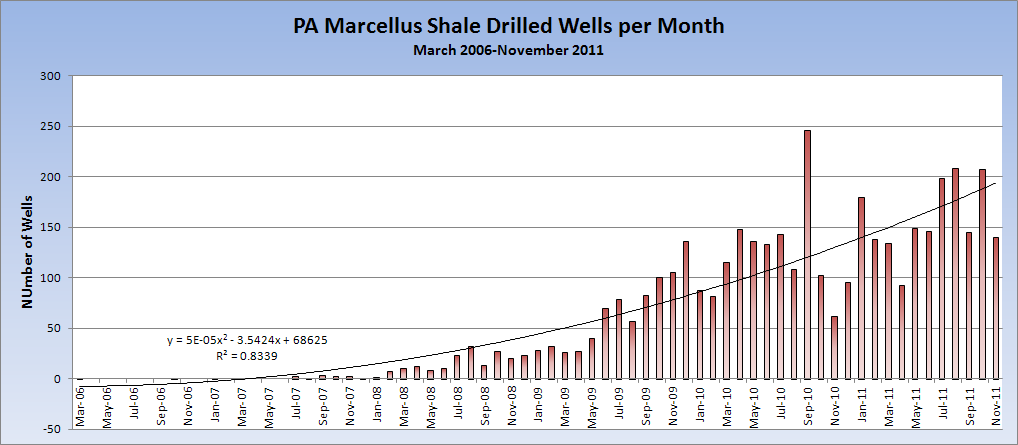
Actually, the best Excel trendline was a sixth order polynomial, with an R2 value of .087, but that’s getting fairly silly relative to my purposes here.
However, when you use the same data but only look at the last 24 months, the results are far more erratic. Once again, the highest R2 value was from a polynomial trendline. But that value wasn’t very high at all:
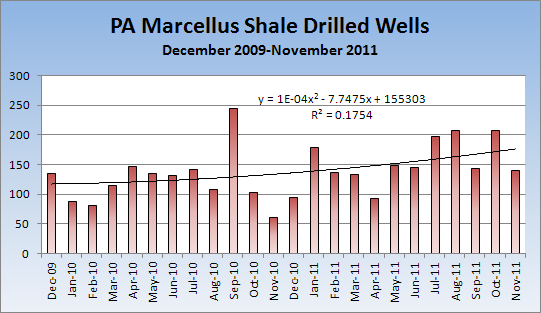
Once again, I don’t think the equation itself is that important, but the 0.18 R2 value is pretty low. Even the sixth order polynomial, with three peaks and three troughs, has an R2 value of only 0.34.
While the first chart shows an industry that is steadily accelerating, the second one shows…I don’t know. I’m hesitant to offer interpretations. My sense is that even though the R2 value is surprisingly low compared to the first chart, it doesn’t actually mean that much. Visually assessing the chart, it doesn’t seem to be a seasonal fluctuation, but there are mini-clusters of months with higher amounts of drilling activity, and those with lower amounts as well. Certainly, the trendline is higher this month that it was two years ago, but not dramatically so.
Logan, you can find the updated raw data here: http://data.fractracker.org/cbi/dataset/datasetPreviewPage?uuid=~01b0cdae783d4911e180e9c2f516a52aab
The source is the PA DEP at: http://www.depreportingservices.state.pa.us/ReportServer/Pages/ReportViewer.aspx?/Oil_Gas/Spud_External_Data
I was wondering if you could send me the excel data sheet for the first graph, please. I would like to use it for a college presentation of how much Marcellus Drilling has increased and fluctuated throughout the years listed.
Thanks for the data. Please take a look at Marcellus Protest to see one of the things that’s been done with the data.