
The Growing Web of Oil and Gas Pipelines
Although the vast majority of scientists agree that we must rapidly move away from fossil fuels to avoid a human-caused climate catastrophe by the end of this century, pipeline construction remains a big business.
Pipelines are the backbone of domestic fossil fuel use and for delivering fuels to terminals for international export. Yet aside from a few high-profile pipeline controversies that show up in the media, few Americans are aware of the vast network of pipelines that transport oil and gas products from sources of extraction to industry and end-use consumers.
The United States is crisscrossed by over 1.63 million miles of fossil fuel pipelines. This includes:
- 190,000 miles of liquid petroleum pipelines
- 300,000 miles of natural gas transmission lines (which move gas between various processing facilities)
- 1.3 million miles of natural gas distribution lines (which take gas from public utilities to consumers)
Many of the country’s pipelines have been built within the last few decades, and in recent years, construction of more has been spurred on by the fracking boom. The total mile count of crude oil pipelines (currently 79,000) has increased over 60% between 2004 and 2017. Natural gas distribution and estimated service pipeline miles increased 72% between 1984 and 2017 (Figure 1).
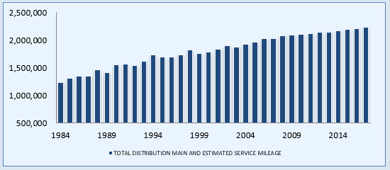
927,052 miles) pipelines in the U.S., 1984-2017
Although total mileage for transmission pipelines slightly dropped between 2004 and 2017 (according to the Pipeline and Hazardous Materials Safety Administration), total mileage for Hazardous Liquids pipelines jumped 33% during that same period (Figures 2 and 3).
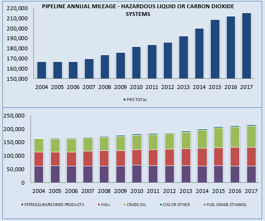
Figure 3 (below). Break down of Hazardous Liquid pipeline miles in the U.S by what they’re transporting, 2004-2017
Exporting natural gas
When natural gas is imported or exported, it’s transported in a liquefied form. The product occupies much less space as a liquefied natural gas (LNG) than it does in its gaseous form, making it easier to transport.
For many years, the United States was an importer of natural gas, until 2007, when this trend quickly reversed, coinciding with the “fracking boom” in the Marcellus Shale, as well as several other shale plays in Texas, Wyoming, and elsewhere.

LNG facilities store and process natural gas to help move it between markets. Between 2010 and 2017, the number of LNG facilities increased from 122 to 152 (includes LNG storage facilities). This nearly 25% increase reflects the surplus of natural gas in the lower 48 states.
The U.S. began exporting LNG in 2016, especially to Europe and China, where demand is high. According to the United States Energy Information Administration (EIA), LNG exports doubled between 2016 and 2017 (Figure 5).

Exports are again expected to double over 2018 levels by the end of 2019, reaching a storage capacity of 9.6 billion cubic feet per day. The US is now the third largest exporter of LNG, after Australia and Qatar.
The breakdown of LNG terminals —existing and future— according to FERC is shown below. These terminals receive LNG imports or ship out LNG for export. The shift from LNG import to export activity over time is quite striking. No new import facilities are currently in the planning phase, yet there are 19 export facilities proposed and another 10 already approved.
Table 1. Import and Export LNG Terminals in the US: Current, Approved, and Proposed.
| Import | Export | |
| Current | 12: Everett, MA; Cove Point, MD; Elba Island, GA; Lake Charles, LA; offshore Boston, MA (2); Freeport, TX; Sabine, LA; Hackberry, LA; Sabine Pass, LA; Pascagoula, MS; Peñuelas, PR) | 3: (Cove Point, MD; Sabine, LA; Kenai, AK) |
| Approved | 3: Corpus Christi, TX; Gulf of Mexico (2) | 10: Hackberry, LA (2); Freeport, TX; Corpus Christi, TX; Sabine Pass, LA (2); Elba Island, GA; Lake Charles, LA (2); Gulf of Mexico |
| Proposed | None | 19: Pascagoula, MS; Cameron Parish, LA (2); Brownsville, TX (3); Port Arthur, TX; Jacksonville, FL; Plaquemines Parish, LA (2); Calcasieu Parish, LA; Nikiski, AK; Freeport, TX; Coos Bay, OR; Corpus Christi, TX; La Fourche Parish, LA; Sabine Pass, LA; Galveston Bay, TX |
The challenge of keeping up
One of the challenges in working on oil and gas-related environmental advocacy is that from week to week, there are always changes in pipeline status. New pipelines are announced, others are delayed, others are postponed, and in some cases, projects are cancelled or defeated. Pipelines that have been under construction for years go on line. Listings are piece-meal, sometimes very vague, and sometimes reported by third and fourth party sources.
FracTracker is committed to sorting through this information, and providing a window into the expansion of oil and gas infrastructure. We have mapped and assembled information on over 60,000 miles of new and proposed oil and gas transmission pipelines and mapped over 250 projects since 2017.
Of these 60,000 pipeline miles, almost 9,800 have been completed and/or are operating. Close to 7,500 miles were cancelled or defeated. This leaves another 42,700 miles of pipeline that are currently in the replacement, reversal, planning or construction stages.
In the interactive map below, against a background of existing pipelines, we show the newest pipelines that have come “on the radar” since 2017. In addition we show LNG terminals, one of the main destinations for the gas that flows through the pipelines to the export market.
Updated U.S. pipeline and LNG terminal map
View Map Full Screen | How Our Maps Work
Our mapping process
FracTracker is dedicated to bringing transparency to the landscape of oil and gas development. We use mapping tools such as GIS (geographic information systems) to illuminate developments in oil and gas infrastructure expansion.
Where do we get our data?
We draw our information from new listings by the United States Energy Information Administration (EIA) and Sierra Club for natural gas projects. In addition, we find announcements about new crude oil and gas pipeline projects on RBN Energy’s website.
After we create a composite list of pipelines, the research begins. We search the internet for references to each pipeline, looking for industry announcements, descriptions, news articles, and, most importantly, the docket listings of the Federal Energy Regulatory Commission (FERC).
FERC may release detailed maps of pipeline routes from the company’s Environmental Impact Statement (EIS), filed after operators have progressed past the initial phases of planning. On occasion, we’ll stumble across links to Google Earth files that grassroots groups have ground-truthed. We can convert these .kml files into our ArcGIS mapping software directly.
Digital cartography
How do we go from online pictures of maps to data that we can use in our interactive maps? For the most part, we use a process called georeferencing, also known in some circles as “rubber-sheeting”. One of the beauties of digital cartography and GIS is that through the magic of computing, we can add information about location to mapped information. This allows us to add different features to a map, such as roads or rivers, and ensure that they line up correctly.
Let’s say I have a .jpg (image) file of a pipeline map that crosses four counties in Indiana. The .jpg shows both the pipeline and the county boundaries. I can open my GIS program and add a reference basemap of the United States, which is similar to what you see when you open Google Maps. I can zoom in to Indiana and add a second GIS layer of Indiana’s counties (already built with coordinates in the digital information), and voila! It drops right into where Indiana is on my base map. Can I do this with the pipeline .jpg? Not yet!
I have to use the clues on the pipeline image to place it in the correct location on the GIS map. Luckily, my pipeline map has county boundaries on it, so I can line up the corners (or other shapes) on the pipeline image to where they are on my map that is “smart” about location using ground control points.
Once I’m satisfied that the map I’ve added is in the correct location, I carefully trace the path of the pipeline, saving it as a GIS layer. Because it’s drawn with its own location data included, it will always appear in future maps in the same place relative to the rest of Indiana.
That’s our process in a nutshell.
Want to see this done as a demo? Here’s a nice 10-minute YouTube video:
By Karen Edelstein, Eastern Program Coordinator