Draft Protocol developed by FracTracker Alliance and Carnegie Mellon University’s CREATE Lab, modified via pilot counts with PennEnvironment
For more information please contact info@fractracker.org
Draft Last Updated: September 2, 2015
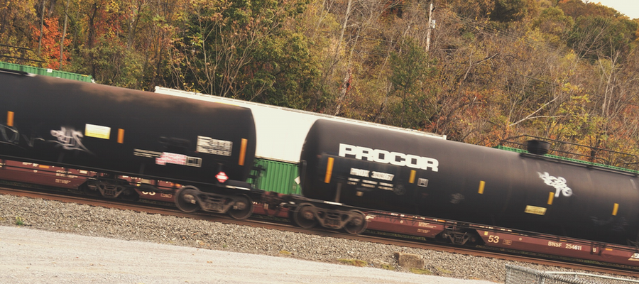
The purpose of this project is to document how many crude oil (1267) and liquefied petroleum gas (1075) train cars go through your area. These types of cars can be identified with their HAZMAT placards:
1267 hazmat placarded cars (crude oil):
1075 hazmat cars (liquefied petroleum gas):
Site Selection
Select a set of sites that cover possible train paths through the area of concern with as many of the following characteristics as possible:
Public place off of the road
Good lighting at night
Safe at night
Location where trains move more slowly, if possible
Avoid more than 2 tracks in parallel. Parallel tracks create the possibility of missing a train that’s obscured by another train.
Train Counting Equipment
1 clipboard, several pens
30 blank train reports per session
Two to three people
Phone with camera to record time for each train, and to take photographs and videos where possible (optional)
Radar gun (optional)
Video camera (optional)
A large umbrella or tent that can cover both the observers and the camera, when needed.
Chairs and other amenities to make sure observers are comfortable
How to Count Trains
There should be at least two, if not three people counting trains at all times. For each train that passes, fill out one Train Report Form. Align yourself perpendicular to the tracks. Capture photos and videos of the trains as you see fit.
Before a train arrives, fill out a new report form with all of the train counters’ names, a cell phone number or email address for one of you, and the date.
Counter 1 is responsible for counting cars marked with the 1267 HAZMAT placard. Counter 2 counts the cars with the 1075 placards. Counter 3 captures the train’s speed with the radar gun, and counts the total number of cars on each train – including the engine and caboose.
Once you hear a train coming, enter the start time on the sheet. Prepare the radar gun to capture the train’s speed as it goes by. While the train passes, count in your head how many cars pass of the type to which you have been assigned. Afterward, mark how many of each type of car the counters saw.
After the train passes, enter the final number of each type of HAZMAT cars on the train and the total number of cars. Also, write down the train’s speed, direction (if known), operator (company), and any additional notes about the session (such as placards that you could not distinguish clearly).
Turn in these tally sheets to your project coordinator. We would also appreciate it if you were to send information about your train counting results and experience to FracTracker Alliance: info@fractracker.org.
Videotaping Best Practices
If you are using a video camera, here are some suggestions for improving the recording process.
Even during broad daylight it might be difficult to clearly videotape the trains if they are moving quickly. Try to find a counting location where the trains move slowly (e.g. 25 mph)
Test out the iPhone’s new slow motion camera feature
Set the video camera up at least 30 frames per second. 60 frames/second is better.
Don’t zoom, as this results in a dark aperture. Try finding a site and setting up close enough that you can get a good shot (but far enough away for safety purposes)
Train Report Form
Before Train Passes
Date:
Time:
Location (address/GPS):
Counter 1 Name:
Counter 2 Name:
Counter 3 Name:
Email:
Phone:
During
While the train passes, count in your head how many cars pass of the type to which you have been assigned. Afterward, mark the number of each type below.
After
Train Car Types
Number
1267 Cars
1075 Cars
Total Cars
Details
Train Speed
Operator
Direction
Notes
Be sure to include information about what might be missing or uncertain — if there were two trains at once, or if you missed some cars for any reason. If you missed or couldn’t discern cars, try to include some insight on whether the situation could be improved in the future by better lighting or site selection, or if the train’s fast speed made it hard to keep up, etc. Remember to send your results to info@fractracker.org.
We were recently asked if there is a reliable way to determine what constituents are being housed in certain types of oil and gas storage containers. While there is not typically a simple and straightforward response to questions like this, some times we can provide educated guesses based on a few photos, placards, or a trip to the site.
One way to become better informed is to follow the trucks. The origins of the trucks will determine whether the current stage in the extraction process is drilling or fracturing (the containers cannot be for both unless they are delivering fresh water). Combine that with good side-view photos of the trucks will tell you if they are heavier going into the site or heavier leaving. Look for the clearance between the rear tires and the frame. Tanker trucks can typically carry 4000 gallons or 100 barrels.
For a quick guide to oil and gas storage containers, see the “quiz” we have compiled below:
Storage Container Quiz
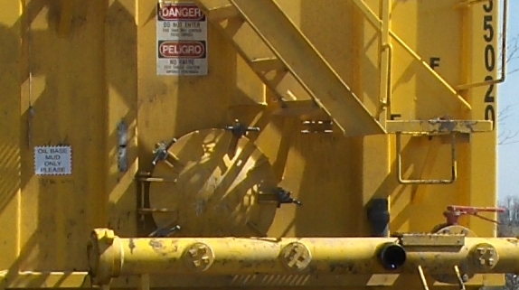
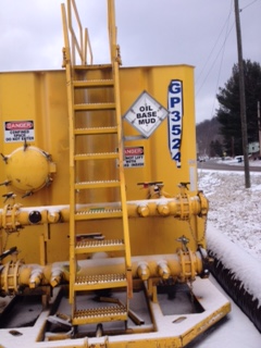
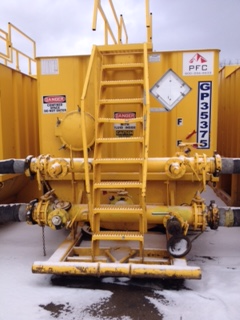
1. What is in this yellow tank?
Q1: Photo 1
Q1: Photo 2 (same tank zoomed in)
Answer: This yellow 500-barrel wheelie storage tank in photos 1 and 2 is a portable storage tank, identified in the placard in photo 2 as having held oil base drill mud at one time. Drillers prefer to keep certain tanks identified for specific purposes if at all possible. This is especially true if they have paid extra to get a tank “certified clean” to use for fresh water storage. A certified clean tank does not mean that the water is potable (drinkable).
Other storage containers that hold fresh water are shown below:
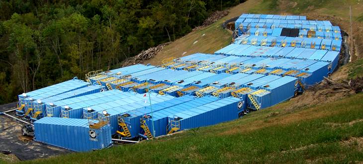
Shark Tanks
Shark Tanks from the sky
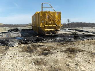
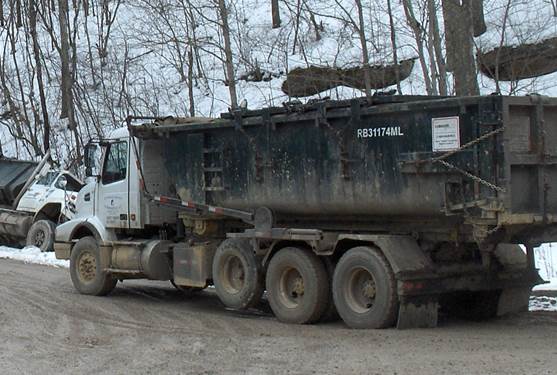
2. What is this truck transporting?
Q2: Truck
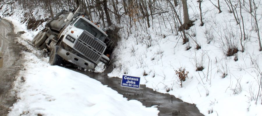
Answer: This type of truck is normally used to haul solid waste – such as drill cuttings going to a landfill. Some trucks, however do not make it the whole way to the landfill before losing some of their contents as shown below.
Truck spill in WV
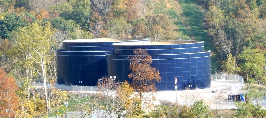
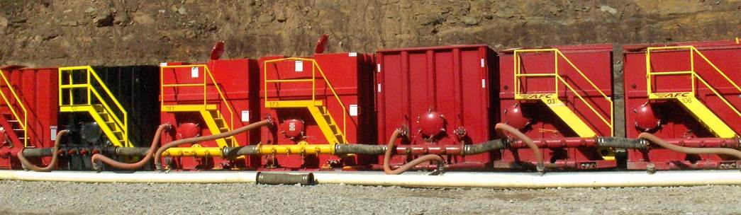
3. How about these yellow tanks?
Q3: Photo 1
Q3: Photo 2
Answer: The above storage containers are 500-barrel liquid storage tanks, also called “frac” tanks.
In photo 2 you can see that at least one tank is connected to others on either side of it. In this case you need to look at the overall operation to see what process is occurring nearby — or what had just finished — to determine what might be in the container presently.
The name plate on photo 1 says “drill mud,” which means that at one time that container might have held exactly that. Now, however, that container would likely have very little to do with drilling waste or drill cuttings. The “GP” and the number on the sign refers to Great Plains and the tank’s number. These type of tanks do not have official placards on them for the purposes of DOT labeling since they are never moved with any significant liquid in them.
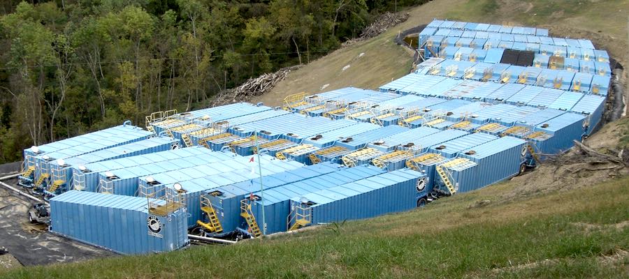
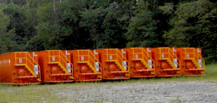
4: What about these miscellaneous tanks?
Q4: Photo 1 – Tank farm with 103 blue tanks
Q4: Photo 2 – Red tanks with connecting hoses
Q4: Photo 3 – Red tanks, no connections
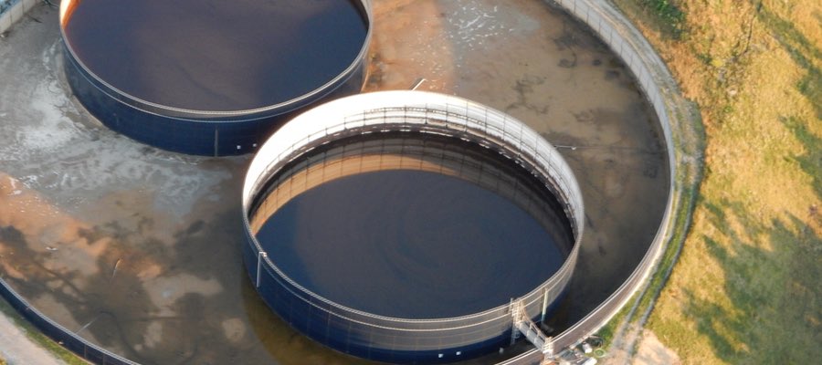
Answer: There is no way to know – unless you have been closely following the process in your neighborhood and know the current stage of the well pad’s drilling process. Tank farms are usually just for storage unless there is some type of filtering and processing equipment on site. The drilling crews (for either horizontal or vertical wells) do not mix their fluids with the fracturing crew. That does not mean that one tank farm could not store a selection of flowback brine—or produced water, or drilling fluids. They would be stored in separate tanks or tank groups that are connected together – usually with flex hoses.
Since I am in the area often, I know that the tanks in photos 1 and 2 were storing fresh water. Both sets were associated with a nearby hydraulic fracturing operation, which has very little to do with the drilling process. You will never see big groups of tanks like this on a well pad that is currently being drilled.
The third set of tanks with no connections on an in-production well pad are probably just empty and storing air – but not fresh air. These tanks are just sitting there, waiting for their next assignment – storage only, not in use. Notice that there are no connecting pipes like in photo 2. The tanks in photo 3 could have held any of the following: fresh water, flowback, brine, mixed fracturing fluids, or condensate. Only the operator would know for certain.
https://www.fractracker.org/a5ej20sjfwe/wp-content/uploads/2015/02/Storage-Feature.jpg400900Guest Authorhttps://www.fractracker.org/a5ej20sjfwe/wp-content/uploads/2025/09/2025-Wordmark-Logo.pngGuest Author2015-02-17 15:41:102020-07-21 10:32:09Name that oil and gas storage container [quiz]
By Ted Auch, Great Lakes Program Coordinator, FracTracker Alliance
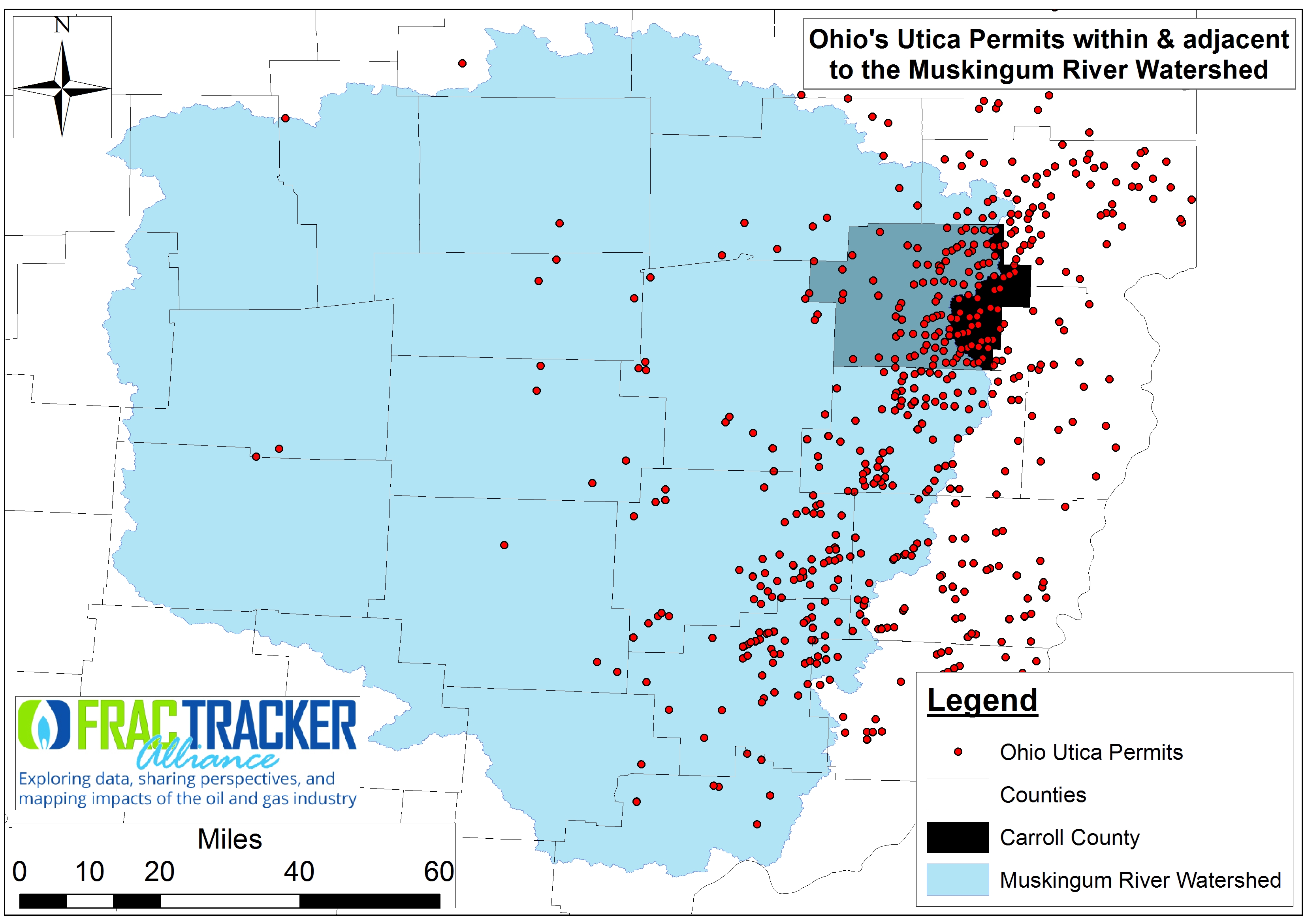
We know from the most recent Ohio Department of Natural Resources (ODNR) permitting numbers that Carroll County, Ohio is home to 26% (461 of 1,778) of the state’s Utica permits and 43% (312 of 712) of all producing wells as of the end of Q3-20141 (Figure 1). But does that mean that the county will continue to see that kind of industrial activity for the foreseeable future? The primary question we wanted to ask with this latest piece is whether the putative “king” of the state’s Utica shale gas counties is indeed Carroll County.
Fig 1. Ohio’s Utica Permits within & adjacent to the Muskingum River Watershed as of February, 2015
To do this we compiled an inventory of annual (2011-2012) and quarterly OH shale gas production numbers for 721 laterals throughout southeast OH.
Permitting and production numbers are not necessarily part and parcel to determine if Carrol Co is truly the king. We decided to investigate the production data and do a simple compare and contrast with the rest of the state’s 409 laterals on one side (ROS) and the 312 Carroll laterals on the other – focusing primarily on days of production and resulting oil, gas, and brine (Table 1 and infographic below).
Carroll vs. ROS Results
Permitting Numbers Breakdown
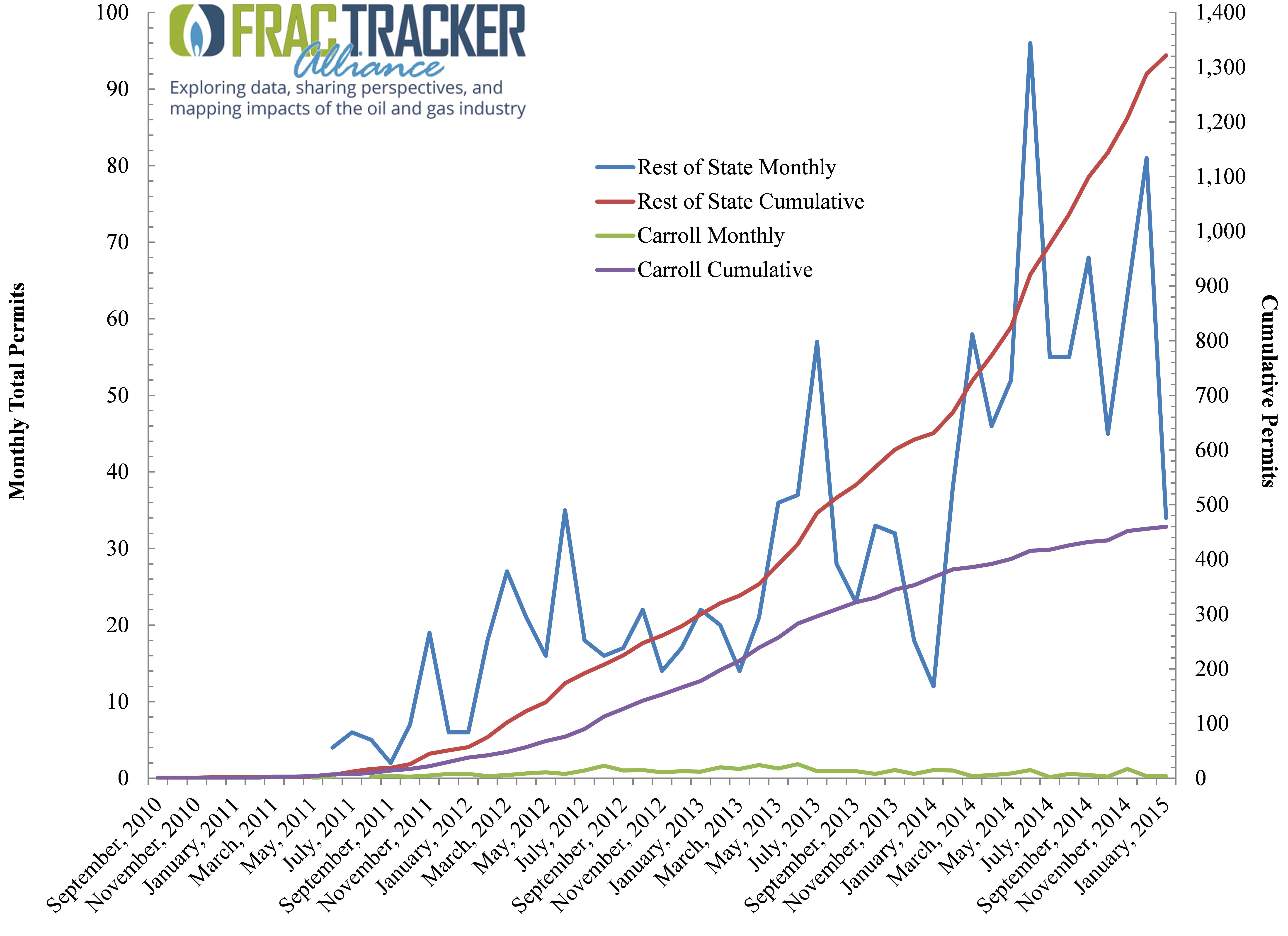
Fig 2. Monthly & cumulative Utica Shale permitting activity in Carrol County, OH vs. the ROS between September 2010 & January 2015
Between the initial permitting phase of September 2010 and January 2105 the number of Utica Shale permits issued in the ROS has averaged 29 per month vs. 10 per month in Carroll County. Permitting actually increased twofold in the ROS in the last 12 months (Figure 2). Conversely, permitting in Carroll County seems to have reached some sort of a steady state, with monthly permitting declining by 23% in the last 12 months. Carroll’s Utica permits generally constituted 47% of all permitting in OH but more recently has dipped to 44%. Newer areas of focus include Belmont, Guernsey, Noble, and Columbiana counties, just to name a few.
Production Days
Days in production is a proxy for road activity and labor hours. Carroll’s wells have the rest of the state beat for that metric, with an average of 292 (±188 days) days. The state average is 192 days, with significant well-to-well variability (±177 days). If we assume there was a total of 1,369 possible production days between 2011 and the end of Q3-2014, these averages translate to 21% and 14% of total possible production days for Carroll and ROS, respectively.
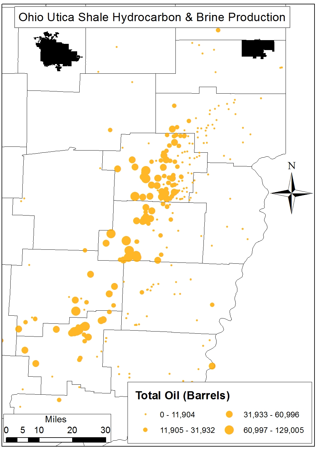
Oil Production
Carroll falls short of the ROS on a total and per-day basis of oil production, although the 442-barrel difference in total oil production is likely not significant. Carroll wells are producing 74 barrels of oil per day (OPD) (±73 OPD) compared to 96 OPD (±122 OPD) for the rest of the state; however, well-to-well variability is so large as to make this type of comparison quite difficult at this juncture. Fifty-seven percent of OH’s 11,361,332 barrels of Utica oil has been produced outside of Carroll County to date. This level of production is equivalent to 16,231 rail tanker cars and roughly 00.18% of US oil production between 2011 and 2013.
This number of rail tanker cars is equivalent to 6% of the US DOT-111 fleet, or 184 miles worth of trains – enough to stretch from Columbus to Pittsburgh.
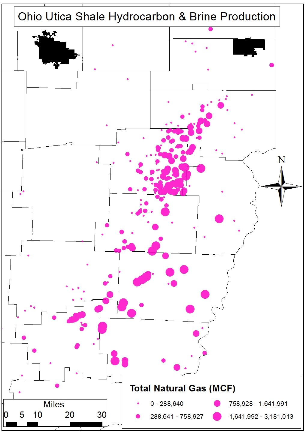
Natural Gas
The natural gas story is mixed, with Carroll’s 312 wells having produced 13,430 MCF more than the ROS wells. On a per-well basis, however, the latter are producing 3,327 MCF per day (MCFPD) (±3,477 MCFPD) relative to the 2,155 MCFPD (±1,264 MCFPD) average for Carroll’s wells. Yet again, well-to-well variability – especially in the case of the 409 ROS wells – is high enough that such simple comparisons would require further statistical analysis to determine whether differences are significant or not.
The natural gas produced here in OH currently amounts to roughly 00.51% of U.S. Natural Gas Marketed Production, according to the latest data from the EIA.
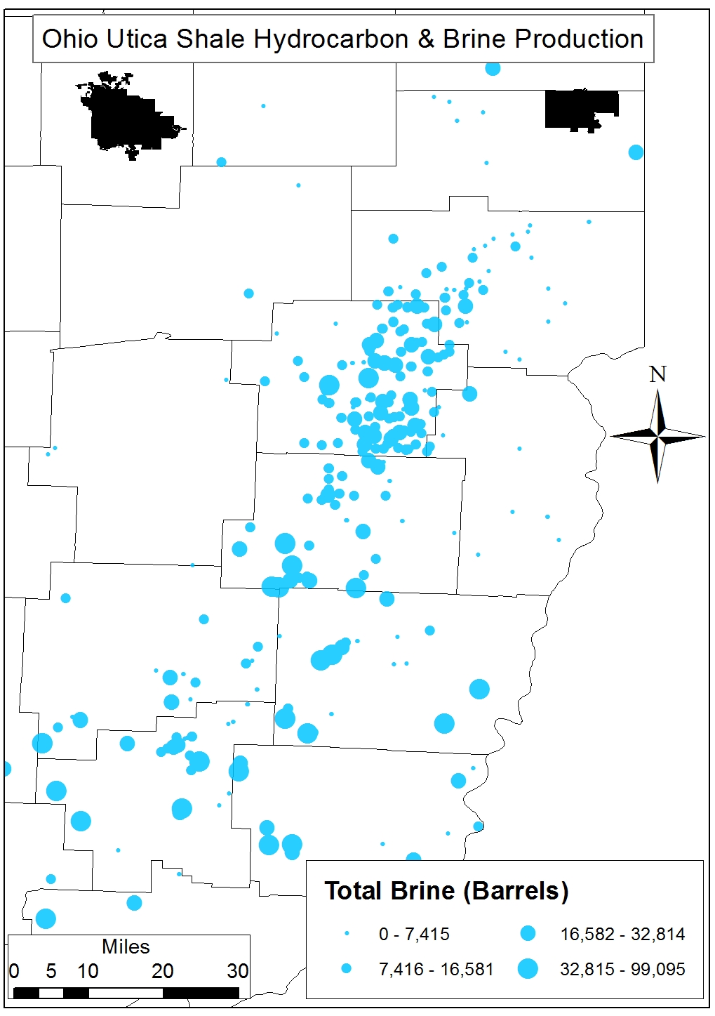
Waste – Brine
From a waste generation point of view, the ROS laterals have produced 41 more barrels of brine per day (BPD) than the Carroll laterals and 1,465 BPD since production began in 2011. On a per-day basis, the ROS laterals are producing more oil than waste at a rate of 1.92 barrels of oil per barrel of brine waste. Conversely, since production began these respective sums result in Carroll County laterals having produced 1.56 barrels of oil for every barrel of brine vs. the 1.40 oil-to-brine ratio for the ROS. Finally, it is worth noting that the 7,775,130 barrels of brine produced here in OH amounts to 13% of all fracking waste processed by the state’s 235+ Class II Injection wells.
What do these figures mean?
As we begin to compare OH’s Utica Shale expectations vs. reality we see that the “sweet spot” of the play is truly a moving target. The train seems to have already left – or is in the process of leaving – the station in Carroll County (Figures 3 and 4). It seems two of the most important questions to ask now are:
How will this rapidly shifting flow of capital, labor, and resources affect future counties deemed the next best thing? and
What will be left in the wake of such hot money flows?
Answers to these questions will be integral to the preparation for the inevitable sudden or slow-and-steady decline in shale gas activity. These dropouts are just the most recent in a long line of boom-bust cycles to have been foisted on Southeast OH and Appalachia. Effects will include questions regarding watershed resilience, local and regional resource utilization (Figures 5 and 6), social cohesion, tax-base uncertainty, roads, and a rapidly changing physical landscape.
Whether Carroll County can maintain its perch on top of the OH shale mountain is far from certain, but whether it will have to begin to – or should have already – prepare for the downside of this cliff is fact based on the above analysis.
Additional Figures and Charts
Table 1. Carroll County, OH production days and production of oil, gas, and brine on a per-day basis and in total between 2011 and Q3-2014 vis à vis the “Rest of State”
Variable
Carroll (312)
Rest of State (409)
Max
Sum
Mean
Max
Sum
Mean
Total Days
914
91,193
292±188
898
78,430
192±177
Oil (Barrels)
Per Day
453
23,190
74±73
601
39,109
96±122
Total
83,098
4,838,147
15,507
129,005
6,523,185
15,949
Gas (MCF)
Per Day
6,774
672,391
2,155±1,264
18,810
1,360,923
3,327±3,477
Total
2,196,240
168,739,064
540,830
3,181,013
215,706,401
527,400
Brine (Barrels)
Per Day
941
18,516
59±87
810
40,839
100±120
Total
36,917
3,105,260
9,953
99,095
4,669,870
11,418
Oil Per Unit of Brine
Per Day
1.25
1.92
Total
1.56
1.40
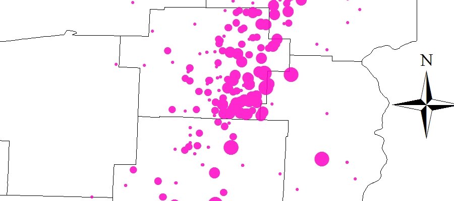
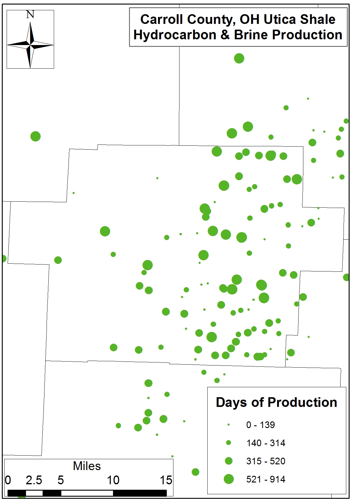
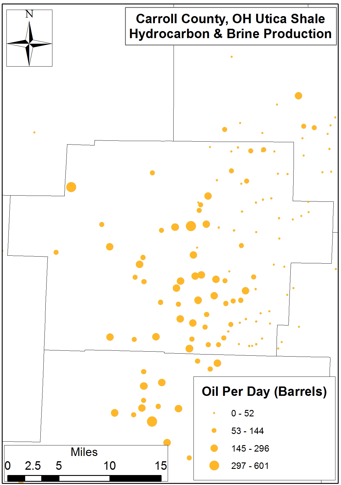
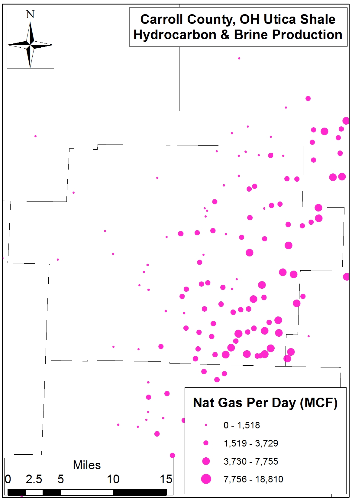
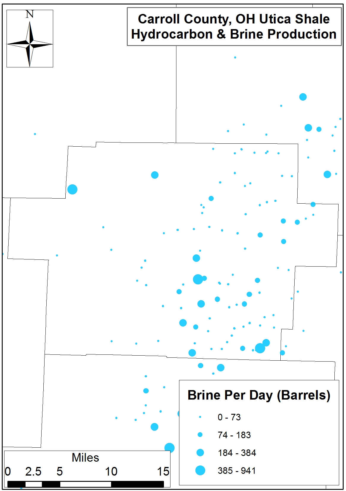
Figures 3a-d. Spatial distribution of Carroll County Utica Shale production days, oil (barrels), natural gas (MCF), and brine (barrels) on a per-day basis.
Fig 3a. Spatial distribution of Carroll Co. Utica Shale production days
Fig 3b. Spatial distribution of Carroll Co. Utica Shale oil (barrels) production on per-day basis
Fig 3c. Spatial distribution of Carroll Co. Utica Shale natural gas (MCF) production on per-day basis
Fig 3d. Spatial distribution of Carroll County Utica Shale brine (barrels) production on a per-day basis
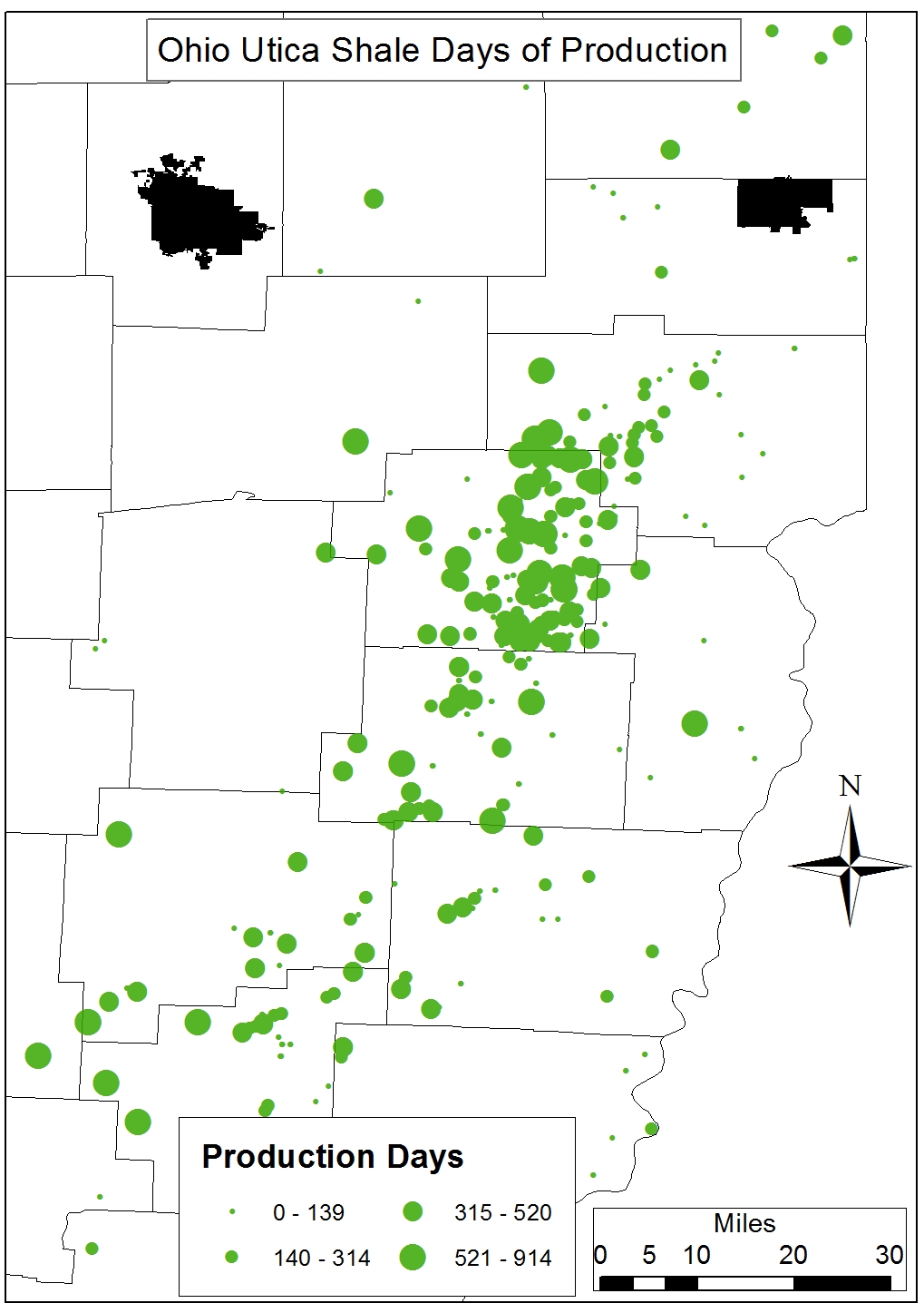
Figures 4a-d. Spatial distribution of OH Utica Shale production days, oil (barrels), natural gas (MCF), and brine (barrels) on a per-day basis.
Fig 4a. Ohio Utica Shale Total Production Days, 2011-2014
Fig 4b. Ohio Utica Shale Total Oil Production (Barrels), 2011-2014
Fig 4c. Ohio Utica Shale Total Natural Gas Production (MCF), 2011-2014
Fig 4d. Ohio Utica Shale Total Brine Production (Barrels), 2011-2014
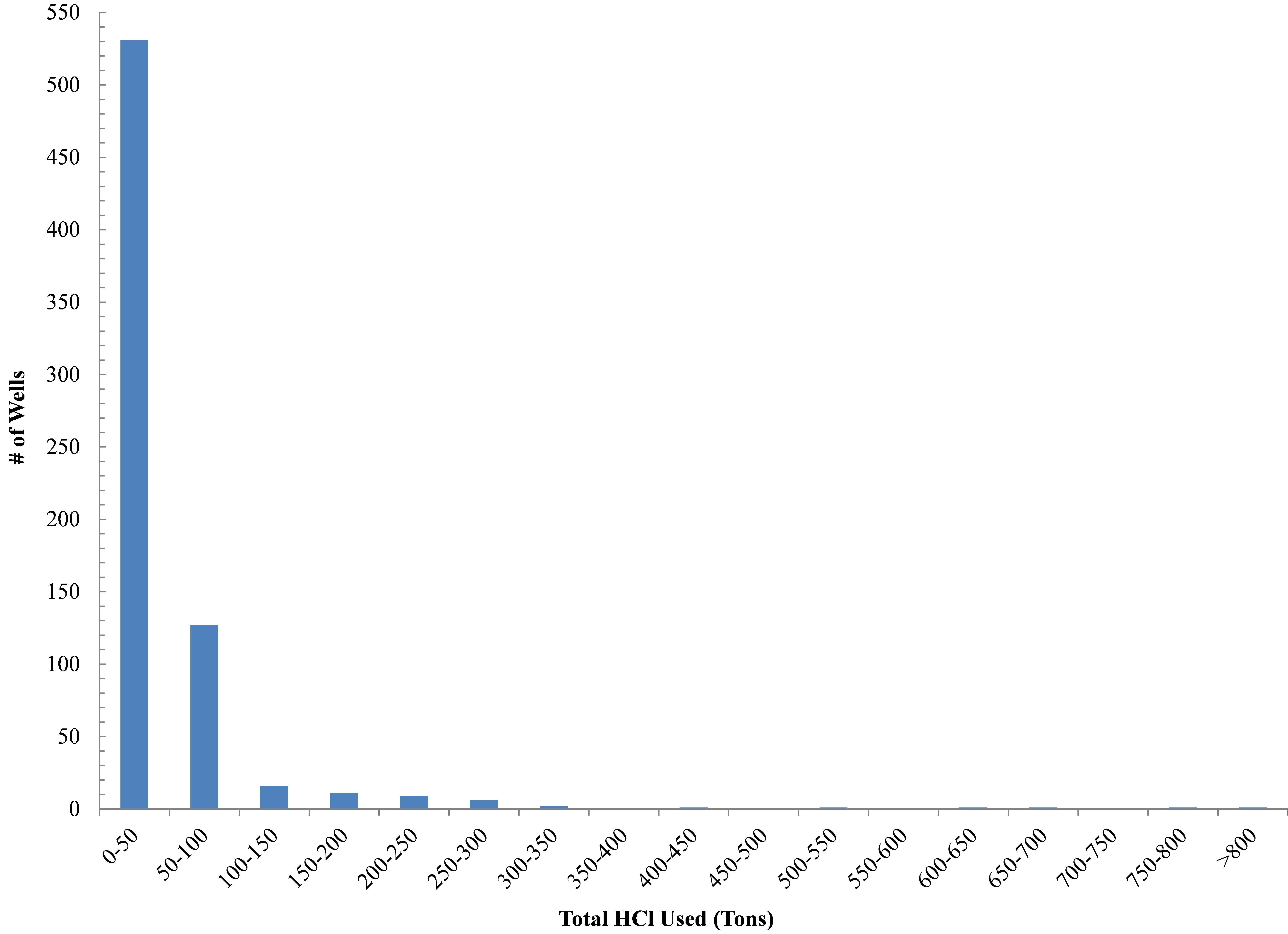
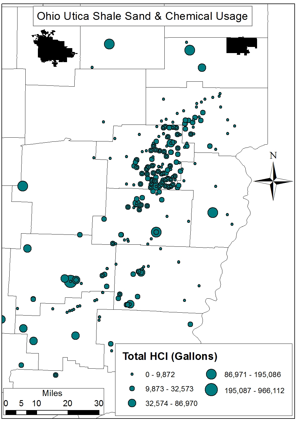
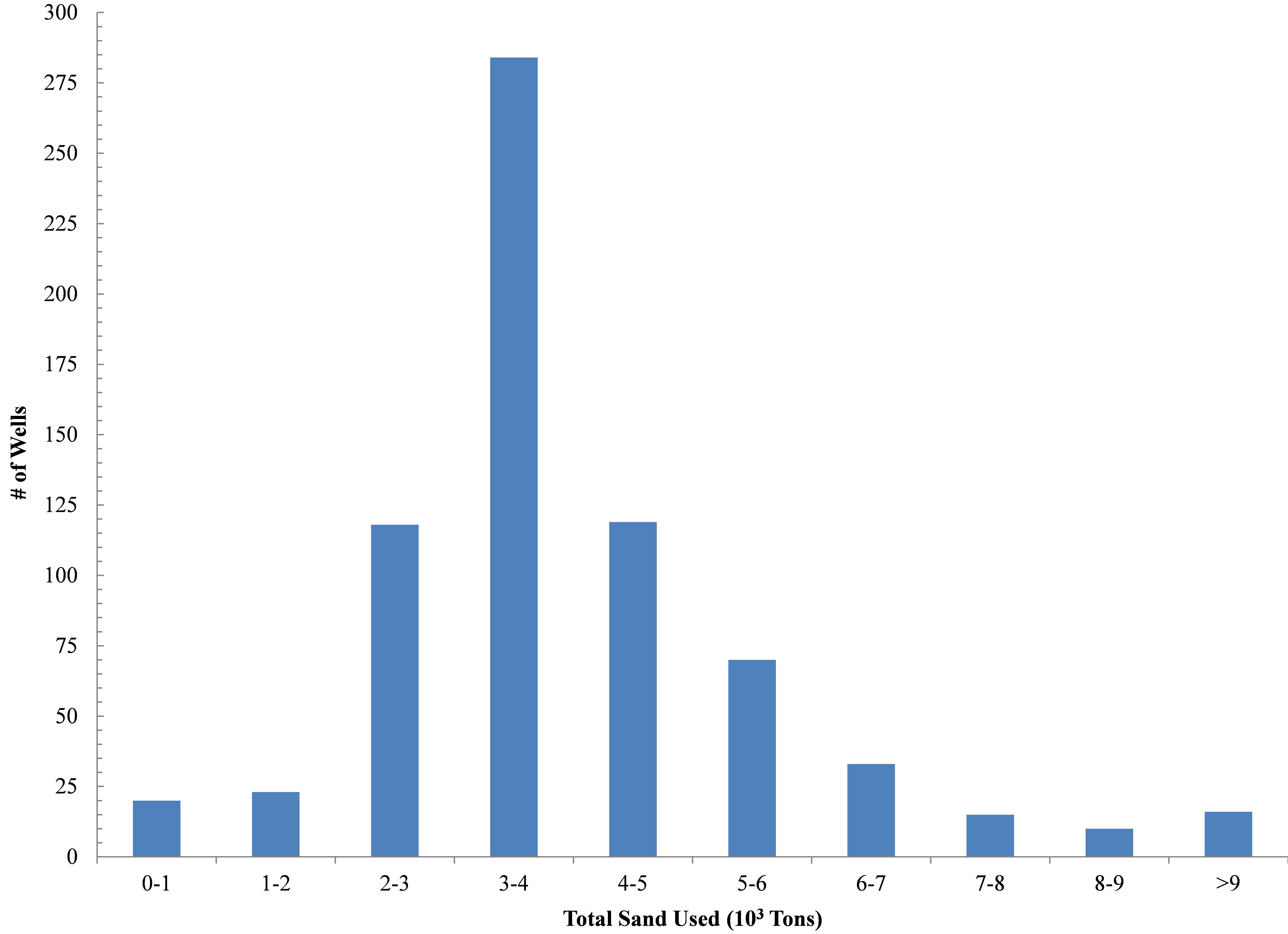
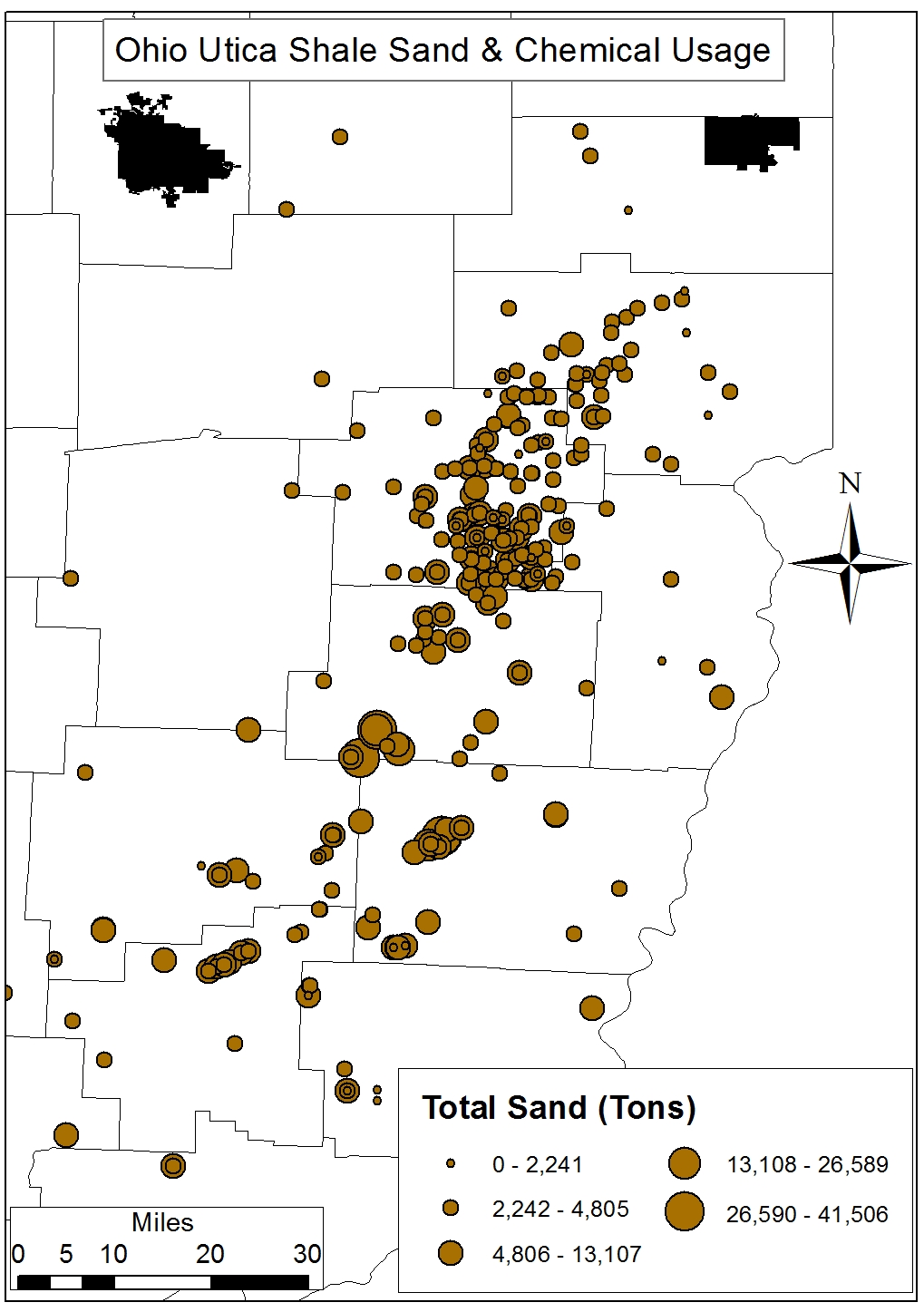
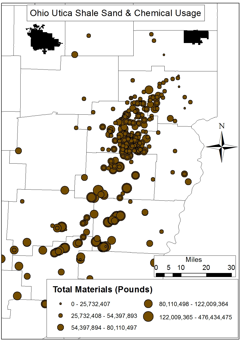
Figures 5a-d. Histograms and Spatial distribution of OH Utica Shale total hydrochloric acid (HCl, gallons) and silica sand (tons) demands.
Fig 5a. Histogram of OH Utica Shale total Hydrochloric Acid (HCl, gallons)
Fig 5b. Spatial distribution of OH Utica Shale total Hydrochloric Acid (HCl, gallons)
Fig 5c. Histogram of OH Utica Shale total Silica Sand (10^3 Tons)
Fig 5d. Spatial distribution of OH Utica Shale total Silica Sand (Tons)
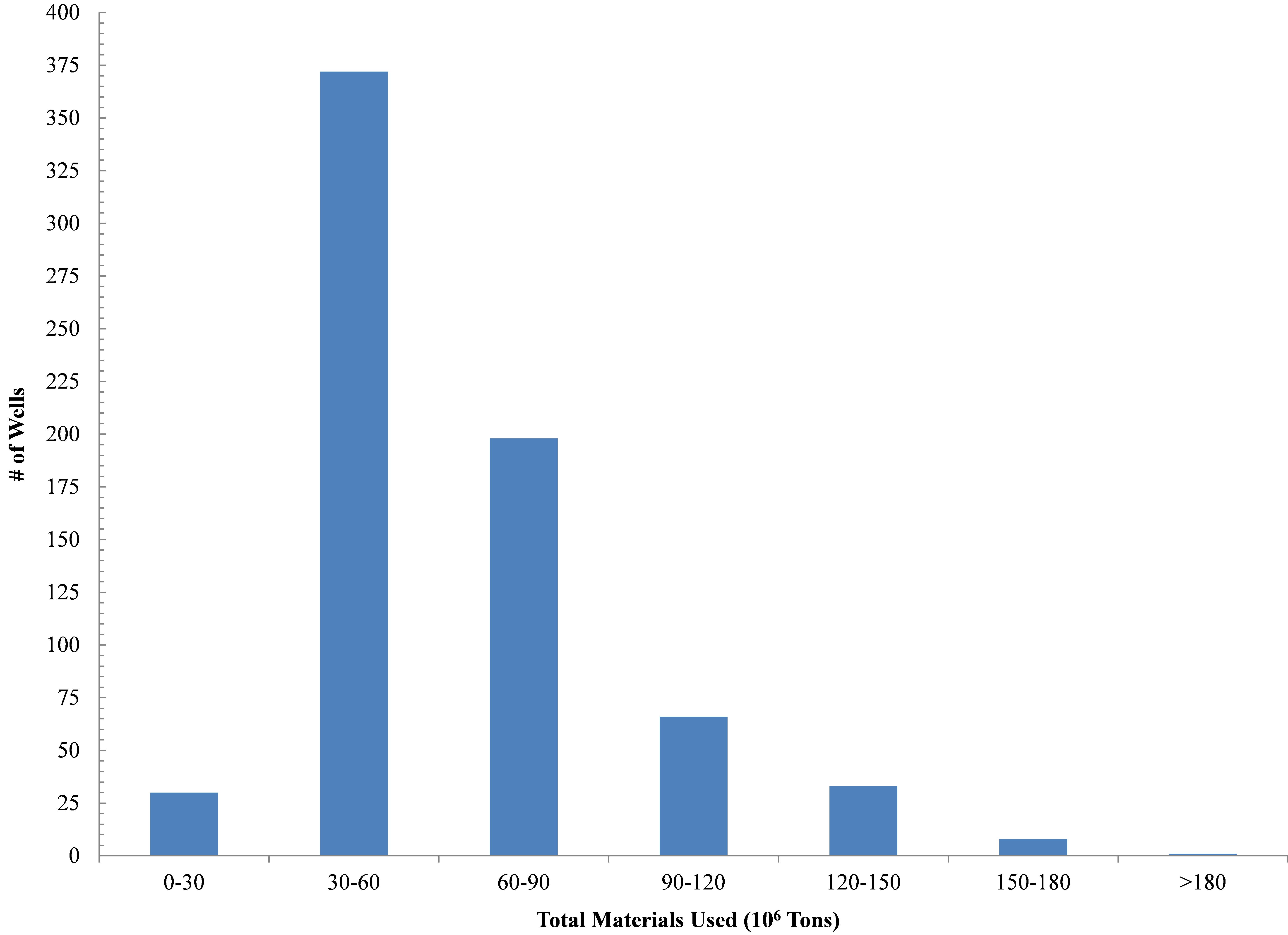
Figures 6a-b. Histograms and Spatial distribution of OH Utica Shale total resource utilization in terms of pounds per lateral.
Fig 6a. Histogram of OH Utica Shale total materials used (10^6 Pounds)
Fig 6b. Spatial distribution of OH Utica Shale total materials used (Pounds)
Endnote
1. Additionally, all of Carroll County’s permitted wells lie within the already – and increasingly so – stressed Muskingum River Watershed (MRW) which has been a significant source of freshwater for the shale gas industry courtesy of the novel pricing schemes of its managing body the Muskingum Watershed Conservancy District (MWCD) (Figure 1). Carroll laterals are requiring 5.41 million gallons per lateral Vs the state average of 6.58 million gallons per lateral.
https://www.fractracker.org/a5ej20sjfwe/wp-content/uploads/2015/02/Carroll-Feature.jpg400900Ted Auch, PhDhttps://www.fractracker.org/a5ej20sjfwe/wp-content/uploads/2025/09/2025-Wordmark-Logo.pngTed Auch, PhD2015-02-16 15:47:382020-07-21 10:32:08Is Carroll Co. truly the king of Ohio’s Utica counties?
The Pennsylvania Department of Environmental Protection (PADEP) publishes oil and gas well data in two different places: on their own website’s Spud Data Report, and in the Oil and Gas Locations file published on the PA Spatial Data Access repository, also known as PASDA. Because these two sources are both ultimately published by PADEP, it would stand to reason that the data sources would match up. Unfortunately, that is not the case. Learn more about the data discrepancies we uncovered:
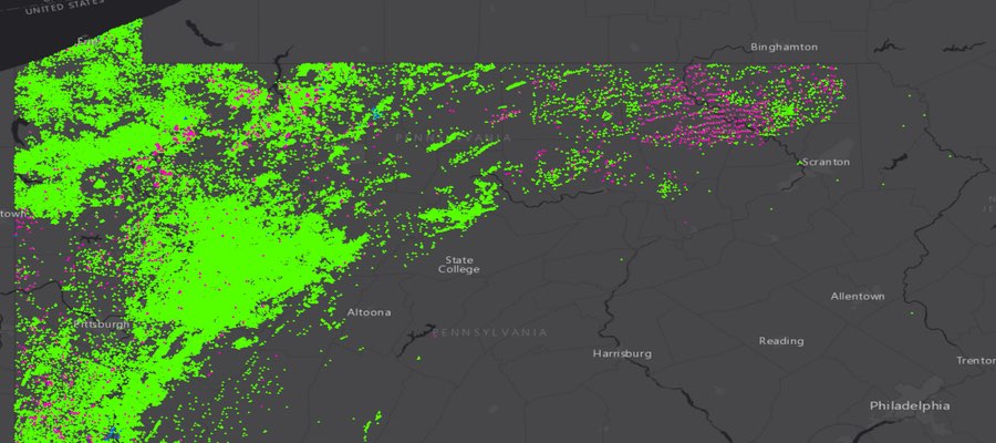
This map shows those wells in Pennsylvania that only show up on one of the two data sources. Pink dots show wells that appear on PASDA but not the PADEP site, while the reverse is true for blue wells. Click here for the full screen view with additional map tools.
Methodology
Both of these data sources have existed for years. When FracTracker does analyses of PA, we usually use data directly from the PADEP site, because it includes far more information about the wells, such as the spud date, county, municipality, well configuration, and whether or not the well is classified as unconventional. Even though it has less information about each well, the data on PASDA is useful for expediently mapping the inventory of wells in the Keystone State. In this current analysis, we looked at both sources, and found significant discrepancies between the two.
Individual oil and gas wells have been given unique API numbers since the 1950’s. The overwhelming majority of items on both lists that we examined have these numbers, and those that do not have other numeric identifiers in their place. The uniqueness of the data in these columns is what we used to determine the number of wells on both lists. These columns in both data sources were then tested against one another using Microsoft Excel in order to determine which wells were included on both lists.
The data on PASDA is described as “Oil and Gas Locations,” and nothing in available metadata made it clear as to whether wells that were permitted but not yet drilled might be included in this or not. Additionally, we are mostly interested in wells that are still operational, assuming that there might be accuracy issues for historical wells in an industry that has been operational in the state since before the Civil War. We did, however, include orphaned and abandoned wells, as they remain a source of impact throughout the state.
Summary
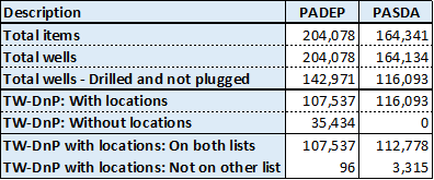
Number of wells in PA in various categories. For brevity, “Total wells – Drilled and not plugged” is shown as “TW-DnP.”
We found 3,315 records of drilled, unplugged wells with location information on the PASDA dataset that are not on the PADEP search tool, and 96 such wells on the PADEP site that aren’t found on PASDA. Additionally, there are 35,434 drilled and unplugged wells in the PADEP data that lack location data, although six of these wells are actually on the PASDA site, meaning that there is some location data for them somewhere at PADEP.
For those of you who might be looking for discrepancies in our discrepancy table, one might expect the number of both wells that appear on both lists (the second to last row on the chart) to be identical. The biggest reason that they are not is that some wells appear in the PASDA dataset multiple times. There are 6,997 fewer unique wells than there are entries on the full file, or a 95.74% match rate. In comparison, the PADEP spud report only has 19 duplicates for over 204,000 wells, a 99.99% match between the number of wells and the number of records. Indeed, when we filter for unique wells, the difference between the two lists shrinks to only 40 records, which might be explained by differences is well statuses that were used to shape our analysis.
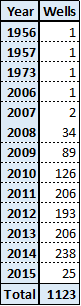
Number of wells drilled per year in Susquehanna Co., through 2/11/15.
Undoubtedly, it will take some effort to get the two datasets to reflect the full set of wells in PA, but that is certainly a task than can be accomplished. The wells lacking location data are likely to be much more of a challenge. If we include all status types, there are 75,508 wells on the spud report that lack latitude and longitude values altogether, leaving us with only the county and municipality to determine where these wells are located. Hopefully, this crucial data exists somewhere in the PADEP inventory, and these wells are not in fact lost.
Finally, there are a couple of things to note about dates. Since the PASDA dataset does not include spud dates, it is impossible to determine the age of the majority of the mismatched wells. Looking at the pink dots on the interactive map above, though, it is clear that a large number of these mismatched PASDA wells are in the northeastern corner of the state that has been booming since the recent development of the Marcellus, but saw little to no development before that time – at least according to the spud report.
Of the 96 wells that are on the spud report but not PASDA, 67 are given the date “1/1/1800,” which seems to be a default date; over 94,000 wells on the report have this listed as the spud date. Most of the other wells that don’t match are relatively old wells, with spud dates ranging between 1960 and 1984. One of these wells was drilled on May 6, 1999 though, and four more were drilled on August 19, 2014.
The mismatched data can be accessed here for those who are interested.
https://www.fractracker.org/a5ej20sjfwe/wp-content/uploads/2015/02/PA_mismatch_Feature.jpg400900Matt Kelso, BAhttps://www.fractracker.org/a5ej20sjfwe/wp-content/uploads/2025/09/2025-Wordmark-Logo.pngMatt Kelso, BA2015-02-11 15:21:442020-07-21 10:32:08Pennsylvania Data Discrepancies
Potential Land-Cover Change and Ecosystem Services By Ted Auch, Great Lakes Program Coordinator, FracTracker Alliance
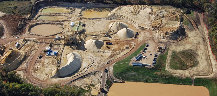
Chieftain Metals Corp, a relatively large mining company, recently proposed to develop nine silica sand mines in the Barron County, Wisconsin towns of Sioux Creek and Dovre, as well as adjacent Public Land Survey System (PLSS) parcels.1 Here we show that the land that Chieftain is proposing to convert into one of the state’s largest collections of adjacent silica sand mine acreage (like the one shown above) currently generates $8-15 million in ecosystem services and commodities per year.
Background
Sand, often silica sand, is used in the hydraulic fracturing process of oil and gas drilling. Including sand in the frac fluid helps to prop open the small cracks that are created during fracking so that the hydrocarbons can be more easily drawn into the well. To supply the growth in the oil and gas industry, bigger and bigger sand mines are being developed with four factors being critical to this expansion:
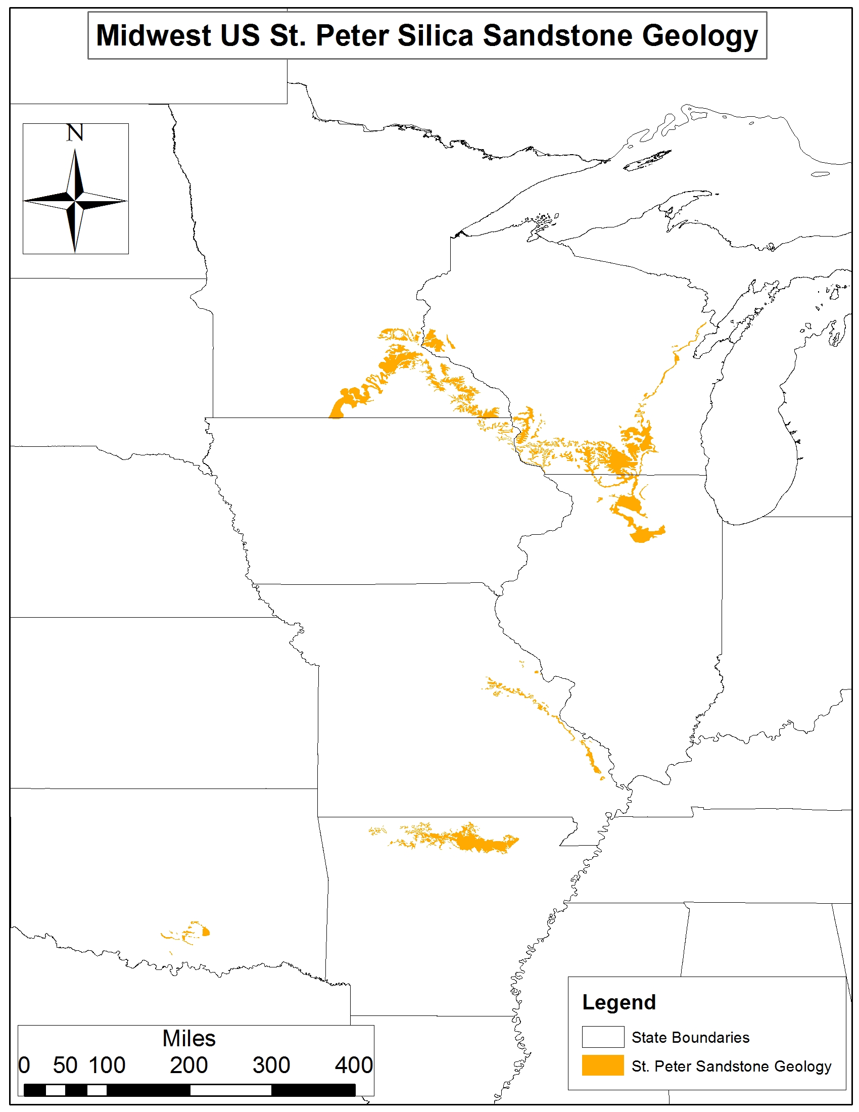
Figure 1. St. Peter Silica Sandstone geology across Minnesota, Wisconsin, Illinois, Missouri, Arkansas, and Oklahoma
The average shale lateral is getting longer by 50-55 feet per quarter and the average silica sand demand is increasing in parallel by 85-90 tons per lateral per quarter with current averages per lateral in the range of 3,500-4,300 tons (Note: These figures stem from an analysis of 780 and 1,120 Ohio and West Virginia laterals, respectively.)
The average silica sand mine proposal throughout the Great Lakes is increasing exponentially.
The average sand mine is targeted at non-agricultural parcels disproportionately. As an example we looked at one of the primary Wisconsin frac sand counties and found that even though 6% of the county was forested and nearly 50% was in some form of agriculture, 98.2% of the frac sand mine area was forested prior to mining. An already fragmented landscape with respect to threatened or endangered ecosystems is becoming even more so, as the price of sand hits an exponential phase and the silica industry all but abandons its positions in Oklahoma and Texas.
The primary geology of interest to the silica sand industry is the St. Peter Silica sandstone geology, which includes much of Southern Minnesota, West Central and Southern Wisconsin, as well as significant sections of Missouri and Arkansas (Figure 1).
To quantify the land-cover/land-use change (LULC) of these proposed mines, we extracted the parcel locations from WI DNR’s Surface Water Data Viewer using the company’s construction permit.2 These parcels encompass approximately 5,671 acres along the edge of what US Forest Service calls the Eastern Broadleaf Forest (Minnesota & NE Iowa Morainal, Oak Savannah) and Laurentian Mixed Forest provinces (Southern Superior Uplands).
Using a now-defunct WI DNR program called WISCLAND we were able to determine the land-cover within the aforementioned acreage in an effort to determine potential changes in ecosystem services and watershed resilience. The WISCLAND satellite imagery was generated in 1992, so it provided a nice snapshot of what this region’s landscape looks like absent silica sand mining.
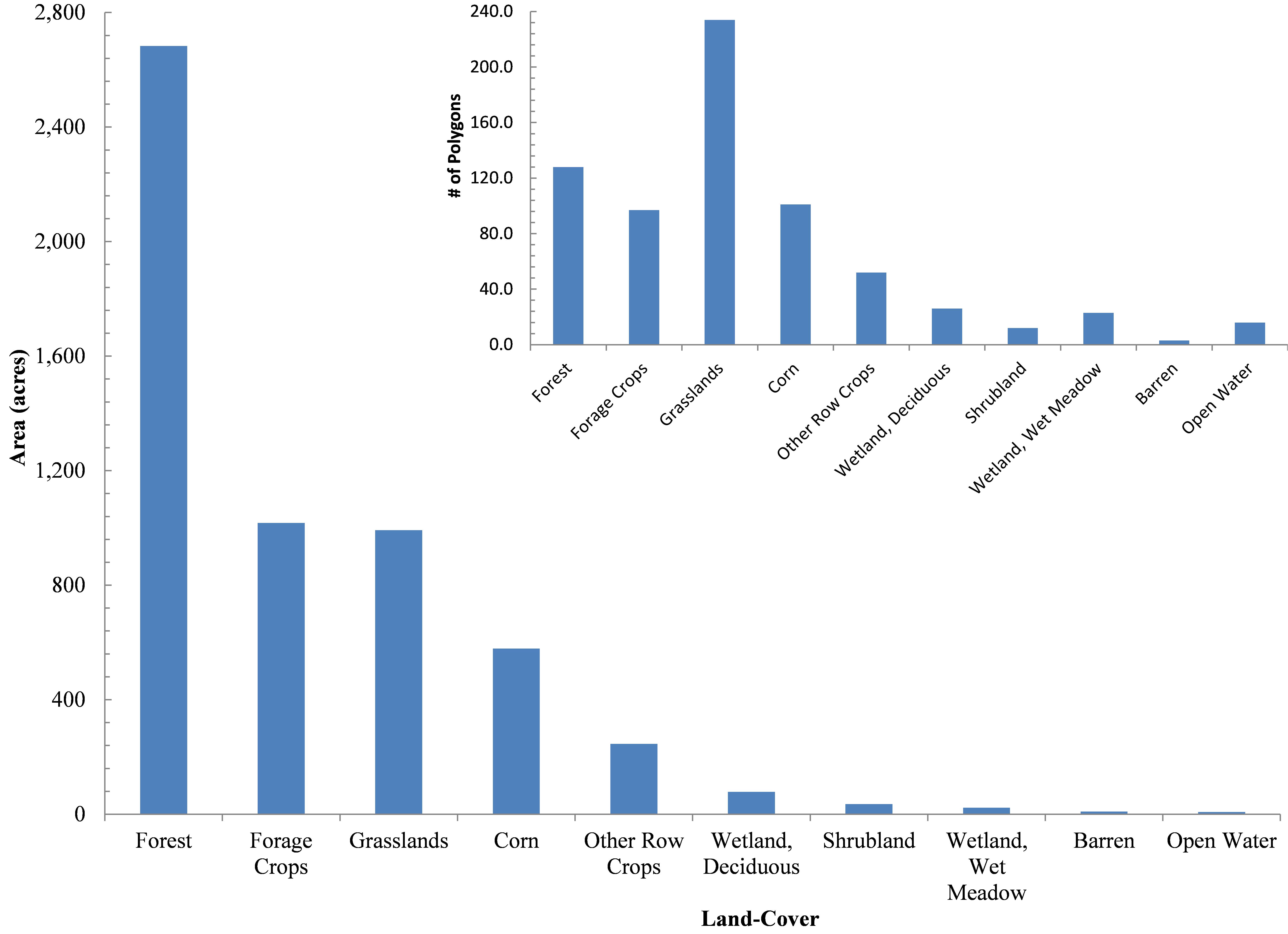
In our joining of the PLSS and WISCLAND data we determined that 2,684 acres (47%) are currently covered by forests, namely:
Figure 2. Chieftain silica sand mine proposal’s land-cover across 5,671 acres in Barron County, WI
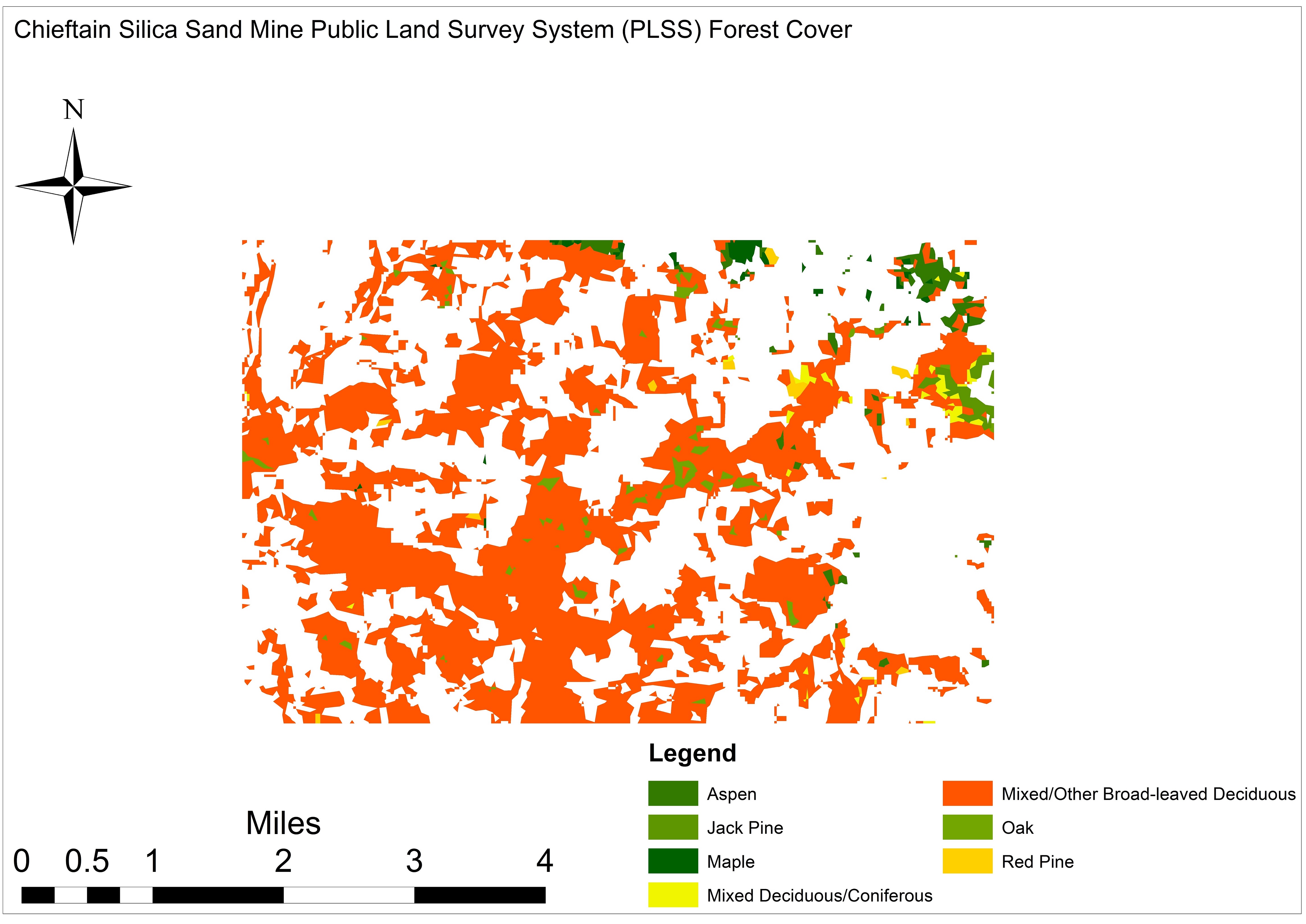
Figure 3. Chieftain proposal’s forest cover across 5,671 acres in Barron County, WI
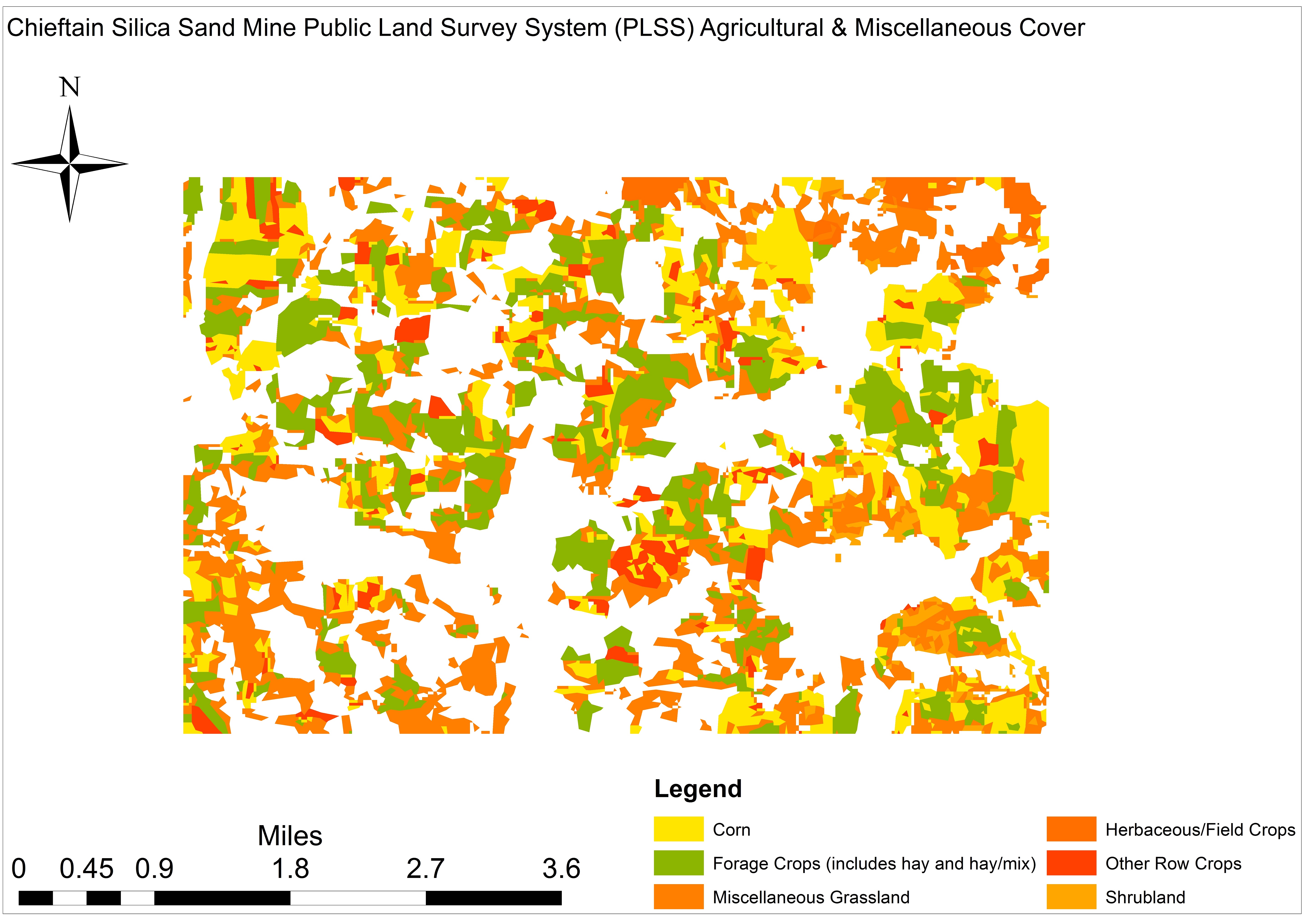
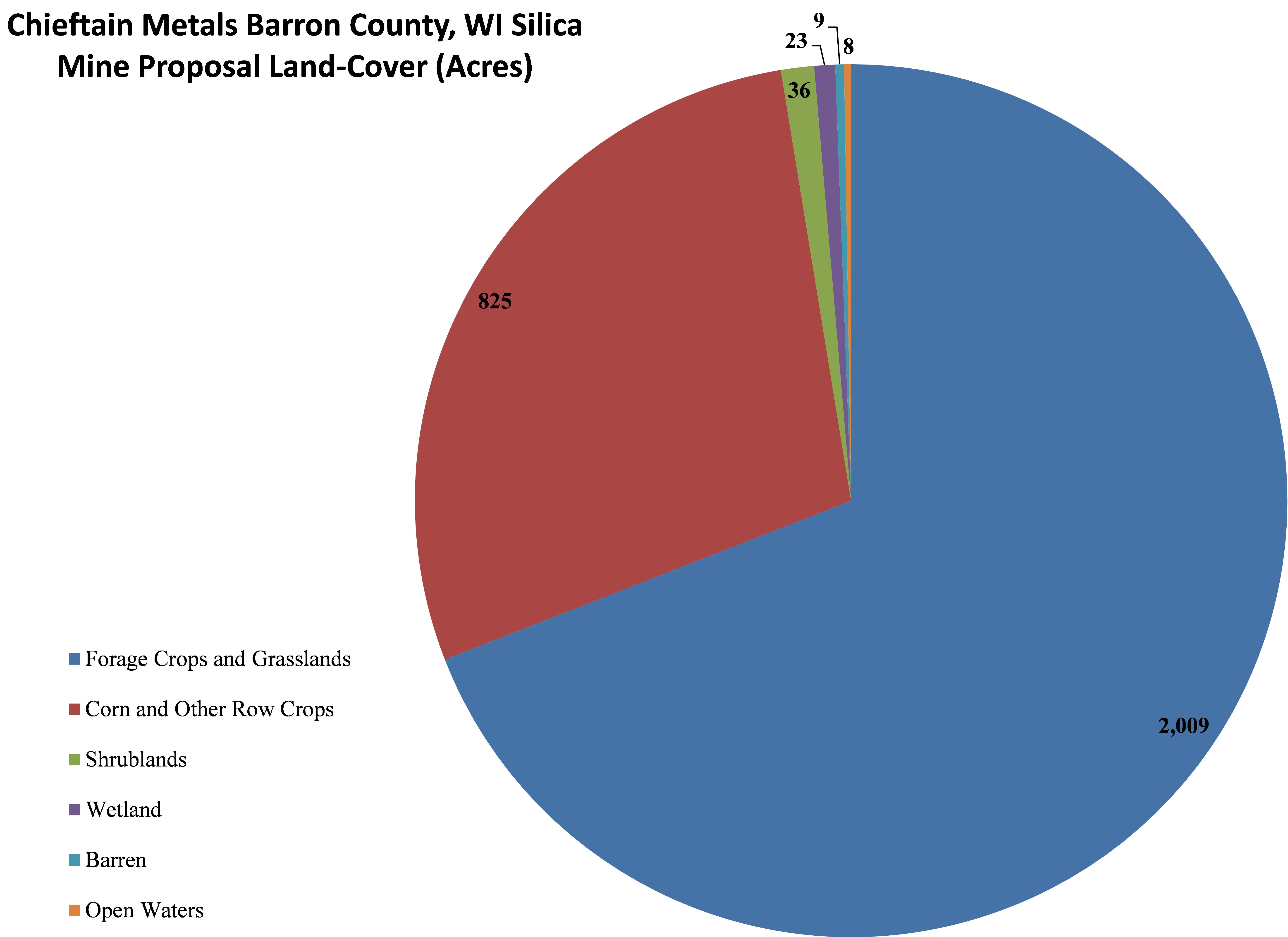
Forage crops and grasslands occupy 2,010 acres (35%) across 331 polygons averaging 7 acres scattered across the proposed mining area. Corn and other row crops account for 825 acres (15%) of Chieftain’s proposal, randomly distributed across the area of interest. Collectively, these land-cover types account for 22% of all polygons averaging 5.7 and 4.7 acres, respectively. Shrublands account for ≤1% of the Chieftain proposal (36 acres) averaging 3 acres spread across a mere 12 polygons (Figures 4 and 5).
Figure 4. Chieftain proposal’s agricultural & miscellaneous cover across 5,671 acres, Barron County, WI
Figure 5. Chieftain proposal’s land-cover by acreage across 5,671 acres, Barron County, WI
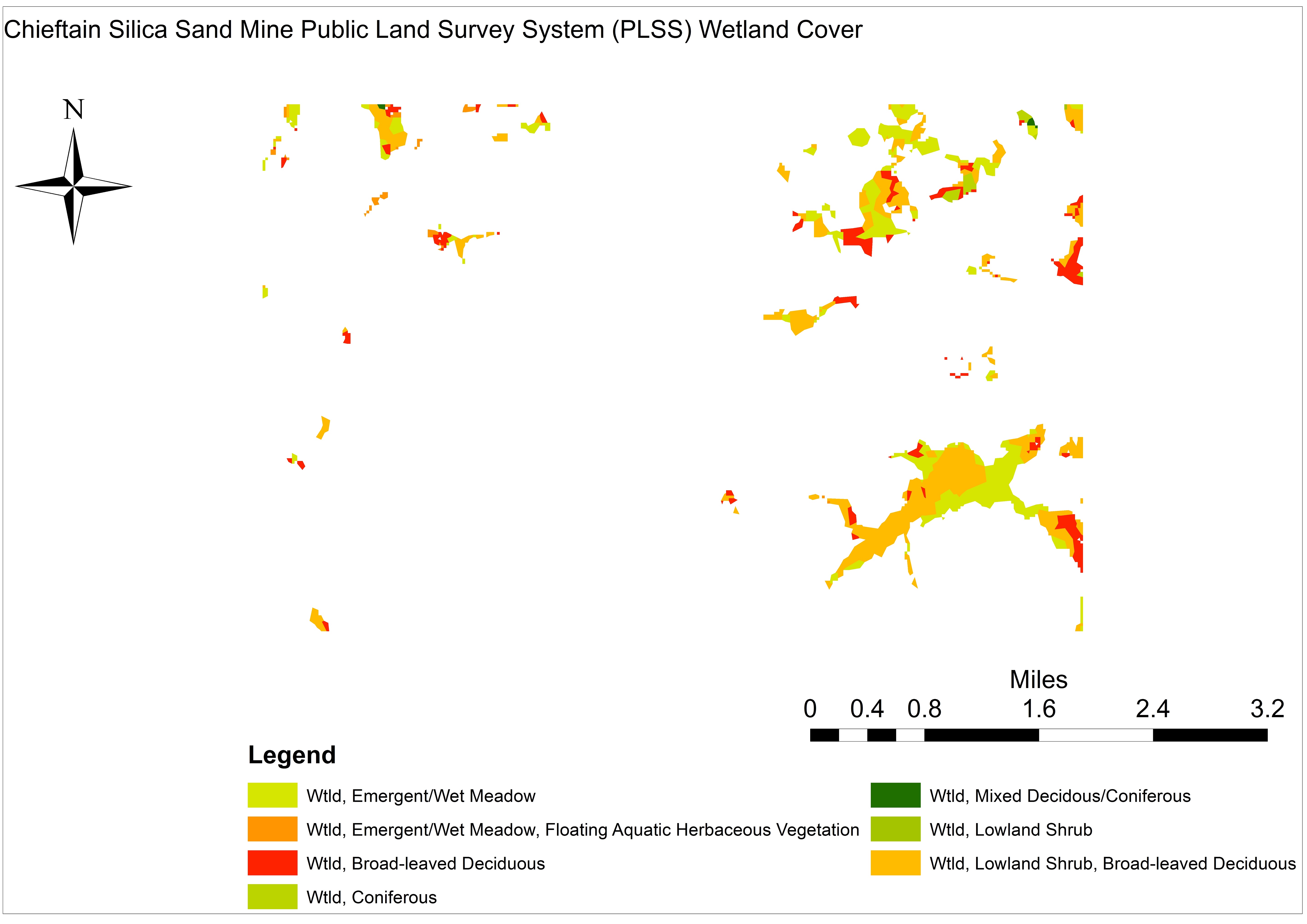
Figure 6. Chieftain silica sand mine proposal’s wetland cover across 5,671 acres in Barron County, WI.
Seven types of forested and shrub-dominated wetlands occupy 101 acres (1.8%) of Chieftain’s PLSS parcels, with an average size of four acres spread across 49 discrete polygons. Wetlands are clustered in three sections of the proposed mining area, with the largest continuous polygons being adjacent 160 acre “Wetland, Lowland Shrub, Broad-leaved Deciduous” and 88 acre “Wetland, Emergent/Wet Meadow” polygons along the area of interest’s eastern edge (See Figure 6 right).
Land Value
In an effort to quantify the value of this aggregation of parcels we calculated annual plant and soil productivity, as well as crop productivity, in terms of tons of carbon and nitrogen3 lost using established WI forest, crop, and freshwater productivity values.4-6
It is worth noting that the following estimates are conservative given that we were not able to determine average above/belowground ecosystem productivity values for the wetland and barren. Additionally, our estimates for crops and grasslands did not include belowground productivity estimates, which likely would increase the following estimates by 20-30%.
1. Forests
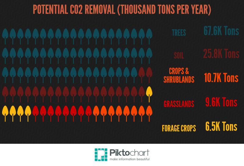
The aforementioned-forested polygons accrue 44,274-90,969 tons of aboveground CO2. This means that if we assume the average forest in this area is 65-85 years old, the Chieftain mine proposal would potentially remove 3.3-6.8 million tons of built up CO2 equivalents. This figure is equal to the per capita CO2 emissions of 202,800-416,700 WI residents. The renewable wood generated on this site has a current market value of $418,516 to $654,125.
If we assume that the price of CO2 is somewhere between $12 and $235 per ton the forested polygons within Chieftain’s proposal currently capture (remove from the atmosphere) $4-17 million worth of CO2 annually.
Additionally, this area generates 23,262-45,447 tons of CO2 via soil processes such as litter decomposition and root production (i.e., 1.8-3.4 million tons over the average 65-85 year lifespan of these forests). The annual value of these belowground processes in terms of soil fertility (i.e., soil organic matter, nitrogen, and phosphorus) is somewhere between $569,962 and $1,029,662 or $43-77 million over the 65-85 year period used in this analysis.
2. Forage Crops and Grasslands
The 1,018 acres of forage crops are currently generating 6,526 CO2 tons per year, which is equivalent to the per capita emissions of 400 WI residents (Note: This carbon has a current value in the range of $417,700-$848,200). The 992 acres of grasslands are capturing 6,600-12,600 tons of CO2 per year and if we assume the average grassland parcel in WI is 5-15 years of age these polygons have captured CO2 equivalent to the per capita emissions of 4,000-7,700 Wisconsinites. Together these two land-cover types capture $840,300-2,518,000 worth of CO2 annually. Again it is worth noting these values do not include any accounting soil processes, which are generally 20-30% of aboveground productivity.
3. Corn, Other Row Crops, Shrublands
The 860 acres of corn, miscellaneous row crops, and shrublands are currently generating 10,450-10,980 CO2 tons per year, which is equivalent to the per capita emissions of 640-670 WI residents. Using the same assumptions about time in grassland (i.e., average Conservation Reserve Program (CRP) tenure) and the 65-85 year assumption used for forests for shrublands we estimate these three land-cover types annually capture CO2 equivalent to the per capita emissions of 8,600-11,030 Wisconsinites. Together these three land-cover types capture $682,420-1,498,030 worth of CO2 annually.
The total average value of commodities produced on the 1,843 acres of cropland is $462 per acre or $851,272 annually.
4. Open Waters
This small fraction of the Chieftain proposal captures 134 tons worth of CO2 annually with a value of $8,590-17,650.
Total Quantifiable Monetary Value
In summary, the nine Chieftain frac sand mines if approved would use land that currently generates $8.77-16.63 million in ecosystem services and commodities per year. Historical and future land-use potential valuations are generally not accounted for in mineral lease agreements. This analysis demonstrates that such values are nontrivial and should at the very least be incorporated into lease agreements, given that post-mining reclamation strategies result in lands that are 40% less productive. If these lands are converted to sand mines, their annual values would drop to $5.0-9.5 million post-development.
Questions about the impact of such operations on LULC in the Mississippi Valley are becoming more and more frequent. For example, families such as the Schultz in Trempealeau County are signing permanent conservation easements. Doing so allows them to continue farming and allocates some acreage to the restoration of oak savanna and dry prairie, considered by the WI Department of Natural Resources (DNR) as “globally imperiled” and “globally rare,” respectively.
References & Footnotes
It is worth noting that Chieftain is taking a huge gamble with this proposal. It stands to reason that such risky ventures are necessary given that the company’s share price has plummeted to $00.15 per share since its IPO days of around $5.50-6.00. These gambles could either catapult Chieftain into the frac sand mining big leagues or relegate it to the bench, however.
We used carbon and nitrogen as their importance from a greenhouse gas (i.e., CO2, CH4, N2O), biogeochemical, and soil fertility perspective is well established.
Burrows, S.N., Gower, S.T., Norman, J.M., Diak, G., Mackay, D.S., Ahl, D.E., Clayton, M.K., 2003. Spatial variability of aboveground net primary production for a forested landscape in northern Wisconsin. Canadian Journal of Forest Research 33, 2007-2018.
Klopatek, J.M., Stearns, F.W., 1978. Primary Productivity of Emergent Macrophytes in a Wisconsin Freshwater Marsh Ecosystem. American Midland Naturalist 100, 320-332.
Scheiner, S.M., Jones, S., 2002. Diversity, productivity and scale in Wisconsin vegetation. Evolutionary Ecology Research 4, 1097-1117.
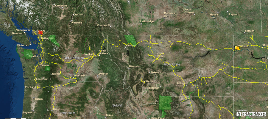
On January 26, 2015, the Columbian, a paper in Southwestern Washington state, reported that an oil tanker spilled over 1,600 gallons of Bakken Crude in early November 2014. The train spill was never cleaned up, because frankly, nobody knows where the spill occurred. This issue highlights weaknesses in the incident reporting protocol for trains, which appears to be less stringent than other modes of transporting crude.
Possible Train Spill Routes
To follow the most likely train route for this incident, start at the yellow flag, then follow the line west. The route forks at Spokane – the northernmost route would be the most efficient. View full screen map
While there is not a good place for an oil spill of this size, some places are worse than others – and some of the locations along this train route are pretty bad. For example, the train passes through the southern edge of Glacier National Park in Montana, the scenic Columbia River, and the Spokane and Seattle metropolitan areas.
Significant Reporting Delay
The Columbian article mentions that railroads are required to report spills of hazardous materials in Washington State within 30 minutes of spills being noticed. In this case, however, the spill was apparently not noticed until the tanker car in question was no longer in BNSF custody. Therefore, relevant state and federal regulatory agencies were never made aware of the incident.
Both state and federal officials are now investigating, and we will follow up this post with more details when they are made available.
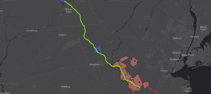
New York State is not the only area where opposition to fracking and its related activities is emerging. A 108-mile proposed PennEast pipeline between Wilkes-Barre, PA and Mercer County, New Jersey is facing municipal movements against its construction, as well. The 36-inch diameter pipeline will likely carry 1 billion cubic feet of natural gas per day. According to some sources, this proposed pipeline is the only one in NJ that is not in compliance with the state’s standard of co-locating new pipelines with an existing right-of-way.1
PennEast Pipeline Oppositions
Below is a dynamic, clickable map of said opposition by FracTracker’s Karen Edelstein, as well as documentation associated with each municipality’s current stance:
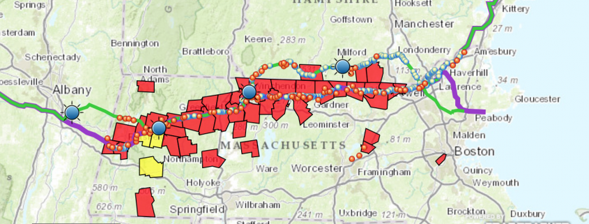
And in Massachusetts and New Hampshire, municipalities are working to ban, reroute, or regulate heavily the Northeast Energy Direct Pipeline (opposition map shown below):
Northeast Energy Direct Proposed Pipeline Paths and Opposition Resolutions in MA & NH
Why is this conversation important?
Participation in government is a beneficial practice for citizens and helps to inform our regulatory agencies on what people want and need. This surge in opposition against oil and gas activity such as pipelines or well pads near schools highlights a broader question, however:
If not pipelines, what is the least risky form of oil and gas transportation?
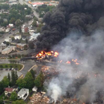
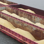
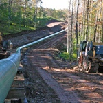
Oil and gas-related products are typically transported in one of four ways: Truck, Train, Barge, or Pipeline.
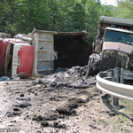
Drilling mud spill from truck accident
Lac-Mégantic oil train derailment
Using a barge to transport frac sand
Gas pipeline construction in PA forest
Trucks are arguably the most risky and environmentally costly form of transport, with spills and wrecks documented in many communities. Because most of these well pads are being built in remote areas, truck transport is not likely to disappear anytime soon, however.
Transport by rail is another popular method, albeit strewn with incidents. Several, major oil train explosions and derailments, such as the Lac-Mégantic disaster in 2013, have brought this issue to the public’s attention recently.
Moving oil and gas products by barge is a different mode that has been received with some public concern. While the chance of an incident occurring could be lower than by rail or truck, using barges to move oil and gas products still has its own risks; if a barge fails, millions of people’s drinking water could potentially be put at risk, as highlighted by the 2014 Elk River chemical spill in WV.
So we are left with pipelines – the often-preferred transport mechanism by industry. Pipelines, too, bring with them explosion and leak potential, but at a smaller level according to some sources.2 Property rights, forest loss and fragmentation, sediment discharge into waterways, and the potential introduction of invasive species are but a few examples of the other concerns related to pipeline construction. Alas, none of the modes of transport are without risks or controversy.
Footnotes
Colocation refers to the practice of constructing two projects – such as pipelines – in close proximity to each other. Colocation typically reduces the amount of land and resources that are needed.
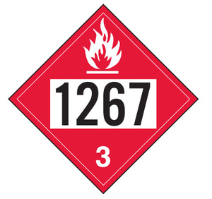 1267 hazmat placarded cars (crude oil):
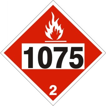 1075 hazmat cars (liquefied petroleum gas):