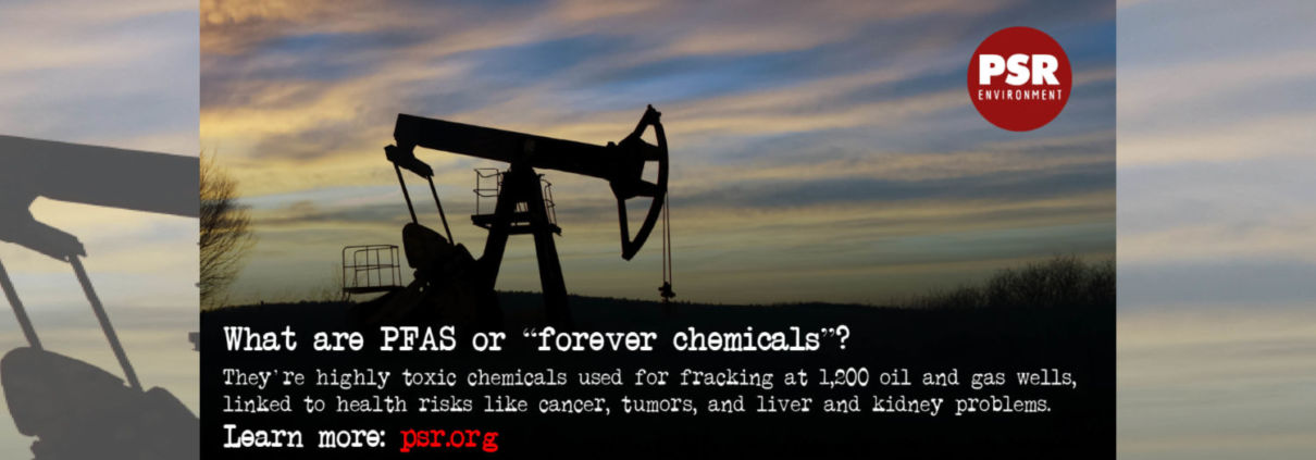
FracTracker Alliance released a new map identifying the locations of over 1,200 oil and gas wells using toxic “forever chemicals” in Arkansas, Louisiana, Oklahoma, New Mexico, Texas, and Wyoming.
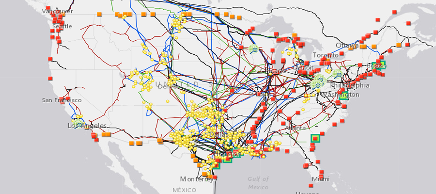
FracTracker Alliance has released a new national map, filled with energy and petrochemical data. Explore the map, continue reading to learn more, and see how your state measures up!
This map has been updated since this blog post was originally published, and therefore statistics and figures below may no longer correspond with the map
The items on the map (followed by facility count in parenthesis) include:
For oil and gas wells, view FracTracker’s state maps.
Transportation & Storage
Natural gas compressor stations (1,367) – Facilities built along a pipeline route that pressurize natural gas to keep it flowing through the pipeline.
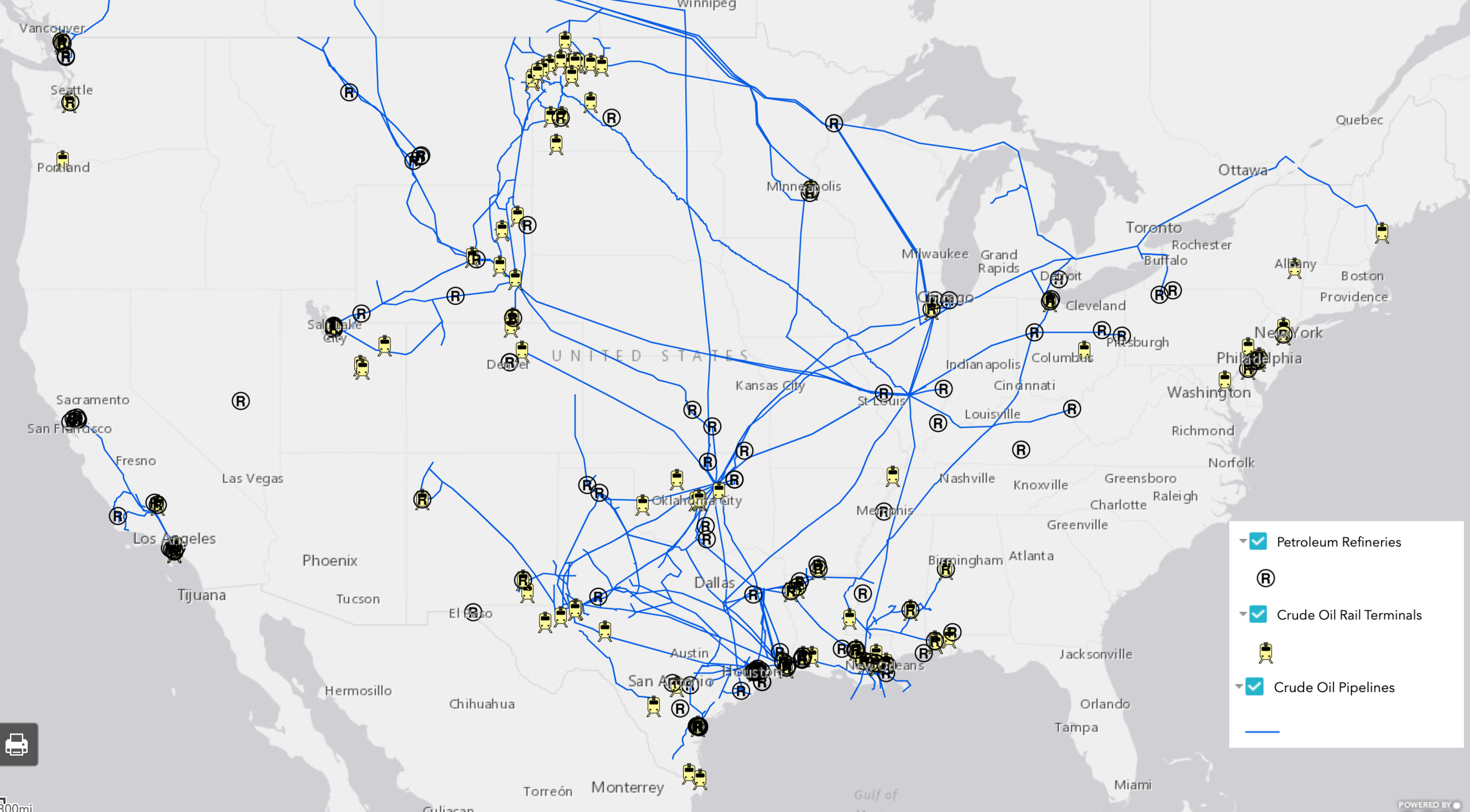
Crude oil rail terminals (94) – Rail terminals that load and unload crude oil (liquid hydrocarbons that have yet to be processed into higher-value petroleum products).
Liquefied natural gas import/export terminals (8) – Facilities that can a) liquefy natural gas so it can be exported as LNG (liquefied natural gas) and/or b) re-gasify LNG so it can be used as natural gas. Natural gas is transported in a liquid state because it takes up less space as a liquid than as a gas.
Natural Gas Underground Storage (486) – Locations where natural gas is stored underground in aquifers, depleted gas fields, and salt formations.
Petroleum Product Terminals (1,484) – Terminals with a storage capacity of 50,000 barrels or more and/or the ability to receive volumes from tanker, barge, or pipeline. Petroleum products include products “produced from the processing of crude oil and other liquids at petroleum refineries, from extraction of liquid hydrocarbons at natural gas processing plants, and from production of finished petroleum products at blending facilities.”
Petroleum Ports (242) – A port that can import and/or export 200,000 or more short tons of petroleum products a year.
Natural gas import/export pipeline facility (54) – A facility where natural gas crosses the border of the continental United States.
Pipelines
Crude oil pipelines – major crude oil pipelines, including interstate truck lines and selected intrastate lines, but not including gathering lines.
Natural gas liquid pipelines – Also referred to as hydrocarbon gas liquid pipelines, they carry the heavier components of the natural gas stream which are liquid under intense pressure and extreme cold, but gas in normal conditions.
Natural gas pipelines– Interstate and intrastate natural gas pipelines. Due to the immensity of this pipeline network and lack of available data, this pipeline layer in particular varies in degree of accuracy.
Petroleum Product Pipelines – Major petroleum product pipelines.
Recent Pipeline Projects – Pipeline projects that have been announced since 2017. This includes projects in various stages, including under construction, complete, planned or canceled. Click on the pipeline for the status.
Processing & Downstream
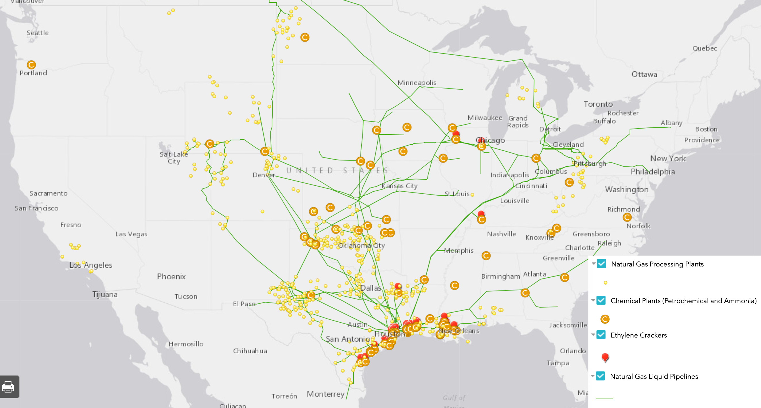
Natural Gas Processing Plants (478) – Plants that separate impurities and components of the natural gas stream.
Chemical plants (36) – Includes two types of chemical plants – petrochemical production and ammonia manufacturing – that report to EPA’s Greenhouse Gas Reporting Program.
Ethylene Crackers (30) – Also referred to as ethane crackers, these petrochemical complexes that converts ethane (a natural gas liquid) into ethylene. Ethylene is used to make products like polyethylene plastic.
Petroleum Refineries (135) – A plant that processes crude oil into products like petroleum naphtha, diesel fuel, and gasoline.
Power Plants (9,414) – Electric generating plants with a capacity of at least one megawatt, sorted by energy source.
Wind Turbines (63,003) – Zoom in on wind power plants to see this legend item appear.
Natural Resources
Shale Plays (45) – Tight oil and gas shale plays, which are formations where oil and gas can be extracted.
Major Rivers
Solar Energy Potential – Potential solar energy generation, in kilowatt-hours per square meter per day – averaged annually.
This map is by no means exhaustive, but is exhausting. It takes a lot of infrastructure to meet the energy demands from industries, transportation, residents, and businesses – and the vast majority of these facilities are powered by fossil fuels. What can we learn about the state of our national energy ecosystem from visualizing this infrastructure? And with increasing urgency to decarbonize within the next one to three decades, how close are we to completely reengineering the way we make energy?
Key Takeaways
Natural gas accounts for 44% of electricity generation in the United States – more than any other source. Despite that, the cost per megawatt hour of electricity for renewable energy power plants is now cheaper than that of natural gas power plants.
The state generating the largest amount of solar energy is California, while wind energy is Texas. The state with the greatest relative solar energy is not technically a state – it’s D.C., where 18% of electricity generation is from solar, closely followed by Nevada at 17%. Iowa leads the country in relative wind energy production, at 45%.
The state generating the most amount of energy from both natural gas and coal is Texas. Relatively, West Virginia has the greatest reliance on coal for electricity (85%), and Rhode Island has the greatest percentage of natural gas (92%).
With 28% of total U.S. energy consumption for transportation, many of the refineries, crude oil and petroleum product pipelines, and terminals on this map are dedicated towards gasoline, diesel, and other fuel production.
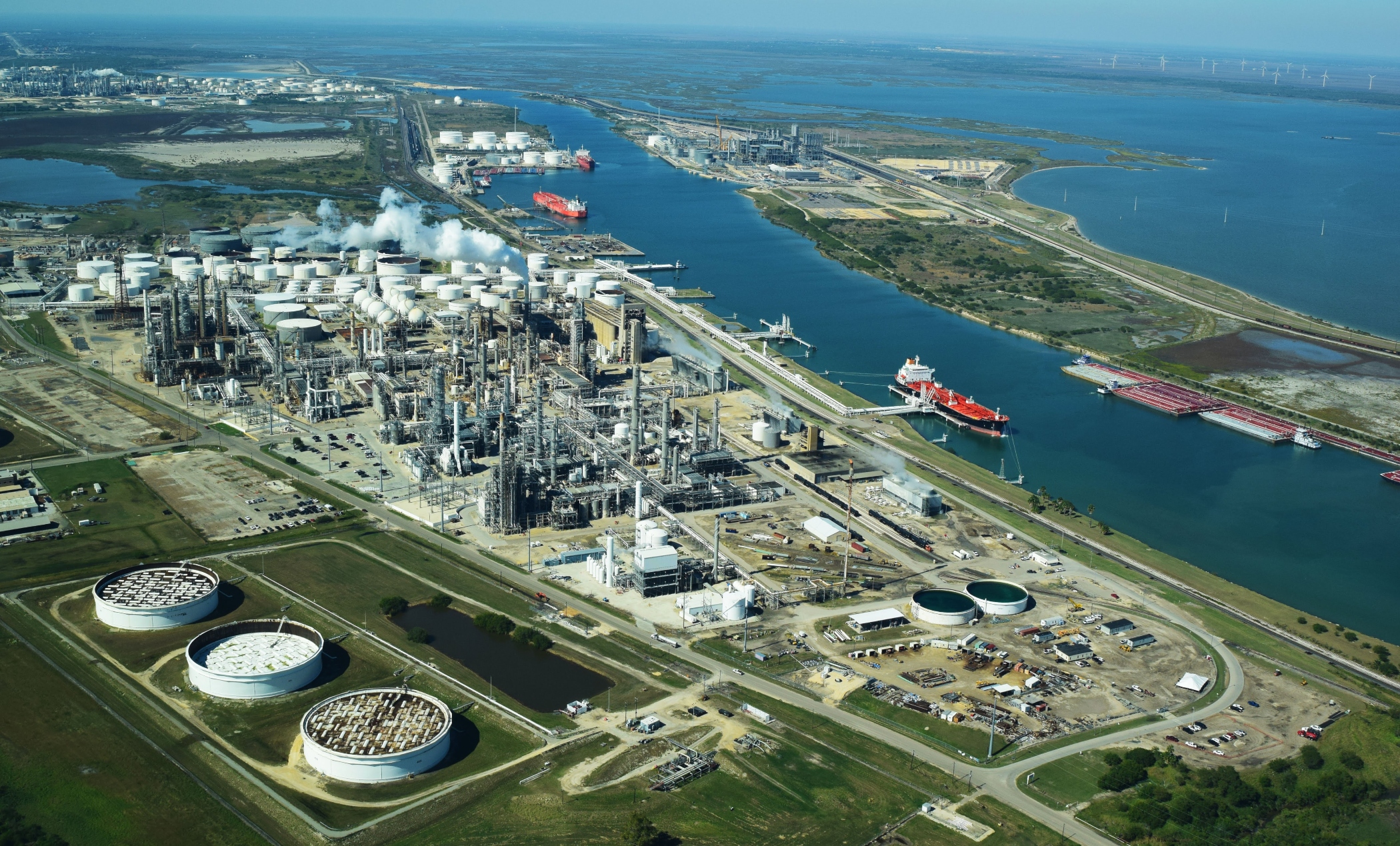
Petrochemical production, which is expected to account for over a third of global oil demand growth by 2030, takes the form of chemical plants, ethylene crackers, and natural gas liquid pipelines on this map, largely concentrated in the Gulf Coast.
Electricity generation
The “power plant” legend item on this map contains facilities with an electric generating capacity of at least one megawatt, and includes independent power producers, electric utilities, commercial plants, and industrial plants. What does this data reveal?
In terms of the raw number of power plants – solar plants tops the list, with 2,916 facilities, followed by natural gas at 1,747.
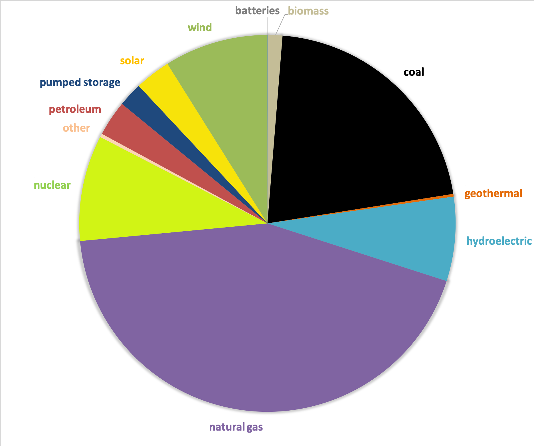
In terms of megawatts of electricity generated, the picture is much different – with natural gas supplying the highest percentage of electricity (44%), much more than the second place source, which is coal at 21%, and far more than solar, which generates only 3% (Figure 1).
Figure 1. Electricity generation by source in the United States, 2019. Data from EIA.
This difference speaks to the decentralized nature of the solar industry, with more facilities producing less energy. At a glance, this may seem less efficient and more costly than the natural gas alternative, which has fewer plants producing more energy. But in reality, each of these natural gas plants depend on thousands of fracked wells – and they’re anything but efficient.
The cost per megawatt hour of electricity for a renewable energy power plants is now cheaper than that of fracked gas power plants. A report by the Rocky Mountain Institute, found “even as clean energy costs continue to fall, utilities and other investors have announced plans for over $70 billion in new gas-fired power plant construction through 2025. RMI research finds that 90% of this proposed capacity is more costly than equivalent [clean energy portfolios, which consist of wind, solar, and energy storage technologies] and, if those plants are built anyway, they would be uneconomic to continue operating in 2035.”
The economics side with renewables – but with solar, wind, geothermal comprising only 12% of the energy pie, and hydropower at 7%, do renewables have the capacity to meet the nation’s energy needs? Yes! Even the Energy Information Administration, a notorious skeptic of renewable energy’s potential, forecasted renewables would beat out natural gas in terms of electricity generation by 2050 in their 2020 Annual Energy Outlook.
This prediction doesn’t take into account any future legislation limiting fossil fuel infrastructure. A ban on fracking or policies under a Green New Deal could push renewables into the lead much sooner than 2050.
In a void of national leadership on the transition to cleaner energy, a few states have bolstered their renewable portfolio.
Figure 2. Electricity generation state-wide by source, 2019. Data from EIA.
One final factor to consider – the pie pieces on these state charts aren’t weighted equally, with some states’ capacity to generate electricity far greater than others. The top five electricity producers are Texas, California, Florida, Pennsylvania, and Illinois.
Transportation
In 2018, approximately 28% of total U.S. energy consumption was for transportation. To understand the scale of infrastructure that serves this sector, it’s helpful to click on the petroleum refineries, crude oil rail terminals, and crude oil pipelines on the map.
Transportation Fuel Infrastructure. Data from EIA.
The majority of gasoline we use in our cars in the US is produced domestically. Crude oil from wells goes to refineries to be processed into products like diesel fuel and gasoline. Gasoline is taken by pipelines, tanker, rail, or barge to storage terminals (add the “petroleum product terminal” and “petroleum product pipelines” legend items), and then by truck to be further processed and delivered to gas stations.
China leads the world in this movement. In 2018, just over half of the world’s electric vehicles sales occurred in China. Analysts predict that the country’s oil demand will peak in the next five years thanks to battery-powered vehicles and high-speed rail.
In the United States, the percentage of electric vehicles on the road is small but growing quickly. Tax credits and incentives will be important for encouraging this transition. Almost half of the country’s electric vehicle sales are in California, where incentives are added to the federal tax credit. California also has a “Zero Emission Vehicle” program, requiring electric vehicles to comprise a certain percentage of sales.
We can’t ignore where electric vehicles are sourcing their power – and for that we must go back up to the electricity generation section. If you’re charging your car in a state powered mainly by fossil fuels (as many are), then the electricity is still tied to fossil fuels.
Petrochemicals
Many of the oil and gas infrastructure on the map doesn’t go towards energy at all, but rather aids in manufacturing petrochemicals – the basis of products like plastic, fertilizer, solvents, detergents, and resins.
Natural gas processing plants separate components of the natural gas stream to extract natural gas liquids like ethane and propane – which are transported through the natural gas liquid pipelines. These natural gas liquids are key building blocks of the petrochemical industry.
Ethane crackers process natural gas liquids into polyethylene – the most common type of plastic.
The chemical plants on this map include petrochemical production plants and ammonia manufacturing. Ammonia, which is used in fertilizer production, is one of the top synthetic chemicals produced in the world, and most of it comes from steam reforming natural gas.
As we discuss ways to decarbonize the country, petrochemicals must be a major focus of our efforts. That’s because petrochemicals are expected to account for over a third of global oil demand growth by 2030 and nearly half of demand growth by 2050 – thanks largely to an increase in plastic production. The International Energy Agency calls petrochemicals a “blind spot” in the global energy debate.
Petrochemical development off the coast of Texas, November 2019. Photo by Ted Auch, aerial support provided by LightHawk.
Investing in plastic manufacturing is the fossil fuel industry’s strategy to remain relevant in a renewable energy world. As such, we can’t break up with fossil fuels without also giving up our reliance on plastic. Legislation like the Break Free From Plastic Pollution Act get to the heart of this issue, by pausing construction of new ethane crackers, ensuring the power of local governments to enact plastic bans, and phasing out certain single-use products.
“The greatest industrial challenge the world has ever faced”
Mapped out, this web of fossil fuel infrastructure seems like a permanent grid locking us into a carbon-intensive future. But even more overwhelming than the ubiquity of fossil fuels in the US is how quickly this infrastructure has all been built. Everything on this map was constructed since Industrial Revolution, and the vast majority in the last century (Figure 3) – an inch on the mile-long timeline of human civilization.
Figure 3. Global Fossil Fuel Consumption. Data from Vaclav Smil (2017)
In fact, over half of the carbon from burning fossil fuels has been released in the last 30 years. As David Wallace Wells writes in The Uninhabitable Earth, “we have done as much damage to the fate of the planet and its ability to sustain human life and civilization since Al Gore published his first book on climate than in all the centuries—all the millennia—that came before.”
What will this map look like in the next 30 years?
A recent report on the global economics of the oil industry states, “To phase out petroleum products (and fossil fuels in general), the entire global industrial ecosystem will need to be reengineered, retooled and fundamentally rebuilt…This will be perhaps the greatest industrial challenge the world has ever faced historically.”
Is it possible to build a decentralized energy grid, generated by a diverse array of renewable, local, natural resources and backed up by battery power? Could all communities have the opportunity to control their energy through member-owned cooperatives instead of profit-thirsty corporations? Could microgrids improve the resiliency of our system in the face of increasingly intense natural disasters and ensure power in remote regions? Could hydrogen provide power for energy-intensive industries like steel and iron production? Could high speed rail, electric vehicles, a robust public transportation network and bike-able cities negate the need for gasoline and diesel? Could traditional methods of farming reduce our dependency on oil and gas-based fertilizers? Could zero waste cities stop our reliance on single-use plastic?
Of course! Technology evolves at lightning speed. Thirty years ago we didn’t know what fracking was and we didn’t have smart phones. The greater challenge lies in breaking the fossil fuel industry’s hold on our political system and convincing our leaders that human health and the environment shouldn’t be externalized costs of economic growth.
https://www.fractracker.org/a5ej20sjfwe/wp-content/uploads/2020/02/National-map-feature-3.png400900Erica Jacksonhttps://www.fractracker.org/a5ej20sjfwe/wp-content/uploads/2025/09/2025-Wordmark-Logo.pngErica Jackson2020-02-28 17:35:142022-05-02 15:21:42National Energy and Petrochemical Map
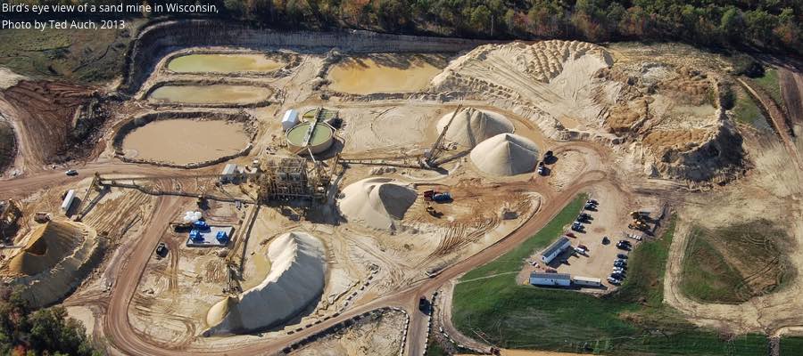
We’ve added several new frac sand resources for visitors to our website this month, including a map of frac sand mines, as well as geolocated data you can download. Explore these resources using the map and links below:
On the map above you can view silica sands/frac sand mines, drying facilities, and value-added facilities in North America. Click view map fullscreen to see the legend, an address search bar, and other tools available on our maps.
Additional data shown on this map include addresses and facility polygons. Wisconsin provides sand production data for 24 facilities, so that information has been included on this map. The remaining Wisconsin and other state facilities do not have production or acreage data associated with them. (Most states lack disclosure requirements for releasing this kind of data. Additionally the USGS maintains a confidentiality agreement with all firms, preventing us from obtaining production data.)
The sandstone/silica geology polygons (areas on the map) include a breakdown of how much land is currently made up of agriculture, urban/suburban, temperate deciduous forest, and conifer forests. At the present time we only have this information for the primary frac-sand-producing state: Wisconsin. We should have details for Ohio and Minnesota soon.
Data Downloads
Click on the links below to download various geolocated datasets (zipped shape files) related to the frac sand industry:
Cover of Dangerous and Close report. Click to view report
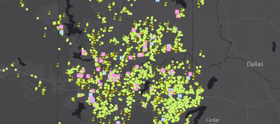
FracTracker Alliance has been working with the Frontier Group and Environment America on a nationwide assessment of “fracked” oil and gas wells. The report is titled Dangerous and Close, Fracking Puts the Nation’s Most Vulnerable People at Risk. The assessment analyzed the locations of fracked wells and identified where the fracking has occurred near locations where sensitive populations are commonly located. These sensitive sites include schools and daycare facilities because they house children, hospitals because the sick are not able to fight off pollution as effectively, and nursing homes where the elderly need and deserve clean environments so that they can be healthy, as well. The analysis used data on fracked wells from regulatory agencies and FracFocus in nine states. Maps of these nine states, as well as a full national map are shown below.
No one deserves to suffer the environmental degradation that can accompany oil and gas development – particularly “fracking” – in their neighborhoods. Fracked oil and gas wells are shown to have contaminated drinking water, degrade air quality, and sicken both aquatic and terrestrial ecosystems. Additionally, everybody responds differently to environmental pollutants, and some people are much more sensitive than others. In fact, certain sects of the population are known to be more sensitive in general, and exposure to pollution is much more dangerous for them. These communities and populations need to be protected from the burdens of industries, such as fracking for oil and gas, that have a negative effect on their environment. Commonly identified sensitive groups or “receptors” include children, the immuno-compromised and ill, and the elderly. These groups are the focus of this new research.
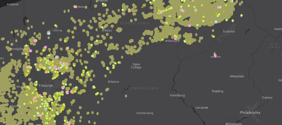
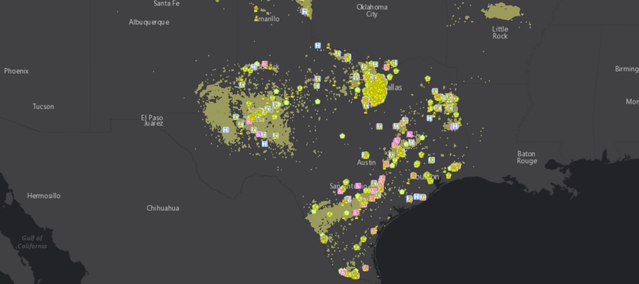
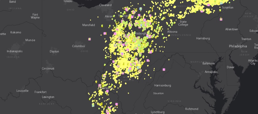
National Map
National interactive map of sensitive receptors near fracked wells
Oklahoma has made news recently because its earthquake story is so dramatic. The state that once averaged one to two magnitude 3 earthquakes per year now averages one to two per day. This same state, which never used to be seismically active, is now more seismically active than California. In terms of understanding the connection between wastewater disposal wells and earthquakes, though, it may be more helpful to look at other states first. Let us explore this issue further in Man-made Earthquakes, Part 2.
How other states handle induced seismicity
In 2010 and 2011, Arkansas experienced a swarm of earthquakes near the town of Greenbrier that culminated in a magnitude 4.7 earthquake. Officials in Arkansas ordered a moratorium on all disposal wells in the area, and earthquake activity quickly subsided.
In late 2011, Ohio experienced small earthquakes near a disposal well that culminated in a magnitude 4 earthquake that shook and startled residents. The disposal well was shut down, and the earthquakes subsided. Subsequent research into the earthquake confirmed that the disposal well in question had, in fact, triggered the earthquake. A swarm of earthquakes last year in Ohio shut down another well, and again, after the wastewater injection ceased, the earthquakes subsided.
Similarly in Kansas, after two earthquakes of magnitudes 4.7 and 4.9 shook the state in late 2014, officials ordered wells in two southern counties to decrease the volume of water injected into the ground. Again, earthquake activity quickly subsided.
A seismologist’s toolbox
A favorite saying among scientists is that correlation does not equal causation, and it’s easy to apply that phrase to the correlations seen in Ohio, Arkansas, and Kansas. Yet scientists remain certain that wastewater disposal wells can trigger earthquakes. So what are some of the techniques they use to come to these conclusions? At the Virginia Seismological Observatory (VTSO), two of the tools we used to determine a connection were cross-correlation programs and beach ball diagrams.
Cross-correlation
The VTSO research, which was funded by the National Energy Technology Laboratory, looked specifically at earthquake swarms that have popped up a couple times near a wastewater disposal well in West Virginia. We used a cross-correlation program to distinguish earthquakes that were likely triggered by the nearby well from events that might be natural or related to mining activity.
A seismic station records all of the vibrations that occur around it as squiggly lines. When an earthquake wave passes through, its squiggly lines take on a specific shape, known as a waveform, that seismologists can easily recognize (as an example, the VTSO logo in Fig. 1 was designed using a waveform from one of West Virginia’s potentially induced earthquakes.)
Figure 1. Virginia Tech Seismological Observatory logo w/waveform
For naturally occurring earthquakes, the waveforms will have some variation in shape because they come from different faults in different locations. When an injection well triggers earthquakes, it typically activates faults that are within close proximity, resulting in greater similarities between waveforms. A cross-correlation program is simply a computer program that can run through days, weeks, or months of data from a seismometer to find those similar waveforms. When matching waveforms indicate that earthquake activity is occurring near an injection well – and especially in regions that don’t have a history of seismic activity – we can conclude the earthquakes are triggered by human activity.
Beach Balls
Any earthquake fault, whether it’s active or ancient, is stressed to its breaking point. The difference is that, in places like California that are active, the natural forces against the faults often change, which triggers earthquakes. Ancient faults are still highly stressed, but the ground around them has become more stabilized. However at any point in time, if an unexpected force comes along, it can still trigger an earthquake.
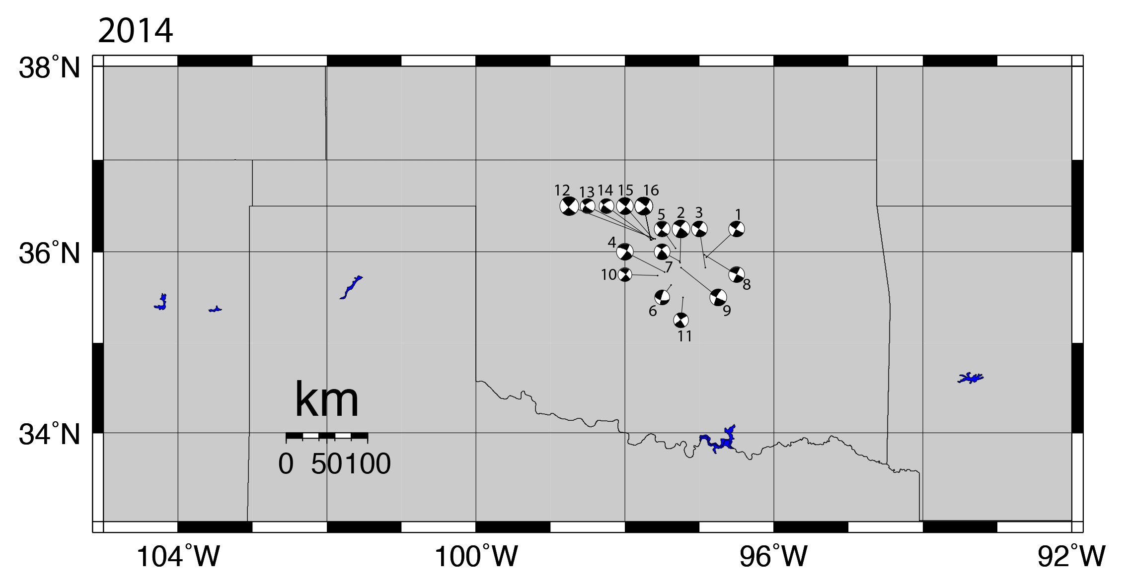
Figure 2. Beach ball diagrams of 16 of the largest earthquakes in Oklahoma in 2014, all showing similar focal mechanisms, which is indicative of induced seismicity.
Earthquake faults don’t all point in the same direction, which means different forces will affect faults differently. Depending on their orientation, some faults might shift in a north-south direction, some might shift in an east-west direction, some might be tilted at an angle, while others are more upright, etc. Seismologists use focal mechanisms to describe the movement of a fault during an earthquake, and these focal mechanisms are depicted by beach ball diagrams (Figure 2). The beach ball diagrams look, literally, like black and white beach balls. Different quadrants of the “beach ball” will be more dominant depending on what type of fault it was and how it moved (See USGS definition of Focal Mechanisms and the “beach ball” symbol).
When an earthquake is triggered by an injection well, it means that the fluid injected into the ground is essentially the straw that broke the camel’s back. Earthquake theory predicts that the forces from an injection well won’t trigger all faults, but only those that are oriented just right. Since we expect that only certain faults with just the right orientation will get triggered, that means we also expect the earthquakes to have similar focal mechanisms, and thus, similar beach ball diagrams. And that’s exactly what we see in Oklahoma.
Cross-correlation programs and beach ball diagrams are only two tools we used at the VTSO to confirm which earthquakes were induced, but seismologists have many means of determining if an earthquake is induced or natural.
Limitations of science?
With so much strong scientific evidence, why can people in industry still claim there isn’t enough science to officially confirm that an injection well triggered an earthquake? In some cases, these claims are simply wrong. In other cases, though, especially in Oklahoma, the problem is that no one was monitoring the disposal wells and the earthquakes from the start. Well operators were not required to publicly track the volumes of water they injected into wells until recently, and no one monitored for nearby earthquake activity. The big problem is not a lack of scientific evidence, but a lack of data from industry to perform sufficient research. Scientists need information about the history, volume, and pressure of fluid injection at a disposal well if they’re to confirm whether or not earthquakes are triggered by it. Often, that information is proprietary and not publically available, or it may not exist at all.
At this point though, two other factors make direct correlations between injection wells and earthquakes in Oklahoma even more difficult:
So many wells have injected signficiant volumes of water in close enough proximity that pointing a finger at a specific well is more challenging.
A large number of wells have injected water for so many years, that the earthquakes are migrating farther and farther from their original source. Again, pointing a finger at a specific well gets harder with time.
What we know
We know what induced seismicity is and why it occurs. We know that if a wastewater injection well disposes of large volumes of fluids deep underground in a region that has existing faults, it will likely trigger earthquakes. We know that if a region previously had few earthquakes, and then sees an uptick in earthquakes after wastewater injection begins, the earthquakes are likely induced. We know that if we want to understand the situation better, we need more seismic stations near disposal wells so we can more accurately monitor the area for seismicity both before and after the well becomes active.
What don’t we know?
We don’t know how big an induced earthquake can get. Oklahoma’s largest earthquake, which was also the largest induced earthquake ever recorded in the United States, was a magnitude 5.6. That’s big enough to cause millions of dollars of damage. Worldwide, the largest earthquake suspected to be induced occurred near the Koyna Dam in India, where a magnitude 6.3 earthquake killed nearly 200 people in 1967.
Can an earthquake that large occur in the central U.S.? The best guess right now: yes.
Seismologists suspect that an induced earthquake could get as big as the size of the fault. If a fault is big enough to trigger a magnitude 7 or 8 earthquake, then that is potentially how large an induced earthquake could be. In the early 1800s, three earthquakes between magnitudes 7 and 8 struck along the New Madrid Fault Zone near St. Louis, Missouri. Toward the end of the 1800s, a magnitude 7 earthquake shook Charleston, South Carolina. In those two areas, injection wells could potentially trigger very large earthquakes.
We have no historic record of earthquakes that large in Oklahoma, so right now, the best guess is that the largest an earthquake could get there would be between a magnitude 6 and 6.5. That would be big enough to cause significant damage, injuries, and possibly death.
The solution
What’s the take-home message from all of this?
First, the science exists to back up the conclusion that wastewater injection wells trigger earthquakes.
Second, if we want to get a better feel for which wells are more problematic, we need funding, seismic stations, and staff to monitor seismic activity around all high-volume injection wells, along with a history of injection times, volumes and pressures at the well.
Third, this is a problem that, if left unchecked, has the potential to result in major damage, incredible expense, and possibly loss of life.
Induced earthquakes are a real phenomenon. While more research is necessary to help us better understand the intricacies of these events and to identify correlations in complex cases, the general cause of the earthquake swarms in Oklahoma and other states is not a mystery. They are man-made problems, backed up by decades of scientific research. They have the potential to create significant damage, but we have the wherewithal to prevent them. We don’t need to go to the extreme of shutting down all wells, but rather, we just need to be able to monitor the wells and ensure that they don’t trigger earthquakes. If a well does trigger an earthquake, then at that point, the well operators can either experiment with significantly decreasing the volume of water that’s injected, or the well can be shut down completely. Understanding and acknowledging the connection between injection wells and earthquakes will make induced seismicity a much easier problem to solve.
Yesterday, we released the second in a series of reports on natural gas drilling in Arkansas: Model Oil and Gas Laws, Regulations and Ordinances. This report looks at how other states with thriving natural gas industries protect their residents. We found that many states and communities enjoy far better safeguards than Arkansas. The findings refute claims by the natural gas industry that improved safeguards for Arkansans will drive them out of business and hurt economic development.
We believe Arkansas communities deserve the best protections available. There is a way to balance natural gas development with landowner and environmental protection. This report highlights some of the best practices other states use to find that balance. Executive Summary | Full Report
https://www.fractracker.org/a5ej20sjfwe/wp-content/uploads/2025/09/2025-Wordmark-Logo.png00Guest Authorhttps://www.fractracker.org/a5ej20sjfwe/wp-content/uploads/2025/09/2025-Wordmark-Logo.pngGuest Author2011-03-18 10:11:002020-07-21 10:37:38New Arkansas Panel Report: Model Oil and Gas Laws


