In this article, FracTracker’s Communications Intern Sarah Liez discusses the role of misinformation as an obstacle to clean energy reform and how it stalls initiatives aimed at transitioning to renewable sources of power.
https://www.fractracker.org/a5ej20sjfwe/wp-content/uploads/2024/04/Clean-Energy-Misinformation-Cover-Art.jpg8451500FracTracker Alliancehttps://www.fractracker.org/a5ej20sjfwe/wp-content/uploads/2025/09/2025-Wordmark-Logo.pngFracTracker Alliance2024-04-03 15:58:552024-04-05 12:28:47The Power of Misinformation in Blocking Clean Energy Reform
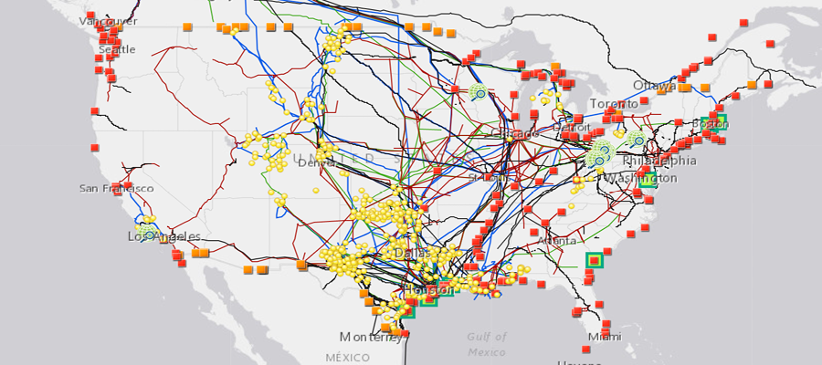
FracTracker Alliance has released a new national map, filled with energy and petrochemical data. Explore the map, continue reading to learn more, and see how your state measures up!
This map has been updated since this blog post was originally published, and therefore statistics and figures below may no longer correspond with the map
The items on the map (followed by facility count in parenthesis) include:
For oil and gas wells, view FracTracker’s state maps.
Transportation & Storage
Natural gas compressor stations (1,367) – Facilities built along a pipeline route that pressurize natural gas to keep it flowing through the pipeline.
Crude oil rail terminals (94) – Rail terminals that load and unload crude oil (liquid hydrocarbons that have yet to be processed into higher-value petroleum products).
Liquefied natural gas import/export terminals (8) – Facilities that can a) liquefy natural gas so it can be exported as LNG (liquefied natural gas) and/or b) re-gasify LNG so it can be used as natural gas. Natural gas is transported in a liquid state because it takes up less space as a liquid than as a gas.
Natural Gas Underground Storage (486) – Locations where natural gas is stored underground in aquifers, depleted gas fields, and salt formations.
Petroleum Product Terminals (1,484) – Terminals with a storage capacity of 50,000 barrels or more and/or the ability to receive volumes from tanker, barge, or pipeline. Petroleum products include products “produced from the processing of crude oil and other liquids at petroleum refineries, from extraction of liquid hydrocarbons at natural gas processing plants, and from production of finished petroleum products at blending facilities.”
Petroleum Ports (242) – A port that can import and/or export 200,000 or more short tons of petroleum products a year.
Natural gas import/export pipeline facility (54) – A facility where natural gas crosses the border of the continental United States.
Pipelines
Crude oil pipelines – major crude oil pipelines, including interstate truck lines and selected intrastate lines, but not including gathering lines.
Natural gas liquid pipelines – Also referred to as hydrocarbon gas liquid pipelines, they carry the heavier components of the natural gas stream which are liquid under intense pressure and extreme cold, but gas in normal conditions.
Natural gas pipelines– Interstate and intrastate natural gas pipelines. Due to the immensity of this pipeline network and lack of available data, this pipeline layer in particular varies in degree of accuracy.
Petroleum Product Pipelines – Major petroleum product pipelines.
Recent Pipeline Projects – Pipeline projects that have been announced since 2017. This includes projects in various stages, including under construction, complete, planned or canceled. Click on the pipeline for the status.
Processing & Downstream
Natural Gas Processing Plants (478) – Plants that separate impurities and components of the natural gas stream.
Chemical plants (36) – Includes two types of chemical plants – petrochemical production and ammonia manufacturing – that report to EPA’s Greenhouse Gas Reporting Program.
Ethylene Crackers (30) – Also referred to as ethane crackers, these petrochemical complexes that converts ethane (a natural gas liquid) into ethylene. Ethylene is used to make products like polyethylene plastic.
Petroleum Refineries (135) – A plant that processes crude oil into products like petroleum naphtha, diesel fuel, and gasoline.
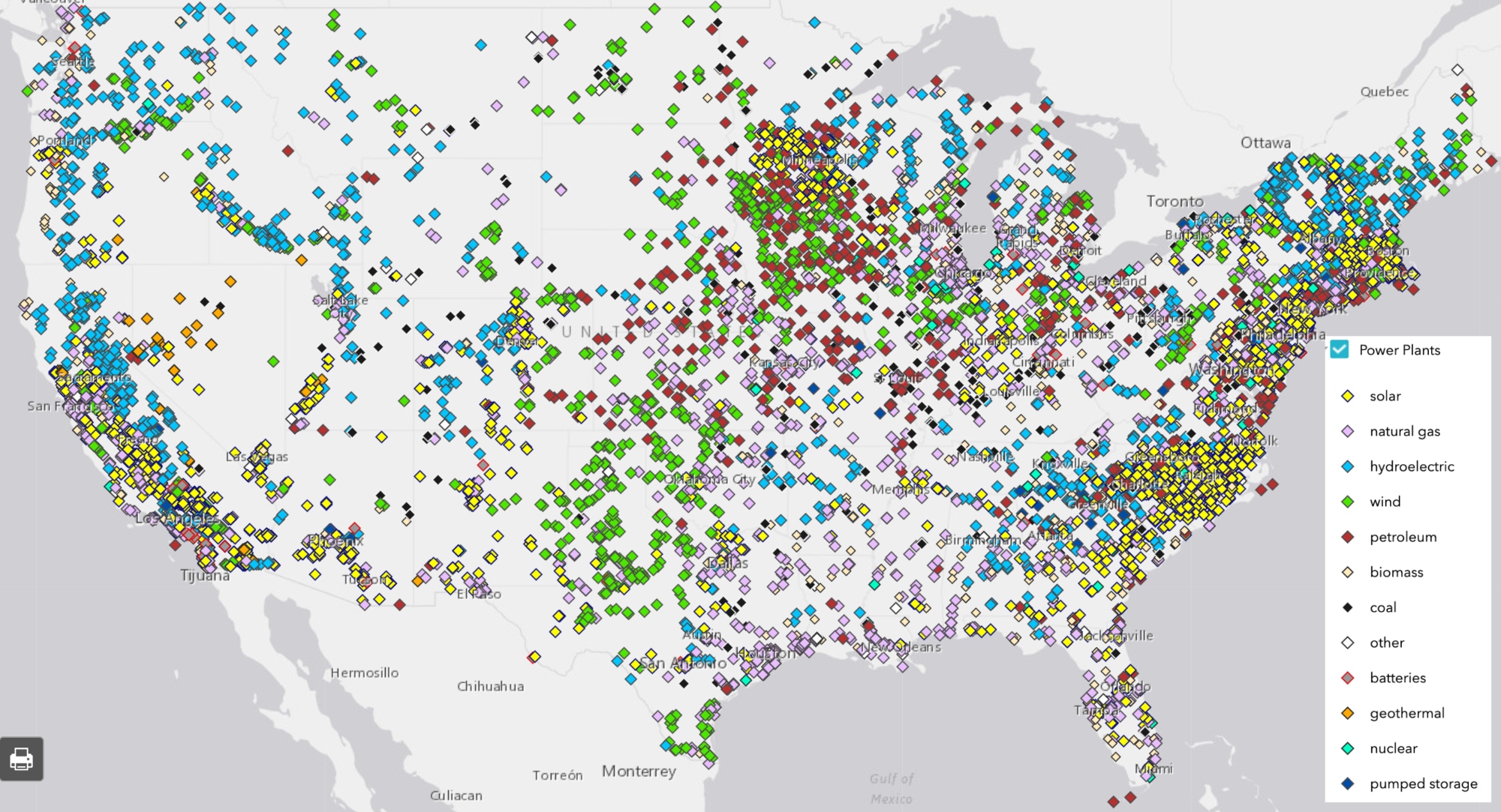
Power Plants (9,414) – Electric generating plants with a capacity of at least one megawatt, sorted by energy source.
Wind Turbines (63,003) – Zoom in on wind power plants to see this legend item appear.
Natural Resources
Shale Plays (45) – Tight oil and gas shale plays, which are formations where oil and gas can be extracted.
Major Rivers
Solar Energy Potential – Potential solar energy generation, in kilowatt-hours per square meter per day – averaged annually.
This map is by no means exhaustive, but is exhausting. It takes a lot of infrastructure to meet the energy demands from industries, transportation, residents, and businesses – and the vast majority of these facilities are powered by fossil fuels. What can we learn about the state of our national energy ecosystem from visualizing this infrastructure? And with increasing urgency to decarbonize within the next one to three decades, how close are we to completely reengineering the way we make energy?
Key Takeaways
Natural gas accounts for 44% of electricity generation in the United States – more than any other source. Despite that, the cost per megawatt hour of electricity for renewable energy power plants is now cheaper than that of natural gas power plants.
The state generating the largest amount of solar energy is California, while wind energy is Texas. The state with the greatest relative solar energy is not technically a state – it’s D.C., where 18% of electricity generation is from solar, closely followed by Nevada at 17%. Iowa leads the country in relative wind energy production, at 45%.
The state generating the most amount of energy from both natural gas and coal is Texas. Relatively, West Virginia has the greatest reliance on coal for electricity (85%), and Rhode Island has the greatest percentage of natural gas (92%).
With 28% of total U.S. energy consumption for transportation, many of the refineries, crude oil and petroleum product pipelines, and terminals on this map are dedicated towards gasoline, diesel, and other fuel production.
Petrochemical production, which is expected to account for over a third of global oil demand growth by 2030, takes the form of chemical plants, ethylene crackers, and natural gas liquid pipelines on this map, largely concentrated in the Gulf Coast.
Electricity generation
The “power plant” legend item on this map contains facilities with an electric generating capacity of at least one megawatt, and includes independent power producers, electric utilities, commercial plants, and industrial plants. What does this data reveal?
In terms of the raw number of power plants – solar plants tops the list, with 2,916 facilities, followed by natural gas at 1,747.
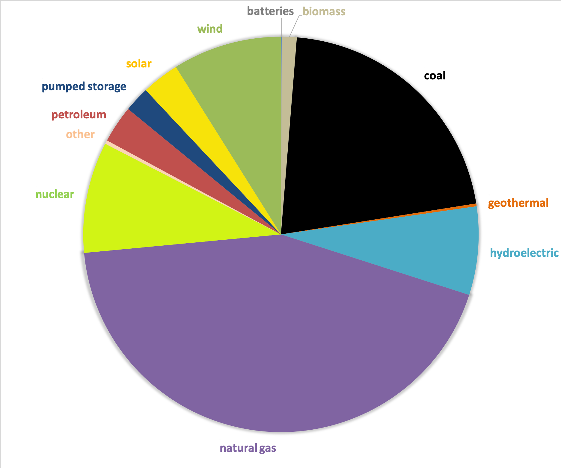
In terms of megawatts of electricity generated, the picture is much different – with natural gas supplying the highest percentage of electricity (44%), much more than the second place source, which is coal at 21%, and far more than solar, which generates only 3% (Figure 1).
Figure 1. Electricity generation by source in the United States, 2019. Data from EIA.
This difference speaks to the decentralized nature of the solar industry, with more facilities producing less energy. At a glance, this may seem less efficient and more costly than the natural gas alternative, which has fewer plants producing more energy. But in reality, each of these natural gas plants depend on thousands of fracked wells – and they’re anything but efficient.
The cost per megawatt hour of electricity for a renewable energy power plants is now cheaper than that of fracked gas power plants. A report by the Rocky Mountain Institute, found “even as clean energy costs continue to fall, utilities and other investors have announced plans for over $70 billion in new gas-fired power plant construction through 2025. RMI research finds that 90% of this proposed capacity is more costly than equivalent [clean energy portfolios, which consist of wind, solar, and energy storage technologies] and, if those plants are built anyway, they would be uneconomic to continue operating in 2035.”
The economics side with renewables – but with solar, wind, geothermal comprising only 12% of the energy pie, and hydropower at 7%, do renewables have the capacity to meet the nation’s energy needs? Yes! Even the Energy Information Administration, a notorious skeptic of renewable energy’s potential, forecasted renewables would beat out natural gas in terms of electricity generation by 2050 in their 2020 Annual Energy Outlook.
This prediction doesn’t take into account any future legislation limiting fossil fuel infrastructure. A ban on fracking or policies under a Green New Deal could push renewables into the lead much sooner than 2050.
In a void of national leadership on the transition to cleaner energy, a few states have bolstered their renewable portfolio.
Figure 2. Electricity generation state-wide by source, 2019. Data from EIA.
One final factor to consider – the pie pieces on these state charts aren’t weighted equally, with some states’ capacity to generate electricity far greater than others. The top five electricity producers are Texas, California, Florida, Pennsylvania, and Illinois.
Transportation
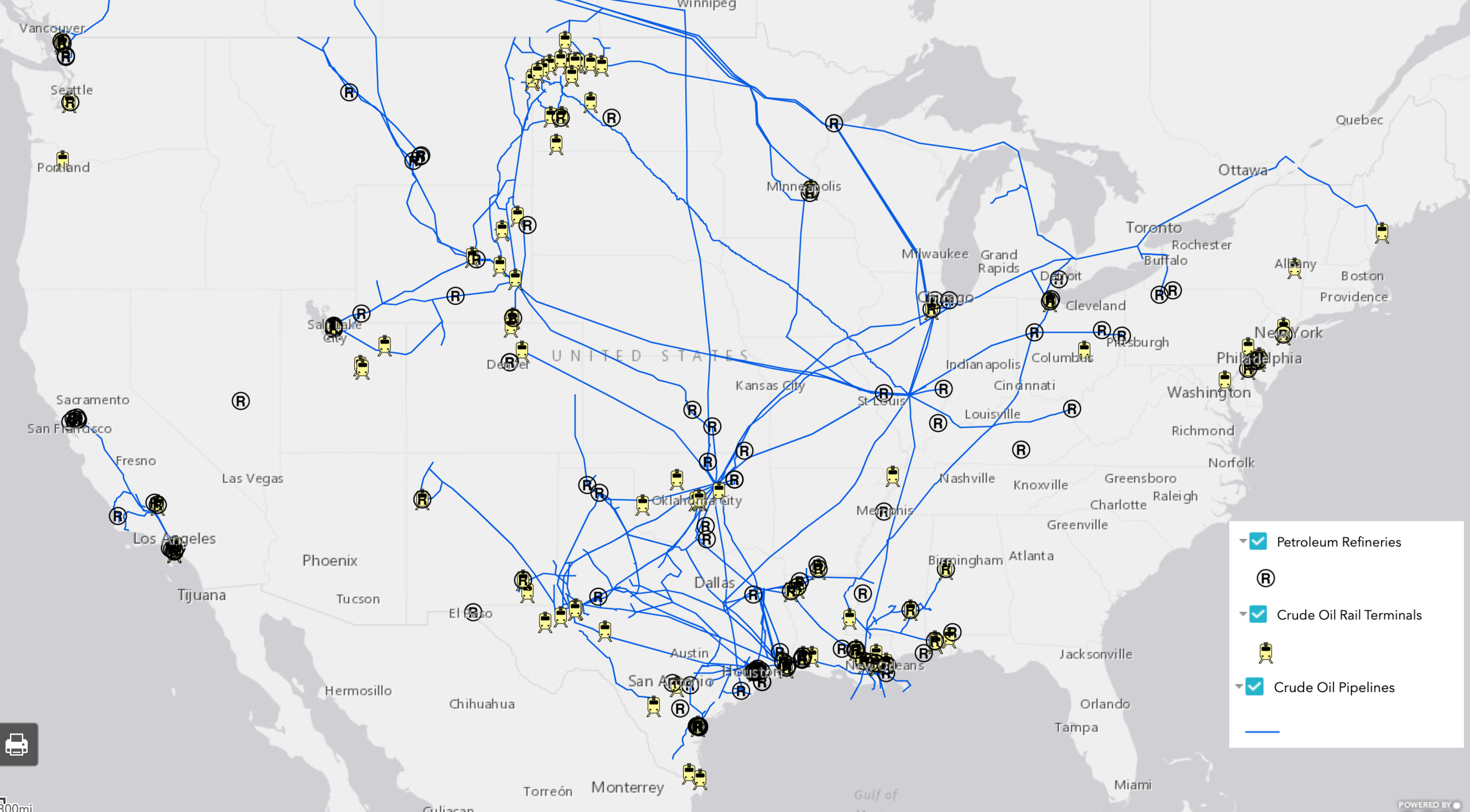
In 2018, approximately 28% of total U.S. energy consumption was for transportation. To understand the scale of infrastructure that serves this sector, it’s helpful to click on the petroleum refineries, crude oil rail terminals, and crude oil pipelines on the map.
Transportation Fuel Infrastructure. Data from EIA.
The majority of gasoline we use in our cars in the US is produced domestically. Crude oil from wells goes to refineries to be processed into products like diesel fuel and gasoline. Gasoline is taken by pipelines, tanker, rail, or barge to storage terminals (add the “petroleum product terminal” and “petroleum product pipelines” legend items), and then by truck to be further processed and delivered to gas stations.
China leads the world in this movement. In 2018, just over half of the world’s electric vehicles sales occurred in China. Analysts predict that the country’s oil demand will peak in the next five years thanks to battery-powered vehicles and high-speed rail.
In the United States, the percentage of electric vehicles on the road is small but growing quickly. Tax credits and incentives will be important for encouraging this transition. Almost half of the country’s electric vehicle sales are in California, where incentives are added to the federal tax credit. California also has a “Zero Emission Vehicle” program, requiring electric vehicles to comprise a certain percentage of sales.
We can’t ignore where electric vehicles are sourcing their power – and for that we must go back up to the electricity generation section. If you’re charging your car in a state powered mainly by fossil fuels (as many are), then the electricity is still tied to fossil fuels.
Petrochemicals
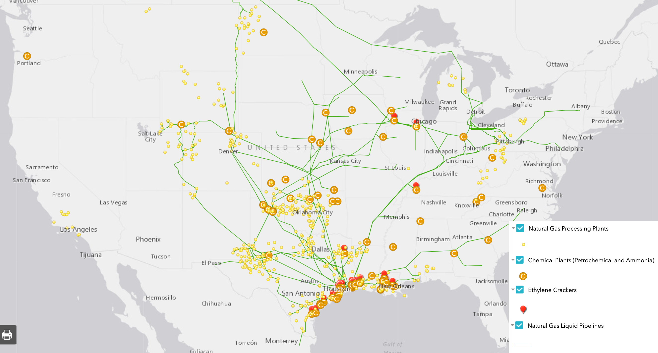
Many of the oil and gas infrastructure on the map doesn’t go towards energy at all, but rather aids in manufacturing petrochemicals – the basis of products like plastic, fertilizer, solvents, detergents, and resins.
Natural gas processing plants separate components of the natural gas stream to extract natural gas liquids like ethane and propane – which are transported through the natural gas liquid pipelines. These natural gas liquids are key building blocks of the petrochemical industry.
Ethane crackers process natural gas liquids into polyethylene – the most common type of plastic.
The chemical plants on this map include petrochemical production plants and ammonia manufacturing. Ammonia, which is used in fertilizer production, is one of the top synthetic chemicals produced in the world, and most of it comes from steam reforming natural gas.
As we discuss ways to decarbonize the country, petrochemicals must be a major focus of our efforts. That’s because petrochemicals are expected to account for over a third of global oil demand growth by 2030 and nearly half of demand growth by 2050 – thanks largely to an increase in plastic production. The International Energy Agency calls petrochemicals a “blind spot” in the global energy debate.
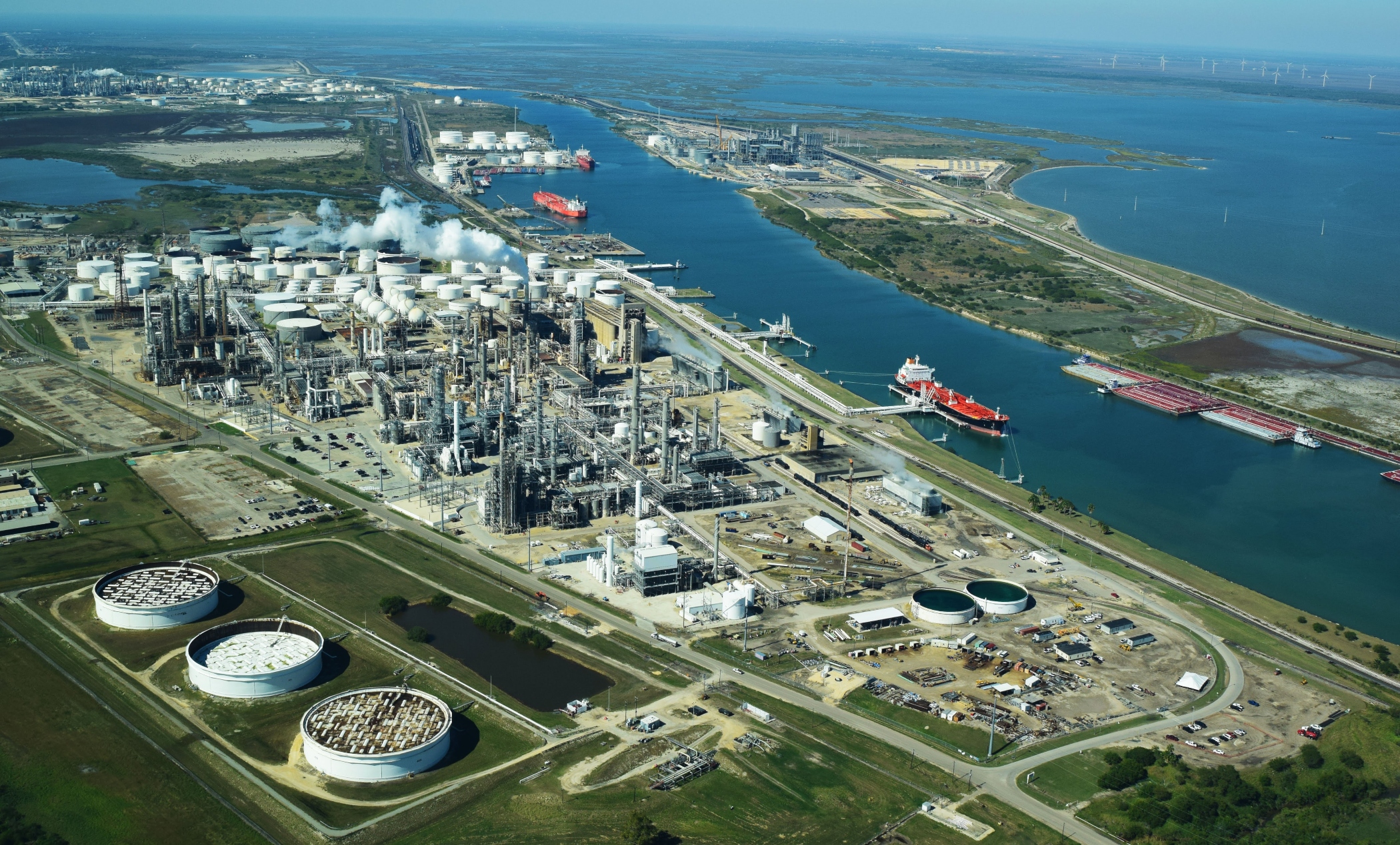
Petrochemical development off the coast of Texas, November 2019. Photo by Ted Auch, aerial support provided by LightHawk.
Investing in plastic manufacturing is the fossil fuel industry’s strategy to remain relevant in a renewable energy world. As such, we can’t break up with fossil fuels without also giving up our reliance on plastic. Legislation like the Break Free From Plastic Pollution Act get to the heart of this issue, by pausing construction of new ethane crackers, ensuring the power of local governments to enact plastic bans, and phasing out certain single-use products.
“The greatest industrial challenge the world has ever faced”
Mapped out, this web of fossil fuel infrastructure seems like a permanent grid locking us into a carbon-intensive future. But even more overwhelming than the ubiquity of fossil fuels in the US is how quickly this infrastructure has all been built. Everything on this map was constructed since Industrial Revolution, and the vast majority in the last century (Figure 3) – an inch on the mile-long timeline of human civilization.
Figure 3. Global Fossil Fuel Consumption. Data from Vaclav Smil (2017)
In fact, over half of the carbon from burning fossil fuels has been released in the last 30 years. As David Wallace Wells writes in The Uninhabitable Earth, “we have done as much damage to the fate of the planet and its ability to sustain human life and civilization since Al Gore published his first book on climate than in all the centuries—all the millennia—that came before.”
What will this map look like in the next 30 years?
A recent report on the global economics of the oil industry states, “To phase out petroleum products (and fossil fuels in general), the entire global industrial ecosystem will need to be reengineered, retooled and fundamentally rebuilt…This will be perhaps the greatest industrial challenge the world has ever faced historically.”
Is it possible to build a decentralized energy grid, generated by a diverse array of renewable, local, natural resources and backed up by battery power? Could all communities have the opportunity to control their energy through member-owned cooperatives instead of profit-thirsty corporations? Could microgrids improve the resiliency of our system in the face of increasingly intense natural disasters and ensure power in remote regions? Could hydrogen provide power for energy-intensive industries like steel and iron production? Could high speed rail, electric vehicles, a robust public transportation network and bike-able cities negate the need for gasoline and diesel? Could traditional methods of farming reduce our dependency on oil and gas-based fertilizers? Could zero waste cities stop our reliance on single-use plastic?
Of course! Technology evolves at lightning speed. Thirty years ago we didn’t know what fracking was and we didn’t have smart phones. The greater challenge lies in breaking the fossil fuel industry’s hold on our political system and convincing our leaders that human health and the environment shouldn’t be externalized costs of economic growth.
https://www.fractracker.org/a5ej20sjfwe/wp-content/uploads/2020/02/National-map-feature-3.png400900Erica Jacksonhttps://www.fractracker.org/a5ej20sjfwe/wp-content/uploads/2025/09/2025-Wordmark-Logo.pngErica Jackson2020-02-28 17:35:142022-05-02 15:21:42National Energy and Petrochemical Map
The Great Plains has become the unconventional oil & gas industry’s dumping ground, prompting questions about the security and resilience of the bread basket and the underlying Ogalalla Aquifer
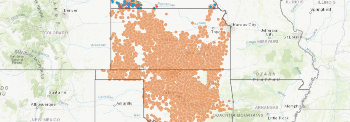
Back in December of 2016, FracTracker analyzed the growing link between injection wells that dispose fracking waste and “induced seismicity” [1], or human-caused earthquakes. Our compiled maps from this analysis (including Figure 1 below) show seismic activity in Kansas and Oklahoma along with Class II injection well volumes up through 2015.
Figure 1. Earthquakes and Class II Injection Well Activity at the Kansas-Oklahoma Border
This link was given acute attention at that time as a result of the magnitude 5.8 earthquake in Pawnee, Oklahoma on September 3rd, 2016, followed closely by a 4.5 earthquake on November 1st. The industry’s increased production of waste came home to roost 5 days later when a magnitude 5.0 quake struck a mile west of the “Cushing Hub,” the largest commercial crude oil storage center in North America. The Cushing Hub is capable of storing 54 million barrels of crude – the equivalent of 2.8 times the U.S. daily oil refinery capacity and 3.1 times the daily oil refinery capacity of all of North America.
Sunflower State of Affairs
Since we published this analysis and associated maps, Class II injection wells have been in the news several times across the Great Plains. An investigation by KSN News found that the Kansas Corporation Commission (KCC) improperly permitted over 2,000 Class II injection wells. The KCC stated that public comment periods for well proposals lasted just 15 days, instead of the correct number of 30 days. This amounts to 42% and 28% of the state’s active and total inventory of oil and gas waste receiving wells approved with inaccurate public notices.
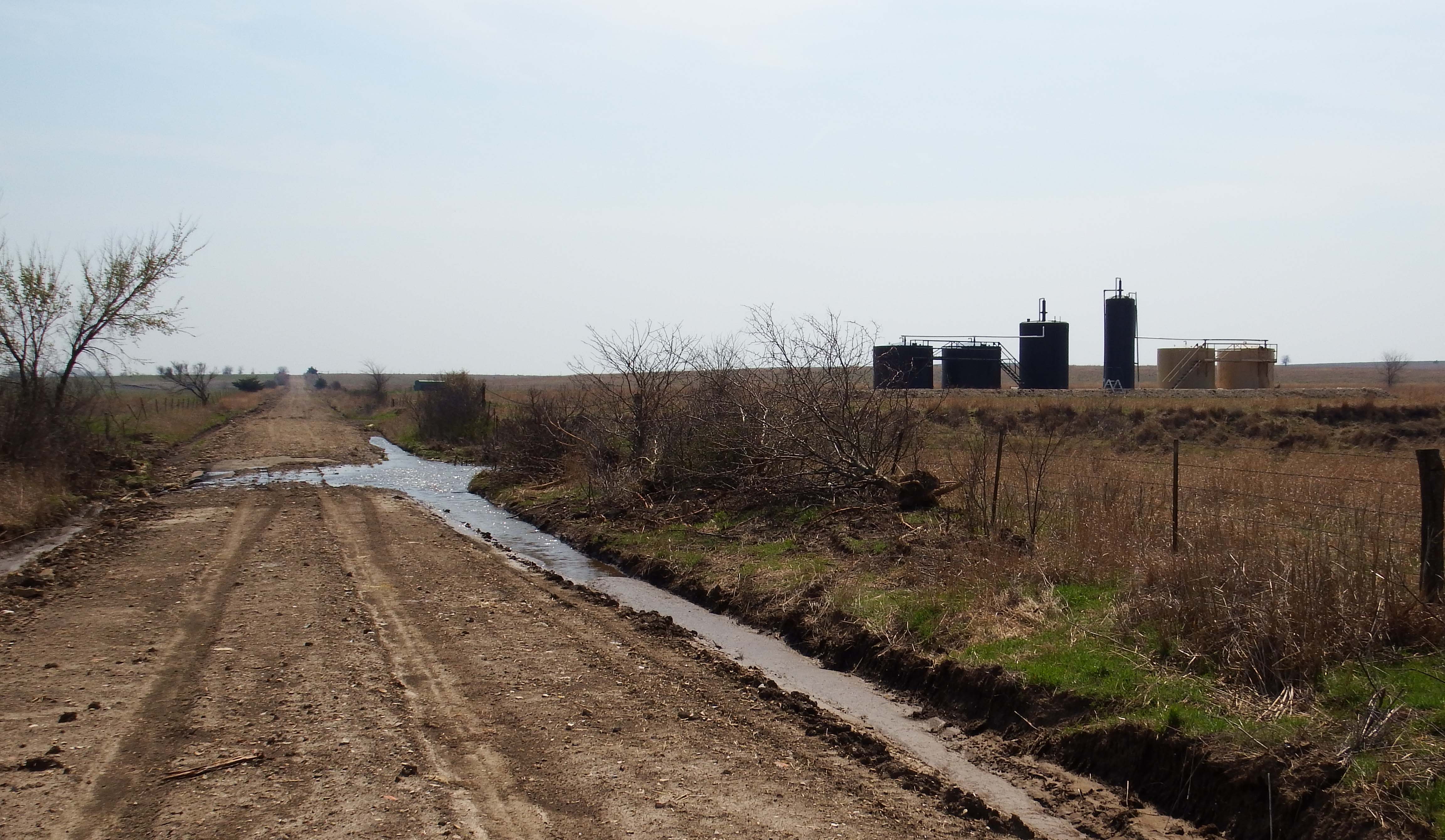
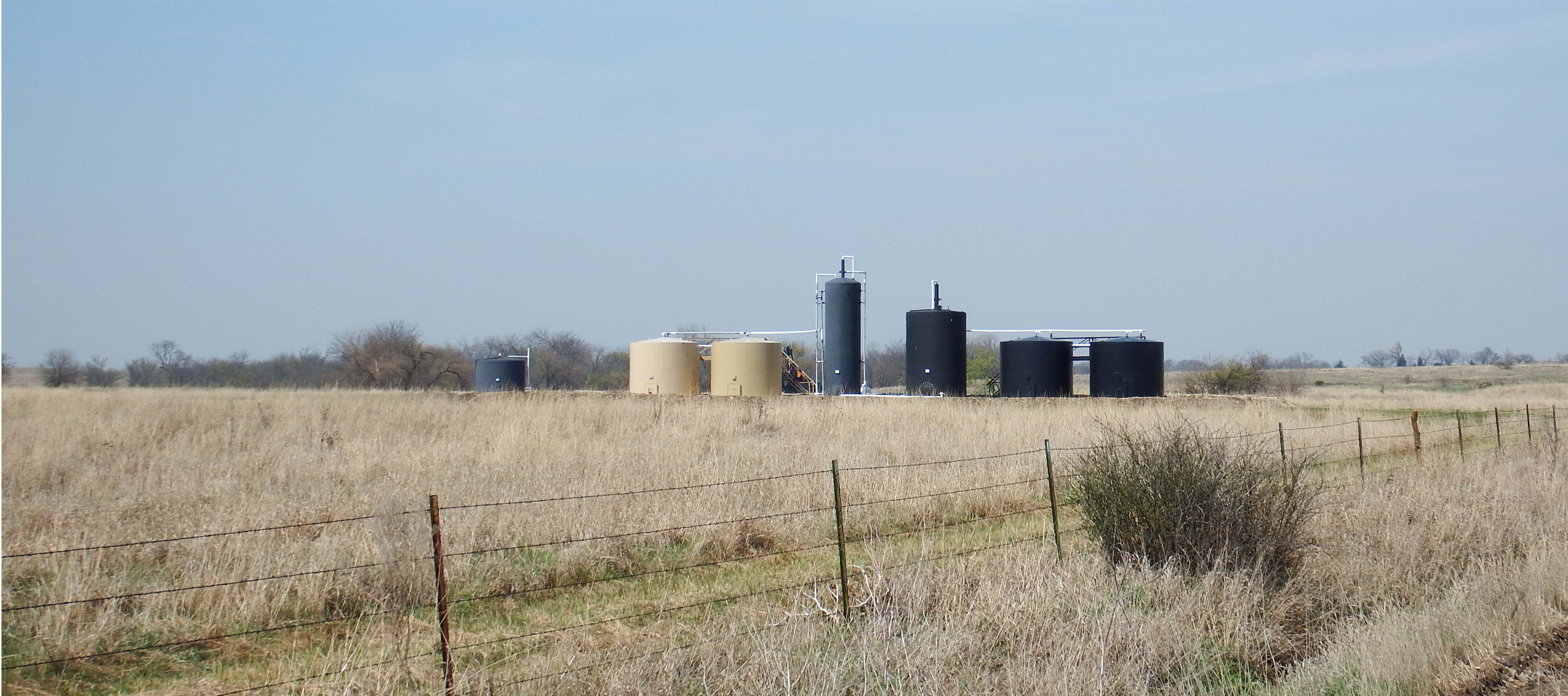
Quail Oil & Gas LC’s Class II Salt Water Disposal (SWD) well, Morris County, KS near Diamond Creek (Photo Courtesy of Karla jo Grimmett at South 500 photography)
According to Cindy Hoedel, a freelance journalist in Kansas, “the KCC responded to the investigation findings… by ruling that no remedy was needed and closing the docket.”
“The significance is they are choking us off in terms of giving us less and less time to try to mount a protest, to submit any kind of comment, and that’s a lot,” Cindy Hoedel, a Matfield Green resident who has complained about earthquakes in her area, said… “These notices get published in these tiny little newspapers, and sometimes it might take us 15 days before we find it”
As Ms. Hoedel wrote in an email when I asked her to comment on issues relating to Kansas’ Class II injection wells:
“The Republican controlled Kansas Legislature is trying to fend off several proposed bills that would reform the KCC (the regulatory body that oversees the permitting of Class II underground injection control wells). Citizen challenges of individual applications for disposal and EOR [enhanced oil recovery] wells continue, with the KCC moving more aggressively than in the past to dismiss protestants before a hearing is held. Some of these dismissals are being challenged in appellate court. The activists’ view is that EPA, the SWDA [Safe Water Drinking Act]and Congress clearly intend for the public to be able to participate in the regulatory process; instead, KCC has written regulations that are effectively barriers to participation… Activists have questions about the large number of EOR wells being applied for in Kansas and what their true purpose is, given the insignificant amounts of oil being produced compared to high volumes of injected fluids. Another concern is that the injection well earthquakes in Oklahoma and Kansas continue, yet KCC refuses to add regs that would address seismic risk in permit applications. There is also a problem with harassment of citizens exercising their right to protest – Scott Yeargain and I were both turned in to the Kansas AG’s office by a KCC staffer on the bogus claim that we were practicing law without a license because we helped explain the convoluted process to other protesters.”
Grapes of Wrath
Meanwhile, across the border, Oklahoma City and its surrounding suburbs have become the San Francisco of the Great Plains, with regular earthquake swarms (including many that exceed magnitude 4.0). According to Think Progress reporter Samantha Page, despite the damages and lawsuits caused by these earthquakes, “for years, the state was slow to respond, while Gov. Mary Fallin (R) and others questioned the link to human activity.”
Eventually, by the end of 2016, the Oklahoma Corporation Commission responded by implementing a ‘traffic light’ protocol, in which operations are paused or stopped altogether following earthquakes of certain magnitudes. For a time, the EPA demanded a moratorium on disposal across Class II wells injecting into the Arbuckle formation in “high seismically active focus areas.”
Chad Warmington, president of the Oklahoma Oil and Gas Association, said that this response by the EPA is “a stellar example of the inefficiency of the federal government…It’s akin to a newspaper telling us today the football scores from games played 15 months ago.”
In reporting on the industry’s response, journalist Paul Monies, buried the lead when he pointed out the following in his second to last paragraph:
“Wastewater recycling remains an expensive option compared to the low costs of disposal wells in Oklahoma. While operators can inject wastewater into formations other than the Arbuckle, Hatfield said other formations don’t accept water as easily and are at shallower depths.”
The Map
Our second stab at mapping the scale and scope of Class II injection wells across the Great Plains is slightly different than our first effort in a few ways:
This iteration includes Class II Salt Water Disposal (SWD) Injection Wells in Nebraska, Oklahoma, and Kansas on one map. Clicking on a well reveals its location, well name, operator, and the volume of wastewater disposed. Volumes are presented annually for Nebraska and monthly for 2011 to 2017 for Oklahoma and Kansas. We also present annual sums for Oklahoma from 2006 to 2010.
The map shows Arkansas and Platte River Basin boundaries, which contain the entire inventory of OK, NE, and KS Class II wells.
Finally, we’ve includedUS Forest Service Robert G. Bailey’s Ecoregions to give a sense for the types of ecosystems threatened by the O&G industry’s demand for suitable waste disposal sites
View Map Full Screen | To view the legend on this map, click the “layers” icon on the top left of the screen
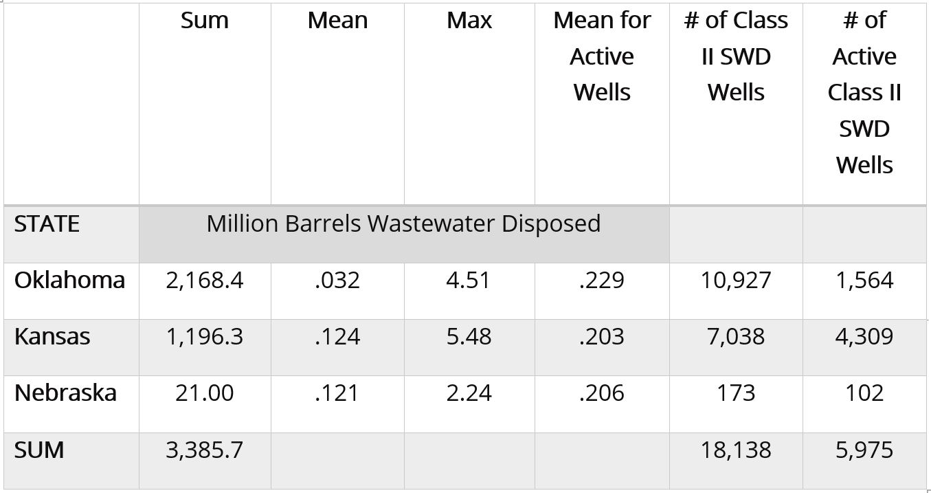
Table 1, below, breaks down the volumes of oil and gas wastewater disposed in Oklahoma, Kansas and Nebraska. Volumes are measured in million barrels, with one barrel equivalent to 42 gallons. The number of Class II SWD (salt water disposal) injection wells in these states is separated to show the total number of wells permitted verse the number of wells that were active (receiving waste).
Table 1. Class II injection well volumes in 2017
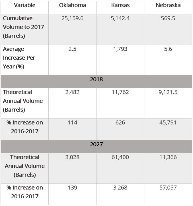
In total, 3,385,700,000 barrels of wastewater were disposed in 5,975 injection wells in these three states in 2017. The volume of wastewater disposed has increased in recent years (Table 2).
Table 2. Cumulative Class II injection well volumes to 2017, annual percent changes, and likely 2018 and 2027 volumes
In Table 2, the theoretical annual volumes for 2018 and 2027 are predictions based on the average of linear, exponential, and polynomial models.
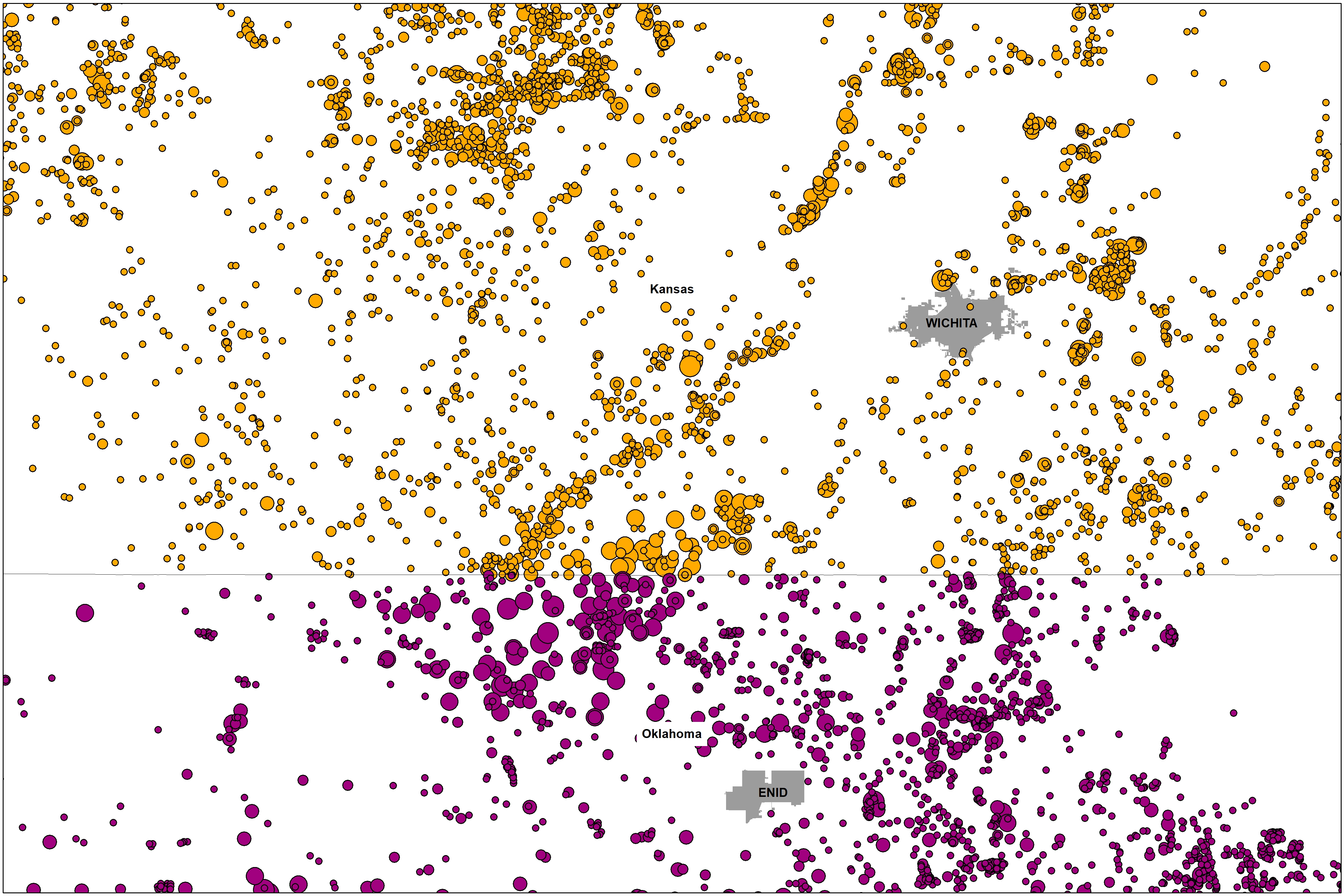
The Kansas-Oklahoma Border
It is critical that we analyze the Great Plains fracking waste ecosystem across state lines. There are several reasons for this, including the proximity of Kansas’ most active Class II wells to the Oklahoma border (Figure 2) and the potential for the KCC to use enhanced oil recovery wells in Kansas to dispose of Oklahoma’s fracking waste.
Figure 2. Class II injection well volumes for 2017 along the Kansas-Oklahoma border.
Collaboration between front line communities, non-profits like FracTracker Alliance, and groups like the Kansas Water Advocacy Team (WAT) will be crucial to understanding the impacts of waste disposal writ large. It seems like the “food vs energy” nexus has come to a head in the heart of the U.S. Bread Basket. We’ll continue to highlight and map the issues associated with this topic in the coming months and years.
Data Download Links
The following links contain the data used in the above tables and map, for use in excel and with Geographic Information Systems (GIS).
By Ted Auch, Great Lakes Program Coordinator, FracTracker Alliance In collaboration with Caleb Gallemore, Assistant Professor in International Affairs, Lafayette University
The September 3rd magnitude 5.8 earthquake in Pawnee, Oklahoma, is the most violent example of induced seismicity, or “man-made” earthquakes, in U.S. history, causing Oklahoma governor Mary Fallin to declare a state of emergency. This was followed by a magnitude 4.5 earthquake on November 1st prompting the Oklahoma Corporation Commission (OCC) and U.S. EPA to put restrictions on injection wells within a 10-mile radius of the Pawnee quake.
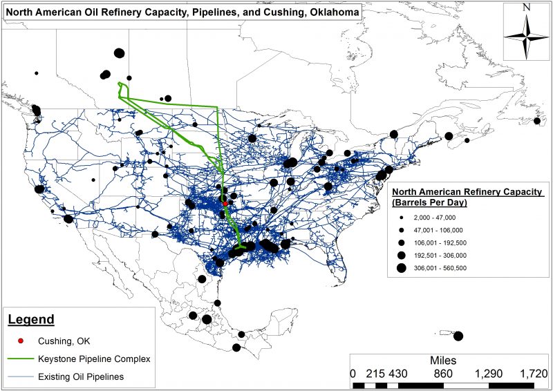
And then on Sunday, November 6th, a magnitude 5.0 earthquake shook central Oklahoma about a mile west of the Cushing Hub, the largest commercial crude oil storage center in North America capable of storing 54 million barrels of crude. This is the equivalent of 2.8 times the U.S. daily oil refinery capacity and 3.1 times the daily oil refinery capacity of all of North America. This massive hub in the North American oil landscape also happens to be the southern terminus of the controversial Keystone pipeline complex, which would transport 590,000 barrel per day over more than 2,000 miles (Fig. 1). Furthermore, this quake demonstrated the growing connectivity between Class II injection well associated induced seismicity and oil transport/storage in the heart of the US version of Saudi Arabia’s Ghawar Oil Fields. This increasing connectivity between O&G waste, production, and processing (i.e., Hydrocarbon Industrial Complex) will eventually impact the wallets of every American.
Figure 1. The Keystone Pipeline would transport 590,000 bpd over more than 2,000 miles.
This latest earthquake caused Cushing schools to close. Magellan Midstream Partners, the major pipeline and storage facility operator in the region, also shut down in order to “check the integrity of our assets.” Compounding concerns about induced seismicity, the Cushing Hub is the primary price settlement point for West Texas Intermediate that, along with Brent Crude, determines the global price of crude oil and by association what Americans pay for fuel at the pump, at their homes, and in their businesses.
Given the significant increase in seismic activity across the U.S. Great Plains, along with the potential environmental, public health, and economic risks at stake, we thought it was time to compile an inventory of Class II injection well volumes. Because growing evidence points to the relationship between induced seismicity and oil and gas waste disposal, our initial analysis focuses on Oklahoma and Kansas. The maps and the associated data downloads in this article represent the first time Class II injection well volumes have been compiled in a searchable and interactive fashion for any state outside Ohio (where FracTracker has compiled class II volumes since 2010). Oklahoma and Kansas Class II injection well data are available to the public, albeit in disparate formats and diffuse locations. Our synthesis makes this data easier to navigate for concerned citizens, policy makers, and journalists.
Induced Seismicity Past, Present, and Future
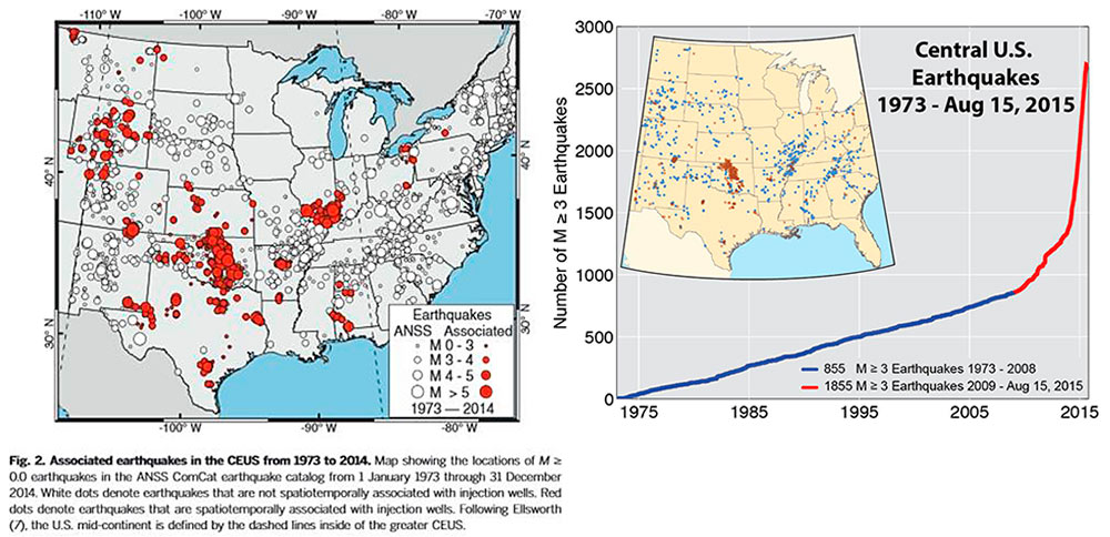
Figure 2. Central U.S. earthquakes 1973-August 15, 2015 according to the U.S. Geological Survey (Note: Based on our analysis this exponential increasing earthquakes has been accompanied by a 300 feet per quarter increase in the average depth of earthquakes across Oklahoma, Kansas, and Texas).
Oklahoma, along with Arkansas, Kansas, Ohio, and Texas, is at the top of the induced seismicity list, specifically with regard to quakes in excess of magnitude 4.0. However, as the USGS and Virginia Tech Seismological Observatory (VTSO)[1] have recently documented, an average of only 21 earthquakes of magnitude 3.0 or greater occurred in the Central/Eastern US between 1973 and 2008. This trend jumped to an average of 99 between 2009 and 2013. In 2014 there were a staggering 659 quakes. The exponential increase in induced seismic events can be seen in Figure 2 from a recent USGS publication titled “High-rate injection is associated with the increase in U.S. mid-continent seismicity,” where the authors note:
“An unprecedented increase in earthquakes in the U.S. mid-continent began in 2009. Many of these earthquakes have been documented as induced by wastewater injection…We find that the entire increase in earthquake rate is associated with fluid injection wells. High-rate injection wells (>300,000 barrels per month) are much more likely to be associated with earthquakes than lower-rate wells.”
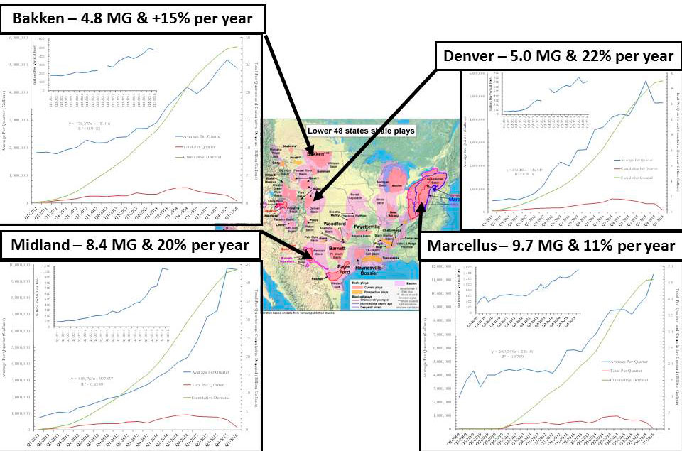
Figure 3. Average freshwater demand per hydraulically fractured well across four U.S. shale plays and the annual percent increase in each of those plays.
This trend suggests that induced seismicity is the new normal and will likely increase given that: 1) freshwater demand per hydraulically fractured well is rising all over the country, from 11-15% per year in the Marcellus and Bakken to 20-22% in the Denver and Midland formations, 2) the amount of produced brine wastewater parallels these increases almost 1-to-1, and 3) the unconventional oil and gas industry is using more and more water as they begin to explore the periphery of primary shale plays or in less productive secondary and tertiary plays (Fig. 3).
Oklahoma
The September, 2016, Pawnee County Earthquake
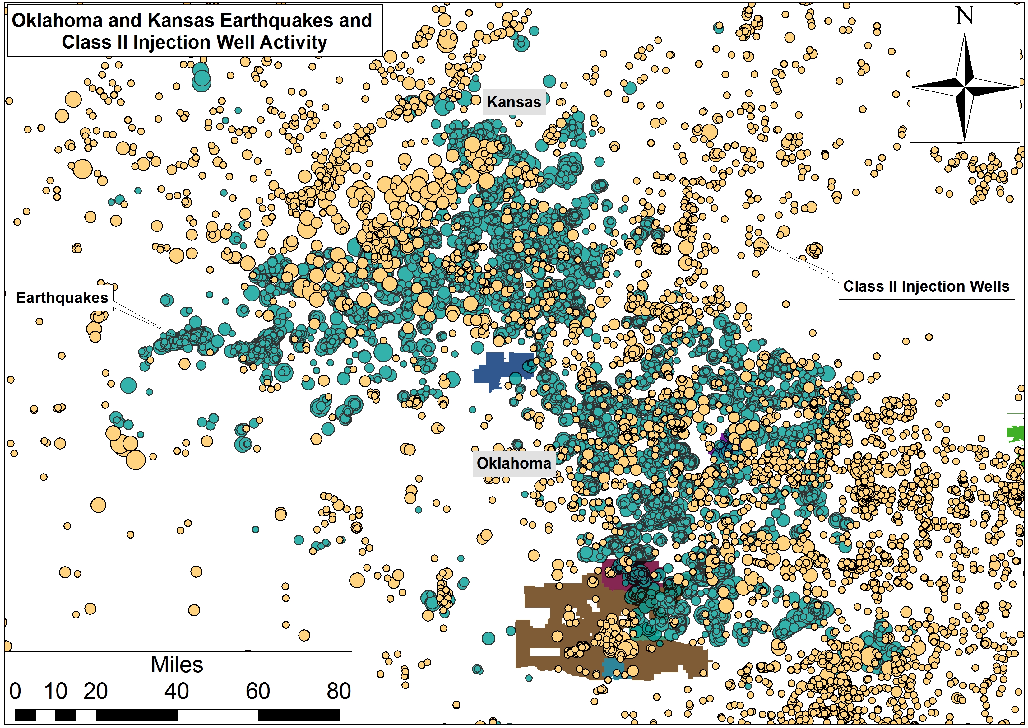
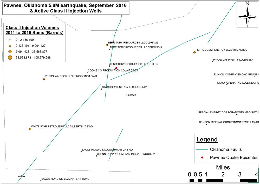
This first map focuses on the September, 2016 Pawnee, OK Magnitude 5.8 earthquake that many people believe was caused by injecting high volume hydraulic fracturing (HVHF) waste into class II injection wells in Oklahoma and Kansas. This map includes all Oklahoma and Kansas Class II injection wells as well as Oklahoma’s primary geologic faults and fractures.
Oklahoma and Kansas Class II injection wells and geologic faults
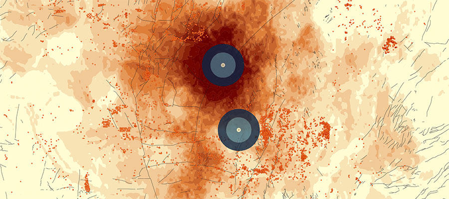
Figure 4. The September, 2016 Pawnee, Oklahoma 5.8M earthquake, neighboring active Class II injection wells, underlying geologic faults and fractures.
Of note on this map is the geological connectivity across Oklahoma resulting from the state’s 129 faults and fractures. Also present are several high volume wells including Territory Resources LLC’s Oldham #5 (1.45 miles from the epicenter, injecting 257 million gallons between 2011 and 2014) and Doyle #5 wells (0.36 miles from the epicenter, injecting 61 million gallons between 2011 and 2015), Staghorn Energy LLC’s Hudgins #1 well (1.43 miles from the epicenter, injecting 11 million gallons between 2011 and 2015 into the Red Fork formation), and Cooke Co Production Co.’s Laird #3-35 well (1.41 miles from the epicenter, injecting 6.5 million gallons between 2011 and 2015). Figure 4 shows a closeup view of these wells relative to the location of the Pawnee quake.
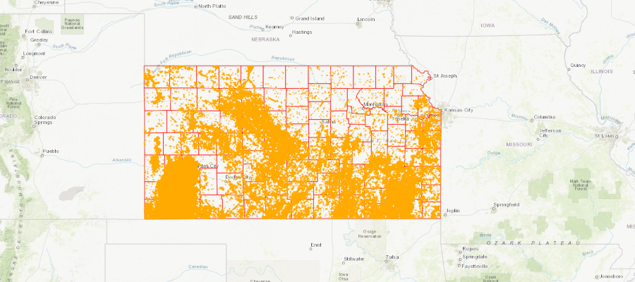
Class II Salt Water Disposal (SWD) Injection Well Volumes
This second map includes annual volumes of disposed wastewater across 10,297 Class II injection wells in Oklahoma between 2011 and 2015 (Note: 2015 volumes also include monthly totals). Additionally, we have included Oklahoma’s geologic faults and fractures for context given the recent uptick in Oklahoma and Kansas’ induced seismicity activity.
Annual volumes of class II injection wells disposal in Oklahoma (2011-2015)
Maximum volume to date (for a single Class II injection well): 105,979,598 barrels, or 4,080,214,523 gallons (68,003,574 gallons per month), for the New Dominion, LLC “Chambers #1” well in Oklahoma County.
Total Volume to Date: 10,655,395,179 barrels or 410,232,714,392 gallons (6,837,211,907 gallons per month).
Mean volume to date across the 10,927 Class II injection wells: approximately 975,144 barrels per well or 37,543,044 gallons (625,717 gallons per month).
This map also includes 632 Class II wells injecting waste into the Arbuckle Formation which is believed to be the primary geological formation responsible for the 5.0 magnitude last week in Cushing.
Below is an inventory of monthly oil and gas waste volumes (barrels) disposed across 4,555 Class II injection wells in Kansas between 2011 and 2015. This map will be updated in the Spring of 2017 to include 2016 volumes. A preponderance of this data comes from 2015 with a scattering of volume reports across Kansas between 2011 and 2014.
Monthly Class II injection wells volumes in Kansas (2011-2015)
Maximum volume to date (for a single Class II injection well): 9,016,471 barrels, or 347,134,134 gallons (28,927,845 gallons per month), for the Sinclair Prairie Oil Co. “H.J. Vohs #8” well in Rooks County. This is a well that was initially permitted and completed between 1949 and 1950.
Total Volume to date: 1,060,123,330 barrels or 40,814,748,205 gallons (3,401,229,017 gallons per month).
Mean volume to date across the 4,555 Class II injection wells: approximately 232,738 barrels per well or 8,960,413 gallons (746,701 gallons per month).
Table 1. Summary of Class II SWD Injection Well Volumes across Kansas and Oklahoma
Sum
Average
Maximum
No. of Class II
SWD Wells
Barrels
Sum To Date
Per Year
Sum To Date
Per Year
Kansas*
4,555
1.06 BB
232,738
…
9.02 MB
…
Oklahoma**
10,927
10.66 BB
975,143
195,029
105.98 MB
21.20 MB
* Wells in the counties of Barton (279 wells), Ellis (397 wells), Rooks (220 wells), Russell (199 wells), and Ness (187 wells) account for 29% of Kansas’ active Class II wells.
** Wells in the counties of Carter (1,792 wells), Creek (946 wells), Pontotoc (684 wells), Seminole (476 wells), and Stephens (1,302 wells) account for 48% of Oklahoma’s active Class II wells.
Conclusion
If the U.S. EPA’s Underground Injection Control (UIC) estimates are to be believed, the above Class II volumes account for 19.3% of the “over 2 billion gallons of brine…injected in the United States every day,” and if the connectivity between injection well associated induced seismicity and oil transport/storage continues to grow, this issue will likely impact the lives of every American.
Given how critical the Cushing Hub is to US energy security and price stability one could easily argue that a major accident there could result in a sudden disruption to fuel supplies and an exponential increase in “prices at the pump” that would make the 240% late 1970s Energy Crisis spike look like a mere blip on the radar. The days of $4.15 per gallon prices the country experienced in the summer of 2008 would again become a reality.
In sum, the risks posed by Class II injection wells and are not just a problem for insurance companies and residents of rural Oklahomans and Kansans, induced seismic activity is a potential threat to our nation’s security and economy.
[1] To learn more about Induced Seismicity read an exclusive FracTracker two-part series from former VTSO researcher Ariel Conn: Part I and Part II. Additionally, the USGS has created an Induced Earthquakes landing page as part of their Earthquake Hazards Program.
https://www.fractracker.org/a5ej20sjfwe/wp-content/uploads/2016/11/OK_KS_InjectionWellVolumes_header.jpg400900Ted Auch, PhDhttps://www.fractracker.org/a5ej20sjfwe/wp-content/uploads/2025/09/2025-Wordmark-Logo.pngTed Auch, PhD2016-12-21 09:00:152021-04-15 15:04:18Oklahoma and Kansas Class II Injection Wells and Earthquakes
 Sarah Jessie Liez, FracTracker Alliance, 2024