https://www.fractracker.org/a5ej20sjfwe/wp-content/uploads/2026/03/Shell-Polymers-Data-Tool-Graphics.png6281200Guest Authorhttps://www.fractracker.org/a5ej20sjfwe/wp-content/uploads/2025/09/2025-Wordmark-Logo.pngGuest Author2026-03-27 15:56:232026-05-07 18:39:05FracTracker’s New Data Tool Visualizes Shell’s Pollution, Violations, and Malfunctions Ahead of Permit Public Hearing (copy)
In February 2014, the FracTracker Alliance produced our first version of a national well data file and map, showing over 1.1 million active oil and gas wells in the United States. We have now updated that data, with the total of wells up to 1,666,715 active wells accounted for.
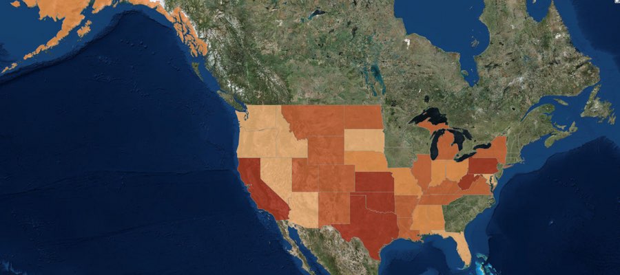
Density by state of active oil and gas wells in the United States. Click here to access the legend, details, and full map controls. Zoom in to see summaries by county, and zoom in further to see individual well data. Texas contains state and county totals only, and North Carolina is not included in this map.
While 1.7 million wells is a substantial increase over last year’s total of 1.1 million, it is mostly attributable to differences in how we counted wells this time around, and should not be interpreted as a huge increase in activity over the past 15 months or so. Last year, we attempted to capture those wells that seemed to be producing oil and gas, or about ready to produce. This year, we took a more inclusive definition. Primarily, the additional half-million wells can be accounted for by including wells listed as dry holes, and the inclusion of more types of injection wells. Basically anything with an API number that was not described as permanently plugged was included this time around.
Data for North Carolina are not included, because they did not respond to three email inquiries about their oil and gas data. However, in last year’s national map aggregation, we were told that there were only two active wells in the state. Similarly, we do not have individual well data for Texas, and we use a published list of well counts by county in its place. Last year, we assumed that because there was a charge for the dataset, we would be unable to republish well data. In discussions with the Railroad Commission, we have learned that the data can in fact be republished. However, technical difficulties with their datasets persist, and data that we have purchased lacked location values, despite metadata suggesting that it would be included. So in short, we still don’t have Texas well data, even though it is technically available.
Wells by Type and Status
Each state is responsible for what their oil and gas data looks like, so a simple analysis of something as ostensibly straightforward as what type of well has been drilled can be surprisingly complicated when looking across state lines. Additionally, some states combine the well type and well status into a single data field, making comparisons even more opaque.
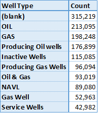
Top 10 of 371 published well types for wells in the United States.
Among all of the oil producing states, there are 371 different published well types. This data is “raw,” meaning that no effort has been made to combine similar entries, so “gas, oil” is counted separately from “GAS OIL,” and “Bad Data” has not been combined with “N/A,” either. Conforming data from different sources is an exercise that gets out of hand rather quickly, and utility over using the original published data is questionable, as well. We share this information, primarily to demonstrate the messy state of the data. Many states combine their well type and well status data into a single column, while others keep them separate. Unfortunately, the most frequent well type was blank, either because states did not publish well types, or they did not publish them for all of their wells.
There are no national standards for publishing oil and gas data – a serious barrier to data transparency and the most important takeaway from this exercise…
Wells by Location
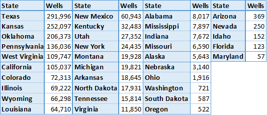
Active oil and gas wells in 2015 by state. Except for Texas, all data were aggregated published well coordinates.
There are oil and gas wells in 35 of the 50 states (70%) in the United States, and 1,673 out of 3,144 (53%) of all county and county equivalent areas. The number of wells per state ranges from 57 in Maryland to 291,996 in Texas. There are 135 counties with a single well, while the highest count is in Kern County, California, host to 77,497 active wells.
With the exception of Texas, where the data are based on published lists of well county by county, the state and county well counts were determined by the location of the well coordinates. Because of this, any errors in the original well’s location data could lead to mistakes in the state and county summary files. Any wells that are offshore are not included, either. Altogether, there are about 6,000 wells (0.4%) are missing from the state and county files.
Wells by Operator
There are a staggering number of oil and gas operators in the United States. In a recent project with the National Resources Defense Council, we looked at violations across the few states that publish such data, and only for the 68 operators that were identified previously as having the largest lease acreage nationwide. Even for this task, we had to follow a spreadsheet of which companies were subsidiaries of others, and sometimes the inclusion of an entity like “Williams” on the list came down to a judgement call as to whether we had the correct company or not.
No such effort was undertaken for this analysis. So in Pennsylvania, wells drilled by the operator Exco Resources PA, Inc. are not included with those drilled by Exco Resources PA, Llc., even though they are presumably the same entity. It just isn’t feasible to systematically go through thousands of operators to determine which operators are owned by whom, so we left the data as is. Results, therefore, should be taken with a brine truck’s worth of salt.
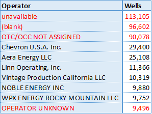
Top 10 wells by operator in the US, excluding Texas. Unknown operators are highlighted in red.
Texas does publish wells by operator, but as with so much of their data, it’s just not worth the effort that it takes to process it. First, they process it into thirteen different files, then publish it in PDF format, requiring special software to convert the data to spreadsheet format. Suffice to say, there are thousands of operators of active oil and gas wells in the Lone Star State.
Not counting Texas, there are 39,693 different operators listed in the United States. However, many of those listed are some version of “we don’t know whose well this is.” Sorting the operators by the number of wells that they are listed as having, we see four of the top ten operators are in fact unknown, including the top three positions.
Summary
The state of oil and gas data in the United States is clearly in shambles. As long as there are no national standards for data transparency, we can expect this trend to continue. The data that we looked for in this file is what we consider to be bare bones: well name, well type, well status, slant (directional, vertical, or horizontal), operator, and location. In none of these categories can we say that we have a satisfactory sense of what is going on nationally.
Click on the above button to download the three sets of data we used to make the dynamic map (once you are zoomed in to a state level). The full dataset was broken into three parts due to the large file sizes.
https://www.fractracker.org/a5ej20sjfwe/wp-content/uploads/2015/08/2015Update-Feature.jpg400900Matt Kelso, BAhttps://www.fractracker.org/a5ej20sjfwe/wp-content/uploads/2025/09/2025-Wordmark-Logo.pngMatt Kelso, BA2015-08-03 14:19:532020-07-21 10:30:051.7 Million Wells in the U.S. – A 2015 Update
This article was originally posted on 10 July 2015, and then updated on 22 January 2016 and 16 February 2016.
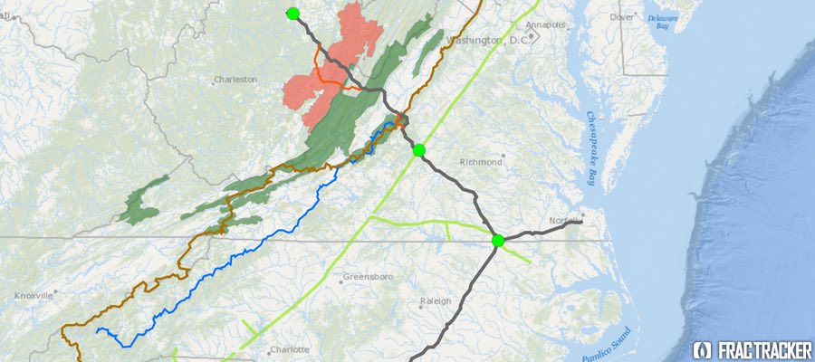
Proposed Pipeline to Funnel Marcellus Gas South
In early fall 2014, Dominion Energy proposed a $5 billion pipeline project, designed provide “clean-burning gas supplies to growing markets in Virginia and North Carolina.” Originally named the “Southeast Reliability Project,” the proposed pipeline would have a 42-inch diameter in West Virginia and Virginia. It would narrow to 36 inches in North Carolina, and narrow again to 20 inches in the portion that would extend to the coast at Hampton Roads. Moving 1.5 billion cubic feet per day of gas, with a maximum allowable operating pressure of 1440 psig (pounds per square inch gage), the pipeline would be designed for larger customers (such as manufacturers and power generators) or local gas distributors supplying homes and businesses to tap into the pipeline along the route, making the pipeline a prime mover for development along its path.
The project was renamed the Atlantic Coast Pipeline (ACP) when a coalition of four major US energy companies—Dominion (45% ownership), Duke Energy (40%), Piedmont Natural Gas (15%), and AGL Resources (5%)— proposed a joint venture in building and co-owning the pipeline. Since then, over 100 energy companies, economic developers, labor unions, manufacturers, and civic groups have joined the new Energy Sure Coalition, supporting the ACP. The coalition asserts that the pipeline is essential because the demand for fuel for power generation is predicted more than triple over the next 20 years. Their website touts the pipeline as a “Path to Cleaner Energy,” and suggests that the project will generate significant tax revenue for Virginia, North Carolina, and West Virginia.
Lew Ebert, president of the North Carolina Chamber of Commerce, optimistically commented:
Having the ability to bring low-cost, affordable, predictable energy to a part of the state that’s desperately in need of it is a big deal. The opportunity to bring a new kind of energy to a part of the state that has really struggled over decades is a real economic plus.
Unlike older pipelines, which were designed to move oil and gas from the Gulf Coast refineries northward to meet energy demands there, the Atlantic Coast Pipeline would tap the Marcellus Shale Formation in Ohio, West Virginia and Pennsylvania and send it south to fuel power generation stations and residential customers. Dominion characterizes the need for natural gas in these parts of the country as “urgent,” and that there is no better supplier than these “four homegrown companies” that have been economic forces in the state for many years.
In addition to the 550 miles of proposed pipeline for this project, three compressor stations are also planned. One would be at the beginning of the pipeline in West Virginia, a second midway in County Virginia, and the third near the Virginia-North Carolina state line. The compressor stations are located along the proposed pipeline, adjacent to the Transcontinental Pipeline, which stretches more than 1,800 miles from Pennsylvania and the New York City Area to locations along the Gulf of Mexico, as far south as Brownsville, TX.
In mid-May 2015, in order to avoid requesting Congressional approval to locate the pipeline over National Park Service lands, Dominion proposed rerouting two sections of the pipeline, combining the impact zones on both the Blue Ridge Parkway and the Appalachian Trail into a single location along the border of Nelson and Augusta Counties, VA. National Forest Service land does not require as strict of approvals as would construction on National Park Service lands. Dominion noted that over 80% of the pipeline route has already been surveyed.
Opposition to the Pipeline on Many Fronts
The path of the proposed pipeline crosses topography that is well known for its karst geology feature—underground caverns that are continuous with groundwater supplies. Environmentalists have been vocal in their concern that were part of the pipeline to rupture, groundwater contamination, along with impacts to wildlife could be extensive. In Nelson County, VA, alone, 70% of the property owners in the path of the proposed pipeline have refused Dominion access for survey, asserting that Dominion has been unresponsive to their concerns about environmental and cultural impacts of the project.
On the grassroots front, 38 conservation and environmental groups in Virginia and West Virginia have combined efforts to oppose the ACP. The group, called the Allegany-Blue Ridge Alliance (ABRA), cites among its primary concerns the ecologically-sensitive habitats the proposed pipeline would cross, including over 49.5 miles of the George Washington and Monongahela State Forests in Virginia and West Virginia. The “alternative” version of the pipeline route would traverse 62.7 miles of the same State Forests. Scenic routes, including the Blue Ridge Parkway and the Appalachian Scenic Trail would also be impacted. In addition, it would pose negative impacts on many rural communities but not offset these impacts with any longer-term economic benefits. ABRA is urging for a programmatic environmental impact statement (PEIS) to assess the full impact of the pipeline, and also evaluate “all reasonable, less damaging” alternatives. Importantly, ABRA is urging for a review that explores the cumulative impacts off all pipeline infrastructure projects in the area, especially in light of the increasing availability of clean energy alternatives.
Environmental and political opposition to the pipeline has been strong, especially in western Virginia. Friends of Nelson, based in Nelson County, VA, has taken issue with the impacts posed by the 150-foot-wide easement necessary for the pipeline, as well as the shortage of Department of Environmental Quality staff that would be necessary to oversee a project of this magnitude.
Do gas reserves justify this project?
Dominion, an informational flyer, put forward an interesting argument about why gas pipelines are a more environmentally desirable alternative to green energy:
If all of the natural gas that would flow through the Atlantic Coast Pipeline is used to generate electricity, the 1.5 billion cubic feet per day (bcf/d) would yield approximately 190,500 megawatt-hours per day (mwh/d) of electricity. The pipeline, once operational, would affect approximately 4,600 acres of land. To generate that much electricity with wind turbines, utilities would need approximately 46,500 wind turbines on approximately 476,000 acres of land. To generate that much electricity with solar farms, utilities would need approximately 1.7 million acres of land dedicated to solar power generation.
Nonetheless, researchers, as well as environmental groups, have questioned whether the logic is sound, given production in both the Marcellus and Utica Formations is dropping off in recent assessments.
Both Nature, in their article Natural Gas: The Fracking Fallacy, and Post Carbon Institute, in their paper Drilling Deeper, took a critical look at several of the current production scenarios for the Marcellus Shale offered by EIA and University of Texas Bureau of Economic Geology (UT/BEG). All estimates show a decline in production over current levels. The University of Texas report, authored by petroleum geologists, is considerably less optimistic than what has been suggested by the Energy Information Administration (EIA), and imply that the oil and gas bubble is likely to soon burst.
Natural Gas Production Projections for Marcellus Shale
David Hughes, author of the Drilling Deeper report, summarized some of his findings on Marcellus productivity:
Field decline averages 32% per year without drilling, requiring about 1,000 wells per year in Pennsylvania and West Virginia to offset.
Core counties occupy a relatively small proportion of the total play area and are the current focus of drilling.
Average well productivity in most counties is increasing as operators apply better technology and focus drilling on sweet spots.
Production in the “most likely” drilling rate case is likely to peak by 2018 at 25% above the levels in mid-2014 and will cumulatively produce the quantity that the Energy Information Administration (EIA) projected through 2040. However, production levels will be higher in early years and lower in later years than the EIA projected, which is critical information for ongoing infrastructure development plans.
Five out of more than 70 counties account for two-thirds of production. Eighty-five percent of production is from Pennsylvania, 15% from West Virginia and very small amounts from Ohio and New York. (The EIA has published maps of the depth, thickness and distribution of the Marcellus shale, which are helpful in understanding the variability of the play.)
The increase in well productivity over time reported in Drilling Deeper has now peaked in several of the top counties and is declining. This means that better technology is no longer increasing average well productivity in these counties, a result of either drilling in poorer locations and/or well interference resulting in one well cannibalizing another well’s recoverable gas. This declining well productivity is significant, yet expected, as top counties become saturated with wells and will degrade the economics which have allowed operators to sell into Appalachian gas hubs at a significant discount to Henry hub gas prices.
The backlog of wells awaiting completion (aka “fracklog”) was reduced from nearly a thousand wells in early 2012 to very few in mid-2013, but has increased to more than 500 in late 2014. This means there is a cushion of wells waiting on completion which can maintain or increase overall play production as they are connected, even if the rig count drops further.
Current drilling rates are sufficient to keep Marcellus production growing on track for its projected 2018 peak (“most likely” case in Drilling Deeper).
Post Carbon Institute estimates that Marcellus predictions overstate actual production by 45-142%. Regardless of the model we consider, production starts to drop off within a year or two after the proposed Atlantic Coast Pipeline would go into operation. This downward trend leads to some serious questions about whether moving ahead with the assumption of three-fold demand for gas along the Carolina coast should prompt some larger planning questions, and whether the availability of recoverable Marcellus gas over the next twenty years, as well as the environmental impacts of the Atlantic Coast Pipeline, justify its construction.
Next steps
The Federal Energy Regulatory Commission, FERC, will make a final approval on the pipeline route later in the summer of 2015, with a final decision on the pipeline construction itself expected by fall 2016.
UPDATE #1: On January 19, 2016, the Richmond Times-Dispatch reported that the United States Forest Service had rejected the pipeline, due to the impact its route would have on habitats of sensitive animal species living in the two National Forests it is proposed to traverse.
UPDATE #2: On February 12, 2016, Dominion Pipeline Company released a new map showing an alternative route to the one recently rejected by the United States Forest Service a month earlier. Stridently condemned by the Dominion Pipeline Monitoring Coalition as an “irresponsible undertaking”, the new route would not only cross terrain the Dominion had previously rejected as too hazardous for pipeline construction, it would–in avoiding a path through Cheat and Shenandoah Mountains–impact terrain known for its ecologically sensitive karst topography, and pose grave risks to water quality and soil erosion.
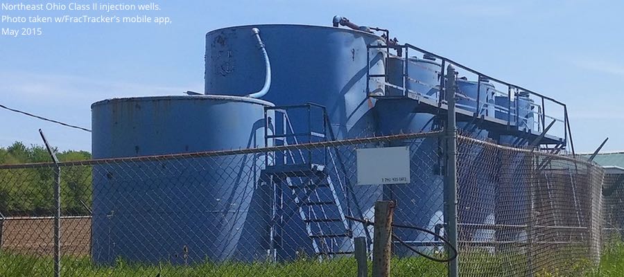
Waste disposal is an issue that causes quite a bit of consternation even amongst those that are pro-fracking. The disposal of fracking waste into injection wells has exposed many “hidden geologic faults” across the US as a result of induced seismicity, and it has been linked recently with increases in earthquake activity in states like Arkansas, Kansas, Texas, and Ohio. Here in OH there is growing evidence – from Ashtabula to Washington counties – that injection well volumes and quarterly rates of change are related to upticks in seismic activity.
Origins of Fracking Waste
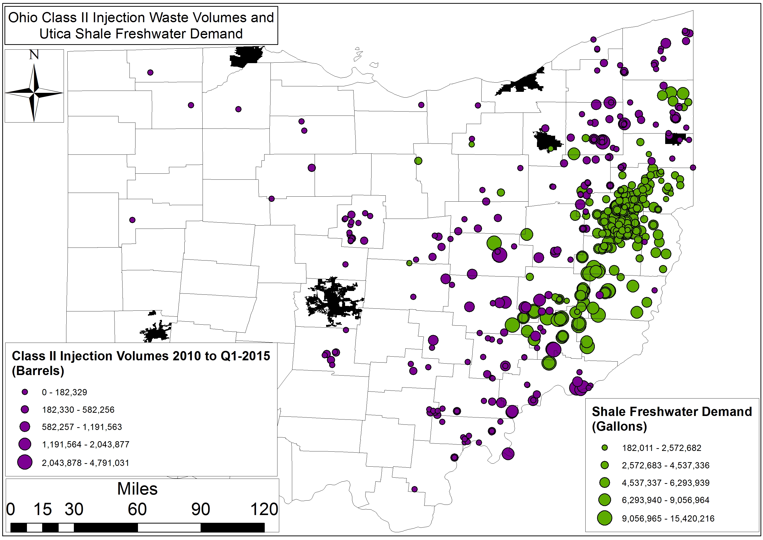
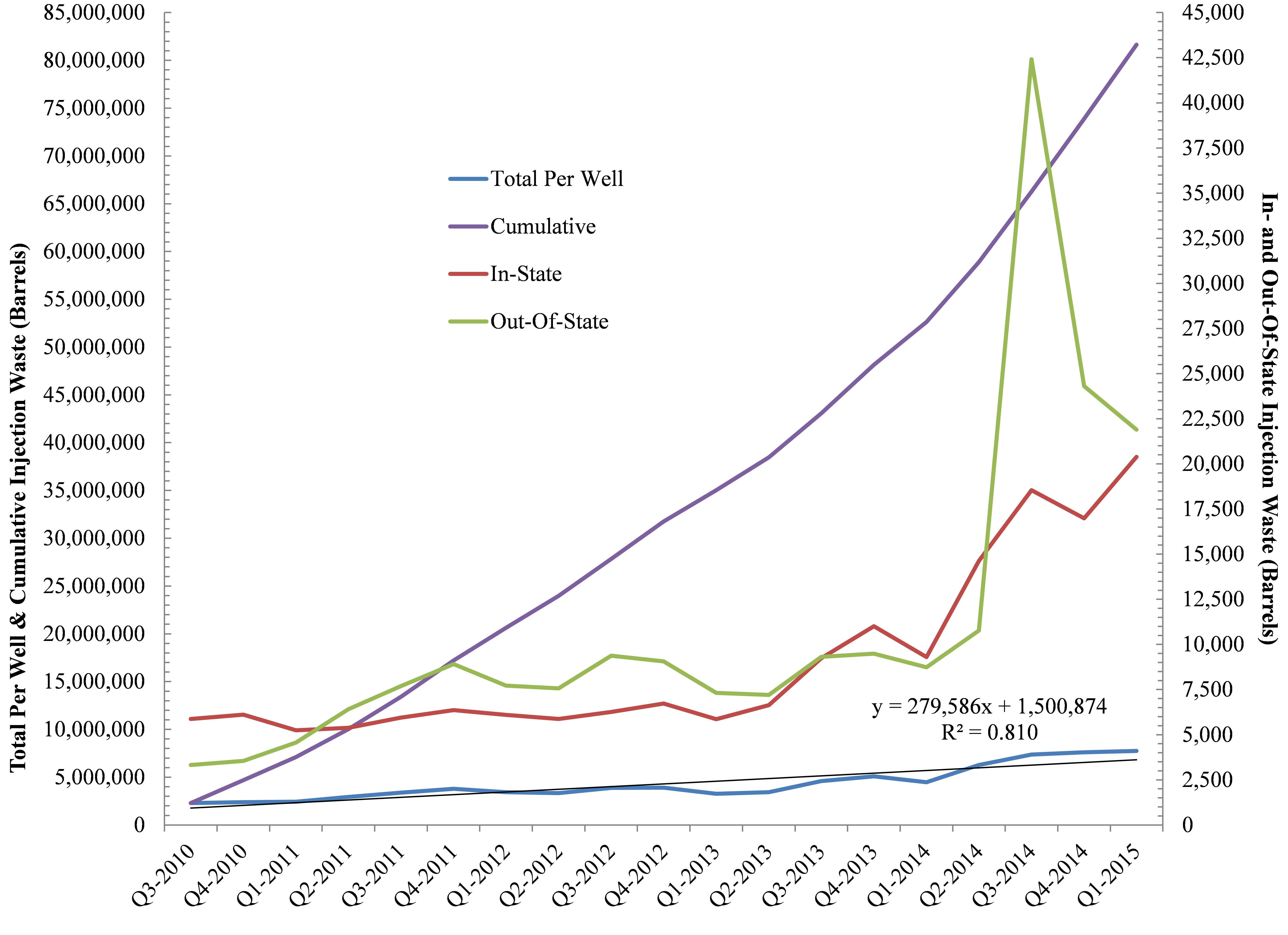
Furthermore, as part of this analysis we wanted to understand the ratio of Ohio’s Class II waste that has come from within Ohio and the proportion of waste originating from neighboring states such as West Virginia and Pennsylvania. Out of 960 Utica laterals and 245+ Class II wells, the results speak to the fact that a preponderance of the waste is coming from outside Ohio with out-of-state shale development accounting for ≈90% of the state’s hydraulic fracturing brine stream to-date. However, more recently the tables have turned with in-state waste increasing by 4,202 barrels per quarter per well (BPQPW). Out-of-state waste is only increasing by 1,112 BPQPW. Such a change stands in sharp contrast to our August 2013 analysis that spoke to 471 and 723 BPQPW rates of change for In- and Out-Of-State, respectively.
Brine Production
Figure 1. Ohio Class II Injection Well trends In- and Out-Of-State, Cumulatively, and on Per Well basis (n = 248).
For every gallon of freshwater used in the fracking process here in Ohio the industry is generating .03 gallons of brine (On average, Ohio’s 758 Utica wells use 6.88 million gallons of freshwater and produce 225,883 gallons of brine per well).
Back in August of 2013 the rate at which brine volumes were increasing was approaching 150,000 BPQPW (Learn more, Fig 5), however, that number has nearly doubled to +279,586 BPQPW (Note: 1 barrel of brine equals 32-42 gallons). Furthermore, Ohio’s Class II Injection wells are averaging 37,301 BPQPW (1.6 MGs) per quarter over the last year vs. 12,926 barrels BPQPW – all of this between the initiation of frack waste injection in 2010 and our last analysis up to and including Q2-2013. Finally, between Q3-2010 and Q1-2015 the exponential increase in injection activity has resulted in a total of 81.7 million barrels (2.6-3.4 billion gallons) of waste disposed of here in Ohio. From a dollars and cents perspective this waste has generated $2.5 million in revenue for the state or 00.01% of the average state budget (Note: 2.5% of ODNR’s annual budget).
Freshwater Demand Growing
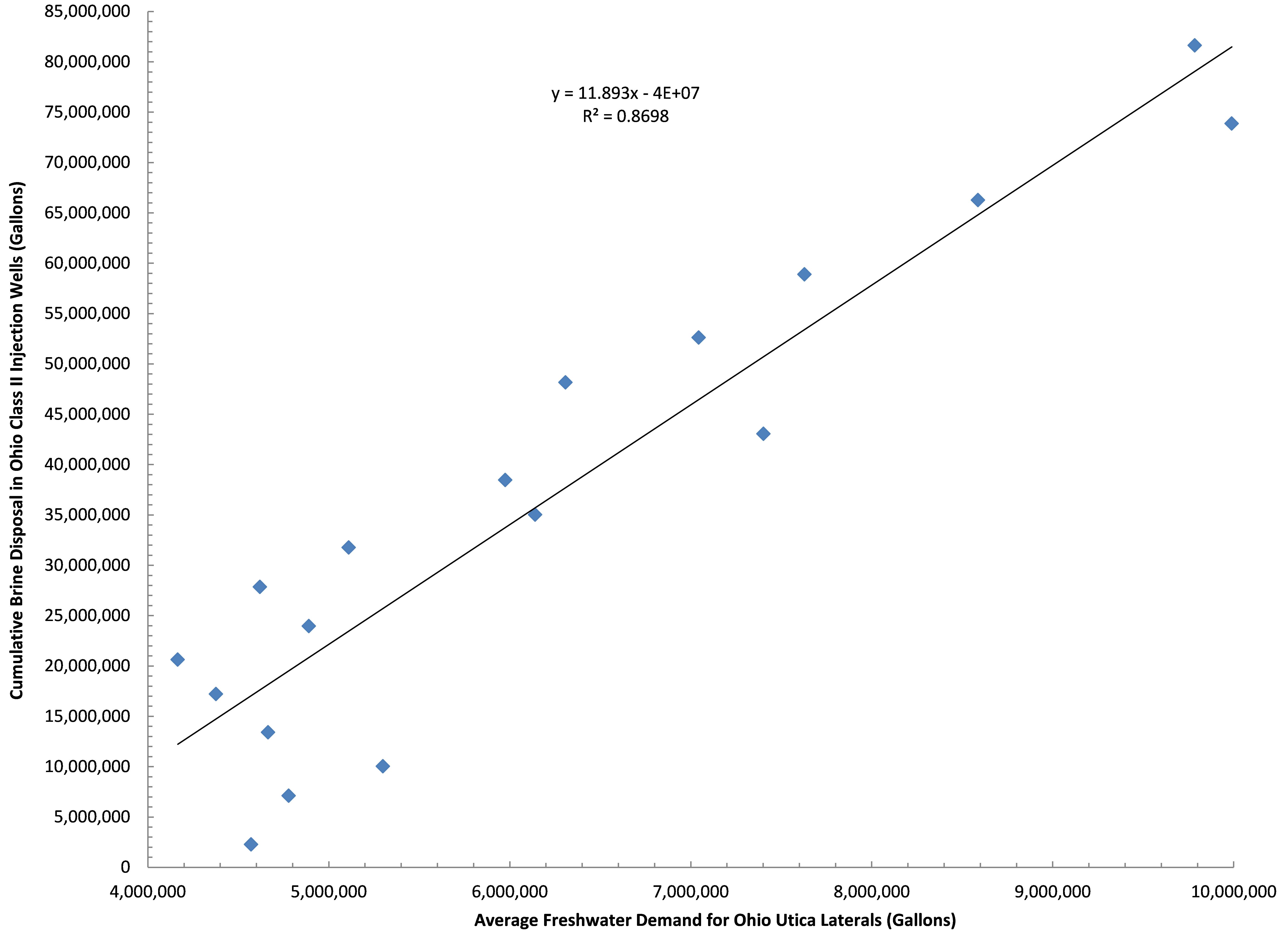
Figure 2. Ohio Class II Injection Well disposal as a function of freshwater demand by the shale industry in Ohio between Q3-2010 and Q1-2015.
The relationship between brine (waste) produced and freshwater needed by the hydraulic fracturing industry is an interesting one; average freshwater demand during the fracking process accounts for 87% of the trend in brine disposal here in Ohio (Fig. 2). The more water used, the more waste produced. Additionally, the demand for OH freshwater is growing to the tune of 405-410,000 gallons PQPW, which means brine production is growing by roughly 12,000 gallons PQPW. This says nothing for the 450,000 gallons of freshwater PQPW increase in West Virginia and their likely demand for injection sites that can accommodate their 13,500 gallons PQPW increase.
Where will all this waste go? I’ll give you two guesses, and the first one doesn’t count given that in the last month the ODNR has issued 7 new injection well permits with 9 pending according to the Center For Health and Environmental Justice’s Teresa Mills.
https://www.fractracker.org/a5ej20sjfwe/wp-content/uploads/2015/07/Injection-Feature.jpg400900Ted Auch, PhDhttps://www.fractracker.org/a5ej20sjfwe/wp-content/uploads/2025/09/2025-Wordmark-Logo.pngTed Auch, PhD2015-07-09 14:54:002020-07-21 10:30:05OH Class II Injection Wells – Waste Disposal and Industry Water Demand
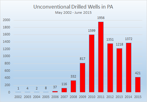
Figure 1: Newly drilled unconventional wells in Pennsylvania peaked in 2011.
Unconventional oil and gas drilling is well established in Pennsylvania, with over 9,200 drilled wells, an additional 7,200 permitted locations that have not yet been drilled, and 5,300 violations all happening since the turn of the millennium. It took a while for the industry to gather steam, with just one unconventional well drilled in 2002, and only eight in 2005. But by 2010, that figure had ballooned to 1,599 wells, which was greater than the previous eight years combined. There were 1,956 wells drilled in 2011, representing the peak for unconventional drilling activity in Pennsylvania (Figure 1).
None of the three full years since then, however, have seen more than 70% of the 2011 total. Halfway through 2015, the industry is on pace to drill only 842 unconventional wells statewide, which would be the lowest total since 2009, and only 43% of the 2011 total.
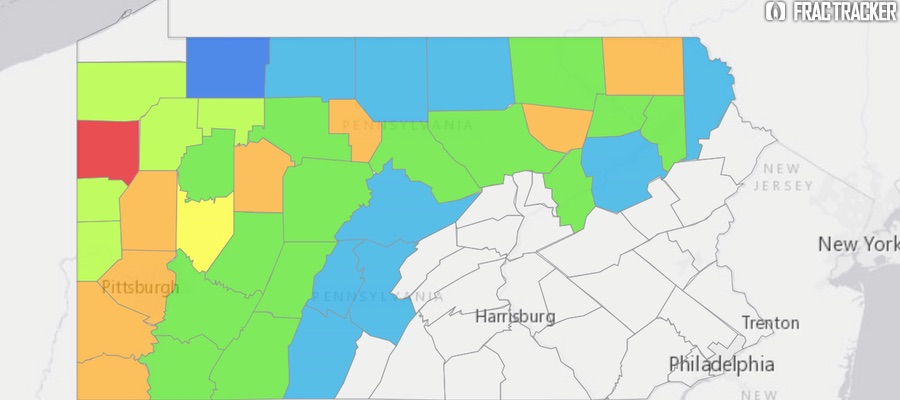
Pennsylvania Shale Viewer. Click here to access the full screen view with a legend, layer details, and other tools.
Taken cumulatively, the footprint on the state is immense, as is shown in the map above, and impacts remain for some time. Of Pennsylvania’s 9,234 unconventional wells 8,187 (89%) are still active. Only 474 wells have been permanently plugged so far, with 570 given an inactive status, and one well listed as “proposed but never materialized,” despite being included on the spud report.
Permits & Violations
The number of permits and violations issued have been declining over the past five years as well.
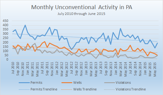
Figure 2: Five years of unconventional oil and gas activity in Pennsylvania, July 2010 through June 2015.
Figure 2 shows the monthly totals of permits, wells, and violations over the last 60 months. Linear trendlines were added to the chart to give a visual representation of changes over time if we ignore the noise of the peaks and troughs of activity, which is an inherent attribute of the industry. Each of the three trendlines has a negative slope1, showing downward trends in each category.
In fact, permits for new wells are declining more rapidly than the drilled wells, and violations issued are declining at a still faster rate. Over the course of five years, these declines are substantial. In July 2010, the smoothed totals that are “predicted” by the trendline show 304 permits issued, 159 wells drilled, and 128 violations issued per month. 60 months later, one would expect 213 permits, 81 wells drilled, and just 12 violations issued2.
Location of Drilling Activity
The oil and gas industry has been more selective about where unconventional wells are being drilled in recent years, as well. Altogether, there are unconventional wells in 39 different counties, with 32 counties seeing action in both 2010 and 2011. That number is down to 22 for both 2014 and the first half of 2015. There has been drilling in 443 different municipalities since 2002, with a maximum of 241 municipal regions in 2011, which shrank to 161 last year, and just 88 in the first half of 2015.
Summary of unconventional wells drilled in each Pennsylvania county by year, through June 30, 2015. Click here to access the full screen view with a legend, layer details, and other tools
Clicking on any of the counties above will show the number of unconventional wells drilled in that county by year since the first unconventional well was spudded in Pennsylvania back in 2002. The color scheme shows the year that the maximum number of unconventional wells were drilled in each county, with blues, greens, and yellows showing counties where the activity has already peaked, oranges showing a peak in 2014, and red showing a peak in 2015, despite only six months of activity. 30 of the 39 counties with unconventional wells in the state saw a peak in activity in 2013 or before.
Notes
The equations for the three trendlines are as follows:
Permits: y = -1.5128x + 303.81
Wells: y = -1.2939x + 158.95
Violations: y = -1.9334x + 127.53
The lowest actual value for each category are as follows:
Permits: 117, in July 2012
Wells: 43, in February 2015
Violations: 16, in August 2014.
https://www.fractracker.org/a5ej20sjfwe/wp-content/uploads/2015/07/PA-Down-Feature.jpg400900Matt Kelso, BAhttps://www.fractracker.org/a5ej20sjfwe/wp-content/uploads/2025/09/2025-Wordmark-Logo.pngMatt Kelso, BA2015-07-08 14:44:562020-07-21 10:30:04Unconventional Drilling Activity Down In Pennsylvania
Sea otters, an endangered keystone species, are at risk due to offshore oil and gas drilling spills. Along the west coast of the U.S., this marine mammal’s habitat is commonly near offshore drilling sites, specifically in California and Alaska.
Sea Otters – a Keystone Species
Sea otter numbers used to range from several hundred thousand to more than a million. Today, there are estimated to be just over 106,000 in existence worldwide, with fewer than 3,000 living in California. Their habitats range from Canada, Russia, Japan, California and Washington, but the majority of all wild sea otters are found in Alaskan waters.
Sea otters play a significant role in their local environments, and a much greater ecosystem role than any other species in their habitat area. Sea otters are predators, critical to maintaining the balance of the near-shore kelp ecosystems, and are referred to as keystone species. Without this balancing act, coastal kelp forests in California would be devoured by other aquatic life. Sea otter predation helps to ensure that the kelp community continues to provide cover and food for many of the marine animals. Additionally, kelp plays a tremendous role in capturing carbon in the coastal ecosystems. In that sense, sea otters also inadvertently help to reduce levels of atmospheric carbon dioxide.
Oil Spills and their Health Implications
Recently, Alaska and California, home to a wide variety of marine life, have been popular areas for offshore oil and gas drilling, which may include the use of fracking to extract hydrocarbons. Oil spills are a great concern for the sea otter; unlike other marine animals that may be able to eventually rid themselves of the oil, contact with the oil causes the sea otters fur to mat, preventing insulation, which can lead to hypothermia. Additionally, the ingestion of toxic oil chemicals while cleansing their fur can cause liver and kidney failure, as well as severe damage to their lungs and eyes.
Because their numbers are low and their geographic location area is rather small compared to other sea otter populations, the California sea otter is especially vulnerable, and could be devastated by oil contamination.
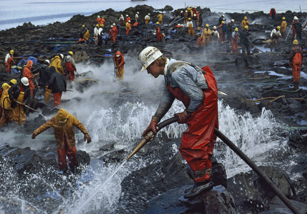
Prince William Sound, Alaska
Exxon Valdez cleanup. Photograph by Natalie Fobes, National Geographic
On March 24, 1989, the tanker vessel Exxon Valdez ran aground on Bligh Reef in Prince William Sound, Alaska, spilling an estimated 42 million liters of Prudhoe Bay crude oil. This incident affected marine life throughout western Prince William Sound, the Gulf of Alaska, and lower Cook Inlet. An estimated 3500–5500 otters from a total population of about 30,000 may have died as a direct result of the oil spill. Oiling and ingestion of oil-contaminated shellfish may have affected reproduction and caused a variety of long-term sublethal effects. Necropsies of sea otter carcasses indicated that most deaths of sea otters were attributed to the oil, and pathologic and histologic changes were associated with oil exposure in the lung, liver, and kidney. Studies of long-term effects indicate that the sea otter population in the Prince William Sound area suffered from chronic effects of oil exposure at least through 1991. While some populations may recover after a spill, it would seem that the threat of oil pollution impacts is intensified for populations in deteriorating habitats and to those that are in decline.
Santa Barbara Coast, California
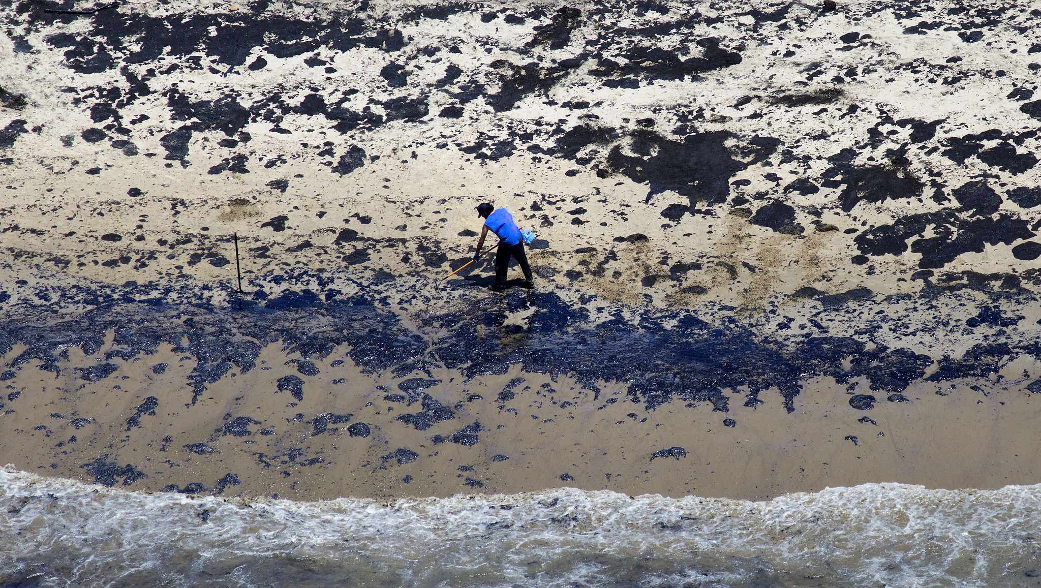
LA Santa Barbara Oil Spill Cleanup – Photo by: Brian van der Brug / Los Angeles Times
On Tuesday, May 19, 2015, a pipeline was found to be leaking into the Santa Barbara Coast in California. This broken pipeline, owned by Plains All American, spilled approximately 105,000 gallons of crude oil into the ocean, according to various news reports, stretching out into a 4-mile radius along the central California coastline.
These waters are home to an array of shore birds, seals, sea lions, otters and whales. Numerous amounts of marine life have been found washed up on the shore, including crabs, octopuses, fish, birds, and dolphins. Elephant seals, sea lions, and other marine wildlife have been taken to Seaworld in San Diego for treatment and recovery.
The Santa Barbara accident occurred on the same stretch of coastline as spill in 1969 that – at the time – was the largest ever incident in U.S. waters and contributed to the rise of the American environmental movement. Several hundred-thousand gallons spilled from a blowout on an oil platform, and thousands of seabirds were killed and numerous ocean wildlife, including sea lions, elephant seals, and fish perished.
Conclusion
Overall, the ocean is home to a great diversity of marine wildlife, all of which are vulnerable to oil contamination. Offshore gas drilling is a significant threat to the survival of sea otters and other marine life, wherein spills and accidents could cause health problems, toxicity, and even death. Oil spills are exceptionally problematic for sea otters, due to the vulnerable state of this animal and its endangered species state. Keeping keystone species healthy is instrumental to maintaining a well flourished ecosystem, while protecting habitats for a large array of marine and wildlife. The potential impacts on CA sea otters and other marine life due to events such as the 2015 oil spill in California should not be taken lightly.
https://www.fractracker.org/a5ej20sjfwe/wp-content/uploads/2015/06/Otter-Feature.jpg400900FracTracker Alliancehttps://www.fractracker.org/a5ej20sjfwe/wp-content/uploads/2025/09/2025-Wordmark-Logo.pngFracTracker Alliance2015-06-30 13:00:062025-05-02 14:45:36Offshore Oil and Gas Drilling: Risks to the Sea Otter
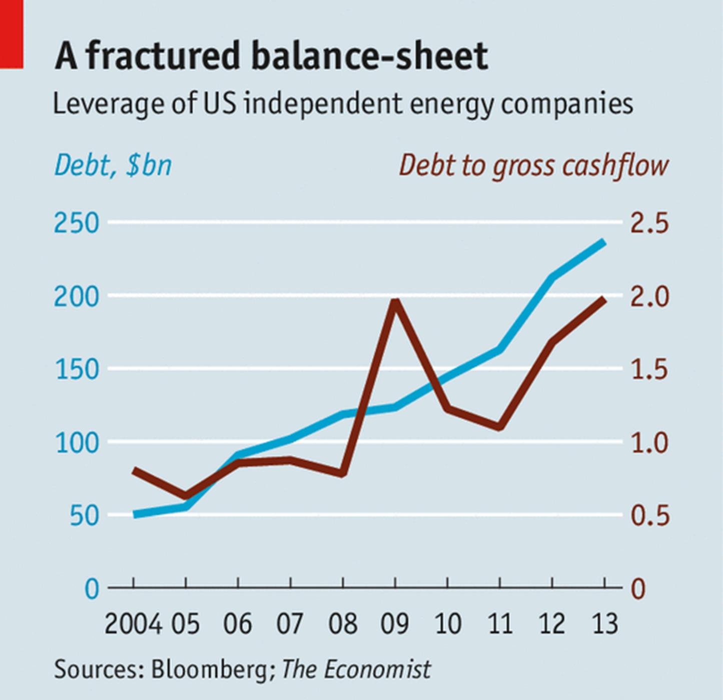
A financial crisis seems to have been averted as the price of crude oil is beginning to stabilize – at least for now. One must wonder how such a volatile market affects oil and gas’ Wall Street, private equity, and pension fund followers, however. We have found that many oil and gas (O&G) shares have experienced steep valuation declines in the last few years for companies operating in Ohio.
Share[d] Values
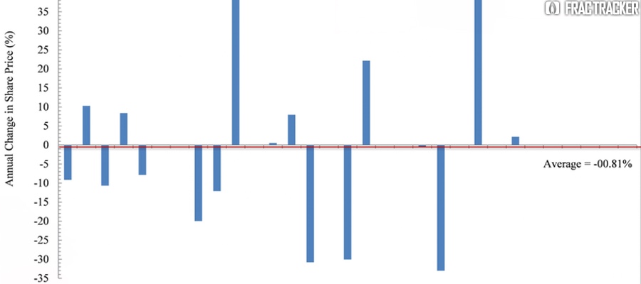
To approach such a broad question, we focused our assessment on Ohio and looked at the share performance of the 17 publicly traded firms operating in the Ohio Utica region since the date of their respective first Utica permits. The Date of First Permit (DFP) ranges between 12/23/2010 for Chesapeake Energy to 3/20/2013 for BP.
Across these 17 companies there are, quite expectedly, winners and losers. On average their shares have experienced 3.75% declines in their valuation or -00.81% per year in the last several years, however. This might be why many of Wall Street and The City’s major banks have limited – or ended – their lines of credit with energy firms from Ohio to the Great Plains. Others are still picking off the highly leveraged losers one by one for pennies on the dollar (Corkery and Eavis, 2015; Staff, 2014). This cutoff of credit and disturbingly high levels of debt/leverage may explain why we found, in a separate analysis, that while cumulative producing oil and gas wells have increased by 349% and 171%, respectively, the rate of permitting needed to maintain and/or incrementally increase these production rates has been 589%.
Cross-Company Comparisons
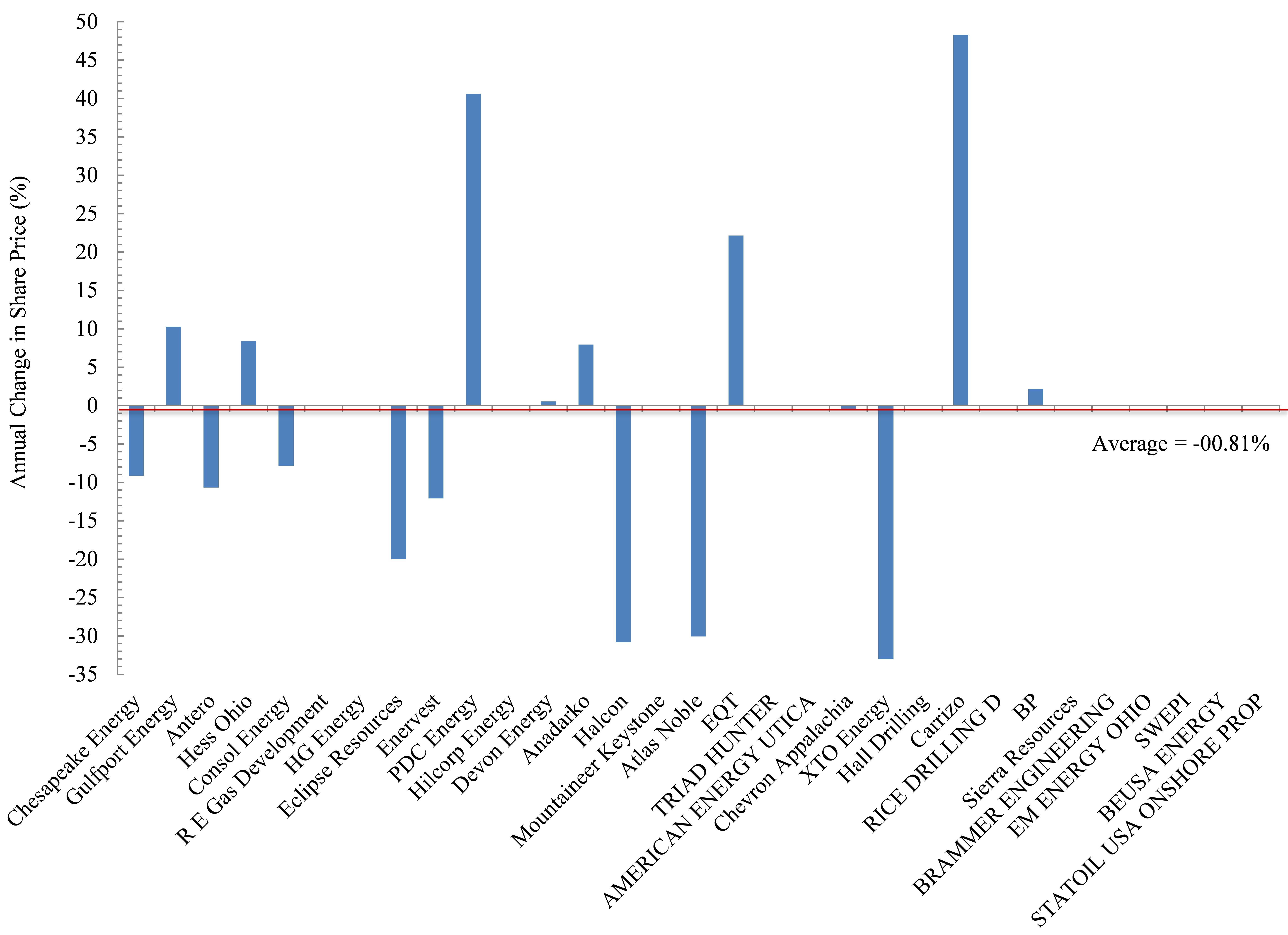
Figure 2. Annual change in share price (%) for 17 publicly traded firms operating in the Ohio Utica shale since their date of first permit
The biggest losers in Ohio’s oil and gas world include Chesapeake Energy. Chesapeake (CHK) is also the largest player in the Buckeye State based on total permits and total producing laterals, accounting for 41% and 55%, respectively. CHK has seen its shares decline on average by 9.1% each year since their DFP (Figure 2). Antero (-10.7% per year), Consol Energy (-7.8%), and Enervest (-12.1%) have experienced similar annual declines, with investors in these firms having seen their position shrink by an average of 37%. Eclipse shares have declined in value by nearly 20% per year, which pales in comparison to the 30-33% annual declines in the share price of Halcon, Atlas Noble, and XTO Energy.
Conversely, the biggest winners are clearly Carrizo (+49% per year), PDC Energy (+41%), and to a lesser degree smaller players like EQT (+22%), Hess Ohio (+8.4%), and Anadarko (+7.9%). Interestingly, the second most active firm operating in Ohio is Gulfport Energy, and their performance has been somewhere in the middle – with annual returns of 10.3%.
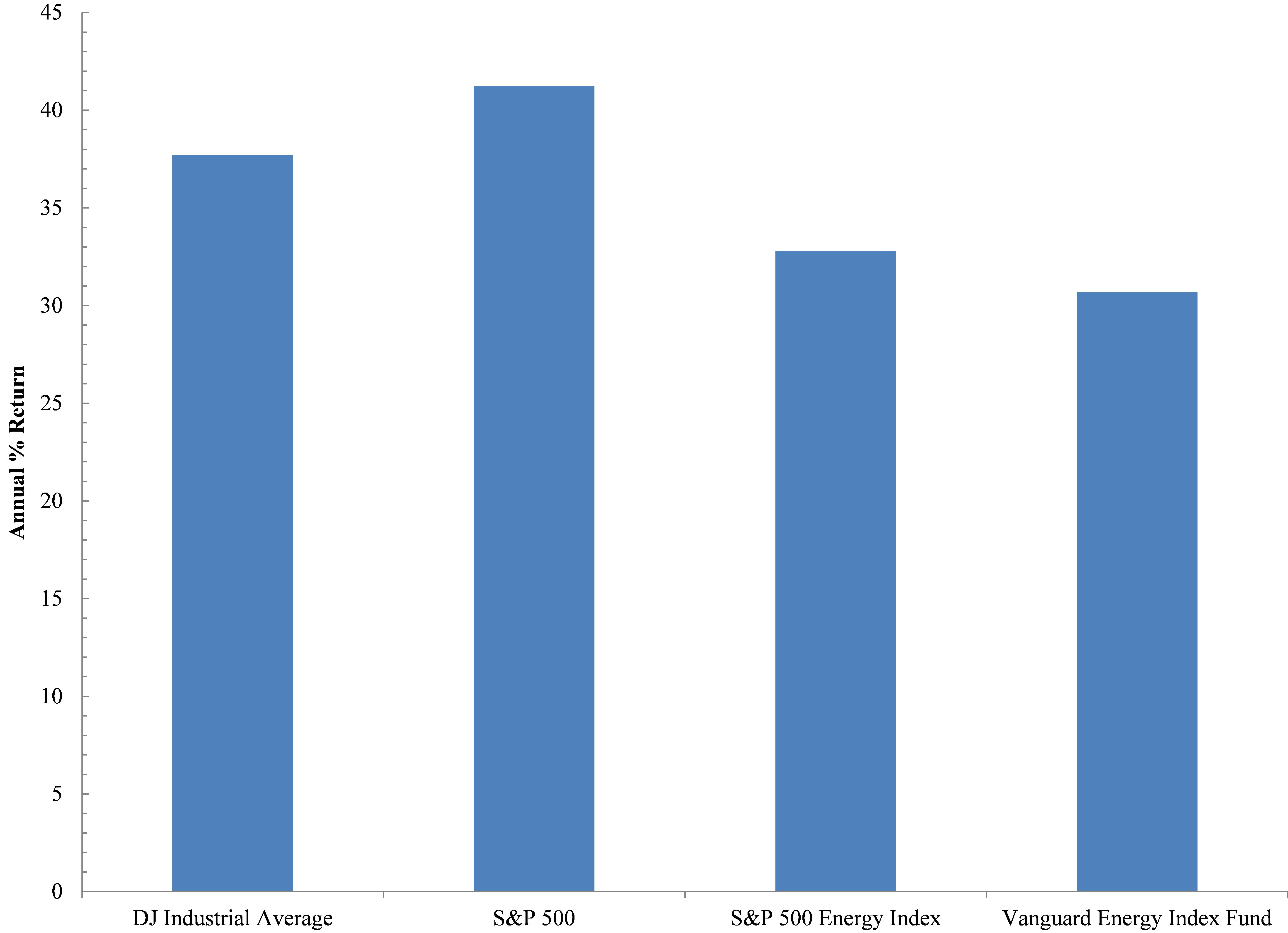
Out of State – The Bigger Picture
But before the big winners light up celebratory cigars, it is worth putting their performance into perspective relative to the rest of the field as it were. In an effort to be as fair as possible we chose the Dow Jones Industrial Average and S&P 500 – two indices that everyone has heard of because they are viewed as broad indicators of US economic growth. Incidentally, the DJIA includes the O&G companies Exon and Chevron. Exon is a multinational firm not involved in Ohio’s Utica development, while Chevron is involved. Additionally, the S&P 500 includes those two firms, as well as 39 other energy firms. Nine of those currently operate in Ohio. To assess these companies’ performance with the most energy-centric indices we have compared Ohio Utica players to the S&P 500’s Energy Index, which strips away all other components of its more famous metric, as well as the Vanguard Energy Index Fund. The latter is described by Vanguard as the following on the Mutual Funds portion of its website:
This low-cost index fund offers exposure to the energy sector of the U.S. equity market, which includes stocks of companies involved in the exploration and production of energy products such as oil, and natural gas. The fund’s main risk is its narrow scope—it invests solely in energy stocks. An investor should expect high volatility from the fund, which should be considered only as a small portion of an already well-diversified portfolio.
In reviewing these four indices we found that they have outperformed the 17 oil and gas firms here in Ohio or the Ohio Energy Complex (OEC), with annual rates of return (ROR) exceeding 35% (Figure 3). This ROR value was not approached or exceeded by any of the 17 OEC firms except for PDC Energy and Carrizo. However, these two companies only account for 2.8% of all Utica permits and 4.4% of all producing Utica laterals to date. Even if we remove the broader indicators of economic growth and just focus on the two energy indices we see the US energy space ROR has experienced annual growth rates of 33% or 7% below the broader US economy but impressive nonetheless. With such growth in the number of companies drilling for oil and gas, it is likely that we will see significant consolidation soon; some of the world’s largest multinationals like Exxon and Total may step in when all of the above are priced to perfection, which is something Exxon’s Chariman and CEO, Rex Tillerson, eluded to in a speech in Cleveland last June.
Figure 3. Annual % Return of Two Broad Economic and Two Energy Specific Indices.
The performance of the OEC indicates investors and/or lenders will not tolerate such a performance for much longer. Just like our country’s Too-Big-To-Fail banks, boards, CEOs, and shareholders were bailed out, it seems as though a similar bubble is percolating in the O&G world; the same untouchables will be protected by way of explicit or implicit taxpayer bailouts. Will Ohioans be made whole, too, or will they be left to pick up the pieces after yet another natural resource bubble bursts?
References
Corkery, M., Eavis, P., 2015. Slump in Oil Prices Brings Pressure, and Investment Opportunity, The New York Times, New York, NY.
Staff, 2014. Shale oil in a Bind: Will falling oil prices curb America’s shale boom?, The Economist, London, UK.
https://www.fractracker.org/a5ej20sjfwe/wp-content/uploads/2015/05/Shareholder-Feature.jpg400900Ted Auch, PhDhttps://www.fractracker.org/a5ej20sjfwe/wp-content/uploads/2025/09/2025-Wordmark-Logo.pngTed Auch, PhD2015-06-24 10:00:432020-07-21 10:30:04Ohio’s Shale Oil and Gas Firms Disappoint Shareholders
In Pennsylvania, the vast majority of unconventional oil and gas activity is focused on the Marcellus Shale formation, a Devonian period deposit of black shale with a high hydrocarbon content, which requires horizontal drilling and large scale hydraulic fracturing to produce enough oil and gas to make the drilling economically viable. This formation was created about 390 million years ago, when organic-rich deposits accumulated in what is now the Appalachian Mountains, but was at that time a shallow sea. Down below the base of the Marcellus lies the Utica Shale, an Ordovician period formation, with almost the same geographic extent as the Marcellus, but the deposits were placed there about 65 million years earlier.
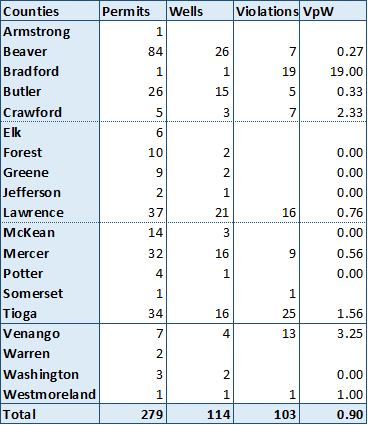
Utica permits and violations in Pennsylvania. Click here to access the legend and other map tools.
In neighboring Ohio, it is the Utica that gets most of the attention, with 937 permitted wells, as opposed to just 20 for the Marcellus. In Pennsylvania, the reverse is true: there are 16,110 permitted Marcellus wells, but only 279 permits for Utica wells. Part of the reason for this is because the subsurface characteristics of these formations vary widely, especially in terms of thickness and depth. With changes in depth come changes in temperature and pressure, which are key criteria in hydrocarbon formation. In other words, the same formation that produces considerable quantities of gas and valuable liquid hydrocarbons in eastern Ohio may be economically unviable just a county or two over in western Pennsylvania.
Utica shale permits, drilled wells, violations, and violations per well for Pennsylvania, through June 19, 2015.
Utica drilling permits have been issued in 19 different counties in Pennsylvania, with wells having been drilled in 15 of those. The violations per well (VpW) score for Utica wells in the Keystone State is 0.9, meaning that there are nine violations issued for every 10 wells that have been drilled. It is worth noting, however, that only 36 of the 114 drilled wells have received violations, meaning that some wells have been cited on multiple occasions.
Of particular note is Bradford county, the site of only one Utica well, but 19 items on the compliance report. The problematic Bayles 1 well was run by three different operators before being permanently plugged. This well also has two “Drill Deeper” permits, and as a result, it is likely that the first six violations assessed to this well were issued before it was associated with the Utica Shale, as they precede the most recent spud date for the well in June, 2005. Most of the violations for this well seem to be for pit violations and discharges to the ground and nearby stream.
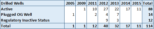
Wells drilled into the Utica Formation in Pennsylvania, by year and current status.
In terms of drilling activity, it appears to have peaked in 2012, calling into question whether the industry considers the formation to be economically viable in Pennsylvania. Of the 28 wells drilled since the beginning of 2014, Tioga County has seen the most activity with 11 wells drilled, followed by five wells in Butler County, then three in Lawrence County. If we think of drilling activity as a sort of positive feedback from the industry – meaning that they like what they see and want to keep exploring – then only Tioga County seems to be holding the attention of the various operators who have been active in the Utica Shale. Given the Utica activity in Ohio, one might have thought that counties on the western edge of the state – especially Beaver, Lawrence, and Mercer – would have shown the most promise, but this appears not to be the case.
https://www.fractracker.org/a5ej20sjfwe/wp-content/uploads/2015/06/PA_Utica-crop.png405920Matt Kelso, BAhttps://www.fractracker.org/a5ej20sjfwe/wp-content/uploads/2025/09/2025-Wordmark-Logo.pngMatt Kelso, BA2015-06-23 14:52:012020-07-21 10:30:04Utica Drilling in Pennsylvania
Media outlets have been very focused recently on reporting oil train derailments and explosions. Additionally, the Keystone XL pipeline has hastened political debates and arguments for years by both political parties since its initial proposal in 2008 – and the May 19th pipeline oil spill in California isn’t helping matters. In the midst of all of this commotion, a million questions are being asked, yet no one can seem to reach a conclusion about what method of transporting oil is truly safest and economically feasible – or if we are just stuck between a rock and a hard place.
Some say the solution to this problem is transporting the volatile crude via pipelines, while others believe it is a matter of increasing regulations, standards, and compliance for transport by train. The answer is simply not simple.
In light of this, a few of the folks at FracTracker gathered some facts on pipelines vs oil trains to lay out this issue in a clearer fashion.
Let’s start with trains.
Benefits
Due to the increasing demand of crude oil supply, there has been increasing activity in the transportation of crude oil by rail, which provides flexibility and quick transportation throughout the U.S. and its 115 refineries. Railroads are also willing to offer shippers shorter contracts than pipelines and other transportation methods, making them a more favorable method of crude oil transportation.
In 2008, U.S. freight trains were delivering somewhere from 9-10,000 carloads of crude oil. In 2013, they delivered roughly 435,560 carloads of crude oil, showing a 20-fold increase in crude oil shipments.
Risks
Oil trains, as well as pipelines, can pose a detrimental risk to communities and public health in the case of an explosion and/or spill. Danger Around the Bend describes in detail the dangers of transporting Bakken Formation crude oil from North Dakota to parts all over the country.
Some of the risks of transporting volatile crude via train have been clearly depicted in the news with announcements of spills, derailments, and explosions in urban and suburban areas, putting many people in harm’s way. Despite the decrease in spills between 1996 and 2007, devastating train accidents like the one on July 6, 2013 have raised questions about the safety of transportation by train.
Trains and train tracks in general can be very dangerous, as demonstrated by the deadly Amtrak train derailment in Philadelphia this May. The total number of incidents in 2014, according to the Federal Railroad Administration, sum up to 11,793 – with 818 of those being fatal. These fatalities have been linked to a range of possible causes, but the numbers depict the gravity of safety issues within the railroad regulations.
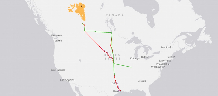
As we all know, finishing the Keystone XL pipeline has stirred years of controversy, since this project was initially proposed back in 2008. On January 31, 2014, the U.S. Department of State released the Final Supplemental Environmental Impact Statement (SEIS) of the Keystone XL Pipeline, which would transport up to 830,000 barrels of tar sand oil per day through an 875-mile long pipeline running from Alberta, Canada, to the Gulf Coast area. Below we have mapped the current and proposed tracks of the Keystone, along with the numerous ports, refineries, and rail lines:
The Keystone XL, Alberta oil sands, North American oil refineries and associated ports. View fullscreen and click Details for the metadata behind this map.
The SEIS discussed the impacts that the proposed pipeline would have on the environment and public health based on research, modeling, and analysis. One of the many purposes of the SEIS is to focus on whether the proposed project serves the national interest by comparing the risks to the benefits – discussed in more detail below.
Risks
The current risks associated with pipelines are similar to the risks associated with other modes of transporting oil across the United States. Oil spills are among the highest risks, but with the XL pipeline, it’s a more profound risk due to the type of oil being carried: tar sand oil. Tar sand oil, also known as heavy oil, is known for its tedious processing and its many environmental implications. Burning one single barrel of oil produced from Canadian tar sands generally emits 170 pounds of greenhouse gases into the atmosphere. It also requires large amounts of energy and water, much of which cannot be recycled, to separate the oil from the tar sands and transform the oil into a form of petroleum that can be processed by refineries.
According to the final SEIS:
The proposed project would emit approximately 24 million metric tons of carbon dioxide per year during the construction period (up to three times as much than producing conventional crude), which would be directly emitted through fuel use in construction vehicles and equipment as well as land clearing activities including open burning, and indirectly from electricity usage.
Additional risks associated with the XL pipeline include potential groundwater contamination of major aquifers – particularly the Ogallala Aquifer – as well as deforestation, habitat destruction, and fragmentation.
In the event of an oil spill from the Keystone XL or other pipelines crossing the U.S., the responsibility for who cleans it up does not fall on TransCanada. According to a report from the Natural Resource Defense Council (NRDC), tar sand oils are exempt from paying into the Oil Spill Liability Trust Fund. Amendments that would require TransCanada to pay the 8-cent-per-barrel fee to the fund have not been passed.
Devastating oil spills such as the one in Santa Barbara in mid May reflect the impact it not only has on wildlife, but on the local culture, especially on those who depend on fisheries and whose lives revolves around surfing in the brisk waters of the Pacific Ocean. 21,000 gallons of crude oil covers roughly 4 miles of Santa Barbara’s coast now, extending about 50 yards into the water.
Benefits
Jobs, jobs, jobs. The economic stimulus is one purported advantage to the XL pipeline. During construction, proposed project spending would support approximately 42,100 jobs, directly and indirectly and around $2 billion in earnings throughout the US, according to the final SEIS. Despite different job creation estimates, any number will contribute significantly to the US gross domestic product, associating a huge economic growth with the construction of the proposed XL pipeline. (TransCanada estimates around 13,000 construction jobs and 7,000 manufacturing jobs, which is about 3 times higher than the State Department’s estimate.) In addition, the cost of paying for the Keystone XL project ($3.3 billion) would not be placed on the U.S. but on Keystone.
According to the Pipeline and Hazardous Materials Safety Administration (PHSMA), the industry and their operators have reduced the risk of hazardous materials transportation incidents with death or major injury by 4% every 3 years, and since 2002, they have reduced the risk of a pipeline spill with environmental consequences by an average of 5% per year.1
Still, there is more work to be done. Safety issues that the pipeline industry is aiming to fix include:
Infrastructure: Repair obsolete pipeline infrastructure through a pipeline integrity management program and investigate new technologies that can detect pipeline risks.
Improving human error and safety culture: Increase the focus on safety beyond compliance standards and evaluate the potential value of safety management systems.
Adding secondary containment: Limit the spread of HAZMAT in the event of a failure in the primary container, and improve leak detection.
Transparency: Increasing transparency for companies and their accountability
Check out the infographic below for a summary of all of these pros and cons:
Moving Forward
All methods of transporting oil present various risks and benefits based on the available data. Explaining both sides of this coin allows us to assess each method’s impacts on our economy, environment, and public health. Through these assessments, we can make more informed decisions on what truly serves the nation’s interests. Oil and gas transport is a dangerous business, but all transportation industries are improving their management programs and increasing their regulations to provide citizens peace of mind and the safety they deserve. In light of ongoing issues, however, some would ask if these risks are even necessary.
For example, the growth of safer energy resources such as solar energy would significantly cut down the risks mentioned above in addition to providing jobs and stimulating the overall economy. According to the Bureau of Labor Statistics and the Solar Foundation, the growth in direct industry jobs for solar has outweighed oil and gas for the past 3 years. In 2014, new jobs created for the solar industry were more than twice the jobs created for the oil and gas industry. Based on 2014’s economics, Kepler Cheuvreux stated that all renewables are already more competitive than oil priced at $100 per barrel — This is because renewables have a higher net energy return on capital invested (EROCI).
As a reader and a citizen, it is important to know the pros and cons of the current activities taking place in our country today. We must be aware of loopholes that may be putting our states, cities, or counties into harm’s way, as well as recognize alternative energy sources and regulatory oversight that lessen the threats that oil extraction and transport pose to our health and environment.
Footnote
1. These statistics are based from the Census Bureau analysis and Bureau of Transportation Statistics as of July 2012.
https://www.fractracker.org/a5ej20sjfwe/wp-content/uploads/2015/04/Keystone-Apr2015.jpg400900FracTracker Alliancehttps://www.fractracker.org/a5ej20sjfwe/wp-content/uploads/2025/09/2025-Wordmark-Logo.pngFracTracker Alliance2015-05-26 11:00:222020-07-21 10:30:03Pipelines vs Oil Trains
By Randy Sargent, Carnegie Mellon CREATE Lab and Samantha Malone, FracTracker Alliance
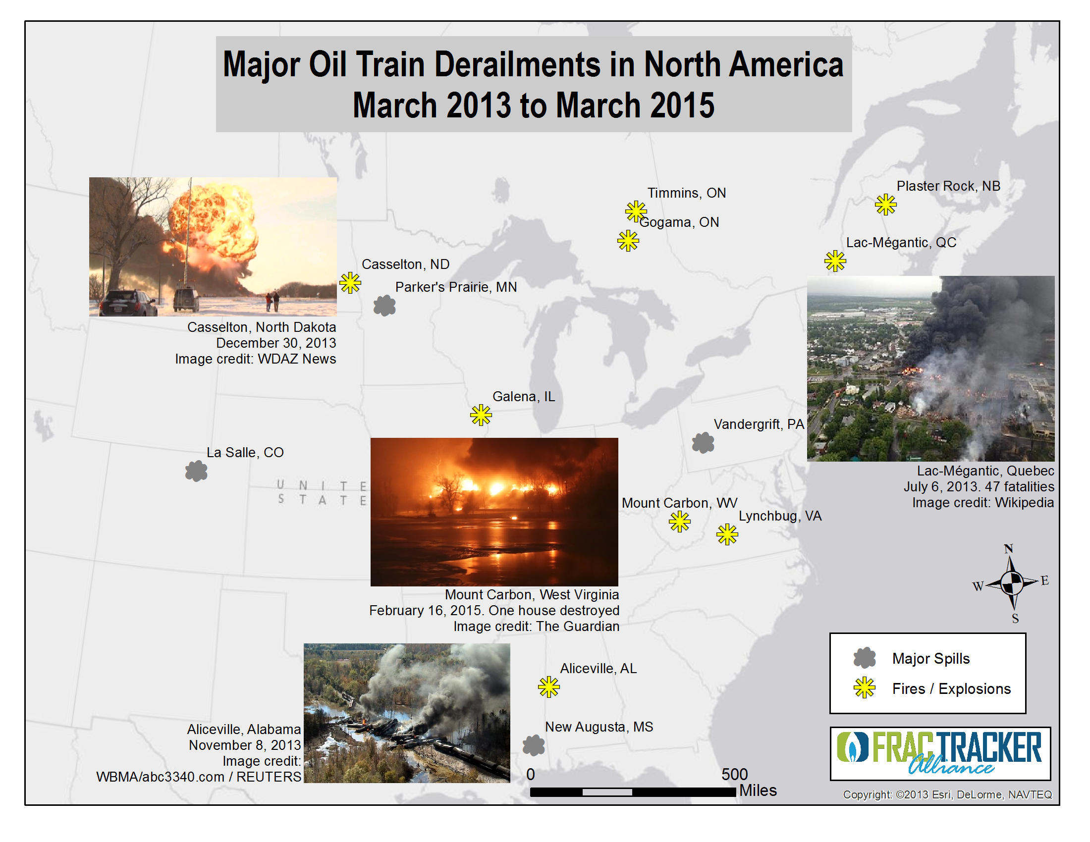
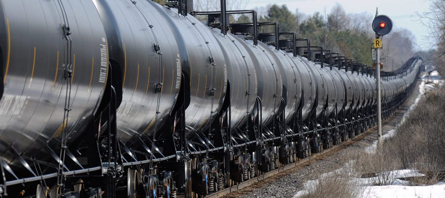
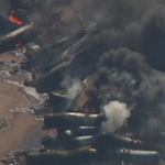
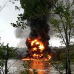
In the past two years, crude oil trains have exploded 10 times, killing 47 people.
Lac-Mégantic, Quebec: 47 killed
Outside Plaster Rock, New Brunswick
Outside Casselton, ND
Outside Aliceville, AL
Outside Lynchburg, VA
Outside Mt. Carbon, WV
Outside Timmins, Ontario
Outside Galena, IL
Outside Heimdal, ND
Outside Gogama, Ontario
It could have been much worse. Eight of the ten trains exploded in rural areas. The train that flattened half the business district of the small town of Lac-Mégantic might have killed hundreds of people if it had exploded during business hours.[1] Residents in Philadelphia have dodged a bullet several times already; they’ve seen two oil train derailments there that fortunately did not explode. And last week’s Amtrak train derailment in Philadelphia that killed 8 people and injured more than 200 could have been much worse, had it impacted an oil train in that area.
Today we ship 17 times as much oil by rail as we did in 2010. This past year we shipped 14.5 billion gallons of oil — that’s 6,700 oil trains the size that destroyed Lac-Mégantic:
This chart above and the ones that follow are derived from the U.S. Energy Information Administration’s recently provided data tracking crude oil movements by rail.
Why do oil trains explode so easily?
Like a carbonated beverage with dissolved CO2, oil extracted from Bakken wells naturally has lighter hydrocarbons in it, such as methane, ethane, propane, and butane. Methane — natural gas — is the lightest of the gases and boils out quickly at surface pressure. But ethane, propane, and butanes, known as light ends or natural gas liquids in the oil industry, take time and/or heat to boil out.[2]
In the most prolific oilfield in the U.S. today, North Dakota’s Bakken formation, most of light ends are left in the oil before loading on the train, to maximize value of what is sent to the refinery. But much like a soda bottle, the pressure increases with temperature and motion, with pressurized ethane, propane, and butane at the top. With those highly volatile gases under pressure, all it takes to create an explosion is a leak and a spark, and both commonly happen in a derailment or collision.
All ten exploding crude trains carried oil from the Bakken.
Bakken trains travel through much of the US and Canada, heading to refineries on the coasts. Increasingly, they are traveling to East coast refineries, which now handle over half of Bakken crude oil production.
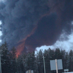
Closer to home for the authors, Pittsburgh is a popular waypoint for Bakken oil trains. Known for its steel industry in the 20th century, Pittsburgh continues to sport a large rail infrastructure. Its rails go through very densely populated areas, a good thing when the rails carried ore and steel and coal for the mills. But it’s a disaster waiting to happen now that the rails are bringing explosive oil trains through the city.
Oil and compressed gasses transit Carnegie Mellon University multiple times daily, Pittsburgh, PA
Oil trains travel across Pittsburgh’s North Shore and Downtown multiple times daily, as well
A significant and growing fraction of Bakken oil trains carrying 1 million gallons or more transit Pittsburgh, with ~30 a week based on Pennsylvania Emergency Management Agency data released for five days in October 2014. Prior to the disclosure, volunteers spent a day with us in 2014 recording traffic along one of several routes into the city to learn more about whether / how the trains might pose a risk to city residents and workers. Learn more about what we found here.
Why does this matter?
As crude-by-rail traffic continues to increase, it is only a matter of time before an oil train explodes in a populated area again. Imagine any of the 10 explosions so far taking place instead in downtown Philadelphia or Pittsburgh, or flattening a school in suburban Chicago, for example.
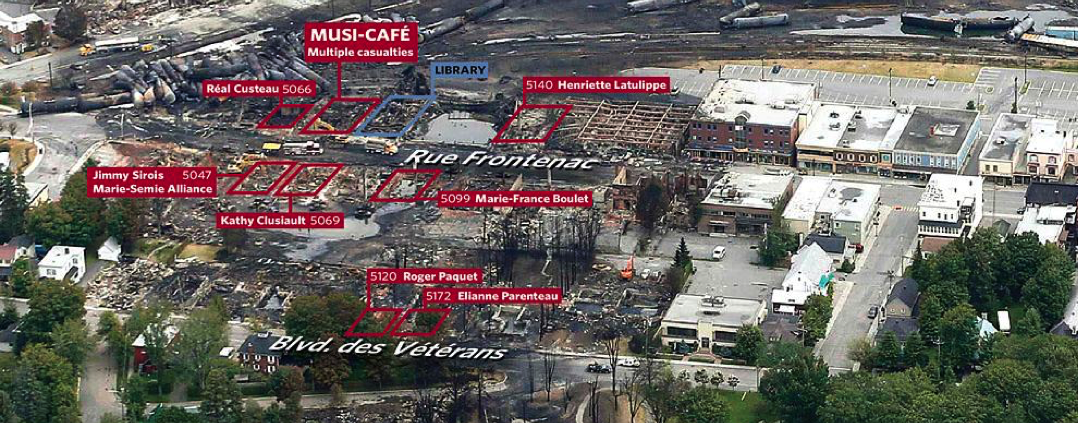
Map of Lac-Mégantic destruction from the Toronto Star’s article, Where they died. Click to explore the interactive map.
One attempt to make these trains safer, by requiring new tanker cars be built to a safer standard, does not appear to have helped; the most recent 5 exploding trains used the newest, “safer” tanker cars.
But there are effective measures that are in our power to take:
If you are concerned about these oil trains, please engage in the democratic process and tell your representatives and friends what you think. The Department of Transportation regulates interstate rail traffic. And local governments can be effective in rerouting traffic, as we’ve seen in St. Louis.


