It’s been just over a year since New York Governor Andrew Cuomo made public his administration’s decision to ban high-volume hydraulic fracturing in the state. A formal ban was established in June 2015. While Cuomo’s politics and record may be controversial on some fronts, he has most certainly shown important leadership in some facets of energy policy. Significantly, activists and environmental advocacy groups have been especially strong during the Cuomo administration, pressing the governor daily to take seriously the responsibility and planning that New York State must demonstrate in light of the realities of climate change.
On Wednesday, January 13, 2016, New York Governor Andrew Cuomo delivered his annual State of the State address. Among the high points of the talk was a commitment to a full phase-out of coal-burning power plants by 2020. Coal, once more affordable alternative to other fossil fuels, is no longer an attractive option from both an economic and environmental standpoint. Despite advances in scrubber technology, coal burning still emits more particulate waste into the atmosphere than other fuels, and leaves behind copious quantities of fly ash containing radioactivity and heavy metals. Historically, fly ash, bottom ash, boiler slag, and flue gas desulfurization materials have been disposed of in landfills. While current disposal methods using landfill liner technologies do attempt to safeguard against groundwater contamination, during earlier decades, these waste products from burning coal were buried in unlined pits, some of which are now actively leaching into waterways and groundwater.
Existing coal burning power plants being shut down, but what’s next?
In New York State, many old, polluting coal plants are now only partially in service or completely shuttered. They did at one time, however, have the capacity to supply over 2100 MW of power to the state. While it’s generally accepted from an economic and environmental standpoint that New York should be transitioning away from coal, the next steps are more fraught with controversy. Several communities, such as those around the likely-to-be-closed Dunkirk (Chautauqua County, 520 MW), as well as Huntley (Niagara County, 380 MW), and Cayuga (Tompkins County, 315 MW) power plants feel that a repowering of these plant with natural gas provides an important economic stabilizer for the surrounding communities. Another smaller coal-burning plant, Greenidge Generation (Seneca County, 107 MW) has been shuttered for several years. A recent local economic development initiative to re-start that plant with a conversion to natural gas met with considerable resistance from environmental groups. This development also resulted in a notification from the US Environmental Protection Agency indicating that proper procedure for restarting the plant had not been followed, setting back the timetable on the project indefinitely.
Coal Burning Power Plants in North America, Zoomed in to NYS
Cayuga Power, which has been operating at a deficit for several years as a coal burning plant, is subsidized through a surcharge that is levied on every ratepayer within the system, with each monthly bill. According to The Sierra Club, these subsidies amount to over $4M a month charged to NYSEG ratepayers for the Cayuga plant, alone. Elected officials, as well as citizen groups concerned with the impacts of natural gas on the environment, are pressing for other viable options to repowering the plant from coal to natural gas, currently estimated to cost over $500M for the Cayuga Plant, alone. These options include solar power – or, in the case of the Cayuga power plant, upgrades to a short stretch of transmissions lines for less than $100M, in lieu of repowering. In either case, the upgrade costs would be passed on to the consumer. Transmission line upgrades would actually obviate the need for the power plant itself, conserving the energy that is now lost through inefficiencies in the system. Repowering the plant would also necessitate the construction of a highly controversial 7-mile-long pipeline from the Town of Dryden, which would significantly raise the carbon footprint of Tompkins County through due to predicted fugitive methane emissions. The power utility, itself, New York State Electric and Gas (NYSEG) has said that they prefer the option of upgrading the lines, rather than converting the plant to run on natural gas. Another study by the Institute for Energy Economics and Financial Analysis also found the Cayuga repowering proposition unviable. Proponents of repowering cite the impacts that shutting down the plant would have on the local Lansing School district, which–unlike any of the surrounding school districts–has benefited for several decades from tax revenues generated by the plant.
Environmental concerns about continuing to invest in fossil fuel technologies like natural gas as an alternative to coal include the entire life cycle of methane extraction, from the air and water quality risks that occur during the process of unconventional drilling (high volume hydraulic fracturing), to environmental and public health impacts of pipelines and compressor stations that convey the gas to the power plants, to the addition of CO2 to the atmosphere as a byproduct of natural gas combustion at these fossil-fuel burning plants.
Of course, energy conservation and making lifestyle changes to how we individually, and collectively, approach energy consumption are at the heart of the changes that need to occur if we are to slow climate change caused by the dramatic upswing of methane and CO2 in the atmosphere during the past 50 years.
New York State’s Renewable Energy Agenda
Cuomo and the State Legislature have shown additional and ongoing interest in moving New York towards a clean energy future. They have been establishing appealing tax incentives for renewable energy, including:
Cuomo’s REV, or Reforming the Energy Vision, attempts to take a comprehensive look at an energy strategy across many sectors of New York. REV targets for 2030 include a goal of 50% of all NYS’s energy being met by renewable sources, a 40% reduction in greenhouse gas levels based on 1990 levels (and an overall emission cut of 80% by 2050), and based on 2012 levels, a 25% reduction on building energy use. The strategy also looks to support the growth of the clean energy sector, energy education to residents and businesses, natural resources protection, and job creation in the energy sector.
New York is taking important steps for a cleaner energy future, but should continue to put more resources towards incentives for renewable resources, as well as outreach and education to municipal, residential, and commercial energy consumers.
We have very little time to waste.
https://www.fractracker.org/a5ej20sjfwe/wp-content/uploads/2016/01/Coal-Feature.jpg400900Karen Edelsteinhttps://www.fractracker.org/a5ej20sjfwe/wp-content/uploads/2025/09/2025-Wordmark-Logo.pngKaren Edelstein2016-01-26 10:54:362020-03-12 13:41:16NYS targets an end to coal power
By Kyle Ferrar, Western Program Coordinator, FracTracker Alliance
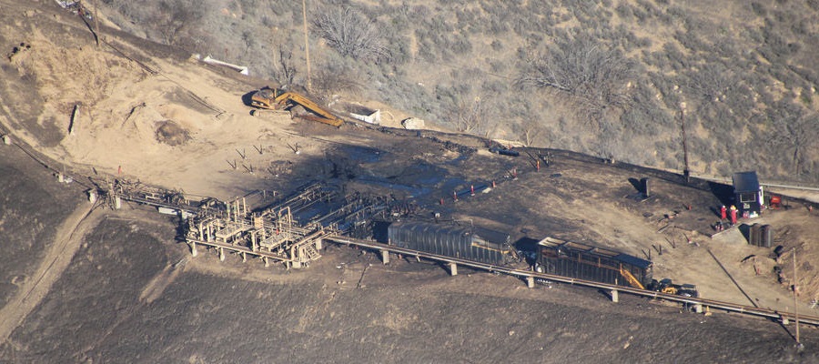
A natural gas well equipment failure in southern California has resulted in the largest point release of methane to the atmosphere in U.S. history. California Governor Jerry Brown has declared a California state of emergency for the incident, and the California Air Resources Board (CARB) has identified the site as the single largest source point of global warming.1 Since October 23, 2015 the failure has been reported to be releasing 62 million cubic feet of methane per day – 110,000 pounds per hour – for a total of about 80 million metric tons thus far. (A running counter for the natural gas leak can be found here, on Mother Jones).2,3 This quantity amounts to a quarter of California’s total methane emissions, and the impact to the climate is calculated to be the equivalent of the operation of 7 million cars.
SoCalGas (a subsidiary of Sempra Energy) reports that nothing can be done to stop or reduce the leak until February or March of 2016. As a result, the nearby community of Porter Ranch has been largely evacuated (30,000 people) due to health complaints and the rotten egg smell of tertbutyl mercaptan and tetradydrothiophen. Air quality sampling, being assessed by the Office of Environmental Health Hazard and Assessment (OEHHA), measured volatile organic compounds, specifically the carcinogen benzene, at concentrations below acute toxicity health standards.4 Exposure to benzene even at low levels presents a risk of cancer and other health hazards. Locals have complained of headaches, sore throats, nosebleeds and nausea. The LA County Department of Public Health has ordered SoCalGas to offer free temporary relocation to any area residents affected. About 1,000 people are suing the company.5A fly over of the site has been posted to youtube by the Environmental Defense Fund, and can be seen here. The video uses a FLIR camera to take infrared video that shows the leak.
Site Description
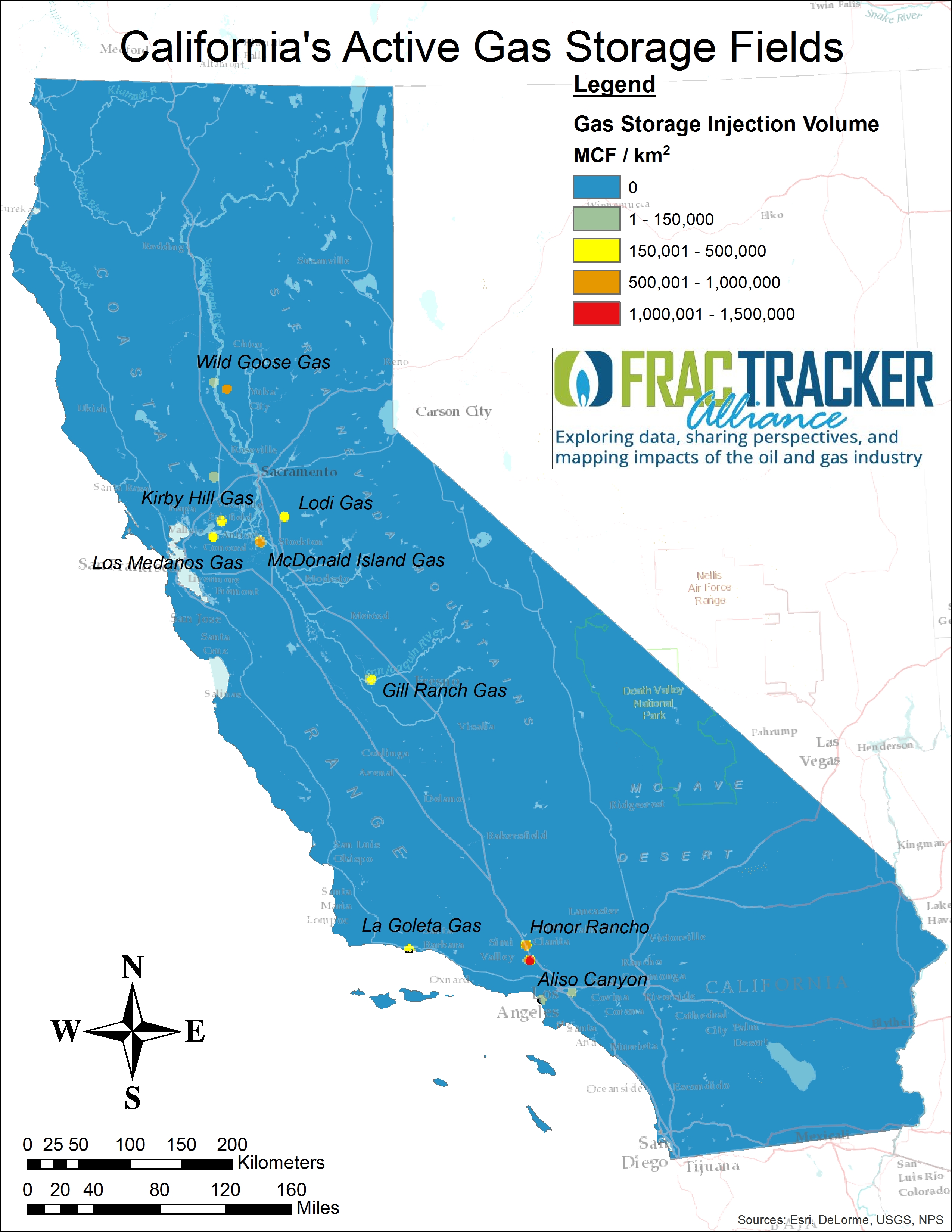
Figure 1. California active natural gas storage fields most active in 2014
The source of the leak is a natural gas storage well operated by SoCalGas in the Aliso Canyon oil field – a drained oil field now used to store natural gas. SoCalGas is the largest natural gas utility in the U.S., distributing natural gas to 20.9 million.4 Aliso Canyon is the largest gas storage field in the state, but there are numerous other gas storage fields in the state that could present similar risks. In Figure 1, to the right, California’s other currently active gas storage fields are shown. Injection volumes of natural gas are summed and averaged over the area of the field, and the Aliso Canyon is shown to have injected over 1,000,000 cubic feet per km2 of natural gas since the beginning of 2014. Other high volume fields include Honor Rancho, McDonald Island Gas, and Wild Goose Gas.
The failed well, known as Standard Sesnon 25, is marked with a red star in the map of gas storage wells shown below (Figure 2). The well was drilled in October of 1953. Reports show that pressures in the well bored reached 2,516 PSI in 2015. If you use the map to navigate around the state of California, it is clear that there are numerous other natural gas storage facilities in California, with wellbore pressures similar to or higher than the reported pressure of Standard Sesnon 25 and other wells in the Aliso Canyon Field. Beyond California, the state of Michigan is reported to have the most natural gas storage by volume, at 1.1 trillion cubic feet.6 The incident that caused the leak was a well casing failure, although the cause of the well casing failure has not yet been identified. There have been numerous editorials written that have painted SoCalGas as a model for contemporary corporate greed and corruption for several reasons, including the removal of safety valves, reports of corrosion, and lack of resources for inspections and repairs.7 Rather than this being a unique case of criminal neglect, casing failures are a statistical likelihood for wells of this age. Well casing failures are a systemic issue of all oil and gas development. Every well casing has a shelf life and will fail eventually.8 Additionally, leaks from gas storage wells have occurred at other SoCalGas natural gas storage facilities in California, such as Montebello and Playa Del Rey.
Figure 2. California’s gas storage wells. The size of orange markers indicates wellhead pressure, as reported in 2015. Blue markers show the volume of gas injected in 2014/2015. The Aliso Canyon leak at ‘Standard Sesnon 25’ natural gas storage well is marked with a red star. Click here to manipulate the map. After expanded, use the “Layers” menu to visualize the data with colored markers rather than size.
Response
Fixing the problem is therefore much more complicated, overall, in this specific case. Since the well casing has ruptured deep underground, natural gas is leaking in the annular space outside the borehole and spewing from the topsoil surrounding the well head. To stop the leak the production pipe must be plugged below the rupture. All attempts to plug the well from the surface have failed due to the high pressure within the borehole, a 7” inner diameter of the production pipe. Therefore, a relief well is being drilled to intersect the well casing, to inject a mud-chemical cocktail intended to plug the well far below the casing failure. Updates on the response, claims information, and the location of the Community Resource Center can be found here. Additionally, Governor Jerry Brown has declared a state of emergency, which means federal support and a requirement of the state of California to cover the costs.9
The state response to the natural gas leak has included numerous agencies. According to documents from California Public Utilities Commission (CPUC), the agencies leading the response are the California Department of Conservation, Division of Oil, Gas, and Geothermal Resources (DOGGR), the Office of Emergency Services (CalOES), California Air Resources Board (ARB), California Division of Occupational Safety and Health (CalOSHA), the California Energy Commission (CEC), and the CPUC. DOGGR is conducting an independent investigation of the incident. The investigation will include a third party analysis for root-cause issues. CARB is monitoring total methane emissions while the Office of Environmental Health Hazard Assessment with CalEPA are collecting and reviewing air quality data. Coordinated response information can be found on the CalOES site. SoCalGas has submitted a proposal to regulators to raise customer rates in order to raise $30 million for a more proactive approach to inspections and repairs.10
This event is the largest, but is not the first major methane/natural gas leak to occur at a wellsite. Leaks can result from a number of natural and anthropogenic (man made) causes. Besides the natural degradation of well integrity with age, acute events can also cause casing failures. There are documented cases where seismic activity has caused casing failures.
As a result of an earthquake natural fractures in the region can grow and disrupt well bores. In areas of dense drilling, fracture stimulations that propagate improperly or intersect unknown faults. When two wells become interconnected, known as “downhole communication” or a “frack hit” when it occurs due to hydraulic fracturing, spills and leaks can occur due to over-pressurization. In many states, these risks are mitigated by having setbacks between wells. California, the most seismically active state, has minimal setbacks for drilling or fracking oil and gas wells. In previous research, FracTracker found that over 96% of new hydraulic fractures in 2013 were drilled within 1,200 feet of another well, which would even violate setback rules in Texas!
Climate Impacts
Natural gas is hailed by the fossil fuel industry as the bridge fuel that will allow the world to transition to renewables. The main argument claims natural gas is necessary to replace coal as our main source of generating electricity. Burning both coal and natural gas produce carbon dioxide, but natural gas is more efficient. For the same amount of energy production, natural gas produces half as much carbon dioxide emissions. The legitimate threat of climate impacts comes from fugitive (leaked) emissions of methane, before the natural gas can be burned. Since methane is a gas, it is much harder to contain than oil or coal. Methane is also more insulating than carbon dioxide in the atmosphere (34-86 times more insulating), making it a more potent greenhouse gas. The leaked natural gas from the Aliso Canyon well is currently equivalent to 7,000,000 tons of CO2 (Updated here, on Mother Jones).
Current estimates show methane is responsible for 25% of the world’s anthropogenic warming to date. Proponents of the bridge fuel theorize that if methane leakage can be kept under 4% of total production, natural gas power generation will provide a climate-positive alternative to coal. EPA estimates set the leakage rate at 2.4%, but independent research estimates actual rates up to 7.9%.11 The EDF has been conducting an $18 million project focused on quantifying methane leaks from the natural gas industry. A team of 20 researchers from 13 institutions conducted the 2 year study measuring emissions from the Barnett Shale. Details can be found on the Environmental Defense Fund’s Page.12
Ingraffea et al. (2013). Assessment and risk analysis of casing and cement impairment in oil and gas wells in Pennsylvania, 2000-2012. PNAS. Vol.111 no.30.
Feature Image: Aliso Canyon natural gas leak – Photo by Environmental Defense Fund
https://www.fractracker.org/a5ej20sjfwe/wp-content/uploads/2016/01/CA-gas-leak_Revised.jpg400900Kyle Ferrar, MPHhttps://www.fractracker.org/a5ej20sjfwe/wp-content/uploads/2025/09/2025-Wordmark-Logo.pngKyle Ferrar, MPH2016-01-11 16:22:382020-03-12 13:37:10A Climate Disaster – California in state of emergency as a result of massive natural gas leak
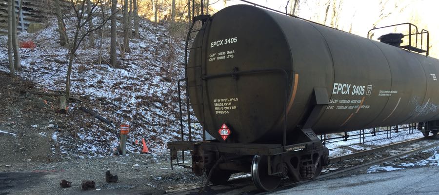
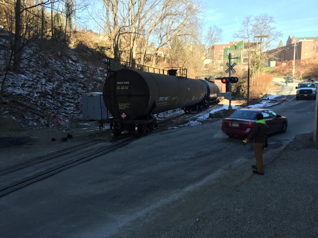
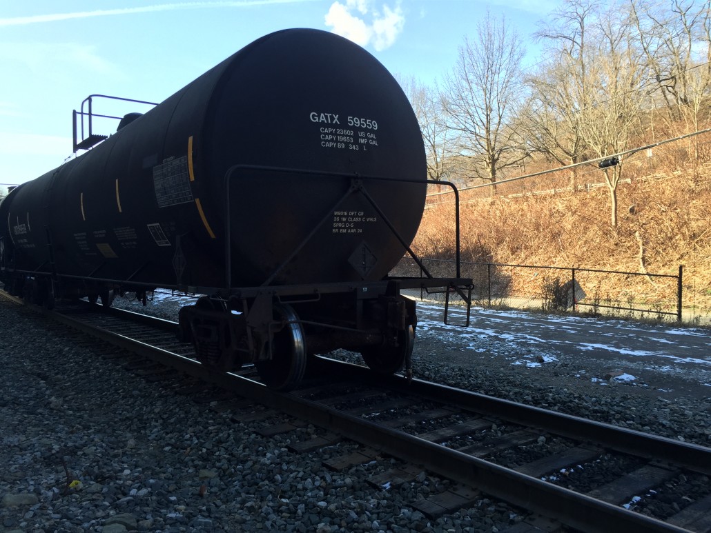
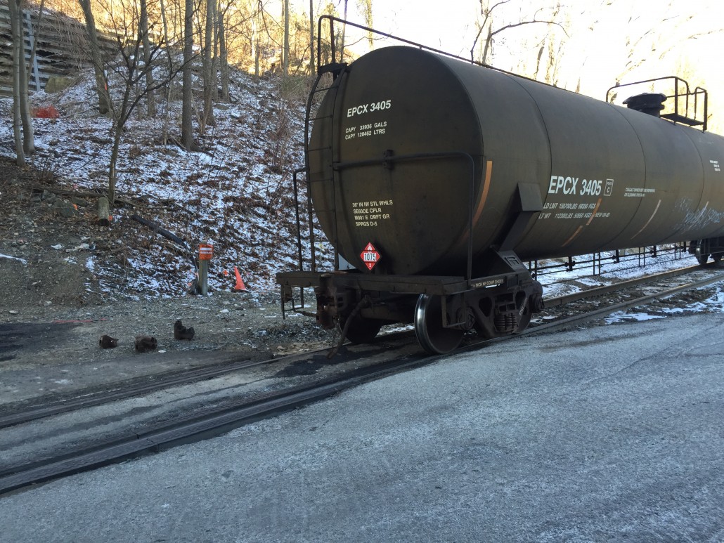
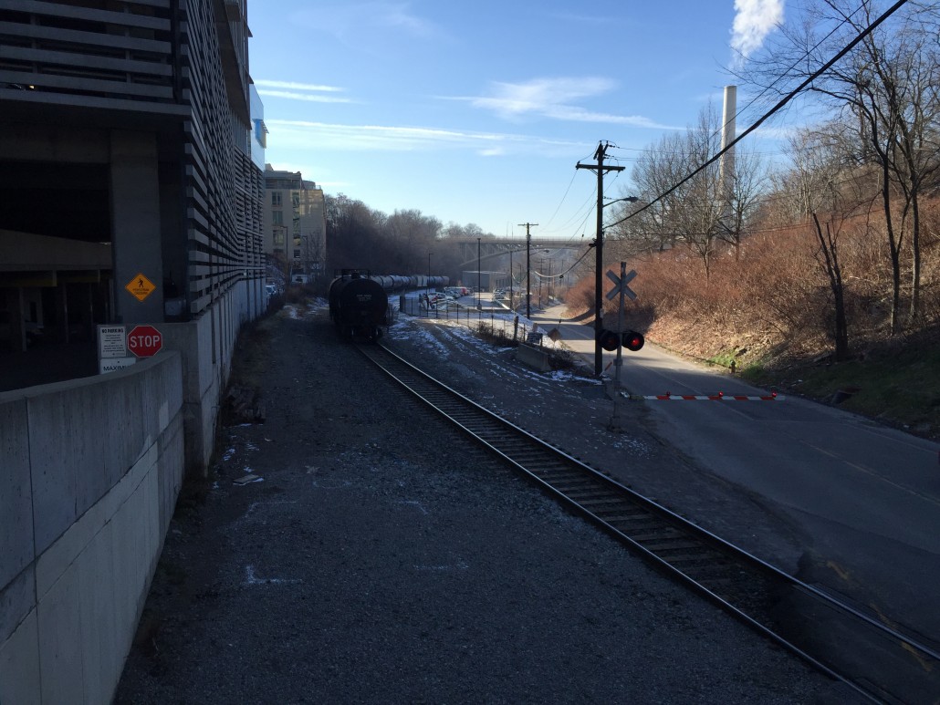
Today a train carrying oil products decoupled, or separated, in the City of Pittsburgh. Collaborators at CMU report that this morning an oil train decoupled along the tracks that run past the Bellefield boiler and under Forbes Avenue in Oakland, a very populated section of the city. While no spills, explosions, or injuries were reported, concerns remain.
This train was carrying a significant number of cars either marked with 1075 or 3295 hazard placards – flammable liquids and gases produced during oil and gas drilling. We’ve discussed the risks associated with oil trains on several occasions on FracTracker. We have not previously mentioned the 3295 hazmat placard, however, which is apparently used to identify condensate. More and more train cars hosting 3295 placards have been passing through Pittsburgh in recent months, observers report.
The cars on this train were likely full, based on the train’s direction (bound for refineries on the East Coast). While it is difficult to tell given available data, these kinds of trains generally originate from Western PA, Ohio, as well as the Bakken shale formation in North Dakota.
Fortunately, the coupling broke while the train was headed uphill. For residents living in Junction Hollow, the brakes on the disconnected part of the train worked properly. If the brakes had failed, this portion of the train could have rolled downhill and derailed at the first turn in the hollow. A similar situation – with much more disastrous results – occurred in 2013 in Lac-Mégantic, Quebec.
Train Incident Photos (Submitted by CMU)
This video taken of the train passing once it was reconnected with the engine shows the sheer quantity of hydrocarbons being hauled through the city. (Randy Sargent of CMU’s CREATE Lab, identifies each of the car’s hazard placards as the train passes his office).
https://www.fractracker.org/a5ej20sjfwe/wp-content/uploads/2016/01/Decoupling-Feature.jpg400900FracTracker Alliancehttps://www.fractracker.org/a5ej20sjfwe/wp-content/uploads/2025/09/2025-Wordmark-Logo.pngFracTracker Alliance2016-01-06 18:00:572020-03-12 13:38:55Oil Train Decoupled in Pittsburgh, No Injuries
Florida, where there has long been an interest in drilling for oil, has recently come into the cross-hairs for unconventional extraction several miles beneath the state. Oil drilling has had spotty and elusive success in the Sunshine State, but new technologies like hydraulic fracturing – fracking – could potentially provide access to those energy resources. Currently, Florida is in a gray zone, however, with no clear regulatory authority over unconventional drilling, but no clear mandate to prevent it either.
History
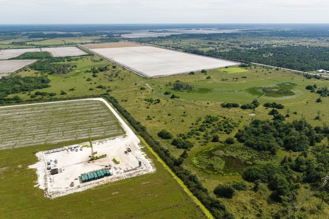
Dan Hughes well adjacent to Florida Panther Wildlife Refuge Source: www.naplesnews.com
In 2014, fracking came to the forefront when the Florida Department of Environmental Protection disclosed that in 2013, the Dan A. Hughes Company filed for a permit to use unconventional drilling techniques to rework an existing conventional well in Naples without a thorough review of the plans by regulators, and fracked the well later that year. As a result, the permit was revoked. Hughes had leases on 115,000 acres of land for additional wells, much of which was in environmentally sensitive areas of the Florida Everglades, bordering the Florida Panther National Wildlife Refuge and Big Cypress National Preserve. After legal pressure from the State of Florida, as well as environmental groups Preserve our Paradise, the Stone Crab Alliance, and South Florida Wildlands Association, the company abandoned their plans for drilling in the area. FracTracker covered this story in a previous blog entry.
A plan to regulate fracking in Florida was unveiled in November 2014. A slate of regulations was drafted by the Orange County League of Women Voters and students in the Environmental and Earth Clinic at Barry Law School, and drew upon examples from 14 states that had already grappled with the issue. While this plan specifies how, when, and where fracking may occur in Florida, it also leaves open the option for communities to ban the practice within its bounds altogether. Democratic Senators Darren DeSoto and Dwight Bulland introduced a bill (SB 166) in the 2015 legislative session that would ban fracking entirely, but they also emphasized the need for rules to be in place governing the practice, were that ban to be overturned. That bill did not advance beyond the Senate’s Environmental Preservation and Conservation Committee, but was reintroduced in August 2015, with additional components that would also prohibit well stimulation.
In April 2015, two bills were presented on the floor of the State Senate and House of representatives: one to create regulations on the practice of fracking (SB 1468), and another that would permit non-disclosure of fracking chemicals by industry (SB 1582). Both bills passed in committee in April 2015, and are set to move on to further consideration by the full House and Senate.
In late April 2015, a bill (HB 1205) passed in the Florida House that would allow fracking to continue, but would put a moratorium on the practice until a study and regulations were in place. HB 1209, would also have exempted industry from disclosure of fracking chemicals. Because the Senate did not take up discussion on either bill and due to an early adjournment of the House, however, neither the Senate nor the House moved ahead on either bill during the 2015 Legislative session.
Using a similar strategy to New York State, which successfully banned high volume hydraulic fracturing for gas in June 2015, dozens of communities across Florida have taken to passing resolutions against unconventional drilling within their municipal bounds. The resolutions cite concerns about water quality, habitat protection, and impacts on endangered species that may result from this technology that aims to extra oil from rock layers more than 14,000 feet below the surface.
In July 2015, the Bonita Springs, Florida (Lee County) took their resolution one step further; the city council unanimously approved a ban on fracking within the city limits. Collier Resources, owner of thousands of acres of land within Bonita Springs, vigorously objected, and threatened lawsuits against the city’s decision. The company is predicting that the ban will be overturned by statewide legislation that permits fracking to occur. Meanwhile, Estero Village, also in Lee County, plans to take up legislation for a similar ban this month, with a vote expected on December 16th, 2015.
On the cusp of this vote, the concerns of dozens of communities across Florida have been registered in local resolutions opposing hydraulic fracturing within their municipal boundaries. Meanwhile, bills that would remove the rights of local municipalities to regulate fracking (HB 191 and SB 318) are also proceeding through legislative channels and will be taken up by the Florida State Legislature when it reconvenes in January 2016.
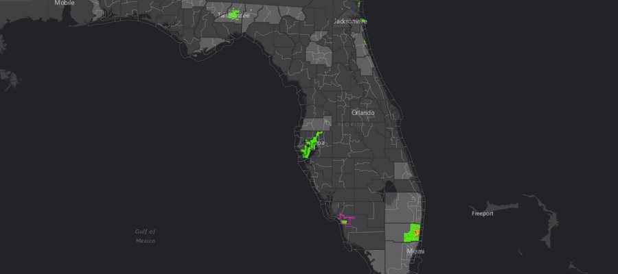
Florida Resolutions Map
This map shows the locations of those communities, most recently updated November 2016. Click here for a full-screen view with map legend.
Community activists in Estero Village are in a race against time to pass this ban; opposing legislation is before the Florida State Legislature that would make it so that only the state, not municipalities, can exercise authority over oil exploration.
The 2016 legislative session will present many important debates and votes on this important issue.
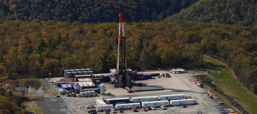
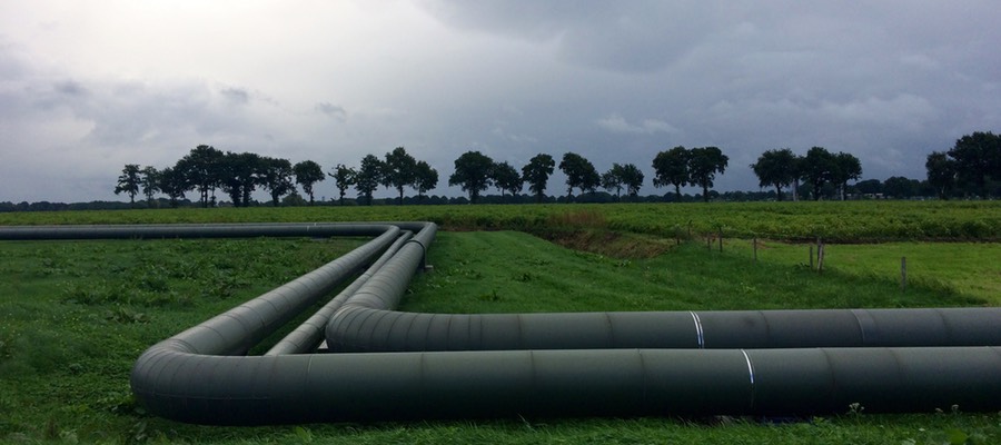
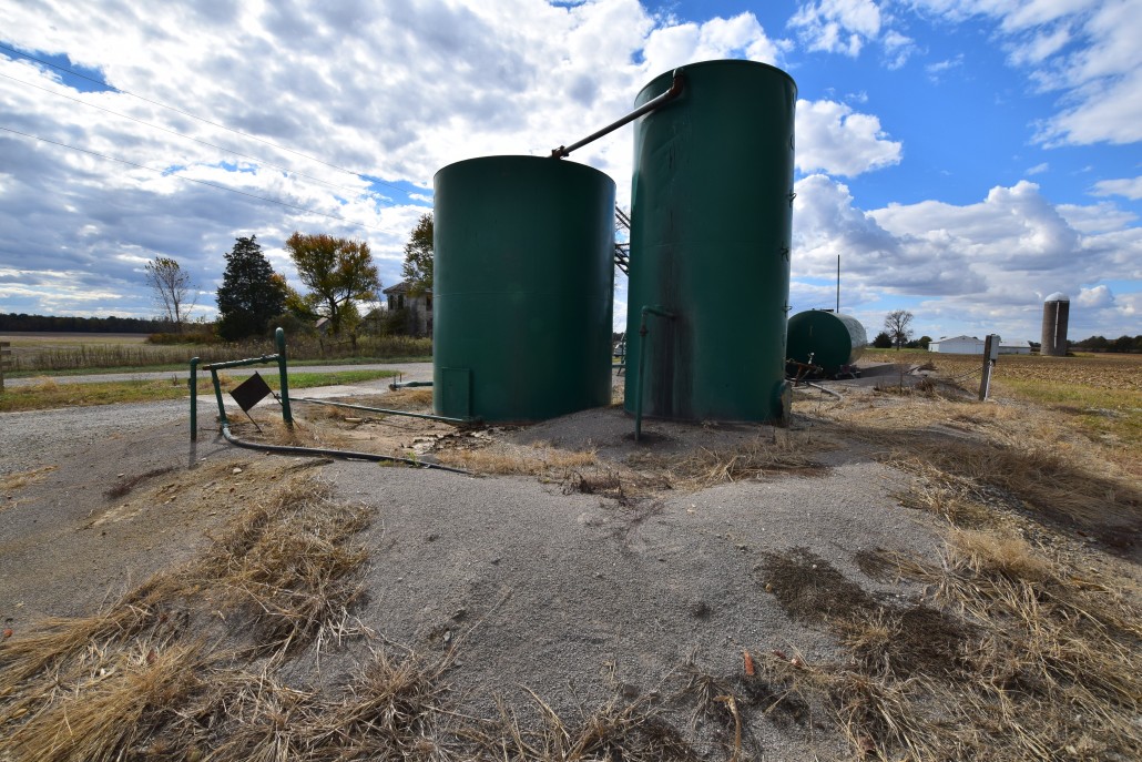
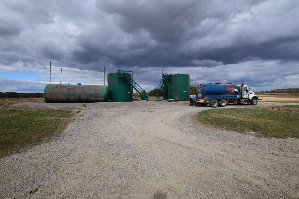
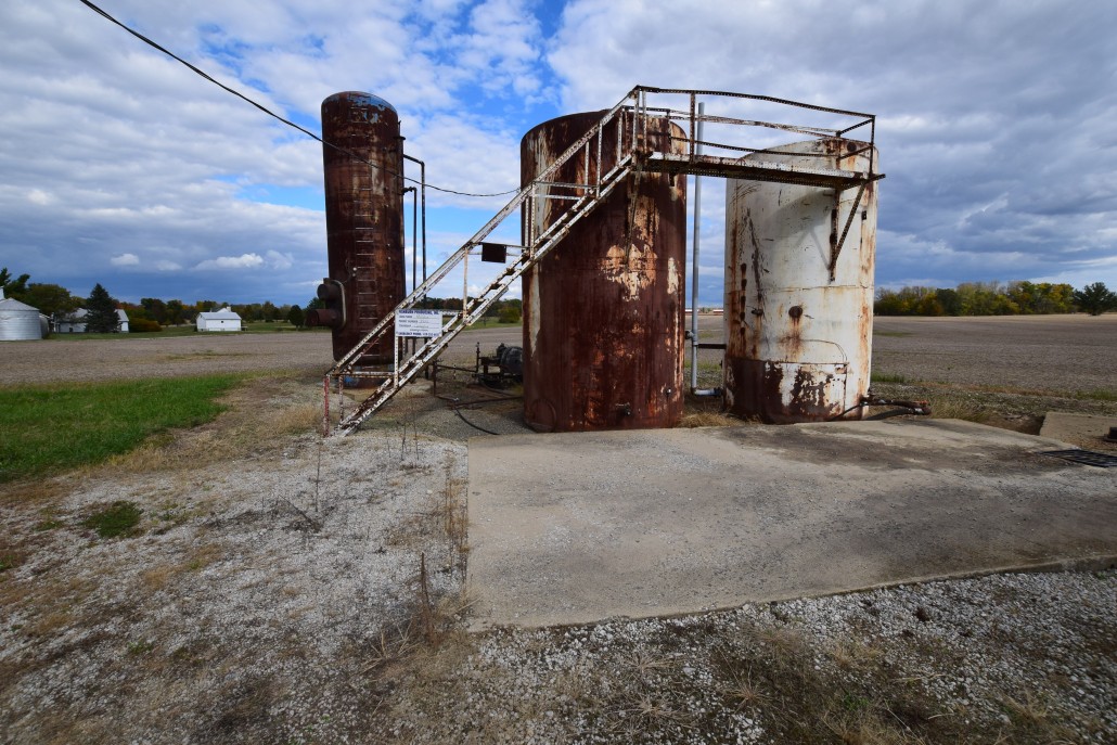
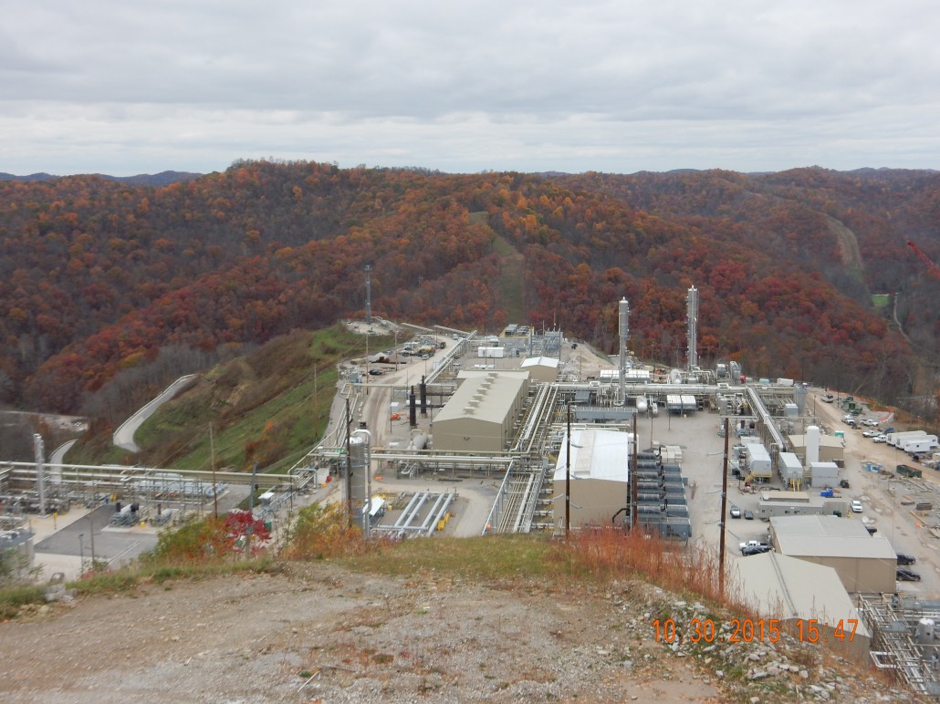
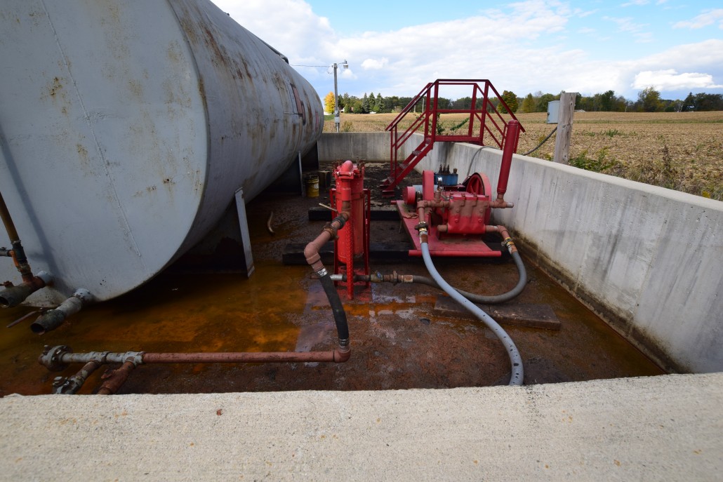
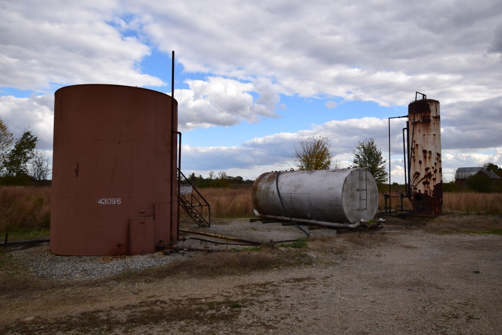
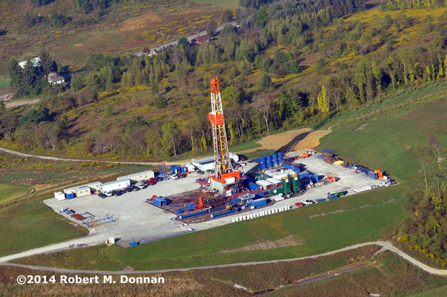
One of the many services that FracTracker offers is access to oil and gas photos. These have been contributed to our website by partners & FracTracker staff and can be used free of charge for non-commercial purposes. Please site the photographer if one is listed, however.
Over the last few months we have added additional oil and gas photos to the following location-based albums – and more photos and videos are coming soon! Click on the links below to explore:
If you would like to contribute photos or videos to this collection, please email us the files along with information on how to credit the photographer to: info@fractracker.org.
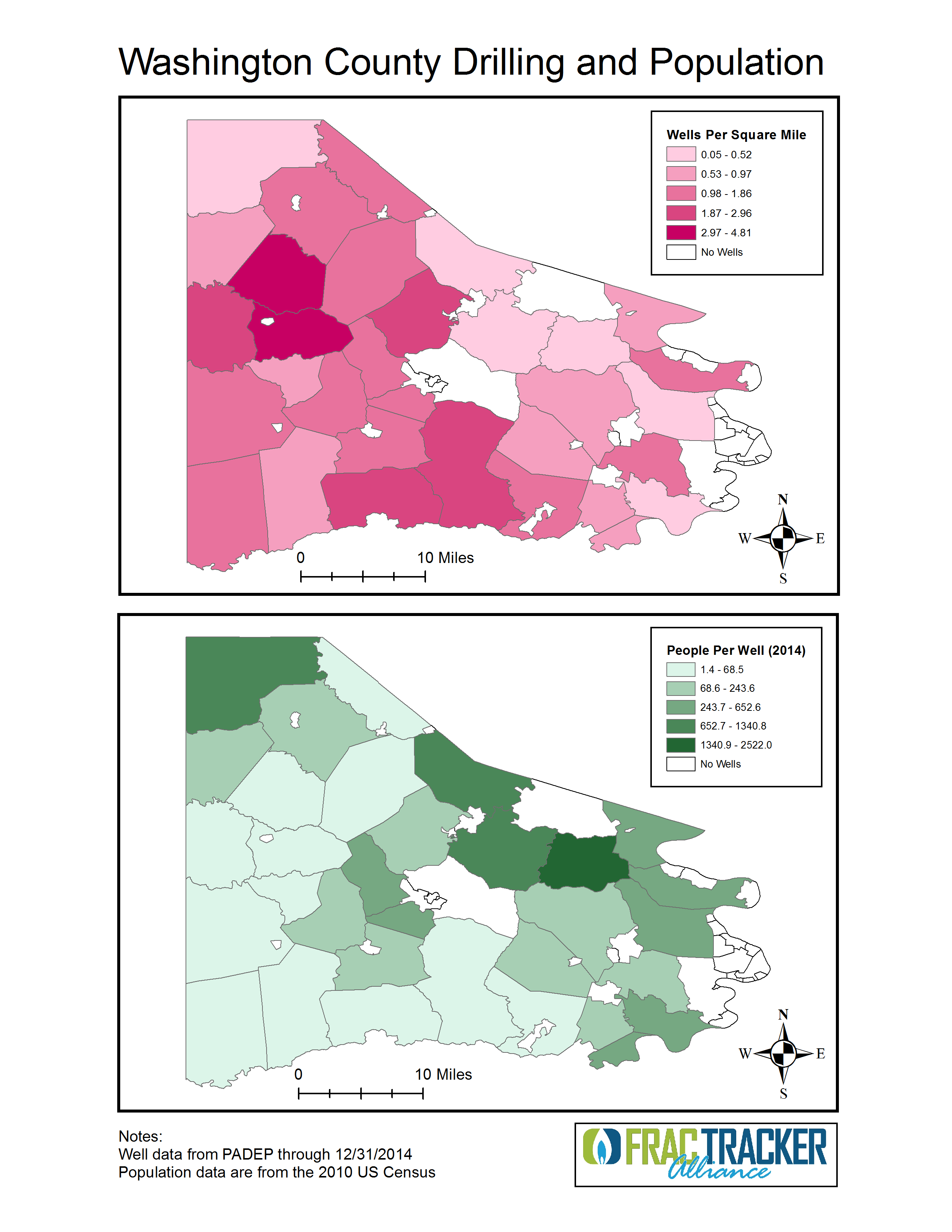
By Danny Kallich, Southwest Pennsylvania Environmental Health Project
This article examines whether emergency responders are prepared in rural areas for oil and gas drilling emergencies, how people may be put at risk if the proper procedures aren’t in place, and other critical safety questions that citizens in Southwest Pennsylvania should be asking.
Maps of wells per sq. mile and people per well in Washington County, PA
The rapid spread of unconventional natural gas development (UNGD) across Pennsylvania has highlighted the need for state, county, and municipal agencies to regulate industry activity and protect the public on several fronts. In particular, comprehensive emergency preparedness and response specific to natural gas development is an obvious necessity for residents living within close proximity of wells, compressor stations, and other stages of UNGD.
While experts in the field of emergency planning are rightfully responsible for creating and executing emergency plans, the Federal Emergency Planning and Community Right to Know Act of 1986 (EPCRA) defines citizens’ rights to engage in the process, both through open records requests and public meetings with local emergency planners. EPCRA establishes roles and requirements for emergency planners while clarifying the rights of citizens to engage in dialogue with those responsible for safety about potentially harmful industrial activity in their community.
Unique Emergency Preparedness Challenges
UNGD presents a unique set of challenges for residents and emergency planners. The high likelihood that UNGD will be located in a rural area not typically supporting industrial use argues for the need for special treatment by emergency planners. Furthermore, responding to a UNGD emergency requires specialized training that is not mandated for local first responders, often volunteer fire fighters. While local first responders cannot be expected to specialize in UNGD related emergencies, it takes many hours for the contracted well-fire specialists, Texas-based Wild Well Control, to arrive and mitigate an emergency situation. The interim period between the arrival of local and county first responders and the arrival of Wild Well Control is, nonetheless, a critical time during which a system for consistent updates to nearby residents should be a priority. An emergency situation, as demonstrated by the February 11, 2014 Chevron Appalachia well fire, discussed below, can affect a community in a variety of ways, even if evacuation is not necessary.
Chevron Appalachia Incident, Greene County, PA
Testing The System:
Using Right-To-Know requests to gauge transparency & citizen awareness
The opportunities for citizen comment and engagement with emergency planners are limited and not well publicized. The dearth of clear and consistent means of communication between residents and those responsible for emergency planning provides a noteworthy opportunity to test the provisions of EPCRA as they relate to UNGD.
In this regard, testing the emergency response system related to oil and gas drilling emergencies is intended to analyze existent emergency plans, municipal preparedness, communication between county, municipal, and industry emergency planners, and perhaps most importantly, how much of this information is available to citizens.
The transparency of the system was tested by filing Right-To-Know requests. These public information requests were filed with nine municipalities in various counties across the state of Pennsylvania. All filed requests specifically asked for “all available county, municipal, and company generated emergency plans” in relation to specific well sites. One request asked for emergency plans generated by an elementary school in relation to a well site within approximately a half-mile.
Of these nine requests, three were fulfilled with returned emergency plans. Of the remaining six requests, five were not fulfilled because no emergency plan existed on record in the municipality. Initially, the request for the elementary school emergency plan was unable to be met by the municipal open records officer because no plan existed. Two months after that request, an unsolicited response from the same individual was received stating that the now-existent plan could not be shared because of security issues. A final question posed to the open records officer asked what concerned parents might be able to do to prepare themselves for emergency situations. This question, too, was deemed unanswerable due to security reasons. Another unmet municipal request was redirected to a county emergency planner who stated that the company generated plan was not theirs to distribute. Of the three emergency plans received, only one made any specific mention of residents living within close proximity; this response merely stated the number of nearby houses. Excluding GPS coordinates, no plan addressed any other infrastructure specific to the surrounding area, indicating a broad generality to their application.
The fact that six out of nine queried communities in PA were unable or unwilling to provide emergency response plans is highly concerning. These findings, when considered in the broader national context, indicate a significant chance that UNGD specific emergency planning and necessary communication with the public is deficient, particularly on the municipal level.
What Communities Need
Lack of specificity, inter-agency communication, and transparency indicate that the potential of EPCRA to benefit citizens has been largely untapped during the Marcellus Shale boom relative to emergency planning. Residents living within close proximity to UNGD should not only be apprised of emergency risk and strategy before an emergency arises, they should have a clearly accessible venue through which to voice concerns, needs, and recommendations. Furthermore, residents have valid reason to demand greater public oversight of current emergency planning efforts when the overwhelming majority of publicly available emergency plans fail to provide any information useful to a layperson.
Currently, there are communities in which the questionable practice of locating UNGD within a half-mile of elementary schools and other sensitive areas continues. In such areas, every effort must be made to develop, institute, and practice emergency plans prioritizing the concerns, safety, and coordination of local residents. Recommendations for improved transparency include:
Make publicly available site-specific plans,
Hold regular public meetings, and
Prioritize communication between emergency responders and residents during emergency events
We encourage residents who are concerned about what their community is doing for UNGD-specific emergency planning to contact their local emergency responders and attend Local Emergency Planning Committee meetings in their county to advocate for such measures.
About EHP
The Southwest Pennsylvania Environmental Health Project (EHP) is a nonprofit environmental health organization created to assist and support Washington County residents who believe their health has been, or could be, impacted by natural gas drilling activities. Their Mission is to respond to individuals’ and communities’ need for access to accurate, timely and trusted public health information and health services associated with natural gas extraction.
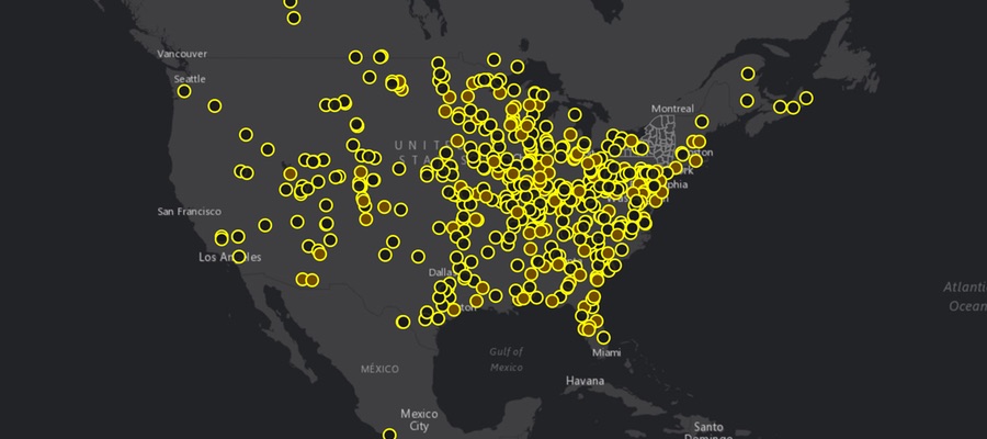
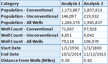
In October 2014, the FracTracker Alliance performed an analysis showing an estimated 1.2 million people lived within a half mile of oil and gas wells in Pennsylvania. We have now updated the analysis, but this time, the unit of measure is one kilometer (0.62 miles).
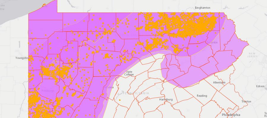
PA Population Within 1km of Active Oil and Gas Wells
This map shows the estimated population within one kilometer of active oil and gas wells in PA – a total of nearly 2 million Pennsylvanians. To access the full set of tools and details about how the map was made, click here for the full screen version of the map.
Methods
To get as complete a picture as possible of the oil and gas industry in PA, we queried the spud date report to show all wells that were listed as being spudded between January 1, 1800 and November 12, 2015. We used the former date because it appears to be a default for unknown spud dates, and the latter being the date that the data were downloaded for the analysis. Altogether, this yielded 203,887 oil and gas wells throughout the state, but 74,900 (37%) of these lacked location coordinates. All of those missing latitude and longitude data were classified as conventional wells, and many of them were fairly old. We then filtered out wells that were reported as not being drilled, as well as those that were permanently plugged, either by the operator, or by the PA Department of Environmental Protection (PADEP). The resulting set, which we refer to as “active” oil and gas wells, included 106,970 wells, of which 9,042 (8%) are defined as unconventional wells by the state.
To obtain an estimated population, we used the Census Tract level of detail, using official 2010 population figures. We calculated the area within 1 kilometer of active wells in three categories – conventional, unconventional, and all oil and gas wells. The population was then estimated by comparing the area inside the 1 km zone to the entire Census Tract, multiplying that ratio to the population of that tract, and repeating the process for each of the three datasets.
This area calculation was performed in Albers Equal Area projection optimized for the Great Lakes Basin area. Every method of flattening an area of a globe on the map will lead to some type of distortion, but this projection prioritizes area over other factors, and is therefore appropriate for this type of analysis.
Results
An additional year of drilling activity, a more comprehensive date range, and the slight increase of the radius distance has had a significant effect on the estimated population near wells. The 2014 analysis yielded an estimated 1,264,576 within a half-mile of wells, while the current analysis has the figure at 1,965,837, an increase of 55%. Below is a table showing differences between the two analyses:
This chart shows summaries of the current analysis of population within 1 km of wells in PA and an October 2014 version, showing population within a half-mile of wells.
One thing you will notice in this figure is that simply adding up the number of people who live in areas near unconventional and conventional drilling will not get you to the 1,965,837 figure we’ve presented. This is because some people live within the specified distance of both types of wells.
Additionally, it is impossible to say how many people live near the oil and gas wells that lack location data, as we obviously can’t map these wells. The majority of these wells may be in the areas that are already represented in the buffer zones, or they may extend that distance significantly.
https://www.fractracker.org/a5ej20sjfwe/wp-content/uploads/2015/11/PA-KM-Feature.jpg400900Matt Kelso, BAhttps://www.fractracker.org/a5ej20sjfwe/wp-content/uploads/2025/09/2025-Wordmark-Logo.pngMatt Kelso, BA2015-11-23 11:26:282020-03-12 17:37:22Nearly 2 Million Pennsylvanians Live Within a Kilometer of Oil & Gas Wells
Pennsylvania’s Drake Well is known for sparking the first oil boom in the United States in 1859. In more recent history, the industry has resurrected hydrocarbon extraction in the Commonwealth through unconventional oil and gas drilling – or fracking. Between 2002 and October 28, 2015, at least 16,826 of these high-impact wells have been approved statewide, and 9,508 drilled.
While standard maps can be useful to show the reach of the industry in aggregate, they aren’t the best way to show how drilling activity has changed over time. Luckily, we have other tools in the toolbox to show the trend. See drilling by year in this time sequence map below.
PA Unconventional Drilling Time Sequence Map
This representation starts slowly, just as the industry did in the state. Activity begins to pick up around 2008. In later years, watch exploration expand throughout the Marcellus and Utica shale plays. Eventually the activity concentrates in the northeastern and southwestern portions in the state.
https://www.fractracker.org/a5ej20sjfwe/wp-content/uploads/2015/11/PAViewer-Feature.jpg400900Matt Kelso, BAhttps://www.fractracker.org/a5ej20sjfwe/wp-content/uploads/2025/09/2025-Wordmark-Logo.pngMatt Kelso, BA2015-11-05 17:03:292020-03-12 17:37:38Time Sequence Map of PA Drilling Available
PA DCNR recently released a draft State Forest Resource Management Plan. The draft plan, last revised in 2007, is an important tool that the Bureau of Forestry (BOF) uses to help manage Pennsylvania’s approximately 2.2 million acre state forest system. Approximately 1.5 million acres of state forest lands lie within the shale gas fairway and gas extraction – along with related issues like water resources – is among the numerous subjects addressed in the document.
In total, approximately 673,000 acres are available for oil and gas development in PA state forests, either because private interests own the mineral rights below the land or because DCNR has opened up state-lands for drilling where it controls the mineral rights.
Approximately 386,000 acres have been leased by DCNR to allow drilling. DCNR’s shale gas monitoring report in 2014 said that only 16% of available state forest lands have been developed, which means that 84% (or 328,700 acres) could still be accessed for oil and gas through DCNR leases. Another 287,000 acres of state forest land sits atop private mineral rights. Mineral rights supersede – or overrule – those of the surface rights.
By some estimates, the projected “drillout” of state forest lands may include an additional 2,000 to 3,000 unconventional natural gas wells. There are concerns that the draft plan also does not adequately address the full scale and scope of such drilling and the serious impacts associated with it.
Derived from available data, FracTracker has prepared the following portrait of the projected impact to Pennsylvania’s state forest estate with emphasis on the resource-intensive nature of hydraulic fracturing and its extensive footprint on this sensitive landscape.
Table 1. Projected land use needed to add 2,000 to 3,000 more wells on PA state forestlands
Facility Type
Unit
Projected Drilled Wells
2,000
3,000
Well Pads
#
606
909
Acres
2,477
3,716
Limit Of Disturbance (LOD)*
Acres
7,130
10,695
Gathering Lines
Acres
20,189
30,284
Addtl. Mid/Down-stream Facilities
Acres
2,847
4,271
Compressor Stations**
#
126-210
189-316
Acres
2,978-4,976
4,466-7,464
ESTIMATED TOTAL
Acres
36,621
54,931
*Limit of Disturbance includes infrastructure, mounded earth, etc. needed to access and service the well pads. **1 compressor station is needed for every 25-30 miles of gathering lines, at 15-30 acres per station.
In Ohio, well pads average 4-5 acres, 3.4 laterals per well pad, and 8.5 acres of gathering line per acre of well pad. However, each pad has what we are calling a “Limit of Disturbance,” which includes infrastructure, mounded earth, etc. LOD likely represents a conservative estimate of miscellaneous land disturbance as it does not include the access roads; it was not possible with our current datasets to discern which roads were specifically added to access the well pads. LODs are averaging 10-14 acres.
Using the 2,000-3,000 wells proposed, the total acreage that could be disturbed by new well pads, well pad LODs, gathering lines, compressor stations, and related mid/downstream facilities in PA’s state forests would be between and 36,621 and 54,931 acres depending on the number and size of compressor stations (i.e., averaging 24 acres) (Table 1).
Water Use
Table 2. Projected resource use and waste produced per well based on OH, WV, and PA historical figures.
Variable
Unit
Avg
Increase / Quarter
Water Needed
Gallons
3.5 MGs
–
PA Stats
Gallons
4.4 MGs
–
OH Stats*
Gallons
6.2-7.0 MGs
405-410 K
WV Stats
Gallons
7.9 MGs
450 K
Drill Cuttings**
Tons
1,050
4.96
OH Stats
Tons
700+ (estimate)
4.7-5.2
PA Stats
Tons
1,400
–
Landfill Waste (Drilling Muds)
Tons / Facility
28,098
15,319
Silica Sand
Tons
4,303
86
Injection Waste
Gallons / Quarter
117 MGs
5.4 MGs
* 7-9% of injected fluids returns to the surface as fracking waste ** significantly dependent upon lateral length
https://www.fractracker.org/a5ej20sjfwe/wp-content/uploads/2015/10/Forest-PA-Feature.jpg400900FracTracker Alliancehttps://www.fractracker.org/a5ej20sjfwe/wp-content/uploads/2025/09/2025-Wordmark-Logo.pngFracTracker Alliance2015-11-04 10:40:372020-03-12 13:44:21The Ultimate Price of PA State Forest Drilling
By Ted Auch, Kyle Ferrar, and Samantha Rubright with Max Gruenig
Fourteen days is not nearly enough time to fully understand the complex differences between oil and gas drilling issues and policies in the United States and several European Union countries. The EU’s drilling policies, geography, and the industry’s level of activity are quite distinct from those of the States in some cases. Still, as part of the Our Energy Solutions project, four staff from FracTracker Alliance and Ecologic Institute attempted to understand and share as many lessons-learned in Europe as we could in the first two weeks of September. Our interest covered all aspects of oil and gas development, but focused on those relating to the use of stimulation techniques (hydraulic fracturing – fracking) in unconventional reservoirs. Even with significant differences between the US and EU, there is still much to be gleaned in sharing our regulatory approaches, community concerns, and environmental challenges.
“Chaos is merely order waiting to be deciphered” ― José Saramago, The Double
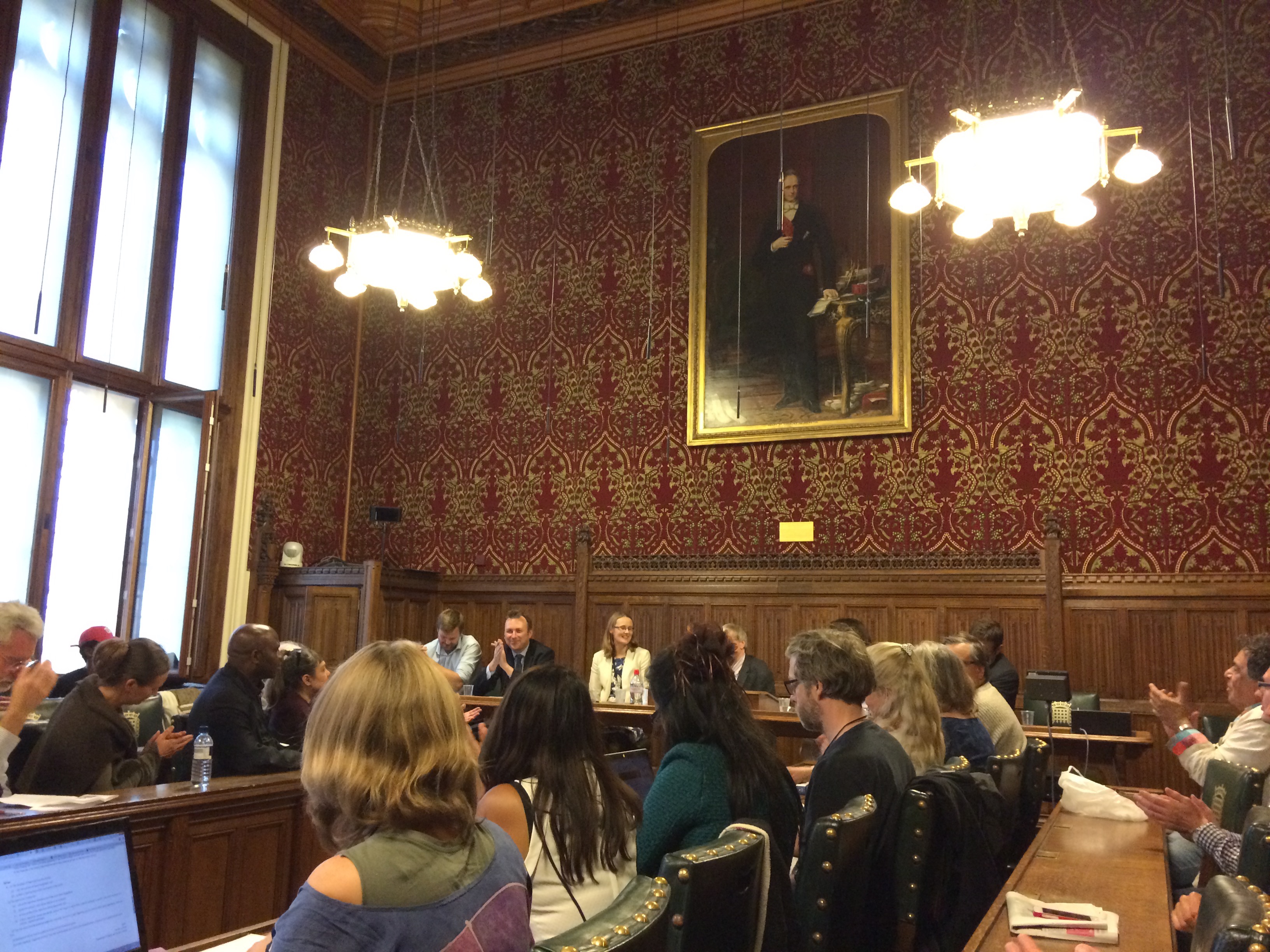
London, England Meetings
The House of Commons meeting was held in Parliament, just below London’s Big Ben. Photo by Sam Rubright
Our European tour started in London with Ecologic Institute’s Max Gruenig. The first stop was a meeting with University of Salford Professor of Regeneration and Sustainable Development Erik Bichard outside of The Palace of Westminster. Erik has worked extensively to understand and chronicle common threads that weave together community response(s) to hydraulic fracturing (fracking) proposals. Much of Erik’s research in the UK has focused on the efforts of the leading shale gas extraction company in the EU, Cuadrilla Resources, to employ hydraulic fracturing technologies, as well as local oppositions to this development. The major points of contention are in Lancashire County, Northwest England and Balcombe in West Sussex. Erik pointed to the fact that Cuadrilla admitted their claims that the 4% decline in UK energy cost was a result of Lancashire oil and gas exploitation were significantly overstated. Such manipulative statements appear to be cut directly from North American energy’s playbook.
House of Commons meeting, London. Photo by Sam Rubright
We then attended a spirited Fracking with Nature Meeting at The House of Commons hosted by 21st Century Network and convened by MP Cat Smith (photo right). Many, if not all, of the attendees were concerned about the negative impacts of fracking and oil and gas development in general, but perhaps the event’s purpose self-selected for those attendees. We found the conversations to be very advanced considering that the UK has not seen nearly the same level of oil and gas activity as the US. Most questions centered on the potential for fracking to negatively impact ground water, followed by the induction of earthquakes. Air quality was not discussed as often, despite the serious risks that oil and gas air pollutants pose to health, and the frequency and severity of ambient degradation reported in the US. With the UK’s move to cut subsidies for renewables and a push toward fracking, these concerns may soon become a reality.
We later met with one of the speakers at the House of Commons meeting, Damien Short LLB, MA, PhD, Director of the University of London’s Human Rights Consortium[1] and the Extreme Energy Initiative.[2] NGO’s, we learned, are on the forefront of the issue, debating the need to prioritize community health over corporate profits. They have had quite a lot of success on this front, despite Tory projections.[3] The past state of UK politics under the direction of PM David Cameron, was supportive of extractive industries and corporate interests, blocking any attempt to introduce regulations. Even with the defeat of David Cameron’s administration, new “fast-tracking” rules to accelerate permits for fracking passed in August.[4] The overwhelming victory of democratic socialist Jeremy Corbyn as the leader of the opposition Labour Party – means that the tenure of the current fracking moratoria in North Yorkshire, as well as in Scotland, Wales, and Northern Ireland[5] could be brief.
Our time in London was filled with several other meetings, including one with Greenpeace UK’s new fracking coordinator, Hannah Martin. During our meeting she indicated that while Greenpeace was sympathetic to the views and tactics of Mr. Corbyn, they were concerned that his election would further divide Labour. In her opinion this change could allow the oil and gas sympathetic – and united – Tories to expedite their vision for fracking in the UK.
Regardless of the similarities between community concerns and industry tactics, however, one difference between the UK and US was crystal clear; no matter their view on the use of fracking, Brits support a substantial Petroleum Revenue Tax (PRT) rate to the tune of 50-60%. The PRT will fall to 35% in January, 2016, however. This latter figure is a sizeable decrease but would still be 40% higher than the average in the US. California for example, the fourth largest producing state, does not and has never levied a severance tax.[6] Unfortunately, the UK is seeing similar conflict of interest issues and deliberate attempts to de-democratize the rule-making around fracking, as demonstrated in a recent move to prevent a proper parliamentary debate about drilling under protected areas in the UK.
Brussels, Belgium Workshop and Meeting
Geert, Max, Kyle, and Ted after our meeting with the European Commission in Brussels. Photo by Sam Rubright
The next phase of OES Europe took us to Brussels to host a community workshop and meet with members of the European Commission’s Directorate-General for Environment. Both events brought to light many concerns and questions about drilling’s safety.
The European Commission is currently drafting a best available techniques reference document (BREF) regarding hydrocarbon extraction for the European Union to consider in December 2015. The recommendations will build upon the “Minimum Principles,” published in January, 2014.[7] Representatives from the European Commission asked us about a variety of concerns that have arisen from drilling in the US, and how Europe might have similar or different experiences. The Commission was most interested in environmental health risks and research focused on exposure to air pollutants, as well as other degraded environmental media (drinking water, soil, etc.). We also shared figures about water consumption, land use, and waste management. It was immediately apparent that the lack of high quality publicly accessible data in the US is making it very difficult for the Commission to make well-informed decisions or policy recommendations. This meeting was arranged by Geert De Cock, of Food and Water Europe, and – interestingly – was one of the first times that the European Commission met with non-industry representatives. (Several major oil and gas players have offices near the European Commission’s in Brussels.)
Rotenburg (Wümme), Germany Workshop
Max presenting during the Rotenburg Germany workshop, Sept 2015. Photo by Kyle Ferrar
Our next stop in Germany was Rotenburg. Lower Saxony also has a long lineage of drilling, with the first well drilled in 1953 and the majority of natural gas development dating back to the mid 1980’s. Currently, this is an area were unconventional oil and gas drilling (fracking) is being heavily proposed and lobbied.
This workshop was by far the most well attended event. A variety of groups and stakeholders, including the town’s mayor, were in attendance and extremely well informed about environmental and public health risks that drilling could pose. They’ve been dealing with a series of environmental health concerns for some time, including high mercury levels in drilling waste and cancer clusters of questionable origin. A systematic statistical analysis has even suggested that cases of Non-Hodgkin lymphoma are higher in an area heavy with oil and gas wells and development.
See maps below for more information about drilling in Germany and Europe at large.
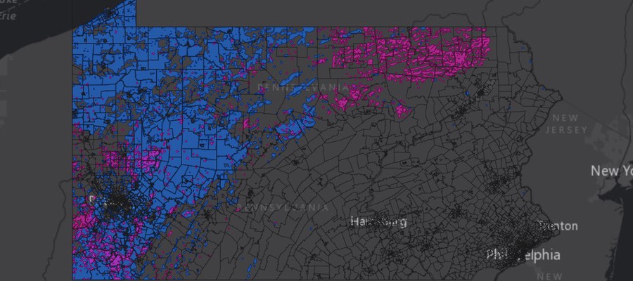
Unconventional gas production, conventional gas drilling, fracking and test boring in Europe
Map by Gegen Gasbohren (Against Gas Drilling)
A dynamic map similar to the one above was created by us to show simply where unconventional drilling is occurring in the UK and Netherlands: View FracTracker’s map fullscreen
Rotenburg Field Tour
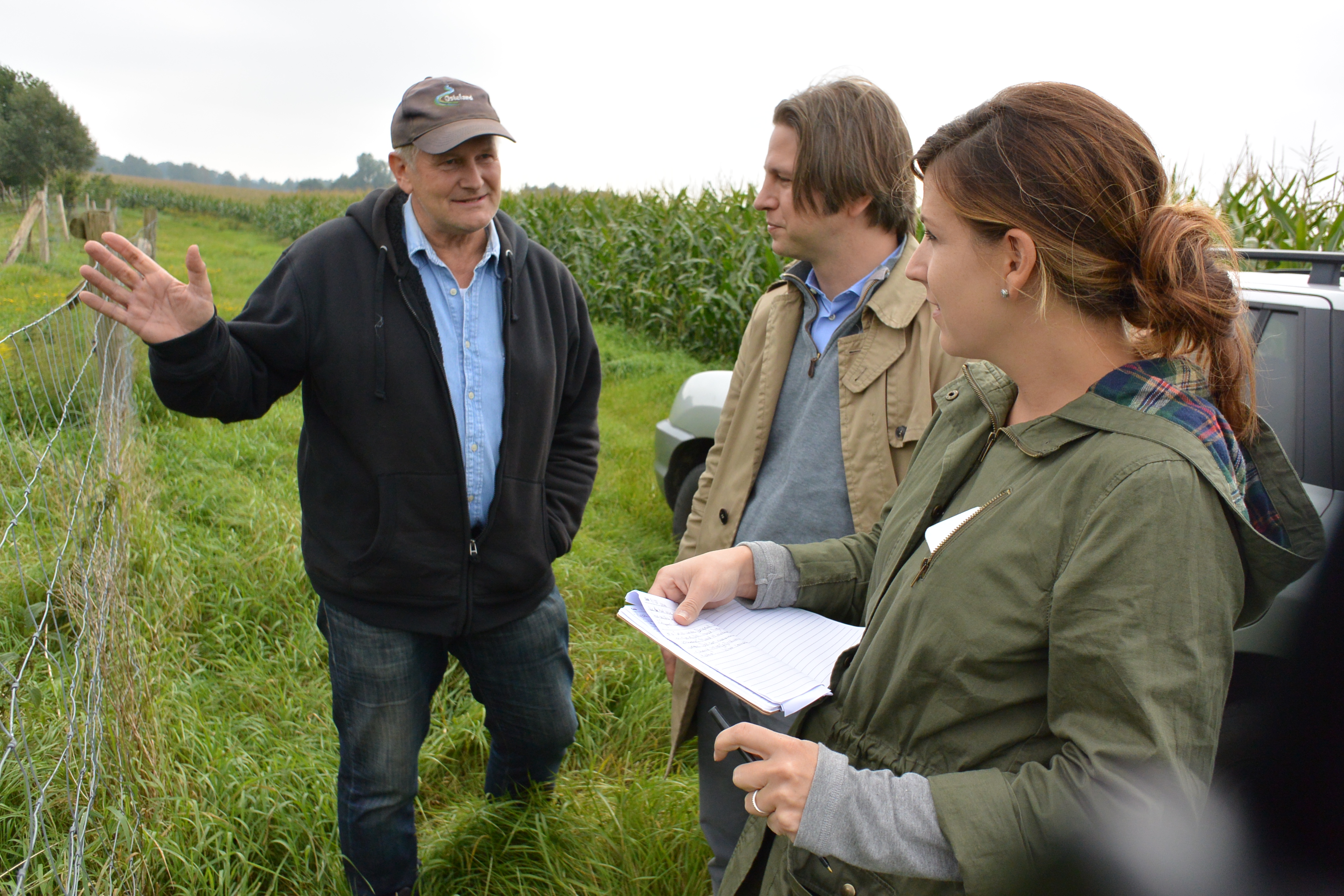
The following morning we set out with a local advocate, Andreas Rathjens, to tour over eight different oil and gas drilling sites and facilities in and around Rotenburg. This area is vey rural and a major agriculture hub, hosting 162k people, 200k cows, and 600k pigs according to our guide.
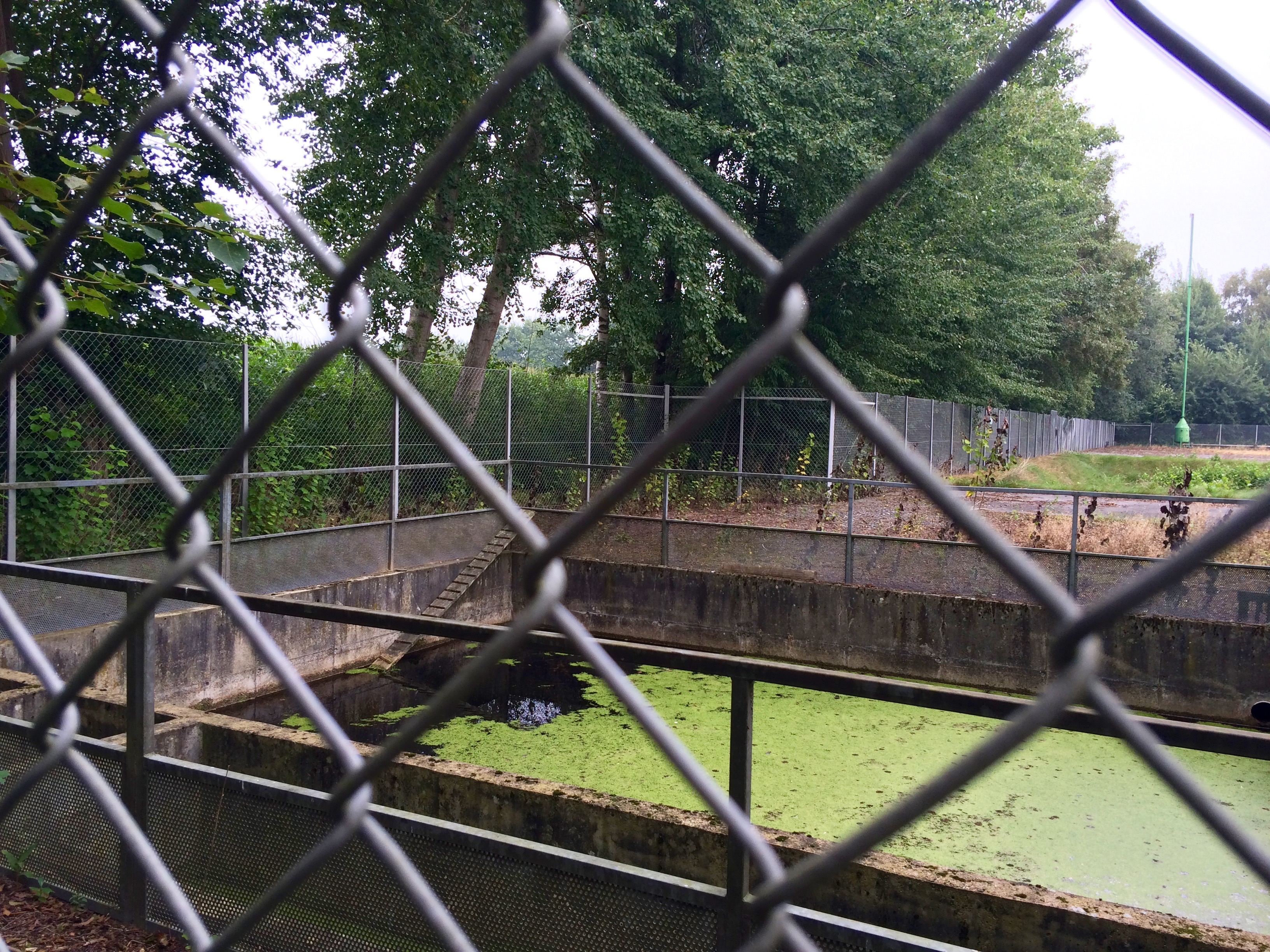
In recent years Germany has received very positive scores for its environmental policies and shift toward renewables. However, this tour highlighted some of the country’s lingering and poorly-regulated drilling history, which experienced a sharp increase in development here in the 1980’s. The pictures below will give you an idea of the issues that German residents are is still seeing from the country’s older oil and gas drilling operations. Click to enlarge the photos:
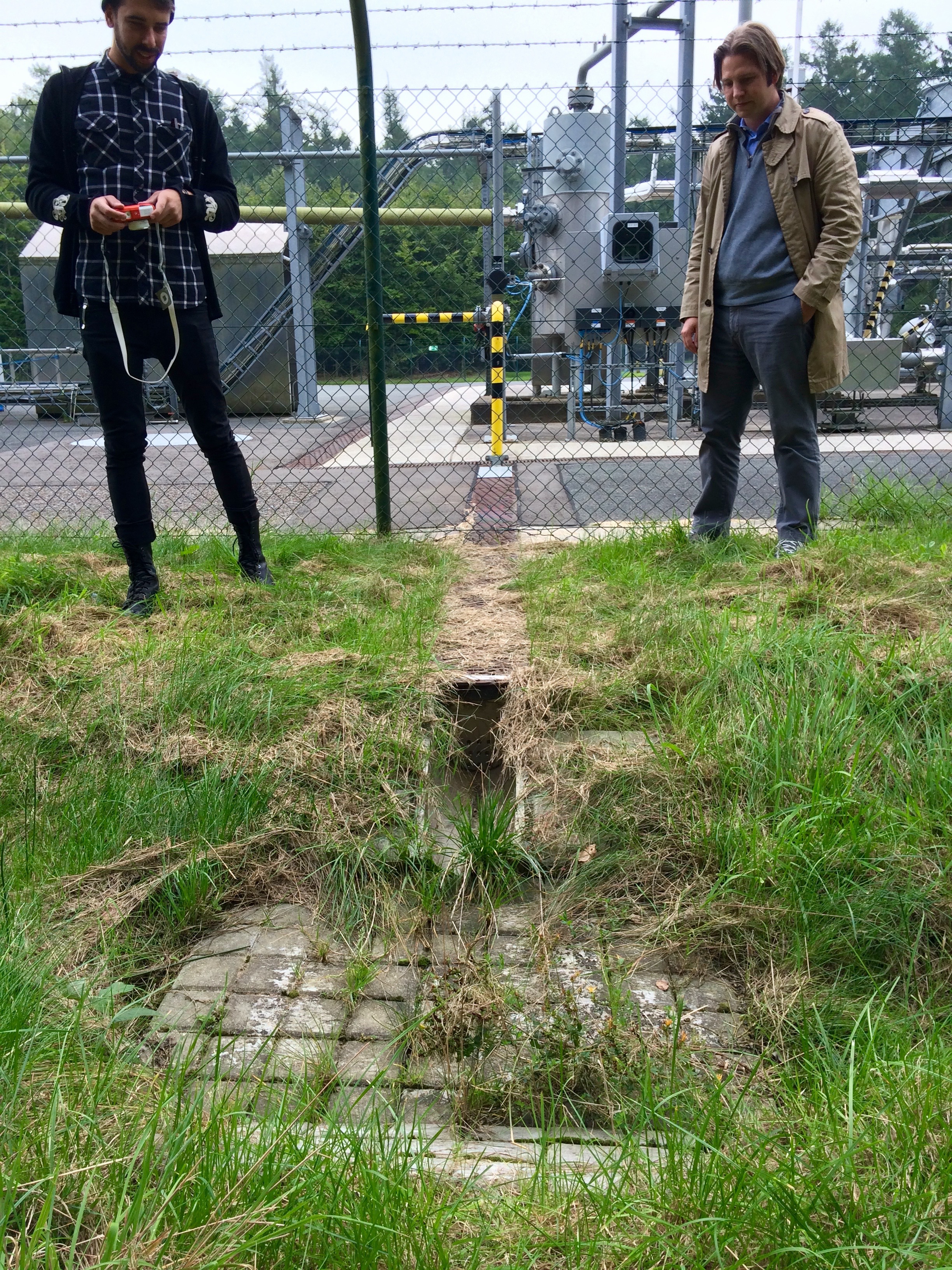
This pit is used to capture rainwater and runoff from the well pad. Since runoff from the pad will carry with it any contaminants spilled on the site, runoff must be quarantined for removal and proper disposal. Unfortunately, these tanks are rarely pumped and drained, and the runoff instead spills into local streams in small watersheds. Such is the case with this tank, with the spillway visible in the lower left corner of the photo.
This site was recently renovated to improve the drainage off of the wellpad. The drainage leads to an excavated waste pit used as an overflow catchment.[8] In these types of waste pits pollutants evaporate into the air and percolate into groundwater sources. The waste from drilling in this region is known for its high levels of mercury.
Andreas showing us the site where he says 80,000 metric tonnes of solid drilling waste was mixed with residential waste and then disposed of in a field on a hilltop. Residents have tested the site and found troubling levels of arsenic and radioactive elements, but to Andreas’ knowledge no governmental or company testing has been done to-date.
Andreas and community members all conveyed their support of domestic energy production but said they were disappointed in how the oil and gas industry has conducted itself historically in the region. They are very frustrated with how difficult it is to get their concerns heard, a sentiment echoed in many boomtowns across the US. One local politician even discussed the intentionally misleading statements made by the German state governments around environmental health issues. These residents are dedicated and driven despite the barriers, however. They are investigating and studying the problems directly at times, as well as searching for other technologies that can help improve their methods – such as the use of drones to measure air quality.
Badbergen, Lower Saxony, Germany Workshop
Fracking-freies Artland hosted our next workshop in Badbergen Germany. In addition to our presentation about drilling experiences in the US, these community gatekeepers led a presentation summarizing the work and struggles that have been occurring in their region due to both historic and modern drilling. The level of community engagement and activism here was quite impressive, mirroring that of NY State’s anti-drilling groups. These members help to inform the rest of the community about environmental and drilling issues, as Exxon is now considering fracking here again.[9]
Schoonebeek Tour, Netherlands
Our final border crossing brought us to the Schoonebeek region in the Netherlands. While the Groningen gas field is by far the largest of the fields in this Western European country, Schoonebeek is the only active field being drilled unconventionally in the Netherlands.
Interestingly, the entire field was recently shut down by NAM Shell/Exxon JV to fix this wastewater pipeline. It was discovered that the pipeline was leaking wastewater in nine places due to corrosion caused by the high sulfur content of the wastewater.
Upon starting our tour we were informed of the fact that the Dutch have an even higher extraction tax than the UK! The Netherlands retains a 50% State Profit Share for revenue and taxes the remaining production at a rate of 20% on the first $225,000 in revenue and “25% on the excess.” In comparison, the highest production tax rate on oil and gas drilling in the US is in Alaska at 35%. Most states have significantly lower severance taxes.[10]
Political support for higher taxes on the extractives industry may be explained by the fact that the state owns all subsurface mineral rights in these European countries. Regardless of other influences on perception, such high taxes disproves the notion here in the US that energy companies “won’t do business in a state [or country] with a newly-enacted punitive severance tax.” What do the states do with this extra revenue? The Netherlands and many Northern European countries have invested these monies for the rainy day when the oil and gas supply is depleted or extraction is no longer justifiable. The best examples are Norway’s $850 billion Government Pension Fund and Netherland’s $440 billion pension fund or $169,000 and $26,000 per capita, respectively.
Additional support for severance taxes is likely due to these countries’ history with oil and gas exploration. They are familiar with the boom-bust cycles that come with the initial expectations and long-term reality on the ground. When the music stops, Europeans are determined not to be the ones left standing.
About the Our Energy Solutions Project
This trip to Europe and our previous expeditions to Florida, North Carolina, Argentina, and Uruguay are part of a larger, collaborative project with Ecologic Institute US called Our Energy Solutions. OES is creating an informed global community of engaged citizens, organizations, businesses, governments, and stakeholders to develop ideas and solutions to keep our society moving forward while preserving our planet for the future. Learn more at: ourenergysolutions.org.
On a more personal note, our sincerest thanks goes out to the many groups and individuals that we met on our Europe tour, including those we did not directly mention in this article. We are forever indebted to all of the people with whom we met on these OES trips for sharing their time and knowledge with us.
Endnotes and References
Dr. Short is currently advising local anti-fracking groups in the UK and county councils on the human rights implications of unconventional (extreme) energy extraction processes such as fracking.
Much of the ammunition used by the anti- or undecided fracking community in the UK – and the EU writ large – is coming from proofs of concept in states like Pennsylvania, Ohio, New York, and North Dakota.
A practice that is supposedly now being investigated for soil contamination issues.
Exxon originally wrote in the local/regional paper that there was to be no unconventional shale drilling (fracking), but now the company is reconsidering.
Please note that the cited article was last updated in 2012. Some tax rates have changed since the time that the article was published, but the table still adequately represents an estimation of production taxes by state.
https://www.fractracker.org/a5ej20sjfwe/wp-content/uploads/2015/10/OES-Europe-Feature.jpg400900FracTracker Alliancehttps://www.fractracker.org/a5ej20sjfwe/wp-content/uploads/2025/09/2025-Wordmark-Logo.pngFracTracker Alliance2015-10-28 15:30:592020-03-12 13:45:14A Fresh Look at Oil and Gas Drilling from Europe


