Landfill Disposal of WV Oil and Gas Waste – A Report Review
By Bill Hughes, WV Community Liaison
As oil and gas drilling increases in West Virginia, the resulting waste stream must also be managed. House Bill 107 required the Secretary of the West Virginia Department of Environmental Protection to investigate the risks associated with landfill disposal of solid drilling waste. On July 1, 2015, a massive report was issued that details the investigation and its results: Examination of Leachate, Drill Cuttings and Related Environmental, Economic and Technical Aspects Associated with Solid Waste Facilities in West Virginia, by Marshall University.
While I must commend the State for looking into this important issue, much more needs to be done, and I have serious concerns about the validity of several aspects of this study. Since the report is almost 200 pages long, I will summarize its findings and my critiques below.
Summary of Waste Disposal Concerns in Report
The page numbers that I reference below refer to the page numbers found within the PDF version of the full study.
- Marcellus shale cuttings are radioactive: pgs. 17, 139, 142, 154
- We do not know if there is a long term problem: pg. 19
- About 30 million tons of waste in next few decades: pg. 176
- Landfill liners leak: pg. 20
- Owning & operating their own landfill would be expensive & risky for gas companies: pgs. 186-7
- Toxicity and biotic risk from drill cuttings is uncharted territory: pg. 78
- Landfill leachate is toxic to plants & invertebrates: pgs. 16, 95, 97
- Other landfills also have radioactive waste: pgs. 14-15
- We have no idea if this will get worse: pgs. 96, 154
- If all systems at landfills work as designed, leachate might not affect ground water: pg. 41
Introduction
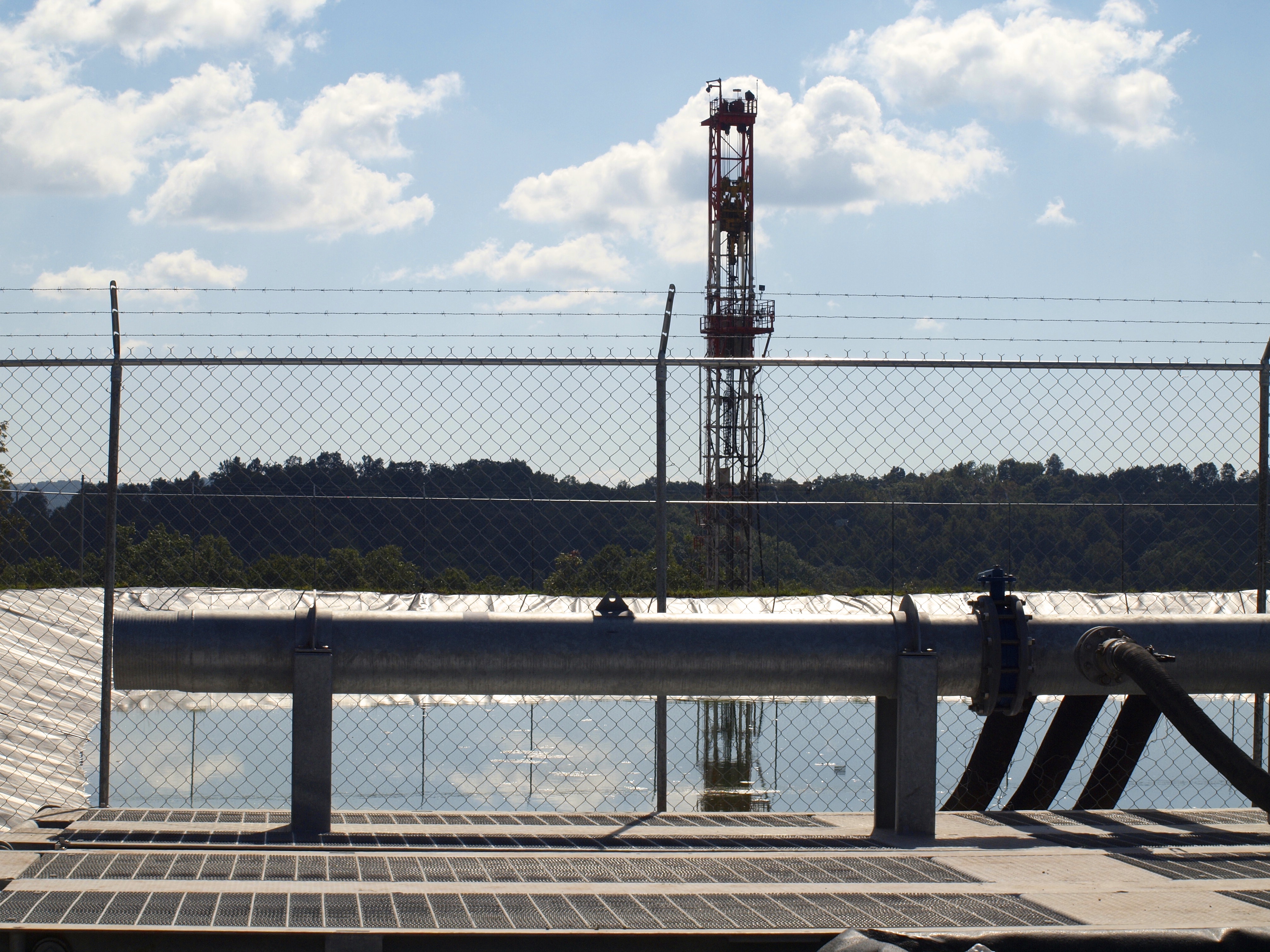
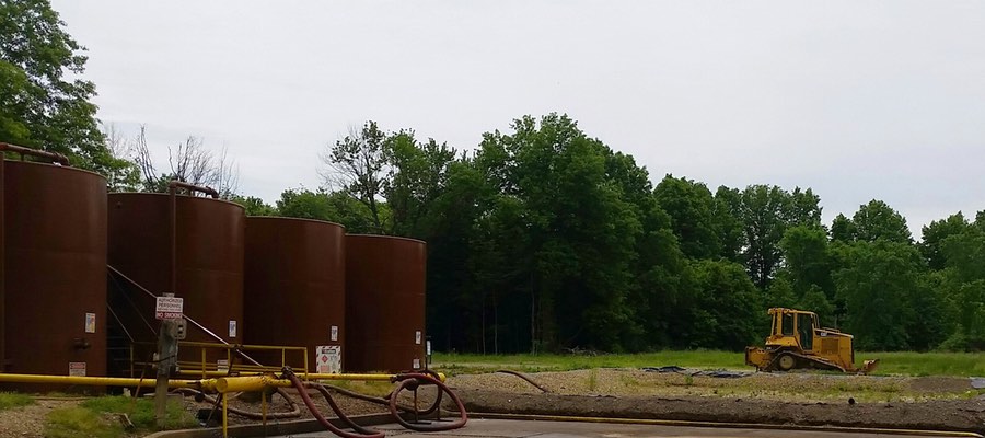
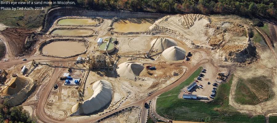
Drilling rig behind a wastewater pond in West Virginia
Any formal report comprised of 195 pages generated by a reputable school like Marshall University with additional input from Glenville State College – supported by over 2,300 pages of semi-raw data and graphs and charts and tables – requires some serious investigation prior to making comprehensive and final conclusions. However, some initial observations are needed to provide independent perspective and to help reflect on how sections of this report might be interpreted.
The overarching perspective that must be kept in mind is that the complete study was first limited by exactly what the legislature told the WV Department of Environmental Protection DEP to do. Secondly, the DEP then added other research guidelines and determined exactly what needed to be in the study and what did not belong. There were also budget and time constraints. The most constricting factor was the large body of existing data possessed by the DEP that was provided to the researchers and report writers. Because of the time restrictions, only a small amount of additional raw data could be added.
And most importantly, similar to the WVU Water Research Institute (WVU WRI) report from two years ago, it must be kept in mind that these types of studies, initiated by those elected to our well-lobbied legislature and funded and overseen by a state agency, do not occur in a political power vacuum. It was surely anticipated that the completed report might have the ability to affect the growing natural gas industry – which is supported by most in the political administration. Therefore, we must be cautious here. The presence and influence of political and economic factors need to be considered. Also, for universities to receive research contracts and government paid study requests, the focus must include keeping the customer satisfied.
My comments below on the report’s methods and findings are organized into three broad and overlapping categories:
- GOOD – positive aspects, good suggestions, important observations
- GENERAL – general comments
- FLAW – problems, flaws, limitations
- MOVING FORWARD – my suggestions & recommendations
I. Water Quality: EPA Test Protocols & Datasets
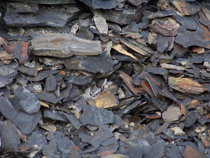
Marcellus Shale (at the surface)
GENERAL It is obvious that a very smart and well-trained set of researchers put a lot of long, detailed thought into analyzing all of the available data. There must be tens of thousands of data points. Meticulous attention was put into how to assemble all of the existing years’ worth of leachate chemical and radiological information.
GOOD There is an elaborate and detailed discussion of how to best analyze everything and how to utilize the best statistical methods and generate a uniform and integrated report. This was made difficult with non-uniform time intervals, some non-detect values, and some missing items. The researchers used a credible process, explaining how they applied the various appropriate statistical analysis methods to all the data. They provided some trends and observations and draw some conclusions.
FLAW 1 The most glaring flaw and the greatest limitation pertaining to the data sets is the nature of the very data set, which was provided to the researchers from the DEP. It is to the commendable credit of the DEP that the leachate at landfills receiving black shale drill cuttings from the Marcellus and other shale formations were, from the beginning, required to start bi-monthly testing of leachate samples at landfills that were burying drill waste products. And in general, when compared to on-site disposal as done for conventional wells, it was initially a good requirement to have the drill cuttings put into some type of landfill; that way we could keep track of where the drill cuttings are located when there are future problems.
To the best of my knowledge, until the states in the Marcellus region started allowing massive quantities of black shale waste material to be put into local landfills, we have never knowingly deposited large quantities of known radioactive industrial waste products into generic municipal waste landfills. The various waste products and drill cuttings of Marcellus black shales have been known for decades by geologists and radiochemists to be radioactive. We know better than to depose of hazardous radioactive waste in an improper way. Therefore, it is very understandable that we might not know how to best solve the problems of this particular waste product. This was and still is new territory.
FLAW 2 All of the years of leachate test samples were processed for radioactivity using what is called the clean drinking water test protocols, also referred to as the EPA 900 series. Three years ago, given the unfamiliarity of regulatory agencies with the uniqueness of this waste problem, we chose the wrong test protocol for assessing leachate samples. We speculated that the commonly used and familiar clean drinking water test procedure would work. So now we have a massive set of test results all derived from using the wrong test protocol for the radiologicals. Fortunately, all of the chemistry test results should still be reasonably useful and accurate.
At first, three years ago, this was understandable and possibly not an intentional error. Now it is widely known by hydrogeologists and radiochemists, however, that the plain EPA 900 series of test methods for determining the radioactivity of contaminated liquids do not work on liquids with high TDS — Total Dissolved Solids. Method 900.0 is designed for samples with low dissolved solid like finished drinking water supplies.
Despite this major and significant limitation, the effort by Marshall University still has some utility. For example, doing comparisons between and among the various landfills accepting drill waste might provide some interesting observations and correlations. It is clearly known now, however, that the protocols that were used for all samples from the start when testing for gross alpha, gross beta and radium-226 and radium-228 in leachate, can only result in very inaccurate, under-reported data. Therefore, it is not possible to draw any valid conclusions on several very important topics, including:
- surface water quality,
- potential ground water contamination,
- exposure levels at landfills and public health implications,
- and policy and regulations considerations.
Labs certified to test for radiological compounds and elements are very familiar with the 900 series of EPA test procedures. These protocols are intended to be used on clean drinking water. They are not intended to be used on “sludgy” waters or liquids contaminated with high dissolved solids like all the many liquid wastes from black shale operations like flowback and produced water and brines and leachate. The required lab process for sample size, preparation, and testing will guarantee that the results will be incorrect.
In no place in the final 195 page report have I seen any discussion of which EPA test protocol was used for the newer samples and why was it used. It has also not yet been seen in the 2,300+ pages of supportive statistical and analytical results, either. The fact that the wrong protocol was used three years ago is very understandable. However, this conventional EPA 900 series was still being used on the additional very recent (done in fall of 2014 and spring of 2015) samples that were included in the final report. The researchers, without any justification or discussion or explanations continued to use the wrong test protocol.
The clean drinking water procedures should have been used along with the 901.1M (gamma spec) process, for comparison. It is understandable for the new data to be consistent and comparable with the very large existing dataset that a case could be made for using the incorrect protocol and the proper one also. There should have been a detailed discussion of what and why any test method was being used, however. That discussion is usually one of the first topics investigated and explained in the Methods section. Having that type of discussion and justification seems to represent a basic science method and accepted research process – and that omission is a serious flaw.
MOVING FORWARD We all know that if we want to bake an appetizing and attractive cake we must use the correct measuring cups for the ingredients. If we want to take our child’s temperature we need an accurate thermometer. When our doctor helps us understand our blood test results, we all want to be confident the right test was used at the lab. The proper test instrument, recently calibrated and designed for the specific sample, is crucial to get useable test results from which conclusions can be drawn and policy enacted.
It seems that the best suggestion so far to test high TDS liquids similar to leachate would be to use what is referred to as Gamma-ray Spectrometry with a high purity germanium instrument with at least a 21-day hold period (30 days are better), while the sample is sealed then counted for at least 16 hours. Many of the old leachate test results indicate high uncertainties that might be attributed to short hold times and short counting times. This procedure is referred to as the 901.1 M (modified). If the sample is sealed, the sample will reach about 99% equilibrium after 30 days. Radon 222 (a gas) must not be allowed to escape.
The potential environmental impacts to water quality section of this report seems to demonstrate that if you do not want to find out something, there are always justifiable options to avoid some inconvenient facts. Given the very narrow scope as defined, some the Marshall University folks did not seem to have the option to stray into important scientific foundational assumptions and, for the most part, just had to work with the stale data sets given to them. All of which, as we have known for close to a year now, have used the wrong test protocol. Therefore we have incorrect results of limited value.
II. Marcellus is Radioactive
GOOD 1 Of course, geologists have known that the Marcellus Shale is radioactive for many decades, but also for decades there has been great reluctance by the natural gas exploration and production companies to acknowledge this fact to the public. And finally we now have a public report that clearly and unambiguously states that Marcellus shale is radioactive. Interestingly enough, it was not much more than a year ago that some on the WV House of Delegates Judiciary Committee, seemed to be echoing the industry’s intentional deception by declaring that:
…it was only dirt and rock…
So this report represents progress and provides a very valuable contribution to beginning to recognize some of the potential problems with shale wastes and their disposal challenges.
GOOD 2 Another very important advance is that finally after eight years of drilling here in Wetzel County, we now have a test sample from near the horizontal bore. The WVU WRI study researchers were never given access to any samples taken from the horizontal bore material itself, however. That was, of course, what they were supposed to have been allowed to do, but they were only given access to study material from the vertical section of the well bore. This report describes how we are getting closer to actually testing good samples of the black shale. It seems that we have gotten closer – but let’s see how close.
Page 11 describes that only three Antero wells in Doddridge County were chosen as the place to try to obtain samples from the horizontal bore. Considering that over 1,000 deviated/horizontal wells or wells with laterals have been drilled in the past few years, that number represents a very small fraction of wells drilled: less than .3%. Even if a high quality sample could have been obtained it might be a challenge to extrapolate test results to the waste being produced from the other wells in WV. These limitations are completely ignored in the report, however. Given the available documentation from the DEP, this seems to be a serious flaw that compromises the reliability of the entire report.
III. Samples From Vertical vs. Horizontal Well Bores
FLAW The actual samples tested from at least two of the three wells used in the study do not seem to be from the horizontal bore material. The sample from the third well might have come from the horizontal bore, but just barely. There is no way to know for sure. I will try to show this within the below chart using information provided by Antero to DEP Office of Oil & Gas. This information is in state records on Antero’s well plats, which become part of the well work application and also part of the final permit.
Table 1. Details about the samples taken from three Antero wells in Doddridge County, WV – and my concerns about the sampling process*
| Antero well ID | API # | Sample’s drilling depth | Marcellus depth** | Horizontal bore length** | Comments / Issues |
| Morton 1H | 47-017-06559 | 6,856 ft. | 7,900 TVD*** | 10,600 ft. | ~1,044 ft. short of reaching Marcellus formation |
| McGee 2H | 47-017-06622 | 6,506 ft. | 6,900 TVD | 8,652 ft. | ~394 ft. short of reaching Marcellus |
| Wentz1 H | 47-017-06476 | 8,119 ft. | 7,900 TVD | 8,300 ft. | Just drilled into Marcellus by 219 ft. |
| * Original chart found on page 11 of report ** Based on information from Antero’s well plat *** TVD = Total Vertical Depth |
|||||
Antero is an active driller in Doddridge County. If any company knows where to find the Marcellus formation it is that company. Well plats are very detailed, technical documents provided to the DEP by the operator regarding the well location, watershed, and leased acres and property boundaries. We need to trust that the information on those plats is accurate and has been reviewed and approved by the permitting agency. Those plats also give the depth of the Marcellus and the length and heading of the lateral or horizontal bore. The Marshall University report gives the drilling depth when the sample was taken on the surface. Using these available well plat records from the DEP it appears that at two of the wells the sample (and its test results included in the report) came from material produced when the experienced drilling operator was not yet into the shale formation.
On the third well, Wentz 1H, the numbers seem to indicate that the sample was taken when the driller said that they were just barely within the shale layer – by 219 feet. Since the drill cuttings take some time to return to the surface from over 7,000 feet down, drilling just a few hundred feet would not at all guarantee that the returned cuttings were totally from the black shale. The processing of the drill cuttings at the shaker table and separator and centrifuge and the mixing in the tubs all cast some doubt on whether the sample, wherever it was taken from, was truly from the horizontal bore material.
On page 11 there is a clear and unambiguous statement:
Three representative sets of drill cuttings from the horizontal drilling activities within the Marcellus Shale formation were collected.
A successful attempt to get three such samples might have then allowed an appropriate waste characterization to be done as needed to accomplish the five required research topics listed in the report’s cover letter. Only an accurate chemical and radiological waste characterization would have allowed scientifically justifiable conclusions to be formulated and then allow for accurate legislation and regulations. It does not seem that West Virginia yet has the required scientific data upon which to confidently formulate laws and regulations to protect public health with regard to shale waste disposal.
Would it not seem prudent – if one wanted a good, representative sample – to make absolutely sure that the operator was, in fact, drilling in the black shale and that the cuttings returning to the surface were, in fact, from the Marcellus bore? That approach would have been eminently defensible and easily accomplished by just waiting for drilling to progress into the lateral bore far enough that the drill cuttings returning to the surface were in fact from the black shale. There might be plausible explanations for this apparent inconsistency or error. Of course, it might be speculated that the Antero-provided information on the well plats is incorrect and not intended to be accurate, or perhaps the driller is not really sure yet where the Marcellus layer starts. There may be many other possible scenarios of explanations. Time will tell.
IV. Research Observations Review
Landfill disposal of drill cuttings
GOOD There are a number of recommendations and suggestions in the study on landfills and leachate related conditions. It seems that a number of these proposals are very accurate and should be implemented. For example:
The report clearly restates that drill cuttings are known to contain radioactive compounds. Since all landfill liners will eventually leak, and since landfills already have ground water test wells for monitoring for potential ground water contamination due to leaking liners, then the well samples should be tested for radiological isotopes. Good idea. They are not required to do that now, but this recommendation should be implemented immediately (pgs. 17 and 21).
GOOD The report recommends that the Publicly Owned Treatment Works (POTW) or in the case of Wetzel County, the on-site wastewater treatment plants, should also test their effluent for radioactive isotopes. This is very important since there is no way to efficiently filter out many of the radioactive isotopes. Such contaminants will pass through traditional wastewater treatment plants.
It is also very useful that the report recommends that all the National Pollution Discharge Elimination System (NPDES) limits at the POTWs be reviewed and required to take into consideration the significantly more challenging chemical and radiological makeup of the shale waste products.
V. Economic Considerations on an Industry Supported Mono-Fill
The legislature asked that the DEP evaluate the feasibility of the natural gas industry to build, own, or operate its own landfill solely for the disposal of the known radioactive waste. This request seems to be a very reasonable approach, since for decades we have only put known radioactive waste products into dedicated landfills that are exclusively and specifically designed for the long term storage of the special waste material.
The discussion of the economic considerations is extremely complete and detailed. They are given in Appendix I and take into consideration a very thorough economic feasibility study of such a proposed endeavor. This section seems to have been compiled by a very talented professional team.
FLAW However, some of the basic assumptions are a bit askew. For example:
The initial Abstract of the financial analysis states that two new landfills would be needed because we do not want to have the well operators to drive any further than they do now. Interesting. This seems to be not too different than a homeowner while in search for privacy and quiet, builds a home far out into the country and then expects the public sewage lines to be extended miles to his new home so he would not have to incur the cost of a septic system. Homebuilders in rural settings should know they will have to incur expenses for their waste disposal needs. Should gas companies expect that communities to provide cheap waste disposal for them?
More than 15 pages later, the most important aspect is clearly stated that, “…the most salient benefit of establishing a separate landfill sited specifically to receive (radioactive) drill cuttings would be the preservation of existing disposal capacity of existing fills for future waste disposal”. Meaning for my (our) grandchildren. See page 175.
Comprehensive and sound financial details later explain that having the natural gas operators build, operate, and eventually close their own radioactive waste depository landfill would involve a lot of their capital and involve some risk to them. It is stated that their money would be better used drilling more wells. The conclusion then seems to be that, all around, it is simply cheaper and less risky for the gas industry to put all their waste products into our Municipal Waste Landfills, and later residents should incur the costs and risk to build another land fill for their household garbage when needed.
VI. Report Omissions
- Within the report section dealing with the leachate test results, it is casually mentioned that not only do the landfills receiving shale waste materials have radioactive contaminated leachate, but the other tested landfills do, as well. However, rather than raising a very red flag and expressing concern over a problem that no one has looked into, the report implies we should not worry about any radioactive waste because it might be in all landfills (pg. 139).
- Nowhere within the radiological discussion is there any mention of what might be called speciation of radioactive isotopes. The report does state that the test for both gross alpha and gross beta, are considered a “scanning procedure.” The speciation process is sort of a slice and dice procedure, showing exactly what isotopes are responsible for the activity that is being indicated. This process, however, does not seem to have been done on the landfill leachate test samples. The general scanning process cannot do that. Appendix H, pages 141-142, contains detailed facts on radiation dose, risk, and exposure. This might have been a good place to also discuss the proper EPA testing protocols, used or not used, and why.
- A short discussion of the DEP-required landfill entrance radiation monitors is included on page 146. The installed monitors are the goalpost type. Trucks drive between them at the entrance and when they cross the scales. It seems that the report should have emphasized that that type of monitor will primarily only detect high-energy gamma radiation. However what is omitted on page 144 is that the primary form of decay for radium-226 is releasing alpha particles. The report is ambiguous in saying the decay products of radium-226 include both alpha particles and some gamma radiation, but radium-266 is not a strong gamma emitter. It is very unlikely that a normal steel enclosed roll-off box would ever trip the alarm setting with a load of drill cuttings. However those monitors are still useful since they will detect the high-energy gamma radiation from a truck carrying a lot of medical waste (pg. 17).
- It is stated on page 144 that the greatest health risk due to the presence of radium-226 is the fact that its daughter product is radon-222. Radium-226 has a half-life of 1,600 years, compared to radon’s 3.8 days. This difference might seem to imply that radon is less of a concern. Given the multitude of radium-226 going into our landfills means that we will be producing radon for a very long time.
VII. Resource Referenced in Article
Examination of Leachate, Drill Cuttings and Related Environmental, Economic and Technical Aspects Associated with Solid Waste Facilities in West Virginia, by Marshall University.