We updated the FracTracker North Dakota Shale Viewer with current data and additional details on the astronomical levels of water used and waste produced throughout the process of fracking for oil and gas in North Dakota.
As folks who visit the FracTracker website may know, the fracking industry is predicated on cheap sources of water and waste disposal. The water they use to bust open shale seams becomes part of the waste stream that they refer to by the benign term “brine,” equating it to nothing more than the salt water we swim in when we hit the beaches.
Some oil and gas operators like SWEPI and Enervest in Michigan, however, have taken to calling their waste “SLOP” (Figure 1), which from my standpoint is actually refreshingly honest.
Fracking Energy Return on Investment 2012 – 2020
Since we created our North Dakota Shale Viewer on October 5th, 2012, much has changed across the fracking landscape, while other songs have remained the same. Both of these truths exist with respect to fracking’s impact on water and the industry’s inability to get its collective head around the billions of barrels of oftentimes radioactive waste it produces by its very nature. From the outset, fracking was on dubious footing when it came to the water and waste associated with its operations, and we have seen a nearly universal and exponential increase in water demand and waste production on a per well basis since fracking became the highly divisive topic it remains to this day.
Figure 1. Oil & Gas waste tank operated by SWEPI and Enervest at the Hayes pad, Otsego County, Michigan May 21st, 2016 (44.892933, -84.786530). Photo by Ted Auch, FracTracker Alliance.
Environmental economists like to look at energy sources from a more holistic standpoint vis a vis engineers, traditional economists, and the divide-and-conquer rhetoric from Bismarck to the White House. They do this by placing all manner of energy sources along a spectrum of Energy Return On Energy Invested (EROEI).
It stands to reason that if natural gas from fracking were a real “bridge fuel” in the transition away from coal, it would at least approach or exceed the EROEI of the latter, but at 46:1 coal is still four times more efficient than natural gas. However, it must be said that coal’s days are numbered as well. Witness the recent bankruptcy of coal giant Murray Energy, and the only reason its EROEI has increased or remained steady is because the mining industry has transitioned to almost exclusively mountaintop removal and/or strip mining and the associated efficiencies resulting from mechanization/automation.
The North Dakota Shale Viewer
We enhanced our North Dakota Shale Viewer nearly eight years since it debuted. This exercise included the addition of several data layers that speak to the above issues and how they have changed since we first launched the North Dakota Shale Viewer.
It is worth noting that oil production in total across North Dakota has not even doubled since 2012, and gas production has only managed to increase 3.5-fold. However, the numbers look even worse when you look at these totals on a per well basis, which as I have mentioned seems to me to be the only way reasonable people should be looking at production. Using this lens, we see that production of oil in North Dakota on a per well basis oil is 1% less than it was in 2012 and gas production has not even doubled per well. This is a stunning contrast to the upticks in water and waste we have documented and are now including in our North Dakota Shale Viewer.
Water Demand Rises for Fracking
We’ve incorporated individual horizontal well freshwater demand for nearly 12,000 wells up to and including Q1-2020. The numbers are jaw dropping when you consider that at the time we debuted this map North Dakota, unconventional wells were using roughly 2.1 million gallons per well compared to an average of 8.3 million gallons per well so far this year. This per well increase is something we have been documenting for years now in states like Pennsylvania, Ohio, and West Virginia.
This is concerning for multiple reasons, the first being that if fracking ever were to rebound to its halcyon days of the early teens, it would mean some of our country’s most prized and fragile watersheds would be pushed to an irreversible hydrological tipping point. Hoekstra et al. (2012) have come to call this the “blue water” precautionary principle whereby “depletion beyond 20% of a river’s natural flow increases risks to ecological health and ecosystem services.”
Another concern is that while permitting in North Dakota has slowed like it has nationwide, the aforementioned quarterly water usage totals per well are now 5.25 times what they were in October 2012 and the total water used by the industry in North Dakota now amounts to 60.43 billion gallons– that we know of — which is nearly 50 times what the industry had used when we created our North Dakota Shale Viewer (Figure 2).[1]
With respect to the points made earlier about the value of EROEI, this increase in water demand has not been reflected in the productivity of North Dakota’s oil and gas wells, which means the EROEI continues to fall at rate that should make the industry blush. Furthermore, this trend should prompt regulators and elected officials in Bismarck and elsewhere to begin to ask if the long-term and permanent environmental and/or hydrological risk is worth the short-term rewards vis à vis the “blue water” precautionary principle, in this case of the Missouri River, outlined by Hoekstra et al. (2012). It is my opinion that it most assuredly is not and never was worth the risk!
The most stunning aspect of the above divergence in production and water demand is that on a per well basis, water only costs the industry roughly 0.46-0.76% of total well pad costs. This narrow range is a function of the water pricing schemes shared with me by the North Dakota Western Area Water Supply Authority (WAWSA). This speaks to an average price of water between $3.68 and $4.07 per 1,000 gallons for “industrial” use (aka, fracking industry) by way of eight depots and “several hundred miles of transmission and distribution lines” spread across the state’s four northwest counties of Mountrail, Divide, Williams, and McKenzie.
Figure 2. Average Freshwater Demand Per Well and Cumulative Freshwater Demand by North Dakota fracking industry from 2011 to Q1-2020.
Increasing Fracking Waste Production
On the fracking waste front, the monthly trend is quite volatile relative to what we’ve documented in states like Oklahoma, Kansas, and Ohio. Nonetheless, the amount of waste produced is increasing per well and in total. How you quantify this increase is quite sensitive to the models you fit to the data. The exponential and polynomial (Plotted in Figure 3) fits yield 4.76 to 9.81 million barrel per month increases, while linear and power functions yield the opposite resulting in 1.82 to 10.91 million-barrel declines per month. If we assume the real answer is somewhere in between we see that fracking waste is increasingly slightly at a rate of 1.51% per year or 460,194 barrels per month.
Figure 3. Average Per Well and Monthly Total Fracking Waste Disposal across 675 North Dakota Class II Salt Water Disposal (SWD) wells from 2010 to Q1-2020.
North Dakota has concerning legislation related to oil and gas waste disposal. Senate Bill 2344 claims that landowners do not actually own the “subsurface pore space” beneath their property. The bill was passed into law by Legislature last Spring but there are numerous lawsuits working against it. We will have further analysis of this bill published on FracTracker.org soon.
FracTracker collaborated with Earthworks to create an interactive map that allows North Dakota residents to determine if oil and gas waste is disposed of or has spilled near them in addition to a list of recommendations for state and local policymakers, including the closing of the state’s harmful oil and gas hazardous waste loophole. Read the report for detailed information about oil and gas waste in North Dakota.
This data is critical to understanding the environmental and/or hydrological impact(s) of fracking, whether it is Central Appalachia’s Ohio River Valley, or in this case North Dakota’s Missouri River Basin. We will continue to periodically update this data.
Without supply-side price signaling or adequate regulation, it appears that the industry is uninterested and insufficiently incentivized to develop efficiencies in water use. It is my opinion that the only way the industry will be incentivized to do so is if states put a more prohibitive and environmentally responsible price on water and waste. In the absence of outright bans on fracking, we must demand the industry is held accountable for pushing watersheds to the brink of their capacity, and in the process, compromising the water needs of so many communities, flora, and fauna.
[1] Here in Ohio where I have been looking most closely at water supply and demand across the fracking landscape it is clear that we aren’t accounting for some 10-12% of water demand when we compare documented water withdrawals in the numerator with water usage in the denominator.
https://www.fractracker.org/a5ej20sjfwe/wp-content/uploads/2020/06/Oil-Gas-waste-tank-in-Michigan-feature-scaled.jpg4301500Ted Auch, PhDhttps://www.fractracker.org/a5ej20sjfwe/wp-content/uploads/2025/09/2025-Wordmark-Logo.pngTed Auch, PhD2020-06-18 10:24:572021-04-15 14:16:44The North Dakota Shale Viewer Reimagined: Mapping the Water and Waste Impact
Challenges have plagued Shell’s construction of the Falcon Pipeline System through Pennsylvania, Ohio, and West Virginia, according to documents from the Pennsylvania Department of Environmental Protection (DEP) and the Ohio Environmental Protection Agency (EPA).
Records show that at least 70 spills have occurred since construction began in early 2019, releasing over a quarter million gallons of drilling fluid. Yet the true number and volume of spills is uncertain due to inaccuracies in reporting by Shell and discrepancies in regulation by state agencies.
A drilling fluid spill from Falcon Pipeline construction near Moffett Mill Road in Beaver County, PA. Source: Pennsylvania DEP
Releases of drilling fluid during Falcon’s construction include inadvertent returns and losses of circulation – two technical words used to describe spills of drilling fluid that occur during pipeline construction.
Drilling fluid, which consists of water, bentonite clay, and chemical additives, is used when workers drill a borehole horizontally underground to pull a pipeline underneath a water body, road, or other sensitive location. This type of installation is called a HDD (horizontal directional drill), and is pictured in Figure 1.
Figure 1. An HDD operation – Thousands of gallons of drilling fluid are used in this process, creating the potential for spills. Click to expand. Source: Enbridge Pipeline
Here’s a breakdown of what these types of spills are and how often they’ve occurred during Falcon pipeline construction, as of March, 2020:
Loss of circulation
Definition: A loss of circulation occurs when there is a decrease in the volume of drilling fluid returning to the entry or exit point of a borehole. A loss can occur when drilling fluid is blocked and therefore prevented from leaving a borehole, or when fluid is lost underground.
Cause: Losses of circulation occur frequently during HDD construction and can be caused by misdirected drilling, underground voids, equipment blockages or failures, overburdened soils, and weathered bedrock.
Construction of the Falcon has caused at least 49 losses of circulation releasing at least 245,530 gallons of drilling fluid. Incidents include:
15 losses in Ohio – totaling 73,414 gallons
34 losses in Pennsylvania – totaling 172,116 gallons
Inadvertent return
Definition: An inadvertent return occurs when drilling fluid used in pipeline installation is accidentally released and migrates to Earth’s surface. Oftentimes, a loss of circulation becomes an inadvertent return when underground formations create pathways for fluid to surface. Additionally, Shell’s records indicate that if a loss of circulation is large enough, (releasing over 50% percent of drilling fluids over 24-hours, 25% of fluids over 48-hours, or a daily max not to exceed 50,000 gallons) it qualifies as an inadvertent return even if fluid doesn’t surface.
Cause: Inadvertent returns are also frequent during HDD construction and are caused by many of the same factors as losses of circulation.
Construction of the Falcon has caused at least 20 inadvertent returns, releasing at least 5,581 gallons of drilling fluid. These incidents include:
18 inadvertent returns in Pennsylvania – totaling 5,546 gallons
2,639 gallons into water resources (streams and wetlands)
2 inadvertent returns Ohio – totaling 35 gallons
35 gallons into water resources (streams and wetlands)
However, according to the Ohio EPA, Shell is not required to submit reports for losses of circulation that are less than the definition of an inadvertent return, so many losses may not be captured in the list above. Additionally, documents reveal inconsistent volumes of drilling mud reported and discrepancies in the way releases are regulated by the Pennsylvania DEP and the Ohio EPA.
Very few of these incidents were published online for the public to see; FracTracker obtained information on them through a public records request. The map below shows the location of all known drilling fluid releases from that request, along with features relevant to the pipeline’s construction. Click here to view full screen, and add features to the map by checking the box next to them in the legend. For definitions and additional details, click on the information icon.
Our investigation into these incidents began early this year when we received an anonymous tip about a release of drilling fluids in the range of millions of gallons at the SCIO-06 HDD over Wolf Run Road in Jefferson County, Ohio. The source stated that the release could be contaminating drinking water for residents and livestock.
Working with Clean Air Council, Fair Shake Environmental Legal Services, and DeSmog Blog, we quickly discovered that this spill was just the beginning of the Falcon’s construction issues.
Documents from the Ohio EPA confirm that there were at least eight losses of circulation at this location between August 2019 and January 2020, including losses of unknown volume. The SCIO-06 HDD location is of particular concern because it crosses beneath two streams (Wolf Run and a stream connected to Wolf Run) and a wetland, is near groundwater wells, and runs over an inactive coal mine (Figure 2).
Figure 2. Losses of circulation that occurred at the SCIO-06 horizontal directional drill (HDD) site along the Falcon Pipeline in Jefferson County Ohio. Data Sources: OH EPA, AECOM
According to Shell’s survey, the coal mine (shown in Figure 2 in blue) is 290 feet below the HDD crossing. A hazardous scenario could arise if an HDD site interacts with mine voids, releasing drilling fluid into the void and creating a new mine void discharge.
A similar situation occurred in 2018, when EQT Corp. was fined $294,000 after the pipeline it was installing under a road in Forward Township, Pennsylvania hit an old mine, releasing four million gallons of mine drainage into the Monongahela River.
The Ohio EPA’s Division of Drinking and Ground Waters looked into the issues around this site and reported, “GIS analysis of the pipeline location in Jefferson Co. does not appear to risk any vulnerable ground water resources in the area, except local private water supply wells. However, the incident location is above a known abandoned (pre-1977) coal mine complex, mapped by ODNR.”
While we cannot confirm if there was a spill in the range of millions of gallons as the source claimed, the reported losses of circulation at the SCIO-06 site total over 60,000 gallons of drilling fluid. Additionally, on December 10th, 2019, the Ohio EPA asked AECOM (the engineering company contracted by Shell for this project) to estimate what the total fluid loss would be if workers were to continue drilling to complete the SCIO-06 crossing. AECOM reported that, in a “very conservative scenario based on the current level of fluid loss…Overall mud loss to the formation could exceed 3,000,000 gallons.”
Despite this possibility of a 3 million+ gallon spill, Shell resumed construction in January, 2020. The company experienced another loss of circulation of 4,583 gallons, reportedly caused by a change in formation. However, in correspondence with a resident, Shell stated that the volume lost was 3,200 gallons.
Whatever the amount, this January loss of circulation appears to have convinced Shell that an HDD crossing at this location was too difficult to complete, and in February 2020, Shell decided to change the type of crossing at the SCIO-06 site to a guided bore underneath Wolf Run Rd and open cut trench through the stream crossings (Figure 3).
Figure 3. The SCIO-06 HDD site, which may be changed from an HDD crossing to an open cut trench and conventional bore to cross Wolf Run Rd, Wolf Run stream (darker blue), an intermittent stream (light blue) and a wetland (teal). Click to expand.
An investigation by DeSmog Blog revealed that Shell applied for the route change under Nationwide Permit 12, a permit required for water crossings. While the Army Corps of Engineers authorized the route change on March 17th, one month later, a Montana federal court overseeing a case on the Keystone XL pipeline determined that the Nationwide Permit 12 did not meet standards set by federal environmental laws – a decision which may nullify the Falcon’s permit status. At this time, the ramifications of this decision on the Falcon remain unclear.
Inconsistencies in Reporting
In looking through Shell’s loss of circulation reports, we noted several discrepancies about the volume of drilling fluid released for different spills, including those that occurred at the SCIO-06 site. As one example, the Ohio EPA stated an email about the SCIO-06 HDD, “The reported loss of fluid from August 1, 2019 to August 14, 2019 in the memo does not appear to agree with the 21,950 gallons of fluid loss reported to me during my site visit on August 14, 2019 or the fluid loss reported in the conference call on August 13, 2019.”
In addition to errors on Shell’s end, our review of documents revealed significant confusion around the regulation of drilling fluid spills. In an email from September 26, 2019, months after construction began, Shell raised the following questions with the Ohio EPA:
when a loss of circulation becomes an inadvertent return – the Ohio EPA clarifies: “For purposes of HDD activities in Ohio, an inadvertent return is defined as the unintended return of any fluid to the surface, as well as losses of fluids to underground formations which exceed 50-percent over a 24-hour period and/or 25-percent loss of fluids or annular pressure sustained over a 48-hour period;”
when the clock starts for the aforementioned time periods – the Ohio EPA says the time starts when “the drill commences drilling;”
whether Shell needs to submit loss of circulation reports for losses that are less than the aforementioned definition of an inadvertent return – the Ohio EPA responds, “No. This is not required in the permit.”
How are these spills measured?
A possible explanation for why Shell reported inconsistent volumes of spills is because they were not using the proper technology to measure them.
Shell’s “Inadvertent Returns from HDD: Assessment, Preparedness, Prevention and Response Plan” states that drilling rigs must be equipped with “instruments which can measure and record in real time, the following information: borehole annular pressure during the pilot hole operation; drilling fluid discharge rate; the spatial position of the drilling bit or reamer bit; and the drill string axial and torsional loads.”
In other words, Shell should be using monitoring equipment to measure and report volumes of drilling fluid released.
Despite that requirement, Shell was initially monitoring releases manually by measuring the remaining fluid levels in tanks. After inspectors with the Pennsylvania DEP realized this in October, 2019, the Department issued a Notice of Violation to Shell, asking the company to immediately cease all Pennsylvania HDD operations and implement recording instruments. The violation also cited Shell for not filing weekly inadvertent return reports and not reporting where recovered drilling fluids were disposed.
In Ohio, there is no record of a similar request from the Ohio EPA. The anonymous source that originally informed us of issues at the SCIO-6 HDD stated that local officials and regulatory agencies in Ohio were likely not informed of the full volumes of the industrial waste releases based on actual meter readings, but rather estimates that minimize the perceived impact.
While we cannot confirm this claim, we know a few things for sure: 1) there are conflicting reports about the volume of drilling fluids spilled in Ohio, 2) according to Shell’s engineers, there is the potential for a 3 million+ gallon spill at the SCIO-06 site, and 3) there are instances of Shell not following its permits with regard to measuring and reporting fluid losses.
The inconsistent ways that fluid losses (particularly those that occur underground) are defined, reported, and measured leave too many opportunities for Shell to impact sensitive ecosystems and drinking water sources without being held accountable.
What are the impacts of drilling fluid spills?
Drilling fluid is primarily composed of water and bentonite clay (sodium montmorillonite), which is nontoxic. If a fluid loss occurs, workers often use additives to try and create a seal to prevent drilling fluid from escaping into underground voids. According to Shell’s “Inadvertent Returns From HDD” plan, it only uses additives that meet food standards, are not petroleum based, and are consistent with materials used in drinking water operations.
However, large inadvertent returns into waterways cause heavy sedimentation and can have harmful effects on aquatic life. They can also ruin drinking water sources. Inadvertent returns caused by HDD construction along the Mariner East 2 pipeline have contaminated many water wells.
Losses of circulation can impact drinking water too. This past April in Texas, construction of the Permian Highway Pipeline caused a loss that left residents with muddy well water. A 3 million gallon loss of circulation along the Mariner East route led to 208,000 gallons of drilling mud entering a lake, and a $2 million fine for Sunoco, the pipeline’s operator.
Our Falcon Public EIA Project found 240 groundwater wells within 1/4 mile of the pipeline and 24 within 1,000 ft of an HDD site. The pipeline also crosses near surface water reservoirs. Drilling mud spills could put these drinking water sources at risk.
But when it comes to understanding the true impact of the more than 245,000+ gallons of drilling fluid lost beneath Pennsylvania and Ohio, there are a lot of remaining questions. The Falcon route crosses over roughly 20 miles of under-mined land (including 5.6 miles of active coal mines) and 25 miles of porous karst limestone formations (learn more about karst). Add in to the mix the thousands of abandoned, conventional, and fracked wells in the region – and you start to get a picture of how holey the land is. Where or how drilling fluid interacts with these voids underground is largely unknown.
Other Drilling Fluid Losses
In addition to the SCIO-04 HDD, there are other drilling fluid losses that occurred in sensitive locations.
In Robinson Township, Pennsylvania, over a dozen losses of circulation (many of which occurred over the span of several days) released a reported 90,067 gallons of drilling fluid into the ground at the HOU-04 HDD. This HDD is above inactive surface and underground mines.
The Falcon passes through and near surface drinking water sources. In Beaver County, Pennsylvania, the pipeline crosses the headwaters of the Ambridge Reservoir and the water line that carries out its water for residents in Beaver County townships (Ambridge, Baden, Economy, Harmony, and New Sewickley) and Allegheny County townships (Leet, Leetsdale, Bell Acres, and Edgeworth). The group Citizens to Protect the Ambridge Reservoir, which formed in 2012 to protect the reservoir from unconventional oil and gas infrastructure, led efforts to stop Falcon Construction, and the Ambridge Water Authority itself called the path of the pipeline “not acceptable.”In response to public pressure, Shell did agree to build a back up line to the West View Water Authority in case issues arose from the Falcon’s construction.
Unfortunately, a 50-gallon inadvertent return was reported at the HDD that crosses the waterline (Figure 4), and a 160 gallon inadvertent return occurred in Raccoon Municipal Park within the watershed and near its protected headwaters (Figure 5). Both of these releases are reported to have occurred within the pipeline’s construction area and not into waterways.
Figure 4) HOU-10 HDD location on the Falcon Pipeline, where 50 gallons were released on the drill pad on 7/9/2019
Figure 5) SCIO-05 HDD location on the Falcon Pipeline, where 160 gallons were released on 6/10/19, within the pipeline’s LOD (limit of disturbance)
Farther west, the pipeline crosses through the watershed of the Tappan Reservoir, which provides water for residents in Scio, Ohio and the Ohio River, which serves over 5 million people.
A 35- gallon inadvertent return occurred at a conventional bore within the Tappan Lake Protection Area, impacting a wetland and stream. We are not aware of any spills impacting the Ohio River.
Pipelines in a Pandemic
This investigation makes it clear that weak laws and enforcement around drilling fluid spills allows pipeline construction to harm sensitive ecosystems and put drinking water sources at risk. Furthermore, regulations don’t require state agencies or Shell to notify communities when many of these drilling mud spills occur.
The problem continues where the 97-mile pipeline ends – at the Shell ethane cracker. In March, workers raised concerns about the unsanitary conditions of the site, and stated that crowded workspaces made social distancing impossible. While Shell did halt construction temporarily, state officials gave the company the OK to continue work – even without the waiver many businesses had to obtain.
The state’s decision was based on the fact it considered the ethane cracker to “support electrical power generation, transmission and distribution.” The ethane cracker – which is still months and likely years away from operation – does not currently produce electrical power and will only provide power generation to support plastic manufacturing.
This claim continues a long pattern of the industry attempting to trick the public into believing that we must continue expanding oil and gas operations to meet our country’s energy needs. In reality, Shell and other oil and gas companies are attempting to line their own pockets by turning the country’s massive oversupply of fracked gas into plastic. And just as Shell and state governments have put the health of residents and workers on the line by continuing construction during a global pandemic, they are sacrificing the health of communities on the frontlines of the plastic industry and climate change by pushing forward the build-out of the petrochemical industry during a global climate crisis.
This election year, while public officials are pushing forward major action to respond to the economic collapse, let’s push for policies and candidates that align with the people’s needs, not Big Oil’s.
By Erica Jackson, Community Outreach & Communications Specialist, FracTracker Alliance
https://www.fractracker.org/a5ej20sjfwe/wp-content/uploads/2020/06/FalconPipelineFrontPage-scaled.jpg4301500Erica Jacksonhttps://www.fractracker.org/a5ej20sjfwe/wp-content/uploads/2025/09/2025-Wordmark-Logo.pngErica Jackson2020-06-16 11:47:062021-04-15 14:16:44Falcon Pipeline Construction Releases over 250,000 Gallons of Drilling Fluid in Pennsylvania and Ohio
Kern County, California has approved at least 18,356 illegal permits to drill new and rework existing oil and gas wells from 2015 – 2019 (data downloaded May 18, 2020). In a monumental decision in February of 2020, a California court ruled that a Kern County oil and gas ordinance paid for and drafted by the oil industry violated the state’s foundational environmental law. Kern County has failed to consider the environmental harms resulting from oil and gas drilling, such as water supply and air quality problems, farmland degradation, and increased noise, and communities have had enough.
Starting in 2015, Kern County used a local ordinance to fast-track the drilling of up to 72,000 new oil and gas wells over the next 25 years. The court’s recent decision allows the existing 18,356 permits to remain valid, but blocked the county from issuing any more permits after the end of April, 2020. This is an important victory for Kern County communities, but the existing permits present a public health threat that regulators have never adequately addressed.
To better understand the impacts of these illegal permits, and identify the communities most impacted, FracTracker Alliance has conducted an environmental justice spatial analysis based on the location of the permits. A map of the permits is found below in Figure 1. shows that there are 18,356 “Drilling” and “Rework” permits issued in Kern County since 2015, as well as the 1,304 permits located within 2,500’ of a sensitive receptor, including hospitals, schools, daycares, and homes.
Figure 1. Map of California Geologic Energy Management Division (CalGEM), formerly the California Division of Oil, Gas, and Geothermal Resources (DOGGR), approved drilling and rework permits, 2015-2019.
The ordinance, written by oil industry consultants, sidestepped state requirements for environmental reviews or public notices, as required by the California Environmental Quality Act (CEQA). It was used as a blanket environmental impact report (EIR), so that the threats of specific projects need not be considered.
To pass the ordinance, the county used a flawed study to hide the immense harm caused by oil and gas drilling and extraction. The appellate court that ruled against the ordinance stated it was passed “despite its significant, adverse environmental impacts.” As a result, the county allowed wells to be constructed next to people’s homes, schools, daycares, and healthcare facilities.
Permitting Summary
FracTracker aggregated, cleaned, and compiled California Geologic Energy Management Division’s (CalGEM) datasets of well permits. A breakdown of the statewide counts of permit types is shown below in Table 1. The table shows that in 2019, permits to drill new oil and gas wells made up about 34% of total permits. Over the course of the last five years, statewide permits have been distributed pretty equally between drilling wells, reworking wells to increase production (including re-drilling activities like deepening and sidetracking wells), and plugging and abandoning wells.
Table 1. Breakdown of permit types issued by California Geologic Energy Management Division (CalGEM), formerly the California Division of Oil, Gas, and Geothermal Resources (DOGGR), 2015-2019.
The illegal Kern County ordinance took effect in 2015, and permit counts for Kern County are shown in Table 2 and Figure 2 below. Note the permit count increase from 2014 to 2015 in the graph in Figure 2. The data shows that Kern County permitting counts increased in 2015 with the passage of the illegal ordinance. In 2016, a new statewide rule (State Bill 4) took effect regulating hydraulic fracturing. Since most oil and gas drilling in California was using hydraulic fracturing, permit numbers statewide, including in Kern, fell drastically. Since 2016, permitting rates have been climbing back up to pre-2016 levels. As of May 18, 2020, Kern County has already approved 1,310 new drilling permits, putting Kern County on track to meet or exceed 2015 permit numbers.
Table 2. Breakdown of permit types issued by California Geologic Energy Management Division (CalGEM) in Kern County alone, 2015-2019.
Figure 2. Time Series of drilling permits issued by Kern County, California, 2014 to present.
2015
New Kern ordinance to fast-track permits. Kern permits increase disproportionately.
New SB4 statewide fracking permit requirements. Kern permits decrease as a result.
2016
2017 - 2020
Proportion of Kern permits begin to increase once again
California court ruled that a Kern County oil and gas ordinance paid for and drafted by the oil industry violated the state’s foundational environmental law. State permitting continues under CalGEM.
2020
Kern County is the most heavily drilled county in the United States, and from 2015 to 2019 well permits were issued in Kern at elevated numbers as compared to the rest of the state. From the implementation of the ordinance (2014 to 2015), the proportion of drilling permits issued by Kern County increased from 82% to 94% of the state total. In Figure 3 below, the time series shows that Kern County makes up the majority of permits issued to drill new wells in California, and the proportion of wells drilled in Kern County has been higher from 2015 to 2019 than it had been prior. Not only did the ordinance allow permits to be drilled without any consideration for the community and public health impacts of Frontline Communities, but the actual numbers and proportions of wells drilled in Kern County increased as well. We have mapped these permits in Figure 3 below to show exactly where they are located.
Figure 3. Time series of permits issued to drill new wells in California from 1998 to 2019. The contribution of individual counties is shown with different colors, the area under the trend line representing the cumulative total.
Environmental Justice Mapping
The locations of well permits were mapped using GIS software and overlaid with indicators of social and environmental justice. The layers of Environmental Justice (EJ) mapping data were derived from CalEnviroScreen 3.0 census tract data, assigned to the block level, and 2015 American Community Survey demographical data, also summarized at the census block data.
Demographics
One of the major failings of the Kern County ordinance was the lack of risk communication with Frontline Communities. Not only were communities not informed of proposed drilling projects, all communications from Kern County and CalGem have been posted solely in English. Any attempts at communication of impacts and notices have excluded non-English speakers. Providing notices and information in non-English languages, at the very least in Spanish, needs to be a top priority for any regulatory body in California. The current permitting policy leverages systematic racism to preclude communities from participating in the decision-making processes that directly affect their families’ health.
As shown below in map in Figure 4, the majority of Kern County ranks high in “linguistic isolation” according to CalEnviroScreen 3.0. Our analysis shows that 11,244 permits were issued in block groups that CalEnviroscreen 3.0 has ranked in the top 60th percentile for linguistic isolation. A total 16,143 permits were issued in block groups that are 40% or more Hispanic, and that number increases to 18,000 (98.1%) permits if you include the permits issued in the Midway-Sunset Field, located on the border of one of Kern’s largest, and predominantly “Hispanic,” census block groups.
Figure 4. Map of Oil and Gas Permits with Kern County “Hispanic” Demographics and Language Disparities. The shades of yellow to red census blocks represent the 60th percentile and above linguistic isolation. Hatched census tracts are census blocks with demographical profiles over 40% Hispanic.
Within Kern County, these permits were approved mostly in low income areas, and areas with pre-existing environmental degradation. In the map in Figure 5, below, permit locations were overlaid with CalEnviroScreen 3.0 rankings for existing environmental degradation and median income data from the American Community Survey (2015) to visually show the disparity.
Our analysis shows that 17,978 0f the 18,356 total drilling and reworking permits were issued in census block groups where the median income was at least 20% lower than that of Kern County (Kern median income = $51,579). Additionally, these areas are more impacted by existing sources of pollution. In fact, 18,298 (99.7%) permits were issued in census blocks designated as the above the 60th percentile of those suffering from existing pollution burden by CalEnviroScreen 3.0.
Figure 5. Map of oil and gas permits with Kern County environmental justice areas. Shown in shades of blue are the block groups with median incomes less than 80% of that of the Kern County ($51,579). The hatched areas are above the 60th percentile for CalEnviroScreen pollution burden.
Conclusion
Our results find that from 2015-2019, very few well permits were issued in census blocks that are predominantly white, with median incomes above the median, and low rankings of linguistic isolation. The policies enacted by Kern County to fast track permits were instituted in predominantly poor, linguistically isolated, Hispanic communities already suffering from existing environmental degradation. Through systematic racism, these areas have become Kern County’s “sacrifice zones.” Moving forward, we are pressuring Kern County to adopt a permitting approach that considers the health of Frontline Communities.
Unfortunately, since the court’s decision, well permitting in Kern County has not only continued, but actually accelerated. While the appellate court ordered permitting to stop for one month, the gap was quickly filled. Between March 28 and May 18, 2020; CalGEM approved 733 permits to drill new wells and rework existing wells in Kern County. In addition, CalGEM approved 38 new fracking permits in 2020 since March 28th, all in Kern County (regulated separately under State Bill 4), increasing the environmental burden on Kern communities further. Like Kern County, CalGEM’s permitting process also deserves scrutiny, as state permitting requirements are lax.
These irresponsible policies have had a direct impact on the health of Central Valley communities. Environmental monitoring has shown time and again that emissions from oil and gas wells include a cocktail of air toxics and carcinogens, and that living near oil and gas activity has been shown to be associated with numerous health impacts such as low birth weight, cancer, skin problems, asthma, and depression, The exclusion of Spanish-speaking residents from notifications and information on decisions that affect their health is an even further condemnation of the systematic and outright racism of Kern County’s permitting approach.
There is more work to be done, but the elimination of Kern County’s fast-tracking ordinance is a major win for public health and democracy.
FracTracker Alliance would like to congratulate the organizations responsible for this legislative victory and thank them for all their hard work. They include Committee for a Better Arvin, Committee for a Better Shafter, and Greenfield Walking Group, represented by the Center on Race, Poverty & the Environment, together with the Center for Biological Diversity, and Sierra Club, who was represented by Earthjustice.
By Kyle Ferrar, MPH, Western Program Coordinator, FracTracker Alliance
https://www.fractracker.org/a5ej20sjfwe/wp-content/uploads/2020/06/CalGEM-Drilling-and-Rework-Permits-2015-2020-feature.jpg8331875Kyle Ferrar, MPHhttps://www.fractracker.org/a5ej20sjfwe/wp-content/uploads/2025/09/2025-Wordmark-Logo.pngKyle Ferrar, MPH2020-06-08 08:44:542021-04-15 14:16:46Systematic Racism in Kern County Oil and Gas Permitting Ordinance
Unconventional wells in Pennsylvania were always resource-intensive, but the maps below show how the amount of water used per well has grown significantly in recent years. In 2013, these wells used an average of 5.8 million gallons per well. By 2019, that figure had increased 145%, consuming more than 14.3 million gallons per well. This is a glimpse into the unsustainable resource demands of this industry and the decreasing energy returned on investment.
As fracking proponents will eagerly remind you, hydraulic fracturing was invented decades ago – back in 1947 – so the practice has been in use for quite a while. What really separates modern unconventional shale gas wells from the supposedly traditional, conventional wells is more a matter of scale than anything else. While conventional wells are typically fracked with tens of thousands of gallons of fluid, their unconventional counterparts are far thirstier, consuming millions of gallons per well.
And of course, more inputs translate into more outputs — not necessarily in the form of gas, but in the form of toxic, radioactive waste. This creates a slew of problems ranging from health impacts, to increased transportation, to disposal.
However, this increase in consumption has continued to grow on a per-well basis, so that wells drilled in recent years aren’t really in the same category as wells drilled a decade ago at the beginning of Pennsylvania’s unconventional boom.
In Pennsylvania, unconventional wells are primarily drilled into two deep shale layers, the Devonian-aged Marcellus Shale, which is about 390 million years old, and the Utica Shale from the Late Ordovician period, which was deposited about 60 million years before the Marcellus. These formations have been known about for decades, but did not yield enough gas justify the expense of drilling until the 21st century, when horizontal drilling allowed for a much greater surface area of exposure to the shale formations. However, stimulating this increased distance also requires significantly more fracking fluid – a mixture of water, sand, and chemicals – which increased the consumptive use of water by several orders of magnitude. And in the end, all of this extra work that is required to extract the gas from the ground has made the industry unprofitable, as high production numbers have outpaced demand.
FracFocus Data
As residents in shale fields around the country started to see impacts to their drinking water, they began to demand to know more about what was injected into the ground around them. The industry’s response was FracFocus, a national registry to address the water component of this question, if not the issue of fracking chemicals. In the early days, visitors to the site could only access data one well at a time, so systematic analyses by third parties were precluded. Additionally, record keeping was sloppy, with widespread data entry issues, incorrect locations, duplicate entries, and so forth.
Many of these issues were addressed with the rollout of FracFocus 2.0 in May of 2013. This fixed many of the data entry issues, such as the six different spellings of “Susquehanna” that were used, and enabled downloads of the entire data set. For that reason, when we wanted to look at changes over time, our analysis started in 2013, where only minimal obvious corrections were required at the county level.
Unconventional wells in Pennsylvania were always resource-intensive, but this GIF shows that the amount of water used per well has grown significantly in recent years. In 2013, these wells used an average of 5.8 million gallons per well. By 2019, that figure had increased 145%, consuming more than 14.3 million gallons per well. This is a glimpse into the unsustainable resource demands of this industry and the decreasing energy returned on investment.
However, statewide data is available since 2008, and as long as we keep in mind the data quality issues from the earlier years, the results are even more stark.
Year
FracFocus Reports
Total Water (gal)
Average Water per Well (gal)
Maximum Water (gal)
2008
2
4,117,827
4,117,827
4,117,827
2009
19
37,415,216
4,157,246
6,176,104
2010
57
123,747,550
4,267,157
7,595,793
2011
1,174
786,513,944
4,345,381
12,146,478
2012
1,375
2,721,696,367
4,676,454
14,247,085
2013
1,272
7,431,752,338
5,842,573
19,422,270
2014
1,277
10,359,150,398
8,112,099
26,927,838
2015
904
8,216,787,382
9,089,367
32,049,750
2016
589
5,933,622,817
10,074,063
32,701,940
2017
710
8,547,034,675
12,038,077
38,681,496
2018
805
10,901,333,749
13,542,030
36,812,580
2019
686
9,811,475,207
14,302,442
39,329,556
2020
76
986,425,600
12,979,284
29,177,980
Grand Total
8,946
65,861,073,069
9,248,852
39,329,556
Figure 1: While the total number of frack jobs reported to FracFocus has declined over the years, the amount of water per well has increased substantially.
In terms of the total number of unconventional wells drilled, the boom years in Pennsylvania were around 2010 to 2014, with more than 1,000 wells drilled each of those years, a total that has not been achieved again since. It is important to note that in this FracFocus data, we are not counting the wells, per se, but the reported instances of well stimulation through hydraulic fracturing, commonly called frack jobs. In the earliest portion of the date range, submitting data to FracFocus was voluntary, and therefore the total activity from 2008 through 2010 is vastly undercounted, but we have included what data was available.
It should be noted that the average consumption for frack jobs started in 2020 are down from the 2019 totals, however, the sample size is considerably smaller. This smaller sample due, in part, to reduced drilling activity due to oversupply of gas in the Northeast, but also due to the fact that the year is still in progress. This analysis is based on data downloaded from FracFocus in April 2020.
Changes Over Time
As we examine changes in the average water consumption over time from Figure 1, we can see that operators in Pennsylvania averaged between 4-5 million gallons of water per well from 2008 to 2012. The numbers take off from there, tripling to more than 14 million gallons for 2019, the last full year available. At the same time, drilling operators began experimenting with truly monstrous quantities of water. In 2008, the only well with water data available used just over 4.1 million gallons. By 2019, there was a well that used 39.3 million gallons of water, almost a tenfold increase.
From late 2008 through early 2020, the industry recorded the use of 65.8 billion gallons of water in unconventional wells. Since we know that many wells during the early boom years did not report to FracFocus, the actual usage must be substantially higher. For the years with the most reliable and complete data – 2013 to 2019 – total water consumption ranged from 5.9 to 10.9 billion gallons per year. For context, the average Pennsylvanian uses about 100 gallons per day, or 36,500 gallons per year.
That means that the 10.9 billion gallons that were pumped into fracked wells in 2018 equals the total usage of 298,667 residents for an entire year. Alternatively, that water could have filled 16,517 Olympic-sized swimming pools. It is equivalent to 33,455 acre-feet, meaning it could fill an acre-sized column of water that stretches more than six miles high.
Surely, there must be a better way to make use of our precious resources than to turn millions upon millions of gallons of water into toxic waste.
By Matt Kelso, Manager of Data & Technology, FracTracker Alliance
https://www.fractracker.org/a5ej20sjfwe/wp-content/uploads/2020/05/waterfall-1806956_1920.jpg7241500Matt Kelso, BAhttps://www.fractracker.org/a5ej20sjfwe/wp-content/uploads/2025/09/2025-Wordmark-Logo.pngMatt Kelso, BA2020-05-29 16:22:102021-04-15 14:16:48Fracking Water Use in Pennsylvania Increases Dramatically
By Kim Fraczek (Sane Energy Project), with input and mapping by Karen Edelstein (FracTracker Alliance)
Despite overwhelming concern about the impacts of fossil fuels on climate chaos, pipeline projects are springing up all over the country in an effort find markets for the surplus of fracked gas extracted from the Marcellus region in Pennsylvania. New Yorkers are directly impacted by these problematic supply chains. The energy company, National Grid, is proposing to raise New Yorkers’ monthly bills in order to complete a new, 30-inch high-pressure fracked gas transmission pipeline through Brooklyn, New York. National Grid euphemistically named the 350-psi pipeline the “The Metropolitan Reliability Pipeline Project.” Gas moving through this pipeline is destined for a National Grid Depot on Newtown Creek, which divides Brooklyn from the borough of Queens. National Grid plans to expand liquefied natural gas (LNG) storage and vaporizer operations at the Depot. The Depot expansion will also facilitate trucking transport of gas to and from North Brooklyn to destinations in Long Island and Massachusetts.
For an industry explanation on how vaporizers work, click here.
National Grid Depot is located on the western bank of Newtown Creek. Source: Google Maps
National Grid is asking the New York State Public Service Commission (PSC) to approve:
A charge of $185 million to rate-payers in order to finish the current pipeline phase under construction in Bushwick. Pipeline construction would continue north into East Williamsburg and Greenpoint (other sections of Brooklyn)
$23 million to replace two old vaporizers at National Grid’s Greenpoint LNG facility
$54 million to add two new vaporizers to the Greenpoint LNG facility
$31.5 million over the next 4 years to add “portable LNG capabilities at the Greenpoint site that will allow LNG delivered via truck to on-system injection points.” National Grid is currently seeking a variance from New York City for permission to bring LNG trucks onto city property. Currently, this sort of activity is illegal due to high risk of fires and explosions.
Impacts on the community, resistance to the pipeline
Pipelines also present risks of catching fire and exploding. On average, a 350-psi gas pipeline has an evacuation radius of approximately 1275 feet. FracTracker Alliance created the interactive map, below, using 2010 census data to show population density in the neighborhoods within this blast zone. According to FracTracker, there were 614 reported pipeline incidents in the United States in 2019 alone, resulting in the death of 10 people, injuries to another 35, and about $259 million in damages.
There is widespread community opposition to this pipeline, LNG expansion, and trucking proposal because it will:
Threaten the health and safety of nearly 153,000 people living in the evacuation zone. Concerns include air quality impacts from fugitive methane that could especially impact those with asthma, and functional logistics around safe evacuation in the event of a leak or explosion.
Within the evacuation zone, using federal data, FracTracker determined that there are also:
Opponents of this pipeline project also raise objections that the pipeline will:
Become a stranded asset leaving residents to foot the bill for the pipeline as city and state climate laws are implemented
Contribute carbon monoxide and methane to the atmosphere, thereby accelerating climate change and its impacts on coastal metropolises like New York City
Project Status
National Grid is currently constructing Phase 4 of the pipeline. However, public pressure and concern about COVID-19 safety measures forced them to stop construction on March 27, 2020. After Governor Cuomo issued an executive order to halt all non-essential work, neighbors reported the company was not mandating personal protective equipment (PPE) nor social distancing for its workers.
Additionally, funding to build north of Montrose Avenue in Bushwick through to Greenpoint—neighborhoods in northeastern Brooklyn on the border with Queens that make up the fifth phase of the pipeline construction—is pending a decision by the Public Service Commission. The approval of the fifth phase of the pipeline would allow it to reach the LNG facility at Greenpoint.
Generalized map of Brooklyn neighborhoods. Source: Wikipedia.
The current National Grid rate case proceeding is in its last stage of discovery, testimony, cross-examination, and final briefs from parties to the rate case. The Administrative Law Judges overseeing the proceeding will review all parties’ information, and make a recommendation to the Public Service Commission, a five-person panel appointed by New York State Governor Cuomo to regulate our utilities. This decision will most likely happen at the monthly meeting on June 18, 2020, where they also may make a decision on National Grid’s Long Term Plan proceeding that could determine the future of LNG expansion in North Brooklyn.
What are the broader economic and political concerns for stopping this, and other new pipeline projects?
Sane Energy Project has laid out a clear and cogent set of arguments. These include:
This project is not about “modernizing” our system for heating and cooking. This is about an expansion to charge rate-payers an increase and to grow profits for National Grid’s shareholders.
This is a transmission pipeline, not a gas distribution line. It will not service the affected community where the already trafficked main thoroughfares and already stressed trucking routes for local businesses will be dug up.
Gas pipelines are not safe. According to the United States Pipeline and Hazardous Safety Materials Administration (PHMSA), between 2016 and 2018, an average of 638 pipeline incidents per year resulted in a total of 43 fatalities and 204 injuries . The cost to the public for these incidents over those three years was nearly $2.7 billion. [For more analysis on national pipeline incidents, see FracTracker’s February 2020 article.]
Fracking exacerbates climate change. Methane is a potent greenhouse gas. Over a 20 year period, it contributes 86 to 100 times more atmospheric warming than equivalent amounts of carbon dioxide. Climate change is destroying Earth’s ability to sustain life.
This project holds New York State back on our renewable energy goals. We should be mandating any gas pipelines should be replaced with geothermal energy, along with energy efficiency measures in our buildings.
The industry coined the term “natural” gas to create the sense that it is clean, but the extraction, transport and burning of this gas creates air pollution, disturbs ecosystems, contaminates drinking water sources,and disproportionately affects lower income communities and communities of color.
A report authored by Suzanne Mattei, former DEC Region 2 Chief, notes National Grid does not have gas supply constraints–the situation where consumer demand exceeds the supply. Mattei contends that this is a manufactured crisis to maintain business-as-usual, keep us hooked on fossil fuels, and charge rate-payers for construction well after the lifespan of this pipeline. This makes local constituents pay for the company’s stranded assets. National Grid themselves report that they are able to handle yearly peak demand through existing supplemental gas sources. What’s more, the EIA expects for natural gas demand to remain flat over the course of the next decade, refuting National Grid’s claim that their massive pipeline project is necessary to respond to the few hours of peak demand experienced each year.
This is actually a substantial project, which avoided more stringent permitting and discussion by breaking the work into five separate projections, a process known as “segmentation”. The North Brooklyn Pipeline project is disguised as a local upgrade by segmentation, while in reality, it is a much larger project leading to an LNG (Liquefied Natural Gas) depot, CNG (Compressed Natural Gas) and other fracking infrastructure facilities in Greenpoint.
National Grid is requesting almost 185 million ratepayer dollars over the next three years to complete the project.
What’s next?
As gas prices continue to drop and renewable energy technologies are more accessible and wide-spread, the whole equation that relies on a fossil fuel-based economy becomes more desperate and unsustainable. Many communities are also saying “no” to new pipelines in their communities, so industry is looking to ship fracked gas over land by truck. Another method for disposing of surplus gas is to compress it into LNG (liquefied natural gas) and ship it to international markets by boat.
For more updates on the North Brooklyn Pipeline, check Sane Energy Project’s website. If you live in the New York/Metropolitan area and want to get involved in this fight, there are numerous ways in which you can work with Sane Energy. Click here for details.
https://www.fractracker.org/a5ej20sjfwe/wp-content/uploads/2020/05/North-Brooklyn-Pipeline-demographics_1.jpg9142242Guest Authorhttps://www.fractracker.org/a5ej20sjfwe/wp-content/uploads/2025/09/2025-Wordmark-Logo.pngGuest Author2020-05-18 09:00:212021-04-15 14:16:48New Yorkers mount resistance against North Brooklyn Pipeline
California is once again a fracked state. The moratorium on well stimulations (hydraulic fracturing and acidizing) that lasted since June 26, 2019 has now come to an end. As of April 3rd, 2020, California’s oil and gas regulatory body, California Geological Energy Management Division (CalGEM), approved 24 new permits to frack new wells. The wells were permitted to the operator Aera Energy. Well types to be fracked include 22 oil and gas production wells and 2 water flood wells; 18 of which are in the South Belridge Field and 6 North Belridge Field. Locations of the wells are shown in the map in Figure 1, and are mapped with the rest of 2020’s approved well drilling and rework permits in Consumer Watchdog’s updated release on NewsomWellWatch.com. Please read our press release with Consumer Watchdog here!
Figure 1. Map of New Fracking Permits in California
Fortunately, these 24 approved well stimulation permits are not located in close proximity to communities that would be directly impacted by the negative contributions to air quality and potential groundwater quality degradation that result from drilling and stimulating oil and gas wells. Regardless of where oil and gas wells and stimulations are permitted in relation to Frontline Communities, these wells will still degrade the regional air quality of the San Joaquin Valley. The San Joaquin Valley has the worst air quality in the country. According to the U.S. EPA, oil and gas production is a main contributor of volatile organic compounds (VOC’s) and NOX in the Valley. In addition to VOC’s being carcinogens, these pollutants are precursors to the ozone and smog that cause health impacts such as asthma, chronic obstructive pulmonary disease (COPD), cardiovascular disease, and negative birth outcomes.
Geology and Spills
Additionally, the dolomite formations where these 24 stimulations were permitted have also experienced the same type of oil seeps and spills (known as surface expressions) as the Cymric Field just to the south. Readers may remember the operator Chevron spilling 1.3 million gallons of oil and wastewater in an uncontrollable seep resulting from high pressure injection wells.
Whereas Governor Newsom may have put a halt to unpermitted high-pressure injections, regulators have just approved permits for 24 new fracking operations, a.k.a well stimulations. The irony here is that risks inherent in the fracking process in California include the same risks associated withhigh pressure steam injection operations. Both techniques elevate the downhole pressure of a well to the point that the formation “source” rock is fractured. These techniques increase the likelihood of downhole communication with other surrounding wells, both active and plugged. Downhole communication events between wells, in this case known as “frack hits” are a major cause of well casing failures and blowouts, which in turn are the primary cause of surface expressions. Simply put, high pressure injections in over-developed oil fields result in spills, and in this case, these 24 permitted stimulations are within 1,500’ of over 7,000 existing wells, a distance specifically identified by CalGEM as a high-risk zone for downhole communication between wells.
Regulation
So how did these wells get approved? Here’s the story, as told by CalGEM:
In November, CalGEM requested a third-party scientific review of pending well stimulation permit applications to ensure the state’s technical standards for public health, safety and environmental protection are met prior to approval of each permit. To ensure the proposed permits comply with California law, including the state’s technical standards to protect public health, safety, and environmental protection, the Department of Conservation asked experts at the Lawrence Livermore National Laboratory (LLNL) to assess CalGEM’s permit review process. LLNL also evaluated the completeness of operators’ application materials and CalGEM’s engineering and geologic analyses.
The independent scientific review is one of Governor Newsom’s initiatives to ensure oil and gas regulations protect public health, safety, and environmental protection. This review, which assesses the completeness of each proposed hydraulic fracturing permit, is taking place as an interim measure while a broader audit is completed of CalGEM’s permitting process for well stimulation. That audit is being completed by the Department of Finance Office of Audits and Evaluation (OSAE) and will be completed and shared publicly later this year. LLNL experts are continuing evaluation on a permit-by-permit basis and conducting a rigorous technical review to verify geological claims made by well operators in the application process. Permit by permit review will continue until the Department of Finance Audit is complete later this year.
LLNL’s scientific review of the permit applications and process found that the permitting process met statutory and regulatory requirements. LLNL found, however, that CalGEM could improve its evaluation of the technical models used in the permit approval process. As a result, CalGEM now requires all operators to provide an Axial Dimensional Stimulation Area (ADSA) Narrative Report for each oilfield and fracture interval which must be validated by LLNL and conform to the new CalGEM permitting process. This will improve CalGEM’s ability to independently validate applicants’ fracture modeling.
While this sounds like a methodological approach to the permitting process, it is still flawed in several ways. First and foremost, there is still no process for community input, let alone community decision-making. Community stakeholders are not engaged at in point in this process. Furthermore the contribution of oil and gas extraction operations to the degradation of environmental quality is already well established. In the case of these 24 fracking permits, they will contribute to the further degradation of regional air quality and continue the legacy of groundwater contamination within the sacrifice zone surrounding the Belridge fields.
Fracking in the Age of Pandemics
While we are critical of Governor Newsom’s climate-changing oil extraction policies, FracTracker would like to recognize the leadership Governor Newsom has shown instituting responsible policies to keep Californians as safe as possible and protected from the threat of COVID-19. While there can still be more done to provide relief for the most financially vulnerable, such as instituting a rent moratorium for those that do not own their own homes, California leads as an example for the public health interventions that need to be instituted nation-wide. The Governors inclusion of undocumented citizens in the state’s economic stimulus program is a first step, and FracTracker Alliance fully supports increasing the amount to at least match the $1,200 provided to the rest of Californians.
Conclusion
Regardless, the threat of COVID-19 cannot be addressed in a vacuum. Threats of infection are magnified for Frontline Communities. Living near oil and gas operations exposes communities to a cocktail of volatile organic compounds that suppress the immune system, increasing the risk of contracting viral lung infections. Frontline Communities are therefore particularly vulnerable to the threat of COVID-19. California and Governor Newsom need to consider the public health implications of permitting new fracking and new oil and gas wells, particularly those permits within 2,500’ of hospitals, schools, and other sensitive sites, above all during an existing pandemic.
By Kyle Ferrar, MPH, Western Program Coordinator, FracTracker Alliance
https://www.fractracker.org/a5ej20sjfwe/wp-content/uploads/2020/04/Map-of-New-2020-Fracking-Permits-in-California.jpg7201500Kyle Ferrar, MPHhttps://www.fractracker.org/a5ej20sjfwe/wp-content/uploads/2025/09/2025-Wordmark-Logo.pngKyle Ferrar, MPH2020-05-07 12:48:132021-04-15 14:16:49California, Back in Frack
In the 2018 The Sky’s Limit report by Oil Change International (OCI),4 FracTracker’s analysis showed that 8,493 active or newly permitted oil and gas wells were located within a 2,500’ buffer of sensitive sites including occupied dwellings, schools, hospitals, and playgrounds. At the time, it was estimated that over 850,000 Californians lived within the setback distance of at least one of these oil and gas wells.
An assessment of the number of California citizens living proximal to active oil and gas production wells was also conducted for the CCST State Bill 4 Report on Well Stimulation in 2016.5 The analysis calculated the number of California residents living within 2,500’ of an active (producing) oil and gas well, and based estimates of demographic percentages on 2015 ACS data at the census block level. The report found that:
859,699 individuals in California live within 2,500’ of an active oil and gas well
Of this, a total of 385,067 are “Non-white” (45%)
Of this, a total of 341,231 are “Hispanic” (40%) *[as defined by the U.S. Census Bureau]
Population counts within the setbacks were calculated for smaller census designated areas including counties and census tracts. The results of the calculations are presented in Table 1 and the analysis is shown in the maps in Figure 1 and Figure 2 below.
Data for the City of Los Angeles was also aggregated. Results showed:
215,624 individuals in the City of Los Angeles live within 2,500’ of an active oil and gas well
Of this, a total of 114,593 are “Non-white” (53%)
Of this, a total of 119,563 are “Hispanic” (55%) *[as defined by the U.S. Census Bureau]
Table 1. Population Counts by County. The table presents the counts of individuals living within 2,500’ of an active oil and gas well, aggregated by county. The top 12 counties with the highest population counts are shown. “Impacted Population” is the count of individuals estimated to live within 2,500’ of an oil and gas well. The “% Non-white” and “% Hispanic” columns report the estimated percentage of the impacted population of said demographic.
County
Total Pop.
Impacted Pop.
Impacted % Non-white
Impacted % Hispanic
Los Angeles
9,818,605
541,818
0.54
0.46
Orange
3,010,232
202,450
0.25
0.19
Kern
839,631
71,506
0.34
0.43
Santa Barbara
423,895
8,821
0.44
0.71
Ventura
823,318
8,555
0.37
0.59
San Bernardino
2,035,210
6,900
0.42
0.59
Riverside
2,189,641
5,835
0.46
0.33
Fresno
930,450
2,477
0.34
0.50
San Joaquin
685,306
2,451
0.55
0.42
Solano
413,344
2,430
0.15
0.15
Colusa
21,419
1,920
0.39
0.70
Contra Costa
1,049,025
1,174
0.35
0.30
Figure 1. Map of impacted census tracts for a 2,500’ setback in California. The map shows areas of California that would be impacted by a 2,500’ setback from active oil and gas wells in California.
Figure 2. Map of impacted census tracts for a 2,500’ setback in Los Angeles. The map shows areas of California that would be impacted by a 2,500’ setback from active oil and gas wells in Los Angeles.
From the analysis we find that the majority of California citizens living near active production wells are located in Los Angeles County. This amounts to 61% of the total count of individuals within 2,500’ in the full state. Additionally, the well sample population is limited to only wells that are reported with an “active” status. Including wells identified as idle or support wells such as Class II injection or EOR wells would increase both the total numbers and the demographical percentages because of the high population density in Los Angeles.
Well Counts – Updated Data
Using California Geologic Energy Management Division (CALGEM) data published March 1, 2020, we find that there are 105,808 wells reported as Active/Idle/New in California. There are 16,690 are located within 2,500′ of a sensitive receptor (15.77%). Of the 74,775 active wells in the state, 9,835 fall within the 2,500’ setback distance.6
There are 6,558 idle wells that fall within the 2500’ setback distance, of nearly 30,000 idle wells in the state. Putting these idle wells back online would be blocked if they required reworks to ramp up production. For the most part operators do not intend for most idle wells to come back online. Rather they are just avoiding the costs of plugging.
Of the 3,783 permitted wells not yet in production, or “new wells,” 298 are located within the 2,500’ buffer zone (235 in Kern County).
In Los Angeles, Rule 1148.2 requires operators to notify the South Coast Air Quality Management District of activities at well sites, including permit approvals for stimulations and reworks. Of the 1,361 reports made to the air district since the beginning of 2018 through April 1, 2019; 634 (47%) were for wells that would be impacted by the setback distance; 412 reports were for something other than “well maintenance” of which 348 were for gravel packing, 4 for matrix acidizing, and 65 were for well drilling.
We also analyzed data reported to DOGGR under the well stimulation requirements of SB4. From 1/1/2016 to 4/1/19 there were 576 well stimulation treatment permits granted under the SB4 regulations. Only 1 hydraulic fracturing event, permitted in Goleta, would have been impacted by a 2,500’ setback.
Production
Also part of the OCI The Sky’s Limit report,4 we approximated the amount of oil produced from wells within 2,500’ of sensitive receptors. Using the API numbers of wells identified as being within the buffer area, we pulled production data for each well from the Division of Oil, Gas, and Geothermal Resources (DOGGR) database. The results are based on 2016 production data, the latest complete data available at the time of the analysis. The data indicated that 12% of statewide production came from wells within the buffer zone in 2016. Looking at the production data for a full 6 year period (2010 – 2016), production from wells within the buffer zone was 10% on average statewide. Limiting the analysis to only Kern County, the result was actually smaller. About 5% of countywide production in 2016 (6.1 million barrels) was found to come from wells in the buffer zone.
Low Income Communities
FracTracker conducted an analysis in Kern County for the California Environmental Justice Alliance’s 2018 Environmental Justice Agency Assessment.7 We assessed the proportions of wells near sensitive receptors that are located in low-income communities (at or below 80% of the Kern County Average Median Income). We found that 5,229 active/idle/new oil and gas wells were within 2,500’ from sensitive receptors in low-income communities, including 3,700 active, 1,346 idle, and 183 newly permitted “new” oil and gas wells. The maps in Figures 3 and 4 below show these areas of Kern County and specifically Bakersfield, California.
FracTracker’s analysis of low income communities in Kern County showed the following:
There are 16,690 active oil and gas production wells located in census blocks with median household incomes of less than 80% of Kern’s area median income (AMI).
Therefore about 25% (16,690 out of 67,327 total) of Kern’s oil and gas wells are located within low-income communities.
Of these 16,690 wells, 5,364 of them are located within the 2,500′ setback distance from sensitive receptor sites such as schools and hospitals (32%), versus 13.1% for the rest of the state.
Figure 3. Map of Kern County census tracts with wells impacted by a 2,500’ setback, with median income brackets.
Figure 4. Map of Kern County census tracts with wells impacted by a 2,500’ setback, with median income brackets.
Schools and Environmental Justice
FracTracker conducted an environmental justice analysis to investigate student demographics in schools near oil and gas drilling in California.8 The school enrollment data is from 2013 and the oil and gas wells data is from June 2014. For the analysis we used multiple distances, including 0.5 miles (about 2,500’). Based on the statistical comparisons in the report, we made the following conclusions:
Students attending school near at least one active oil and gas well are 10.5% more likely to be Hispanic.
Students attending school near at least one active oil and gas well are 6.7% more likely to be a minority.
There are 61,612 students who attend school within 1 mile of a stimulated oil or gas well, and 12,362 students who attend school within 0.5 miles of a stimulated oil or gas well.
School districts with greater Hispanic and non-white student enrollment are more likely to house wells that have been hydraulically fractured.
Schools campuses with greater Hispanic and non-white student enrollment are more likely to be closer to more oil and gas wells and wells that have been hydraulically fractured.
Students attending school within 1 mile of oil and gas wells are predominantly non-white (79.6%), and 60.3% are Hispanic.
The top 11 school districts with the highest well counts are located the San Joaquin Valley with 10 districts in Kern County and the other just north of Kern in Fresno County.
The two districts with the highest well counts are in Kern County: Taft Union High School District, host to 33,155 oil and gas wells; and Kern Union High School District, host to 19,800 oil and gas wells.
Of the schools with the most wells within a 1 mile radius, 8/10 are located in Los Angeles County.
There are 485 active/new oil and gas wells within 1 mile of a school and 177 active/new oil and gas wells within 0.5 miles of a school. This does not include idle wells.
There are 352,784 students who attend school within 1 mile of an oil or gas well, and 121,903 student who attend school within 0.5 miles of an oil or gas well. This does not include idle wells
Permits
In collaboration with Consumer Watchdog,9 we counted permit applications that were approved in 2018 during Governor Brown’s administration, as well as in 2019 and 2020 under Governor Newsom. The analysis included permits for drilling new wells, well reworks, deepening wells and well sidetracks. Almost 10% of permits issued during the first two months of 2020 have been issued within 2,500’ of sensitive receptors including homes, hospitals, schools, daycares, and nursing facilities. This is slightly lower than the average for all approved permits in 2019 (12.2%). In 2018, Governor Brown approved 4,369 permits, of which 518 permits (about 12%) were granted within the proposed 2,500’ setback.
Conclusion
FracTracker Alliance’s body of work in California provides a summary of the population demographics of communities most impacted by oil and gas extraction. It is clear that communities of color in Los Angeles and Kern County make up the majority of Frontline Communities. New oil and gas wells are not permitted in equitable locations and setbacks from currently active oil and gas extraction sites are an environmental justice necessity. Putting a ban on new permits and shutting down existing wells located within 2,500’ of sensitive receptors such as schools, hospitals, and homes would have a very small impact on overall production of oil in California. It is clear that the public health and environmental equity benefits of a 2,500’ setback far outweigh any and all drawbacks. We hope that the resources summarized in this article provide a useful source of condensed information for those that feel similarly.
References
Hays J, Shonkoff SBC. 2016. Toward an Understanding of the Environmental and Public Health Impacts of Unconventional Natural Gas Development: A Categorical Assessment of the Peer-Reviewed Scientific Literature, 2009-2015. PLOS ONE 11(4): e0154164. https://doi.org/10.1371/journal.pone.0154164Ferrar, K.
Air pollution from Pennsylvania shale gas compressor stations is a significant, worsening public health concern.
By Cynthia Walter, Ph.D.
Dr. Walter is a retired biology professor who has worked on shale gas industry pollution since 2009 through Westmoreland Marcellus Citizens Group, Protect PT and other groups. Contact: walter.atherton@gmail.com
Executive Summary
Compressor Stations (CS) in the gas industry are sources of serious air pollutants known to harm humans and the environment. CS are permanent facilities required to transport gases from wells to major pipelines and along pipelines. Additional operations and equipment located at CS also emit toxins. In the last 20 years, CS abundance and sizes have dramatically increased in shale gas extraction areas across the US. This report will focus on CS in and near Southwestern Pennsylvania. Numbers of CS there have risen more than tenfold in the last decade in response to well completions and pipelines after the local fracking boom began in 2005. For example, Westmoreland County, Pennsylvania, had two CS before 2005 and now has 50 CS corresponding with about 341 active shale gas wells. In Pennsylvania, state regulations allow CS to be as close as 750 feet from homes, schools, and businesses. Emission monitoring relevant to public health exposure is limited or absent.
Current Pennsylvania policies allow rapid CS expansion. Also, regulations do not address public health risks due to several major flaws. First, permits allow annual totals of emitted toxins using models that assume constant releases, but substantial emissions from CS occur in peaks that expose citizens to concentrations may impair health, ranging from asthma to cancer. Second, permits do not address the fact that CS simultaneously release many serious air toxins including benzene and formaldehyde, and particulates that carry toxins into lungs. This allowance of multiple toxin release does not reflect the well-established science that public health risks multiply when people are exposed to several toxins at once. Third, permit reviews rarely consider nearby known air pollution sources contributing to aggregate air toxin exposures that occur in bursts and continually. Fourth, permits do not require operators to provide public access to real-time reports of air pollutants released by CS and ambient air quality near CS.
Poor air quality causes harm directly, e.g. respiratory distress, and indirectly, e.g., through increased vulnerability to respiratory viruses. The annual cost of damages from air pollution from CS was estimated at $4 million-$24 million in Pennsylvania based on emissions from CS in 2011. These damages include harm to human and livestock health and losses of crops and timber. After 2011, CS and gas infrastructures continue to expand, with increasing air pollution and damages, especially in shale gas areas. These costs must be compared to the benefits of using alternative energy sources. For example, in a neighboring state, New York, shifting to renewable energy will save tens of billions of dollars annually in air pollution costs, prevent thousands of premature deaths each year, and trigger substantial job creation, based on peer-reviewed research using US government data.
Recommendations
Constant air monitoring must occur at current compressor stations and nearby sites important to the public, such as schools. The peak concentrations and totals for substances relevant to public health must be recorded and made available to the public in real time.
Air pollution from compressor stations must become an important part of measuring and modeling pollution exposures from all components of the shale gas industry.
Permits for new compressor stations must be revised to better protect the public in ways including, but not limited to the following:
Location, e.g., increased general setback limits and expanded limits for sensitive sites such as schools, senior care facilities and hospitals
Emission limits for criteria air pollutants and hazardous air pollutants including Radon, especially limits for peak concentrations and annual totals
Monitoring air quality within the station, at the fence-line and in key sites nearby, such as schools, using information from air movement models to select locations and heights.
Limits for CS size based on aggregate pollution from other local air pollution sources.
Costs of harm from CS and other shale gas activities must be compared to alternatives.
CS emissions contribute major air pollutants to the total pollution from unconventional gas development (UCGD), but their role in regional air quality problems has not always been noted. In 2009, when UCGD operations were only a few years in this region and many CS had not yet been built, CS emissions were estimated to be a small component. Now, in 2020, gas transport requirements have increased, leading to many more and larger CS. The amounts of CS emissions have increased accordingly, based on estimates by Carnegie Mellon University atmospheric researcher, Robinson (Figure 1). Part of the reason that CS are such a major pollution source is that they run constantly, in contrast to machinery for well development and trucking that fluctuate with the market for new wells.
Figure 1. Relative contribution of compressor stations and other components of shale gas industry to Nitrous Oxides (NOx) and Volatile Organic Compounds (VOC). Source: Clean Air Council- adapted from webinar by Alan Robinson.
Air pollutants in CS emissions vary substantially in chemistry and concentrations due to differences in equipment (Table 1). Emissions in CS can come from several types of sources described below.
Engines: Compression engines powered with methane release nitrogen oxides (NOx), carbon monoxide (CO), volatile organic compounds (VOCs) and hazardous air pollutants (HAP). Diesel engines release those pollutants as well as sulfur dioxide (SO2) and substantial particulate matter. In addition, diesel storage on site is a hazard. Electric engines produce less pollutants, but they are much less common than fossil fuel engines in southwestern Pennsylvania. CS operators can vary the use of engines at a station, and therefore, emissions vary during partial or full shutdowns and start-up periods.
Blowdowns: Toxic emissions dramatically increase during blowdowns, a procedure that is scheduled or used as needed to release the build-up of gases. Blowdown frequency and emissions vary with the rate of gas transport and the chemistry of transported gases. The full extent of emissions from any CS, therefore, is not known. Blowdowns can release a wide range of substances, and when flaring is used to burn off gases, the combustion creates new substances and additional particulates. Blowdowns are the most likely source of peaks in emissions at continuously operated CS. For example, Brown et al. (2015) used PA DEP measures of a CS in Washington County, Pennsylvania, alongside likely blowdown frequencies and weather models to predict peak emission frequency. They estimated nearby residents would experience over 118 peak emissions per year.
Non-compression Procedures: CS facilities are often the location for equipment that separate gases, remove water and other fluids, and run pipeline testing operations called pigging. These activities can be constant or intermittent and release a wide range of substances which may or may not be included in estimates for a permit. In addition, some of the processing releases gases which are flared at the facility, thus releasing a range of combustion by-products and particulate pollution. For example, the Shamrock CS operated by Dominion Transfer Inc. includes equipment for dehydration, glycol processing and pigging. The Janus facility operated by EQT includes dehydration and flaring. Permitted emissions for those facilities are listed in Table 1.
Storage Tank Emissions: CS often include storage tanks that hold substances known to release fumes. For example, the Shamrock CS was permitted to have an above ground storage tank of 3000 gallons for drip gas and a 1000-gallon tank for used oil, both of which release volatile organic compounds. The EQT Janus CS has two 8,820-gallon tanks. Gas releases from such tanks could be controlled and recorded by the operator or they could be unrecorded leaks.
Fugitive emissions: Gas leaks, called fugitive emissions, occur readily from many components in CS facilities; such problems will increase as equipment ages. A study of CS stations in Texas is an example.
“In the Fort Worth, TX area, researchers evaluated compressor station emissions from eight sites, focusing in part on fugitive emissions. A total of 2,126 fugitive emission points were identified in the four month field study of 8 compressor stations: 192 of the emission points were valves; 644 were connectors (including flanges, threaded unions, tees, plugs, caps and open-ended lines where the plug or cap was missing); and 1,290 were classified as Other Equipment. The Other category consists of all remaining components such as tank thief hatches, pneumatic valve controllers, instrumentation, regulators, gauges, and vents. 1,330 emission points were detected with an IR camera (i.e. high-level emissions) and 796 emission points were detected by Method 21 screening (i.e. low-level emissions). Pneumatic Valve Controllers were the most frequent emission sources encountered at well pads and compressor stations.”
Eastern Research Group (2011).
Table 1. Examples of air pollutants allowed for release by compressor stations. Air pollutants (pounds/year) are estimates provided by the companies for permits in West Virginia and Pennsylvania in recent years. Total compressor engine horsepower (hp) is noted. Sources: Janus and Tonkin CS Permits at WV DEP website. Shamrock CS permit. Buffalo CS, Washington, Co PA – PENNSYLVANIA BULLETIN, VOL. 45, NO. 16 APRIL 18, 2015.
Pollutant
Term
Janus (WV)
22,000 hp
Tonkin (WV)
4390 hp
Shamrock* (PA)
4140 bhp
Buffalo ** (PA) 20,000 hp + 5,000 bhp
Nitrogen Oxides
NOx
254,400
248,000
170,000
155,800
Volatile Organic Compounds
VOC
191,200
30,000
66,000
77,000
Carbon Monoxide
CO
118,200
80,000
154,000
144,400
Sulfur Dioxide
SO2
1,400
400
10,000
5,400
Hazardous Air Pollutants-Total
HAP
48,200
3,280
19,400
30,000
Formaldehyde
1,080
12,800
12,200
Benzene
540
Ethylbenzene
60
Toluene
140
Xylene
200
Hexane
500
Acetaldehyde
600
Acrolein
160
Total Particulate Matter
(PM-2.5, PM-10-separate or combined)
PM
18,200
11,000
32,000
PM-10 32,000
PM-2.5 32,000
TOTAL TOXINS
631,600
372,680
417,400
444,600
Carbon Dioxide Equivalents
CO2-e
29,298,000
27,200,000
367,000,000
214,514,000
Health Effects of Compressor Station Emissions
Several toxic chemicals are released by individual CS in amounts that range from a few thousand pounds to a quarter of a million pounds per year (Tables 1 & 2) as described below.
Nitrous Oxides (NOx) are often the largest total amount of emissions from fossil fuel machinery. In CS, these oxides are formed when a fossil fuel such as methane or diesel is combusted to produce the energy to compress and propel gases. NOx contribute to acid rain. Excess acids in rain lower the pH of waters, in some cases to levels that dissolve toxic metals in drinking water supplies. NOx also trigger the formation of ozone, a substance well known to impair lungs.
Ozone forms when oxygen reacts with nitrous oxides, carbon monoxide, and a wide range of volatile organic compounds. Ozone exposure can trigger asthma and heart attacks in sensitive individuals, and for healthy people, ozone causes breathing problems in the short term and eventual scarring of lungs and impaired function.
Volatile Organic Compounds (VOCs) are gaseous compounds containing carbon, such as benzene and formaldehyde. In air pollution regulation, the EPA lists many compounds as VOC, but excludes carbon dioxide, carbon monoxide, methane and butane. Many VOC’s are toxic in themselves (Tables 2, 3 and 4). Also, several VOC’s react to form ozone. https://www.epa.gov/air-emissions-inventories/what-definition-voc
Carbon Monoxide (CO) is another product of fossil fuel combustion and another contributor to ozone formation. CO is directly toxic because it prevents oxygen from binding to the blood.
Sulfur Dioxide (SO2) adds to lung irritation. It also contributes to acid rain, lowering the pH of water and increasing the ability of toxic metals to dissolve in water supplies.
Hazardous Air Pollutants (HAP) include highly toxic substances such as formaldehyde and benzene, which are known carcinogens, as well as the other substances known to be emitted from CS (Tables 3 & 4). The EPA lists 187 substances as HAP, which include many VOC’s as well as some non-organic chemicals such as arsenic and radionuclides including Radon. (https://www.epa.gov/haps/initial-list-hazardous-air-pollutants-modifications)
Particulate Matter (PM) usually refers to particles in small size classes. Most state or federal regulations address measures of particles less than 10 microns (PM-10) and some monitoring systems separate out particles less than 2.5 microns (PM-2.5). Particles in either of those size ranges are not visible, but highly damaging because they travel deep into the lungs where they irritate tissues and impair breathing. Also, these tiny particles carry toxins from air into the blood passing through the lungs. This blood transports substances directly to the brain where toxins can quickly impair the nervous system and subsequently impact other organs. (https://www.epa.gov/pm-pollution/particulate-matter-pm-basics)
Health impacts from many of the substances released by CS are well-known in medical research. For example, many of the VOC and HAP compounds permitted for release by state agencies are known carcinogens (Table 3). Many of these substances also impact the nervous system as shown in the organic compounds measured in CS in PA and listed in Table 4. Also, a study of 18 CS in New York by Russo and Carpenter (2017) found that all 18 CS released substances with known impacts on the nervous system and total annual emissions were over five million pounds, among the highest of all types of emissions (Table 5). Russo and Carpenter also found high annual emissions of over five million pounds for substances known to be associated with each of the following other health problems: digestive problems, circulatory disorders, and congenital malformations.
Congenital defects were significantly more common for mothers living in a 10-mile radius of denser shale gas development in Colorado compared to reference populations (MacKenzie et al. 2014). Currie et al. (2017) examined over a million birth records in Pennsylvania and found statistically significant increased frequencies of low birth weight and negative health scores for infants born to mothers within 3 km of unconventional gas wells compared to matching populations more distant from shale gas developments. Such developments include a wide range of gas infrastructure including CS and also high truck traffic and fracking. One plausible mechanism for harm to developing babies is exposure to VOCs such as benzene, toluene and xylene associated with CS and well operations. These VOC’s are classified by the Agency for Toxic Substances and Disease Registry as known to cross the placental barrier and cause harm to the fetus including birth deformities.
In sum, CS are a significant source of air pollutants with direct and indirect impacts on health. One indirect impact especially important during the COVID-19 pandemic in 2020, is the increased incidence and severity of respiratory viral infections in populations living in areas with poor air quality. Ciencewicki, and Jaspers (2007) write, “a number of studies indicate associations between exposure to air pollutants and increased risk for respiratory virus infections.”
Table. 2. Health effects of air pollutants permitted for release by compressor stations.
Pollutant
Health Effects
Particulate Matter
Impairs lungs and transfers toxins into body when microscopic particles carry chemicals deep into lungs and release into bloodstream.
Nitrogen Oxides
Forms ozone that impairs lung function which can trigger asthma and heart attacks and scars lungs in the long term.
Forms acid rain that dissolves toxic metals into water supplies.
Volatile Organic Compounds
Includes a wide variety of gaseous organic compounds, some of which cause cancer. Many VOC react to form ozone that impairs lungs as noted above.
Carbon Monoxide
Blocks ability of blood to carry oxygen.
Also forms ozone that impairs lungs as noted above.
Sulfur Dioxide
Irritates lungs, triggering respiratory and heart distress.
Forms acid rain that dissolves toxic metals into water supplies.
Hazardous Air Pollutants
Category of various toxic compounds many of which impact the nervous system. Includes formaldehyde, benzene and several other carcinogens.
Total Toxins
Sum of emissions of all toxins. Exposure to multiple toxins exacerbates harm directly through impairment of lungs and circulatory system and indirectly through injury to detoxification mechanisms, such as liver function.
Carbon Dioxide Equivalents
A measure of the combined effects of greenhouse gases such as CO2 and Methane expressed in a standard unit equivalent to the heat trapping effect of CO2. Greenhouse gases trap heat and worsen climate change and related harm to health when increased air temperatures directly cause stress directly and indirectly accelerate ozone formation.
Table 3. Gas industry list of carcinogenicity rating for Hazardous Air Pollutants (HAPs) released by compressor stations in a factsheet prepared by EQT for Janus compressor, WV. 2015 Source: DEP.
Substance
Type
Known/Suspected Carcinogen
Classification
Acetaldehyde
VOC
Yes
B2-Probable Human Carcinogen
Acrolein
VOC
No
Inadequate Data
Benzene
VOC
Yes
Category A – Known Human Carcinogen
Ethyl-benzene
VOC
No
Category D Not Classifiable
Biphenyl
VOC
Yes
Suggested Evidence of Carcinogenic Potential
1,3 Butadiene
VOC
Yes
B2-Probable Human Carcinogen
Formaldehyde
VOC
Yes
B1- Probable Human Carcinogen
n-Hexane
VOC
No
Inadequate Data
Naphthalene
VOC
Yes
C- Possible human Carcinogen
Toluene
VOC
No
Inadequate Data
2,3,4-Trimethlypentane
VOC
No
Inadequate Data
Xylenes
VOC
No
Inadequate Data
Table 4. Center for Disease Control list of health effects for volatile organic carbons measured by PA DEP near compressor station. Source: CDC.
Substance
Exposure Symptoms
Target Organs
Ethylbenzene
Irritation to eyes and nose; nausea, headache; neuropath; numb extremities, muscle weakness; dermatitis; dizziness
Eyes, skin, respiratory system, central nervous system, peripheral nervous system
n-Butane
Drowsiness
Central nervous system
n-Hexane
Irritation to eyes, skin & respiratory system; headache, dizziness; nausea
Eyes, skin, respiratory system, central nervous system
2-Methyl Butane
n/a
n/a
Iso-butane
Drowsiness, narcosis, asphyxia
Central nervous system
Table 5. Amounts of pollutants known to be associated with health impacts in a review of 18 New York compressor stations. Emissions were grouped and tallied based on their impacts on disorders classified by ICD codes as defined by the International Statistical Classification of Diseases and Related Health Problems (ICD), a medical classification list by the World Health Organization. Source: Copy of Table 3.17b, Russo and Carpenter 2017.
ICD-10
Facilities
Chemicals
Pounds
#
Description
‘08
‘11
‘14
Tot
‘08
‘11
‘14
Tot
2008
2011
2014
Total
1
Q00-Q89
Congenital malformations and deformations
18
18
17
18
57
54
54
57
4,393,806
6,607,676
5,900,691
16,902,175
1.1
Q00-Q07
Nervous system
18
18
17
18
16
16
16
16
4,068,877
5,882,704
5,258,344
15,209,926
1.2
Q10-Q18
Eye, ear, face and neck
15
15
12
15
4
4
4
4
5,825
19,569
11,475
36,869
1.3
Q20-Q28
Circulatory system
18
18
17
18
10
10
10
10
4,269,779
6,336,905
5,651,896
16,258,581
1.4
Q30-Q34
Respiratory system
14
8
7
14
4
4
4
4
150
107
113
372
1.5
Q35-Q45
Digestive system
18
18
17
18
17
17
17
17
4,386,043
6,586,345
5,884,324
16,856,713
1.6
Q50-Q56
Genital organs
6
7
8
8
2
2
2
2
1,399
4,373
2,612
8,385
1.7
Q60-Q64
Urinary system
18
17
16
18
9
9
9
9
119,382
254,922
237,359
611,663
1.8
Q65-Q79
Musculoskeletal system
18
18
16
18
19
19
19
19
122,314
262,300
243,932
628,547
1.9
Q80-Q89
Other
18
18
17
18
55
52
52
55
2,124,445
3,614,575
3,413,375
9,152,395
2
Q90-Q99
Chromosomal abnormalities, nec
18
18
16
18
30
31
31
32
120,669
256,739
239,709
617,118
Q00-Q99
Total
18
18
17
18
57
56
56
59
4,393,806
6,607,676
5,900,691
16,902,175
Regional Air Toxins and Cancer Risk in Southwestern Pennsylvania
Cancer risks from HAPs have been elevated for many years in several areas of Southwestern PA, as noted in a map from 2005 (Figure 2), when most air pollution was from urban traffic and single sources such as coke works and unconventional gas development (UCGD) had just begun in the region. The cancer risk pattern changed by 2014 (Figure 3). The specific numbers of excess cancer risk predicted for each location cannot be compared between the two maps because each map was produced using different sources of information and models. The pattern, however, can be compared and shows that elevated cancer risk is now more widespread across Southwestern PA and no longer primarily in Allegheny County.
Cancer risk maps are constructed by the EPA office of National Air Toxics Assessment (NATA) using models of reported air toxics and their relationship to cancer as a risk factor, as defined by NATA: “A risk level of “N”-in-1 million implies that up to “N” people out of one million equally exposed people would contract cancer if exposed continuously (24 hours per day) to the specific concentration over 70 years (an assumed lifetime). This would be in addition to cancer cases that would normally occur in one million unexposed people.” (https://www.epa.gov/national-air-toxics-assessment/nata-glossary-terms) In the current context, the NATA models are useful to compare the relative differences in air quality from a public health perspective, assuming the data on air pollutants is complete.
Another, very different statistic regarding cancer is the rate of cancer, also called the incidence. This number is based on actual reported cases and applies to cancers that occur due to all causes. The cancer rate, therefore, is a much higher number than a risk factor. For example, according to the US Center for Disease Control, the annual rate of new cases of cancer in PA in 2016, the most recent year reported, was 482.5 per 100,000 people. Compared to other states, PA is among the ten states with the highest cancer incidence. In the US, one in four people die from cancer, placing it second to heart disease as a leading cause of death. (https://gis.cdc.gov/Cancer/USCS/DataViz.html). Compared to other nations, the US has the fifth highest cancer rate, with 352 new cases each year per 100,000 people. (https://www.wcrf.org/dietandcancer/cancer-trends/data-cancer-frequency-country)
Compressor station emissions contribute to air pollutants known to be associated with cancer. For example, in a review of emissions for 18 CS in New York, Russo and Carpenter (2017) found that most or all CS released substances associated with a wide range of cancers (Table 6). Up to 56 such chemicals were emitted in amounts that totaled over 1 million pounds each year.
Maps of cancer risk are likely to be under-reporting risk levels in both the amount rates of risk and also the locations. Cancer risks from serious air pollutants cannot be properly mapped for several reasons. First, reports on concentrations of HAP in emissions are limited. HAP emissions are in accounts required only from large facilities, and thus, smaller operations, such as many CS, are likely be ignored. Second, general air quality monitoring stations are limited in location and do not measure HAP. For example, the PA DEP maintains 47 air quality stations dispersed among over 60 counties (http://www.dep.state.pa.us/dep/deputate/airwaste/aq/aqm/pollt.html). Most stations report hourly measures of Ozone and PM-2.5, and only a handful also monitor one or more other substances such as CO, NOx, SO ₂ or H2S. One county in Southwestern PA has additional air quality stations. Allegheny has a county health department that maintains 17 stations to report real-time air quality based on Ozone, SO2 or PM-2.5 (https://alleghenycounty.us/Health-Department/Programs/Air-Quality/Air-Quality.aspx).
In sum, cancer risk estimates from air pollution fall short in the following ways:
Estimates of air quality do not reflect the reality of air pollution from CS as well as many other new sources such as increased truck traffic associated with shale gas development.
Tallies of annual emissions do not represent the actual exposures of individuals to pulses of toxins.
Models of air pollution and cancer are not sufficiently based on real world studies of impacts from multiple toxins in short and long-term exposures.
Figure 2. Cancer risk map in Southwestern Pennsylvania in 2005 from the National Air Toxics Assessment program in the EPA. Total Lifetime Cancer Risk from Hazardous Air Pollutants (HAP) per million. Colors indicate yellow for 28-78, gold for 79-95, light orange for 99-148, orange for 149-271, bright orange for 272-517, and red for 518-744 excess cancer risk per million. (https://www.epa.gov/national-air-toxics-assessment)
Figure 3. Cancer risk map in Southwestern Pennsylvania in 2014 from the National Air Toxics Assessment in the EPA. Facilities are locations where air quality information was available for modeling. Total Risk of cancer as a baseline was assumed to be 1 per 1,000,000. Estimates of risk predict known air pollution sources alone will cause 1-24 excess cancers per million in Light Pink areas, 25-49 excess cancers per million in Gray areas, and 50-74 excess cancers per million in Blue areas. Source: EPA.
Table 6. Amounts of pollutants known to be associated with cancer in a review of 18 New York compressor stations. Emissions were grouped and tallied based on their impacts on disorders classified by ICD codes as defined by the International Statistical Classification of Diseases and Related Health Problems (ICD), a medical classification list by the World Health Organization. Source: Copy of Table 3b, Russo and Carpenter 2017.
ICD-10
Facilities
Chemicals
Pounds
#
Code
Description
‘08
‘11
‘14
Tot
‘08
‘11
‘14
Tot
2008
2011
2014
Total
1
C00-C97
Malignant neoplasms
18
18
17
18
53
54
54
56
744,394
1,679,621
1,583,745
4,007,761
2
C00-C14
Lip, oral cavity and pharynx
18
18
16
18
12
14
14
14
118,992
254,897
238,943
612,833
3
C15-C26
Digestive organs
18
18
16
18
37
38
38
38
121,690
258,670
241,866
622,227
4
C30-C39
Respiratory system and intrathoracic organs
18
18
17
18
36
37
37
38
740,798
1,673,574
1,579,882
3,994,254
5
C40-C41
Bone and articular cartilage
18
18
17
18
33
34
34
35
694,106
1,551,399
1,492,704
3,738,210
6
C43-C44
Skin
16
15
13
16
12
12
12
14
2,362
5,008
4,029
11,400
7
C45-C49
Connective and soft tissue
17
17
15
17
17
17
17
17
1,929
5,074
4,639
11,643
8
C50-C58
Breast and female genital organs
18
18
16
18
23
25
25
25
361,015
823,303
663,237
1,847,556
9
C60-C63
Male genital organs
18
17
16
18
12
13
13
13
111,217
233,176
224,147
568,541
10
C64-C68
Urinary organs
18
18
16
18
24
24
24
25
119,062
255,474
238,596
613,133
11
C69-C72
Eye, brain and central nervous system
18
18
16
18
20
20
20
20
121,282
258,655
241,954
621,892
12
C73-C75
Endocrine glands and related structures
18
17
16
18
10
10
10
10
112,911
235,120
225,269
573,300
13
C76-C80
Secondary and ill-defined
17
16
14
17
6
6
6
6
2,054
5,690
5,771
13,516
14
C81-C96
Malignant neoplasms, stated or presumed to be primary, of lymphoid, haematopoietic and related tissue
18
18
16
18
31
31
31
31
364,338
833,140
671,245
1,868,724
15
C97
Malignant neoplasms of independent (primary) multiple sites
0
0
0
0
0
0
0
0
0
0
0
0
16
D00-D09
In situ neoplasms
16
15
13
16
3
3
3
3
3,313
7,557
6,606
17,477
17
D10-D36
Benign neoplasms
17
17
14
17
27
27
27
27
12,499
35,013
23,068
70,580
18
D37-D48
Neoplasms of uncertain or unknown behavior
18
18
16
18
39
40
40
41
121,277
257,142
240,115
618,535
Measurements of Compressor Station Emissions
Studies of real-world concentrations of air pollutants from CS emissions are lacking, but some reports exist. Of these, a few records are in peer-reviewed studies, and cited in reviews such as Saunders et al. 2018. A few published reports are described below. They all show the high variation over time for CS emissions and the occurrence of peak concentrations.
Macey et al. (2014) observed ambient air near CS contained toxins at concentrations that impair health. They collected grab samples of air from industrial sites including CS in Arkansas and Pennsylvania and analyzed them for toxins using EPA approved methods. Most of the CS studied in Arkansas (Table 6) and Pennsylvania (Table 7) released formaldehyde at amounts associated with a cancer risk from exposure to this substance of 1/10,000 which is equivalent to 100 times higher risk than the widely accepted baseline risk of 1 per million. This means the amounts of formaldehyde found near CS substantially increased the risk of cancer using well-established federal analyses (https://www.atsdr.cdc.gov/hac/phamanual/appf.html). Some toxins Macey et al. recorded are less well studied than formaldehyde and benzene. For example, 1,3-butadiene is classified by the EPA as a known human carcinogen, but a calculation of cancer risk for this substance is lacking. Air samples in the Macey study were collected close to the CS (e.g., 30-42m) and at greater distances (e.g., 254-460m). Those distant samples were well beyond the 750-foot set-back rule for Pennsylvania. At all these distances, air movement modeling predicts that toxins released from a source such as a CS are likely to travel downwind within the air mass under most weather conditions, thus exposing residents near and further from CS. Many people, therefore, in homes, schools and businesses that are downwind of CS are likely to experience serious air toxins at concentrations that harm their health.
Air toxins were also measured by the Pennsylvania Department of Environmental Protection in 2010 in a variety of unconventional gas extraction facilities including one CS in Washington County, PA. Brown et al. (2015) reported these data, showing the concentrations that citizens could experience near a compressor station varied greater than tenfold within a day and among consecutive days (Table 8). The length of time for peak concentrations was unknown, but Brown et al. used a model of weather including wind patterns to estimate citizens are likely to experience 118 peak concentrations per year.
Goetz et al. (2015) sampled air in Marcellus shale regions of Pennsylvania for short periods (1-2.5 hrs.) at distances 480-1100 meters from eight CS, four with relatively small capacity (5,000-9,000 hp) and four with moderate capacity (14,000-17,000 hp). They found that each CS had a different pattern of relatively higher concentrations of some pollutants, such as NOX versus other pollutants, e.g., CO. Also, totals of all pollutants did not correlate with compressor engine capacity, probably because the CS they sampled include a mix of engines using fossil fuels and electric power. Goetz et al. concluded with recommendations for more comprehensive and longer-term monitoring to better understand air pollution from CS and all components in shale gas development.
Radionuclides in CS emissions are almost never measured, even though Marcellus shales are well known for containing elevated amounts of radiologic substances such as uranium, radium and radon. The only published report of testing for radionucleotides in CS emissions in PA was a test of a single CS emission for one period of time. In a review of radiation in shale gas industry components, the Pennsylvania Department of Environmental Protection (PA DEP) measured radon (Rn) in ambient air at one CS by deploying sample bags in four cardinal directions at the fence line at a height of 5 feet for 62 days. They reported Rn concentrations of 0.1-0.8 pCi/L, values they stated were within the range of outdoor air in the US. (https://www.dep.pa.gov/Business/Energy/OilandGasPrograms/OilandGasMgmt/Oil-and-Gas-Related-Topics/Pages/Radiation-Protection.aspx) Given the high variation of amounts of emissions from CS and variable chemistry in sources of gases released from combustion, blowdowns and leaks, frequent testing for radionucleotides should be standard in monitoring CS emissions.
Methane is the substance tracked most often in emissions from CS and other gas industry facilities because of its central role in operations, requirements to avoid explosive concentrations, and readily available measurement technology, in comparison to other substances emitted from CS. Although methane emissions from CS are not always correlated with amounts of other, more toxic emissions, patterns observed in plumes of methane from CS are likely to reflect elevated concentrations of other harmful substances from CS.
Nathan et al (2015) sampled methane emissions from one CS in the Barnett shale region using a sensor carried on a model aircraft. The open-path, laser sensor produced measures with a precision of 0.1 ppmv over short intervals, allowing researchers to see emission variation in time and space as the aircraft changed position. Based on 22 flights within a week period, they observed a substantial range in methane released from 0.3 – 73 g CH4 per second. These values calculate to 0.02 – 6.3 metric tons of methane per day, a range that matches that estimated by Goetz of 0.5 – 9 metric tons per day. In addition, Nathan et al. found high variability in concentrations at different heights, as the emission plumes shifted in response to wind velocity, direction and topography. They recommend caution in interpretations of ground-based emission monitors and called for more monitoring of air movements and emissions at different elevations.
Payne et al. 2017 confirmed these ideas when they mapped plumes of methane in CS in New York and Pennsylvania using a sensor capable of recording methane in parts per million (ppm) every 0.25 – 5 seconds. The sensor was located on a mobile unit that marked GPS location. They found high variability in the shape and extent of plumes. For example, one of most extensive plumes was recorded near Dimock, Pennsylvania in a locale with CS as the only major source of methane. Researchers recorded the highest concentrations of methane in the study, 22 ppm, at 500 m from the CS, with a second peak of 0.6 ppm noted over 1 km from the CS and elevated methane as far as 3 km from the site (Figure 4). Wind direction did not always predict the shape of the plume, but data collection was restricted by the path of the sensor and the transport vehicle (Figure 8). Most importantly, they found that …“during atmospheric temperature inversions, when near-ground mixing of the atmosphere is limited or does not occur, residents and properties located within 1 mile of a compressor station can be exposed to rogue methane from these point sources.” These residents are likely to also experience excess toxins from CS as well, especially under such weather conditions.
Exposure to peak concentrations of air pollutants have dramatic effects on health for several reasons. First, lungs carry toxins into the blood within seconds, and the blood quickly transfers compounds to the brain and other vital organs. Many of the substances released by compressor stations impact the central nervous system as seen in Table 3, and these toxins are released simultaneously. Citizens, therefore inhaling a plume of emissions will have impacts from the total of these compounds. The health impacts for these combined toxins are unknown, and especially of concern during pregnancy and child development. Exposure studies in animals and humans test individual substances and the Center for Disease Control and NIOSH use these to develop exposure guidelines for a healthy adult in a work-place. In contrast, residents near compressor stations will include citizens of all ages with various health conditions. For example, the American Lung Association determined that over 50% of the 360,000 residents of Westmoreland County are at greater risk for health impairment due to air pollution because they have one or more of these conditions: asthma, diabetes, heart disease, respiratory illness, advanced age (https://www.lung.org/our-initiatives/healthy-air/sota/key-findings/people-at-risk.html).
In sum, the research on CS emissions of methane, air pollutants such as NOx, and hazardous air pollutants such as formaldehyde and benzene, all indicate exposures to CS emissions pose a threat to public health, but the emissions have not yet been fully quantified and modeled. Documenting CS contributions to harmful ambient air quality is feasible, however. The published studies from as far back as 2011 indicate that instrumentation to record substances and weather are readily available. Activities within a station such as compressor function, blowdowns, venting and flaring are all recorded by operators, but such reports are not released to researchers or the public. The science of models that predict public health risks in response to air pollution exposure are highly developed. In sum, operators of CS have the technology to measure emissions and ambient air quality and scientists have the models, but lack of industry data prevents the public from knowing impacts from CS.
Table 6. Air toxins found in grab samples near Arkansas compressor stations including concentrations, the Agency for Toxic Substances and Disease Registry (ASTDR), Minimum Risk Level (MRL) exceedance, and the Environmental Protection Agency (EPA) Integrated Risk Information System (IRIS) cancer risk. Source: Copy of Table 4 from Macey et al. 2014.
State/ID
County
Nearest infrastructure
Chemical
Concentration (μg/m3)
ATSDR MRLs
exceeded
EPA IRIS cancer risk exceeded
AR-3136-003
Faulkner
355 m from compressor
Formaldehyde
36
C
1/10,000
AR-3136-001
Cleburne
42 m from compressor
Formaldehyde
34
C
1/10,000
AR-3561
Cleburne
30 m from compressor
Formaldehyde
27
C
1/10,000
AR-3562
Faulkner
355 m from compressor
Formaldehyde
28
C
1/10,000
AR-4331
Faulkner
42 m from compressor
Formaldehyde
23
C
1/10,000
AR-4333
Faulkner
237 m from compressor
Formaldehyde
44
C, I
1/10,000
AR-4724
Van Buren
42 m from compressor
1,3-butadiene
8.5
n/a
1/10,000
AR-4924
Faulkner
254 m from compressor
Formaldehyde
48
C, I
1/10,000
C = chronic; I = intermediate.
Table 7. Air toxins found in grab samples near Pennsylvania compressor stations including concentrations, the Agency for Toxic Substances and Disease Registry (ASTDR), Minimum Risk Level (MRL) exceedance, and the Environmental Protection Agency (EPA) Integrated Risk Information System (IRIS) cancer risk. Source: Copy of Table 5 from Macey et al. 2014
State
ID
County
Nearest infrastructure
Chemical
Concentration (μg/m3)
ATSDR MRLs
exceeded
EPA IRIS cancer risk exceeded
PA-4083-003
Susquehanna
420 m from compressor
Formaldehyde
8.3
1/10,000
PA-4083-004
Susquehanna
370 m from compressor
Formaldehyde
7.6
1/100,000
PA-4136
Washington
270 m from PIG launcha
Benzene
5.7
1/100,000
PA-4259-002
Susquehanna
790 m from compressor
Formaldehyde
61
C, I, A
1/10,000
PA-4259-003
Susquehanna
420 m from compressor
Formaldehyde
59
C, I, A
1/10,000
PA-4259-004
Susquehanna
230 m from compressor
Formaldehyde
32
C
1/10,000
PA-4259-005
Susquehanna
460 m from compressor
Formaldehyde
34
C
1/10,000
C = chronic; A = acute; I = intermediate.
aLaunching station for pipeline cleaning or inspection tool.
Table 8. Variation in air pollutants measured in ug/cubic meter by PA DEP during two sampling times per day for three consecutive days near a compressor station in Southwest PA. Source: Copied from Table 1. Brown et al. 2015 based on data from Southwestern Pennsylvania Short Term Marcellus Ambient Air Sampling Report, Pennsylvania Department of Environmental Protection, Nov. 2010.
May 18
May 19
May 20
Chemical
Morning
Evening
Morning
Evening
Morning
Evening
3-day Average
Ethylbenzene
No detect
No detect
964
2015
10,553
27,088
13,540
n-Butane
385
490
326
696
12,925
915
5,246
n-Hexane
No detect
536
832
11,502
33,607
No detect
15,492
2-Methyl Butane
No detect
230
251
5137
14,271
No detect
6,630
Iso-butane
397
90
No detect
1481
3,817
425
2070
Figure 4. Methane emission plumes from compressor stations near Dimock, Pennsylvania (left) and Springvale, Pennsylvania (right). Source: Copied from Payne et al. 2017.
Compressor Station Locations
Prior to 2008, compressor stations were infrequent with one or a few per county broadly distributed across PA as part of gas transport from locations outside of PA (Figure 5). These pipelines were mainly an issue for public health in the case of explosions. Major transmission pipelines use pressures up to 1500 psi. Leaks, therefore, release large amounts of gas much of which is not noticed because it lacks the mercaptan odorant added to household methane. For example, the 30-inch Spectra gas pipeline that exploded in 2016 in Westmoreland County caused a hole 12 feet deep and1500 square feet in area and burned 40 acres. The PA DEP claimed to have measured air quality, but they did not arrive until long after the plume from the fire traveled downwind. This pipeline was transporting gas from one of the largest gas storage facilities in the country, the Sunoco Gas Depot in Delmont, Pennsylvania to New Jersey as part of over 9,000 miles of pipelines in the Texas Eastern system from the Gulf Coast to the Northeast. That section of pipeline was built in 1981 and had recently been increased in pressure, probably using older or newer compressors in nearby locations. Faulty joints between pipeline sections were blamed for the catastrophic release of gas. (Phillips, S. 2016. State Impact, NPR). Immediately after the explosion, while gas continued to pour out of the pipeline, emergency workers needed at least one hour to locate shut-off locations. In general, pipeline shut-offs are sited at compressors stations or at intervals along a pipeline.
CS abundance in counties with shale gas extraction increased over tenfold in the decade after 2005 when the gas industry obtained exemptions to the Clean Water Act and began unconventional gas extraction in Pennsylvania (Figure 6). Permit applications for new wells, pipelines and CS continue throughout southwest Pennsylvania. In PA, the Oil and Gas law states the following: “ In order to allow for the reasonable development of oil and gas resources, a local ordinance … Shall authorize natural gas compressor stations as a permitted use in agricultural and industrial zoning districts and as a conditional use in all other zoning districts, if the natural gas compressor building meets the following standards:….(i) is located 750 feet or more from the nearest existing building or 200 feet from the nearest lot line, whichever is greater, unless waived by the owner of the building or adjoining lot;” (Pennsylvania Statutes Title 58 Pa.C.S.A. Oil and Gas §3304). CS and many aspects of the shale gas industry are controlled by this state law.
Each stage of gas extraction involves emissions that can be close or far from the well pad. Most emissions involve diesel engines. Diesel engines are well-known to produce substantial amounts of VOC’s, NOx and particulate pollution (PM-2.5, PM-10). Well pad construction requires intense activity by diesel trucks and earth moving equipment. Well drilling uses diesel engines. From 3 – 5 million gallons of water are used for each fracking event and up to 300 truck visits are needed to transport water for the many wells that are not close to water supplies from piped sources. Trucks are used to transport the 1 – 2 million gallons of produced water that emerges from the well for disposal in injection wells likely to be distant from most wells. Additional waste is carried long distances as well, including drill cuttings and sludge. For example, shale gas industry waste was handled for years in Max Environmental, one of the largest industrial waste sites in the eastern US located in Yukon, Westmoreland County since the 1960’s. Within one mile of Yukon is Reserved Environmental, a waste facility with operations focused since 2008 on processing sludge from fracking into solid cakes to be trucked to other landfills. In sum, all stages of shale gas industry contribute to many poorly documented sources of air pollution likely to be near CS.
The density of CS in some areas such as southwest Pennsylvania impacts the local and regional air quality. For example, Westmoreland County has 50 CS and 341 shale gas wells (https://www.fractracker.org) and some neighboring counties have even more shale gas emission sources. People in Westmoreland County receive pollutants from shale gas activities in their immediate vicinity and additional air pollutants from CS and other industries in neighboring counties. Wind patterns shown in Figure 7 indicate Westmoreland County is frequently downwind from Washington County, a county with a very high density of shale gas operations, and Eastern Allegheny County where large industries such as coke works release substantial amounts of air pollutants.
Figure 5. Compressor Stations prior to 2008 and in around 2013. Source: Copied from article by James Hilton in Pittsburgh Post-Gazette.
Figure 6. Compressor Stations in Pennsylvania mapped in 2019. Source: FracTracker Alliance. 2000.
Figure 7. Wind patterns at small airports around Pennsylvania 1991-2005 showing predominant direction of wind and velocity in knots (Orange 0 – 4, Yellow 4 – 7, Turquoise 7 – 11, Medium Blue 11 – 17, Dark Blue 17 – 21). Source: The Pennsylvania State Climatologist.
Costs of Compressor Stations and Air Pollution
As permanent, constant sources of air and noise pollution and safety risks, CS add significant costs to communities. Poor air quality alone is well-established as an economic drain for a region due to many factors including increased health care, lower property values, a declining tax base, and difficulty in attracting new businesses or housing development. Litovitz et al. (2013) estimated that, compared to other activities of shale gas extraction, CS made up the majority of the annual emissions of important air toxins in 2011, and therefore a majority of the damages from air pollution, totaling 4 – 24 million dollars of the 7 – 32 million dollars of the aggregate air pollution damages from gas operations (Table 9).
Litovitz and others recognize that the costs of damages from the gas industry air pollution in 2011 may appear smaller than the state-wide impacts from other industries, such as coal burning power plants and coke production, but that appearance deserves a second look. First, shale gas extraction activities are concentrated in a few regions of Pennsylvania, and local air quality is most relevant to public health and local economics such as property values. Second, emissions from gas extraction in 2011 was only in its early stages in Pennsylvania and shale gas operations will expand greatly unless regulations change, while coal-fired power plants are declining due to the advanced age of most facilities. For example, in Westmoreland County, PA alone there are over 50 CS in 2020, the number currently in the entire state of New York, where unconventional gas development was suspended due, in large part, to concerns for public health. Costs from one aspect of an energy sector can be viewed in the context of economic and other benefits of alternative energy efforts. For example, Jacobson et al. (2013) estimated that shifting to clean, renewable energy in NY state would prevent 4000 premature deaths each year and save $33 billion/year through air pollution reductions that impact health care, crop production and other costs. Jacobson et al. used government data in their models regarding health benefits and also identified substantial job growth during and after the transition away from fossil fuels toward renewable energy. Pennsylvania has the potential to attain similar benefits in air quality, public health, savings and job growth gained from a shift to clean, renewable energy in place of fossil fuels.
Table 9. a) Emissions from shale gas industry in 2011 throughout Pennsylvania in metric tons per year. b) Costs of damages due to air pollution from shale gas extraction in 2011 throughout Pennsylvania. Copied from Tables 5 and 6 in Litovitz et al. 2013.
a)
Activities
VOC
NOx
PM2.5
PM10
SOx
(1) Transport
31–54
550–1000
16–30
17–30
0.82–1.4
(2) Well drilling and hydraulic fracturing
260–290
6600–8100
150–220
150–220
6.6–190
(3) Production
71–1800
810–1000
15–78
15–78
4.8–6.2
(4) Compressor stations
2200–8900
9300–18 000
280–1100
280–1100
0–340
Totalᵃ
2500–11 000
17 000–28 000
460–1400
460–1400
12–540
ᵃ These totals are reported to two significant figures, as are all intermediate emissions values in this document. The activity emissions may not exactly sum to the totals.
b)
Activities
Timeframe
Total regional damage for 2011 ($2011)
Average per well or per MMCF damage ($2011)
(1) Transport
Development
$320 000–$810 000
$180–$460 per well
(2) Well drilling, fracturing
Development
$2 200 000–$4 700 0
$1 200-$2 700 per well
(3) Production
Ongoing
$290 000–$2 700 0
$0.27-$2.60 per MMCF
(4) Compressor stations
Ongoing
$4 400 000–$24 000 000
$4.20-$23.00 per MMCF
(1)-(4) Aggregated
Both
$7 200 000–$32 000 000
NA
Major Studies Cited in Text:
Brown, David, Celia Lewis, Beth I. Weinberger and Heather Bonaparte. 2014. Understanding air exposure from natural gas drilling put air standards to the test. Reviews in Environmental Health. https://doi.org/10.1515/reveh-2014-0002
Brown, David, Celia Lewis and Beth I. Weinberger. 2015. Human exposure to unconventional natural gas development; a public health demonstration of high exposure to chemical mixtures in ambient air. Journal of Environmental Science and Health (Part A) 50: 460-472.
Ciencewicki, J. and I. Jaspers 2007. Air Pollution and Respiratory Viral Infection. Inhalation Toxicology 19:1135–1146, DOI: https://doi.org/10.1080/08958370701665434
Currie, J, M Greenstone and K Meckel. 2017. Hydraulic fracturing and infant health: New evidence from Pennsylvania. Science Advances 2017;3:e1603021
Goetz, J.D. E. Floerchinger, E., C. Fortner, J. Wormhoudt, P. Massoli, W. Berk Knighton, S.C. Herndon, C.E. Kolb, E. Knipping, S. L. Shaw, and P. F. DeCarlo. 2015. Atmospheric Emission Characterization of Marcellus Shale Natural Gas Development Sites. Environ. Sci. Technol. 49, 7012−7020. DOI: https://doi.org/10.1021/acs.est.5b00452
Jacobson, MZ, RW Howarth, MA Delucchi, ST Scobie, JH Barth, M Dvorak, M Klevze, H. Hatkhuda, B. Mirand, NA Chowdhury, R Jones, L Plano, AR Ingraffea. 2013. Examining the feasibility of converting New York State’s all-purpose energy infrastructure to one using wind, water, and sunlight. Energy Policy 57: 585-601.
Litovitz, A., A. Curtright, S. Abramzon, N. Burger and C. Samaras. 2013. Estimation of regional air-quality damages from Marcellus Shale natural gas extraction in Pennsylvania. Environ. Res. Lett. 8; 014017 (8pp) doi:10.1088/1748-9326/8/1/014017. https://iopscience.iop.org/article/10.1088/1748-9326/8/1/014017/meta
Macey, G.P., Breech, R., Chernaik, M. (2014) Air concentrations of volatile compounds near oil and gas production: a community-based exploratory study. Environ Health 13, 82 (2014). https://doi.org/10.1186/1476-069X-13-82
McKenzie, LM, G Ruisin, RZ Witter, DA Savitz, LS Newman, JL Adgate. 2014. Birth Outcomes and Maternal Residential Proximity to Natural Gas Development in Rural Colorado. Environmental Health Perspectives Vol 22. http://dx.doi.org/10.1289/ehp.1306722.
Payne, RA, P Wicker, ZL Hildenbrand, DD Carlton, and KA Schug. 2017. Characterization of methane plumes downwind of natural gas compressor stations in Pennsylvania and New York. Science of The Total Environment 580:1214-1221
Russo, PN and DO Carpenter 2017. Health Effects Associated with Stack Chemical Emissions from NYS Natural Gas Compressor Stations: 2008-2014 Institute for Health and the Environment, A Pan American Health Organization / World Health Organization Collaborating Centre in Environmental Health, University at Albany, 5 University Place, Rensselaer New York. Https://www.albany.edu/about/assets/Complete_report.pdf
Saunders, P.J., D. McCoy. R. Goldstein. A. T. Saunders and A. Munroe. 2018. A review of the public health impacts of unconventional natural gas development Environ Geochem Health 40:1–57. https://doi.org/10.1007/s10653-016-9898-x
Appendix
Compressor Stations in Westmoreland Co. PA in Dec 2019, based on information from FracTracker Alliance, Pennsylvania Department of Environmental Protection Air Quality Report, and the Department of Homeland Security.
ID #
Facility #
Name/Operator
Municipality
Latitude
Longitude
Status
627743
645570
CNX GAS CO/HICKMAN COMP STA
Bell Twp
40.5174
-79.5498
Active
693305
696606
PEOPLES TWP/RUBRIGHT COMP STA
Bell Twp
40.5278
-79.5561
Active
626482
644726
CNX GAS CO/BELL POINT COMP STA
Bell Twp
40.5413
-79.5338
Active
na
na
NORTH OAKFORD
Delmont
40.4018
-79.5597
Active
714057
713241
RW GATHERING LLC/ECKER BERGMAN RD COMP STA
Derry Twp
40.3533
-79.3028
Active
760724
752063
RE GAS DEV/ORGOVAN COMP STA
Derry Twp
40.3857
-79.4019
Active
736807
732436
RW GATHERING LLC/SALEM COMP STA
Derry Twp
40.3908
-79.3361
Active
714057
713241
RW GATHERING LLC/ECKER BERGMAN RD COMP STA
Derry Twp
40.3533
-79.3028
Active
774714
766854
EQT GATHERING LLC/DERRY COMP STA
Derry Twp
40.4511
-79.3161
Active
na
na
Layman Compressor, Range Resources Appalachia, LLC
East Huntingdon
40.1113
-79.6345
Unknown
na
na
Key Rock Energy/LLC
East Huntingdon
40.1228
-79.6489
Unknown
662759
673466
Kriebel Minerals Inc./Sony Compressor Station (Inactive)
East Huntingdon
40.181
-79.5882
Unknown
662781
673477
Lynn Compressor, Kriebel Minerals Inc.
East Huntingdon
40.1798
-79.5557
Unknown
636316
660570
Range Resources Appalachia/ Layman Compressor Station
East Huntingdon
40.1086
-79.6359
Unknown
na
na
Keyrock Energy LLC/ Hribal Compresor Station, East Huntingdon, Pa. (active)
East Huntingdon
40.1353
-7905653
Unknown
761545
752755
KeyRock Energy LLC/ Hribal Compressor Station (Active)
East Huntingdon
40.1333
-79.55
Unknown
649767
663499
Range Resources Appalachia/Schwartz Comp. Station
East Huntingdon
40.0879
-79.601
Unknown
652968
665874
TEXAS KEYSTONE/FAIRFIELD TWP COMP STA
Fairfield Twp
40.3363
-79.1786
Active
557780
572987
EQUITRANS LP/W FAIRFIELD COMP STA
Fairfield Twp
40.3333
-79.1167
Active
675937
683303
DIVERSIFIED OIL & GAS LLC/MURPHY COMP SITE
Fairfield Twp
40.3362
-79.1122
Active
812881
806928
TEXAS KEYSTONE INC/ MURPHY COMP STA
Fairfield Twp
40.3543
-79.1123
Active
na
na
SOUTH OAKFORD/Dominion
Greensburg
40.365
-79.5585
Unknown
na
na
OAKFORD
Greensburg
40.3848
-79.5489
Active
na
na
DELMONT
Geensburg
40.382
-79.5554
Active
496667
626720
Silvis Compressor Station, Exco Resources Pa. Inc
Hempfield
40.2022
-79.5526
Unknown
na
na
Dominion Trans Inc., Lincoln Heights
Hempfield Township
40.3004
-79.6193
Active
812660
806731
CNX Gas Co. LLC
Hempfield Township
40.2957
-79.6277
Active
812661
806732
CNX Gas Co. LLC/ Jackson Compressor Station, Status: Active
Hempfield Township
40.2931
-79.6119
Unknown
601521
626775
PEOPLES NATURAL GAS CO/ARNOLD COMP STA
Lower Burrell City
40.3623
-79.4316
Active
812883
806930
TEXAS KEYSTONE INC/LOYALHANNA
Loyalhanna Twp
40.4514
-79.4727
Inactive
na
na
J.B. TONKIN
Murrysville Boro
40.4629
-79.6402
Active
815083
809310
HUNTLEY & HUNTLEY INC/BOARST COMP STA
Murrysville Boro
40.4686
-79.6417
Inactive
735725
731655
MTN GATHERING LLC/10078 MAINLINE COMP STA
Murrysville Boro
40.4708
-79.65
Active
241708
276314
Dominion Trans Inc/Jeannette
Penn Township
40.3317
-79.5935
inactive
na
701239
DOMINION ENERGY TRANS INC/ROCK SPRINGS COMP STA
Salem Twp
40.4052
-79.5546
Unknown
na
na
OAKFORD
Salem Twp
40.4052
-79.5546
Unknown
465965
495182
EQT GATHERING/SLEEPY HOLLOW COMP STA
Salem Twp
40.3634
-79.5426
Inactive
465965
495182
EQT GATHERING/SLEEPY HOLLOW COMP STA
Salem Twp
40.3634
-79.5426
Inactive
483173
512126
COLUMBIA GAS TRANS CORP/DELMONT COMP STA
Salem Twp
40.3871
-79.5638
Active
707759
708010
LAUREL MTN MIDSTREAM OPR LLC/SALEM COMP STA
Salem Twp
40.3782
-79.4929
Active
459024
488214
CNX Gas Co./ Jacobs Creek Compressor Station,
South Huntingdon Twp
40.1172
-79.6681
Unknown
634559
650802
Rex Energy I LLC/Launtz
Unity Twp
40.3325
-79.4295
Unknown
na
668776
Keyrock Energy LLC/ Unity Compressor Station
Unity Twp
40.2251
-79.5109
Unknown
na
na
Nelson/RE Gas Dev LLC
UnityTwp
40.3378
-79.4348
Unknown
657366
66932
People’s Natural Gas/ Latrobe Compressor Station
Unity Twp
40.3075
-79.4369
Inactive
812662
806733
CNX Gas Co. LLC, Troy Compressor Station
Unity Twp
na
na
Unknown
657366
564168
Dominion Peoples (Inactive)
Unity Twp
40.3073
-79.4371
Inactive
815196
809457
HUNTLEY & HUNTLEY INC/WASHINGTON STATION
Washington Twp
40.4967
-79.6206
Active
605562
629821
PEOPLES NATURAL GAS/MERWIN COMP STA
Washington Twp
40.5083
-79.6203
Active
815203
809466
HUNTLEY & HUNTLEY INC/TARPAY STA
Washington Twp
40.5222
-79.6186
Active
na
na
Mamont (CNX GAS CO/MAMONT COMP STA)
Washington Twp
40.5046
-79.5862
Unkown
741197
735870
CONE MIDSTREAM PARTNERS LP/MAMONT COMP STA
Washington Twp
40.5067
-79.5644
Active
Feature image of a compressor station within Loyalsock State Forest, PA. Photo by Brook Lenker, FracTracker Alliance, June 2016.
We’ve recently updated the New York State Oil and Gas Well Viewer with data up to 2020. The map and data below show that conventional gas drilling in New York State has decreased significantly since the first decade of 2000, but drilling for oil in western New York has increased in the past few years. In part thanks to the fracking ban in New York State, less than 1% of the wells in New York State have been drilled unconventionally.
These data are compiled by the New York State Department of Environmental Conservation on their Downloadable Well Data site, and mapped by FracTracker. Well data can either be accessed as a zipped file, or viewed on a well-by-well scale through a searchable database.
Summary
Currently, there are more active gas wells in New York State than all other types combined. Fewer than 1% of the wells in the New York State database have been drilled directionally or horizontally. And only a fraction of those were gas wells. Since 2014, high-volume hydraulic fracturing has been banned, due to health and environmental concerns.
Western New York State was once a very active region for oil drilling, but today, only 21% of all oil wells are still active. Additional well types include brine solution mines. Many of these mines, once a large enough cavern has been dissolved, are later converted into storage mines for gas.
Well type, as of 24 January 2020
Status = Active
Status = Other (includes plugged and abandoned, unlisted/unknown, converted, voided/expired permit, etc.)
Gas well
6,721 (58% of all active wells)
4,214 (13% of “other” categories)
Oil well
3,581 (31% of all active wells)
13,217 (40% of “other” categories)
Storage well
840 (7% of all active wells)
146 (<1% of “other” categories)
Monitoring well
165 (1% of all active wells)
311 (1% of “other” categories)
Brine well
138 (1% of all active wells)
593 (2% of “other” categories)
Other (145 geothermal, 7724 category not listed)
85 (1% of all active wells)
7,784 (23% of “other” categories)
Disposal well
36 (<1% of all active wells)
4,186 (13% of “other” categories)
Dry hole
4 (<1% of all active wells)
2,786 (8% of “other” categories)
Total
11,570
33,237
Patterns in Well Drilling
Well drilling in New York State was at a high point between the mid-1960s and the early 1990s. After another peak in activity in the first decade of the 21st century with conventional gas drilling, activity has dropped off sharply.
Figure 1. Oil and gas wells in New York State per year, 1990-2020. Data from NYS DEC.
A Potential Uptick in the Past Few Years
While gas drilling in New York State has tapered off dramatically, drilling for oil in Cattaraugus County in western New York has increased significantly since 2017.
Figure 2. Oil wells drilled in Cattaraugus County, New York, 2018-19. Data from NYS DEC.
Nearly every one of the 169 new wells drilled in New York State during 2019 was an oil well within 5 miles of St. Bonaventure in Cattaraugus County. We’ll be following up shortly with a more in-depth analysis of the issues and risks associated with this oil “boom” in the upper reaches of the Allegheny River of New York State.
https://www.fractracker.org/a5ej20sjfwe/wp-content/uploads/2020/03/New-York-State-Oil-Gas-Well-Viewer-2020.jpg12081966Karen Edelsteinhttps://www.fractracker.org/a5ej20sjfwe/wp-content/uploads/2025/09/2025-Wordmark-Logo.pngKaren Edelstein2020-03-11 12:07:052021-04-15 14:16:54New York State Oil & Gas Wells – 2020 Update
FracTracker Alliance has released a new national map, filled with energy and petrochemical data. Explore the map, continue reading to learn more, and see how your state measures up!
This map has been updated since this blog post was originally published, and therefore statistics and figures below may no longer correspond with the map
The items on the map (followed by facility count in parenthesis) include:
For oil and gas wells, view FracTracker’s state maps.
Transportation & Storage
Natural gas compressor stations (1,367) – Facilities built along a pipeline route that pressurize natural gas to keep it flowing through the pipeline.
Crude oil rail terminals (94) – Rail terminals that load and unload crude oil (liquid hydrocarbons that have yet to be processed into higher-value petroleum products).
Liquefied natural gas import/export terminals (8) – Facilities that can a) liquefy natural gas so it can be exported as LNG (liquefied natural gas) and/or b) re-gasify LNG so it can be used as natural gas. Natural gas is transported in a liquid state because it takes up less space as a liquid than as a gas.
Natural Gas Underground Storage (486) – Locations where natural gas is stored underground in aquifers, depleted gas fields, and salt formations.
Petroleum Product Terminals (1,484) – Terminals with a storage capacity of 50,000 barrels or more and/or the ability to receive volumes from tanker, barge, or pipeline. Petroleum products include products “produced from the processing of crude oil and other liquids at petroleum refineries, from extraction of liquid hydrocarbons at natural gas processing plants, and from production of finished petroleum products at blending facilities.”
Petroleum Ports (242) – A port that can import and/or export 200,000 or more short tons of petroleum products a year.
Natural gas import/export pipeline facility (54) – A facility where natural gas crosses the border of the continental United States.
Pipelines
Crude oil pipelines – major crude oil pipelines, including interstate truck lines and selected intrastate lines, but not including gathering lines.
Natural gas liquid pipelines – Also referred to as hydrocarbon gas liquid pipelines, they carry the heavier components of the natural gas stream which are liquid under intense pressure and extreme cold, but gas in normal conditions.
Natural gas pipelines– Interstate and intrastate natural gas pipelines. Due to the immensity of this pipeline network and lack of available data, this pipeline layer in particular varies in degree of accuracy.
Petroleum Product Pipelines – Major petroleum product pipelines.
Recent Pipeline Projects – Pipeline projects that have been announced since 2017. This includes projects in various stages, including under construction, complete, planned or canceled. Click on the pipeline for the status.
Processing & Downstream
Natural Gas Processing Plants (478) – Plants that separate impurities and components of the natural gas stream.
Chemical plants (36) – Includes two types of chemical plants – petrochemical production and ammonia manufacturing – that report to EPA’s Greenhouse Gas Reporting Program.
Ethylene Crackers (30) – Also referred to as ethane crackers, these petrochemical complexes that converts ethane (a natural gas liquid) into ethylene. Ethylene is used to make products like polyethylene plastic.
Petroleum Refineries (135) – A plant that processes crude oil into products like petroleum naphtha, diesel fuel, and gasoline.
Power Plants (9,414) – Electric generating plants with a capacity of at least one megawatt, sorted by energy source.
Wind Turbines (63,003) – Zoom in on wind power plants to see this legend item appear.
Natural Resources
Shale Plays (45) – Tight oil and gas shale plays, which are formations where oil and gas can be extracted.
Major Rivers
Solar Energy Potential – Potential solar energy generation, in kilowatt-hours per square meter per day – averaged annually.
This map is by no means exhaustive, but is exhausting. It takes a lot of infrastructure to meet the energy demands from industries, transportation, residents, and businesses – and the vast majority of these facilities are powered by fossil fuels. What can we learn about the state of our national energy ecosystem from visualizing this infrastructure? And with increasing urgency to decarbonize within the next one to three decades, how close are we to completely reengineering the way we make energy?
Key Takeaways
Natural gas accounts for 44% of electricity generation in the United States – more than any other source. Despite that, the cost per megawatt hour of electricity for renewable energy power plants is now cheaper than that of natural gas power plants.
The state generating the largest amount of solar energy is California, while wind energy is Texas. The state with the greatest relative solar energy is not technically a state – it’s D.C., where 18% of electricity generation is from solar, closely followed by Nevada at 17%. Iowa leads the country in relative wind energy production, at 45%.
The state generating the most amount of energy from both natural gas and coal is Texas. Relatively, West Virginia has the greatest reliance on coal for electricity (85%), and Rhode Island has the greatest percentage of natural gas (92%).
With 28% of total U.S. energy consumption for transportation, many of the refineries, crude oil and petroleum product pipelines, and terminals on this map are dedicated towards gasoline, diesel, and other fuel production.
Petrochemical production, which is expected to account for over a third of global oil demand growth by 2030, takes the form of chemical plants, ethylene crackers, and natural gas liquid pipelines on this map, largely concentrated in the Gulf Coast.
Electricity generation
The “power plant” legend item on this map contains facilities with an electric generating capacity of at least one megawatt, and includes independent power producers, electric utilities, commercial plants, and industrial plants. What does this data reveal?
In terms of the raw number of power plants – solar plants tops the list, with 2,916 facilities, followed by natural gas at 1,747.
In terms of megawatts of electricity generated, the picture is much different – with natural gas supplying the highest percentage of electricity (44%), much more than the second place source, which is coal at 21%, and far more than solar, which generates only 3% (Figure 1).
Figure 1. Electricity generation by source in the United States, 2019. Data from EIA.
This difference speaks to the decentralized nature of the solar industry, with more facilities producing less energy. At a glance, this may seem less efficient and more costly than the natural gas alternative, which has fewer plants producing more energy. But in reality, each of these natural gas plants depend on thousands of fracked wells – and they’re anything but efficient.
The cost per megawatt hour of electricity for a renewable energy power plants is now cheaper than that of fracked gas power plants. A report by the Rocky Mountain Institute, found “even as clean energy costs continue to fall, utilities and other investors have announced plans for over $70 billion in new gas-fired power plant construction through 2025. RMI research finds that 90% of this proposed capacity is more costly than equivalent [clean energy portfolios, which consist of wind, solar, and energy storage technologies] and, if those plants are built anyway, they would be uneconomic to continue operating in 2035.”
The economics side with renewables – but with solar, wind, geothermal comprising only 12% of the energy pie, and hydropower at 7%, do renewables have the capacity to meet the nation’s energy needs? Yes! Even the Energy Information Administration, a notorious skeptic of renewable energy’s potential, forecasted renewables would beat out natural gas in terms of electricity generation by 2050 in their 2020 Annual Energy Outlook.
This prediction doesn’t take into account any future legislation limiting fossil fuel infrastructure. A ban on fracking or policies under a Green New Deal could push renewables into the lead much sooner than 2050.
In a void of national leadership on the transition to cleaner energy, a few states have bolstered their renewable portfolio.
Figure 2. Electricity generation state-wide by source, 2019. Data from EIA.
One final factor to consider – the pie pieces on these state charts aren’t weighted equally, with some states’ capacity to generate electricity far greater than others. The top five electricity producers are Texas, California, Florida, Pennsylvania, and Illinois.
Transportation
In 2018, approximately 28% of total U.S. energy consumption was for transportation. To understand the scale of infrastructure that serves this sector, it’s helpful to click on the petroleum refineries, crude oil rail terminals, and crude oil pipelines on the map.
Transportation Fuel Infrastructure. Data from EIA.
The majority of gasoline we use in our cars in the US is produced domestically. Crude oil from wells goes to refineries to be processed into products like diesel fuel and gasoline. Gasoline is taken by pipelines, tanker, rail, or barge to storage terminals (add the “petroleum product terminal” and “petroleum product pipelines” legend items), and then by truck to be further processed and delivered to gas stations.
China leads the world in this movement. In 2018, just over half of the world’s electric vehicles sales occurred in China. Analysts predict that the country’s oil demand will peak in the next five years thanks to battery-powered vehicles and high-speed rail.
In the United States, the percentage of electric vehicles on the road is small but growing quickly. Tax credits and incentives will be important for encouraging this transition. Almost half of the country’s electric vehicle sales are in California, where incentives are added to the federal tax credit. California also has a “Zero Emission Vehicle” program, requiring electric vehicles to comprise a certain percentage of sales.
We can’t ignore where electric vehicles are sourcing their power – and for that we must go back up to the electricity generation section. If you’re charging your car in a state powered mainly by fossil fuels (as many are), then the electricity is still tied to fossil fuels.
Petrochemicals
Many of the oil and gas infrastructure on the map doesn’t go towards energy at all, but rather aids in manufacturing petrochemicals – the basis of products like plastic, fertilizer, solvents, detergents, and resins.
Natural gas processing plants separate components of the natural gas stream to extract natural gas liquids like ethane and propane – which are transported through the natural gas liquid pipelines. These natural gas liquids are key building blocks of the petrochemical industry.
Ethane crackers process natural gas liquids into polyethylene – the most common type of plastic.
The chemical plants on this map include petrochemical production plants and ammonia manufacturing. Ammonia, which is used in fertilizer production, is one of the top synthetic chemicals produced in the world, and most of it comes from steam reforming natural gas.
As we discuss ways to decarbonize the country, petrochemicals must be a major focus of our efforts. That’s because petrochemicals are expected to account for over a third of global oil demand growth by 2030 and nearly half of demand growth by 2050 – thanks largely to an increase in plastic production. The International Energy Agency calls petrochemicals a “blind spot” in the global energy debate.
Petrochemical development off the coast of Texas, November 2019. Photo by Ted Auch, aerial support provided by LightHawk.
Investing in plastic manufacturing is the fossil fuel industry’s strategy to remain relevant in a renewable energy world. As such, we can’t break up with fossil fuels without also giving up our reliance on plastic. Legislation like the Break Free From Plastic Pollution Act get to the heart of this issue, by pausing construction of new ethane crackers, ensuring the power of local governments to enact plastic bans, and phasing out certain single-use products.
“The greatest industrial challenge the world has ever faced”
Mapped out, this web of fossil fuel infrastructure seems like a permanent grid locking us into a carbon-intensive future. But even more overwhelming than the ubiquity of fossil fuels in the US is how quickly this infrastructure has all been built. Everything on this map was constructed since Industrial Revolution, and the vast majority in the last century (Figure 3) – an inch on the mile-long timeline of human civilization.
Figure 3. Global Fossil Fuel Consumption. Data from Vaclav Smil (2017)
In fact, over half of the carbon from burning fossil fuels has been released in the last 30 years. As David Wallace Wells writes in The Uninhabitable Earth, “we have done as much damage to the fate of the planet and its ability to sustain human life and civilization since Al Gore published his first book on climate than in all the centuries—all the millennia—that came before.”
What will this map look like in the next 30 years?
A recent report on the global economics of the oil industry states, “To phase out petroleum products (and fossil fuels in general), the entire global industrial ecosystem will need to be reengineered, retooled and fundamentally rebuilt…This will be perhaps the greatest industrial challenge the world has ever faced historically.”
Is it possible to build a decentralized energy grid, generated by a diverse array of renewable, local, natural resources and backed up by battery power? Could all communities have the opportunity to control their energy through member-owned cooperatives instead of profit-thirsty corporations? Could microgrids improve the resiliency of our system in the face of increasingly intense natural disasters and ensure power in remote regions? Could hydrogen provide power for energy-intensive industries like steel and iron production? Could high speed rail, electric vehicles, a robust public transportation network and bike-able cities negate the need for gasoline and diesel? Could traditional methods of farming reduce our dependency on oil and gas-based fertilizers? Could zero waste cities stop our reliance on single-use plastic?
Of course! Technology evolves at lightning speed. Thirty years ago we didn’t know what fracking was and we didn’t have smart phones. The greater challenge lies in breaking the fossil fuel industry’s hold on our political system and convincing our leaders that human health and the environment shouldn’t be externalized costs of economic growth.
https://www.fractracker.org/a5ej20sjfwe/wp-content/uploads/2020/02/National-map-feature-3.png400900Erica Jacksonhttps://www.fractracker.org/a5ej20sjfwe/wp-content/uploads/2025/09/2025-Wordmark-Logo.pngErica Jackson2020-02-28 17:35:142022-05-02 15:21:42National Energy and Petrochemical Map
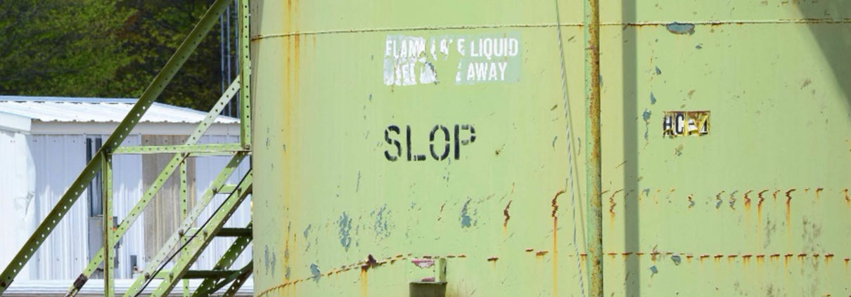
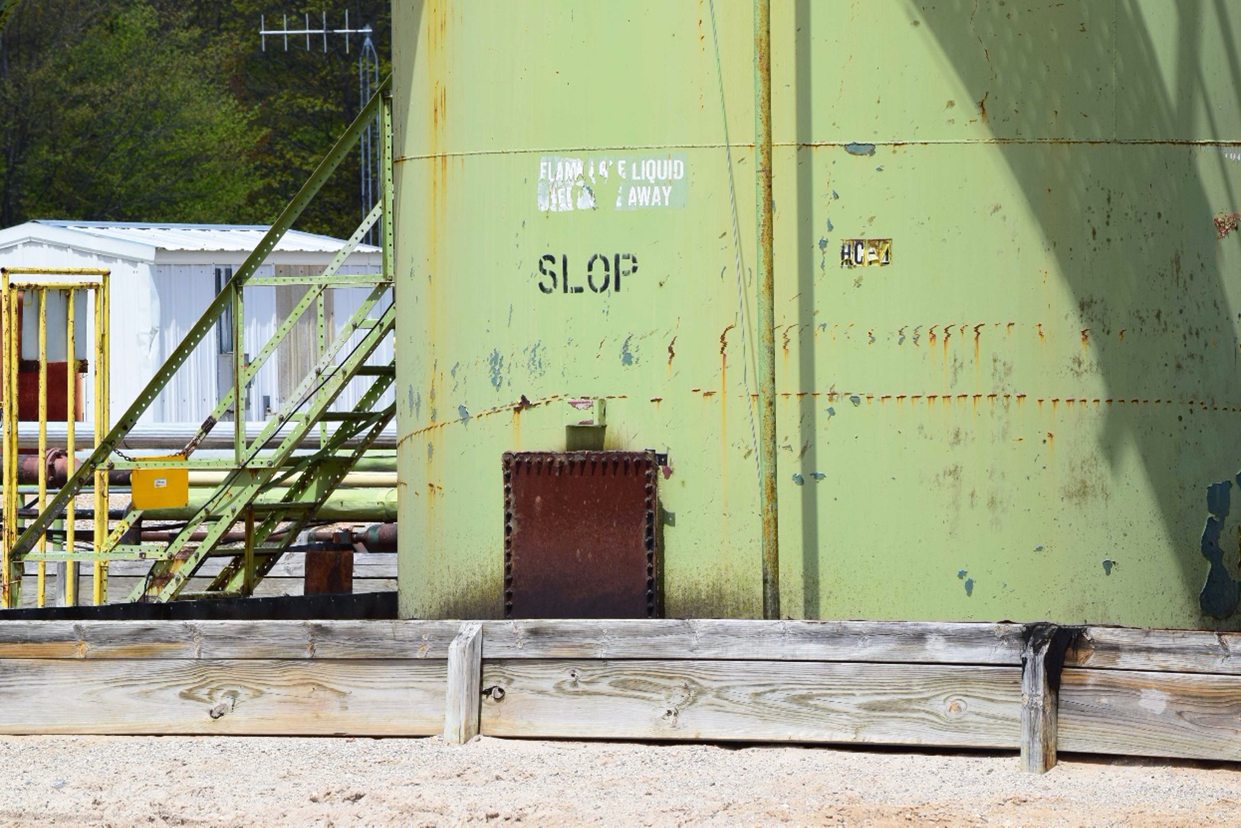
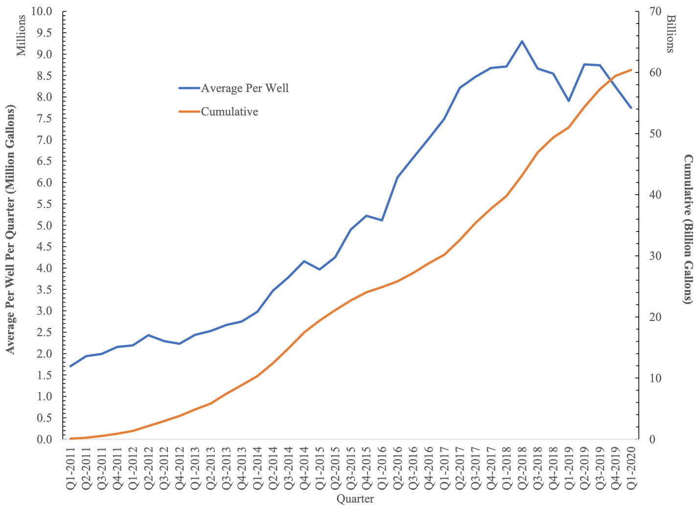
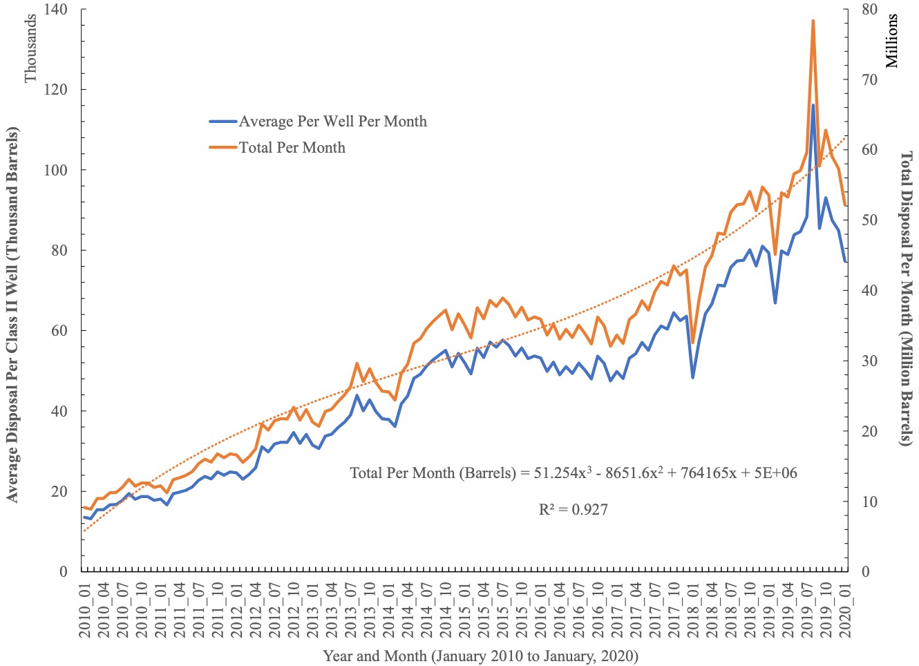
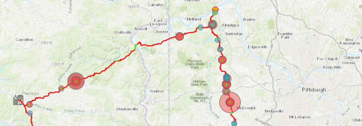
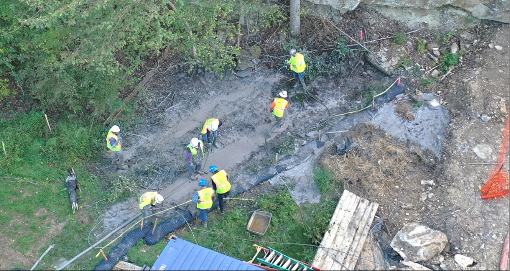
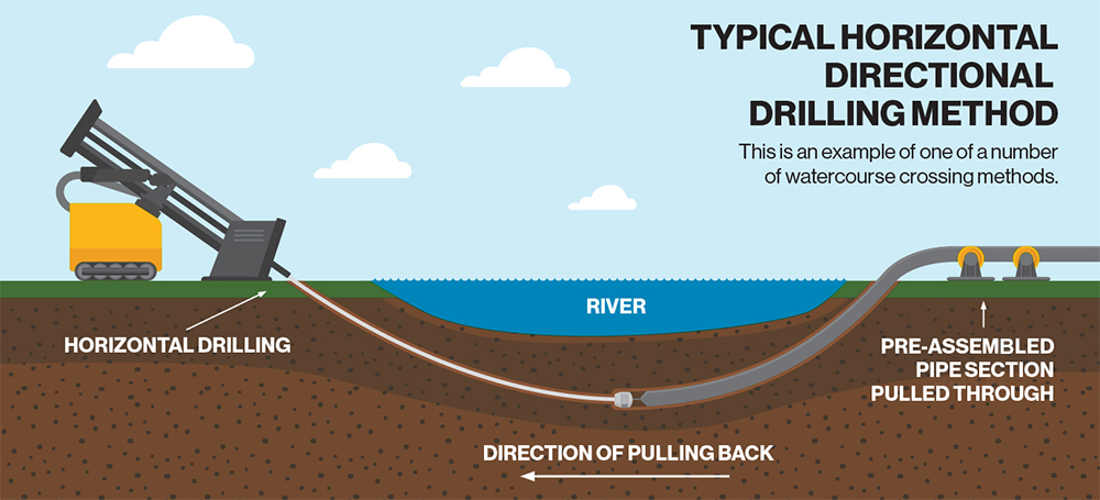
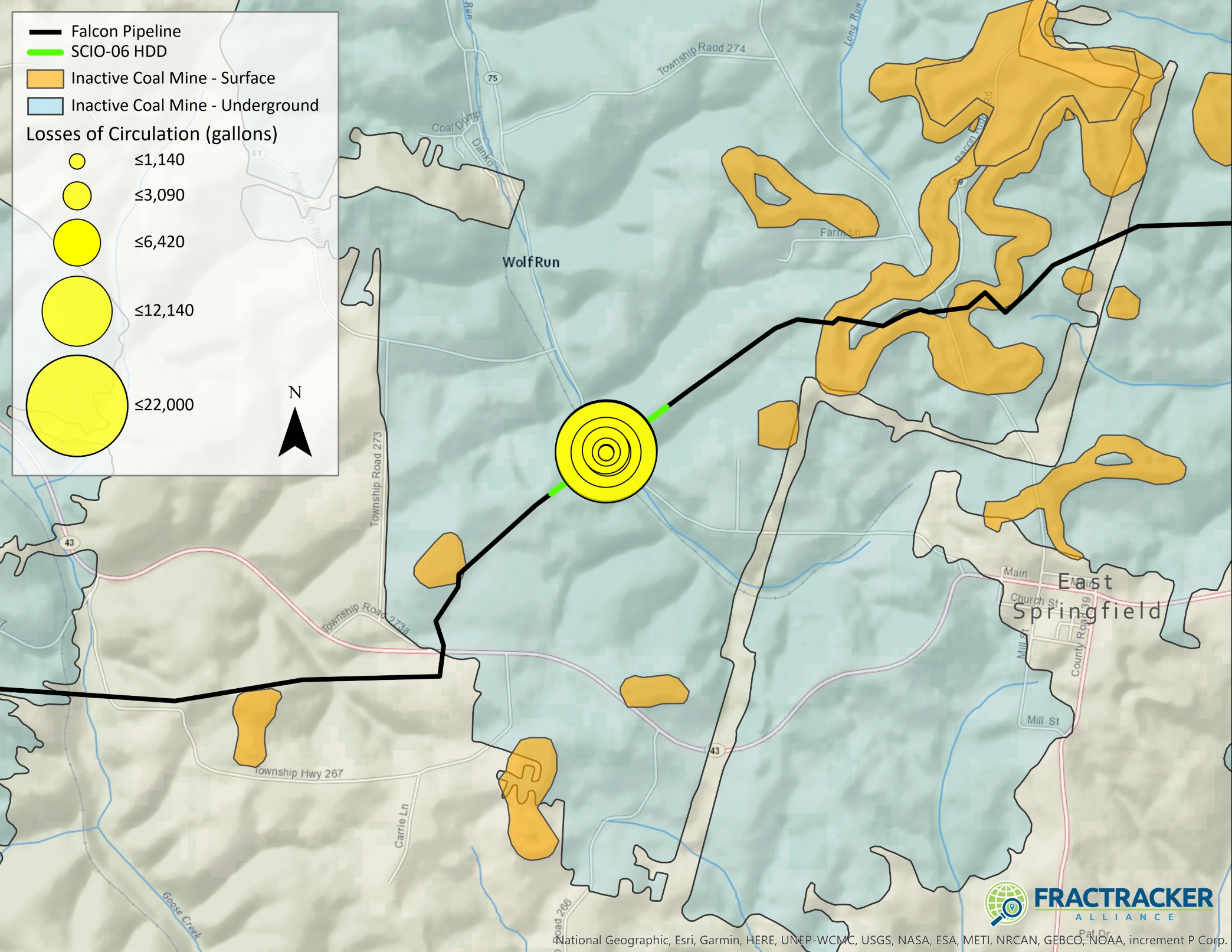
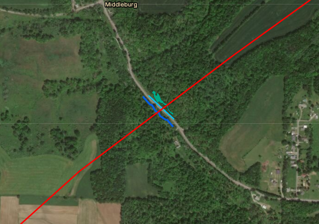

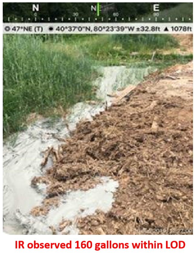
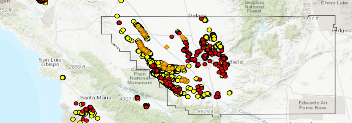
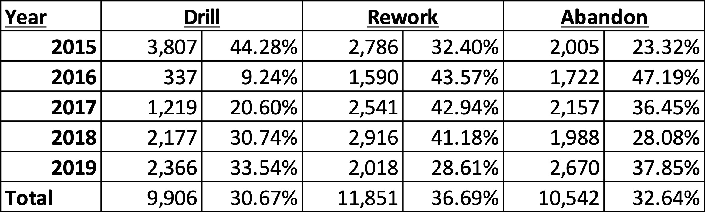
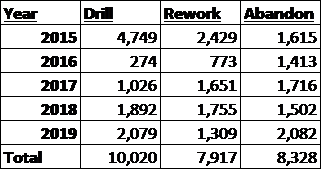
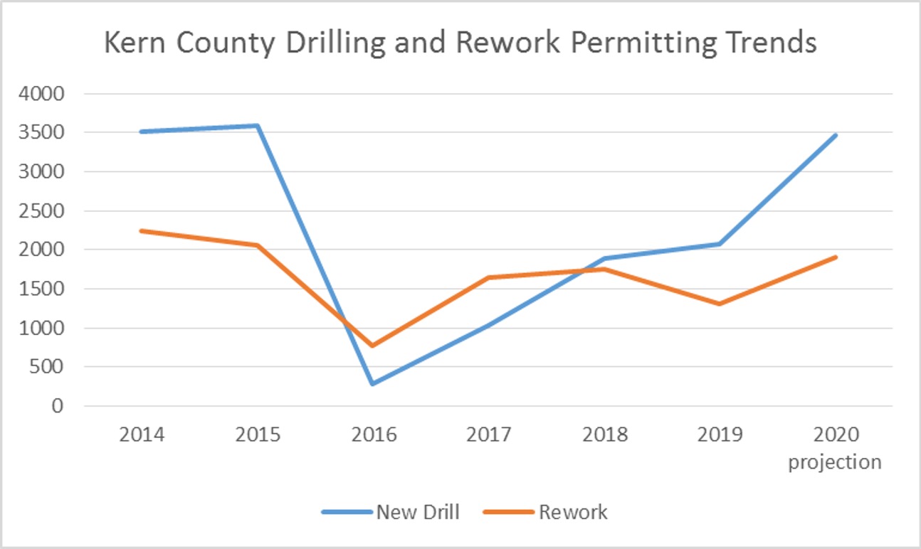
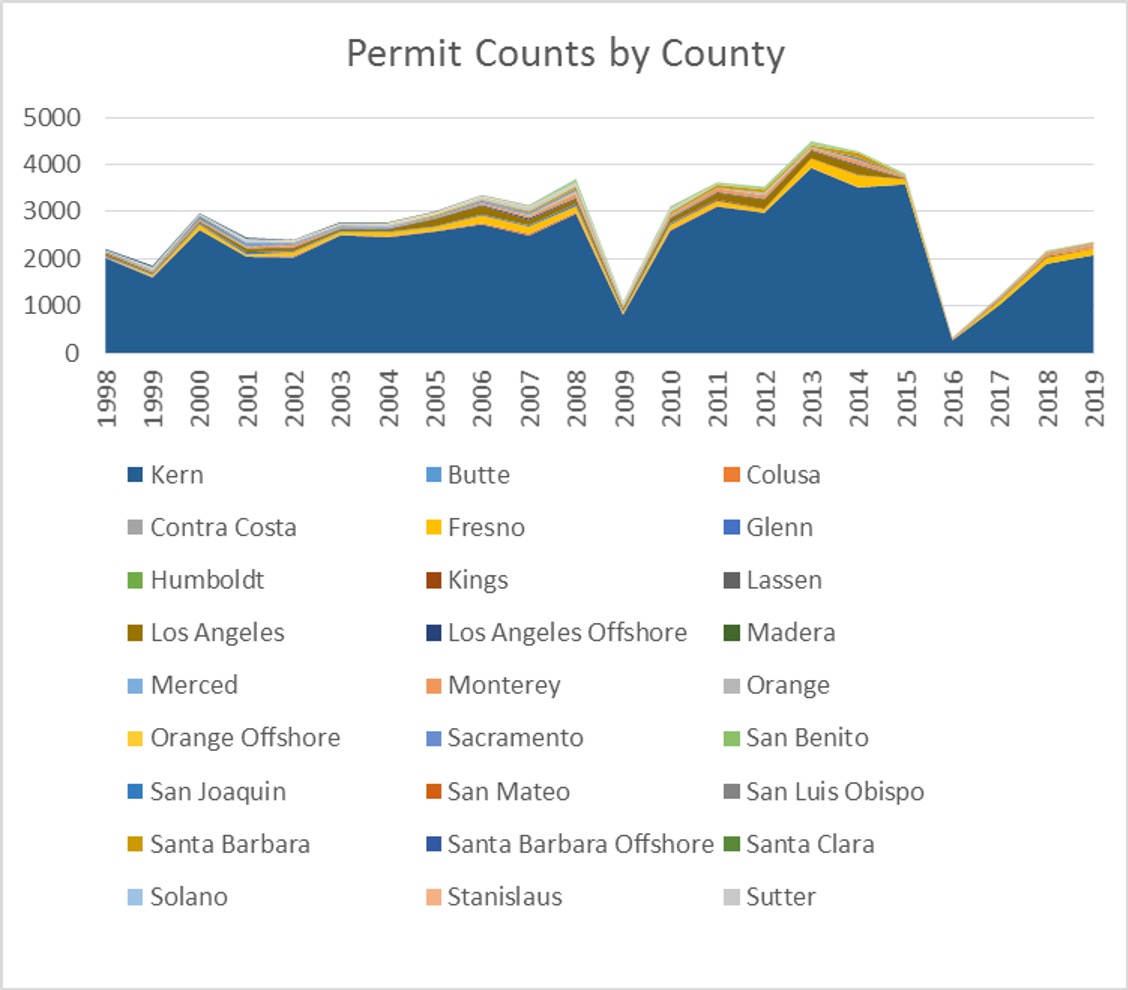

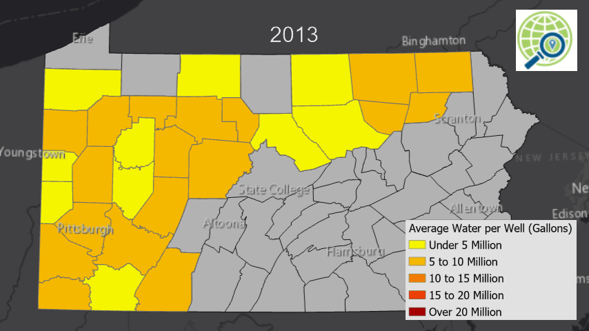


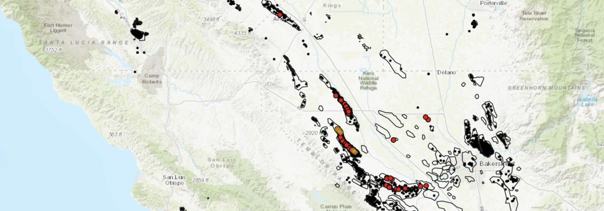
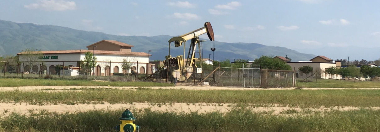
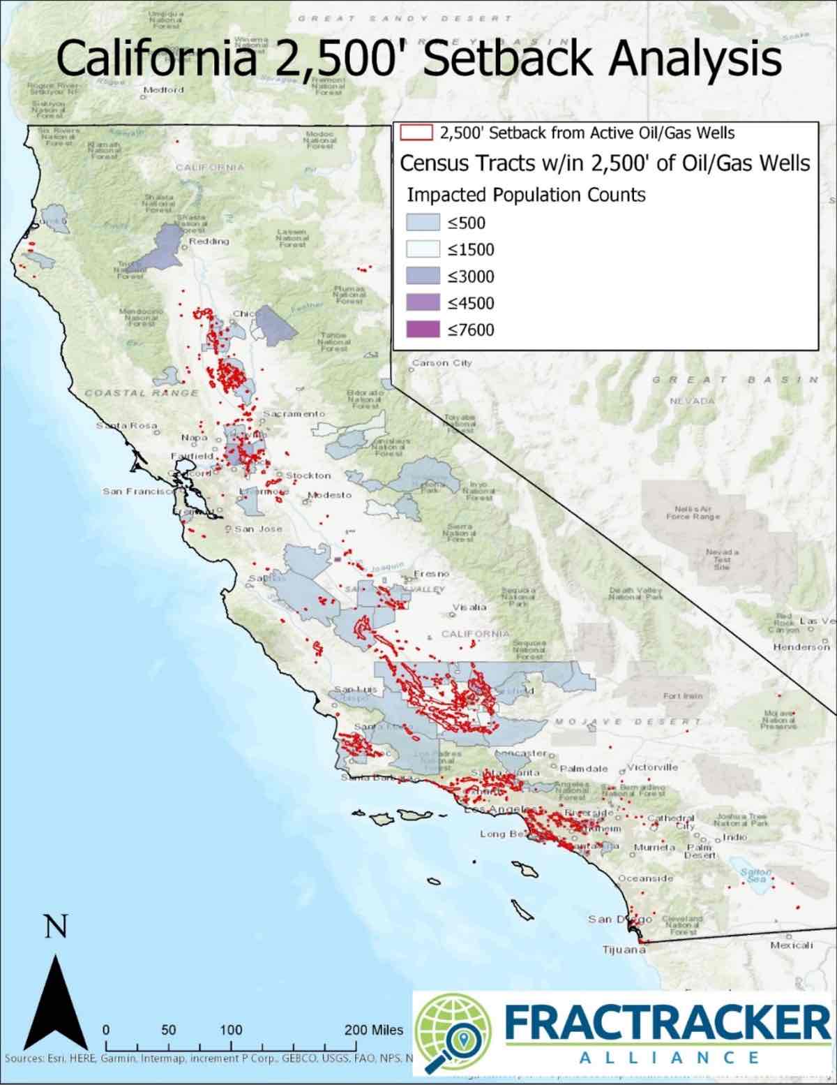
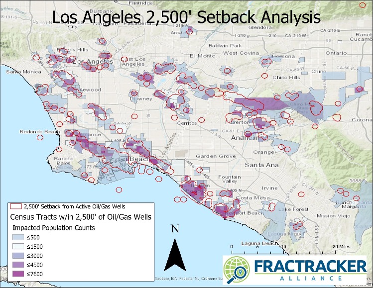
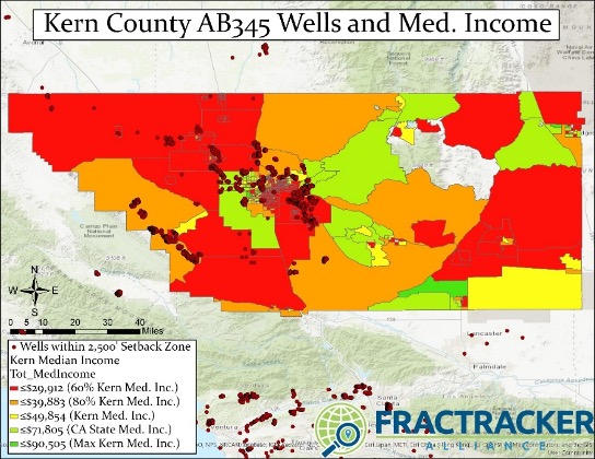
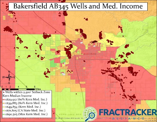
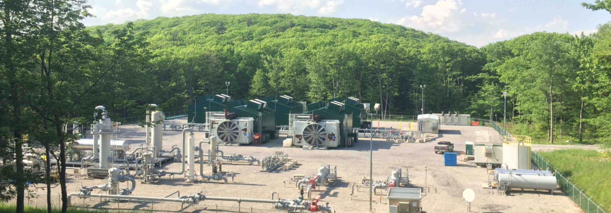
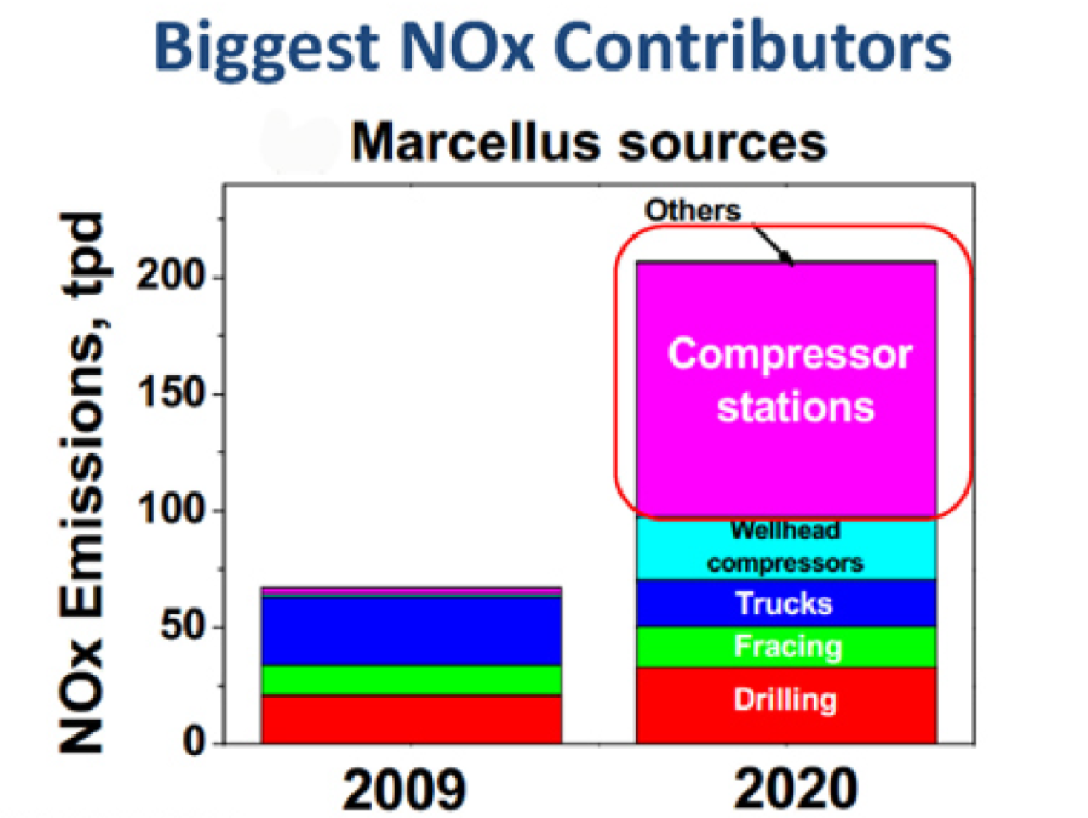
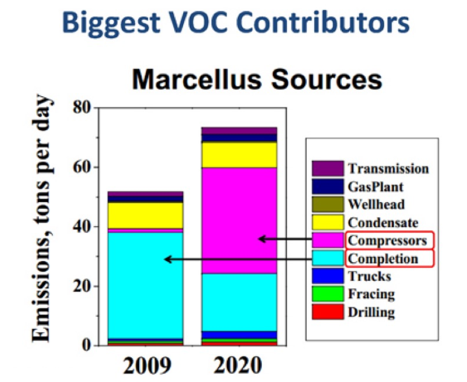
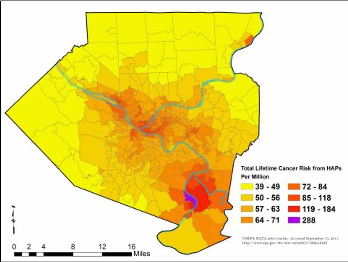
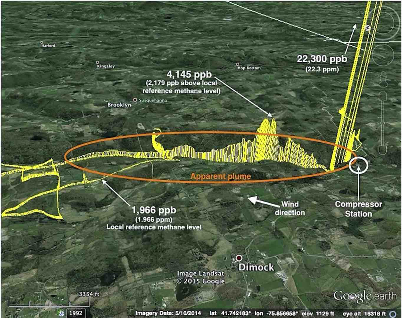
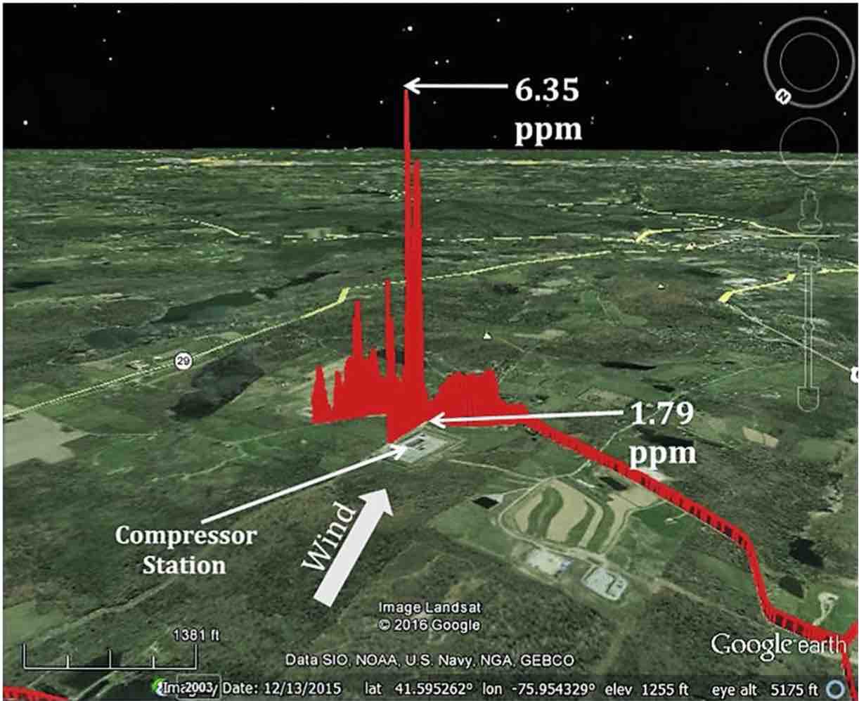
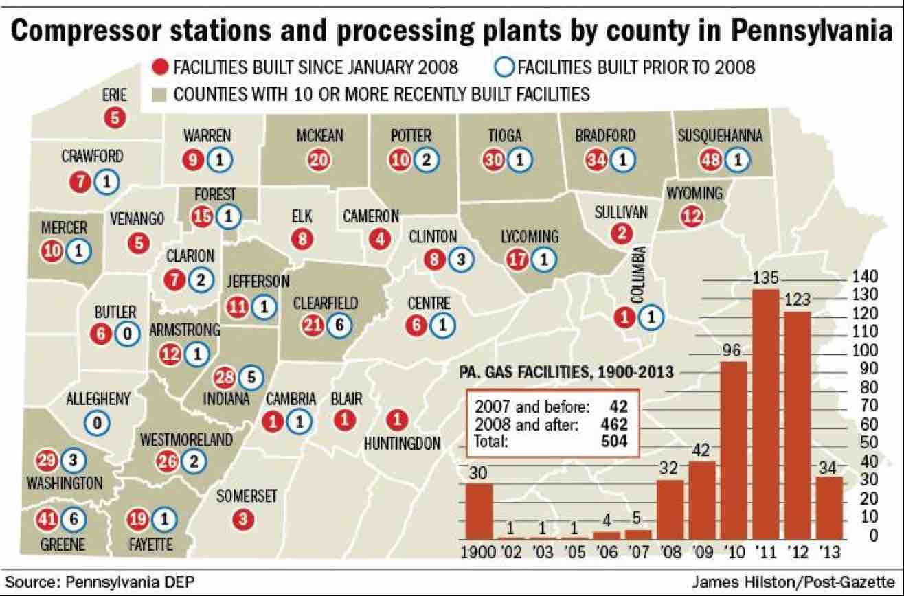
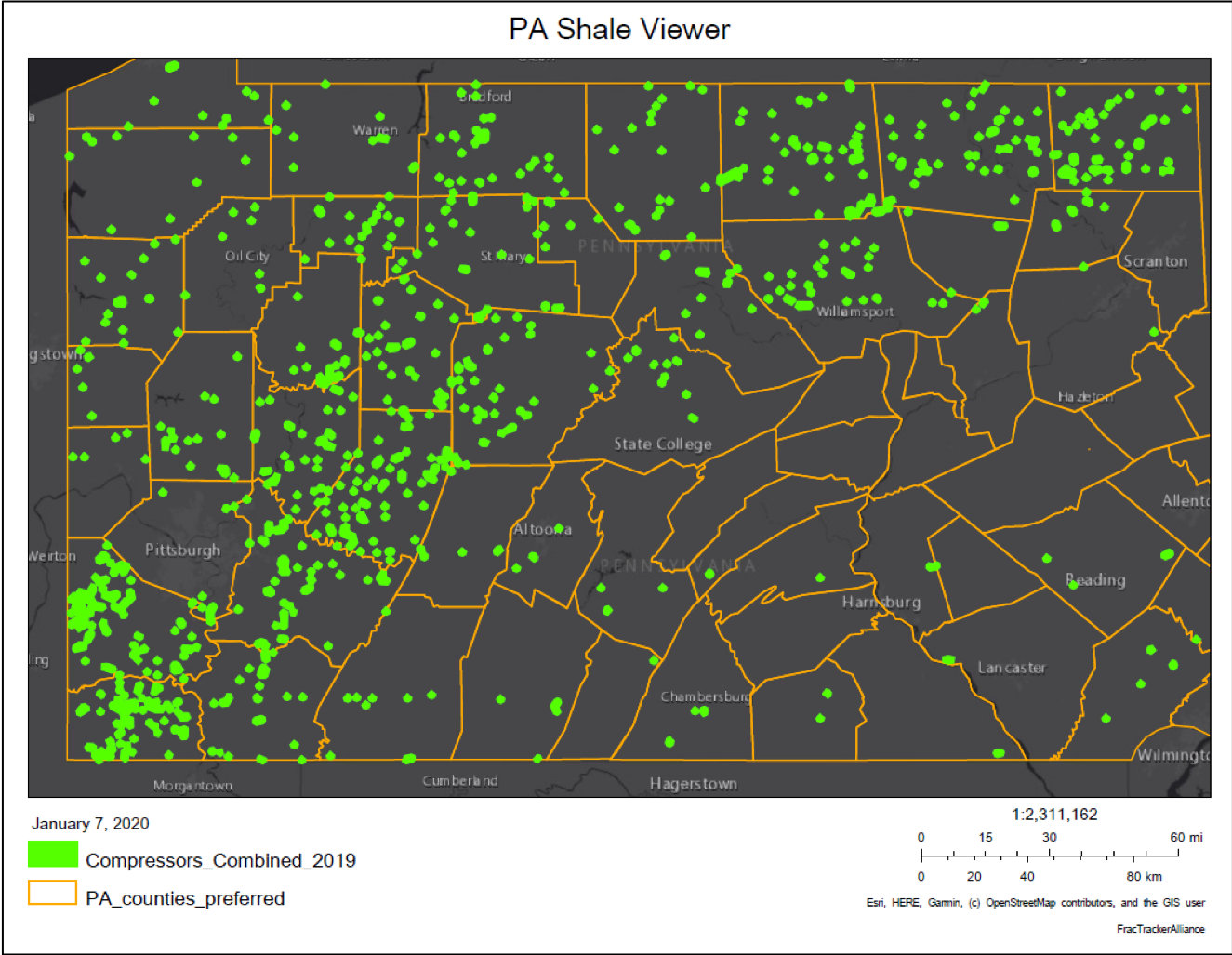
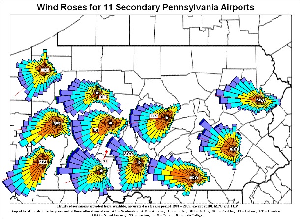
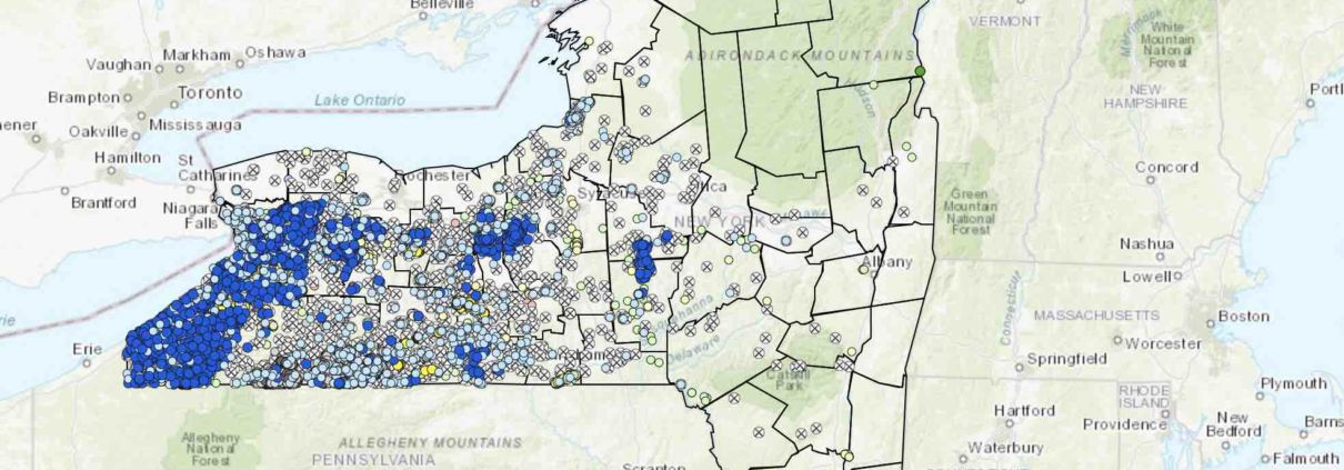
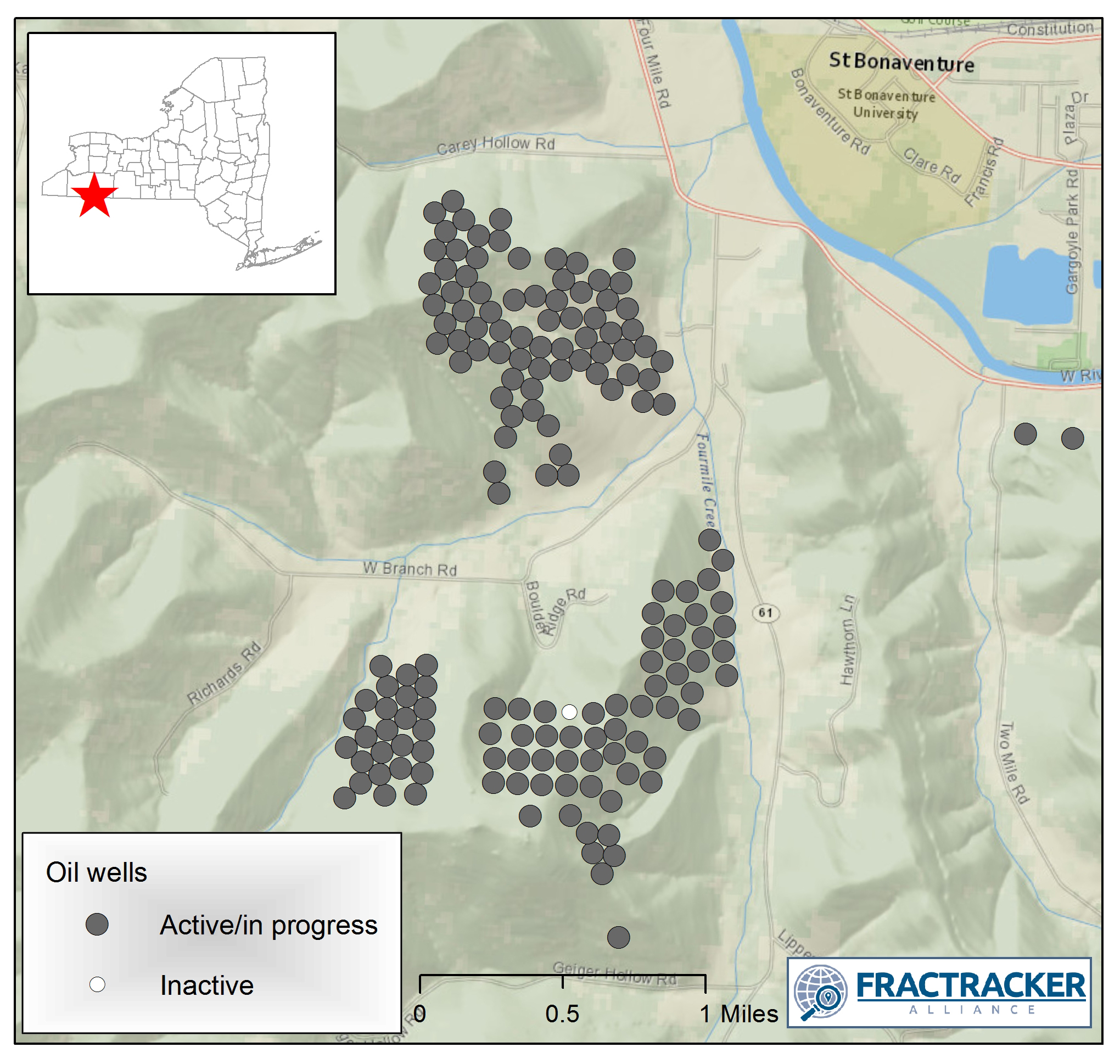
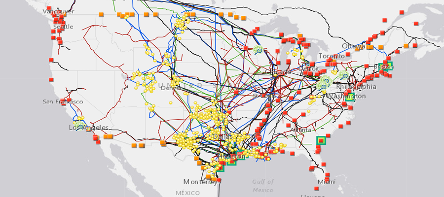
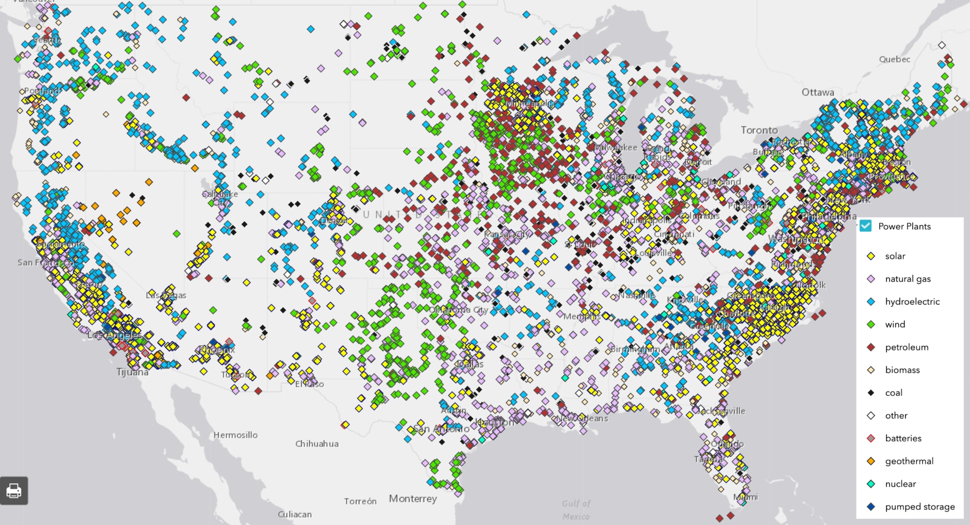
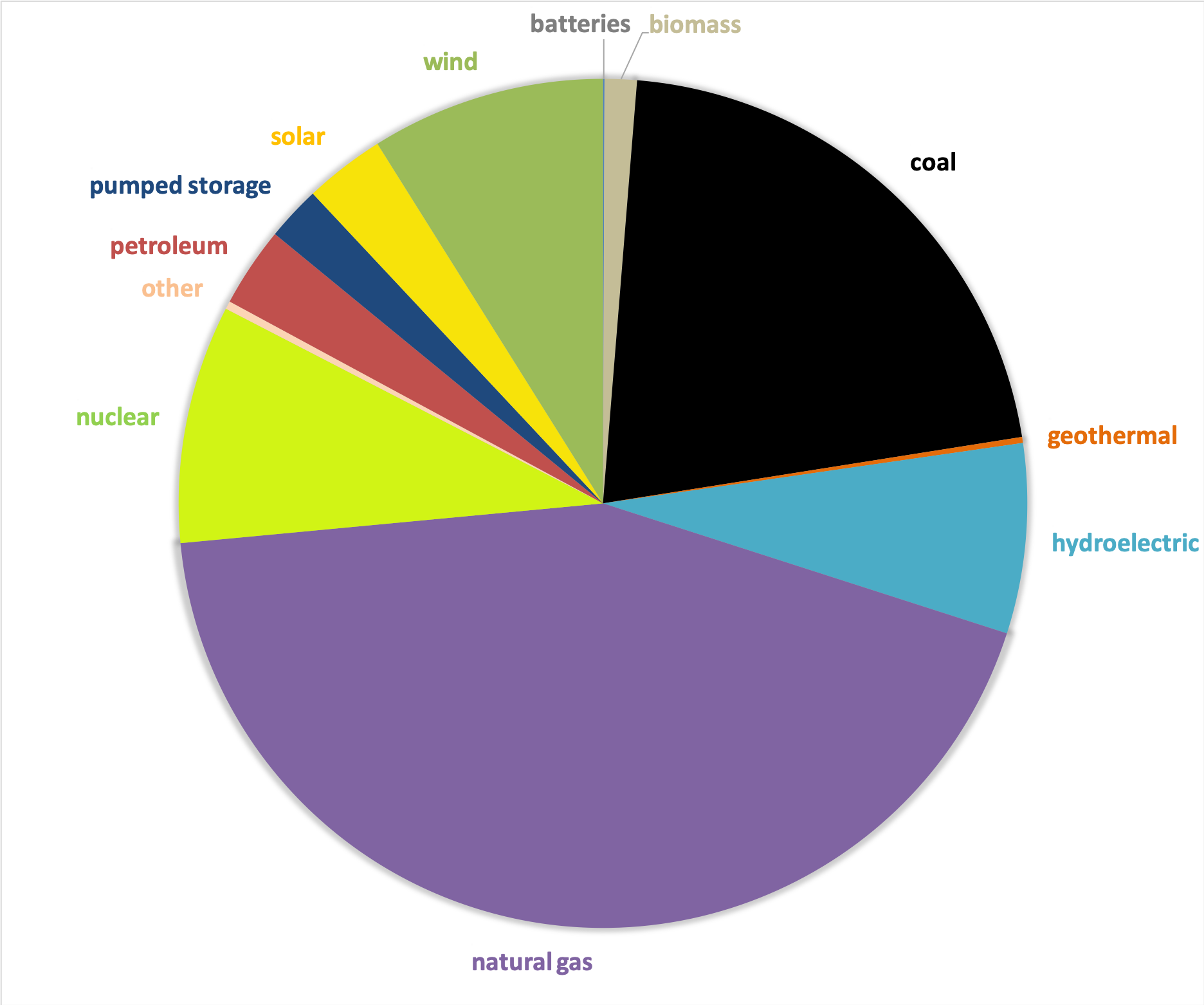
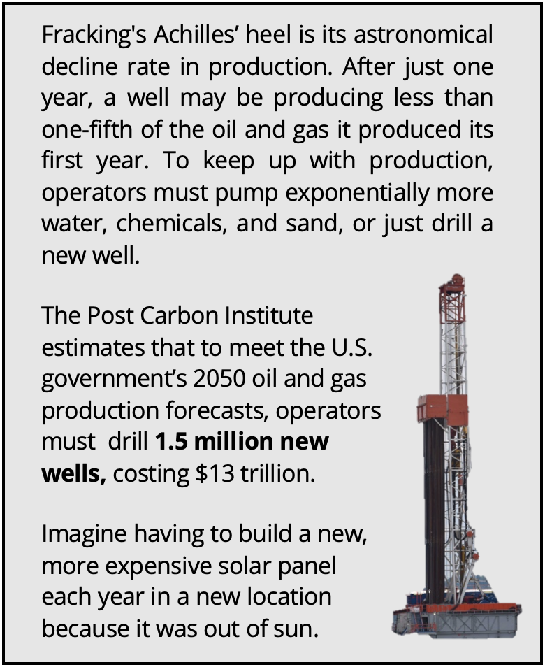


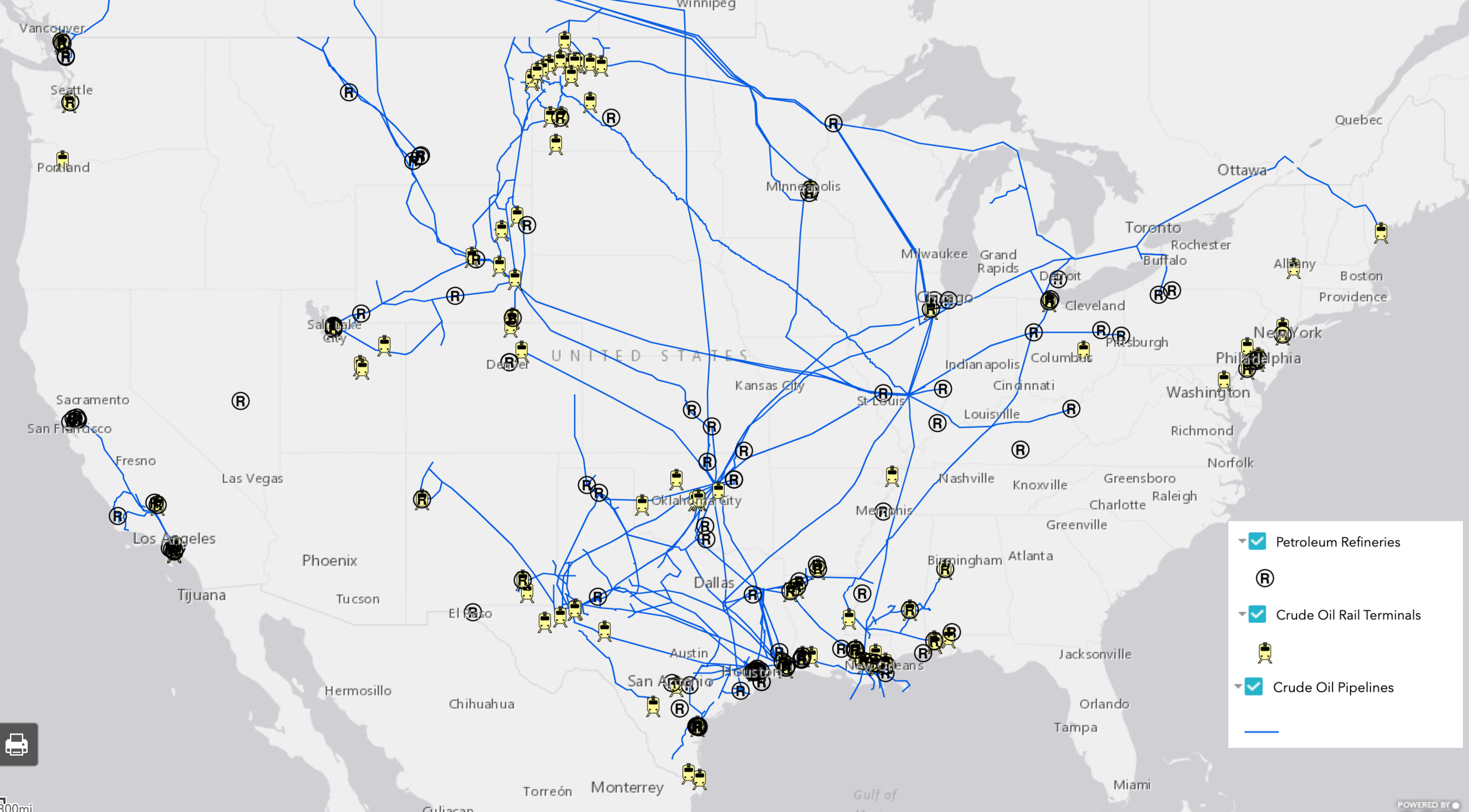
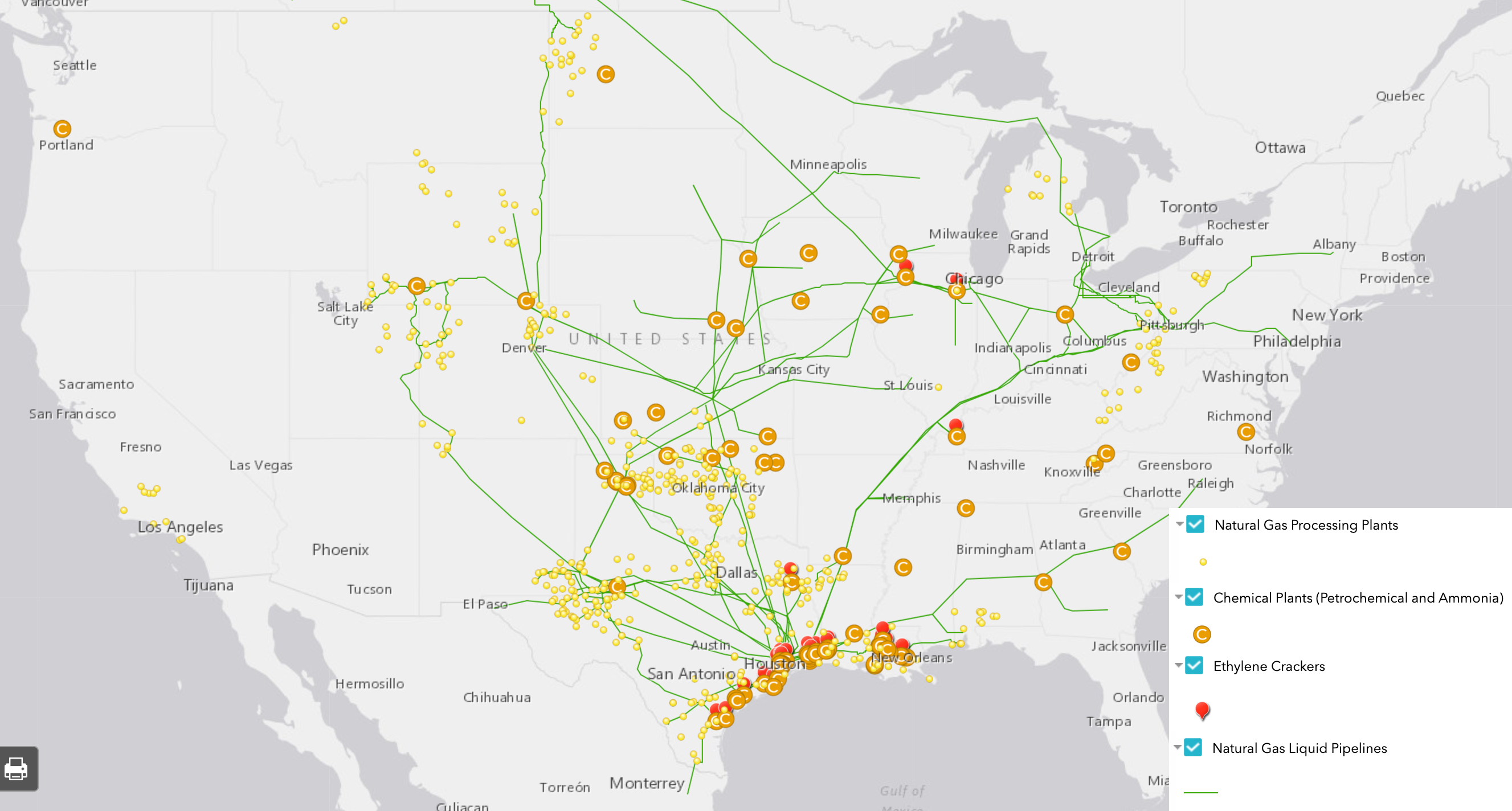