Cover of Dangerous and Close report. Click to view report
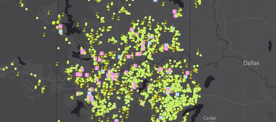
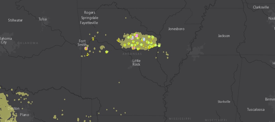
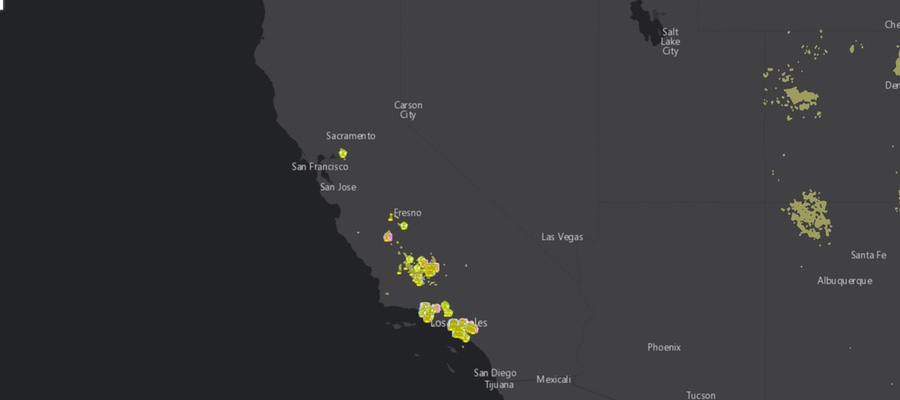
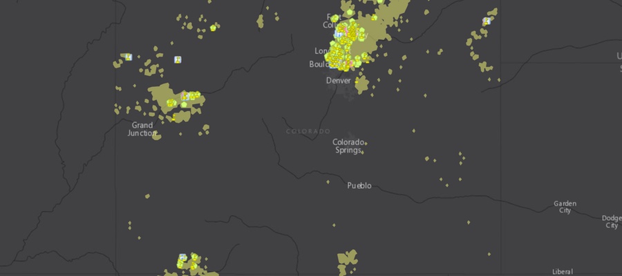
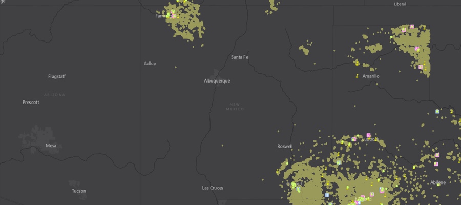
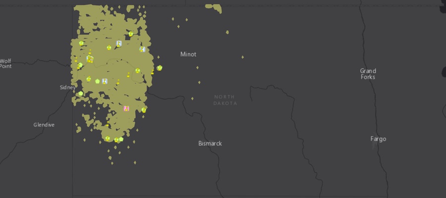
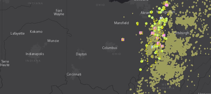
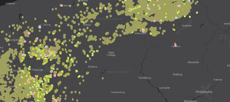
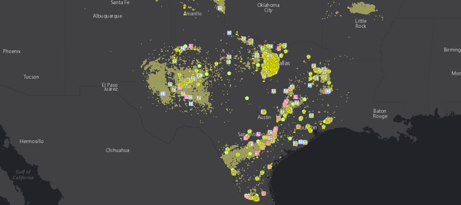
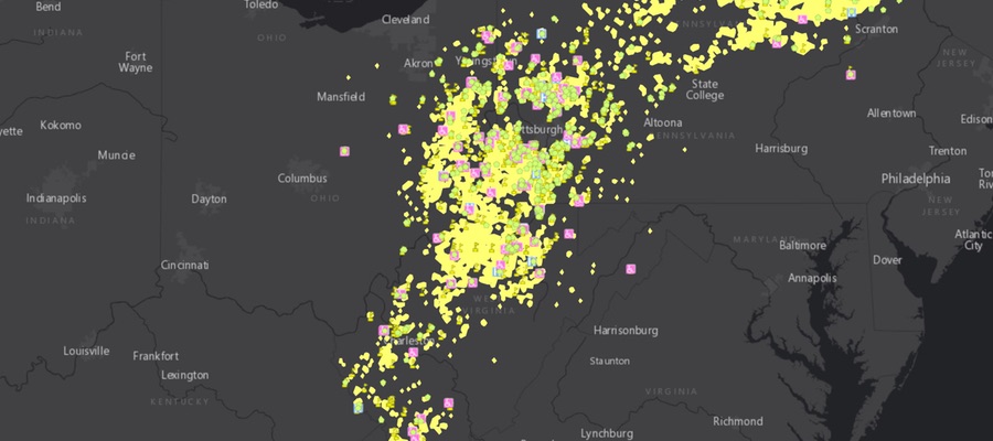
FracTracker Alliance has been working with the Frontier Group and Environment America on a nationwide assessment of “fracked” oil and gas wells. The report is titled Dangerous and Close, Fracking Puts the Nation’s Most Vulnerable People at Risk. The assessment analyzed the locations of fracked wells and identified where the fracking has occurred near locations where sensitive populations are commonly located. These sensitive sites include schools and daycare facilities because they house children, hospitals because the sick are not able to fight off pollution as effectively, and nursing homes where the elderly need and deserve clean environments so that they can be healthy, as well. The analysis used data on fracked wells from regulatory agencies and FracFocus in nine states. Maps of these nine states, as well as a full national map are shown below.
No one deserves to suffer the environmental degradation that can accompany oil and gas development – particularly “fracking” – in their neighborhoods. Fracked oil and gas wells are shown to have contaminated drinking water, degrade air quality, and sicken both aquatic and terrestrial ecosystems. Additionally, everybody responds differently to environmental pollutants, and some people are much more sensitive than others. In fact, certain sects of the population are known to be more sensitive in general, and exposure to pollution is much more dangerous for them. These communities and populations need to be protected from the burdens of industries, such as fracking for oil and gas, that have a negative effect on their environment. Commonly identified sensitive groups or “receptors” include children, the immuno-compromised and ill, and the elderly. These groups are the focus of this new research.
National Map
National interactive map of sensitive receptors near fracked wells
By Ted Auch, PhD – Great Lakes Program Coordinator
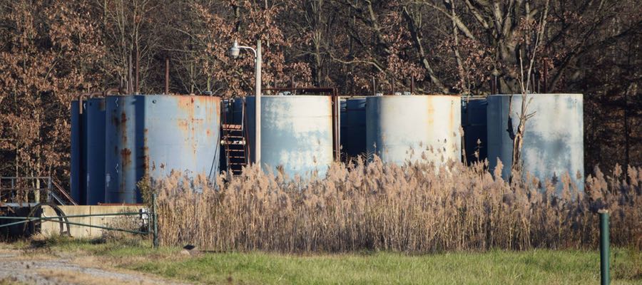
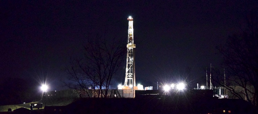
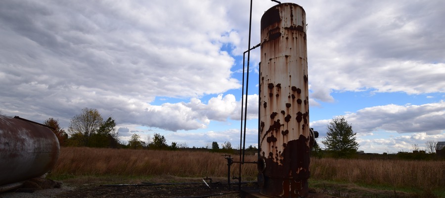
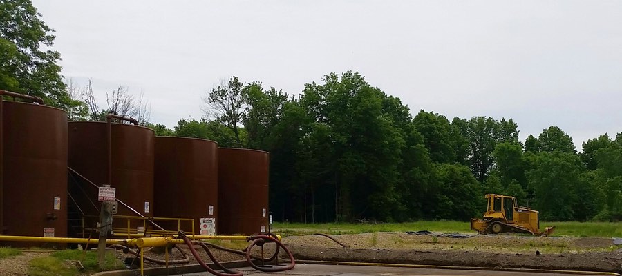
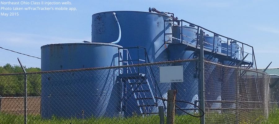
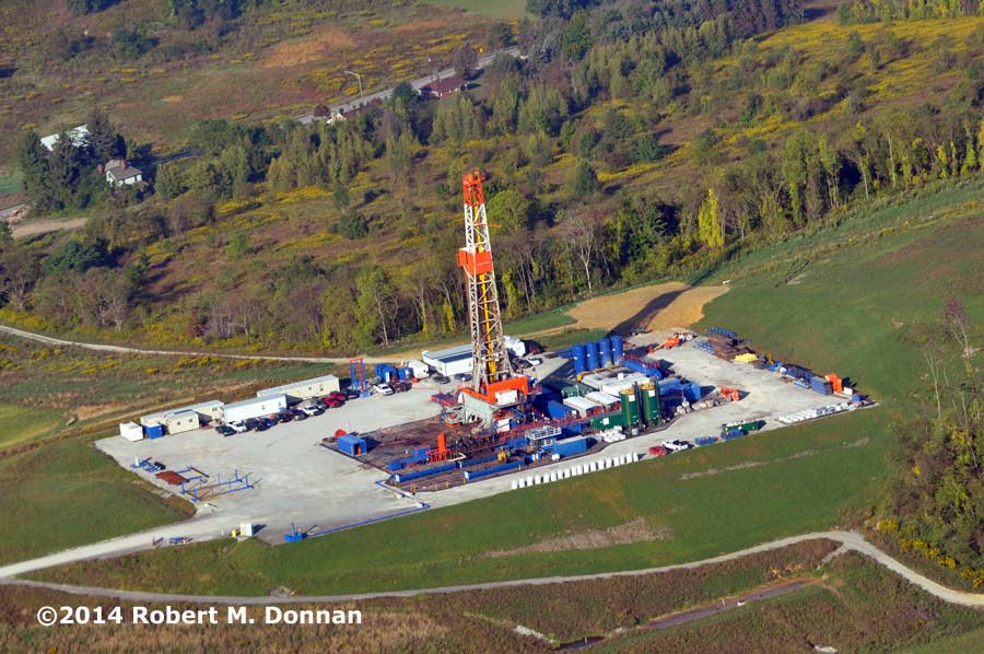
Hydraulic Fracturing “Fracking” at a well-pad outside Barnesville, Ohio operated by Halliburton
The industrial practice of disposing of oil and gas drilling waste into Class II injection wells causes a lot of strife for people on both sides of the fracking debate. This process has exposed many “hidden [geologic] faults” across the US as a result of induced seismicity. It has been linked in recent months and years with increases in earthquake activity in states like Arkansas, Kansas, Texas, and Ohio.
Locally, there is growing evidence in counties – from Ashtabula to Washington – that Ohio Class II injection well volumes and quarterly rates of change are related to upticks in seismic activity (Figs. 1-3). But exactly how much waste are these sites receiving, and where is it coming from? Since it has been a little over a year since last we looked at the injection well landscape here in Ohio, we decided to revisit the issue here.
Figures 1-3. Ohio Class II Injection Well disposal during Q3-2010, Q2-2012, and Q2-2015
The Class II Landscape in Ohio
In Ohio 245+ Class II Salt Water Disposal (SWD) Disposal Wells are permitted to accept unconventional oil and gas waste. Their disposal capacity and number of wells served is by far the most of any state across the Marcellus and Utica Shale plays.
Ohio’s Class II Injection wells have accepted an average of 22,750 barrels per quarter per well (BPQPW) (662,632 gallons) of oil and gas wastewater over the last year. In comparison, our last analysis uncovered a higher quarterly average (29,571 BPQPW) between the initiation of frack waste injection in 2010 and Q2-2015 (Fig. 4). This shift is likely due to the significant decrease in overall drilling activity from 2012 to 2015. Between Q3-2010 and Q1-2016, however, OH’s Class II injection wells saw an exponential increase in injection activity. In total, 109.4 million barrels (3.8-4.6 billion gallons) of waste was disposed in Ohio. From a financial perspective this waste has generated $3.4 million in revenue for the state or 00.014% of the average state budget (Note: 2.5% of ODNR’s annual budget).
The more important point is that even in slow times (i.e., Q2-2015 to the present) the trend continues to migrate from the bottom-left to the top-right, with each of Ohio’s Class II injection wells seeing quarterly demand increases of 972 BPQPW (34,017-40,821 gallons). This means that the total volume coming into our Class II Wells is increasing at a rate of 8.2-9.8 MGs per year, or the equivalent to the water demand of several high volume hydraulically fractured wells.
With respect to the source of this waste, the story isn’t as clear as we had once thought. Slightly more than half the waste came from out-of-state during the first two years for which we have data, but this statistic plummeted to as low as 32% in the last year-to-date (Fig. 5). This change is likely do to the high levels of brine being produced in Ohio as the industry migrates towards the perimeter of the Utica Shale.
Figures 4 and 5
Freshwater Demand and Brine Production
Map of Ohio Utica Brine Production and Class II Injection Well Disposal
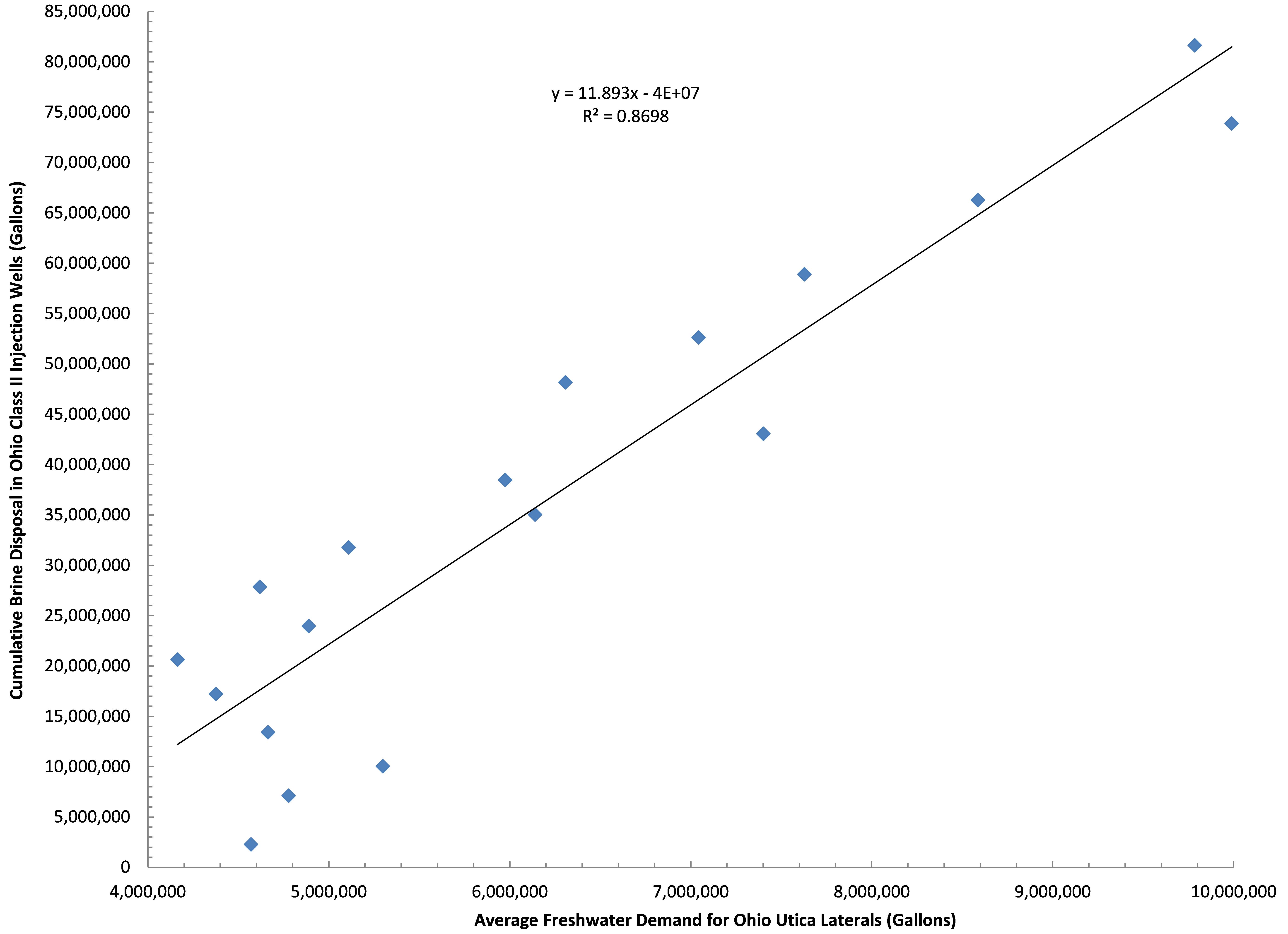
Figure 6. Ohio Class II Injection Well disposal as a function of freshwater demand by the shale industry in Ohio between Q3-2010 and Q1-2015
To gain a more comprehensive understanding of what’s going on with Class II wastewater disposal in Ohio, it’s important to look into the relationship between brine and freshwater demand by the hydraulic fracturing industry. The average freshwater demand during the fracking process, accounts for 87% of the trend in brine disposal in Ohio (Fig. 6).
As we mentioned, demand for freshwater is growing to the tune of 405-410,000 gallons PQPW in Ohio, which means brine production is growing by roughly 12,000 gallons PQPW. This says nothing for the 450,000 gallons of freshwater PQPW increase in West Virginia and their likely demand for injection sites that can accommodate their 13,500 gallons PQPW increase.
Conclusion
Essentially, the seismic center of Ohio has migrated eastward in recent years; originally it was focused on Western counties like Shelby, Logan, Auglaize, Darke, and Miami on the Indiana border, but it has recently moved to injection well hotbed counties like Ashtabula, Trumbull, and Washington along the Pennsylvania and West Virginia borders. This growth in “induced seismicity” resulting from the uptick in frack waste disposal puts Ohio in the company of Oklahoma, Arkansas, Colorado, Kansas, New Mexico, and Texas. Each of those states have reported ≥4.0 magnitude “man-made” quakes since 2008. Between 1973 and 2008 an average of 21 earthquakes of ≥M3 were reported in the Central/Eastern US. This number jumped to 99 between 2009 and 2013, with 659 of M3+ in 2014 alone according to the USGS and Virginia Tech Seismological Observatory (VTSO). This “hockey stick moment” is exemplified in the below figure from a recent USGS publication (Fig. 7). Figure 8 illustrates the spatial relationship between recent seismic activity and Class II Injection well volumes here in Ohio. The USGS even went so far as to declare the following:
An unprecedented increase in earthquakes in the U.S. mid-continent began in 2009. Many of these earthquakes have been documented as induced by wastewater injection…We find that the entire increase in earthquake rate is associated with fluid injection wells. High-rate injection wells (>300,000 barrels per month) are much more likely to be associated with earthquakes than lower-rate wells.
– From USGS Report High-rate injection is associated with the increase in U.S. mid-continent seismicity
Figures 7 and 8
The sentiment here in Ohio regarding Class II Injection wells is best summed up by Dr. Ray Beiersdorfer, Distinguished Professor of Geology, Youngstown State University and his wife geologist Susie Beiersdorfer who jointly submitted the following quote regarding the North Star (SWIW #10) Class II Injection Well in Mahoning County, which processed 555,030 barrels (21,368,655 gallons) of fracking waste between Q4-2010 and Q4-2011[1].
The operator, D&L, and the ODNR denied the correlation in space and time between the injection of toxic fracking fluids into the well and earthquakes for over eight months in 2011. The well was shut down on December 30 and the largest seismic event, a 4.0 happened at 3:04 p.m. on December 31, 2011. Though the rules say that a “shut-in” well must be plugged after 60 days, this well is still “open” after 1656 days (July 12, 2016). This well must be plugged [and abandoned] to prevent further risks to the health and safety of the Youngstown community… According to Rick Simmers, the only thing holding this up is bankruptcy procedures. It was drilled into a fault, triggered over five hundred earthquakes, including a Magnitude 4.0 that caused damage to homes. [It is likely] that any other use of this well would trigger additional hazardous earthquakes.
Images From Across Ohio
Click on the images below to explore visual documentation and volumes disposed (as of Q1-2016) into Class II Injection wells in Ohio.
https://www.fractracker.org/a5ej20sjfwe/wp-content/uploads/2016/07/ClassIIOhio-Feature.jpg400900Ted Auch, PhDhttps://www.fractracker.org/a5ej20sjfwe/wp-content/uploads/2025/09/2025-Wordmark-Logo.pngTed Auch, PhD2016-07-15 14:03:162020-03-12 17:19:05OH Class II Injection Wells – Waste Disposal Trends and Images From Around Ohio
The below industry quote divides the world into two camps when it comes to horizontal hydraulic fracturing: those who are for it and those who are against it:
Fracking has emerged as a contentious issue in many communities, and it is important to note that there are only two sides in the debate: those who want our oil and natural resources developed in a safe and responsible way; and those who don’t want our oil and natural gas resources developed at all. – Energy from Shale (an industry-supported public relations website)
The writer imagines a world in black and white – with a clear demarcation line. In reality, it is not so simple, at least not when talking to the people who actually live in the Ohio towns where fracking is happening. They want the jobs that industry promises, but they worry about the rising costs of housing, food, and fuel that accompany a boomtown economy. They want energy independence, but worry about water contamination. They welcome the opening of new businesses, but lament the constant rumble of semi-trucks down their country roads. They are eager for economic progress, but do not understand why the industry will not hire more locals to do the work.
In short, the situation is complicated and it calls for a comprehensive response from Ohio’s local and state policy makers.
Through hefty campaign contributions and donations to higher learning institutions, the oil and gas industry exerts undue influence on Ohio’s politics and academic institutions. Many media outlets covering the drilling boom also have ties to the industry. Therefore, industry has been able to control the message and the medium. Those who oppose oil and gas in any way are painted as radicals. Indeed, some of Ohio’s most dedicated anti-fracking activists are unwavering in their approach. But most of the people living atop the Utica Shale simply want to live peacefully. Many would be willing to co-exist with the industry if their needs, concerns, and voices were heard.
This project attempts to give these Ohioans a voice and outsiders a more accurate representation about life in the Utica Shale Basin. The report does not engage in the debate about whether or not fracking should occur – but, rather, examines the situation as we currently find it.
Listening Project Summary
The Ohio Shale Country Listening Project is a collaborative effort to solicit, summarize, and share the perspectives and observations of those directly experiencing the shale gas boom in eastern Ohio. The project is led by the Ohio Organizing Collaborative (OOC)’s Communities United for Responsible Energy (CURE), with support from the Ohio Environmental Council (OEC), FracTracker Alliance, and the Laborers Local 809 of Steubenville. Policy Matters Ohio and Fair Shake Environmental Legal Services offered resources and time in drafting the final policy recommendations.
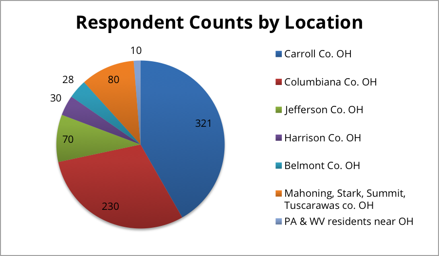
Over the course of six months, organizers from the Laborers Local 809 and OOC worked with a team of nearly 40 volunteers to survey 773 people living in the heart of Utica Shale country. Respondents are from eastern Ohio, ranging from as far north as Portage County to as far south as Monroe County. A small number of respondents hail from across the border in West Virginia and Pennsylvania, but the overwhelming majority are from Carroll (321), Columbiana (230), Jefferson (70), Harrison (30) and Belmont (28) counties.
Respondents were asked to talk about their family and personal history in the community where they live, their favorite things about their community and what changes they have noticed since the arrival of shale gas drilling using horizontal hydraulic fracturing or fracking. They were also asked to describe their feelings about oil and gas development as either positive or negative and what they believed their community would be like once the boom ends. Finally, respondents were also asked how concerned or excited they are about 11 possible outcomes or consequences of fracking.
Summary of Recommendations
Create incentives for companies to hire local workers; and increase transparency about who drilling and subcontracting companies are employing
Tax the oil and gas industry fairly with a severance tax rate of at least 5%; use this revenue to support affected communities to mitigate the effects of the boom and bust cycle
Increase the citizen participation in county decision-making on how additional sales tax or severance tax revenue is spent and how the county deals with the effects of the drilling boom
Increase transparency around production and royalties for landowners and the public
Set aside funding at the local level for air and water monitoring programs
Mitigate noise and emissions as much as possible with mandatory sound barriers and green completion on all fracking wells
Create mechanisms to protect sensitive areas from industry activity
Levy municipal impact fees to address issues associated with drilling
Better protect landowners during leasing negotiation process and from potential loss of income due to property damage
Conclusion
The more shale gas wells a community has, the less popular the oil and gas industry appears to be. Carroll County is the most heavily drilled county in Ohio, and more than half the respondents said they view the drilling boom negatively. Moreover, many residents say they are not experiencing the economic benefits promised by the oil and gas industry. They see rent, cost of gas, and groceries rising as the drilling and pipeline companies hire workers from out of state and sometimes even out of the country. Residents see more sales tax revenue coming into their counties but also see their roads destroyed by large trucks. They say they are experiencing more traffic delays and accidents than ever before. Ohioans love their community’s pastoral nature but are watching as the landscape and cropland get destroyed. As it is playing out now, the boom in shale gas drilling is not fulfilling the promises made by industry. Locals feel less secure and more financially strapped. Many feel their towns will soon be uninhabitable. It is up to state and local governments to hold industry accountable and make it pay for the impacts it creates.
The Ohio Shale Country Listening Project started in February 2014 with a conversation between Ohio Organizing Collaborative (OOC) staff and a veteran organizer who once worked on mountain top removal in a large region of West Virginia. The OOC organizer lamented the difficulty of organizing across a large geography around a specific issue – in this case, fracking. How do you find out what the people want without dictating to the community? The more experienced organizer immediately responded: What about a listening project? She connected OOC to the Shalefield Organizing Project in Pennsylvania whose organizers helped OOC think through what a listening project might look like in Ohio.
The project took on several iterations. First, OOC planned to focus the listening project solely on Columbiana County, which at the time was the third most fracked county in Ohio. Next, community leaders in Carroll County, the most heavily drilled county in the state, suggested the project also focus there. Eventually, as it became clear that the shale play was moving further south in Ohio, the project expanded into other counties such as Belmont, Harrison, and Jefferson. While attending a public hearing on pipeline construction in Portage County, OOC staff met an organizer from the Laborers Local 809 out of Steubenville. The organizer expressed interest in joining the project. Meanwhile, OOC had been in discussions with the Ohio Environmental Coalition (OEC) about the need to share the stories of people living in the middle of a fracking boom. OEC agreed to join the project. Finally, FracTracker also came into the fold, eager to assist in analyzing and mapping data gathered during the effort.
A listening project volunteer surveys a shopper at Rogers Open Air Market
OOC staff solicited the help from about 40 volunteers to form the “Listening Project Team” who surveyed their friends, family, coworkers, and neighbors. Volunteers met four times over the course of six months to discuss the project and strategize about how to reach more people with the survey. Most of the volunteer team came from Columbiana and Carroll Counties. The Laborers Local 809 also distributed the surveys to their members. Members of the team canvassed neighborhoods, attended local festivals, set up a booth at Rogers Open Air Market (photo left) and distributed an online version of the survey through Facebook and email. OOC staff spoke at college classes at Kent State-Salem and Kent State-East Liverpool, and solicited input from students in attendance.
The project’s initial goal was to hit a target of 1,000 – 1,500 survey responses. In the end the team fell short of this number, but were able to reach 773 people living in the Utica Shale area. This barrier is mostly due to the rural nature of the communities surveyed, which makes it more difficult to reach a large number of people in a short timeframe. The most responses came from Carroll County – 321 surveys. Columbiana County represented the second largest group of respondents with 230 surveys. Seventy people from Jefferson County, 30 people from Harrison County, 28 from Belmont County filled out the survey. The final 80 responses came from Mahoning, Stark, Summit and Tuscarawas Counties. Finally, nearly fifty responses came from Pennsylvania and West Virginia residents who live along the Ohio border (see Figure right). We promised survey respondents that all names and information would be kept confidential with survey responses presented only in aggregate.
https://www.fractracker.org/a5ej20sjfwe/wp-content/uploads/2016/01/Listening-Feature-1.jpg400900Ted Auch, PhDhttps://www.fractracker.org/a5ej20sjfwe/wp-content/uploads/2025/09/2025-Wordmark-Logo.pngTed Auch, PhD2016-01-08 12:01:222020-03-12 13:38:15Ohio Shale Country Listening Project Part 1
One of the many services that FracTracker offers is access to oil and gas photos. These have been contributed to our website by partners & FracTracker staff and can be used free of charge for non-commercial purposes. Please site the photographer if one is listed, however.
Over the last few months we have added additional oil and gas photos to the following location-based albums – and more photos and videos are coming soon! Click on the links below to explore:
If you would like to contribute photos or videos to this collection, please email us the files along with information on how to credit the photographer to: info@fractracker.org.
Oil, Gas, and Brine Oh My! By Ted Auch, Great Lakes Program Coordinator, FracTracker Alliance
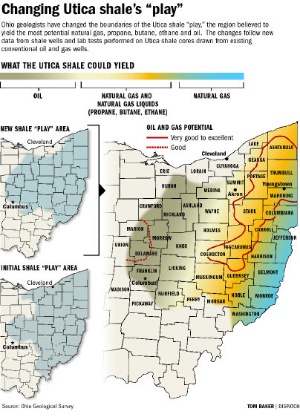
It was just three years ago that the Ohio Geological Survey (OGS) and Department of Natural Resources (DNR) were proposing – and expanding – their bullish stance on the potential Utica Shale oil and gas production “play.” Back in April 2012 both agencies continue[d] to redraw their best guess, although as the Ohio Geological Survey’s Chief Larry Wickstrom cautioned, “It doesn’t mean anywhere you go in the core area that you will have a really successful well.”
What we found is that the OGS projections have not held up to their substantial claims. And here is why…
Background
The Geological Survey eventually parsed the Utica play into pieces:
a large oil component encompassing much of the central part of the state,
natural gas liquids from Ashtabula on the Pennsylvania border southwest to Muskingum, Guernsey, and Noble Counties, and
natural gas counties, primarily, along the Ohio River from Columbiana on the Pennsylvania-West Virginia border to Washington County in the Southeast quarter of the state.
Columbus Dispatch Utica Shale “play” map
Fast forward to the first quarter of 2015 and we have a very healthy dataset to begin to model and validate/refute these projections. Back in 2009 Wickstrom & Co. only had 53 Utica Shale laterals, while today Ohio is host to 962 laterals from which to draw our conclusions. The preponderance of producing wells are operated by Chesapeake (463), Gulfport (118), Antero Resources (62), Eclipse Resources (41), American Energy Utica (36), Consol (35), and R.E. Gas Development (34), with an additional 13 LLCs and 10 publicly traded companies accounting for the remaining 173 producing laterals. A further difference between the following analysis and the OGS one is that we looked at total production and how much oil and gas was produced on a per-day basis.
Analysis
Using an interpolative geostatistical technique known as Empirical Bayesian Kriging and the 962 lateral dataset, we modeled total and per day oil, gas, and brine production for Ohio’s Utica Shale between 2011 and Q1-2015 to determine if the aforementioned map redrawing holds up, is out-of-date, and/or is overly optimistic as is generally the case with initial O&G “moving target” projections.
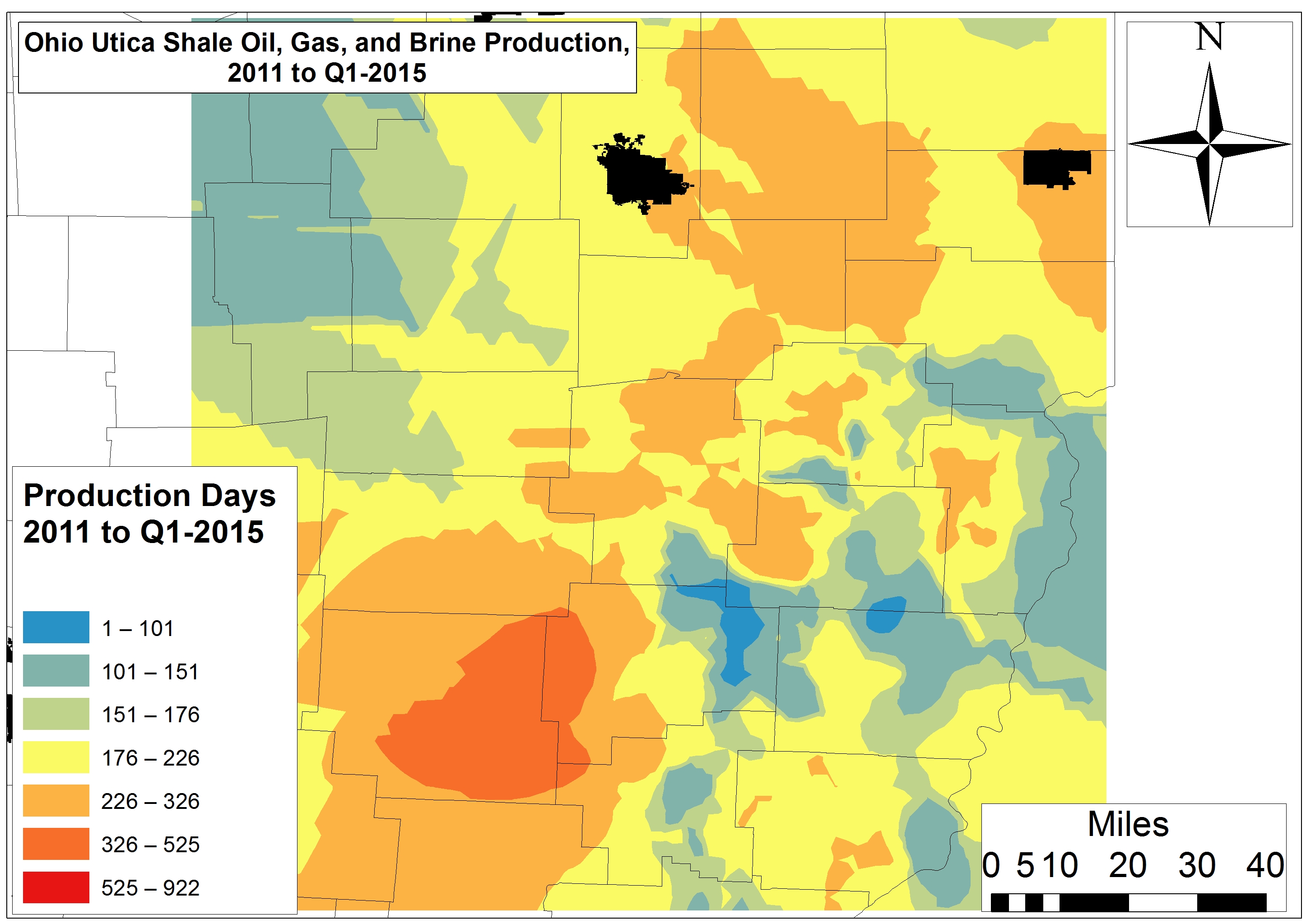
Days of Activity & Brine Production
The most active regions of the Utica Shale for well pad activity has been much of Muskingum County and its border with Guernsey and Noble counties; laterals are in production every 1 in 2.1-3.4 days. Conversely, the least active wells have been drilled along the Harrison-Belmont border and the intersection between Harrison, Tuscarawas, and Guernsey counties.
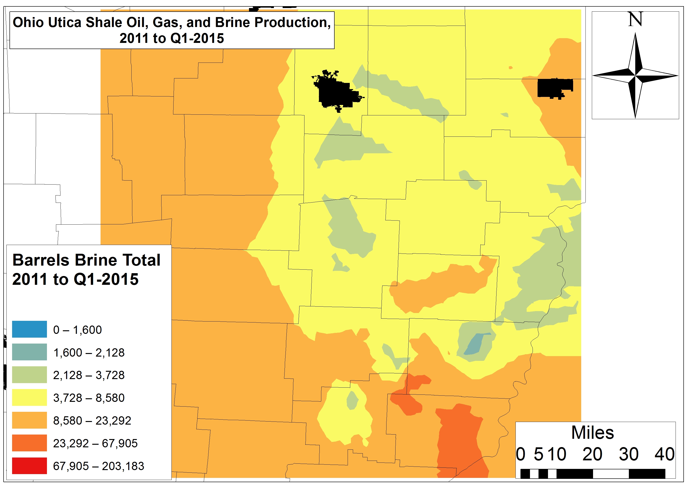
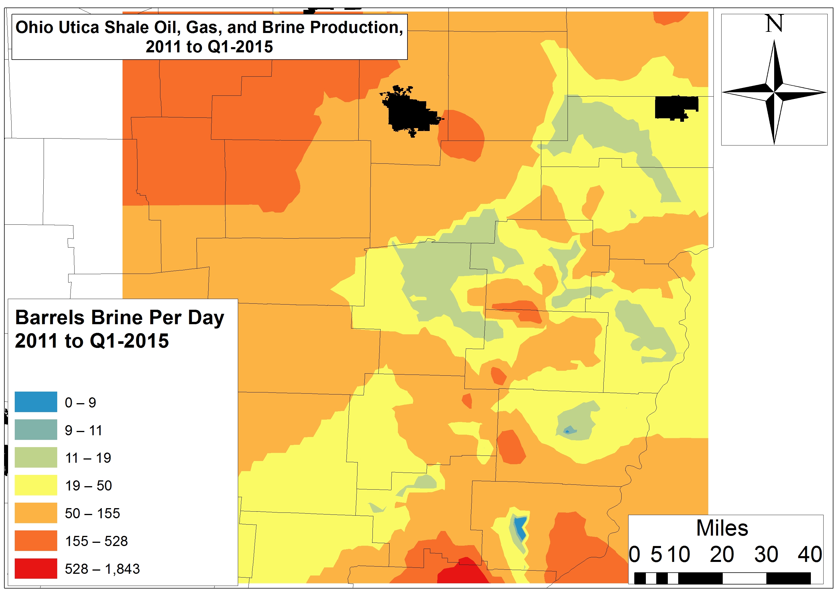
Brine is a form of liquid drilling waste characterized by high salt loads and total dissolved solids. The laterals that have produced the most brine to date are located in a large section of Monroe County and at the intersection of Belmont, Monroe, and Noble counties, with total brine production amounting to 23,292 barrels or 734,000-978,000 gallons (Fig. 1).
Figure 1. Total Ohio Utica Shale Oil, Gas, and Brine Production 2011 to Q1-2015
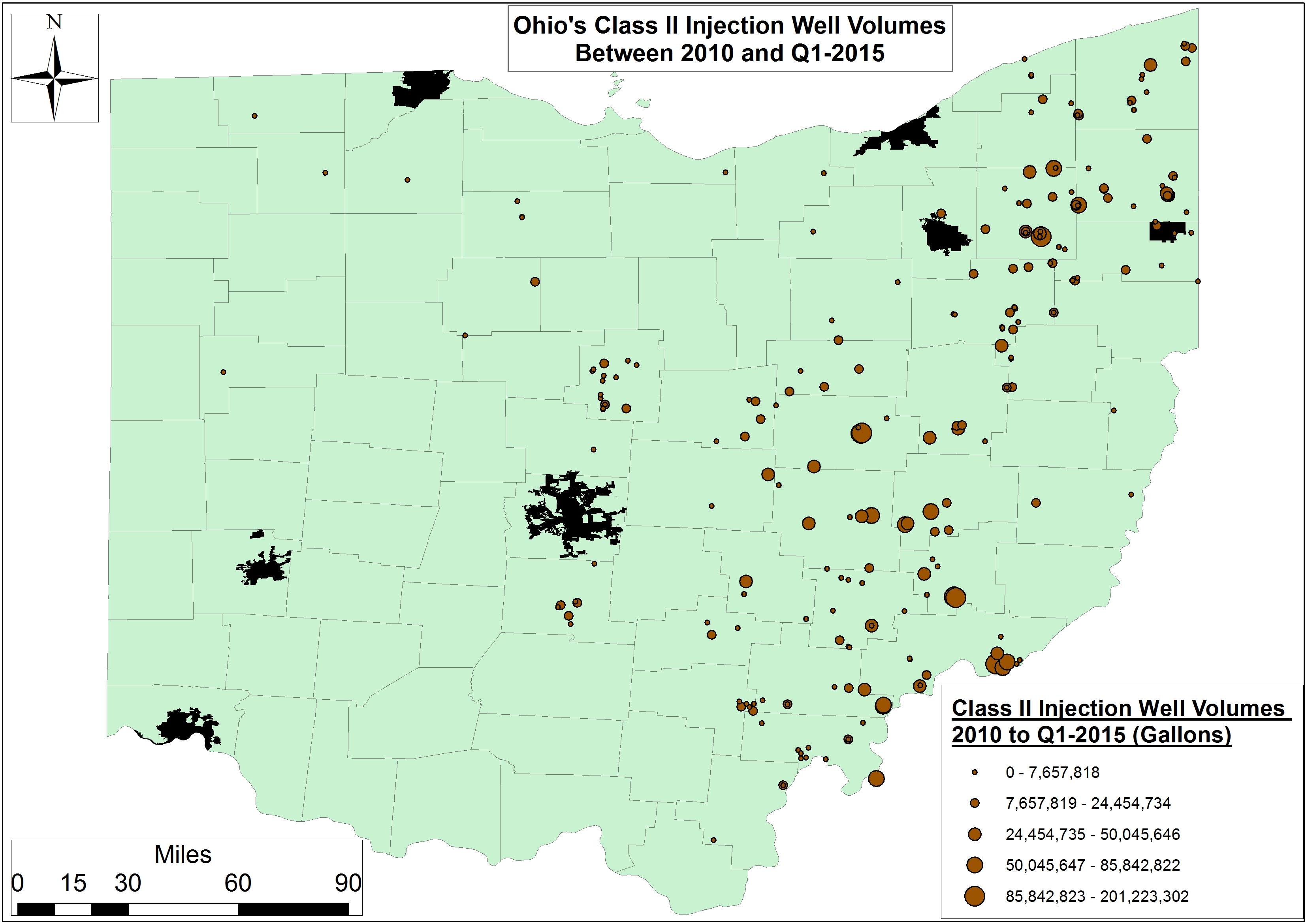
This area is also one of the top three regions of the state with respect to Class II Injection volumes; the other two high-brine production regions are Morrow and Portage counties to the west and southwest, respectively (Fig. 2).
Figure 2. Layout & Volume (2010 to Q1-2015, Gallons) of Ohio’s Active Class II Injection Wells
However, on a per-day basis we are seeing quite a few inefficient laterals across the state, including Devon Energy’s Eichelberger and Richman Farms laterals in Ashland and Medina counties. Ashland and Medina are producing 230-270 barrels (8,453-9,923 gallons) of brine per day. In Carroll County, one of Chesapeake’s Trushell laterals tops the list for brine production at 1,843 barrels (67,730 gallons) per day. One of Gulfport’s Bolton laterals in Belmont County and EdgeMarc’s Merlin 10PPH in Washington County are generating 1,100-1,200 barrels (40,425-44,100 gallons) of brine per day.
Oil & Gas Production
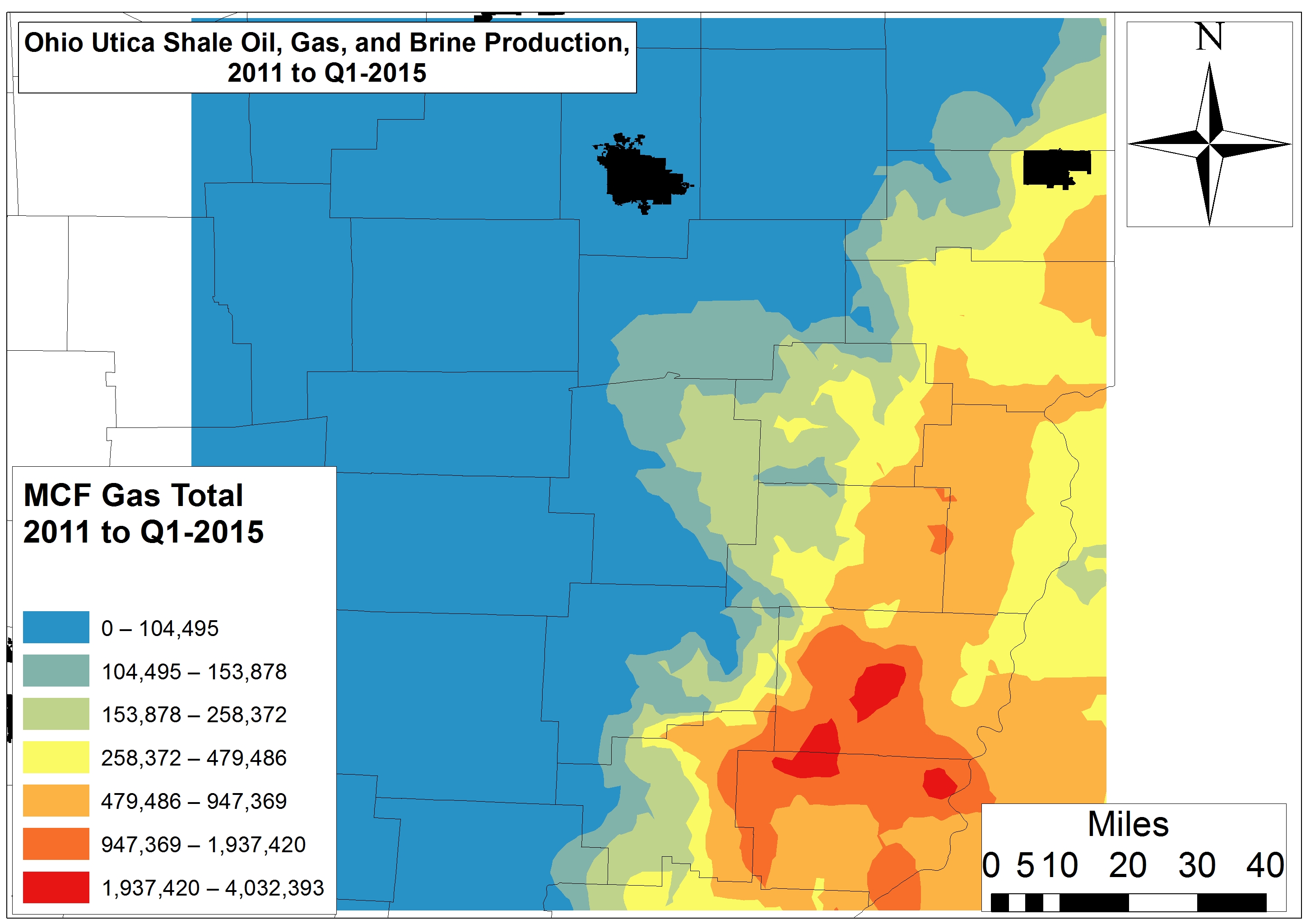
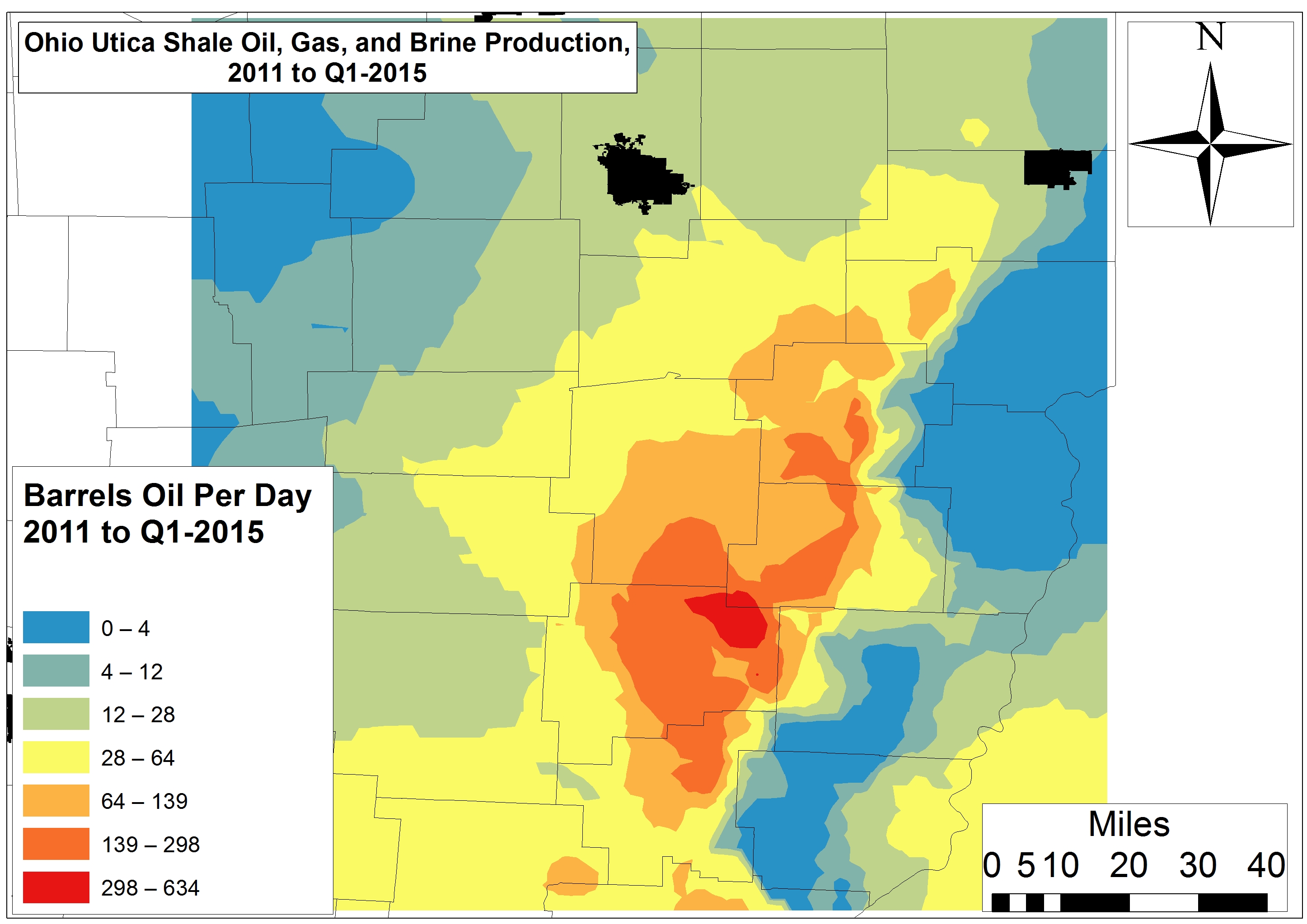
Since the last time we modeled production the oil hotspots have shrunk. They have also become more discrete and migrated southward – all of this in contrast to the model proposed by the OGS in 2012. The areas of greatest productivity (i.e., >26,000 barrels of oil) are not the central part of the state, but rather Tuscarawas, Harrison, Guernsey, and Noble counties (Fig. 1). The intersection of Harrison, Tuscarawas, and Guernsey counties is where oil productivity per-day is highest – in the range of 300-630+ barrels (Fig. 3). The areas that the OGS proposed had the highest oil potential have produced <600 barrels total or <12 barrels per day.
Figure 3. Per-Day Ohio Utica Shale Oil, Gas, and Brine Production 2011 to Q1-2015
The OGS natural gas region has proven to be another area of extremely low oil productivity.
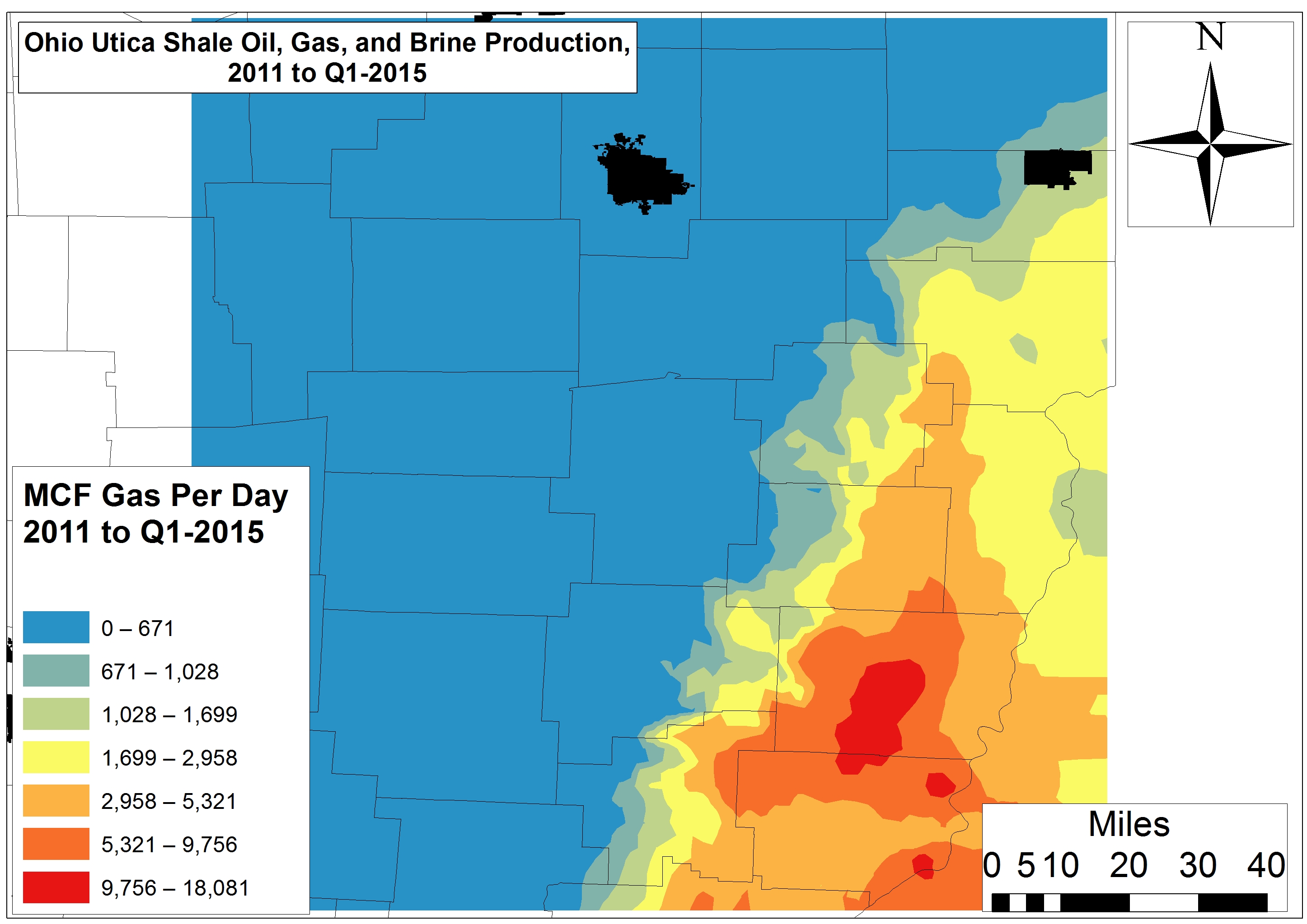
Natural gas productivity in the Utica Shale is far less extensive than the OGS projected back in 2012. High gas production is restricted to discreet areas of Belmont and Monroe counties to the tune of 947,000-4.1 million Mcf to date – or 5,300-18,100 Mcf per day. While the OGS projected natural gas and natural gas liquid potential all the way from Medina to Fairfield and Perry counties, we found a precipitous drop-off in productivity in these counties to <1,028 Mcf per day (<155,000 Mcf total from 2011 to Q1-2015) or a mere 6-11% of the Belmont-Monroe sweet spot.
Conclusion: A Shrinking Utica Shale Play
Simply put, the OGS 2012 estimates:
Have not held up,
Are behind the times and unreliable with respect to citizens looking to guestimate potential royalties,
Were far too simplistic,
Mapped high-yield sections of the “play” as continuous when in fact productive zones are small and discrete,
Did not differentiate between per day and total productivity, and
Did not address brine waste.
These issues should be addressed by the OGS and ODNR on a more transparent and frequent basis. Combine this analysis with the disappointing returns Ohio’s 17 publicly traded drilling firms are delivering and one might conclude that the structural Utica Shale bubble is about to burst. However, we know that when all else fails these same firms can just “lever up,” like their Rocky Mountain brethren, to maintain or marginally increase production and shareholder happiness. Will these Red Queens of the O&G industry stay ahead of the Big Bank and Private Equity hounds on their trail?
https://www.fractracker.org/a5ej20sjfwe/wp-content/uploads/2015/09/OH-Shrinking2-Feature.jpg400900Ted Auch, PhDhttps://www.fractracker.org/a5ej20sjfwe/wp-content/uploads/2025/09/2025-Wordmark-Logo.pngTed Auch, PhD2015-09-29 15:29:212020-03-12 17:39:58The Curious Case of the Shrinking Utica Shale Play
Ohio waterways face headwinds in the form of hydraulic fracturing water demand and waste disposal
By Ted Auch, PhD – Great Lakes Program Coordinator, and Elliott Kurtz, GIS Intern and University of Michigan Graduate Student
In just 44 of its 88 counties, Ohio houses 1,134 wells – including those producing oil and natural gas and Class II injection wells into which the industry’s waste is disposed. Last month we wrote about Ohio’s disturbing fracking waste disposal trend and the disproportionate influence of neighboring states. (Prior to that Ariel Conn at Virginia Tech outlined the relationship between Class II Injection Wells and induced seismicity on FracTracker.) This time around, we are digging deeper into how water demand is related to Class II disposal trends.
Ohio’s Utica oil and gas wells are using 7 million gallons of freshwater – or 2.4-2.8 million more than the average well cited by the US EPA.1 Below we explore the inter-county differences of the water used in these oil and gas wells, and how demand compares to residential water demand and wastewater production.
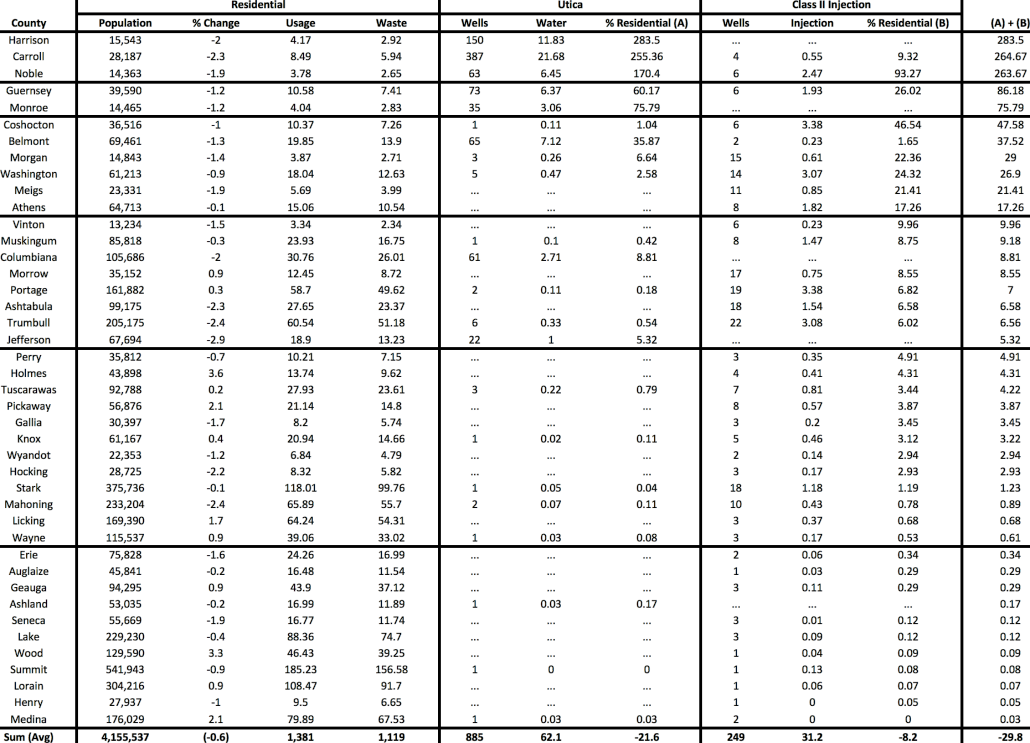
Please refer to Table 1 at the end of this article regarding the following findings.
Utica Shale Freshwater Demand
Data indicate that there may be serious threats to Ohio’s water security on the horizon due to the oil and gas industry.
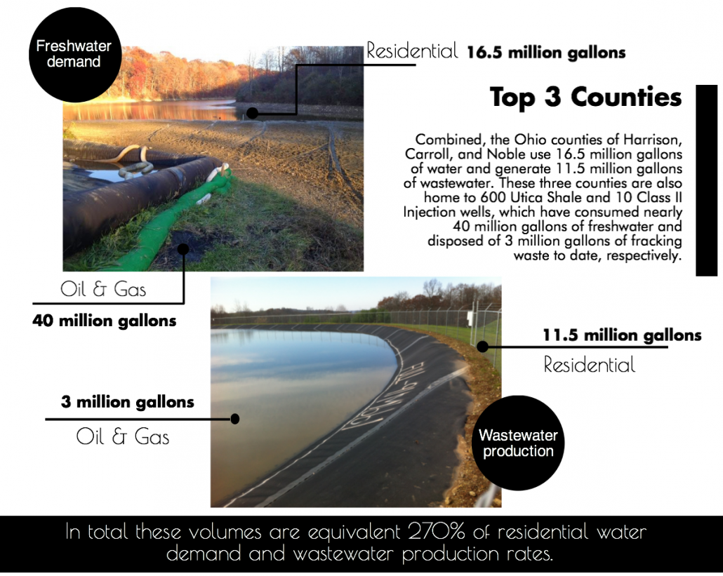
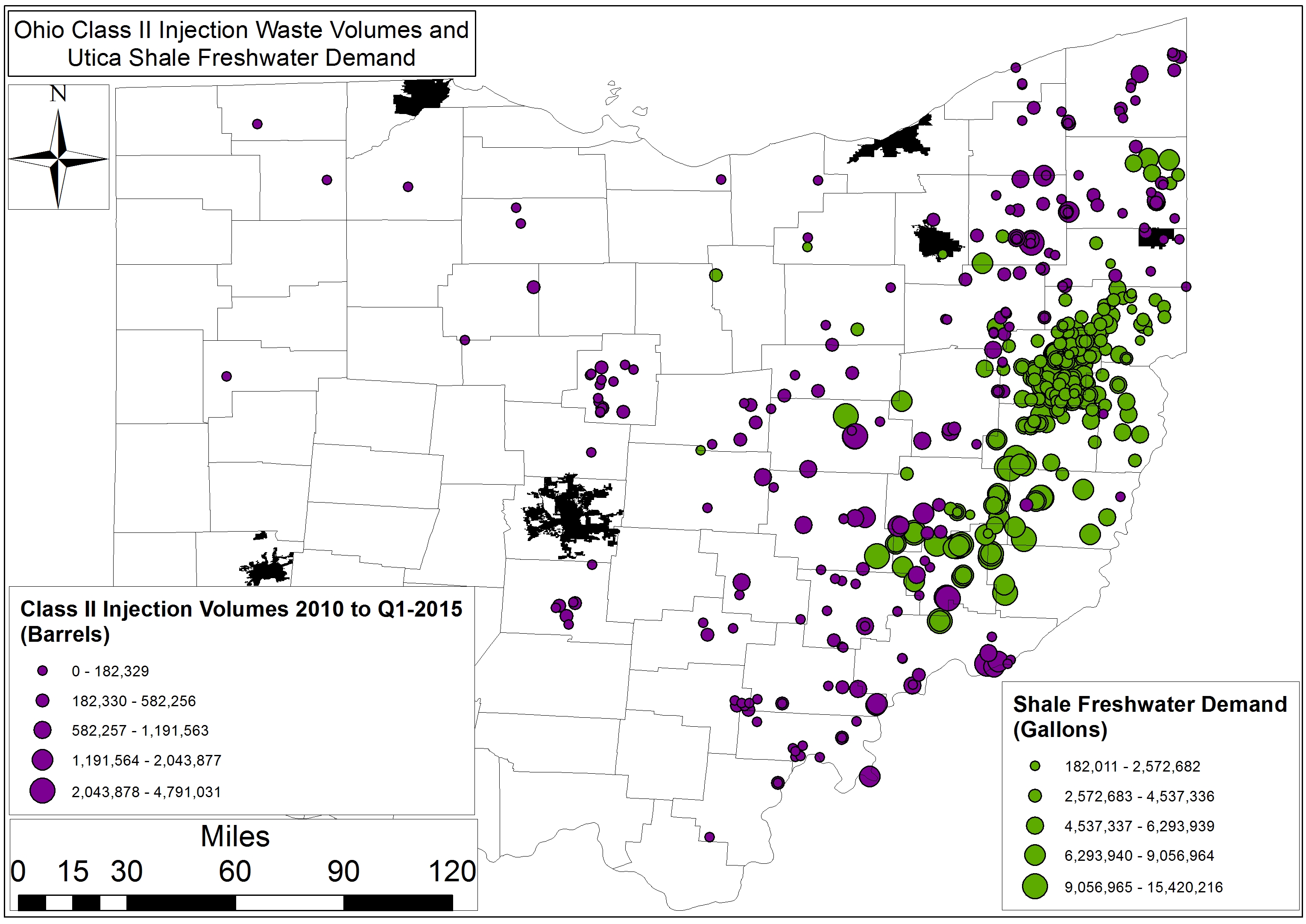
The counties of Guernsey and Monroe are next up with water demand and waste water generation at rates of 14.6 and 10.3 million gallons per year. However, the 11.4 million gallons of freshwater demand and fracking waste produced by these two counties 114 Utica and Class II wells still accounts for roughly 81% of residential water demand.
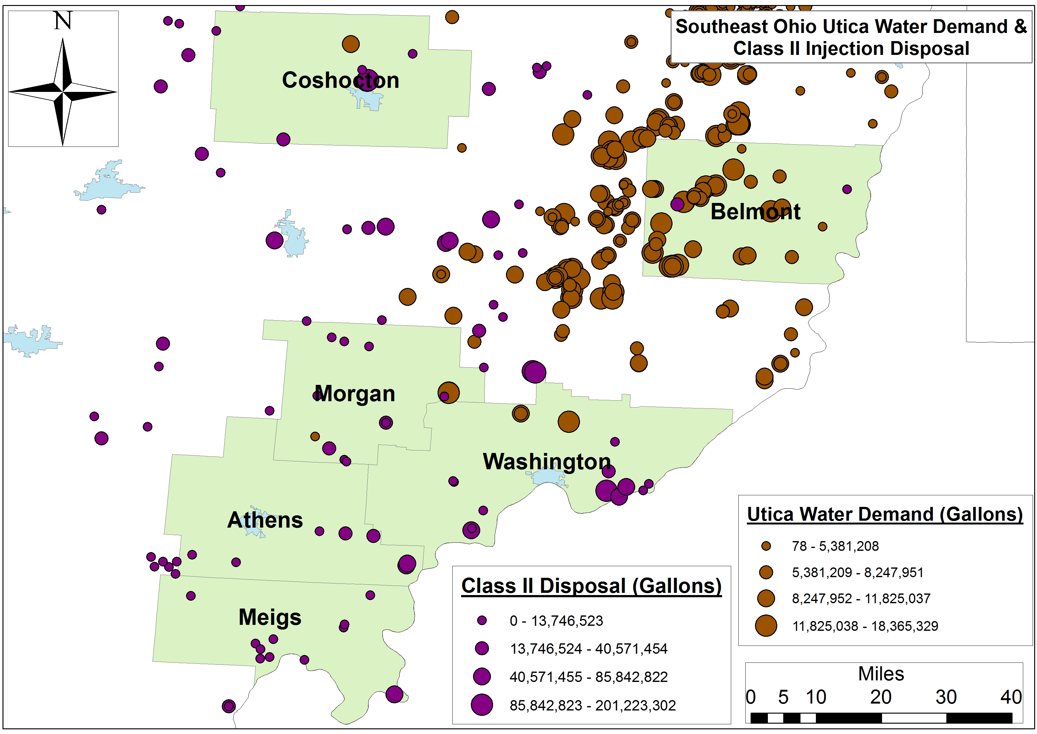
The wells within the six-county region including Meigs, Washington, Athens, and Belmont along the Ohio River use 73 million gallons of water and generate 51 million gallons of wastewater per year, while the hydraulic fracturing industry’s water-use footprint ranges between 48 and 17% of residential demand in Coshocton and Athens, respectively. Class II Injection well disposal accounts for a lion’s share of this footprint in all but Belmont County, with injection well activities equaling 77 to 100% of the industry’s water footprint (see Figure 1 for county locations and water stress).
Figure 1. Primary Southeast Ohio counties experiencing Utica Shale and Class II water stress
The next eight-county cohort is spread across the state from the border of Pennsylvania and the Ohio River to interior Appalachia and Central Ohio. Residential water demand there equals 428 million gallons, while the eight county’s 92 Utica and 90 Class II wells have accounted for 15 million gallons of water demand and disposal. Again the injection well component of the industry accounts for 5.8% of the their 7.7% footprint relative to residential demand. The range is nearly 10% in Vinton and 5.3% in Jefferson County.
The next cohort includes twelve counties that essentially surround Ohio’s Utica Shale region from Stark and Mahoning in the Northeast to Pickaway, Hocking, and Gallia along the southwestern perimeter of “the play.” These counties’ residents consume 405 million gallons of water and generate 329 million gallons of wastewater annually. Meanwhile the industry’s 69 Class II wells account for 53 million gallons – a 2.8% water footprint.
Finally, the 11 counties with the smallest Utica/Class II footprint are not suprisingly located along Lake Erie, as well as the Michigan and Indiana border, with water demand and wastewater production equalling nearly 117 billion gallons per year. Meanwhile the region’s 3 Utica and 18 Class II wells have utilized 59 million gallons. These figures equate to a water footprint of roughly 00.15%, more aligned with the 1% of total annual water use and consumption for the hydraulic fracturing industry cited by the US EPA this past June.
Future Concerns and Projections
Industry will see their share of the region’s hydrology increase in the coming months and years given that injection well volumes and Utica Shale demand is increasing by 1.04 million gallons and 405-410 million gallons per quarter per well, respectively. The number of people living in these 42 counties is declining by 0.6% per year, however, 1.4% in the 10 counties that have seen the highest percentage of their water resources allocated to Utica and Class II operations. Additionally, hydraulic fracturing permitting is increasing by 14% each year.2
Table 1. Residential, Utica Shale, and Class II Injection well water footprint across forty-two Ohio Counties (Note: All volumes are in millions of gallons)
2. Auch, W E, McClaugherty, C, Gallemore, C, Berghoff, D, Genshock, E, Kurtz, E, & Jurjus, R. (2015). Ramification of current and future production, resource utilization, and land-use change in the Ohio Utica Shale Basin. Paper presented at the National Environmental Monitoring Conference, Chicago, IL.
https://www.fractracker.org/a5ej20sjfwe/wp-content/uploads/2015/08/InjectionWells-Feature.jpg400900Ted Auch, PhDhttps://www.fractracker.org/a5ej20sjfwe/wp-content/uploads/2025/09/2025-Wordmark-Logo.pngTed Auch, PhD2015-08-11 10:42:442020-03-12 14:04:43Threats to Ohio’s Water Security
In February 2014, the FracTracker Alliance produced our first version of a national well data file and map, showing over 1.1 million active oil and gas wells in the United States. We have now updated that data, with the total of wells up to 1,666,715 active wells accounted for.
Density by state of active oil and gas wells in the United States. Click here to access the legend, details, and full map controls. Zoom in to see summaries by county, and zoom in further to see individual well data. Texas contains state and county totals only, and North Carolina is not included in this map.
While 1.7 million wells is a substantial increase over last year’s total of 1.1 million, it is mostly attributable to differences in how we counted wells this time around, and should not be interpreted as a huge increase in activity over the past 15 months or so. Last year, we attempted to capture those wells that seemed to be producing oil and gas, or about ready to produce. This year, we took a more inclusive definition. Primarily, the additional half-million wells can be accounted for by including wells listed as dry holes, and the inclusion of more types of injection wells. Basically anything with an API number that was not described as permanently plugged was included this time around.
Data for North Carolina are not included, because they did not respond to three email inquiries about their oil and gas data. However, in last year’s national map aggregation, we were told that there were only two active wells in the state. Similarly, we do not have individual well data for Texas, and we use a published list of well counts by county in its place. Last year, we assumed that because there was a charge for the dataset, we would be unable to republish well data. In discussions with the Railroad Commission, we have learned that the data can in fact be republished. However, technical difficulties with their datasets persist, and data that we have purchased lacked location values, despite metadata suggesting that it would be included. So in short, we still don’t have Texas well data, even though it is technically available.
Wells by Type and Status
Each state is responsible for what their oil and gas data looks like, so a simple analysis of something as ostensibly straightforward as what type of well has been drilled can be surprisingly complicated when looking across state lines. Additionally, some states combine the well type and well status into a single data field, making comparisons even more opaque.
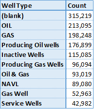
Top 10 of 371 published well types for wells in the United States.
Among all of the oil producing states, there are 371 different published well types. This data is “raw,” meaning that no effort has been made to combine similar entries, so “gas, oil” is counted separately from “GAS OIL,” and “Bad Data” has not been combined with “N/A,” either. Conforming data from different sources is an exercise that gets out of hand rather quickly, and utility over using the original published data is questionable, as well. We share this information, primarily to demonstrate the messy state of the data. Many states combine their well type and well status data into a single column, while others keep them separate. Unfortunately, the most frequent well type was blank, either because states did not publish well types, or they did not publish them for all of their wells.
There are no national standards for publishing oil and gas data – a serious barrier to data transparency and the most important takeaway from this exercise…
Wells by Location
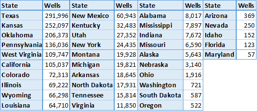
Active oil and gas wells in 2015 by state. Except for Texas, all data were aggregated published well coordinates.
There are oil and gas wells in 35 of the 50 states (70%) in the United States, and 1,673 out of 3,144 (53%) of all county and county equivalent areas. The number of wells per state ranges from 57 in Maryland to 291,996 in Texas. There are 135 counties with a single well, while the highest count is in Kern County, California, host to 77,497 active wells.
With the exception of Texas, where the data are based on published lists of well county by county, the state and county well counts were determined by the location of the well coordinates. Because of this, any errors in the original well’s location data could lead to mistakes in the state and county summary files. Any wells that are offshore are not included, either. Altogether, there are about 6,000 wells (0.4%) are missing from the state and county files.
Wells by Operator
There are a staggering number of oil and gas operators in the United States. In a recent project with the National Resources Defense Council, we looked at violations across the few states that publish such data, and only for the 68 operators that were identified previously as having the largest lease acreage nationwide. Even for this task, we had to follow a spreadsheet of which companies were subsidiaries of others, and sometimes the inclusion of an entity like “Williams” on the list came down to a judgement call as to whether we had the correct company or not.
No such effort was undertaken for this analysis. So in Pennsylvania, wells drilled by the operator Exco Resources PA, Inc. are not included with those drilled by Exco Resources PA, Llc., even though they are presumably the same entity. It just isn’t feasible to systematically go through thousands of operators to determine which operators are owned by whom, so we left the data as is. Results, therefore, should be taken with a brine truck’s worth of salt.
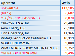
Top 10 wells by operator in the US, excluding Texas. Unknown operators are highlighted in red.
Texas does publish wells by operator, but as with so much of their data, it’s just not worth the effort that it takes to process it. First, they process it into thirteen different files, then publish it in PDF format, requiring special software to convert the data to spreadsheet format. Suffice to say, there are thousands of operators of active oil and gas wells in the Lone Star State.
Not counting Texas, there are 39,693 different operators listed in the United States. However, many of those listed are some version of “we don’t know whose well this is.” Sorting the operators by the number of wells that they are listed as having, we see four of the top ten operators are in fact unknown, including the top three positions.
Summary
The state of oil and gas data in the United States is clearly in shambles. As long as there are no national standards for data transparency, we can expect this trend to continue. The data that we looked for in this file is what we consider to be bare bones: well name, well type, well status, slant (directional, vertical, or horizontal), operator, and location. In none of these categories can we say that we have a satisfactory sense of what is going on nationally.
Click on the above button to download the three sets of data we used to make the dynamic map (once you are zoomed in to a state level). The full dataset was broken into three parts due to the large file sizes.
https://www.fractracker.org/a5ej20sjfwe/wp-content/uploads/2015/08/2015Update-Feature.jpg400900Matt Kelso, BAhttps://www.fractracker.org/a5ej20sjfwe/wp-content/uploads/2025/09/2025-Wordmark-Logo.pngMatt Kelso, BA2015-08-03 14:19:532020-07-21 10:30:051.7 Million Wells in the U.S. – A 2015 Update
This article was originally posted on 10 July 2015, and then updated on 22 January 2016 and 16 February 2016.
Proposed Pipeline to Funnel Marcellus Gas South
In early fall 2014, Dominion Energy proposed a $5 billion pipeline project, designed provide “clean-burning gas supplies to growing markets in Virginia and North Carolina.” Originally named the “Southeast Reliability Project,” the proposed pipeline would have a 42-inch diameter in West Virginia and Virginia. It would narrow to 36 inches in North Carolina, and narrow again to 20 inches in the portion that would extend to the coast at Hampton Roads. Moving 1.5 billion cubic feet per day of gas, with a maximum allowable operating pressure of 1440 psig (pounds per square inch gage), the pipeline would be designed for larger customers (such as manufacturers and power generators) or local gas distributors supplying homes and businesses to tap into the pipeline along the route, making the pipeline a prime mover for development along its path.
The project was renamed the Atlantic Coast Pipeline (ACP) when a coalition of four major US energy companies—Dominion (45% ownership), Duke Energy (40%), Piedmont Natural Gas (15%), and AGL Resources (5%)— proposed a joint venture in building and co-owning the pipeline. Since then, over 100 energy companies, economic developers, labor unions, manufacturers, and civic groups have joined the new Energy Sure Coalition, supporting the ACP. The coalition asserts that the pipeline is essential because the demand for fuel for power generation is predicted more than triple over the next 20 years. Their website touts the pipeline as a “Path to Cleaner Energy,” and suggests that the project will generate significant tax revenue for Virginia, North Carolina, and West Virginia.
Lew Ebert, president of the North Carolina Chamber of Commerce, optimistically commented:
Having the ability to bring low-cost, affordable, predictable energy to a part of the state that’s desperately in need of it is a big deal. The opportunity to bring a new kind of energy to a part of the state that has really struggled over decades is a real economic plus.
Unlike older pipelines, which were designed to move oil and gas from the Gulf Coast refineries northward to meet energy demands there, the Atlantic Coast Pipeline would tap the Marcellus Shale Formation in Ohio, West Virginia and Pennsylvania and send it south to fuel power generation stations and residential customers. Dominion characterizes the need for natural gas in these parts of the country as “urgent,” and that there is no better supplier than these “four homegrown companies” that have been economic forces in the state for many years.
In addition to the 550 miles of proposed pipeline for this project, three compressor stations are also planned. One would be at the beginning of the pipeline in West Virginia, a second midway in County Virginia, and the third near the Virginia-North Carolina state line. The compressor stations are located along the proposed pipeline, adjacent to the Transcontinental Pipeline, which stretches more than 1,800 miles from Pennsylvania and the New York City Area to locations along the Gulf of Mexico, as far south as Brownsville, TX.
In mid-May 2015, in order to avoid requesting Congressional approval to locate the pipeline over National Park Service lands, Dominion proposed rerouting two sections of the pipeline, combining the impact zones on both the Blue Ridge Parkway and the Appalachian Trail into a single location along the border of Nelson and Augusta Counties, VA. National Forest Service land does not require as strict of approvals as would construction on National Park Service lands. Dominion noted that over 80% of the pipeline route has already been surveyed.
Opposition to the Pipeline on Many Fronts
The path of the proposed pipeline crosses topography that is well known for its karst geology feature—underground caverns that are continuous with groundwater supplies. Environmentalists have been vocal in their concern that were part of the pipeline to rupture, groundwater contamination, along with impacts to wildlife could be extensive. In Nelson County, VA, alone, 70% of the property owners in the path of the proposed pipeline have refused Dominion access for survey, asserting that Dominion has been unresponsive to their concerns about environmental and cultural impacts of the project.
On the grassroots front, 38 conservation and environmental groups in Virginia and West Virginia have combined efforts to oppose the ACP. The group, called the Allegany-Blue Ridge Alliance (ABRA), cites among its primary concerns the ecologically-sensitive habitats the proposed pipeline would cross, including over 49.5 miles of the George Washington and Monongahela State Forests in Virginia and West Virginia. The “alternative” version of the pipeline route would traverse 62.7 miles of the same State Forests. Scenic routes, including the Blue Ridge Parkway and the Appalachian Scenic Trail would also be impacted. In addition, it would pose negative impacts on many rural communities but not offset these impacts with any longer-term economic benefits. ABRA is urging for a programmatic environmental impact statement (PEIS) to assess the full impact of the pipeline, and also evaluate “all reasonable, less damaging” alternatives. Importantly, ABRA is urging for a review that explores the cumulative impacts off all pipeline infrastructure projects in the area, especially in light of the increasing availability of clean energy alternatives.
Environmental and political opposition to the pipeline has been strong, especially in western Virginia. Friends of Nelson, based in Nelson County, VA, has taken issue with the impacts posed by the 150-foot-wide easement necessary for the pipeline, as well as the shortage of Department of Environmental Quality staff that would be necessary to oversee a project of this magnitude.
Do gas reserves justify this project?
Dominion, an informational flyer, put forward an interesting argument about why gas pipelines are a more environmentally desirable alternative to green energy:
If all of the natural gas that would flow through the Atlantic Coast Pipeline is used to generate electricity, the 1.5 billion cubic feet per day (bcf/d) would yield approximately 190,500 megawatt-hours per day (mwh/d) of electricity. The pipeline, once operational, would affect approximately 4,600 acres of land. To generate that much electricity with wind turbines, utilities would need approximately 46,500 wind turbines on approximately 476,000 acres of land. To generate that much electricity with solar farms, utilities would need approximately 1.7 million acres of land dedicated to solar power generation.
Nonetheless, researchers, as well as environmental groups, have questioned whether the logic is sound, given production in both the Marcellus and Utica Formations is dropping off in recent assessments.
Both Nature, in their article Natural Gas: The Fracking Fallacy, and Post Carbon Institute, in their paper Drilling Deeper, took a critical look at several of the current production scenarios for the Marcellus Shale offered by EIA and University of Texas Bureau of Economic Geology (UT/BEG). All estimates show a decline in production over current levels. The University of Texas report, authored by petroleum geologists, is considerably less optimistic than what has been suggested by the Energy Information Administration (EIA), and imply that the oil and gas bubble is likely to soon burst.
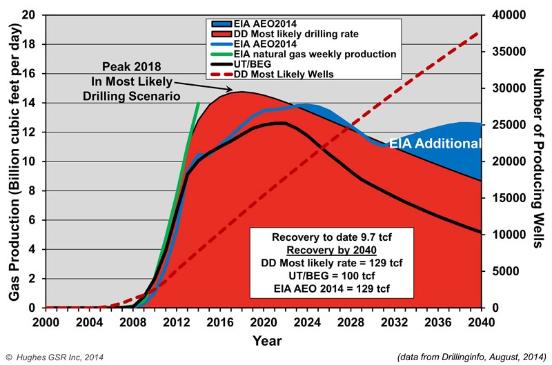
Natural Gas Production Projections for Marcellus Shale
David Hughes, author of the Drilling Deeper report, summarized some of his findings on Marcellus productivity:
Field decline averages 32% per year without drilling, requiring about 1,000 wells per year in Pennsylvania and West Virginia to offset.
Core counties occupy a relatively small proportion of the total play area and are the current focus of drilling.
Average well productivity in most counties is increasing as operators apply better technology and focus drilling on sweet spots.
Production in the “most likely” drilling rate case is likely to peak by 2018 at 25% above the levels in mid-2014 and will cumulatively produce the quantity that the Energy Information Administration (EIA) projected through 2040. However, production levels will be higher in early years and lower in later years than the EIA projected, which is critical information for ongoing infrastructure development plans.
Five out of more than 70 counties account for two-thirds of production. Eighty-five percent of production is from Pennsylvania, 15% from West Virginia and very small amounts from Ohio and New York. (The EIA has published maps of the depth, thickness and distribution of the Marcellus shale, which are helpful in understanding the variability of the play.)
The increase in well productivity over time reported in Drilling Deeper has now peaked in several of the top counties and is declining. This means that better technology is no longer increasing average well productivity in these counties, a result of either drilling in poorer locations and/or well interference resulting in one well cannibalizing another well’s recoverable gas. This declining well productivity is significant, yet expected, as top counties become saturated with wells and will degrade the economics which have allowed operators to sell into Appalachian gas hubs at a significant discount to Henry hub gas prices.
The backlog of wells awaiting completion (aka “fracklog”) was reduced from nearly a thousand wells in early 2012 to very few in mid-2013, but has increased to more than 500 in late 2014. This means there is a cushion of wells waiting on completion which can maintain or increase overall play production as they are connected, even if the rig count drops further.
Current drilling rates are sufficient to keep Marcellus production growing on track for its projected 2018 peak (“most likely” case in Drilling Deeper).
Post Carbon Institute estimates that Marcellus predictions overstate actual production by 45-142%. Regardless of the model we consider, production starts to drop off within a year or two after the proposed Atlantic Coast Pipeline would go into operation. This downward trend leads to some serious questions about whether moving ahead with the assumption of three-fold demand for gas along the Carolina coast should prompt some larger planning questions, and whether the availability of recoverable Marcellus gas over the next twenty years, as well as the environmental impacts of the Atlantic Coast Pipeline, justify its construction.
Next steps
The Federal Energy Regulatory Commission, FERC, will make a final approval on the pipeline route later in the summer of 2015, with a final decision on the pipeline construction itself expected by fall 2016.
UPDATE #1: On January 19, 2016, the Richmond Times-Dispatch reported that the United States Forest Service had rejected the pipeline, due to the impact its route would have on habitats of sensitive animal species living in the two National Forests it is proposed to traverse.
UPDATE #2: On February 12, 2016, Dominion Pipeline Company released a new map showing an alternative route to the one recently rejected by the United States Forest Service a month earlier. Stridently condemned by the Dominion Pipeline Monitoring Coalition as an “irresponsible undertaking”, the new route would not only cross terrain the Dominion had previously rejected as too hazardous for pipeline construction, it would–in avoiding a path through Cheat and Shenandoah Mountains–impact terrain known for its ecologically sensitive karst topography, and pose grave risks to water quality and soil erosion.
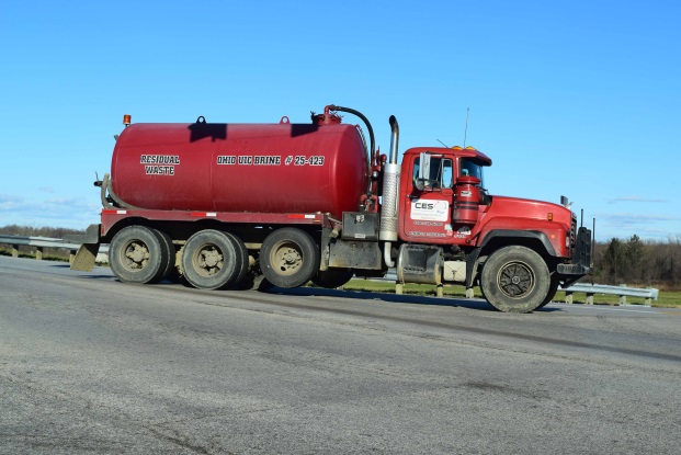
Waste disposal is an issue that causes quite a bit of consternation even amongst those that are pro-fracking. The disposal of fracking waste into injection wells has exposed many “hidden geologic faults” across the US as a result of induced seismicity, and it has been linked recently with increases in earthquake activity in states like Arkansas, Kansas, Texas, and Ohio. Here in OH there is growing evidence – from Ashtabula to Washington counties – that injection well volumes and quarterly rates of change are related to upticks in seismic activity.
Origins of Fracking Waste
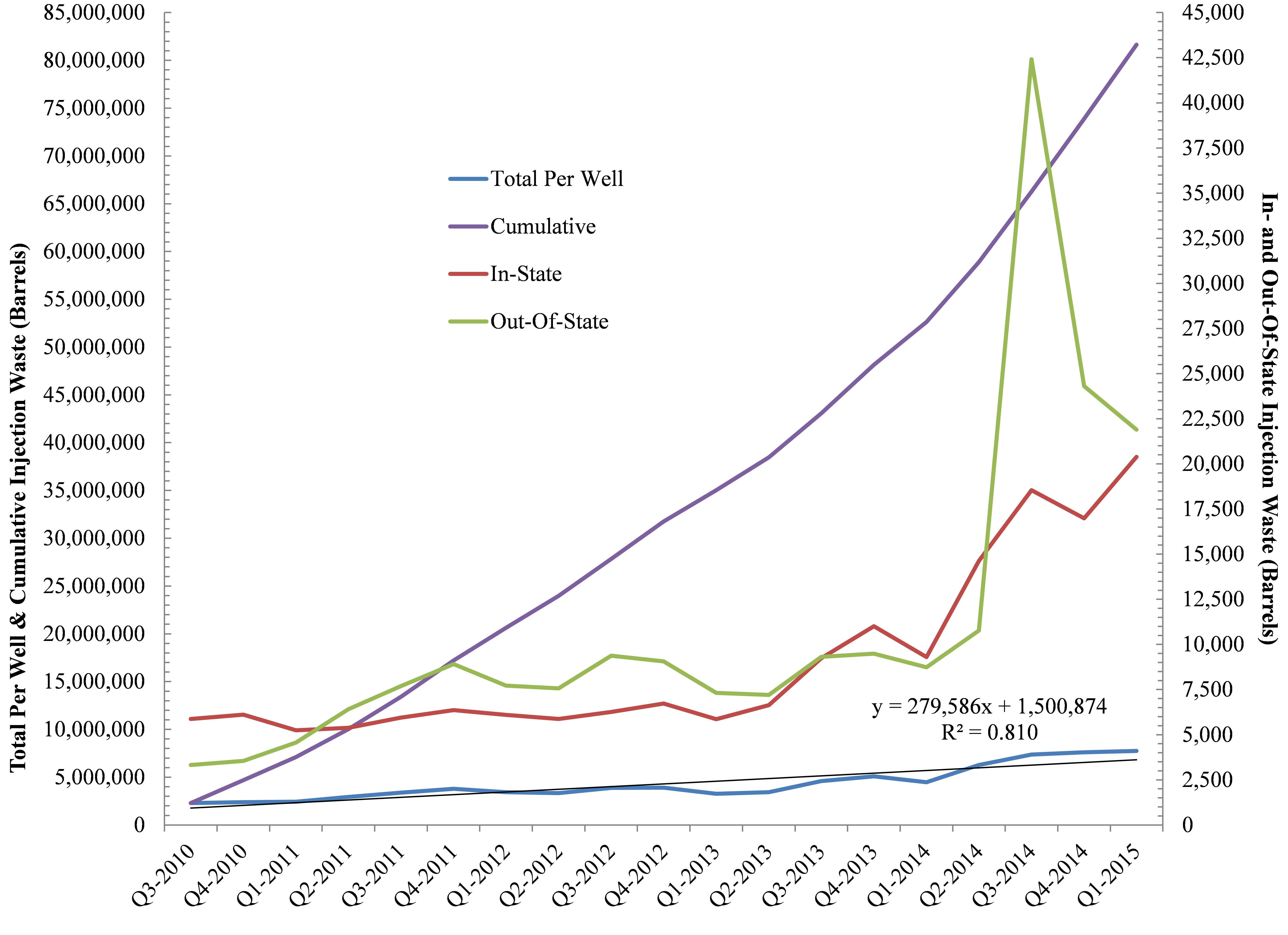
Furthermore, as part of this analysis we wanted to understand the ratio of Ohio’s Class II waste that has come from within Ohio and the proportion of waste originating from neighboring states such as West Virginia and Pennsylvania. Out of 960 Utica laterals and 245+ Class II wells, the results speak to the fact that a preponderance of the waste is coming from outside Ohio with out-of-state shale development accounting for ≈90% of the state’s hydraulic fracturing brine stream to-date. However, more recently the tables have turned with in-state waste increasing by 4,202 barrels per quarter per well (BPQPW). Out-of-state waste is only increasing by 1,112 BPQPW. Such a change stands in sharp contrast to our August 2013 analysis that spoke to 471 and 723 BPQPW rates of change for In- and Out-Of-State, respectively.
Brine Production
Figure 1. Ohio Class II Injection Well trends In- and Out-Of-State, Cumulatively, and on Per Well basis (n = 248).
For every gallon of freshwater used in the fracking process here in Ohio the industry is generating .03 gallons of brine (On average, Ohio’s 758 Utica wells use 6.88 million gallons of freshwater and produce 225,883 gallons of brine per well).
Back in August of 2013 the rate at which brine volumes were increasing was approaching 150,000 BPQPW (Learn more, Fig 5), however, that number has nearly doubled to +279,586 BPQPW (Note: 1 barrel of brine equals 32-42 gallons). Furthermore, Ohio’s Class II Injection wells are averaging 37,301 BPQPW (1.6 MGs) per quarter over the last year vs. 12,926 barrels BPQPW – all of this between the initiation of frack waste injection in 2010 and our last analysis up to and including Q2-2013. Finally, between Q3-2010 and Q1-2015 the exponential increase in injection activity has resulted in a total of 81.7 million barrels (2.6-3.4 billion gallons) of waste disposed of here in Ohio. From a dollars and cents perspective this waste has generated $2.5 million in revenue for the state or 00.01% of the average state budget (Note: 2.5% of ODNR’s annual budget).
Freshwater Demand Growing
Figure 2. Ohio Class II Injection Well disposal as a function of freshwater demand by the shale industry in Ohio between Q3-2010 and Q1-2015.
The relationship between brine (waste) produced and freshwater needed by the hydraulic fracturing industry is an interesting one; average freshwater demand during the fracking process accounts for 87% of the trend in brine disposal here in Ohio (Fig. 2). The more water used, the more waste produced. Additionally, the demand for OH freshwater is growing to the tune of 405-410,000 gallons PQPW, which means brine production is growing by roughly 12,000 gallons PQPW. This says nothing for the 450,000 gallons of freshwater PQPW increase in West Virginia and their likely demand for injection sites that can accommodate their 13,500 gallons PQPW increase.
Where will all this waste go? I’ll give you two guesses, and the first one doesn’t count given that in the last month the ODNR has issued 7 new injection well permits with 9 pending according to the Center For Health and Environmental Justice’s Teresa Mills.
https://www.fractracker.org/a5ej20sjfwe/wp-content/uploads/2015/07/Injection-Feature.jpg400900Ted Auch, PhDhttps://www.fractracker.org/a5ej20sjfwe/wp-content/uploads/2025/09/2025-Wordmark-Logo.pngTed Auch, PhD2015-07-09 14:54:002020-07-21 10:30:05OH Class II Injection Wells – Waste Disposal and Industry Water Demand
A financial crisis seems to have been averted as the price of crude oil is beginning to stabilize – at least for now. One must wonder how such a volatile market affects oil and gas’ Wall Street, private equity, and pension fund followers, however. We have found that many oil and gas (O&G) shares have experienced steep valuation declines in the last few years for companies operating in Ohio.
Share[d] Values
To approach such a broad question, we focused our assessment on Ohio and looked at the share performance of the 17 publicly traded firms operating in the Ohio Utica region since the date of their respective first Utica permits. The Date of First Permit (DFP) ranges between 12/23/2010 for Chesapeake Energy to 3/20/2013 for BP.
Across these 17 companies there are, quite expectedly, winners and losers. On average their shares have experienced 3.75% declines in their valuation or -00.81% per year in the last several years, however. This might be why many of Wall Street and The City’s major banks have limited – or ended – their lines of credit with energy firms from Ohio to the Great Plains. Others are still picking off the highly leveraged losers one by one for pennies on the dollar (Corkery and Eavis, 2015; Staff, 2014). This cutoff of credit and disturbingly high levels of debt/leverage may explain why we found, in a separate analysis, that while cumulative producing oil and gas wells have increased by 349% and 171%, respectively, the rate of permitting needed to maintain and/or incrementally increase these production rates has been 589%.
Cross-Company Comparisons
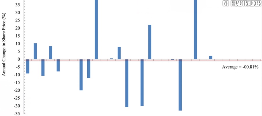
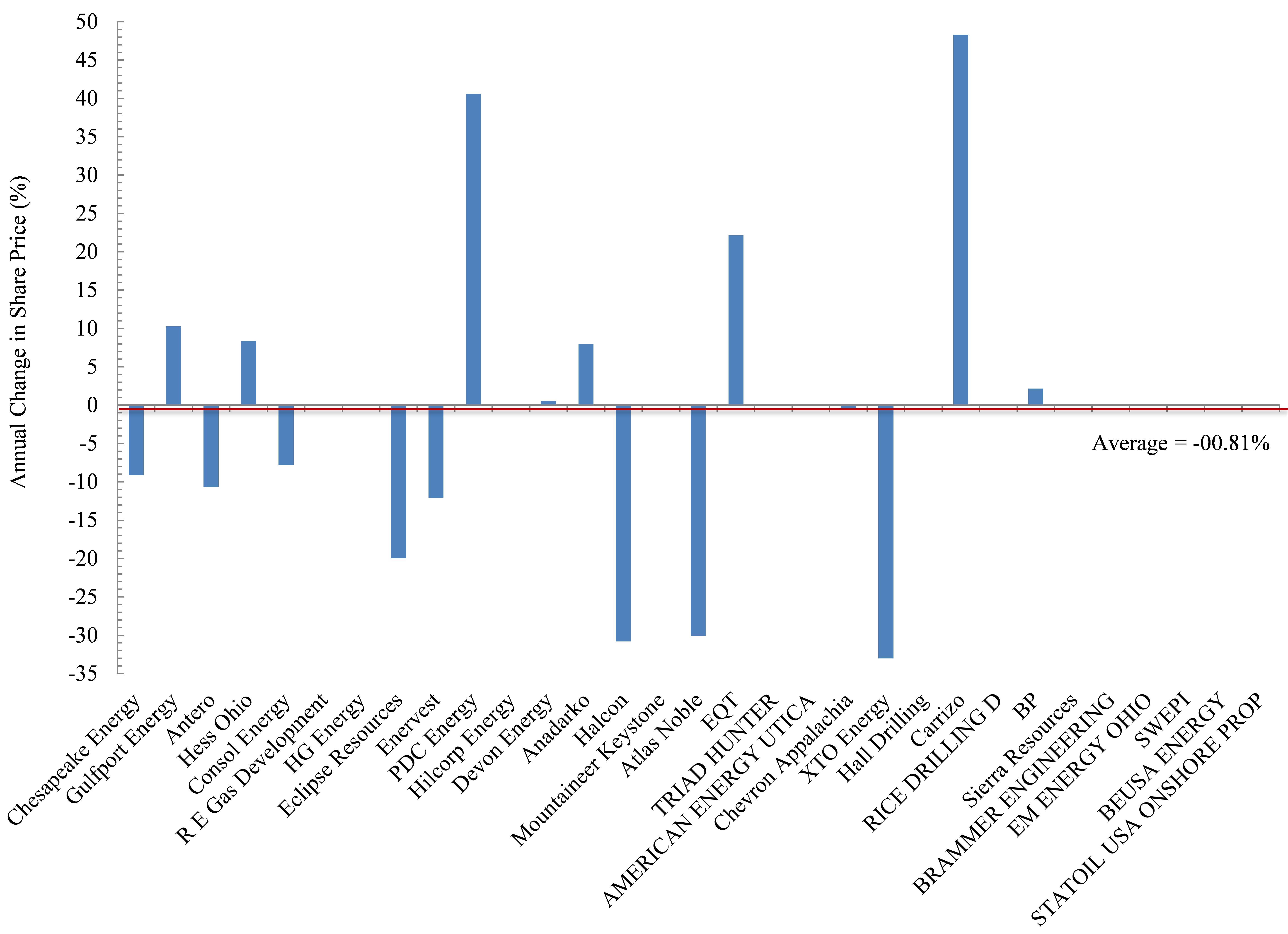
Figure 2. Annual change in share price (%) for 17 publicly traded firms operating in the Ohio Utica shale since their date of first permit
The biggest losers in Ohio’s oil and gas world include Chesapeake Energy. Chesapeake (CHK) is also the largest player in the Buckeye State based on total permits and total producing laterals, accounting for 41% and 55%, respectively. CHK has seen its shares decline on average by 9.1% each year since their DFP (Figure 2). Antero (-10.7% per year), Consol Energy (-7.8%), and Enervest (-12.1%) have experienced similar annual declines, with investors in these firms having seen their position shrink by an average of 37%. Eclipse shares have declined in value by nearly 20% per year, which pales in comparison to the 30-33% annual declines in the share price of Halcon, Atlas Noble, and XTO Energy.
Conversely, the biggest winners are clearly Carrizo (+49% per year), PDC Energy (+41%), and to a lesser degree smaller players like EQT (+22%), Hess Ohio (+8.4%), and Anadarko (+7.9%). Interestingly, the second most active firm operating in Ohio is Gulfport Energy, and their performance has been somewhere in the middle – with annual returns of 10.3%.
Out of State – The Bigger Picture
But before the big winners light up celebratory cigars, it is worth putting their performance into perspective relative to the rest of the field as it were. In an effort to be as fair as possible we chose the Dow Jones Industrial Average and S&P 500 – two indices that everyone has heard of because they are viewed as broad indicators of US economic growth. Incidentally, the DJIA includes the O&G companies Exon and Chevron. Exon is a multinational firm not involved in Ohio’s Utica development, while Chevron is involved. Additionally, the S&P 500 includes those two firms, as well as 39 other energy firms. Nine of those currently operate in Ohio. To assess these companies’ performance with the most energy-centric indices we have compared Ohio Utica players to the S&P 500’s Energy Index, which strips away all other components of its more famous metric, as well as the Vanguard Energy Index Fund. The latter is described by Vanguard as the following on the Mutual Funds portion of its website:
This low-cost index fund offers exposure to the energy sector of the U.S. equity market, which includes stocks of companies involved in the exploration and production of energy products such as oil, and natural gas. The fund’s main risk is its narrow scope—it invests solely in energy stocks. An investor should expect high volatility from the fund, which should be considered only as a small portion of an already well-diversified portfolio.
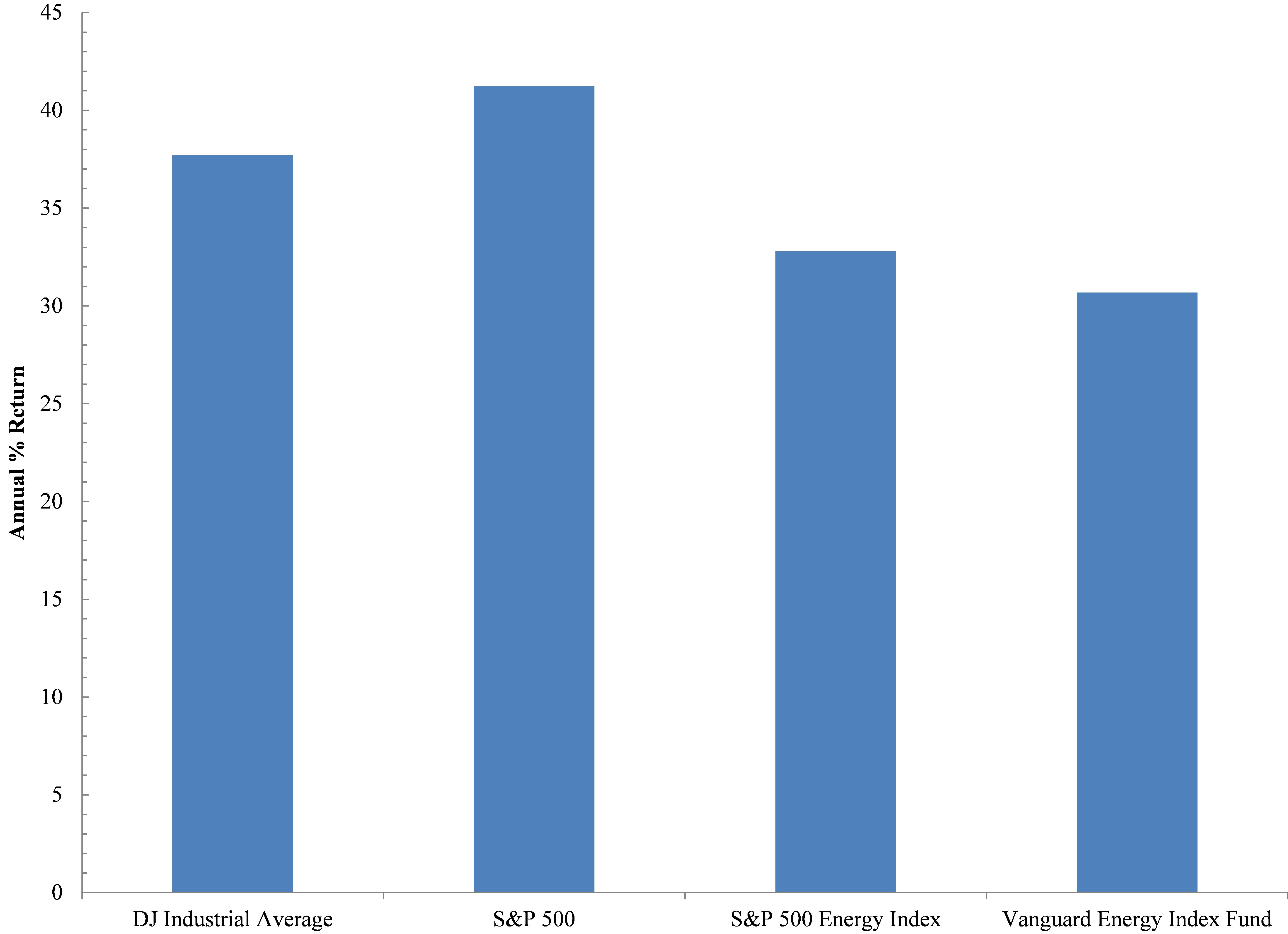
In reviewing these four indices we found that they have outperformed the 17 oil and gas firms here in Ohio or the Ohio Energy Complex (OEC), with annual rates of return (ROR) exceeding 35% (Figure 3). This ROR value was not approached or exceeded by any of the 17 OEC firms except for PDC Energy and Carrizo. However, these two companies only account for 2.8% of all Utica permits and 4.4% of all producing Utica laterals to date. Even if we remove the broader indicators of economic growth and just focus on the two energy indices we see the US energy space ROR has experienced annual growth rates of 33% or 7% below the broader US economy but impressive nonetheless. With such growth in the number of companies drilling for oil and gas, it is likely that we will see significant consolidation soon; some of the world’s largest multinationals like Exxon and Total may step in when all of the above are priced to perfection, which is something Exxon’s Chariman and CEO, Rex Tillerson, eluded to in a speech in Cleveland last June.
Figure 3. Annual % Return of Two Broad Economic and Two Energy Specific Indices.
The performance of the OEC indicates investors and/or lenders will not tolerate such a performance for much longer. Just like our country’s Too-Big-To-Fail banks, boards, CEOs, and shareholders were bailed out, it seems as though a similar bubble is percolating in the O&G world; the same untouchables will be protected by way of explicit or implicit taxpayer bailouts. Will Ohioans be made whole, too, or will they be left to pick up the pieces after yet another natural resource bubble bursts?
References
Corkery, M., Eavis, P., 2015. Slump in Oil Prices Brings Pressure, and Investment Opportunity, The New York Times, New York, NY.
Staff, 2014. Shale oil in a Bind: Will falling oil prices curb America’s shale boom?, The Economist, London, UK.
https://www.fractracker.org/a5ej20sjfwe/wp-content/uploads/2015/05/Shareholder-Feature.jpg400900Ted Auch, PhDhttps://www.fractracker.org/a5ej20sjfwe/wp-content/uploads/2025/09/2025-Wordmark-Logo.pngTed Auch, PhD2015-06-24 10:00:432020-07-21 10:30:04Ohio’s Shale Oil and Gas Firms Disappoint Shareholders


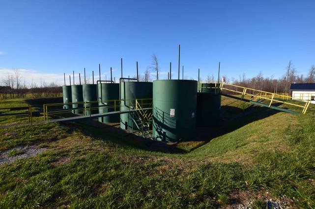
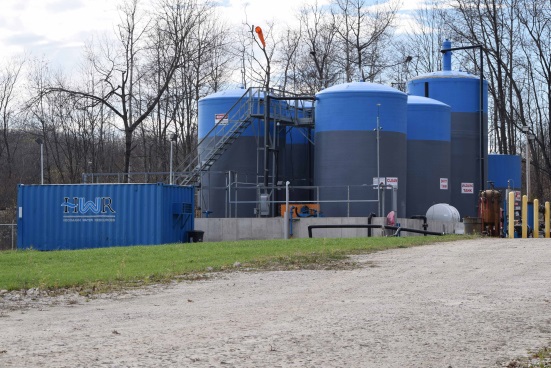
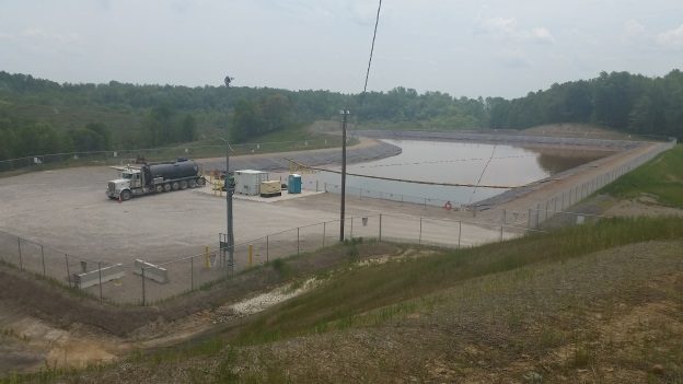
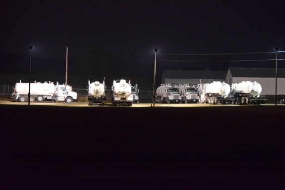
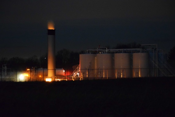
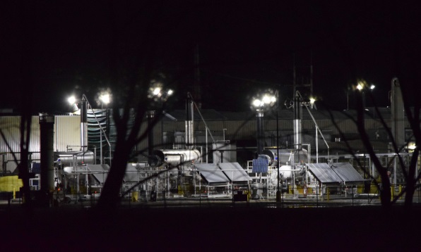
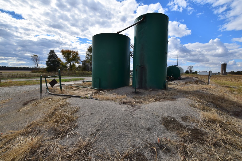
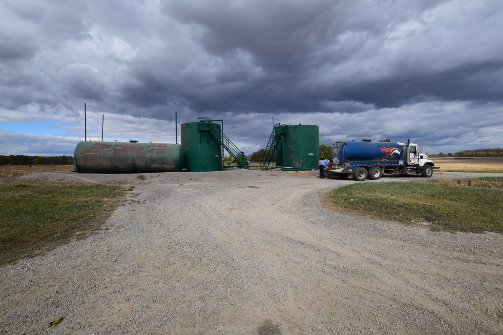
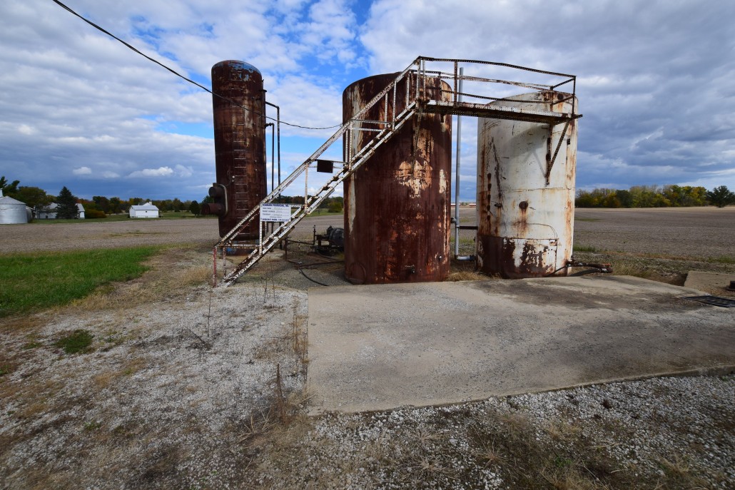
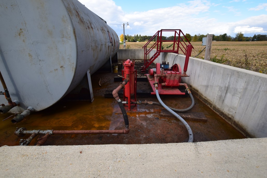
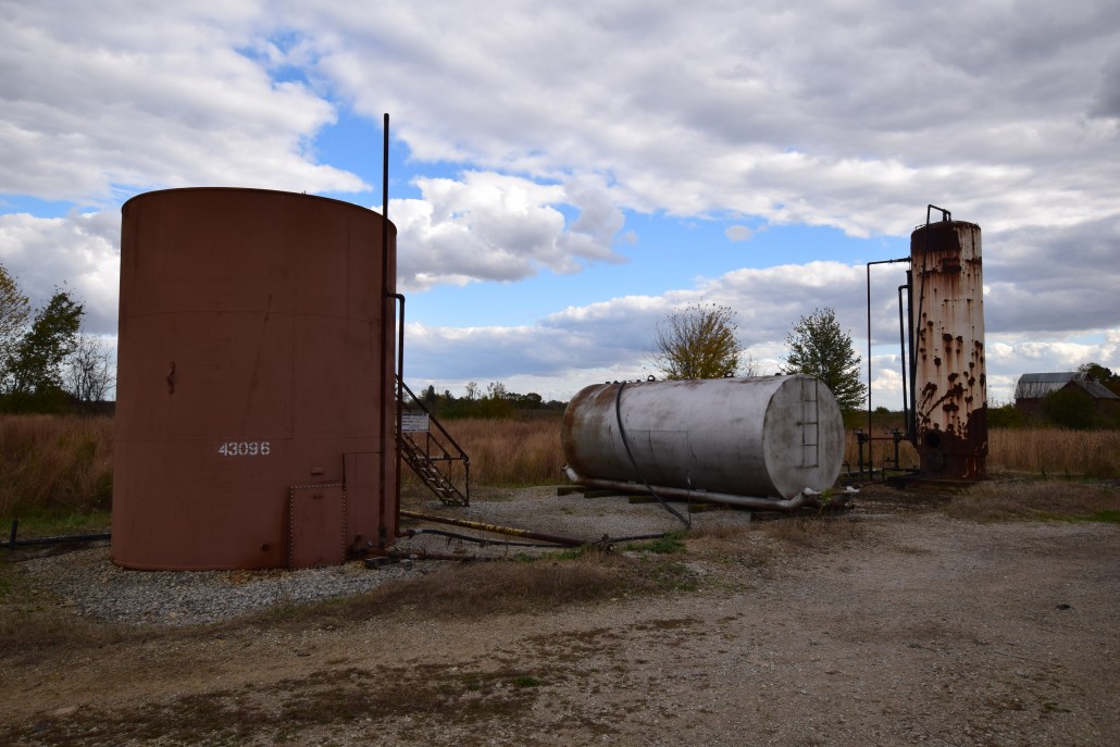
 Class II Injection Well, Ashtabula County, Ohio")
 Class II Injection Well, Ashtabula County, Ohio")
 Class II Injection Well, Lake County, Ohio")
 Class II Injection Well, Lake County, Ohio")


, Knox County, Ohio")

 Class II Injection Well in Mahoning County, Ohio")


