An Ottawa, IL resident’s letter to U.S. Silica regarding how the firm’s “frac” sand mines adjacent to Starved Rock State Park will alter the local economy.
As is so often the case, we find that those things we have taken most for granted are usually the things we miss most when they are gone. The list of what our nation has lost to industrial and commercial concerns couldn’t possibly be compiled in a single article. The short-sighted habits of economic progress have often led to long-term loss and ecologic disaster. That is why it took a man like Abraham Lincoln, a man of long-term vision and wisdom, to sign into existence our first national park, preserving for antiquity what surely would have been lost to our American penchant for development and overuse.
With that in mind, I have always found it amazing how the gears of our own local and state governments have continually chosen the economic path of least resistance and allowed the areas surrounding Starved Rock State Park to be ravaged and destroyed for what is, ultimately, minimal gain. I am no expert but I suspect it could be argued that a full 1/3 of LaSalle County’s economic engine is funded by the simple existence of Starved Rock State Park. Beyond the 2 million plus visitors to the park each year, it cannot be forgotten that nearly every municipality in LaSalle County has directly or indirectly benefited from the countless number of businesses that prosper from the magnetism of the park’s tranquil canyons.


Photos by Michelle McCray of McCray Photography.
As the 4-year battle with Mississippi Sand over development of the Ernat property has proved, there are many rational souls who truly acknowledge the importance of maintaining a healthy and productive park environment. With the recent sale of the Ernat property to U.S. Silica, we are again confronted with the prospect of irrational development of the eastern boundaries of Starved Rock State Park.
Given the gravity of these decisions, I would like to share a letter recently sent on behalf of many of those who have fought so hard and so long for preservation of that same eastern boundary. This letter was sent to Brian Shinn, CEO of U.S. Silica Holdings, INC. (SLCA) in Frederick, Maryland nearly a month ago, and we have yet to receive a response. In sharing this information on FracTracker’s website, I hope this letter will contribute to further discussion among our local representatives over a far more long-term vision of what LaSalle County wishes to be and what qualities, both environmental and economic, that it wishes to maintain and protect:
Dear Mr. Shinn,
I am writing this letter on behalf of dozens of LaSalle County, Illinois residents who have, for the past several years, been intimately involved in the active pursuit of rational use and conservation of our local natural environment. As I am sure you are aware, the debate over use of the Ernat property as a functional sand mining operation has been a long and hard-fought battle. Years of litigation by the Sierra Club and other local environmental groups helped stall it’s development by Mississippi Sand, and have now led to the sale of the Ernat acreage to U.S. Silica. As irrational as the previous proposals were, the sale putting that acreage under your control has not lessened our concerns over the damaging use of that property as it relates to historic Highway 71 and the entire Starved Rock State Park area.
Obviously, sand mining operations have been a long-standing component of LaSalle County economics. Decades of mining under U.S. Silica supervision have not substantially reduced the quality of life for county residents or the natural environment as a whole. However, as can be specified by many local experts, the development and spoilage of the Ernat property will most certainly have longstanding and drastic impacts on both the ecology of Starved Rock State Park and the economic engine that it sustains. Starved Rock State Park attracts over 2 million visitors each year, with an estimated half million visitors using the Hwy. 71 entrance paralleling the Ernat farm as their main gateway into the park. The Ernat property’s river frontage has long been the tranquil eastern entry into the Illinois Canyon area, as well as an active nesting site for countless birds amidst bountiful wetlands and flat, open prairies. The Ernat property’s shared access to Horseshoe Creek has also made it essential to the entire Illinois Canyon ecosystem within the park. In short, any development of this property will most certainly have long-term negative impacts on both the economics and ecology of the Illinois River Basin.
In writing this letter, we are hoping that U.S. Silica, under your guidance, may consider the opportunity to preserve this indispensable parcel of land and examine ways in which U.S. Silica might make this land available as a gift or negotiated property to the state of Illinois. It would certainly be an important addition to the entire Starved Rock State Park area. I have included the signatures of many of our own local coalition. We hope you will consider the long-term impacts that this development would have to one of Illinois premier natural areas. Thank you.
I hope those who have signed this letter will be inspired to further action, and those who have not will reconsider their years of inaction. The natural heritage and local economies of our entire Illinois River Basin are depending on it.
Sincerely,
Paul Wheeler
Only when the last tree has died…
and the last river been poisoned…
and the last fish been caught…
will we realize we cannot eat money.
For additional photos from Illinois, explore our online photo album.
Mr. Wheeler grew up in Oak Lawn, IL and now lives with his wife and daughter in the Ottawa, IL area and is a para-educator.
Feature image by Michelle McCray of McCray Photography.
As part of our staff spotlight series, learn more about Karen Edelstein and how her work through FracTracker has changed the course of drilling in New York State.
Time with FracTracker: I started with FracTracker in 2010 as a contract employee and then in 2012 started working 25 hours a week as a regular part-time staffer.
Education: M.P.S. in Environmental Management, and B.S. in Natural Resources, both from Cornell University
Office Location: Ithaca, NY
Title: Eastern Program Coordinator
My job has changed a lot since I started working for FracTracker. I came to FracTracker when many New Yorkers were frantically learning as much as they could about unconventional drilling for natural gas, which at the time, appeared likely to start happening in the near future. Over a period of years, using credible public data, I have created dozens of maps on topics about geology, water withdrawals, waste transportation, hydrocarbon storage, and documenting the surging movements of public opposition to high-volume hydraulic fracturing for gas. The maps were informative to a wide range of decision-makers, environmental advocates, educators, and citizens.
Now, I’m working more broadly on projects up and down the East Coast. These projects include documenting controversies surrounding pipelines and other oil and gas infrastructure, and the public opposition to this development. I also support FracTracker’s mission to educate and report on the alternatives to fossil fuel infrastructure, and have been looking at renewable energy issues, as well.
Over the past 16 years, I’ve used geographic information systems in positions at numerous environmental and educational organizations, working for land trusts and other nonprofit agencies, secondary school teacher development programs, and county government agencies. Prior to that, I worked as a naturalist and environmental educator for ten years.

Karen Edelstein, FracTracker’s Eastern Program Coordinator
I live in a rural area of New York State that was in the cross-hairs of the oil and gas industry about 9 years ago. Landsmen were at the door asking me to lease my land, “thumper trucks” were pounding the roads trying to get seismic readings, and helicopters were overhead dropping bundles of equipment to conduct testing. Few people, including me, understood the enormity of what was going on. I joined a few community groups that wanted to know more.
Shortly after a multi-year work contract I had at a local college ended, in 2010, I met the (then small) staff of FracTracker at a public training event in Central New York. The organization had just been formed, and the presentation was all about mapping in Pennsylvania. I went right up to the director and told him how much we needed similar work in New York State, and I could be the person to do it! I started working part-time for FracTracker within the month.
Our map of New York State bans and moratoria on high volume hydraulic fracturing received a great deal of attention in the years leading up to the eventual statewide ban on the process. Over time, close to 200 municipalities enacted legislation. It was rewarding to document this visually through a progression of dozens of maps during that period. These maps of how municipality after municipality invoked New York State home rule provided important touchstones for community activists, too. In late 2014, in their announcement about the decision to ban HVHF in NYS, New York’s Health and Environment commissioners cited FracTracker’s map as an indication of patterns of strong ambivalence towards the process among state residents:
Together DEC’s proposed restrictions and local bans and moratoria total approximately 7.5 million acres, or about 63% of the resource. Here’s a summary of the local government restrictions and prohibitions. And the picture even gets cloudier. The practical impact of the Dryden decision I mentioned earlier is that even more acreage may be off-limits to HVHF drilling. Within the 4.5 million acres NOT excluded by the state or local restrictions, approximately 253 towns have zoning and 145 have no zoning. Each town with zoning would have to determine whether its current law restricts or even allows HVHF. So those towns without zoning would still have to decide whether to allow HVHF virtually anywhere or to prescribe where drilling could occur. The uncertainty about whether HVHF is an authorized use would undoubtedly result in additional litigation. It would also result in a patchwork of local land use rules which industry has claimed would utterly frustrate the rational development of the shale resource. Clearly the court’s decision shifted the battleground to town boards, to as evidenced by the conflicting claims of the opposing stakeholder groups. According to the Joint Landowners Coalition, many towns in the Southern Tier have passed resolutions favoring HVHF, while the online map from FracTracker.org indicates that many of the same towns are moving toward a ban. Indeed, our own informal outreach to towns in the Southern Tier confirms that even towns that support HVHF decisions are still up in the air. I’d say that the prospects for HVHF development in NY are uncertain, at best.
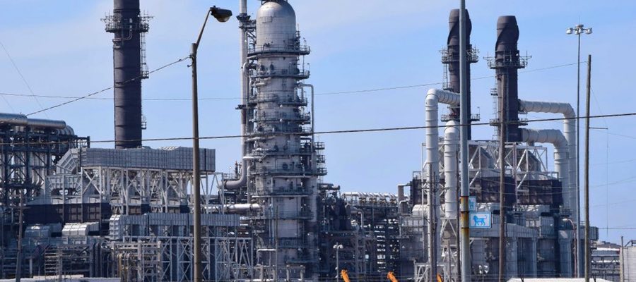
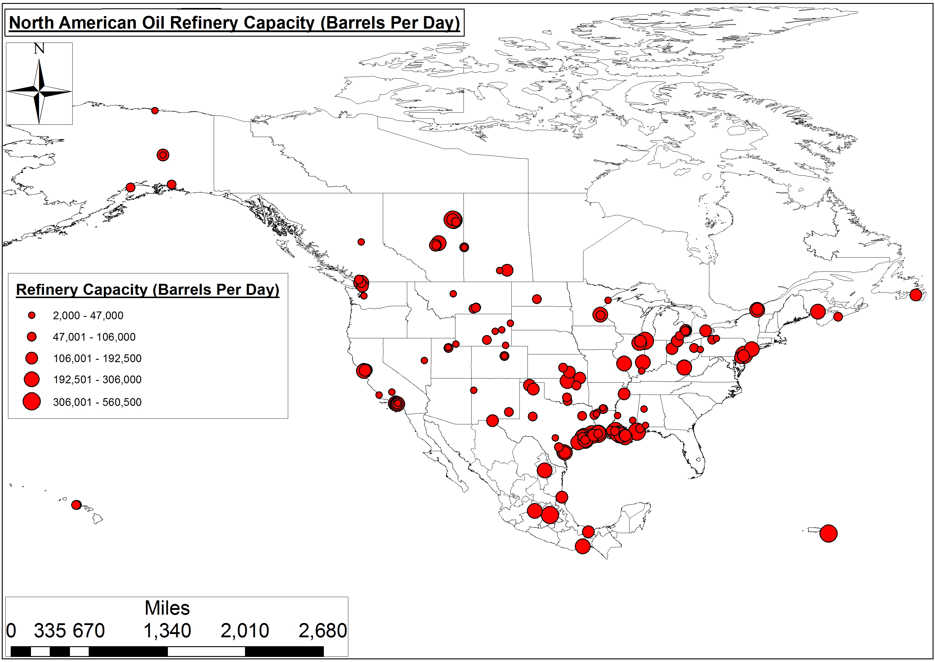
Figure 1. North American Oil Refinery Capacity
Typically, we analyze the potential economic impacts of oil refineries by simply quantifying potential and/or actual capacity on an annual or daily basis. Using this method, we find that the 126 refineries operating in the U.S. produce an average of 100,000-133,645 barrels per day (BPD) of oil – or 258 billion gallons per year.
In all of North America, there are 158 refineries. When you include the 21 and 27 billion gallons per year produced by our neighbors to the south and north, respectively, North American refineries account for 23-24% of the global refining capacity. That is, of course, if you believe the $113 dollar International Energy Agency’s 2016 “Medium-Term Oil Market Report” 4.03 billion gallon annual estimates (Table 1 and Figure 1).
Table 1. Oil Refinery Capacity in the United States and Canada (Barrels Per Day (BPD))
| United States | Canada | Mexico | Total | |
| Refinery Count | 126 | 17 | 6 | 158 |
| Average Capacity | 133,645 BPD | 104,471 BPD | 228,417 BPD | 139,619 BPD |
| Low | Foreland & Silver Eagle Refining in NV & WY, 2-3K BPD | Prince George & Moose Jaw Refining in BC and SK, 12-15K BPD | Pemex’s Ciudad Madero Refinery, 152K BPD | — |
| High | Exxon Mobil in TX & LA, 502-560K BPD | Valero and Irving Oil Refining in QC & NS, 265-300K BPD | Pemex’s Tula Refinery, 340K BPD | — |
| Median | 100,000 BPD | 85,000 BPD | 226,500 | 109,000 |
| Total Capacity | 16.8 MBPD | 1.8 MBPD | 1.4 MBPD | 22.1 MBPD |
However, we would propose that an alternative measure of a given oil refinery’s impact would be neighborhood prosperity in the census tract(s) where the refinery is located. We believe this figure serves as a proxy for economic justice. As such, we recently used the above refinery location and capacity data in combination with US Census Bureau Cartographic Boundaries (i.e., Census Tracts) and the Census’ American FactFinder clearinghouse to estimate neighborhood prosperity near refineries.
Our analysis involved merging oil refineries to their respective census tracts in ArcMAP 10.2, along with all census tracts that touch the actual census tract where the refineries are located, and calling that collection the oil refinery’s sphere of influence, for lack of a better term. We then assigned Mean Income in the Past 12 Months (In 2014 Inflation-Adjusted Dollars) values for each census tract to the aforementioned refinery tracts – as well as surrounding regional, city, and state tracts – to allow for a comparison of income disparities. We chose to analyze mean income instead of other variables such as educational attainment, unemployment, or poverty percentages because it largely encapsulates these economic indicators.
As the authors of the UN’s International Forum of Social Development paper Social Justice in an Open World wrote:
In today’s world, the enormous gap in the distribution of wealth, income and public benefits is growing ever wider, reflecting a general trend that is morally unfair, politically unwise and economically unsound… excessive income inequality restricts social mobility and leads to social segmentation and eventually social breakdown…In the modern context, those concerned with social justice see the general increase in income inequality as unjust, deplorable and alarming. It is argued that poverty reduction and overall improvements in the standard of living are attainable goals that would bring the world closer to social justice.
Environmental regulatory agencies like to separate air pollution sources into point and non-point sources. Point sources are “single, identifiable” sources, whereas non-point are more ‘diffuse’ resulting in impacts spread out over a larger geographical area. We would equate oil refineries to point sources of socioeconomic and/or environmental injustice. The non-point analysis would be far more difficult to model given the difficulties associated with converting perceived quality of life disturbance(s) associated with infrastructure like compressor stations from the anecdotal to the empirical.
Primarily, residents living in the shadow of 80% of our refineries earn nearly $16,000 less than those in the surrounding region – or, in the case of urban refineries, the surrounding Metropolitan Statistical Areas (MSAs). Only residents living in census tracts within the shadow of 25 of our 126 oil refineries earn around $10,000 more annually than those in the region.
On average, residents of census tracts that contain oil refineries earn 13-16% less than those in the greater region and/or MSAs (Figure 2). Similarly, in comparing oil refinery census tract incomes to state averages we see a slightly larger 17-21% disparity (Figure 3).
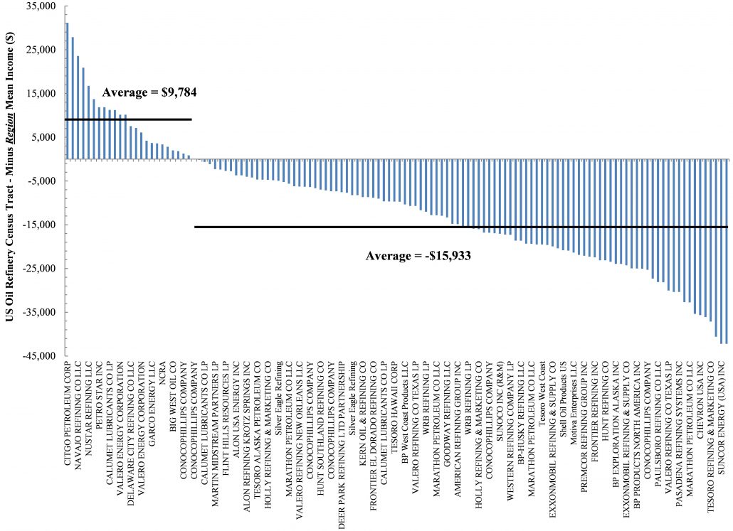
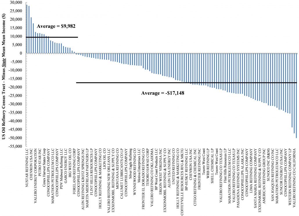
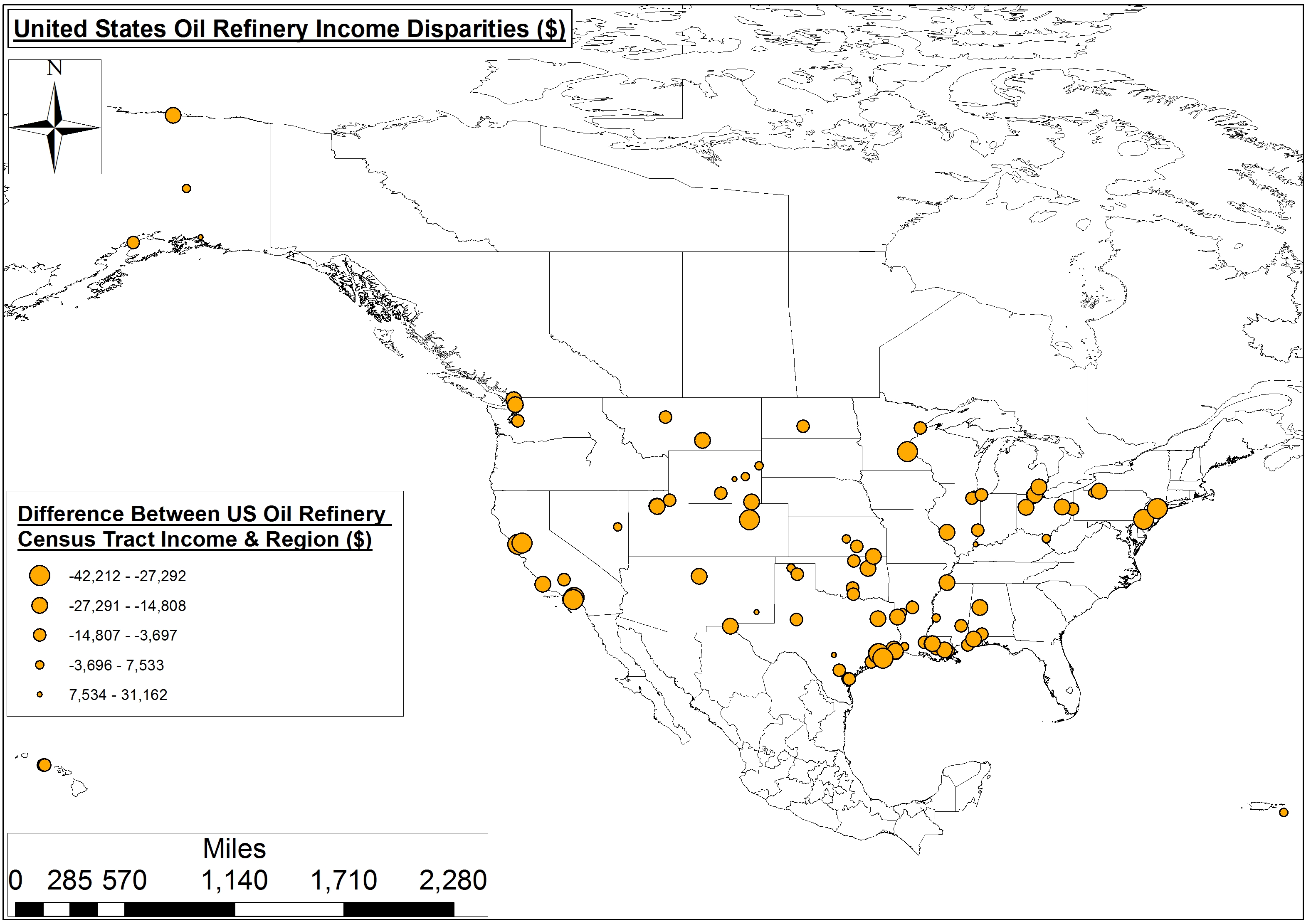
Figure 4. United States Oil Refinery Income Disparities (Note: Larger points indicate oil refinery census tracts that earn less than the surrounding region or city.)
Oil refinery income disparities seem to occur not just in one region, but across the U.S. (Figure 4).
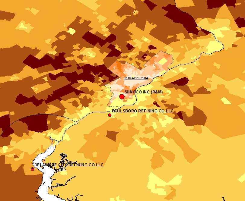
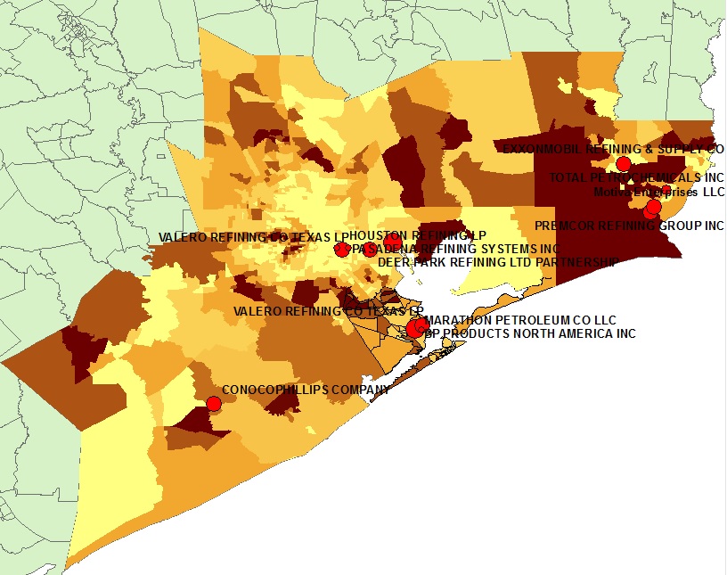
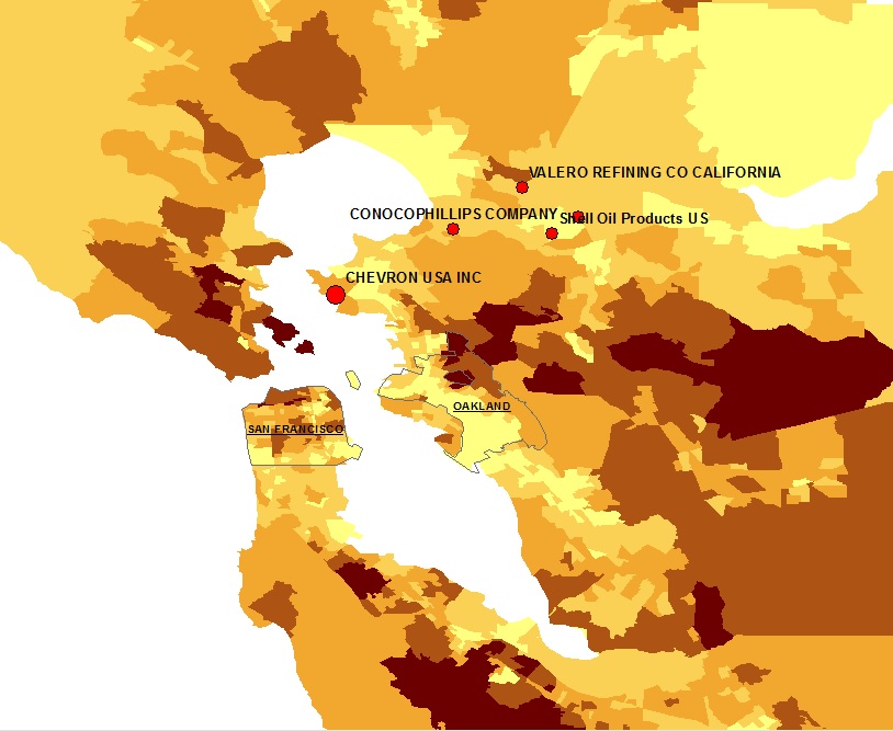
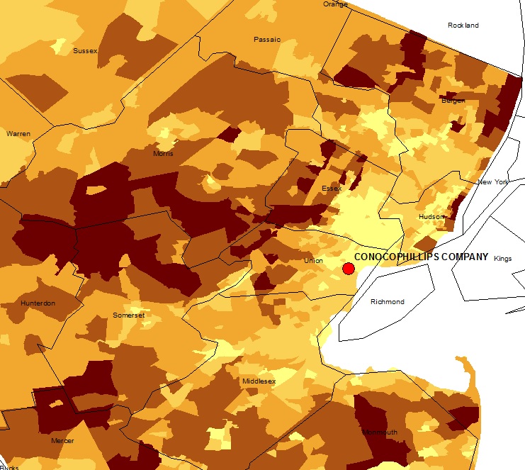
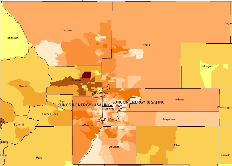
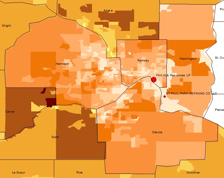
The biggest regional/MSA disparities occur in northeastern Denver neighborhoods around the Suncor Refinery complex (103,000 BPD), where the refinery’s census tracts earn roughly $42,000 less than Greater Denver residents1. California, too, has some issues near its Los Angeles’ Valero and Tesoro Refineries and Chevron’s Bay Area Refinery, with a combined daily capacity of nearly 600 BPD. There, two California census associations in the shadow of those refineries earn roughly $38,000 less than Contra Costa and Los Angeles Counties, respectively. In the Lone Star state Marathon’s Texas City, Galveston County refinery resides among census tracts where annual incomes nearly $33,000 less than the Galveston-Houston metroplex. Linden, NJ and St. Paul, MN, residents near Conoco Phillips and Flint Hills Resources refineries aren’t fairing much better, with annual incomes that are roughly $35,000 and nearly $33,000 less than the surrounding regions, respectively.
Click on the images below to explore each of the top disparate areas near oil refineries in the U.S. in more detail. Lighter shades indicate census tracks with a lower mean annual income ($).
Clearly, certain communities throughout the United States have been essentially sacrificed in the name of Energy Independence and overly-course measures of economic productivity such as Gross Domestic Product (GDP). The presence and/or construction of mid- and downstream oil and gas infrastructure appears to accelerate an already insidious positive feedback loop in low-income neighborhoods throughout the United States. Only a few places like Southeast Chicago and Detroit, however, have even begun to discuss where these disadvantaged communities should live, let alone how to remediate the environmental costs.
There exists a robust history of journalists and academics focusing on Internally Displaced People (IDP) throughout war-torn regions of Africa, the Middle East, and Southeast Asia – to name a few – and most of these 38 million people have “become displaced within their own country as a result of violence.” However, there is a growing body of literature and media coverage associated with current and potential IDP resulting from rising sea levels, drought, chronic wildfire, etc.
The issues associated with oil and gas infrastructure expansion and IDPs are only going to grow in the coming years as the Shale Revolution results in a greater need for pipelines, compressor stations, cracker facilities, etc. We would propose there is the potential for IDP resulting from the rapid, ubiquitous, and intense expansion of the Hydrocarbon Industrial Complex here in the United States.
View map fullscreen | How FracTracker maps work | Download map data
By Ted Auch, PhD – Great Lakes Program Coordinator, FracTracker Alliance
Mariner East 2 (ME 2) is a $2.5 billion, 350 mile-long pipeline that, if built, would be one of the largest pipeline construction projects in Pennsylvania’s history—carving a fifty-foot wide path through 17 counties. A project of Sunoco Logistics, ME 2 would have the capacity to transport 275,000 barrels a day of propane, ethane, butane, and other hydrocarbons from the shale fields of Western Pennsylvania and neighboring states to an international export terminal in Marcus Hook, located on the Delaware River.
ME 2 has sparked a range of responses from residents in Pennsylvania, however, including concerns about recent pipeline accidents, the ethics of taking land by eminent domain, and the unknown risks to sensitive ecosystems. Below we explore the watersheds that could be impacted by this proposed pipeline.
While some components of Sunoco’s ME 2 proposal are approved, the project requires more permits from the Pennsylvania Department of Environmental Protection (DEP) before construction can begin. Among those are permits to build through and under stream and wetlands. Many of the waters threatened by ME 2 are designated by the Commonwealth as “exceptional value” (EV) or “high quality” (HQ) and are supposed to be given greater protections from harm. Water Obstruction and Encroachment Permits, also known as “Chapter 105” permits, are required for any building activities that would disrupt any body of water, including wetlands and streams. Sunoco applied for these so-called “Chapter 105” permits in the summer of 2015, but its applications were rejected as incomplete several times.
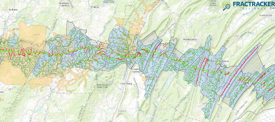
The below map shows the ME 2 route as of May 2016 relative to the watersheds and streams it will cross. Zoom into the map to see additional layers. Note that this is the most accurate representations of ME 2’s route we have seen to date. MWA provided the shapefiles for ME 2’s route to FracTracker Alliance and continues its investigations into potential watershed impacts.
Proposed ME 2 Route
View map full screen | How FracTracker maps work
In total, ME 2’s path will include 1,227 stream crossings, 570 wetland crossings, and 11 pond crossings. Of the 1,227 stream crossings, 19 are EV and 318 are HQ, meaning that 337 crossings will disturb what DEP refers to as “special protection” waters. In addition, there are 129 exceptional value wetlands being crossed. These numbers were compiled by Mountain Watershed Association (MWA) from Sunoco’s permitting applications. MWA also identified 2 HQ streams in Washington County, and 3 HQ streams in Blair County, that are proposed to be crossed that are not acknowledged as being HQ in Sunoco’s permits.
People living along the proposed route are sometimes in the best position to see what the route looks like from the ground, where wetlands and streams are, and what kinds of wetlands and streams they are. The DEP is accepting public comments on Sunoco’s ME 2 Ch. 105 permit application through Wednesday, August 24. Each DEP regional office receives separate Ch. 105 applications depending on where the pipeline routes through different counties. Those wishing to comment on the project can do so through the DEP regional office websites: DEP Southwest Region, DEP South-central Region, DEP Southeast Region. For guidance on how to write comments on permits, see MWA’s Pipeline Project Information & Talking Points.
We wish to thank Mountain Watershed Association and the Clean Air Council for helping us compile data and analysis for this article.
Written by Kirk Jalbert, PhD, MFA – Manager of Community-Based Research & Engagement, FracTracker Alliance

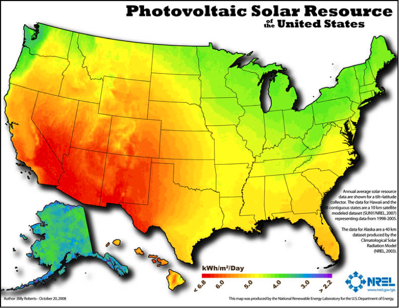
Photovoltaic solar resources of the US (NREL)
It’s difficult to talk about the risks of oil and gas extraction without providing data on energy alternatives in the conversation. Let’s look at New York State, as an example. There, solar power is taking a leadership position in the renewable energy revolution in the United States. Although New York State receives far less sunshine than many states to the west and south, the trends are bright! Currently, New York State ranks seventh in the nation in installed solar capacity, with over 700 MW of power generated by the sun, enough to power 121,000 homes.
Despite common assumptions that solar power only makes sense where the sun shines 360 days a year, we’ve been seeing successful adoption of solar in Europe for years. For example, in Germany, where even the most southern part of the country is further north of the Adirondack Mountains in New York State, close to 7% of all the power used comes from combined residential and commercial scale photovoltaic sources–35.2 TWh in all. Munich, one of the sunniest places in all of Germany, has a lower average solar irradiation rate of 3.1 kWh/m2/day than most cities in New York State; compare it with locations in New York like Rochester (3.7 kWh/m2/day), New York City (4.0 kWh/m2/day), and Albany (3.8 kWh/m2/day). At present, Germany still leads New York State by more than double the electrical output from solar for equivalent areas.
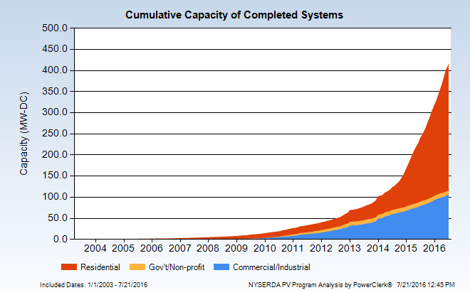
Cumulative Solar Capacity in New York
The cumulative capacity for completed photovoltaic systems in New York State has risen steeply in the past three years, with ground-mounted and roof-top residential capacity outpacing commercial capacity by a wide margin.
Nonetheless, commercial and industrial scale installations in New York account for over 100 MW of power capacity in the state.
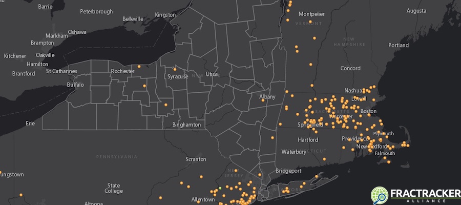
This map shows the location of those large-scale solar installations in the US (zoom out to see full extent of US), as of March 2016. Here is our interactive map:
View map full screen | How FracTracker maps work
In the past fifteen years, the increase in small to medium-sized solar installations in New York State has been significant, and growth is projected to continue. The following animation, based on data from the New York State Energy Research and Development Authority (NYSERDA), shows that increase in capacity (by zip code) since 2000:
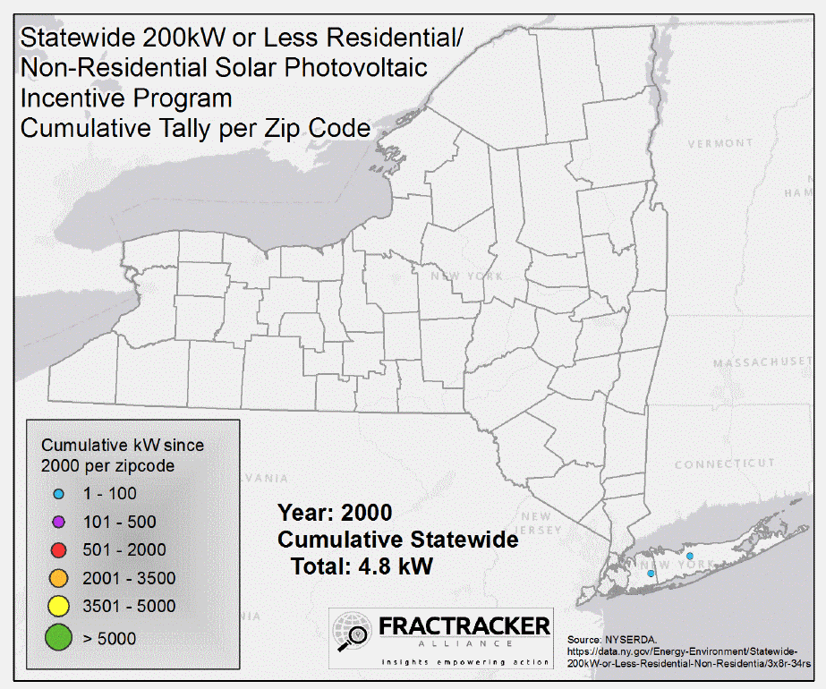
Solar Installations by Zip Code
NYSERDA also provides maps that show distributions of residential, governmental/NGO, and commercial solar energy projects (images shown below). For example, Suffolk County leads the way in the residential arena, with nearly 8200 photovoltaic (PV) systems on roofs and in yards, with an average size of 8.3 kW each.


Erie County has 128 PV systems run by governmental and not-for-profit groups, with an average size of about 27 kW each. Albany County has over 320 commercial installations, with an average size each of about 117 kW.
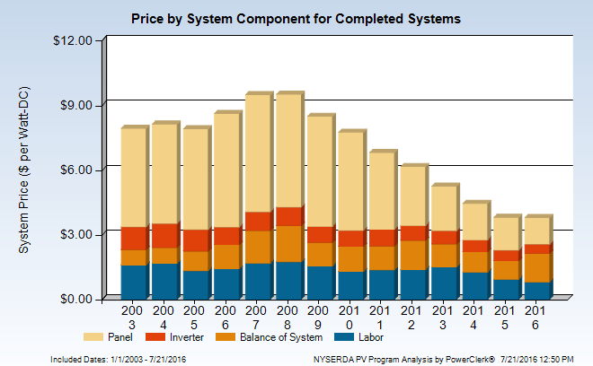
Price of Completed Solar Systems 2003-2016
The prices of solar panels is steeply declining, and is coupled with generous tax incentives. The good news, according to the Solar Energy Industries Association (SEIA), is that over the next five years, New York State’s solar capacity is expected to quadruple its current output, adding over 2900 MW of power. This change would elevate New York State from seventh to fourth place in output in the US.
By Karen Edelstein, Eastern Program Coordinator, FracTracker Alliance
![]()
216 Franklin St, Suite 400, Johnstown, PA 15901
Phone: +1 (717) 303-0403 | info@fractracker.org
FracTracker Alliance is a 501(c)3 non-profit: Tax identification number: 80-0844297


