The majority of FracTracker’s posts are generally considered articles. These may include analysis around data, embedded maps, summaries of partner collaborations, highlights of a publication or project, guest posts, etc.
With tens of thousands of wells scattered across the countryside, Southwestern Pennsylvania is no stranger to oil and gas development. New, industrial scale extraction methods are already well entrenched, with over 3,600 of these unconventional wells drilled so far in that part of the state, mostly from the well known Marcellus Shale formation.
Southwestern Pennsylvania is also home to the Pittsburgh Metropolitan Area, a seven county region with over 2.3 million people. Just over half of this population is in Allegheny County, where unconventional drilling has become more common in recent years, along with all of its associated impacts. In the following interactive story map, the FracTracker Alliance takes a look at current impacts in more urban and suburban environments, plus projects what future impacts could look like, based on leasing activity.
https://www.fractracker.org/a5ej20sjfwe/wp-content/uploads/2016/12/AC_hypothetical_drilling_header.jpg400900Matt Kelso, BAhttps://www.fractracker.org/a5ej20sjfwe/wp-content/uploads/2025/09/2025-Wordmark-Logo.pngMatt Kelso, BA2016-12-30 10:03:102021-04-15 15:04:18Hypothetical Impacts of Unconventional Drilling In Allegheny County
By Ted Auch, Great Lakes Program Coordinator, FracTracker Alliance In collaboration with Caleb Gallemore, Assistant Professor in International Affairs, Lafayette University
The September 3rd magnitude 5.8 earthquake in Pawnee, Oklahoma, is the most violent example of induced seismicity, or “man-made” earthquakes, in U.S. history, causing Oklahoma governor Mary Fallin to declare a state of emergency. This was followed by a magnitude 4.5 earthquake on November 1st prompting the Oklahoma Corporation Commission (OCC) and U.S. EPA to put restrictions on injection wells within a 10-mile radius of the Pawnee quake.
And then on Sunday, November 6th, a magnitude 5.0 earthquake shook central Oklahoma about a mile west of the Cushing Hub, the largest commercial crude oil storage center in North America capable of storing 54 million barrels of crude. This is the equivalent of 2.8 times the U.S. daily oil refinery capacity and 3.1 times the daily oil refinery capacity of all of North America. This massive hub in the North American oil landscape also happens to be the southern terminus of the controversial Keystone pipeline complex, which would transport 590,000 barrel per day over more than 2,000 miles (Fig. 1). Furthermore, this quake demonstrated the growing connectivity between Class II injection well associated induced seismicity and oil transport/storage in the heart of the US version of Saudi Arabia’s Ghawar Oil Fields. This increasing connectivity between O&G waste, production, and processing (i.e., Hydrocarbon Industrial Complex) will eventually impact the wallets of every American.
Figure 1. The Keystone Pipeline would transport 590,000 bpd over more than 2,000 miles.
This latest earthquake caused Cushing schools to close. Magellan Midstream Partners, the major pipeline and storage facility operator in the region, also shut down in order to “check the integrity of our assets.” Compounding concerns about induced seismicity, the Cushing Hub is the primary price settlement point for West Texas Intermediate that, along with Brent Crude, determines the global price of crude oil and by association what Americans pay for fuel at the pump, at their homes, and in their businesses.
Given the significant increase in seismic activity across the U.S. Great Plains, along with the potential environmental, public health, and economic risks at stake, we thought it was time to compile an inventory of Class II injection well volumes. Because growing evidence points to the relationship between induced seismicity and oil and gas waste disposal, our initial analysis focuses on Oklahoma and Kansas. The maps and the associated data downloads in this article represent the first time Class II injection well volumes have been compiled in a searchable and interactive fashion for any state outside Ohio (where FracTracker has compiled class II volumes since 2010). Oklahoma and Kansas Class II injection well data are available to the public, albeit in disparate formats and diffuse locations. Our synthesis makes this data easier to navigate for concerned citizens, policy makers, and journalists.
Induced Seismicity Past, Present, and Future
Figure 2. Central U.S. earthquakes 1973-August 15, 2015 according to the U.S. Geological Survey (Note: Based on our analysis this exponential increasing earthquakes has been accompanied by a 300 feet per quarter increase in the average depth of earthquakes across Oklahoma, Kansas, and Texas).
Oklahoma, along with Arkansas, Kansas, Ohio, and Texas, is at the top of the induced seismicity list, specifically with regard to quakes in excess of magnitude 4.0. However, as the USGS and Virginia Tech Seismological Observatory (VTSO)[1] have recently documented, an average of only 21 earthquakes of magnitude 3.0 or greater occurred in the Central/Eastern US between 1973 and 2008. This trend jumped to an average of 99 between 2009 and 2013. In 2014 there were a staggering 659 quakes. The exponential increase in induced seismic events can be seen in Figure 2 from a recent USGS publication titled “High-rate injection is associated with the increase in U.S. mid-continent seismicity,” where the authors note:
“An unprecedented increase in earthquakes in the U.S. mid-continent began in 2009. Many of these earthquakes have been documented as induced by wastewater injection…We find that the entire increase in earthquake rate is associated with fluid injection wells. High-rate injection wells (>300,000 barrels per month) are much more likely to be associated with earthquakes than lower-rate wells.”
Figure 3. Average freshwater demand per hydraulically fractured well across four U.S. shale plays and the annual percent increase in each of those plays.
This trend suggests that induced seismicity is the new normal and will likely increase given that: 1) freshwater demand per hydraulically fractured well is rising all over the country, from 11-15% per year in the Marcellus and Bakken to 20-22% in the Denver and Midland formations, 2) the amount of produced brine wastewater parallels these increases almost 1-to-1, and 3) the unconventional oil and gas industry is using more and more water as they begin to explore the periphery of primary shale plays or in less productive secondary and tertiary plays (Fig. 3).
Oklahoma
The September, 2016, Pawnee County Earthquake
This first map focuses on the September, 2016 Pawnee, OK Magnitude 5.8 earthquake that many people believe was caused by injecting high volume hydraulic fracturing (HVHF) waste into class II injection wells in Oklahoma and Kansas. This map includes all Oklahoma and Kansas Class II injection wells as well as Oklahoma’s primary geologic faults and fractures.
Oklahoma and Kansas Class II injection wells and geologic faults
Figure 4. The September, 2016 Pawnee, Oklahoma 5.8M earthquake, neighboring active Class II injection wells, underlying geologic faults and fractures.
Of note on this map is the geological connectivity across Oklahoma resulting from the state’s 129 faults and fractures. Also present are several high volume wells including Territory Resources LLC’s Oldham #5 (1.45 miles from the epicenter, injecting 257 million gallons between 2011 and 2014) and Doyle #5 wells (0.36 miles from the epicenter, injecting 61 million gallons between 2011 and 2015), Staghorn Energy LLC’s Hudgins #1 well (1.43 miles from the epicenter, injecting 11 million gallons between 2011 and 2015 into the Red Fork formation), and Cooke Co Production Co.’s Laird #3-35 well (1.41 miles from the epicenter, injecting 6.5 million gallons between 2011 and 2015). Figure 4 shows a closeup view of these wells relative to the location of the Pawnee quake.
Class II Salt Water Disposal (SWD) Injection Well Volumes
This second map includes annual volumes of disposed wastewater across 10,297 Class II injection wells in Oklahoma between 2011 and 2015 (Note: 2015 volumes also include monthly totals). Additionally, we have included Oklahoma’s geologic faults and fractures for context given the recent uptick in Oklahoma and Kansas’ induced seismicity activity.
Annual volumes of class II injection wells disposal in Oklahoma (2011-2015)
Maximum volume to date (for a single Class II injection well): 105,979,598 barrels, or 4,080,214,523 gallons (68,003,574 gallons per month), for the New Dominion, LLC “Chambers #1” well in Oklahoma County.
Total Volume to Date: 10,655,395,179 barrels or 410,232,714,392 gallons (6,837,211,907 gallons per month).
Mean volume to date across the 10,927 Class II injection wells: approximately 975,144 barrels per well or 37,543,044 gallons (625,717 gallons per month).
This map also includes 632 Class II wells injecting waste into the Arbuckle Formation which is believed to be the primary geological formation responsible for the 5.0 magnitude last week in Cushing.
Below is an inventory of monthly oil and gas waste volumes (barrels) disposed across 4,555 Class II injection wells in Kansas between 2011 and 2015. This map will be updated in the Spring of 2017 to include 2016 volumes. A preponderance of this data comes from 2015 with a scattering of volume reports across Kansas between 2011 and 2014.
Monthly Class II injection wells volumes in Kansas (2011-2015)
Maximum volume to date (for a single Class II injection well): 9,016,471 barrels, or 347,134,134 gallons (28,927,845 gallons per month), for the Sinclair Prairie Oil Co. “H.J. Vohs #8” well in Rooks County. This is a well that was initially permitted and completed between 1949 and 1950.
Total Volume to date: 1,060,123,330 barrels or 40,814,748,205 gallons (3,401,229,017 gallons per month).
Mean volume to date across the 4,555 Class II injection wells: approximately 232,738 barrels per well or 8,960,413 gallons (746,701 gallons per month).
Table 1. Summary of Class II SWD Injection Well Volumes across Kansas and Oklahoma
Sum
Average
Maximum
No. of Class II
SWD Wells
Barrels
Sum To Date
Per Year
Sum To Date
Per Year
Kansas*
4,555
1.06 BB
232,738
…
9.02 MB
…
Oklahoma**
10,927
10.66 BB
975,143
195,029
105.98 MB
21.20 MB
* Wells in the counties of Barton (279 wells), Ellis (397 wells), Rooks (220 wells), Russell (199 wells), and Ness (187 wells) account for 29% of Kansas’ active Class II wells.
** Wells in the counties of Carter (1,792 wells), Creek (946 wells), Pontotoc (684 wells), Seminole (476 wells), and Stephens (1,302 wells) account for 48% of Oklahoma’s active Class II wells.
Conclusion
If the U.S. EPA’s Underground Injection Control (UIC) estimates are to be believed, the above Class II volumes account for 19.3% of the “over 2 billion gallons of brine…injected in the United States every day,” and if the connectivity between injection well associated induced seismicity and oil transport/storage continues to grow, this issue will likely impact the lives of every American.
Given how critical the Cushing Hub is to US energy security and price stability one could easily argue that a major accident there could result in a sudden disruption to fuel supplies and an exponential increase in “prices at the pump” that would make the 240% late 1970s Energy Crisis spike look like a mere blip on the radar. The days of $4.15 per gallon prices the country experienced in the summer of 2008 would again become a reality.
In sum, the risks posed by Class II injection wells and are not just a problem for insurance companies and residents of rural Oklahomans and Kansans, induced seismic activity is a potential threat to our nation’s security and economy.
[1] To learn more about Induced Seismicity read an exclusive FracTracker two-part series from former VTSO researcher Ariel Conn: Part I and Part II. Additionally, the USGS has created an Induced Earthquakes landing page as part of their Earthquake Hazards Program.
https://www.fractracker.org/a5ej20sjfwe/wp-content/uploads/2016/11/OK_KS_InjectionWellVolumes_header.jpg400900Ted Auch, PhDhttps://www.fractracker.org/a5ej20sjfwe/wp-content/uploads/2025/09/2025-Wordmark-Logo.pngTed Auch, PhD2016-12-21 09:00:152021-04-15 15:04:18Oklahoma and Kansas Class II Injection Wells and Earthquakes
By Karen Edelstein, Eastern Program Coordinator, FracTracker Alliance
In an apparent move to step around compliance with comprehensive regulations outlined in the Endangered Species Act (ESA), a coalition of nine oil and gas corporations has filed a draft plan entitled the Oil & Gas Coalition Multi-State Habitat Conservation Plan (O&G HCP). The proposed plan, which would relax regulations on five species of bats, is unprecedented in scope in the eastern United States, both temporally and spatially. If approved, it would be in effect for 50 years, and cover oil and gas operations throughout the states of Ohio, Pennsylvania, and West Virginia—covering over 110,000 square miles. The oil and gas companies see the plan as a means of “streamlining” the permit processes associated with oil and gas exploration, production, and maintenance activities. Others outside of industry may wonder whether the requested permit is a broad over-reach of an existing loophole in the ESA.
Habitat fragmentation, air, and noise pollution that comes with oil and gas extraction and fossil fuel delivery activities have the potential to incidentally injure or kill bat species in the three-State plan area that are currently protected by the Endangered Species Act (ESA) of 1973. In essence, the requested “incidental take permit”, or ITP, would acknowledge that these companies would not be held to the same comprehensive regulations that are designed to safeguard the environment, particularly the flora and fauna at most risk to extirpation. Rather, they would simply be asked to insure that their impacts are “minimized and mitigated to the maximum extent practicable.”
Section 10(a)(2)(B) of the ESA contains provisions for issuing an ITP to a non-Federal entity for the take of endangered and threatened species, provided the following criteria are met:
The taking will be incidental
The applicant will, to the maximum extent practicable, minimize and mitigate the impact of such taking
The applicant will develop an HCP and ensure that adequate funding for the plan will be provided
The taking will not appreciably reduce the likelihood of survival and recovery of the species in the wild
The applicant will carry out any other measures that the Secretary may require as being necessary or appropriate for the purposes of the HCP
What activities would be involved?
The Northern Long-eared Bat is a federally-listed threatened species, also included in the ITP
The proposed plan, which would seek to exempt both upstream development activities (oil & gas wells) and midstream development activities (pipelines). Upstream activities include the creation of access roads, staging areas, seismic operations, land clearing, explosives; the development and construction of well fields, including drilling, well pad construction, disposal wells, water impoundments, communication towers; and other operations, including gas flaring and soil disturbance; and decommissioning and reclamation activities, including more land moving and excavation.
Midstream activities include the construction of gathering, transmission, and distribution pipeline, including land grading and stream construction, construction of compressor stations, meter stations, electric substations, storage facilities, and processing plants, and installation of roads, culverts, and ditches, to name just a few.
Companies involved in the proposed “Conservation Plan” represent the major players in fossil fuel extraction, refinement, and delivery in the region, and include:
Antero Resources Corporation
Ascent Resources, LLC
Chesapeake Energy Corporation
EnLink Midstream L.P.
EQT Corporation
MarkWest Energy Partners, L.P., MPLX L.P., and Marathon Petroleum Corporation (all part of same corporate enterprise)
Rice Energy, Inc.
Southwestern Energy Company
The Williams Companies, Inc.
Focal species of the request
Populations of federally-endangered Indiana Bats could be impacted by the proposed Incidental Take Permit (ITP)
The five species listed in the ITP include the Indiana Bat (a federally-listed endangered species) and Northern Long-eared Bat (a federally-listed threatened species), the Eastern Small-footed Bat (a threatened species protected under Pennsylvania’s Game and Wildlife Code), as well as the Little Brown Bat and Tri-colored Bat. Populations of all five species are already under dire threats due to white-nose syndrome, a devastating disease that, since 2008, has killed an estimated 5.7 million bats in North America. In some cases, entire local populations have succumbed to this deadly disease. Because bats already have a naturally low birthrate, bat populations that do survive this epidemic will be slow to rebound. Only recently, wildlife biologists have begun to see hope for a treatment in a beneficial bacterium that may save affected bats. However, production and deployment details of this treatment are still under development. Best summarized in a recent article in the Pittsburgh Post-Gazette:
This [ITP] would be a huge deal because we are dealing with species in a precipitous decline,” said Jared Margolis, an attorney with the Center for Biological Diversity, a national nonprofit conservation organization headquartered in Tucson, Ariz. “I don’t see how it could be biologically defensible. Even without the drilling and energy development we don’t know if these species will survive.
In 2012, Bat Conservation International produced a report for Delaware Riverkeeper, entitled Impacts of Shale Gas Development on Bat Populations in the Northeastern United States. The report focuses on landscape scale impacts that range from water quality threats, to disruption of winter hibernacula, the locations where bats hibernate during the winter, en masse. In addition, because bats have strong site fidelity to roosting trees or groups of trees, forest clearing for pipelines, well pads or other facilities may disproportionately impact local populations.
The below map, developed by FracTracker Alliance, shows the population ranges of all five bat species, as well as the current areas impacted by existing development by the oil and gas industry through well sites, pipelines, and other facilities.
To learn more details about the extensive oil and gas development in each of the impacted states, follow these links:
Oil and gas threat map for Pennsylvania. Currently, there are ~104,000 oil and gas wells, compressors, and other related facilities here.
Oil and gas threat map for Ohio. Currently, there are ~90,000 oil and gas wells, compressors, and other related facilities here.
Oil and gas threat map for West Virginia. Currently, there are ~16,000 oil and gas wells, compressors, and other related facilities here.
Public input options
The U.S. Fish and Wildlife Service (USFWS) announced in the Federal Register in late November 2016 its intent to prepare an environmental impact statement (EIS) and hold five public scoping sessions about the permit, as well as an informational webinar. In keeping with the parameters of an environmental impact statement, USFWS is particularly interested in input and information about:
Aspects of the human environment that warrant examination such as baseline information that could inform the analyses.
Information concerning the range, distribution, population size, and population trends concerning the covered species in the plan area.
Additional biological information concerning the covered species or other federally listed species that occur in the plan area.
Direct, indirect, and/or cumulative impacts that implementation of the proposed action (i.e., covered activities) will have on the covered species or other federally listed species.
Information about measures that can be implemented to avoid, minimize, and mitigate impacts to the covered species.
Other possible alternatives to the proposed action that the Service should consider.
Whether there are connected, similar, or reasonably foreseeable cumulative actions (i.e., current or planned activities) and their potential impacts on covered species or other federally listed species in the plan area.
The presence of archaeological sites, buildings and structures, historic events, sacred and traditional areas, and other historic preservation concerns within the plan area that are required to be considered in project planning by the National Historic Preservation Act.
Any other environmental issues that should be considered with regard to the proposed HCP and potential permit issuance.
The public comment period ends on December 27, 2016. Links to more information about locations of the public hearings, as well as instructions about how to sign up for the December 20, 2016 informational webinar can be found at this website. In addition, you can electronically submit comments about the “conservation plan” by following this link.
https://www.fractracker.org/a5ej20sjfwe/wp-content/uploads/2016/12/Eastern-small-footed-bat-header.jpg4301500Karen Edelsteinhttps://www.fractracker.org/a5ej20sjfwe/wp-content/uploads/2025/09/2025-Wordmark-Logo.pngKaren Edelstein2016-12-12 14:22:072021-04-15 15:04:19“Taking” Wildlife in PA, OH, WV
By Kyle Ferrar, Western Program Coordinator, FracTracker Alliance
Eliza Czolowski, Program Associate, PSE Healthy Energy
Since April 2016, demonstrators in North Dakota have been protesting a section of the Dakota Access Pipeline (DAPL) being built by Dakota Access LLC, a construction subsidiary of Energy Transfer Partners LP. The proposed pipeline passes just 1.5 miles north of the Standing Rock Sioux Tribal Lands, where it is planned to cross Lake Oahe, the largest Army Corps of Engineers reservoir created on the Missouri River. The tribe argues that the project will not only threaten their environmental and economic well-being, but will also cut through land that is sacred.
Given how quickly circumstances have changed on the ground, we have received numerous requests to post an overview on the issue. This article examines the technical aspects of the DAPL proposal and details the current status of protests at Standing Rock. It includes a discussion of what the Army Corps’ recent denial of DAPL’s permits means for the project as well as looks towards the impacts of incoming Trump administration. We have also created the below map to contextualize DAPL and protest activities that have occurred at Standing Rock.
DAPL is a $3.78 billion dollar project that was initially slated for completion on January 1, 2017. The DAPL is a joint venture of Phillips 66, Sunoco Logistics, and other smaller fossil fuel companies including Marathon Petroleum Corporation, and Enbridge Energy Partners. Numerous banks and investment firms are supporting the project and financing the related infrastructure growth, including Citi Bank, JP Morgan Chase, HSBC, PNC, Community Trust, Bank of America, Morgan Stanley, ING, Tokyo-Mitsubishi, Goldman Sachs, Wells Fargo, SunTrust, Us Bank, UBS, Compass and others.
Its route travels from Northwestern North Dakota, south of Bismarck, and crosses the waterway made up of the Missouri River and Lake Oahe just upriver of the Standing Rock Sioux Tribal Area. From North Dakota the pipeline continues 1,172 miles to an oil tank farm in Pakota, Illinois. DAPL would carry 470,000 barrels per day (75,000 m3/d) of Bakken crude oil with a maximum capacity up to 570,000 barrels per day. That’s the CO2 equivalent of 30 average sized coal fired power plants.
As documented by the NY Times map, in addition to the Missouri River and Lake Oahe, the pipeline crosses 22 other waterways that also require the pipeline to be drilled deep under these bodies of water. But Standing Rock portion is the only section disputed and as of yet unfinished. Now the pipeline project, known by the protesters as “the black snake,” is over 95% complete, despite having no official easement to cross the body of water created by the Missouri River and Lake Oahe. The easement is required for any domestic pipeline to cross a major waterway and because the land on either side of the Army Corps Lake Oahe project is managed by the Army Corps (shown in the protest map). An easement would allow Dakota Access LLC to drill a tunnel for the pipeline under the federally owned lands, including the lake and river.
Safety & Environmental Racism
Proponents of the project tout the opinion that pipelines are the safest method of moving oil large distances. Trucking oil in tankers on highways has the highest accident and spill rates, whereas moving oil by railways presents a major explosive hazard when incidents do occur. Pipeline spills are therefore considered the “safe” alternative. On November 11, Kelcy Warren was interviewed on CBS News, claiming Dakota Access, LLC takes every precaution to reduce leaks and that the likelihood of a leak is highly unlikely. The problem with comparing the risk for each of these transportation methods is that rates of incidence are the only comparison. The resulting hazard and impact is ignored. When pipelines rupture, they present a much larger hazard than trucks and trains. Large volumes of spilled oil result in much greater water and soil contamination.
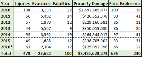
We know that pipelines do rupture, and quite often. An analysis by the U.S. DOT Pipeline and Hazardous Materials Safety Administration in 2012 shows that there have been 201 major incidents (with volumes over 1,000 gallons) related to liquid leaks in the U.S. over the last ten years that were reported to the Department of Transportation. The “average” pipeline therefore has a 57% probability of experiencing a major leak, with consequences over the $1 million range, in a ten-year period. FracTracker’s recent analysis of PHMSA data shows the systemic issue of pipeline spills: there have been 4,215 pipeline spill incidents just since 2010 resulting in 100 reported fatalities, 470 injuries, and property damage exceeding $3.4 billion! The recent (December 12) spill of 176,000 gallons of crude oil into a stream just 150 miles from the Standing Rock protest site highlights the Tribes’ concerns.
A previously proposed route for the DAPL would have put Bismarck—a city that is 92% white—just downriver of its Missouri River crossing. This initial route was rejected due to its potential threat to Bismarck’s water supply, according to the Army Corps. In addition to being located upriver of Bismarck’s water intake, the route would have been 11 miles longer and would have passed through “wellhead source water protection” areas that are avoided to protect municipal water supply wells. Passing through this “high consequence area” would have required further actions and additional safety measures on the part of Dakota Access LLC. The route would also have been more difficult to stay at least 500 feet away from homes, as required by the North Dakota Public Service Commission. The route was changed and pushed as close to Sioux County as possible, the location of the Standing Rock Indian Reservation.
Protests: The Water Protectors
The Standing Rock Sioux Tribe has taken an active stance against Bakken Oil Development in the past. In 2007, the Reservation passed a resolution to prevent any oil and gas development or pipelines on the Tribal Lands. However, deep concerns about the safety of DAPL led protesters to begin demonstrations at Standing Rock in April, 2016. The Standing Rock Sioux Tribe then sued the Army Corps in July, after the pipeline was granted most of the final permits over objections of three other federal agencies. Construction of it, they say, will “destroy our burial sites, prayer sites and culturally significant artifacts.” A timeline of The Standing Rock Sioux Tribe’s litigation addressing DAPL through this period can be found on the EARTHJUSTICE website.
In August, a group organized on the Standing Rock Indian Reservation called ReZpect Our Water brought a petition to the Army Corps in Washington, D.C. stating that DAPL interferes with their ancestral land and water rights. The Tribe sued for an injunction citing the endangerment of water and soil, cultural resources, and the improper use of eminent domain. The suit argued that the pipeline presents a risk to Sioux Tribe communities who live near or downstream of the pipeline. The Missouri River is the main water source for the Standing Rock Sioux Tribe. In September, members of the Standing Rock Sioux tribe in North Dakota finally made headlines.
Federal Injunction
On September 9, District Judge James Boasberg denied the Standing Rock Sioux Tribes preliminary injunction request to prevent the Army Corps from granting the easement. The Judge ordered Dakota Access to stop work only on the section of pipeline nearest the Missouri river until the Army Corps granted the crossing easement. The excavation of Standing Rock burial grounds and other sacred sites, where direct action demonstrators were clashing with Dakota Access security and guard dogs, was allowed to continue. Later that same day, a joint statement was released by the U.S. Department of Justice, the Department of the Interior, and the U.S. Army:
“We request that the pipeline company voluntarily pause all construction activity within 20 miles east or west of Lake Oahe.”
In the map above the 20-mile buffer zone is shown in light green. Regardless of the request from the three federal agencies to pause construction, Dakota Access’s parent company Energy Transfer Partners LP ignored requests to voluntarily halt construction. Dakota Access LLC has also disregarded the instructions of the federal judge. The Army Corps declared Dakota Access LLC would not receive the easement required to cross the waterway until after 2016, but that has not stopped the company from pushing forward without the necessary permits. The pipeline has been built across all of Cannonball Ranch right up to Lake Oahe and the Missouri River, which can be seen in the map above and in drone footage taken November 2, 2016 showing the well pad for the drill rig has been built.
On November 4 the Army Corps requested Dakota Access LLC voluntarily halt construction for 30 days; then on November 8 (Election Day), Dakota Access ignored the request and announced they would begin horizontally drilling under the waterway within weeks. On November 14 Dakota Access filed a lawsuit against the Army Corps arguing that permits are not legally required. Later that day, the Army Corps responded with a statement that said any construction on or under Corps land bordering Lake Oahe cannot occur because the Army has not made a final decision on whether to grant an easement. In the issued statement, Assistant Secretary of the Army Jo-Ellen Darcy said “in light of the history of the Great Sioux Nation’s dispossession of lands [and] the importance of Lake Oahe to the Tribe,” the Standing Rock Sioux tribe would be consulted to help develop a timetable for future construction plans. The Army Corps has since denied the easement entirely.
Violence Against Protesters
Law enforcement has used physical violence to disrupt demonstrations on public lands and to prevent direct action activities as protesters aim to shut down construction on private land held by Energy Transfer Partners LP. Since September 4, law enforcement agencies led by the Morton County Sheriff’s Department have maintained jurisdiction over the protests. Officers from other counties and states have also been brought in to assist. Morton County and the State of North Dakota do not have the jurisdiction to evict protesters from the camps located on Army Corps land. Well over 500 activists have been arrested.
The majority of clashes with law enforcement have occurred on the roadways exiting the Army Corps lands, or at the access points to the privately owned Cannonball Ranch (shown on the map). Morton County has spent more than $8 million keeping direct action protesters from shutting down excavation and construction activities along the path of the pipeline. Meanwhile, the state of North Dakota has spent over $10 million on additional law enforcement officials to provide assistance to Morton County.
The first violent confrontation occurred on September 3 after Dakota Access bulldozed an area of Cannonball Ranch identified by the Tribe as a sacred site hosting burial grounds. At that time, the site was actively being contested in court and rulings still had not been made. The Tribe was seeking a restraining order, known as a “preliminary injunction” to protect their cultural heritage. Direct action demonstrators put themselves in the way of bulldozers to stop the destructive construction. In response, Dakota Access LLC security personnel assaulted protesters with pepper spray and attack dogs. The encounter was documented by Democracy Now reporter Amy Goodman.
October 27, the Morton County Sheriff’s Department reinforced with 300 police from neighboring counties and states, raided the frontline camp site making mass arrests. In response, demonstrators reinforced a blockade of the 1806 bridge, shown in the map above. The most violent clash was witnessed on public lands on November 20, 2016 at this bridge, which demarcates Army Corps land. The Police forces’ use of “non-lethal” bean bag rounds, rubber bullets, tear gas, pepper spray, water hoses, LRAD, and explosive flash grenades on peaceful demonstrators has been criticized by many groups. Fire hoses were used on protesters in freezing conditions resulting in dozens of demonstrators needing treatment for hypothermia. In total 300 people were injured according to a release from the standing rock medic and healer council.
Most recently, the Army Corps has targeted the Standing Rock Demonstration by determining that it is no longer safe to stay at the Sacred Stone and Oceti Sakowin camps located on Army Corps property. North Dakota Governor Jack Dalrymple has frequently blasted the Army Corps for not removing the protesters.
As of December 5th, federal authorities consider the protesters to be trespassing on federal lands, leaving protesters vulnerable to various citations and possible arrest. The Army Corps has also said that emergency services may no longer be provided in the evacuation area. The Army Corps has jurisdiction on Army Corps lands, and only federal authorities can remove the protesters from federal lands. There are now more than 5,000 activists demonstrating at Standing Rock, and an additional 2,000 U.S. veterans joined the protest this past week for an action of solidarity. Nevertheless, U.S. authorities have said that there are no plans to forcibly remove activists, despite telling them to leave.
Victory and an Uncertain Future
Perhaps as a result of this mass outcry, the Army Corps announced on December 4th—only a day before trespassing claims would be imposed—that Dakota Access LLC’s permit application to cross under the Missouri River and Lake Oahe had been denied. Jo-Ellen Darcy, the Army’s Assistant Secretary for Civil Works, announced:
“Although we have had continuing discussion and exchanges of new information with the Standing Rock Sioux and Dakota Access, it’s clear that there’s more work to do…The best way to complete that work responsibly and expeditiously is to explore alternate routes for the pipeline crossing.”
To determine alternate routes, the Army Corps has announced it will undertake an environmental impact statement which could take years to complete. While this is a major victory for the “water protectors” demonstrating at Standing Rock, it is not a complete victory. Following the Army Corps’ announcement, the two main pipeline investors, Energy Transfer Partners LP and Sunoco Logistics, responded that they:
“…are fully committed to ensuring that this vital project is brought to completion and fully expect to complete construction of the pipeline without any additional rerouting in and around Lake Oahe. Nothing this Administration has done today changes that in any way.”
In fact, prior to the Army Corps denying the easement, numerous democrats in congress called for President Obama to shut down the pipeline. While President Obama has not heeded these calls to shut down the project entirely, he also has not given the green light for the project either. Instead the President stated that the situation needed to be handled carefully and urged the Army Corps to consider rerouting the pipeline. “We’re monitoring this closely and I think, as a general rule, my view is that there’s a way for us to accommodate sacred lands of Native Americans…. I think right now the Army Corps is examining whether there are ways to reroute this pipeline,” the President said.
The Corps decision to conduct a lengthy environmental impact statement is encouraging but, ultimately, the Trump administration may have the final say on the DAPL easement. President-elect Trump has voiced support for the easement in the past, and on December 5th, just one day following the Army Corps’ decision, Trump spokesman Jason Miller commented:
“That’s something we support construction of, and we will review the full situation in the White House and make an appropriate determination at that time.”
Energy Transfer Partners LP CEO Kelcy Warren donated $103,000 to the Trump campaign and the President-elect has investments in Energy Transfer Partners LP totaling up to $1 million according to campaign financial disclosures. President-elect Trump has made it clear that pipeline projects, specifically the Keystone Access Pipeline rejected by President Obama, will be allowed to move forward along with additional fossil fuel extraction projects.
If the construction company, Dakota Access LLC, continues building the pipeline they are liable to be fined. It is not yet clear whether Dakota Access LLC will “eat” the fine to continue building and drilling, or whether the Army Corps will forcefully stop DAPL. Analysts say the expense of changing the route, such as to the south of the tribal lands, would make the economics of the pipeline a total loss. It is cheaper for Dakota Access LLC to continue to fight the protest despite overwhelming disapproval of the project.
Meanwhile, protestors have refused to leave Standing Rock in fear that the Army Corp will reverse its decision and allow DAPL to proceed, despite requests by the chairman of the Sioux Tribe that demonstrators go home. Many are hopeful that, by stalling the project past January 1st—the deadline by which Energy Transfer Partners LP promised oil companies it would complete construction—the possibility exists that contracts will expire and DAPL loses support from investors.
Other Mapping Resources
This web map shows the current construction progress of the pipeline.
The New York Times website is hosting a map focusing on the many water crossings of the pipeline route.
The Guardian has a static map on their website similar to our interactive map.
by Kirk Jalbert, Manager of Community-Based Research & Engagement with technical assistance from Seth Kovnant
In September, the Pennsylvania Department of Environmental Protection (DEP) rejected a number of permits for wetland crossings and sedimentation control that were required for Sunoco Pipeline’s proposed “Mariner East 2” pipeline. According to Sunoco, the proposed Mariner East 2 is a $2.5 billion, 350-mile-long pipeline that would be one of the largest pipeline construction projects in Pennsylvania’s history.
If built, Mariner East 2 could transport up to 450,000 barrels (18,900,000 gallons) per day of propane, ethane, butane, and other liquefied hydrocarbons from the shale fields of western Pennsylvania to export terminals in Marcus Hook, located just outside Philadelphia. A second proposed pipeline, if constructed, could carry an additional 250,000 barrels (10,500,000 gallons) per day of these same materials. Sunoco submitted revised permit applications to PADEP on Tuesday, December 6th.
The industry often refers to ethane, propane and butane collectively as “natural gas liquids.” They are classified by the federal government as “hazardous, highly volatile liquids,” but that terminology is also misleading. These materials, which have not been transported through densely populated southeast Pennsylvania previously, are liquid only at very high pressure or extremely cold temperatures. At the normal atmospheric conditions experienced outside the pipeline, these materials volatilize into gas which is colorless; odorless; an asphyxiation hazard; heavier than air; and extremely flammable of explosive. This gas can travel downhill and downwind for long distances while remaining combustible. It can collect (and remain for long periods of time) in low-lying areas; and things as ordinary as a cell phone, a doorbell or a light switch are capable of providing an ignition source.
Many who have followed the proposed Mariner East 2 project note that, while much has been written about the likely environmental impacts, insufficient investigation has been conducted into safety risks to those who live, work and attend schools in the proposed pipeline’s path. We address these risks in this article, and, in doing so, emphasize the importance of regulatory agencies allowing public comments on the project’s resubmitted permit applications.
The Inherent Risks of Artificially Liquified Gas
Resident of Pennsylvania do not need to look far for examples of how pipeline accidents pose serious risk. For instance, the 2015 explosion of the Enterprise ATEX (Appalachia to Texas) pipeline near Follansbee, WV, provides a depiction of what a Mariner East 2 pipeline failure could look like. This 20-inch diameter pipeline carrying liquid ethane is similar in many ways to the proposed Mariner East 2. When it ruptured in rural West Virginia, close to the Pennsylvania border, it caused damage in an area that extended 2,000 feet—about ½ square mile—from the place where the pipeline failed.
In another recent instance, the Spectra Energy Texas Eastern methane natural gas pipeline ruptured in Salem, PA, this April as a result of corroded welding. The explosion, seen above (photo by PA NPR State Impact), completely destroyed a house 200ft. away. Another house, 800ft. away, sustained major damage and its owner received 3rd degree burns. These incidents are not unique. FracTracker’s recent analysis found that there have been 4,215 pipeline incidents nation-wide since 2010, resulting in 100 reported fatalities, 470 injuries, and property damage exceeding $3.4 billion (“incident” is an industry term meaning “a pipeline failure or inadvertent release of its contents.” It does not necessarily connote “a minor event”).
Calculating Immediate Ignition Impact Zones
It is difficult to predict the blast radius for materials like ethane, propane and butane. Methane, while highly flammable or explosive, is lighter than air and so tends to disperse upon release into the atmosphere. Highly volatile liquids like ethane, propane and butane, on the other hand, tend to concentrate close to the ground and to spread laterally downwind. A large, dispersed vapor cloud of these materials may quickly spread great distances, even under very light wind conditions. A worst-case scenario would by highly variable since gas migration and dispersion is dependent on topography, leak characteristics, and atmospheric conditions. In this scenario, unignited gas would be allowed to migrate as an unignited vapor cloud for a couple miles before finding an ignition source that causes an explosion that encompasses the entire covered area tracing back to the leak source. Ordinary devices like light switches or cell phones can serve as an ignition source for the entire vapor cloud. One subject matter expert recently testified before a Municipal Zoning Hearing board that damage could be expected at a distance of three miles from the source of a large scale release.
The federal government’s “potential impact radius” (PIR) formula, used for natural gas (methane) isn’t directly applicable because of differences in the characteristics of the material. It may however be possible to quantify an Immediate Ignition Impact Zone. This represents the explosion radius that could occur if ignition occurs BEFORE the gas is able to migrate.
The Pipeline and Hazardous Materials Safety Administration (PHMSA) provides instructions for calculating the PIR of a methane natural gas pipeline. The PIR estimates the range within which a potential failure could have significant impact on people or property. The PIR is established using the combustion energy and pipeline-specific fuel mass of methane to determine a blast radius: PIR = 0.69*sqrt(p*d^2). Where: PIR = Potential Impact Radius (in feet), p = maximum allowable operating pressure (in pounds per square inch), d = nominal pipeline diameter (in inches), and 0.69 is a constant applicable to natural gas
The Texas Eastern pipeline can use the PIR equation as-is since it carries methane natural gas. However, since Mariner East 2 is primarily carrying ethane, propane, and butane NGLs, the equation must be altered. Ethane, propane, butane, and methane have very similar combustion energies (about 50-55 MJ/kg). Therefore, the PIR equation can be updated for each NGL based on the mass density of the flow material as follows: PIR = 0.69*sqrt(r*p*d^2). Where: r = the density ratio of hydrocarbons with similar combustion energy to methane natural gas. At 1,440 psi, methane remains a gas with a mass density 5 times less than liquid ethane at the same pressure:
The methane density relationships for ethane, propane, and butane can be used to calculate an immediate-ignition blast radius for each hydrocarbon product. The below table shows the results assuming a Mariner East 2-sized 20-inch diameter pipe operating at Mariner East 2’s 1,440psi maximum operating pressure:
Using these assumptions, the blast radius can be derived as a function of pressure for each hydrocarbon for the same 20in. diameter pipe:
ME2 Immediate Ignition Blast Radius
Note the sharp increase in blast radius for each natural gas liquid product. The pressure at which this sharp increase occurs corresponds with the critical pressure where each product transitions to a liquid state and becomes significantly denser, and in turn, contains more explosive power. These products will always be operated above their respective critical pressures when in transport, meaning their blast radius will be relatively constant, regardless of operating pressure.
Averaging the “Immediate Ignition Blast Radius” for ethane, propane, and butane gives us a 1,300 ft (about 0.25 mile) potential impact radius. However, we must recognize that this buffer represents a best case scenario in the event of a major pipeline accident.
FracTracker has created a new map of the Mariner East 2 pipeline using a highly-detailed GIS shapefile recently supplied by the DEP. On this map, we identify a 0.5 mile radius “buffer” from Mariner East 2’s proposed route. We then located all public and private schools, environmental justice census tracts, and estimated number of people who live within this buffer in order to get a clearer picture of the pipeline’s hidden risks.
Proposed Mariner East 2 and At-Risk Schools and Populations
In order to estimate the number of people who live within this 0.5 mile radius, we first identified census blocks that intersect the hazardous buffer. Second, we calculated the percentage of that census block’s area that lies within the buffer. Finally, we used the ratio to determine the percentage of the block’s population that lies within the buffer. In total, there are an estimated 105,419 people living within the proposed Mariner East 2’s 0.5 mile radius impact zone. The totals for each of the 17 counties in Mariner East 2’s trajectory can be found in the interactive map. The top five counties with the greatest number of at-risk residents are:
Chester County (31,632 residents in zone)
Delaware County (17,791 residents in zone)
Westmoreland County (11,183 residents in zone)
Cumberland County (10,498 residents in zone)
Berks County (7,644 residents in zone)
Environmental Justice Areas
Environmental justice designations are defined by the DEP as any census tract where 20% or more of the population lives in poverty and/or 30% or more of the population identifies as a minority. These numbers are based on data from the U.S. Census Bureau, last updated in 2010, and by the federal poverty guidelines. Mariner East 2 crosses through four environmental justice areas:
Census Tract 4064.02, Delaware County
Census Tract 125, Cambria County
Census Tract 8026, Westmoreland County
Census Tract 8028, Westmoreland County
DEP policies promise enhanced public participation opportunities in environmental justice communities during permitting processes for large development projects. No additional public participation opportunities were provided to these communities. Furthermore, no public hearings were held whatsoever in Cambria County and Delaware County. The hearing held in Westmoreland County took place in Youngwood, nine miles away from Jeanette. Pipelines are not specified on the “trigger list” that determines what permits receive additional scrutiny, however the policy does allow for “opt-in permits” if the DEP believes they warrant special consideration. One would assume that a proposed pipeline project with the potential to affect the safety of tens of thousands of Pennsylvanians qualifies for additional attention.
At-Risk Schools
One of the most concerning aspects of our findings is the astounding number of schools in the path of Mariner East 2. Based on data obtained from the U.S. Department of Education on the locations of schools in Pennsylvania, a shocking 23 public (common core) schools and 17 private schools were found within Mariner East 2’s 0.5 mile impact zone. In one instance, a school was discovered to be only 7 feet away from the pipeline’s intended path. Students and staff at these schools have virtually no chance to exercise their only possible response to a large scale release of highly volatile liquids, which is immediate on-foot evacuation.
Middletown High School in Dauphin County in close proximity to ME2
One reason for the high number of at-risk schools is that Mariner East 2 is proposed to roughly follow the same right of way as an older pipeline built in the 1930s (now marketed by Sunoco as “Mariner East 1.”). A great deal of development has occurred since that time, including many new neighborhoods, businesses and public buildings. It is worth noting that the U.S. Department of Education’s data represents the center point of schools. In many cases, we found playgrounds and other school facilities were much closer to Mariner East 2, as can be seen in the above photograph. Also of note is the high percentage of students who qualify for free or reduced lunch programs at these schools, suggesting that many are located in disproportionately poorer communities.
Now that PADEP has received revised permit applications from Sunoco, presumably addressing September’s long list of technical deficiencies, the agency will soon make a decision as to whether or not additional public participation is required before approving the project. Given the findings in our analysis, it should be clear that the public must have an extended opportunity to review and comment on the proposed Mariner East 2. In fact, public participation was extremely helpful to DEP in the initial review process, providing technical and contextual information.
It is, furthermore, imperative that investigations into the potential impacts of Mariner East 2 extend to assess the safety of nearby residents and students, particularly in marginalized communities. Thus far, no indication has been made by the DEP that this will be the case. However, the Pennsylvania Sierra Club has established a petition for residents to voice their desire for a public comment period and additional hearings.
Seth Kovnat is the chief structural engineer for an aerospace engineering firm in Southeastern PA, and regularly consults with regard to the proposed Mariner East 2 pipeline. In November, Seth’s expertise in structural engineering and his extensive knowledge of piping and hazardous materials under pressure were instrumental in providing testimony at a Pennsylvania Senate and House Veterans Affairs and Emergency Preparedness Committee discussion during the Pennsylvania Pipeline Infrastructure Citizens Panel. Seth serves on the board of Middletown Coalition for Community Safety and is a member of the Mariner East 2 Safety Advisory Committee for Middletown Township, PA. He is committed to demonstrating diligence in gathering, truth sourcing, and evaluating technical information in pipeline safety matters in order to provide data driven information-sharing on a community level.
NOTE: This article was modified on 12/9/16 at 4pm to provide additional clarification on how the 1,300ft PIR was calculated, and the map was modified on 11/4/2021 to add the 1,300 ft Thermal Impact Zone Buffer, which was previously mislabeled as the half-mile Buffer
https://www.fractracker.org/a5ej20sjfwe/wp-content/uploads/2016/12/ME2_schools_header.jpg400900FracTracker Alliancehttps://www.fractracker.org/a5ej20sjfwe/wp-content/uploads/2025/09/2025-Wordmark-Logo.pngFracTracker Alliance2016-12-09 08:36:102021-11-04 15:58:45Mariner East 2: At-Risk Schools and Populations
By Ted Auch, Great Lakes Program Coordinator, FracTracker Alliance
While solar and wind energy gets much of the attention in renewable energy debates, various states are also leaning more and more on burning biomass and waste to reach renewable energy targets and mandates. As is the case with all sources of energy, these so-called “renewable energy” projects present a unique set of environmental and socioeconomic justice issues, as well as environmental costs and benefits. In an effort to document the geography of these active and proposed future projects, this article offers some analysis and a new map of waste and woody biomass-to-energy infrastructure across the U.S. with the maximum capacities of each facility.
Map of U.S. Facilities Generating Energy from Biomass and Waste
To illustrate the problems of woody biomass-to-energy projects, one only needs to look at Michigan. Michigan’s growing practice of generating energy from the wood biomass relies on ten facilities that currently produce roughly 209 Megawatts (an average of 21 MW per facility) from 1.86 million tons of wood biomass (an average of 309,167 tons per facility). Based on our initial analysis this is equivalent to 71% of the wood and paper waste produced in Michigan.
Making matters worse, these ten facilities rely disproportionately on clearcutting 60-120 years old late successional northern Michigan hardwood and red pine forests. These parcels are often replanted with red pine and grown in highly managed, homogeneous 20-30 year rotations. Reliance on this type of feedstock stands in sharp contrast to many biomass-to-energy facilities nationally, which tend to utilize woody waste from urban centers. Although, to provide context to their needs, the area of forest required to service Michigan’s 1.86 million-ton demand is roughly 920 mi2. This is 1.65 times the area of Chicago, Milwaukee, Detroit, Cleveland, Buffalo, and Toronto combined.
Panorama of the Sunset Trail Road 30 Acre Biomass Clearcut, Kalkaska Conty, Michigan
Based on an analysis of 128 U.S. facilities, the typical woody biomass energy facility produces 0.01-0.58 kW, or an average of 0.13 kW per ton of woody biomass. A few examples of facilities in Michigan include Grayling Generating Station, Grayling County (36.2 MW Capacity and 400,000 TPY), Viking Energy of McBain, Missaukee County (17 MW Capacity and 225,000 TPY), and Cadillac Renewable Energy, Wexford County (34 MW Capacity and 400,000 TPY).
The relationship between wood processed and energy generated across all U.S. landfill waste-to-energy operations is represented in the figure below (note: data was log transformed to generate this relationship).
Waste-To-Energy
Dr. Jim Stewart at the University of the West in Rosemead, California, recently summarized the Greenhouse Gas (GHG) costs of waste landfill energy projects and a recent collaboration between the Sierra Club and International Brotherhood of Teamsters explored the dangers of privatizing waste-to-energy given that two companies, Waste Management and Republic Services/Allied Waste, are now a duopoly controlling all remaining U.S. landfill capacity (an additional Landfill Gas Fact Sheet from Energy Justice can be found here).
Their combined analysis tells us that, by harnessing and combusting landfill methane, the current inventory of ninety-three U.S. waste-to-energy facilities generate 5.3 MW of electricity per facility. Expanded exploitation of existing landfills could bring an additional 500 MW online and alleviate 21.12 million metric tons of CO2 pollution (based on reduction in fugitive methane, a potent greenhouse gas). Looking at this capacity from a different angle, approximately 0.027 MW of electricity is generated per ton of waste processed, or 1.64 MW per acre. If we assume the average American produces 4.4 pounds of waste per day, we have the potential to produce roughly 6.9 million MW of energy from our annual waste outputs, or the equivalent energy demand created by 10.28 million Americans.
The relationship between waste processed per day and energy generated across all U.S. landfill waste-to-energy operations is represented in the figure below.
Conclusion
Waste burning and woody biomass-to-energy “renewable energy”projects come with their own sets of problems and benefits. FracTracker saw this firsthand when visiting Kalkaska County, Michigan, this past summer. There, the forestry industry has rebounded in response to several wood biomass-to-energy projects. While these projects may provide local economic opportunity, the industry has relied disproportionately on clearcutting, such as is seen in the below photograph of a 30-acre clearcut along Sunset Trail Road:
As states diversify their energy sources away from fossil fuels and seek to increase energy efficiency per unit of economic productivity, we will likely see more and more reliance on the above practices as “bridge fuel” energy sources. However, the term “renewable” needs parameterization in order to understand the true costs and benefits of the varying energy sources it presently encompasses. The sustainability of clearcutting practices in rural areas—and the analogous waste-to-energy projects in largely urban areas—deserves further scrutiny by forest health and other environmental experts. This will require additional mapping similar to what is offered in this article, as well as land-use analysis and the quantification of how these energy generation industries enhance or degrade ecosystem services. Of equal importance will be providing a better picture of whether or not these practices actually produce sustainable and well-paid jobs, as well as their water, waste, and land-use footprints relative to fossil fuels unconventional or otherwise.
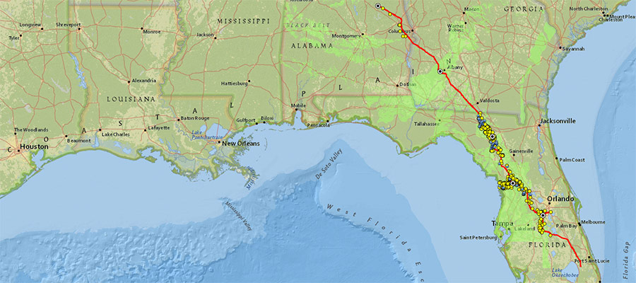
Construction is underway for a $3.2 billion, 515-mile-long interstate gas pipeline, running from central Alabama, through southwestern Georgia, and deep into Central Florida. The Sabal Trail Pipeline is a project of Duke Energy, NextEra Energy, and Spectra Energy. Spectra is the fossil fuel corporation responsible for other controversial pipelines also under construction – notably the Algonquin Incremental Market (AIM) Project. AIM, the target of ongoing protests in the Hudson Valley (NY) and elsewhere, would run from central New Jersey to ports in the Boston, MA area, passing within a few hundred feet of Indian Point Nuclear Power Plant on the Hudson River.
The Sabal Trail project is touted by Spectra to be crucial to aiding economic development along its route, and fueling gas-fired power generators in the Southeast United States. Environmentalists, however, view the project quite differently. Such development plans rarely come without a cost to communities, and to the environment.
A Unique Geology
Reflecting its geological origins as part of a shallow ancient ocean, the southeastern United States is underlain by porous limestone bedrock, known as karst. Water running through the karst bedrock flows not only through small pores, but often through extensive underground caves. When under under pressure, water can bubble up to the surface in a multitude of freshwater springs throughout the region. It’s not hard to imagine how contamination to the limestone aquifer in one area can spread rapidly and widely.
The karst bedrock, due to the sometimes large voids in its structure, is also prone to the formation of sinkholes, some of which are small; others are large enough to swallow whole buildings. Recognizing these risks, opponents of the Sabal Trail pipeline frequently cite the inherent danger of pipelines bending and rupturing should the ground beneath them give way, leading to potentially dangerous gas leakages or explosions.
One piece of recent research from the University of Georgia maps the prevalence of sinkholes in Doughterty County, GA, one of the many counties the Sabal Trail pipeline would pass through. For reference, FracTracker has added the path of the pipeline to the Dougherty County map, above.
In the interactive map below, we show the full proposed pipeline route and associated compressor stations. Karst geology, documented sinkholes, and springs near the route of the pipeline are also shown. The double-arrows in the upper right corner of the map will launch a full-screen view of the map, including a map legend. Use the “Layers” dropdown along the top bar of that map to turn on locations of nearby schools and hospitals that could be impacted by a nearby pipeline emergency. In addition, a “Bookmarks” dropdown menu along the same top bar that will allow zooming to locations along the pipeline mentioned in this article.
Map of the proposed Sabal Trail pipeline route, karst geology, and known sinkholes
In October 2015, the United States Environmental Protection Agency (EPA) issued a scathing letter detailing the impacts that the proposed pipeline would have on the Floridan Aquifer, water quality, and ecology in this region of sensitive karst geology. Two months later, however, in mid-December, the EPA suddenly reversed its position. While reasons included an endorsement of industry’s choices to avoid “many of the most sensitive areas” that could be impacted, ABC News has suggested that political favoritism could have played a role, as well. This video, published on November 24, 2016 by ABC/FirstCoast News, describes that situation, and also includes excellent footage of construction impacts.
Currently, the construction is proceeding. Federal Energy Regulatory Commission (FERC) has granted eminent domain to industry to build the project through seized private property. Although all federal permits for the pipeline construction are in place, a joint lawsuit filed by the Sierra Club, the Gulf Restoration Network, and Flint Riverkeeper has challenged that permitting process. There is opposition to the pipeline in Alabama, Georgia, and Florida–the three states in which construction is occurring.
The video clips below documents the noise associated with the pipeline’s construction, as well as views of the sinkhole terrain along its route.
As winter descends on the northern Plains, thousands of indigenous people representing hundreds of tribes, as well as non-Native allies, have gathered in camps near the Sioux Standing Rock Reservation to pray and protest the Dakota Access Pipeline (DAPL), which would drill an oil pipeline through sacred Native lands and under the Missouri River. Participants in this movement are united by the words “Water Is Life” (Mni Wiconi), in recognition of the threats that an oil spill would present to their homeland and the source of drinking water for the tribe. Hundreds of arrests of peaceful protesters have been made there in recent months, many resulting in serious injuries to the protesters as water cannons, rubber bullets, concussion grenades, and attack dogs have been used in efforts to intimidate the activists.
Coordination among First Nations groups against other fossil fuel infrastructure is happening elsewhere, too. For example, in September 2016, at least fifty US and Canadian aboriginal groups signed a treaty, saying they will work together to fight proposals that would bring crude oil from the Alberta tar sands via pipeline, tanker, and rail.
The protests against the Sabal Trail Project are similarly themed to those at Standing Rock, but have not resulted in violence towards protesters thus far. Along the Suwanee River in Florida, peaceful protesters have assembled at the Sacred Waters encampment and, on November 12, 2016, faced off with authorities in an effort to stop pipeline drilling under the Santa Fe River between Branford and Fort White, Florida. 14 people were arrested in that protest. Demonstrations at the site continue, with a dawn march and demonstration that began just after sunrise on November 26th. No arrests were made on that day. Another protest encampment, the Crystal Waters Camp, is also in place near Fort Drum, Florida, where observers noted hydrocarbon releases from the pipeline construction into Fort Drum Creek and destruction of wildlife by a pipeline crew. Still other protests about the potential environmental risks posed by the Sabal Trail have taken place recently in both Orlando and Live Oak, Florida.
Even in the phases of construction, environmentalists in Georgia discovered that the Sabal Trail pipeline had started leaking drilling mud from a pilot hole into the Withlacooche River in late October, and continued to ooze turbid mud for at least three weeks. Environmental advocates from the WWALS (the Withlacoochee, Alapaha, Little, and Upper Suwannee River) Watershed Coalition raised concerns that if a pilot hole could cause such a leakage, what could happen once full-scale directional drilling was occurring?
As massive new pipeline projects continue to generate news, the existing midstream infrastructure that’s hidden beneath our feet continues to be problematic on a daily basis. Since 2010, there have been 4,215 pipeline incidents resulting in 100 reported fatalities, 470 injuries, and property damage exceeding $3.4 billion.
Figure 1: Cumulative impacts pipeline incidents in the US. Data collected from PHMSA on November 4th, 2016. Operators are required to submit incident reports within 30 days.
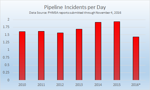
In our previous analyses, pipeline incidents occurred at a rate of 1.6 per day nationwide, according to data from the Pipeline and Hazardous Materials Safety Administration (PHMSA). Rates exceeding 1.9 incidents per day in 2014 and 2015 have brought the average rate up to 1.7 incidents per day. Incidents have been a bit less frequent in 2016, coming in at a rate of 1.43 incidents per day, or 1.59 if we roll results back to October 4th in order to capture all incidents that are reported within the mandatory 30 day window.
Figure 2: Pipeline incidents per day for years between 2010 and 2016. Incidents after October 4, 2016 may not be included in these figures.
These figures are the aggregation of three reports, namely natural gas transmission and gathering pipelines (828 incidents since 2010), natural gas distribution (736 incidents), and hazardous liquids (2,651 incidents). Not all of the hazardous liquids are petroleum related, but the vast majority are. 1,321 of the releases involved crude oil, and an additional 896 involved other liquid petroleum products, accounting for 84% of hazardous liquid incidents. The number could be higher, depending on the specific substances involved in the 399 highly volatile liquid (HVL) related incidents. The HVL category includes propane, butane, liquefied petroleum gases, ethylene, and propylene, as well as other volatile liquids that become gaseous at ambient conditions.
What is causing all of these pipeline incidents?
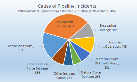
Figure 3: Cause of pipeline incidents for all reports received from January 1, 2010 through November 4, 2016.
Nonprofits, academics, and concerned citizens looking for accurate pipeline data will find that it is restricted, with the argument that releasing accurate pipeline data constitutes a threat to national security. This makes little sense for several reasons. First, with over 2.4 million miles of pipelines, they are nearly omnipresent. Additionally, similar data access restrictions only apply to midstream infrastructure such as pipelines and compressor stations, whereas the locations for wells, refineries, and power plants are all publicly available, despite the presence of the same volatile hydrocarbons at these facilities. Additionally, pipelines are purposefully marked with surface placards to help prevent unintentionally impacting the infrastructure.
In fact, a quick look at the causes of pipeline incidents reveal that it it much more dangerous to not know where the pipelines are located. In the “Other Incident Cause” category (Figure 3) there are 152 incidents that were caused by unsuspecting motor vehicles. When this is combined with incidents resulting from excavation damage, we have 558 cases where “not knowing” about the pipeline’s location likely contributed to the failure. On the other hand, there are 14 incidents (only .003%) where the cause is identified as intentional. While even one case of tampering with pipeline infrastructure is unacceptable, PHMSA incident data indicate that obfuscated pipelines are 40 times more likely to cause a problem when compared to sabotage. Equipment failures and corrosion account for more than half of all incidents.
Where do these incidents occur?
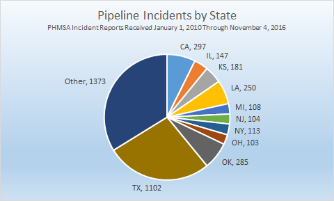
PHMSA is not allowed to make accurate pipeline location data available for download, but such rules apparently do not apply to pipeline incidents. The following map shows the 4,215 pipeline releases since 2010, highlighting those that have resulted in injuries and fatalities.
Pipeline incidents in the US. Please zoom in to access specific incident data. To see the legend and other tools, Please click here.
Figure 4: Pipeline incidents by state for reports received 1/1/2010 through 11/4/2016.
While operators are required to submit the incident’s location as a part of their report to PHMSA, data entry errors are common in the dataset. The FracTracker Alliance has been able to identify and correct a few of the higher profile errors, such as the February 9, 2011 explosion in Allentown, PA, the report for which had mangled the latitude and longitude values so badly that the incident was rendered in Greenland. Other errors persist in the dataset, however. Since 2010, pipeline incidents have occurred in Washington, DC, Puerto Rico, and 49 states (the exception being Vermont). Ten states have at least 100 incidents apiece during the past six years (see Figure 4), and more than a quarter of all pipeline incidents in that time frame have occurred in Texas.
Which operators are responsible?
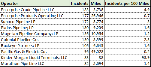
Figure 5: This table shows the ten operators with the most reported incidents, along with the length of their pipeline network.
Altogether, there are 521 pipeline operators with reported releases, although many of these are affiliated with one another in some fashion. For example, the top two results in Figure 5 are almost certainly both subsidiaries of Enterprise Products Partners, L.P.
The real outlier in Figure 5, in terms of incidents per 100 miles, is Kinder Morgan Liquid Terminals; LLC. However, this is one of ten or more companies that share the Kinder Morgan name when reporting pipeline inventories. When taken in aggregate, companies with the Kinder Morgan name accounted for 142 incidents over a reported 7,939 miles, for a rate of 1.8 incidents per 100 miles. It should be noted that this, along with all of the statistics in Figure 5, are entirely based on matching the operator name between the incident and inventory reports. Kinder Morgan’s webpage boasts of 84,000 miles of pipelines in the US — there are numerous possible explanations for the discrepancy in pipeline length, including additional Kinder Morgan subsidiaries, as well as whether gathering lines that aren’t considered to be mains are on both lists.
The operators responsible for the most deaths from pipeline incidents since 2010 include Pacific Gas & Electric (15), Washington Gas Light (9), and Consolidated Edison Co. of New York (8). Of course, the greatest variable in whether or not a pipeline explosion kills people or not is whether or not the incident happens in a populated location. In the course of this analysis, there were 230 explosions and 635 fires over 2,500 days, meaning that there is pipeline explosion somewhere in the United States every 11 days, on average, and a fire every fourth day. The fact that only 65 of the incidents resulted in fatalities indicates that we have been rather lucky with incidents in the midstream sector.
By Wendy Park, senior attorney with the Center for Biological Diversity
If the Bureau of Land Management (BLM) gets its way, large areas of Mississippi’s Bienville and Homochitto national forests will be opened up to destructive fracking. This would harm one of the last strongholds for the rare and beautiful red-cockaded woodpecker, create a new source of climate pollution, and fragment our public forests with roads, drilling pads and industrial equipment. That’s why we’re fighting back.
My colleagues and I at the Center for Biological Diversity believe that all species, great and small, must be preserved to ensure a healthy and diverse planet. Through science, law and media, we defend endangered animals and plants, and the land air, water, and climate they need. As an attorney with the Center’s Public Lands Program, I am helping to grow the “Keep It in the Ground” movement, calling on President Obama to halt new leases on federal lands for fracking, mining, and drilling that only benefit private corporations.
That step, which the president can take without congressional approval, would align U.S. energy policies with its climate goals and keep up to 450 billion tons of greenhouse gas pollution from entering the atmosphere. Already leased federal fossil fuels will last far beyond the point when the world will exceed the carbon pollution limits set out in the Paris Agreement, which seeks to limit warming to 1.5 °C above pre-industrial levels. That limit is expected to be exceeded in a little over four years. We simply cannot afford any more new leases.
Fracking Will Threaten Prime Woodpecker Habitat
In Mississippi, our concerns over the impact of fracking on the rare red-cockaded woodpecker and other species led us to administratively protest the proposed BLM auction of more than 4,200 acres of public land for oil and gas leases the Homochitto and Bienville national forests. The red-cockaded woodpecker is already in trouble. Loss of habitat and other pressures have shrunk its population to about 1% of its historic levels, or roughly 12,000 birds. In approving the auction of leases to oil and gas companies, BLM failed to meet its obligation to protect these and other species by relying on outdated forest plans, ignoring the impact of habitat fragmentation, not considering the effects of fracking on the woodpecker, and ignoring the potential greenhouse gas emissions from oil and gas taken from these public lands. The public was also not adequately notified of BLM’s plans.
Mississippi National Forests, Potential BLM Oil & Gas Leasing Parcels, and Red Cockaded Woodpecker Sightings
According to the National Forest Service’s 2014 Forest Plan Environmental Impact Statement, core populations of the red-cockaded woodpecker live in both the Bienville and Homochitto national forests, which provide some of the most important habitat for the species in the state. The Bienville district contains the state’s largest population of these birds and is largely untouched by oil and gas development. The current woodpecker population is far below the target set by the U.S. Fish and Wildlife Service’s recovery plan. A healthy and fully recovered population will require large areas of mature forest. But the destruction of habitat caused by clearing land for drilling pads, roads, and pipelines will fragment the forest, undermining the species’ survival and recovery.
New leasing will likely result in hydraulic fracturing and horizontal drilling. In their environmental reviews, BLM and the Forest Service entirely ignore the potential for hydraulic fracturing and horizontal drilling to be used in the Bienville and Homochitto national forests and their effects on the red-cockaded woodpecker. Fracking would have far worse environmental consequences than conventional drilling. Effects include increased pollution from larger rigs; risks of spills and contamination from transporting fracking chemicals and storing at the well pad; concentrated air pollution from housing multiple wells on a single well pad; greater waste generation; increased risks of endocrine disruption, birth defects, and cardiology hospitalization; and the risk of earthquakes caused by wastewater injection and the hydraulic fracturing process (as is evident in recent earthquakes in Oklahoma and other heavily fracked areas).
Greenhouse Gas Emissions and Climate Change
Oil and gas development also results in significant greenhouse gas emissions from construction, operating fossil-fuel powered equipment during production, reclamation, transportation, processing and refining, and combustion of the extracted product. But BLM and the Forest Service have refused to analyze potential emissions or climate change effects from new leasing. Climate change is expected to worsen conditions for the woodpecker, compounding the harms of destructive drilling practices. Extreme weather events will become more frequent in the Southeast U.S. as temperatures rise. Hurricane Katrina resulted in significant losses of woodpecker habitat and birds in the Mississippi national forests. The Forest Service should be redoubling its efforts to restore and preserve habitat, but instead it is turning a blind eye to climate change threats.
At a time when world leaders are meeting in Morocco to discuss the climate crisis and scientists tell us we already have enough oil and gas fields operating to push us past dangerous warming thresholds, it’s deeply disturbing that the Obama administration continues to push for even more oil and gas leases on America’s public lands. The BLM’s refusal to acknowledge and analyze the effects of fracking on the climate, at-risk species, and their habitat, is not only inexcusable it is illegal. The science is clear: The best way to address catastrophic warming — and protect wildlife — is to keep fossil fuels in the ground.
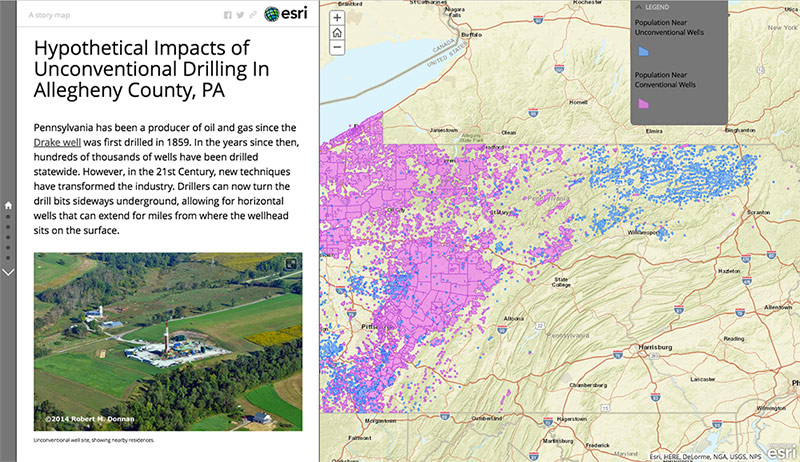
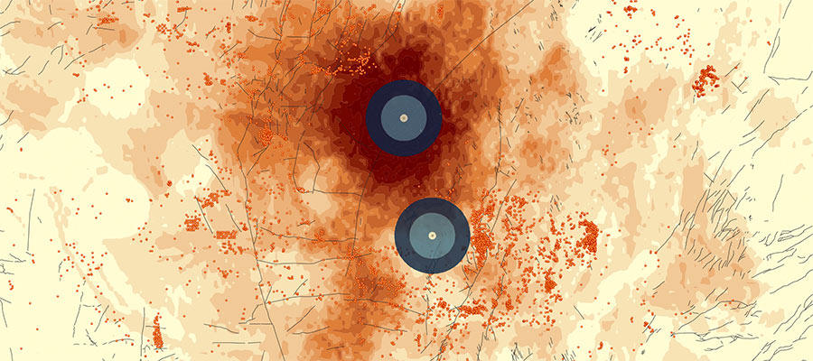

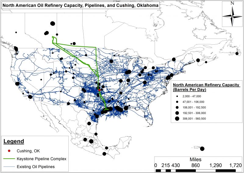
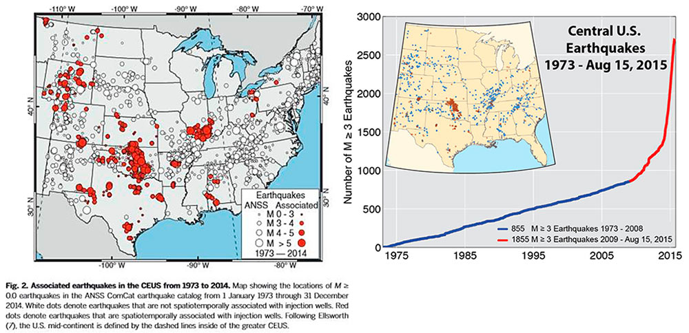
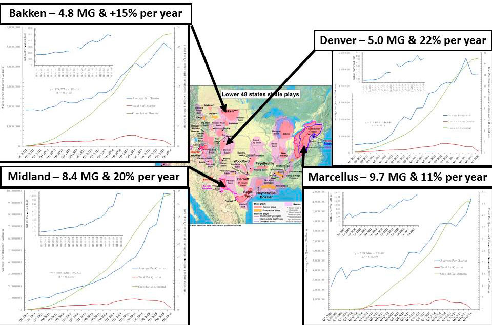
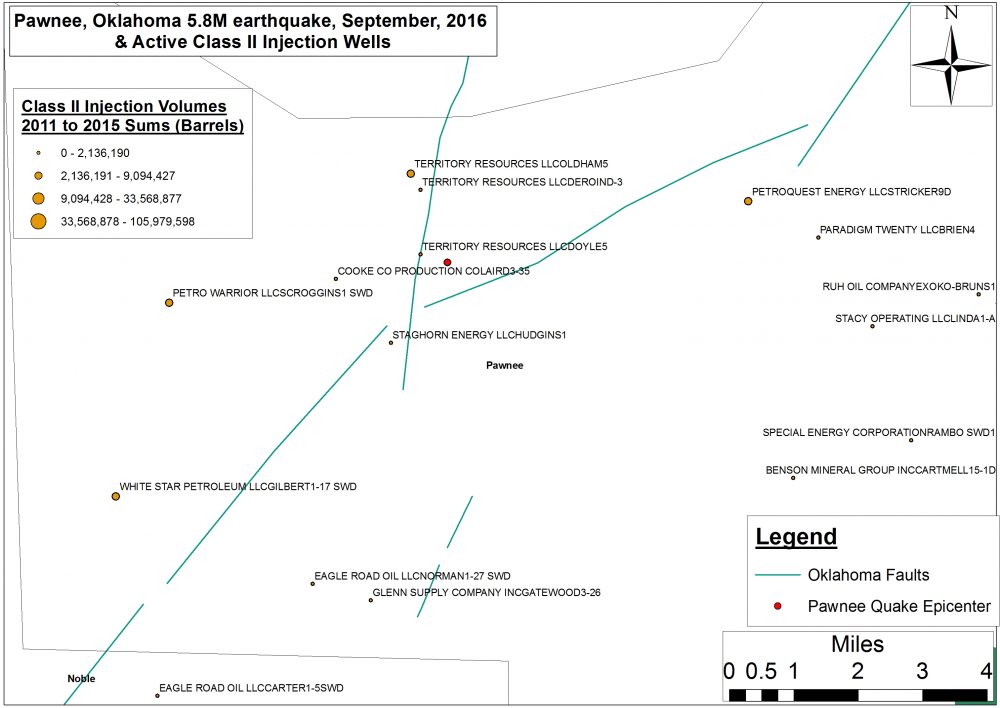


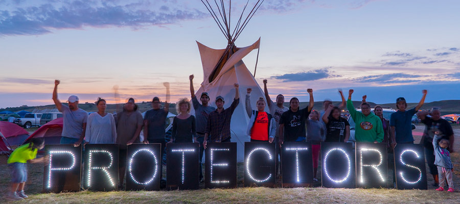
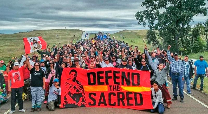
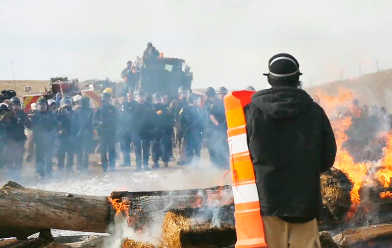
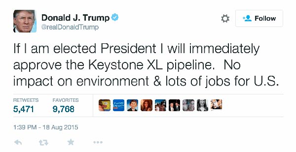

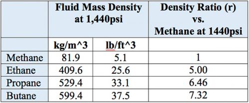
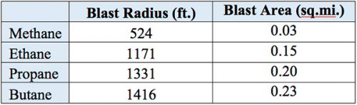
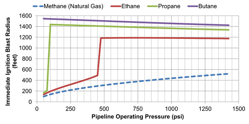

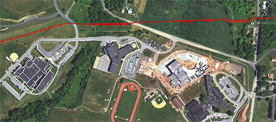

")
")